Wesleyan Wolves | Rebranding
Dan Blessing
Overview
Wesleyan School is a K-12 school located in Georgia guided by Christian principles.
With Wesleyan School in need of modernizing their athletic identity which is based around a wolf, Design Shark was tasked with creating an identity that: unified the brand, strengthened school spirit, and reflected the quality and tradition of its athletics program. The existing wolf logos and wordmark lacked cohesion, emotional impact, and scalability, limiting their effectiveness across key brand touchpoints.
Scope & Deliverables
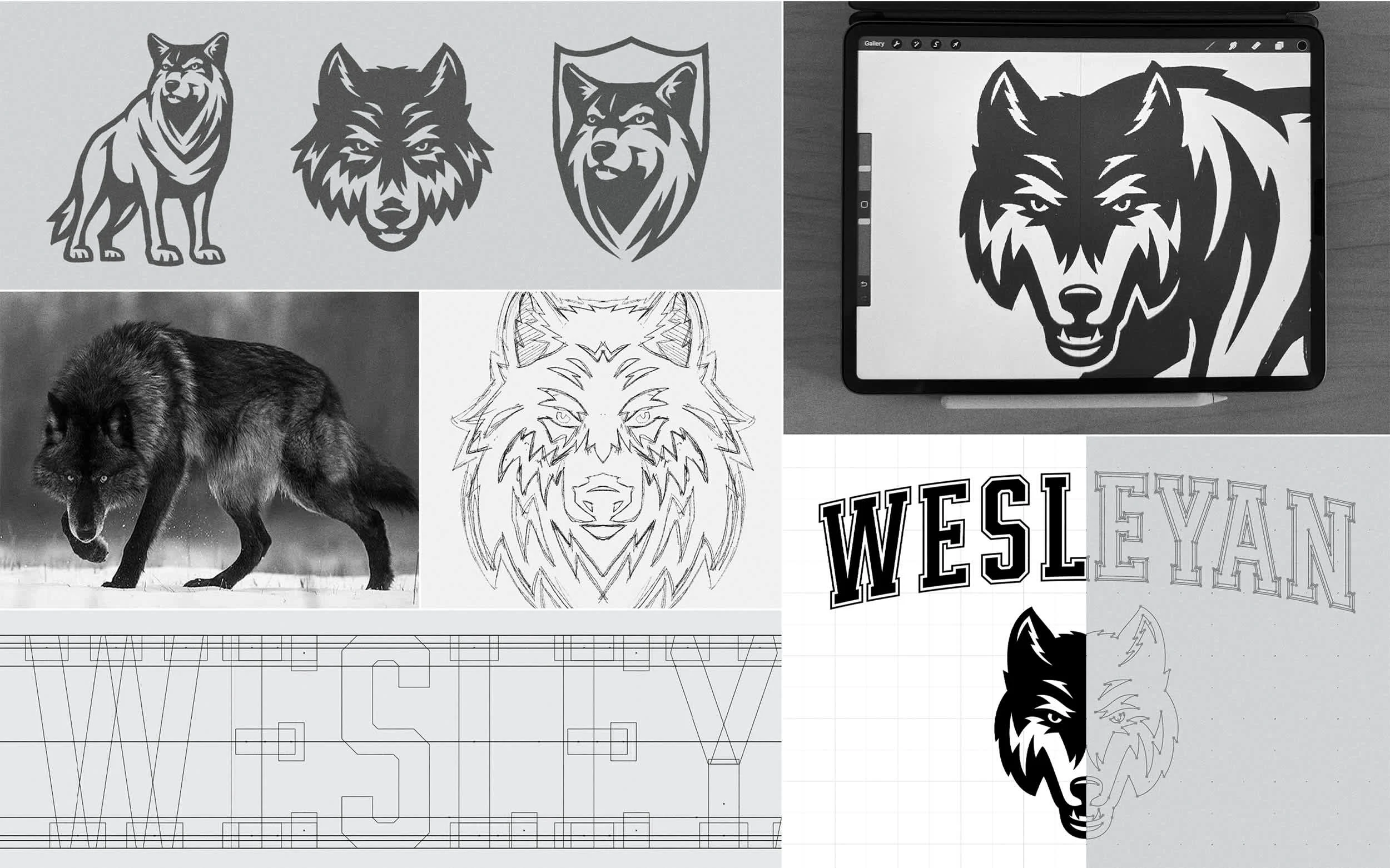
– Discovery & Research
– Primary Logo System
– Custom Wordmark
– Roundel Badge
– Display type pairing
– Primary Color System
– Brand Guide
Before and After
Identified Problem
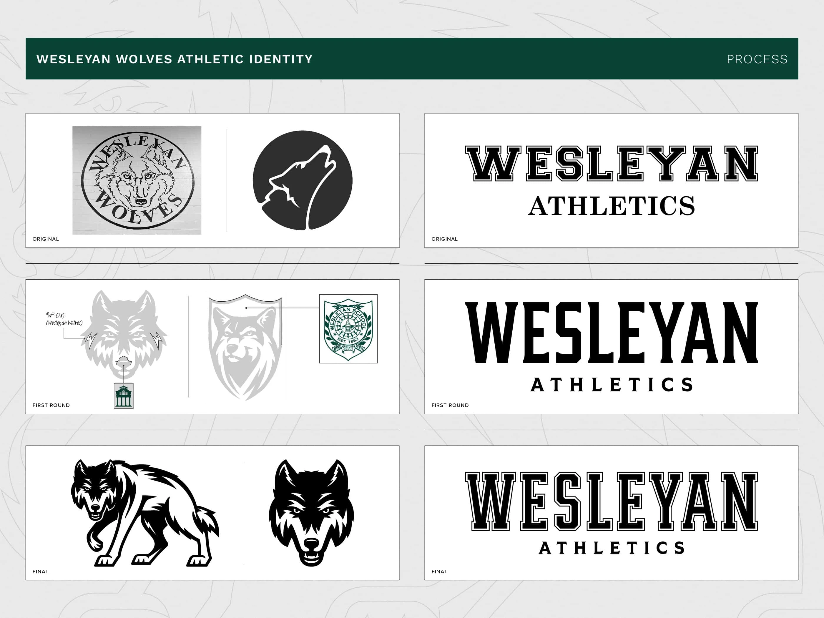
The existing wolf logos felt outdated and generic with one being too detailed and the other overly simplified. Neither captured the energy of a modern athletic brand or sparked meaningful school pride, leaving little emotional connection with the community.
Much like the wolf logos, the wordmark felt outdated and generic and lacked visual cohesion with the rest of the identity. Its wide layout made it difficult to use effectively across key applications like apparel, merchandise, and signage and needed an upgrade.
Wesleyan already had a strong color palette, but their green and gold both competed for attention when used together so they usually could not be present in the same design space.
Approved Solution
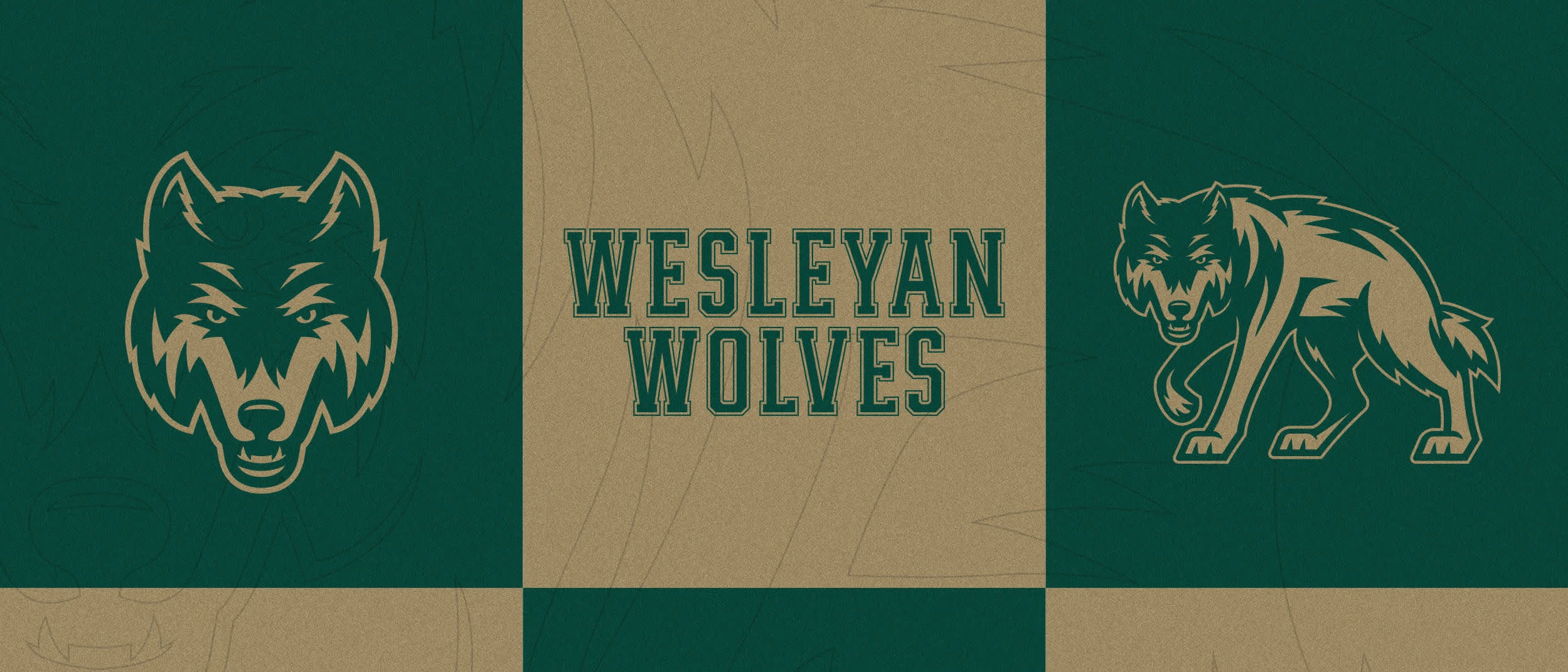
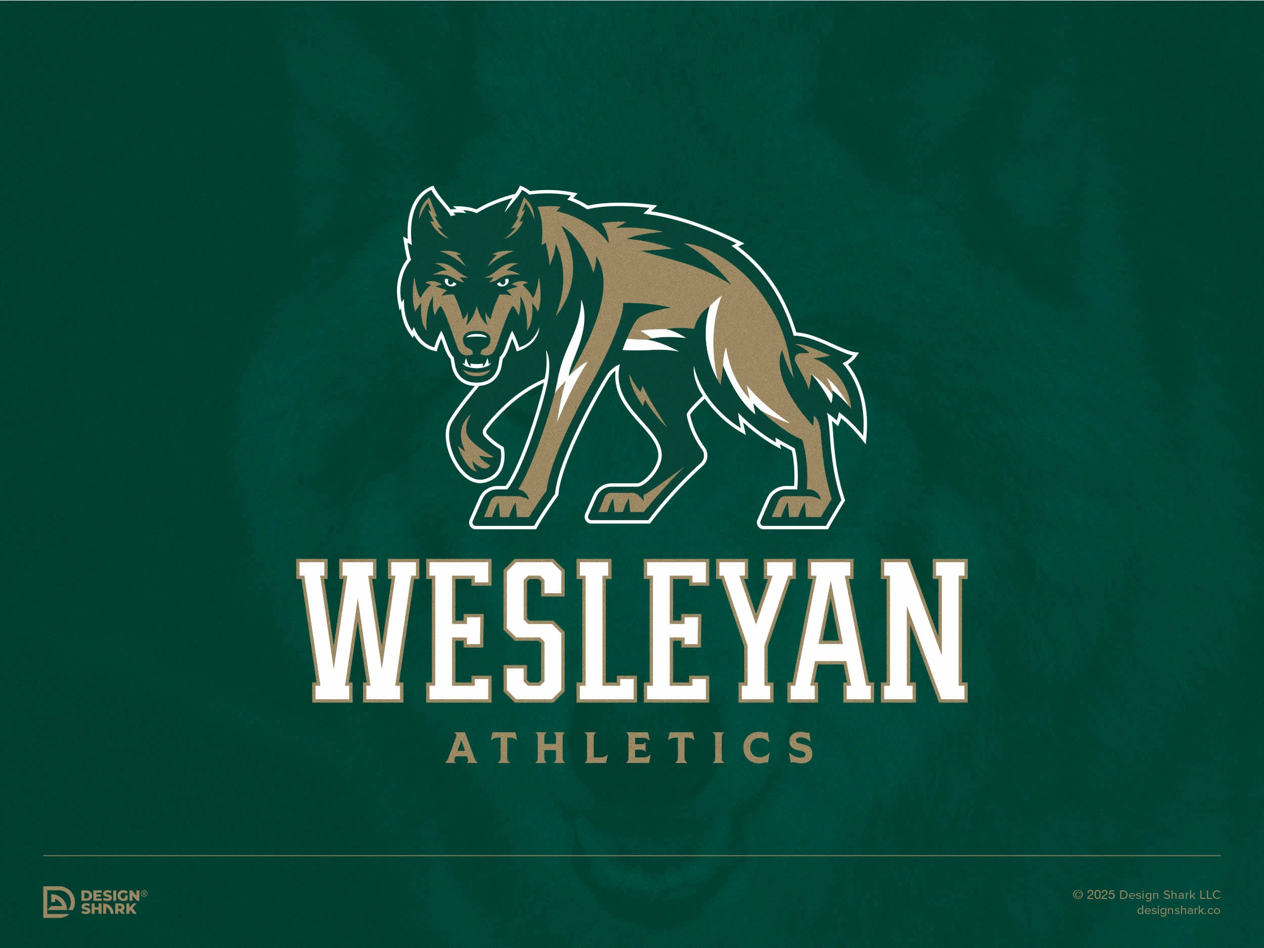
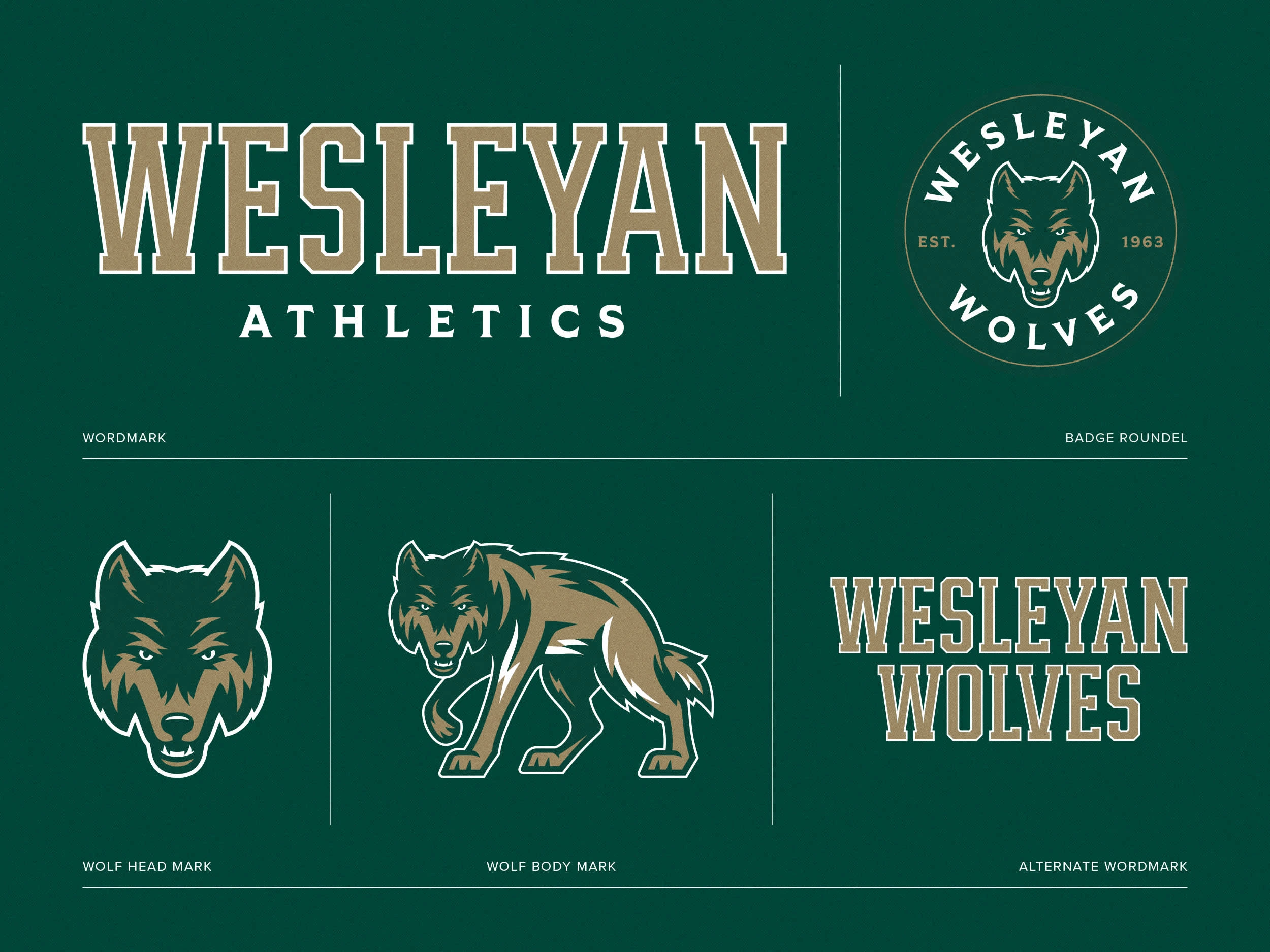
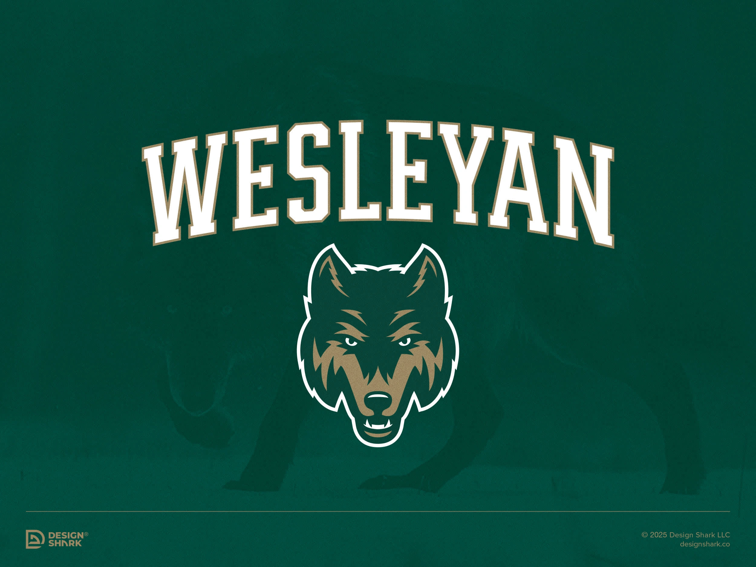
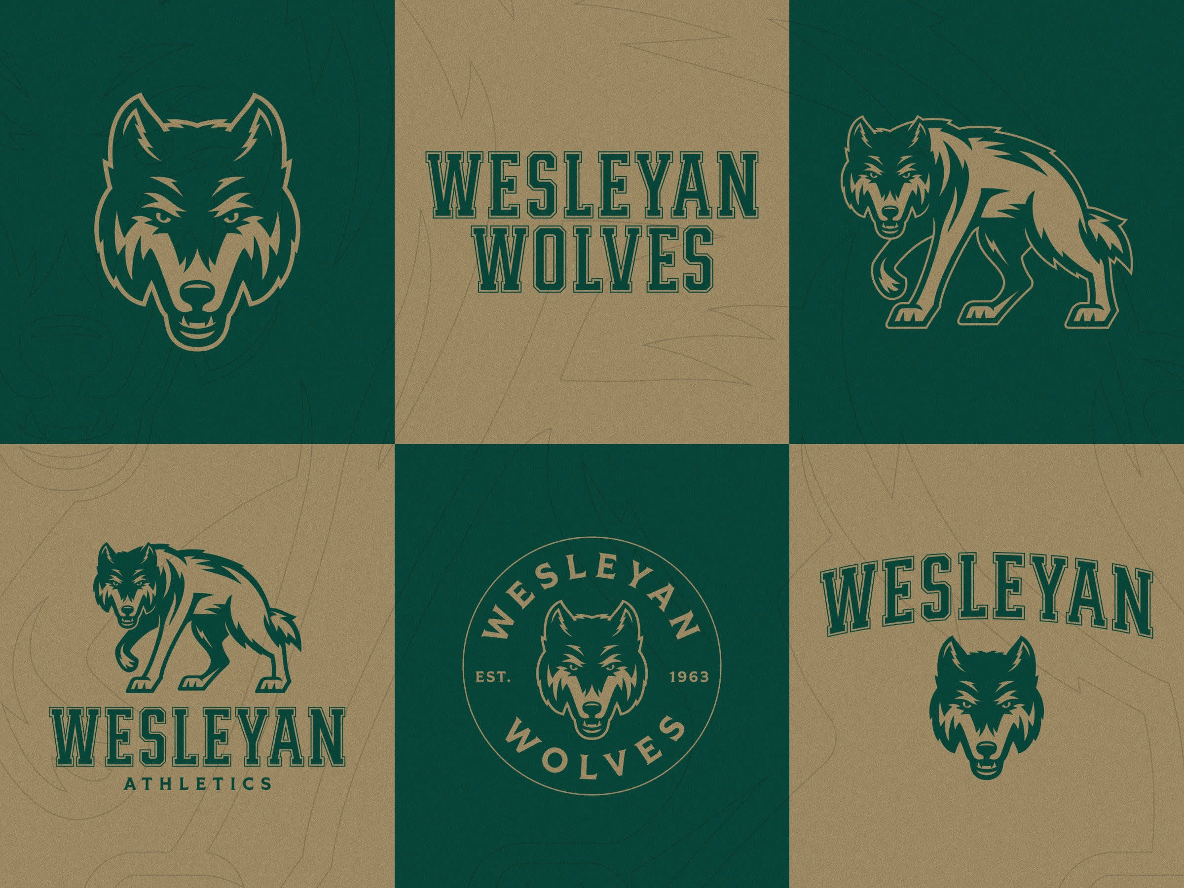
I created a strong, modern identity system centered around a full-body wolf and a complementary wolf head. The new marks strike a balance between classic and contemporary, designed to feel powerful, timeless, and recognizable. The goal was to create a wolf that was intimidating but not overly aggressive so we opted to only show a little teeth and gave it a strong, prowling stance. The system offers flexibility and scalability, maintaining visual impact across everything from digital media to uniforms and merchandise. Most importantly, the new designs help foster deeper school pride and a stronger emotional connection within the community.
The first wordmark exploration was a more modern take, which was created with simplified forms for enhanced readability. That ended up being too much of a departure from the original mark so then I designed a custom, condensed “Wesleyan” wordmark inspired by traditional varsity lettering. the updated wordmark complements the new wolf marks, improves balance, usability, and ensures cohesive brand representation across all athletic touchpoints.
To make the color palette stronger, I kept the green the same but used a lighter tint (85%) of the school's gold color to allow both colors to be used in the new athletic identity. This helped make the identity system more dynamic and modern.
Wolf BodyLockup
Process
Full Color Logo System
Wolf Head Lockup
One Color Logo System
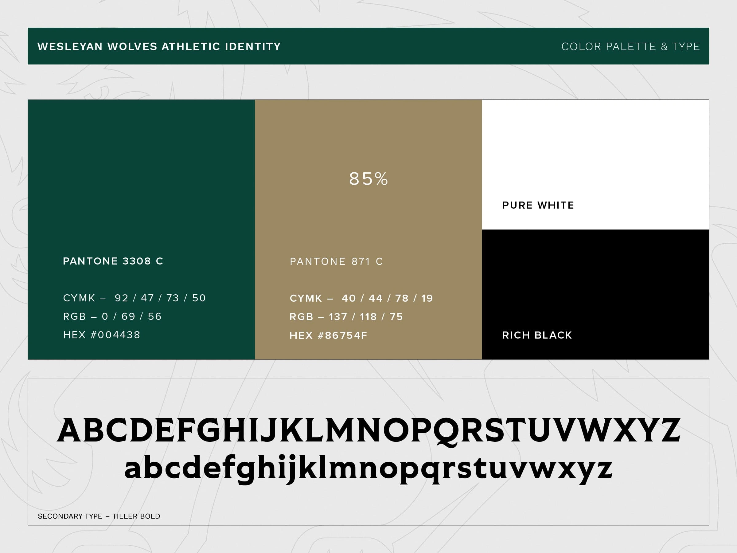
Color Palette and Typography
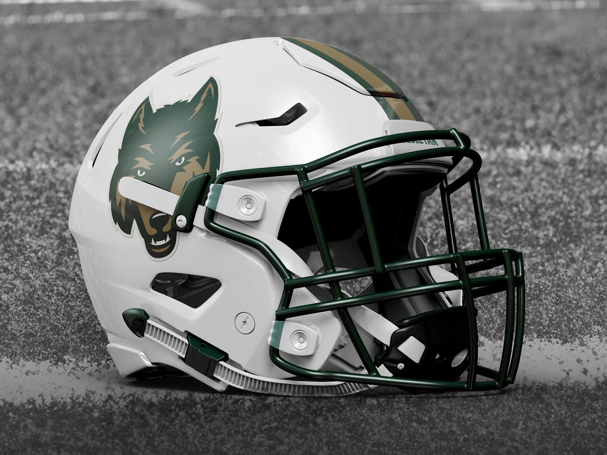
Football Helmet
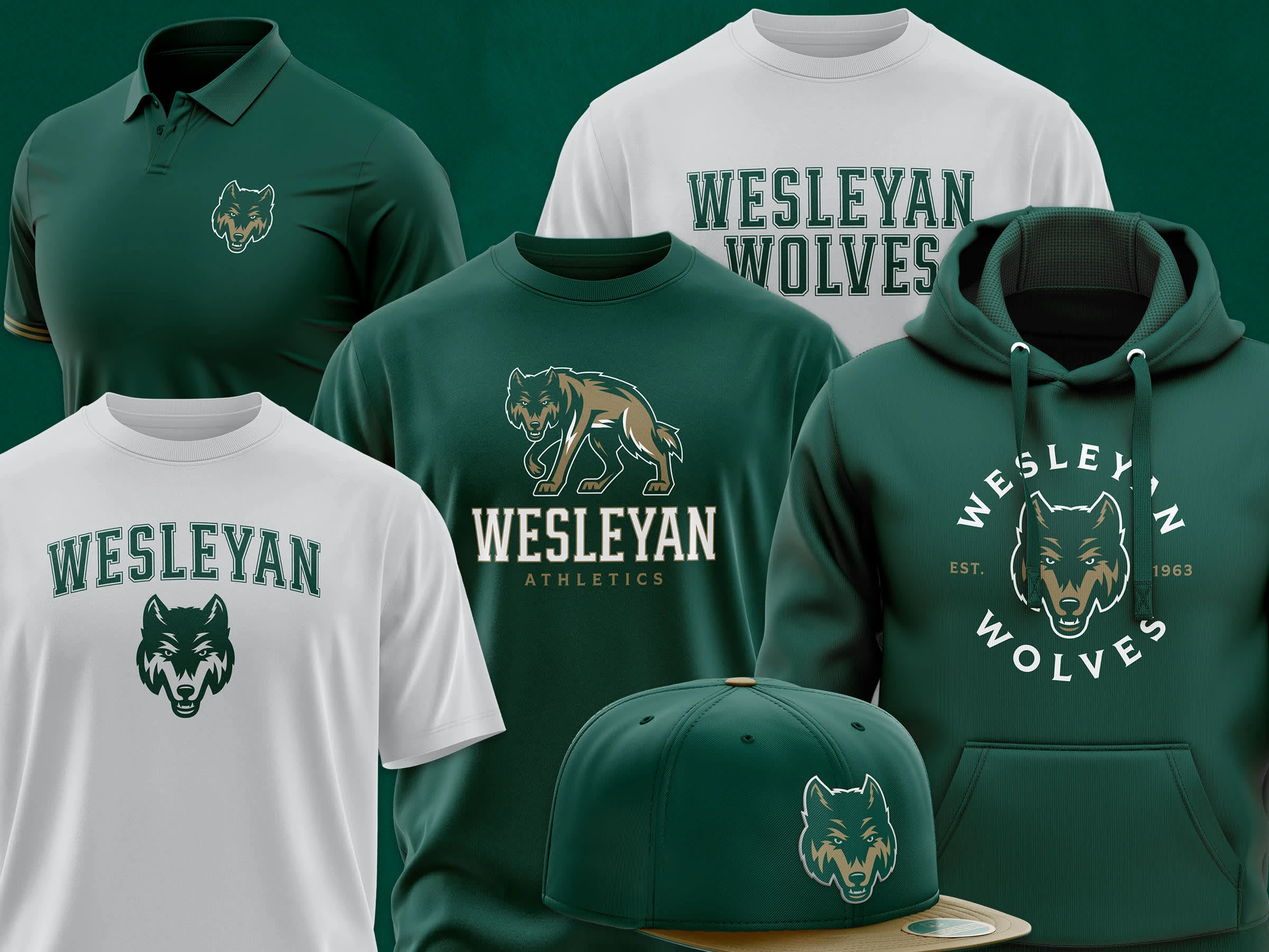
Apparel Applications
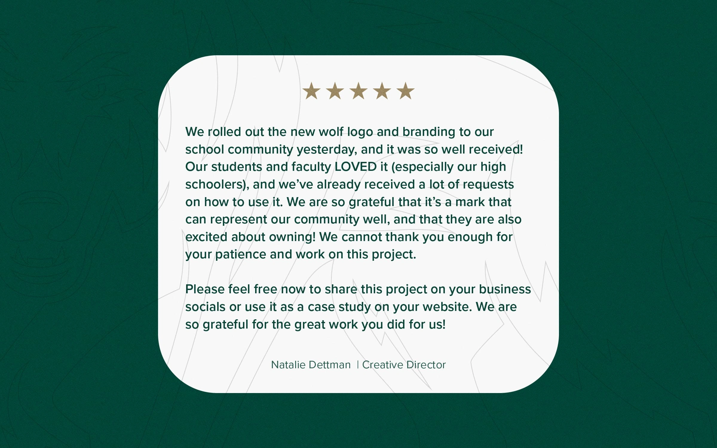
Testimonial
Like this project
Posted May 13, 2025
Unified identity with a bold wolf, varsity-inspired wordmark, and refined colors—balancing classic and modern to boost pride and brand flexibility.