VendorPM's Design System
Overview
Role: UX Designer
Team: UX Designer
Timeframe: 3 months - 02/2022 - 04/2022
Problem
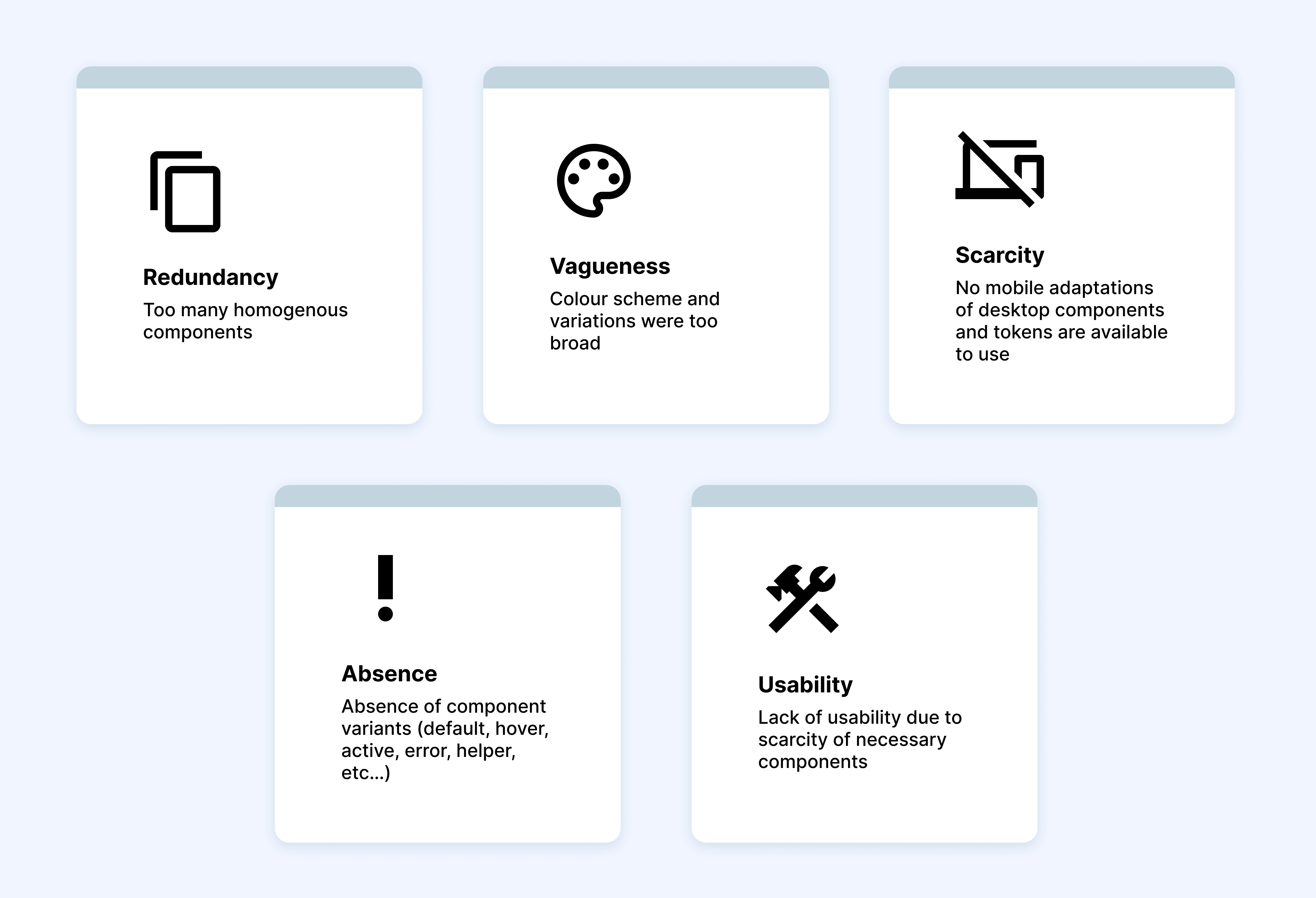
Designers would copy components and patterns directly from the most recent design films because the existing design system was unreliable
The design system had numerous formatting inconsistencies and redundant duplicates
Components coded to launch were inconsistent and defined based on the developer's interpretation of each design (i.e.: different corner radii on buttons depending on each developer's work).
Overview
VendorPM is a Toronto-based startup focused on simplifying the contracting process for property managers and vendors with vendor management, sourcing, procurement, and compliance.
My task was to co-lead a large-scope project and construct a fully functioning design system
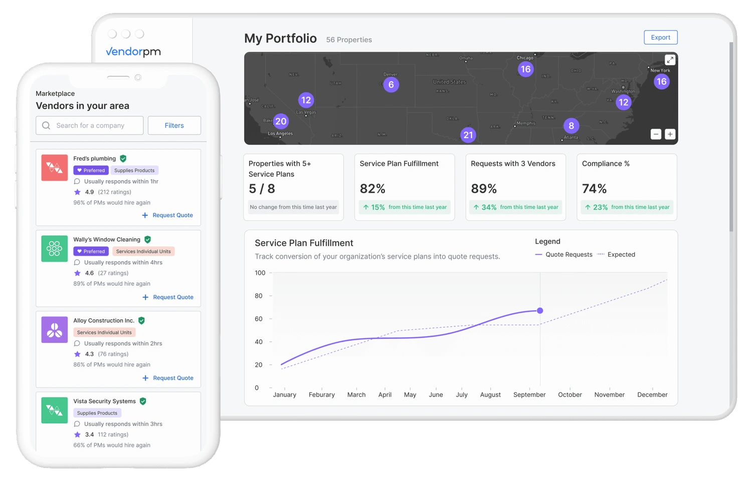
How might we consolidate the current design system in order to streamline the design > dev handoff > platform launch process?
Solution
In order to consolidate our existing design system, we plan to…
Reinforce the brand identity with… elements that enhance and complement the product experience
Refine and restructure existing tokens by… reducing snowflake components and tokens
Standardize styling and variants to… improve efficiency in design and front-end development work
Understanding the Problem
Execution

Phase 1: Platform UI Component Audit & Storybook Setup


Phase 2: Implementation & Re-iterate

Phase 3: Token Refinement & Rollout

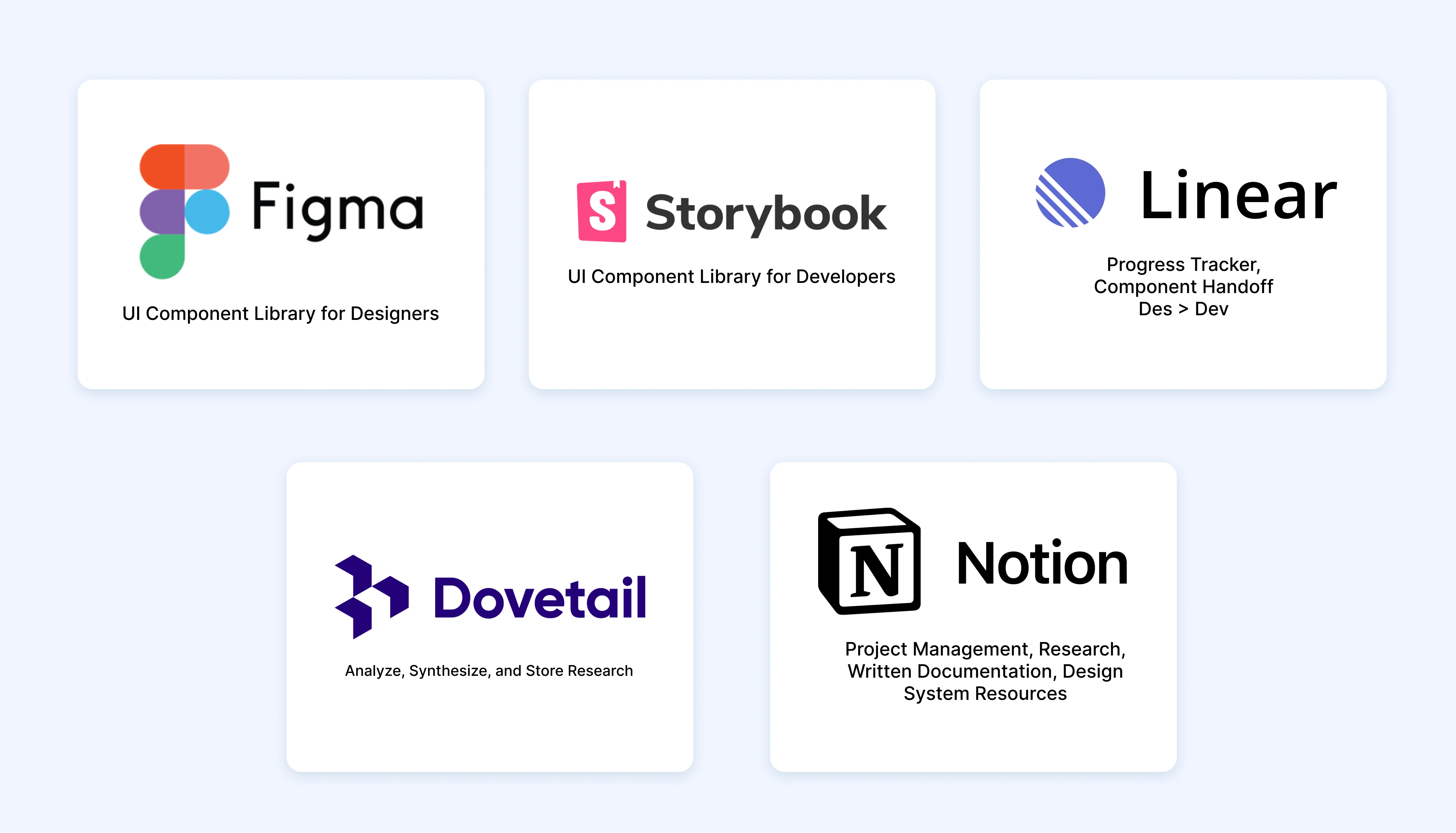
Techstack
Secondary Research
In order to define best practices for tokens and build a good foundation for our design system, we examined exemplar design systems from the design industry favorites.
We also found plenty of inspiration from Storybook’s showcase, which displayed popular component libraries from leading UI engineering teams.
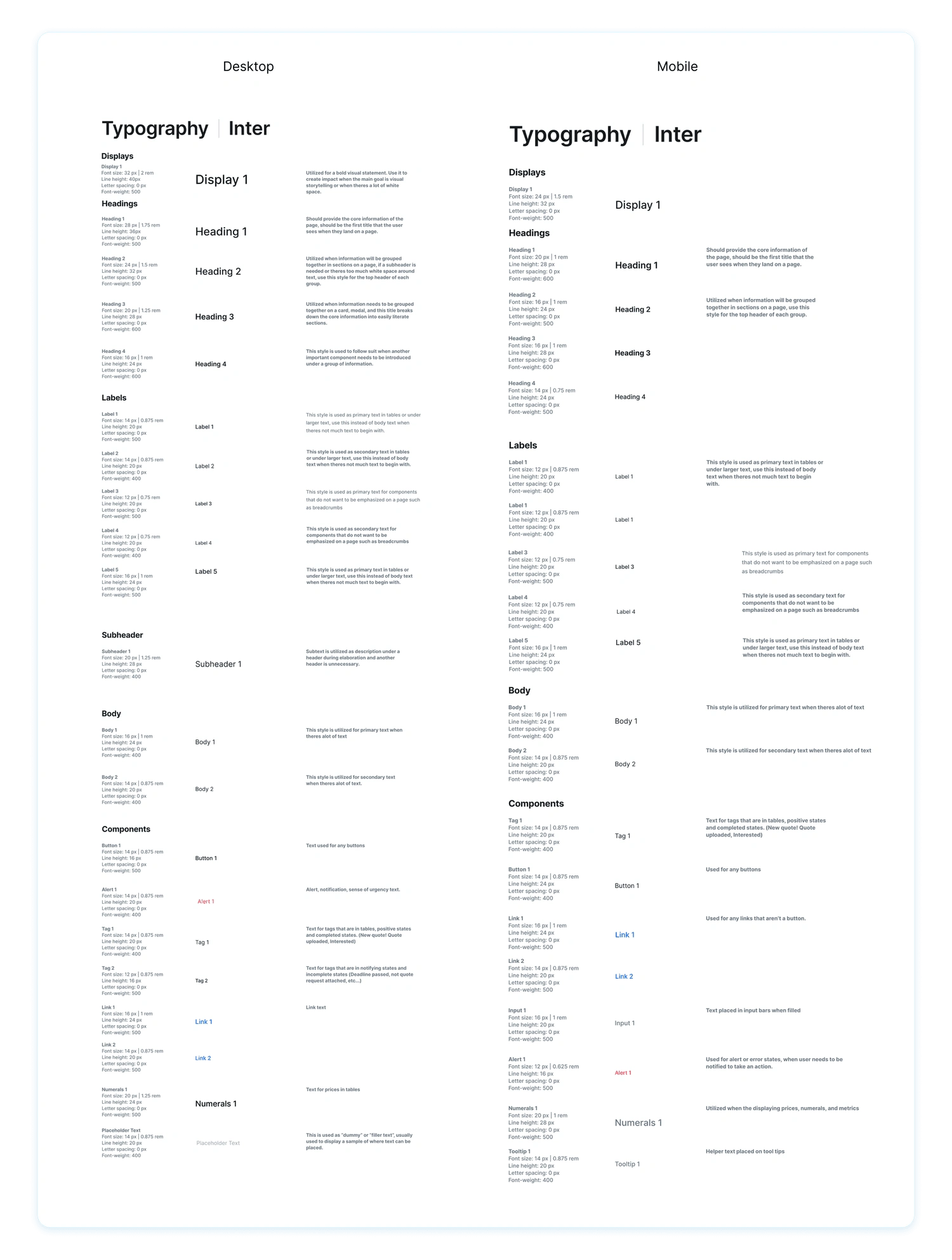
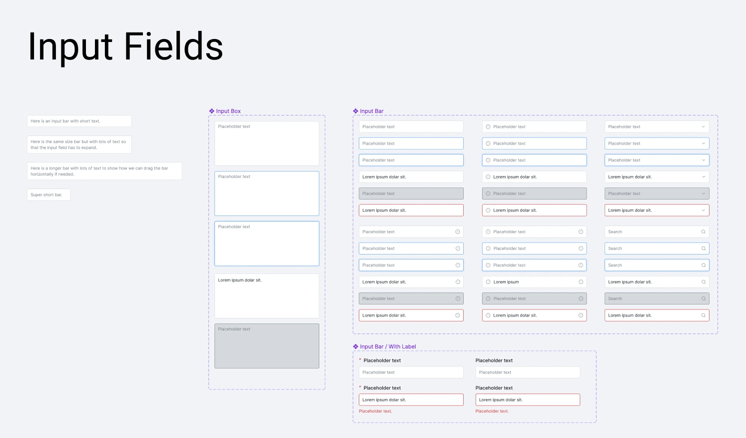
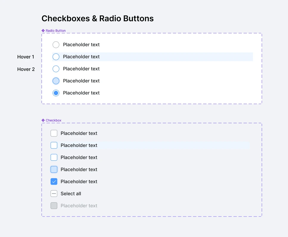
Design System
Samples of the tokens and components that I created for VendorPM's Design System.
Results
All components and styling are now taken directly from the design system
Updates to the main components automatically revise the instances that are linked
Storybook and Figma UI libraries are both launched and running
Linear is utilized to keep track of the components that require updating
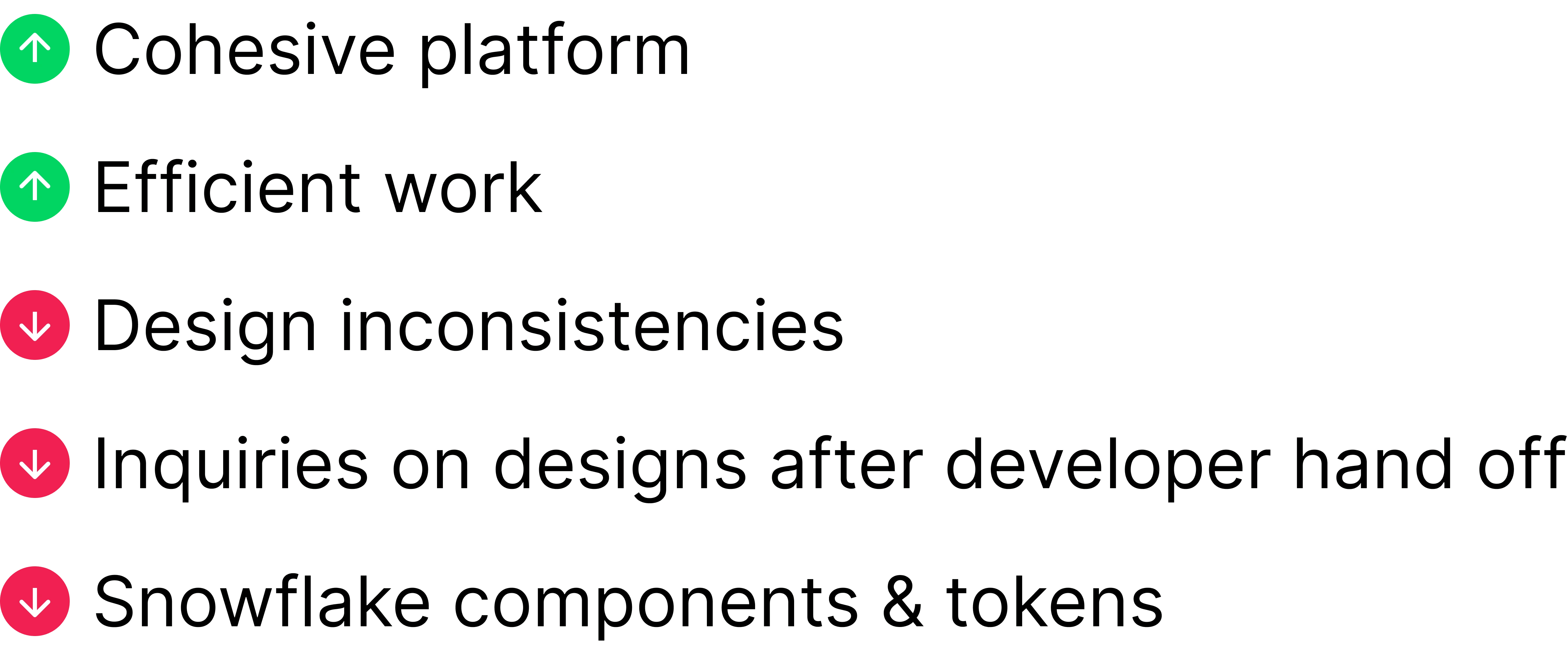
Measuring Success
Team Retro
The design team followed up together after each sprint to reflect on our project goals, successes, improvement areas, kudos, and action plans.
What could be improved:
Building typographic tokens took much longer than anticipated
QA must be approved by one of the designers before the tokens/components are updated on the website, however, inconsistencies or mistakes would be found between UI library on Figma and Storybook UI which led to a delay in product delivery.
What can be done?
Periodic contact with members involved in the brand identity and implementing the design system to ensure no last-minute revisions disrupt the next sprint.
Have an individual be tasked solely to QA the UI library prior to updates or a stage primarily to QA content
Like this project
Posted Sep 1, 2023
Reinventing VendorPM's Design System

