Cinema city app
About project
Cinema city is an app for online movie tickets purchases and reservations. The app has a simple and convenient interface. Cinema city targets customers are who wants to choose a movie and buy tickets online without queues and harm for environment.
Task
The goal was to design and develop a user-friendly and efficient online ticket purchasing system for Cinema City's mobile app, allowing customers to easily browse showtimes, select seats, and complete transactions with minimal steps and maximum convenience.
Contributions
My workflow:
user research
wireframe development
prototyping
usability studies
visual concept
UI kit
User research
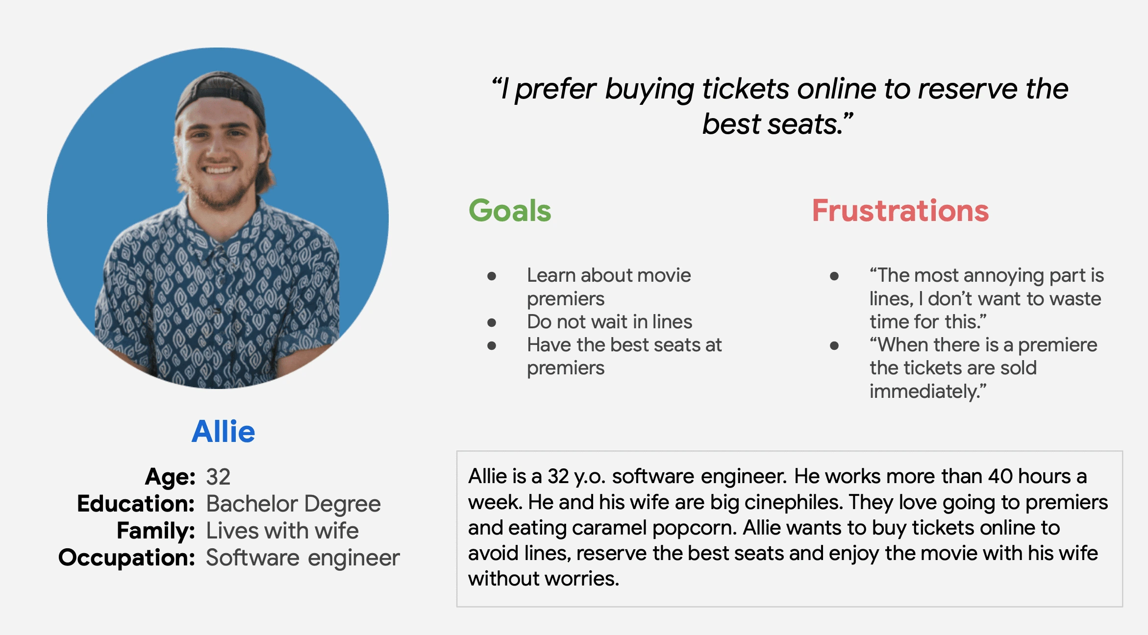
I conducted interviews and created empathy maps to understand the users I’m designing for and their needs. A primary user group identified through research was people who don’t want to wait in lines.
This user group confirmed initial assumptions about app users, but research also revealed that lines was not the only factor motivating users to buy online tickets. Other user problems included impairments, interests and life positions that make it difficult to get movie tickets at the cinemas.
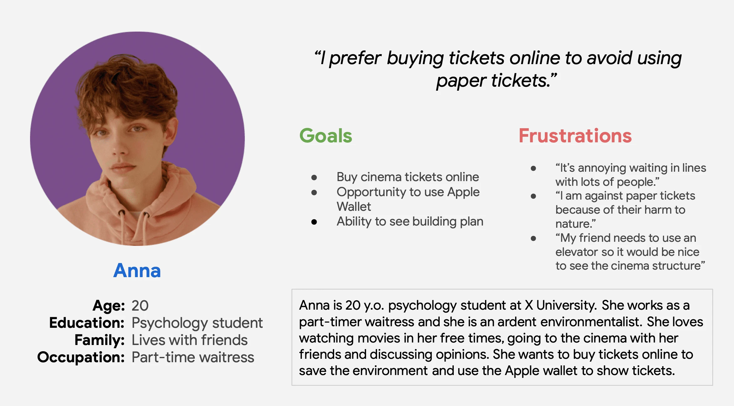
Personas
User pain points are addressing common pain points such as long wait times, harm to environment caused by paper tickets and sold out shows.
Time: It takes lots of time and stress to wait in lines.
Harm to environment: Paper is one the largest industrial polluters all over the world. As well as producing physical movie tickets.
Sold outs: When there are movie premieres cinemas are loaded with large crowd that creates long lines and seats are limited.
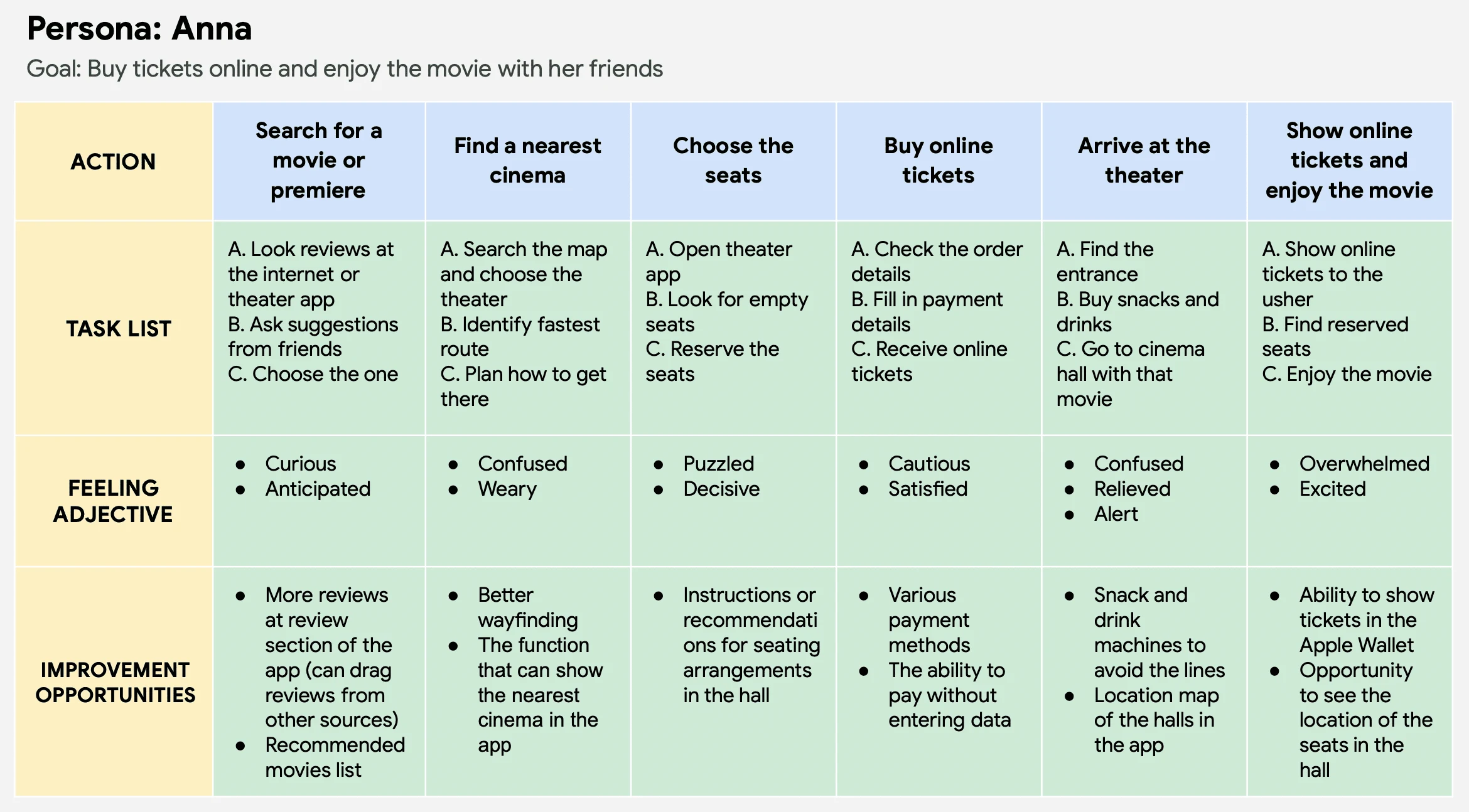
User journey map
The user journey map for the Cinema City mobile app would detail the steps and interactions a user goes through when purchasing a movie ticket online. It would typically include the following key touchpoints:
Discovery: The user opens the app and is presented with options to browse movies, view trailers, and search for showtimes.
Selection: The user selects a movie and is presented with a list of showtimes and the option to select seats.
Payment: The user confirms their selection and proceeds to the payment page, where they enter their payment information and complete the transaction.
Confirmation: The user receives a confirmation of their purchase, including a digital ticket they can use to enter the theater.
The user journey map also took into account any additional features or options that the app offers, such as the ability to save favorite theaters or purchase concessions.
The user journey map is built based on user research, testing, and feedback to ensure that it is optimized for a smooth and intuitive experience.
Starting the design
The design process includes wireframes, prototypes and usability testing through user interviews.
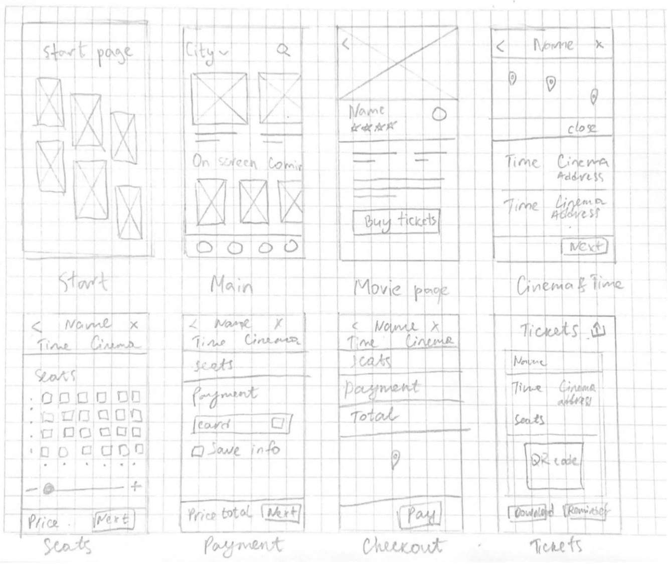
Paper wireframes
Taking the time to draft iterations of each screen of the app on paper ensured that the elements that made it to digital wireframes would be well-suited to address user pain points. For the home screen, I prioritized movie browsing and quick purchasing to help users save time.
Digital wireframes
As the initial design phase continued, I made sure to base screen designs on feedback and findings from the user research. Easy navigation was a key user need to address in the designs.
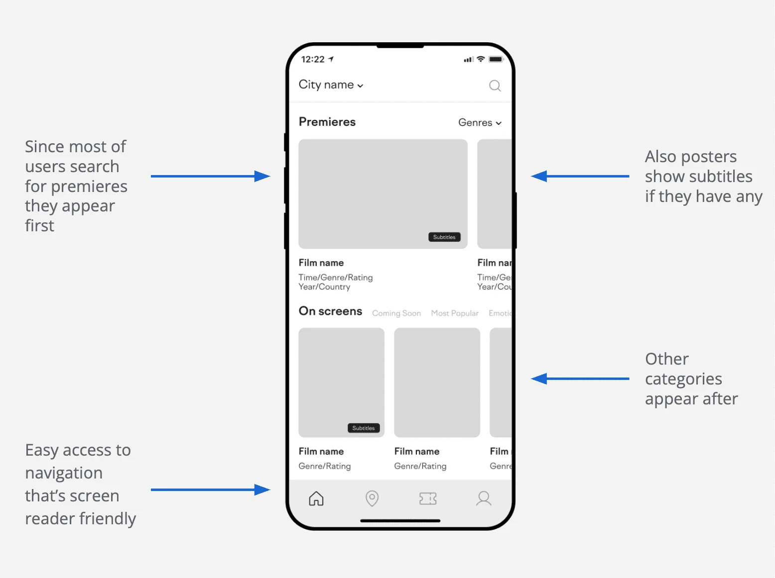
Using the completed set of digital wireframes, I created a low-fidelity prototype. The primary user flow I connected was sign up and purchasing tickets, so the prototype could be used in a usability study.
Usability studies
I conducted two rounds of usability studies. Findings from the first study helped guide the designs from wireframes to mockups. The second study used a high-fidelity prototype and revealed what aspects of the mockups needed refining.

Refining the design
Early designs allowed for one payment method with card, but after the usability studies, I added additional options to payment.
The second usability study revealed frustration with not being able to see the building plan. So I added an info icon that opens a pop-up window with building information.
Key mockups
Main page and movie detail page
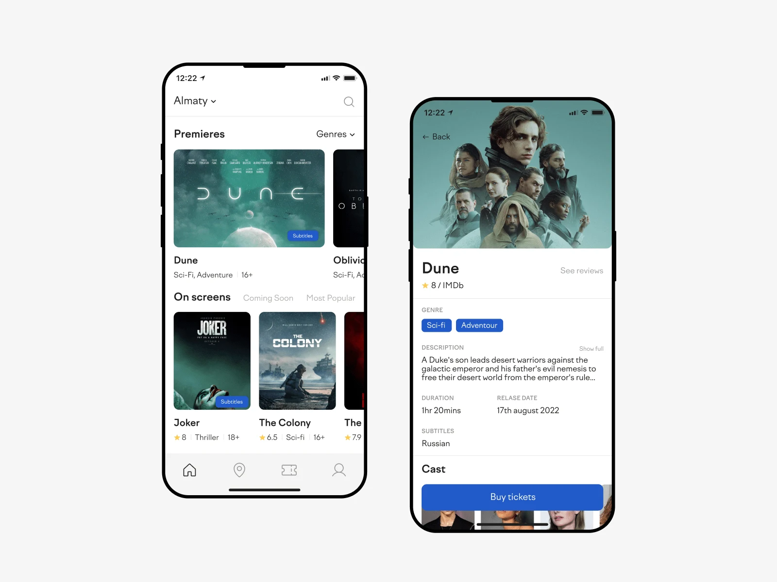
Main page and movie detail page
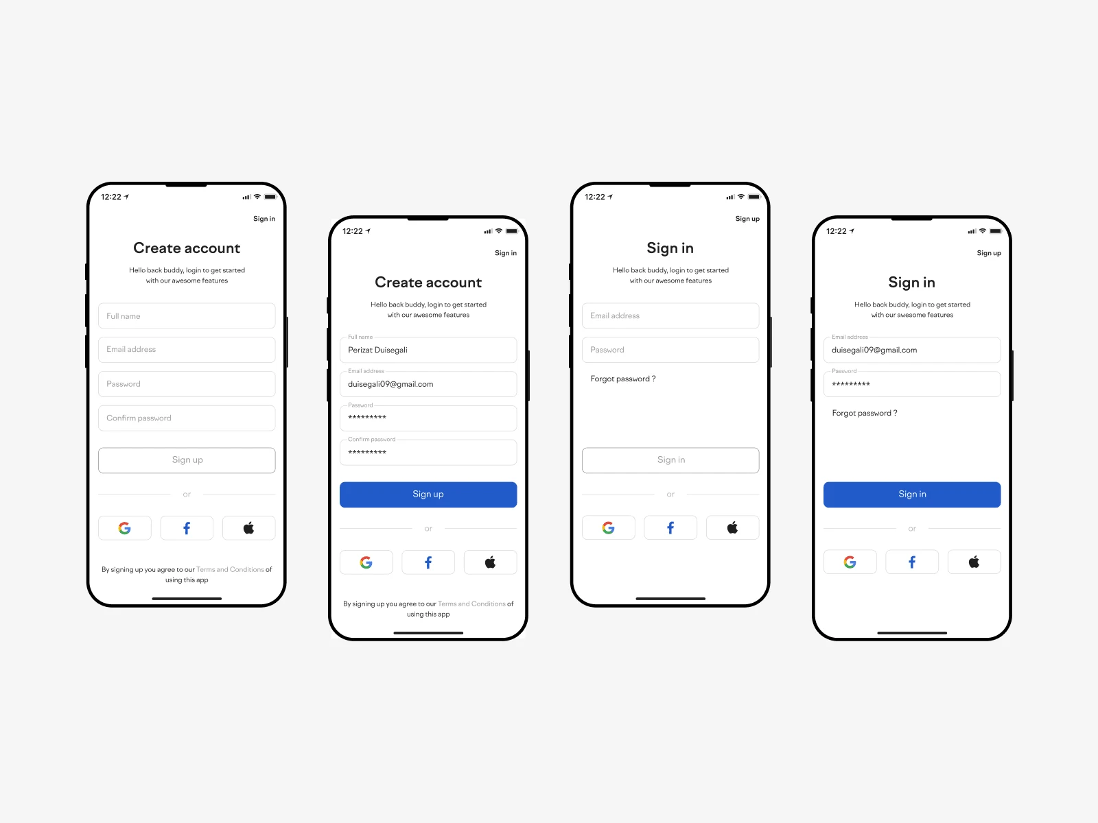
Sign up/sign in page
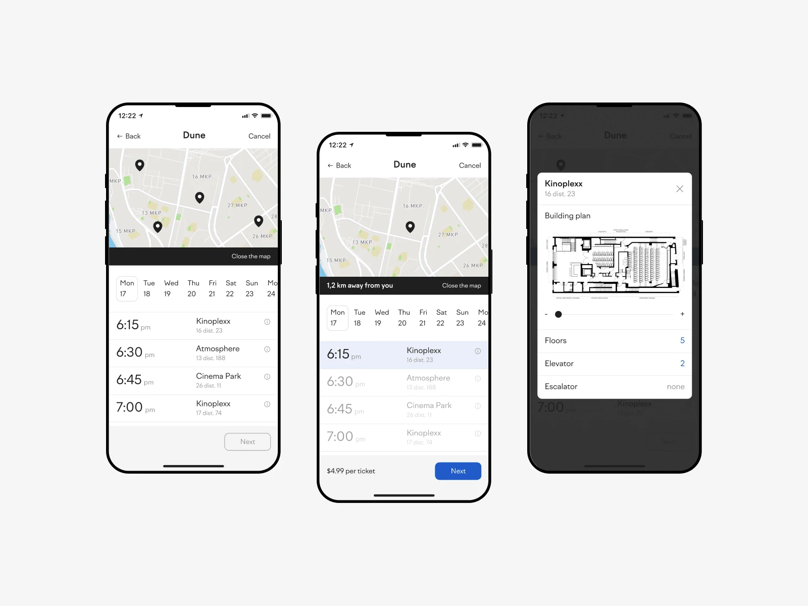
Cinema choice page
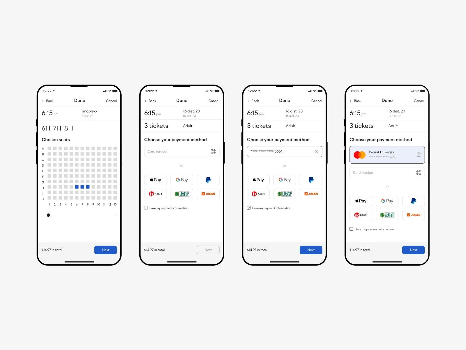
Seats and payment method choice pages
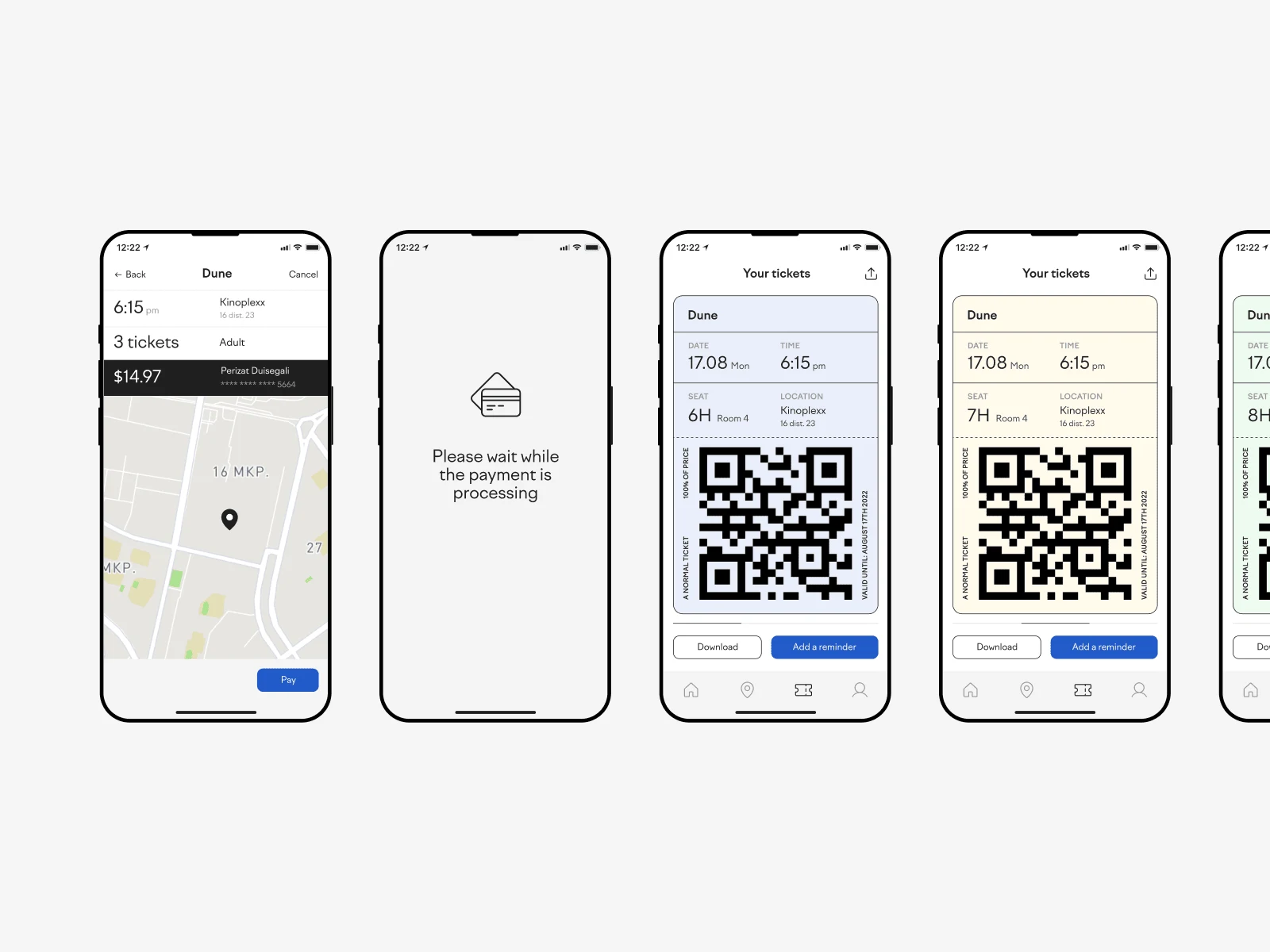
Checkout and e-tickets pages
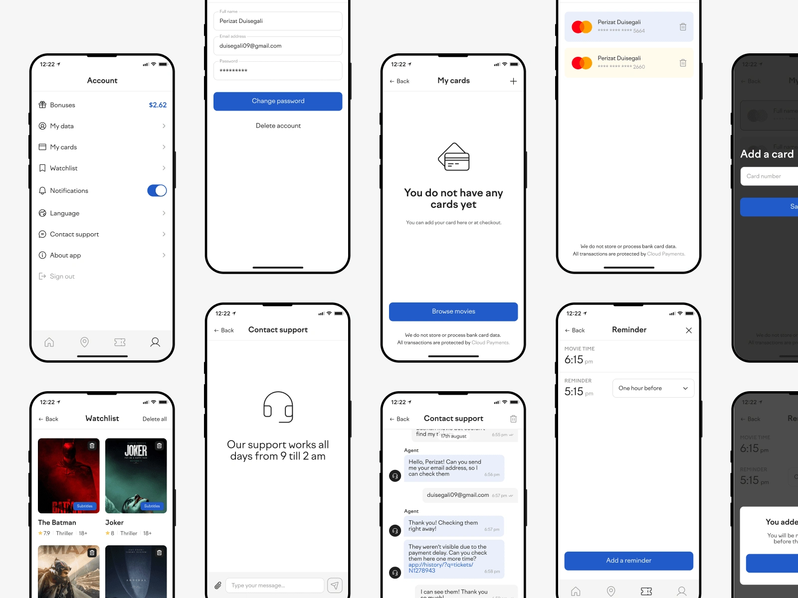
Other pages
High fidelity prototype
The final high-fidelity prototype presented cleaner user flows for movie browsing and tickets purchasing. It also met user needs for more payment options and additional information.
View the Cinema City’s High fidelity prototype
Accessibility considerations:
Provided access to users with hearing impairments through adding an availability for subtitles.
Added more payment methods to help all users not to struggle by typing.
Added a building plan at cinemas choose page to help all users easily navigate when they arrive.
Provided access to users with vision impairments by adding a scale function at seats plan.
Takeaways
Impact: The app makes users feel like Cinema City really thinks about how to meet their needs.
One quote from peer feedback:
“So cool you have tickets inside the app, usually I receive them by email and they're always at spam. I don't like that stuff.”
What I learned: While designing the Cinema City app, I learned that the first ideas for the app are only the beginning of the process. Usability studies and peer feedback influenced each iteration of the app’s designs.
Like this project
Posted Oct 30, 2023
Designed the online ticket purchasing system for Cinema City mobile app, allowing customers to easily browse showtimes, select seats, and complete transaction.
Likes
0
Views
5

