Website for Constraction company
Perizat Duisegali
About project
Novation - is a construction company specializing in architecture and infrastructure with over 40 completed projects at its back. The company entered the international market and wanted to demonstrate its activities through the website.
Task
The goal was to make a website to introduce the company, attract more visitors and easily represent their values and innovative technologies for construction. Such a UX/UI solution will help create a website that would be aesthetically pleasing and work well from the marketing point of view, increasing conversion.
This case taught me to think ahead and keep in mind all the details to create something remarkable.
Contributions
My dynamic discovery workflow:
competitive analysis
information architecture
wireframe development
prototyping
visual concept
UI kit
Problem & Solution
There are many sites in this industry. Most of them have creative and unusual solutions. The main problem was to come up with an alternative idea of content presentation, different from other companies and talk about its innovative sustainable solutions.
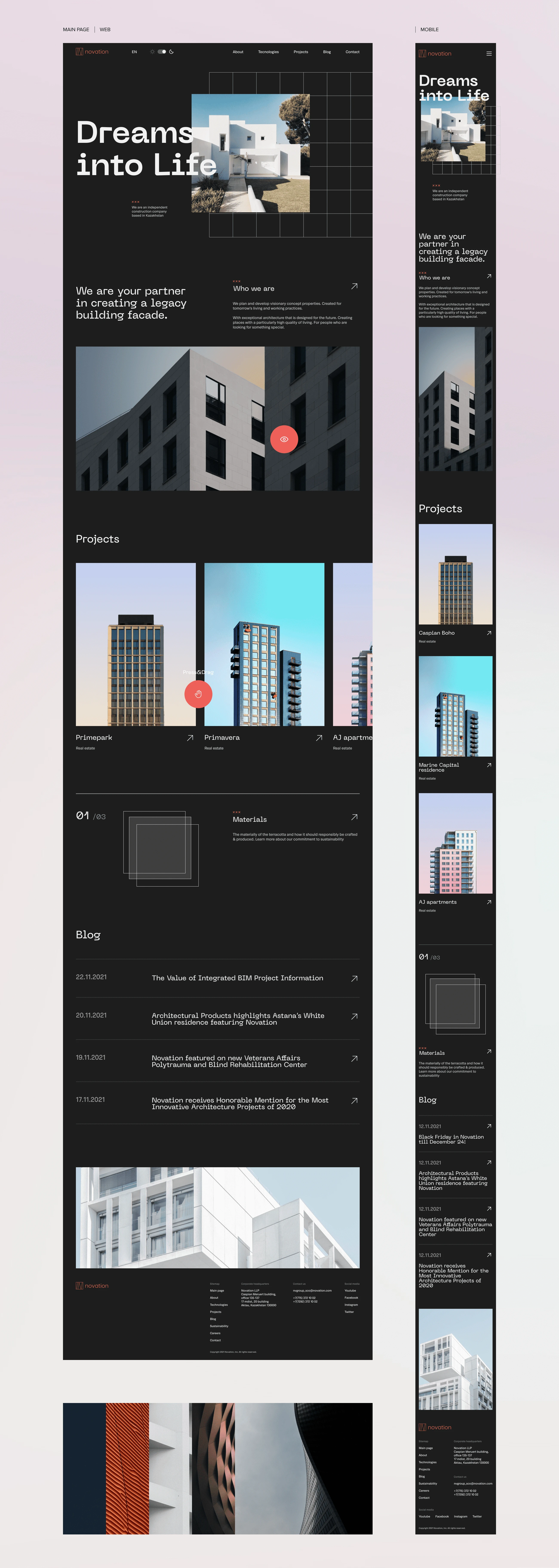
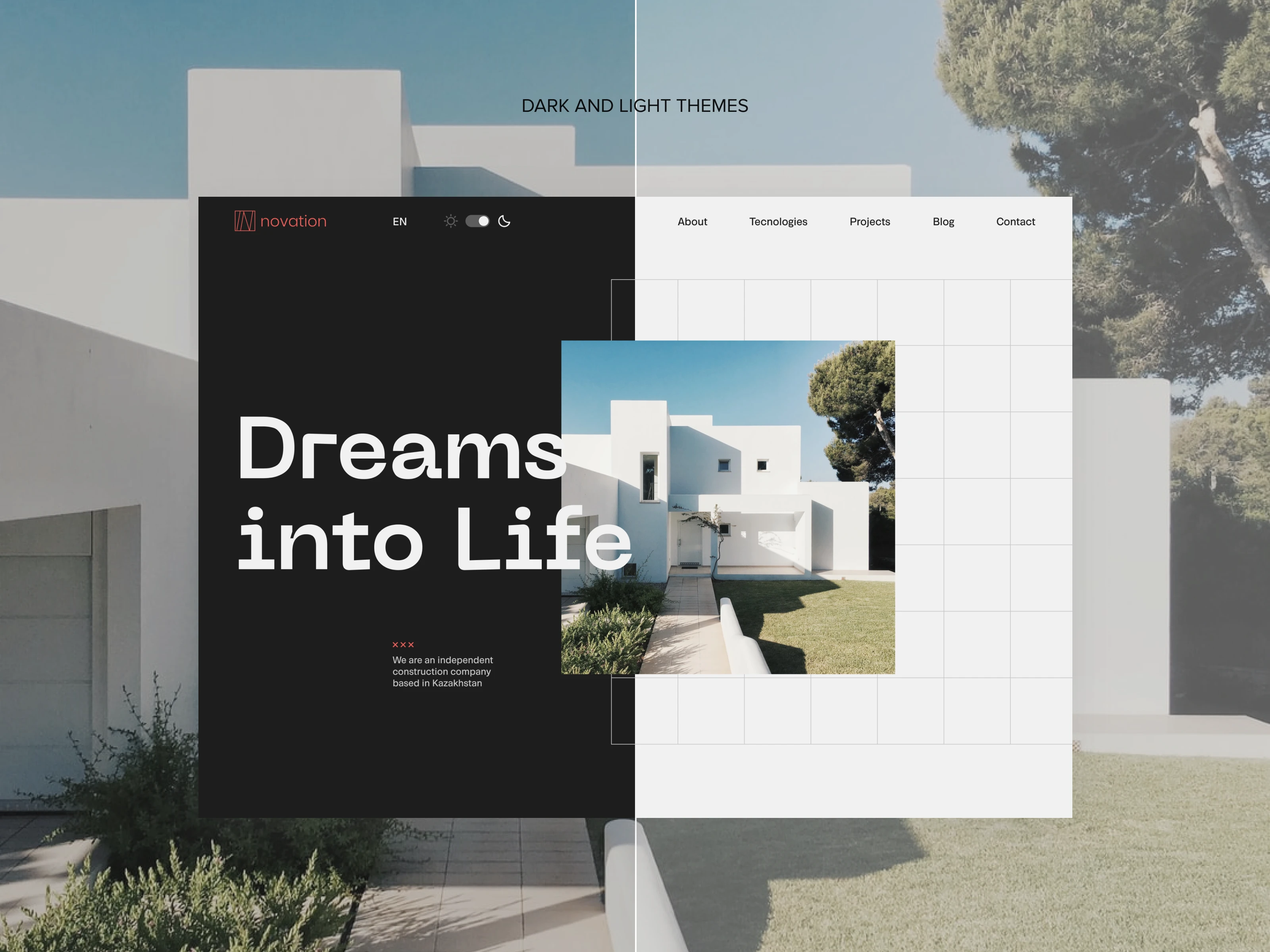
Came up with the idea to make a dark theme site in line with the latest trends. Shades are more comfortable for the eyes than pure colors: gray, light gray, pink, etc. With a high contrast, it is difficult for the eyes, so a dark theme was initially chosen for the convenience of visitors. Also it was diluted with brutalism to make the site more rigorous.
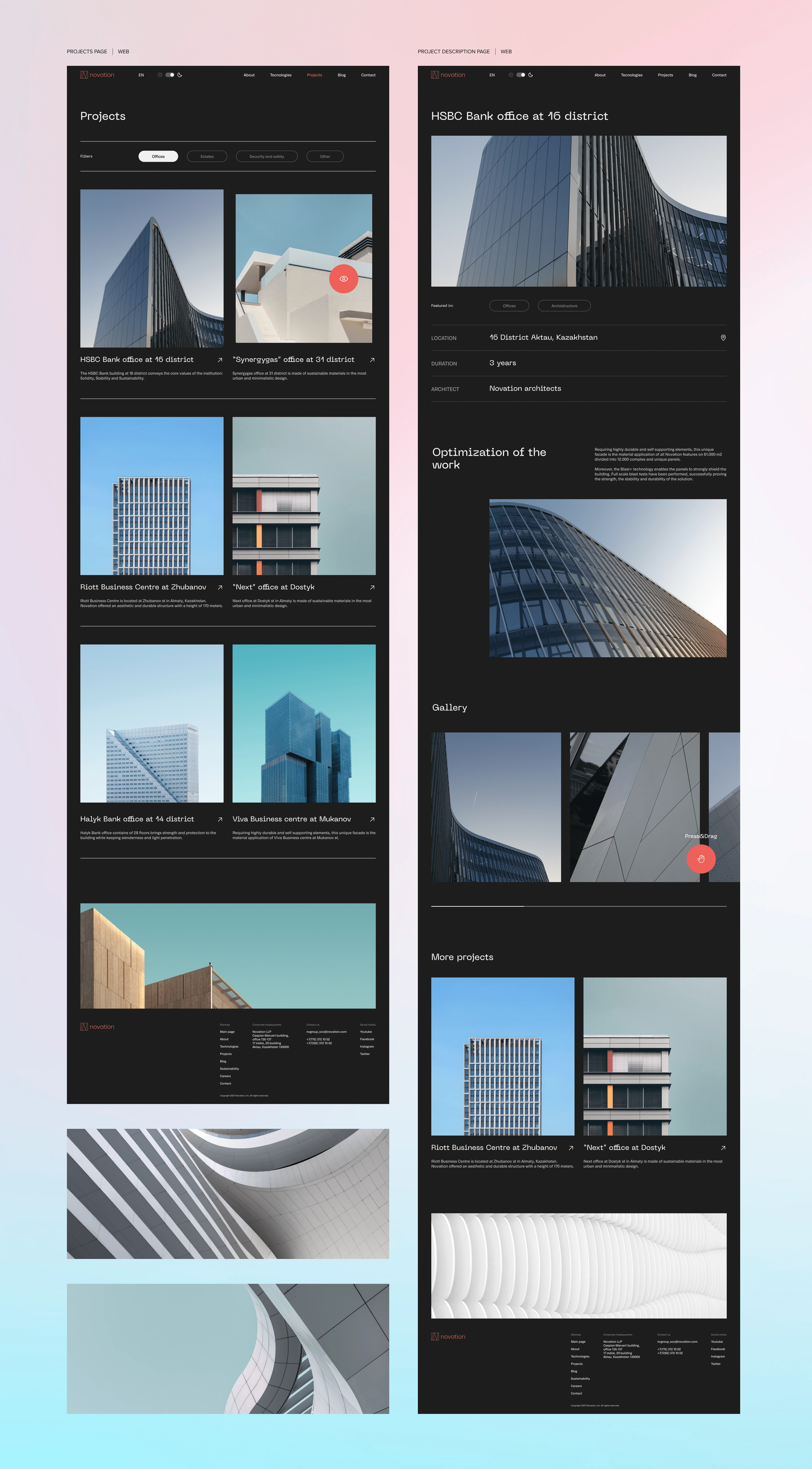
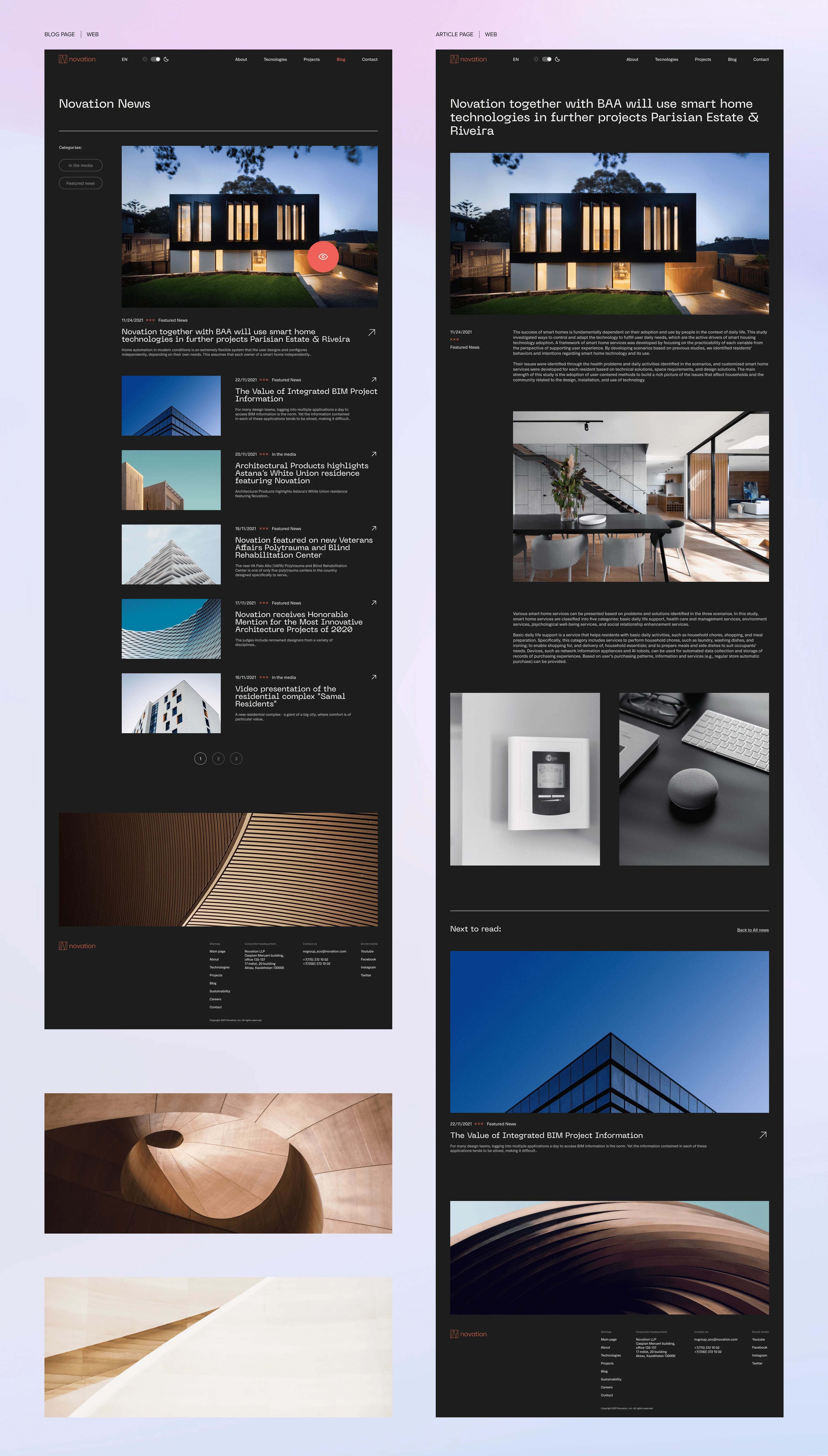
Overview
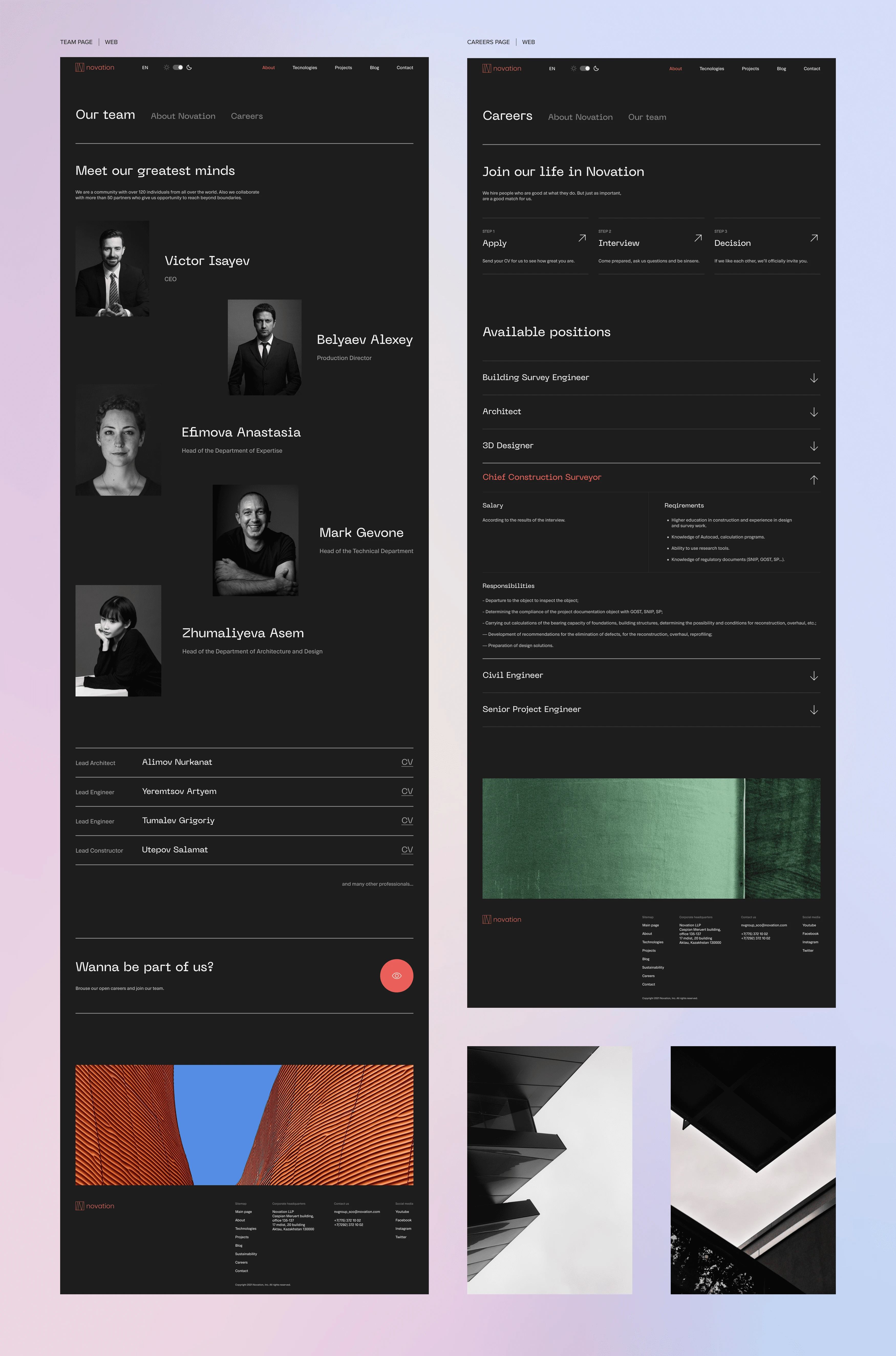
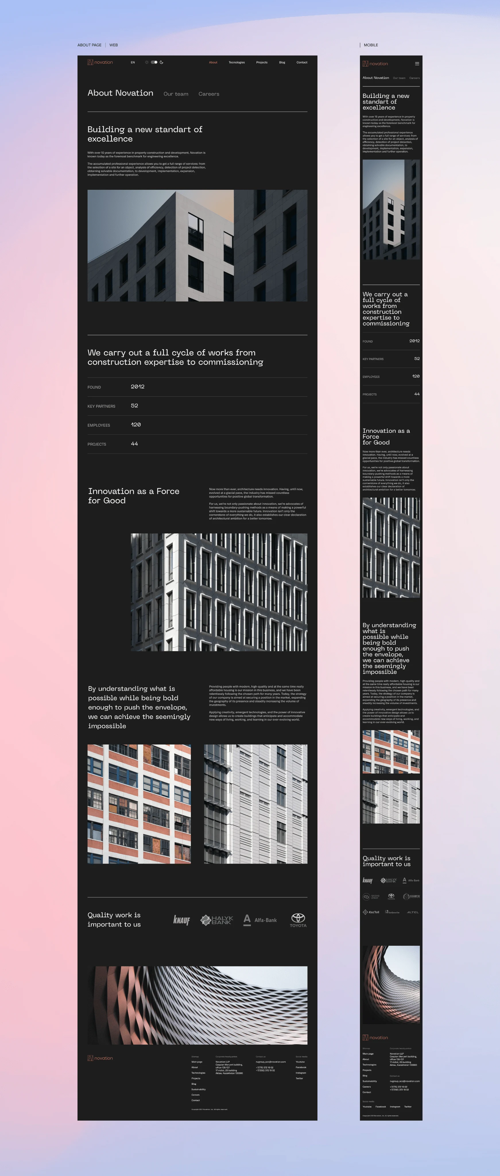
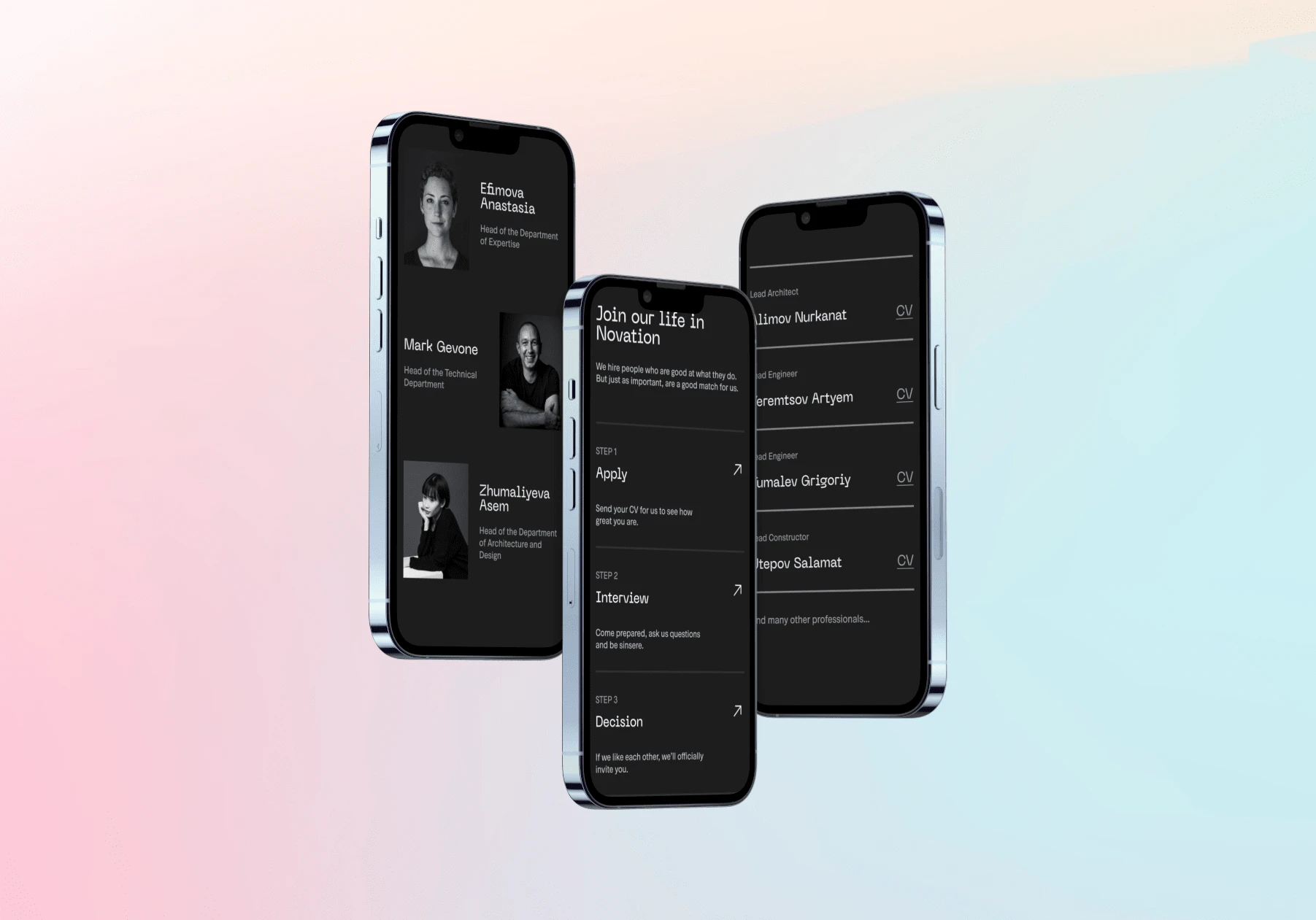
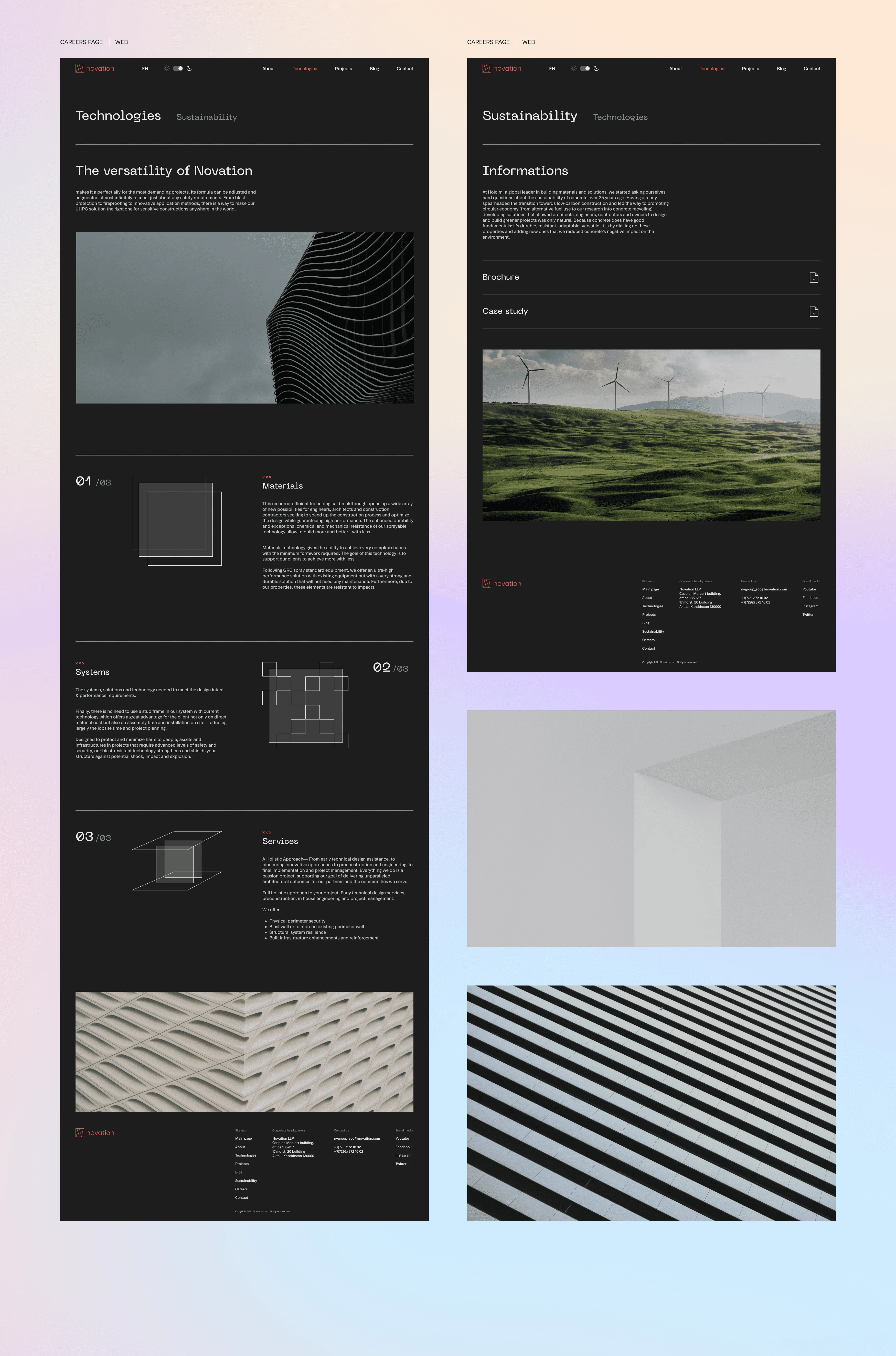
The ubiquitous typography is the main graphic material for a very modern and minimalist finish. With a project-driven, contact-focused UX, a lot of content becomes more understandable through divisions that give the browsing some rhythm. The design is aiming to clarify Novation’s offer in only a few seconds, accessibility being the main concern.
Given the different ages of the target audience, we decided to add a light theme for those who are not used to using the dark theme. It was also a modern solution that is rarely used in the field of architecture.
Note: All media belong to its owners and used to represent my work
Harmony
A prominent and bulky font is complemented by minimalistic images, and sharp corners are diluted with the help of symmetry of different elements. All this harmonizes well with the calm shades in both themes.
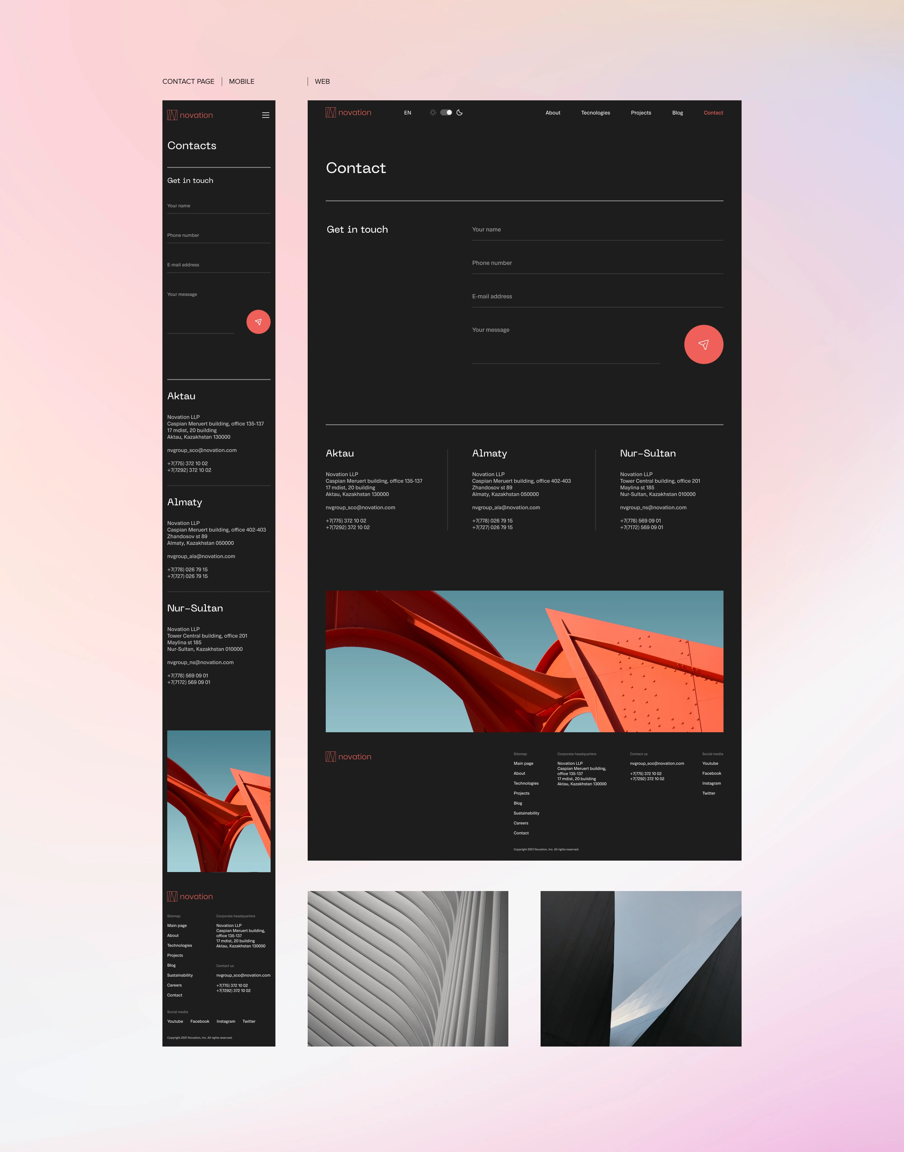
Light theme
I decided to keep the complementary and accent red colors the same in both themes, which would be more convenient for developing and identifying the future brand.
The primary colors for fonts and backgrounds are swapped depending on the choice of visitors.
Like this project
Posted Oct 30, 2023
Designed a website for Novation - architecture and construction company.
Likes
0
Views
4