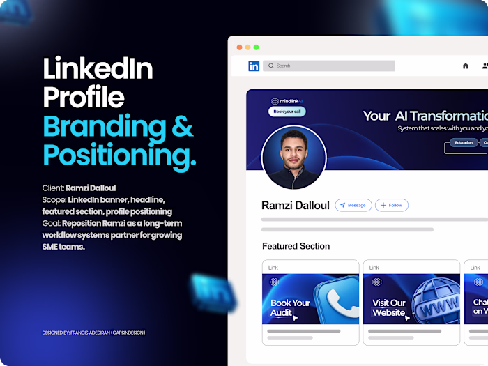
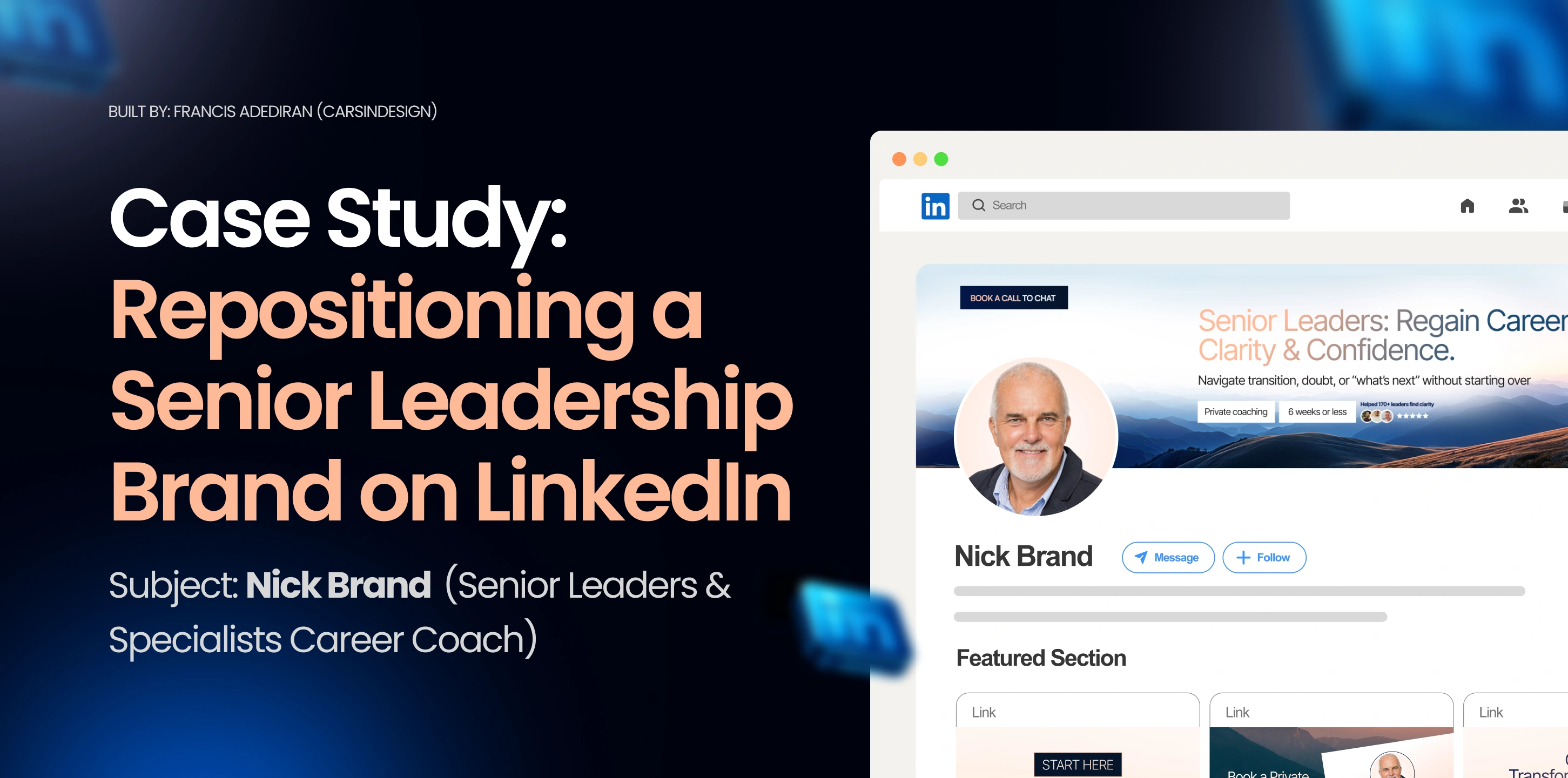
LinkedIn Profile Revamp and Personal Branding for Nick
Francis Adediran
Project Context & Goal
This case study started as an observation, not a brief.
When I first came across Nick Brand’s LinkedIn profile, it was clear he had depth, experience, and real authority offline but none of that translated online. His profile wasn’t bad, but it wasn’t doing the heavy lifting his role required.
For a senior leadership coach helping people navigate career transitions, doubt, and “what’s next,” the profile needed to feel steady, grounded, and trustworthy at first glance.
The goal wasn’t to make Nick look flashy.
It was to make him feel safe to trust.
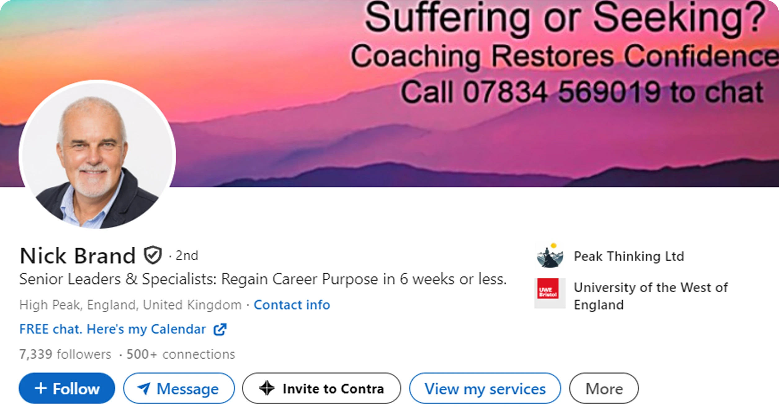
Old Profile Image and Banner
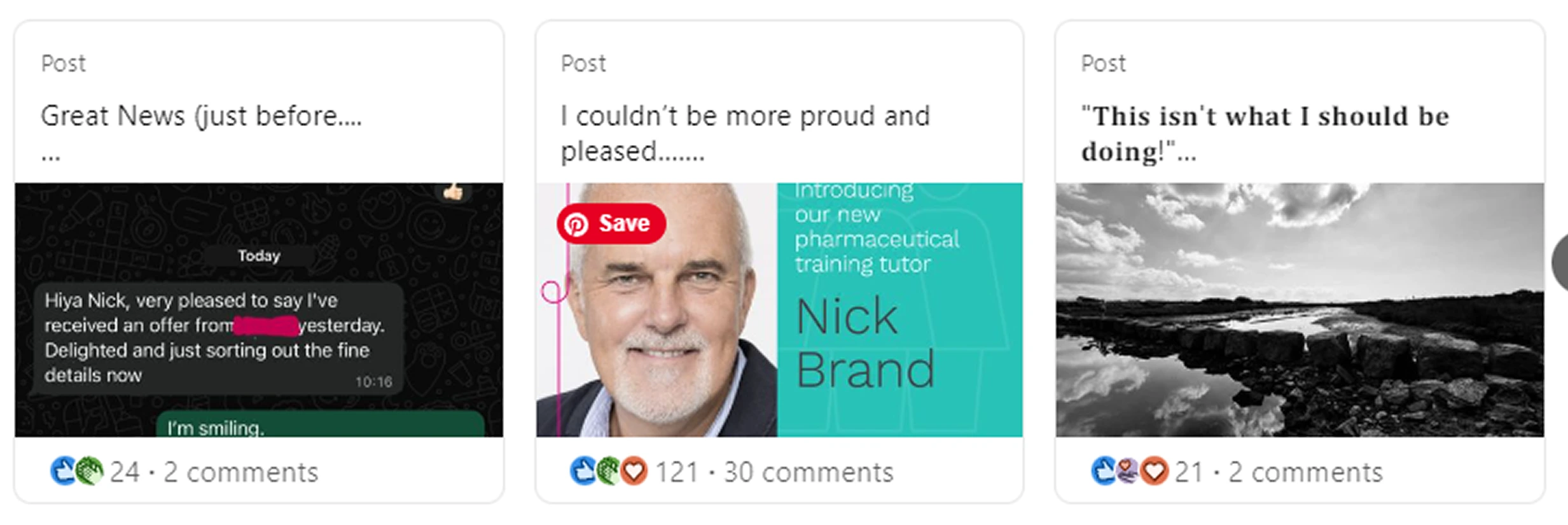
What Needed Improvement (Before)
The original banner relied heavily on text and direct selling language. It asked questions like “Suffering or Seeking?” and pushed contact details front and center. While well-intended, it felt more like an advert than a leadership presence.
The profile image was professional, but visually disconnected from the banner. There was no cohesion, no system, and no emotional anchor tying everything together.
Most importantly, the Featured Section was underutilized. It existed, but it wasn’t guiding visitors anywhere. No clear starting point. No structure. No story.
The result:
A capable professional whose profile felt busy, unclear, and slightly dated, especially for someone guiding others through clarity.
Strategy & Symbol Choice
Before touching visuals, I needed to understand Nick properly.
We gathered context around:
Who he works with
What stage of life they’re in
What they feel when they arrive on his profile
What symbol could quietly communicate reassurance and leadership
Out of several symbolic directions, the stag stood out.
The stag represents:
Calm authority
Strength without aggression
Leadership through presence
Guidance rather than dominance
Perfect for a senior career coach whose role is to steady people, not push them.
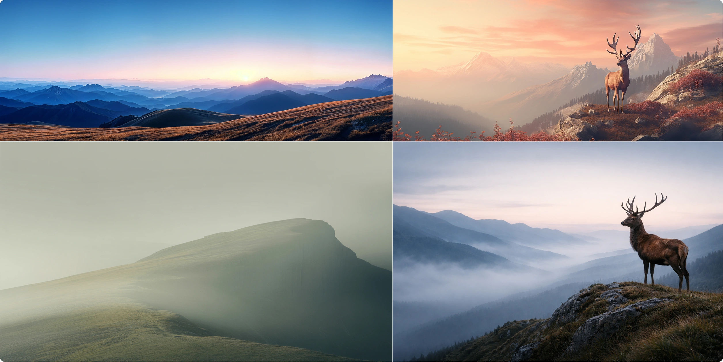
(Stag Symbol Reference / Moodboard)
The New Banner (After)
The new banner removed noise. Instead of selling, it positioned.
The message was simple, human, and reassuring:
Clear promise
Clear audience
Calm tone
Visually, the open landscape and stag placement created space, literally and psychologically. It slowed the eye down and let the message breathe.
This is important. Senior leaders don’t want urgency. They want certainty.
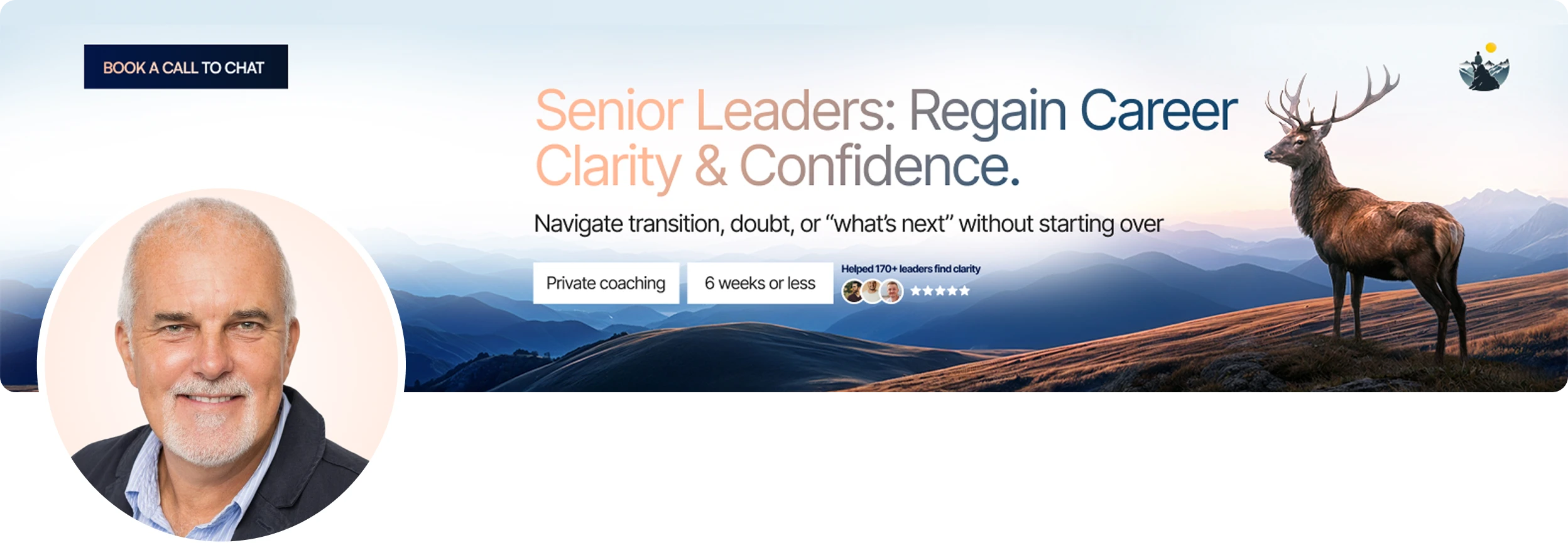
New Profile Image and Banner
Profile Image Upgrade
The profile image didn’t need a dramatic change, it needed alignment.
We adjusted tone, lighting, and framing to match the calm confidence of the banner. The result was a profile image that felt like it belonged inside the environment we’d created, not pasted on top of it.
Now, banner and image speak the same language.
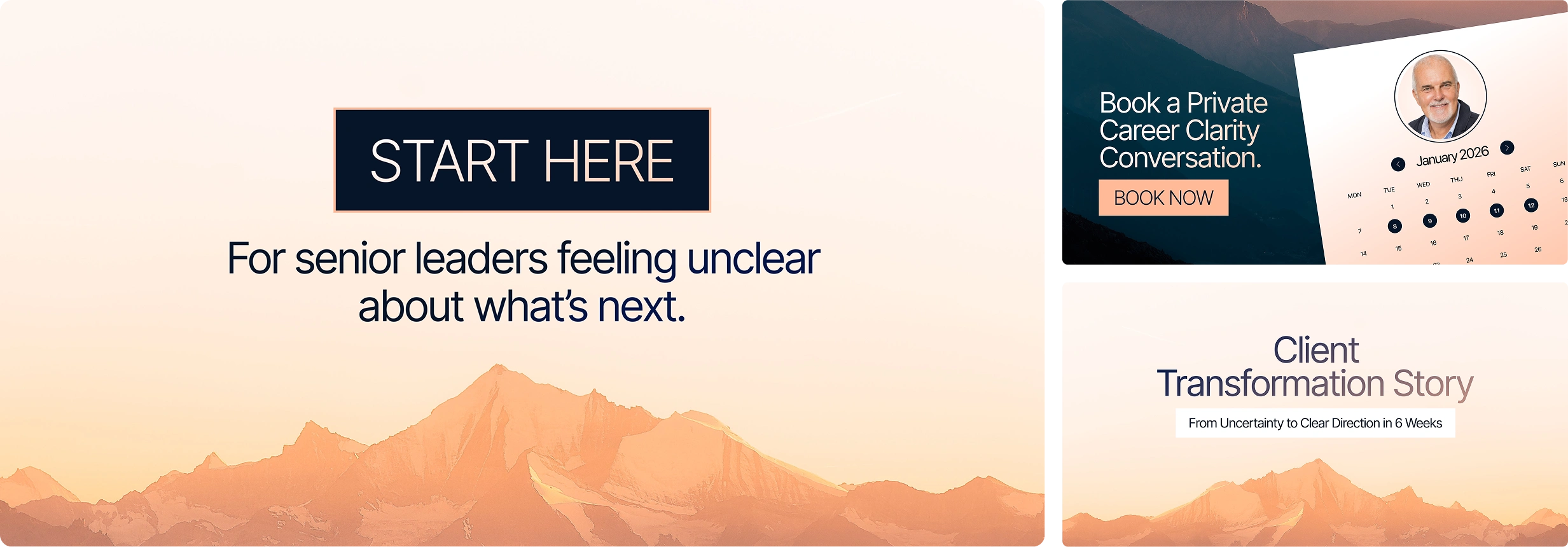
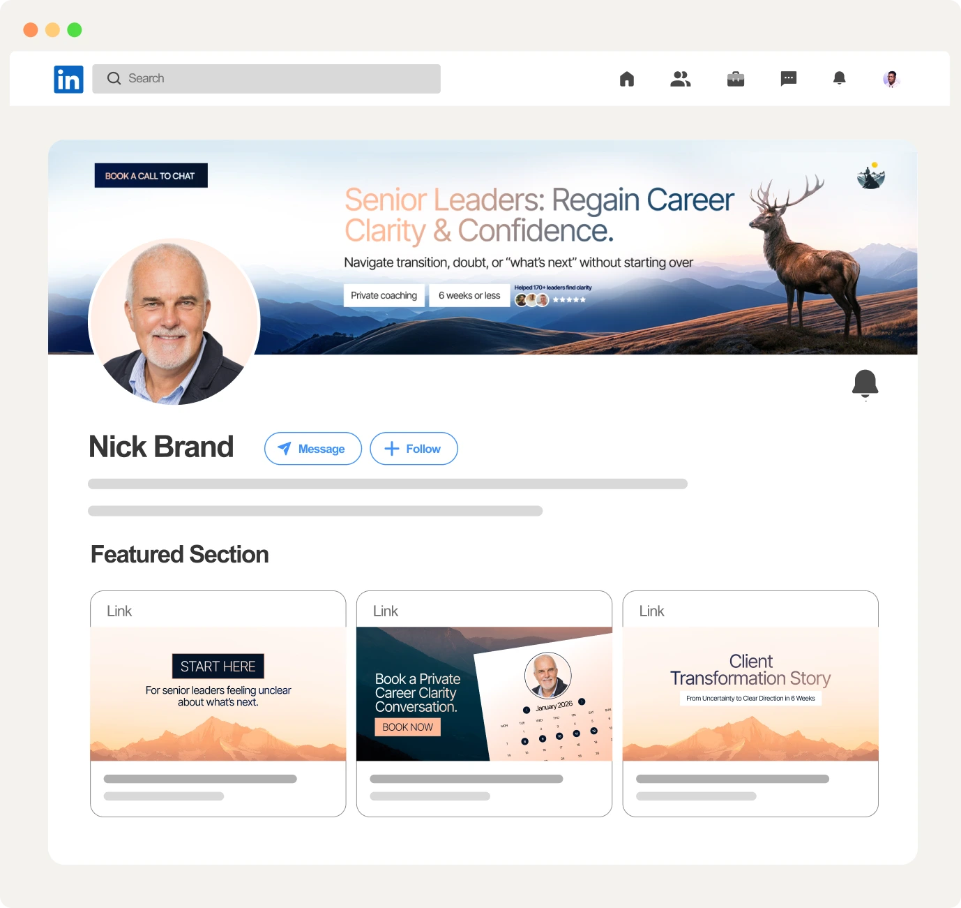
New Featured Section
Featured Section: From Empty Space to Guided Journey
Before, the Featured Section existed but didn’t guide action. After, it became a clear path:
Start Here (For visitors feeling unsure about what’s next)
Book a Private Career Clarity Conversation (A clear next step without pressure)
Client Transformation Story (Proof, not claims)
Each card was designed to feel calm, intentional, and human, not salesy.
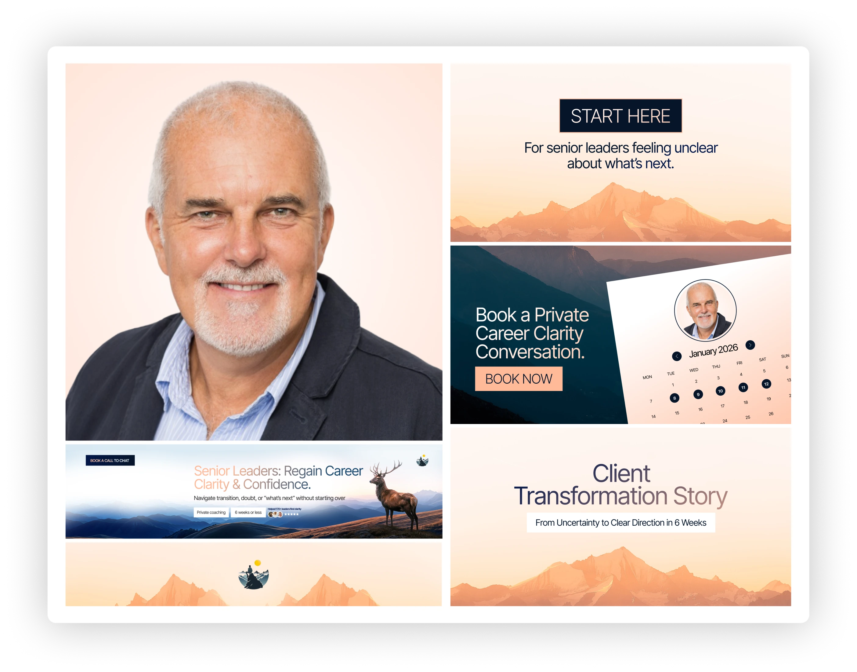
Old Featured Section
New Featured Section
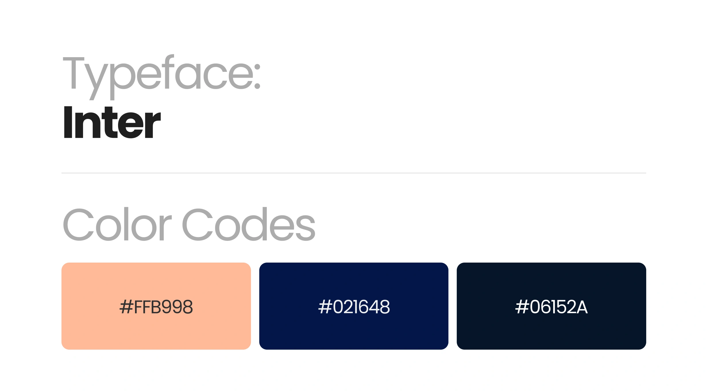
Color Palette:
#FFB998 – warmth, empathy, human connection
#06152A & #021648 – stability, trust, depth
These colors balance softness with authority, essential for leadership positioning.
Typeface:
Inter was used for its clarity and modern neutrality. It doesn’t distract. It supports the message. Nothing here was decorative. Everything had a job.
Brand Typeface and Color Codes
Result & Impact
The transformation didn’t change who Nick is. It clarified it.
The new profile:
Feels calm and intentional
Communicates leadership without shouting
Makes visitors feel understood before being sold to
Positions Nick as a guide, not a marketer
This is what symbolic personal branding does. It designs certainty.
New LinkedIn Profile Mockup
Closing Thought
This wasn’t about making a “better looking” LinkedIn profile. It was about building an environment where authority is felt instantly and trust follows naturally.
If your profile doesn’t reflect the weight of your experience, you’re leaving perception to chance. And perception always decides first.
Nick Brand Branding Presentation
Built By: Francis Adediran (Carsindesign)
Like this project
Posted Jan 11, 2026
A LinkedIn personal branding case study showcasing a full LinkedIn profile branding transformation for a senior leadership coach.
Likes
2
Views
10
Timeline
Dec 17, 2025 - Dec 26, 2025