LinkedIn Profile Transformation for SME Workflow Architect
Francis Adediran
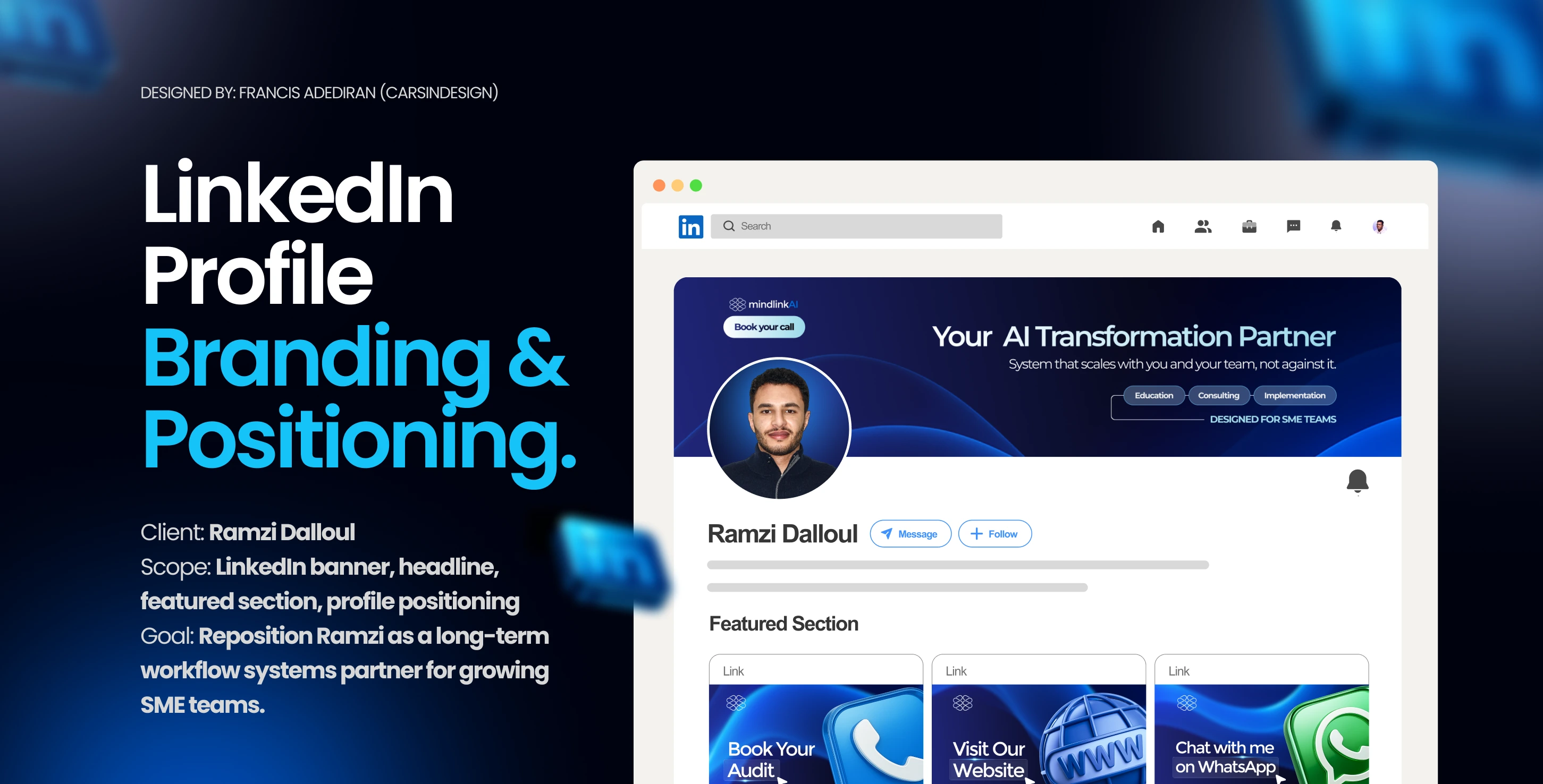
Ramzi Dalloul (AI Automation Expert)
Context, Challenge & Goal
This project started unexpectedly. One morning, I received a direct message from Ramzi on Contra, my first inbound message there while I was still actively building my profile. Ramzi works in workflow systems and operations for growing SME teams, but his LinkedIn profile didn’t reflect the level he operates at. The positioning was fragmented, the banner didn’t clearly explain who he helps or how, and the profile failed to signal long-term partnership or scale.
The goal was to reposition Ramzi as a Workflow Architect, not a task fixer. Someone who builds systems that scale with growth and partners with teams long-term. The profile needed to speak directly to companies with 11–200 employees, communicate outcomes clearly, and establish credibility within seconds before any conversation started.
Strategy
We rebuilt the entire profile around one clear idea: The Scalable Workflow Architect with Long-Term Partnership Focus. Every section of the profile was aligned to reinforce this positioning from the banner promise and headline to the featured section and About copy. The focus was clarity over complexity, outcomes over tools, and authority over aesthetics. Nothing was decorative. Every element had a job: to make Ramzi’s value obvious, trustworthy, and actionable at first glance.
Old Banner and Profile Picture
Old Banner and Profile picture
The full redesign included:
I redesigned his LinkedIn presence from top to bottom, crafting a clean profile picture, a professional banner, and three featured section designs, all tied together with a cohesive brand banner.
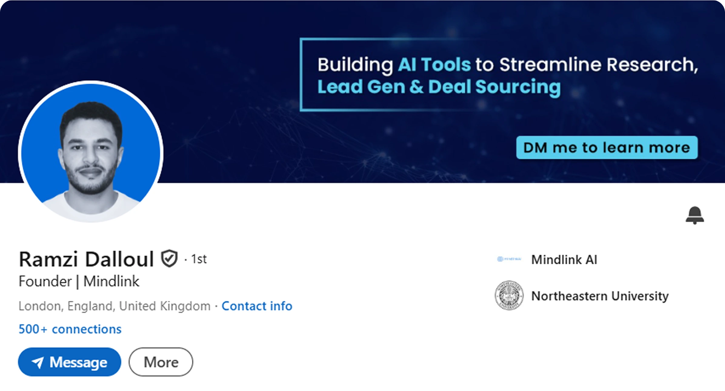
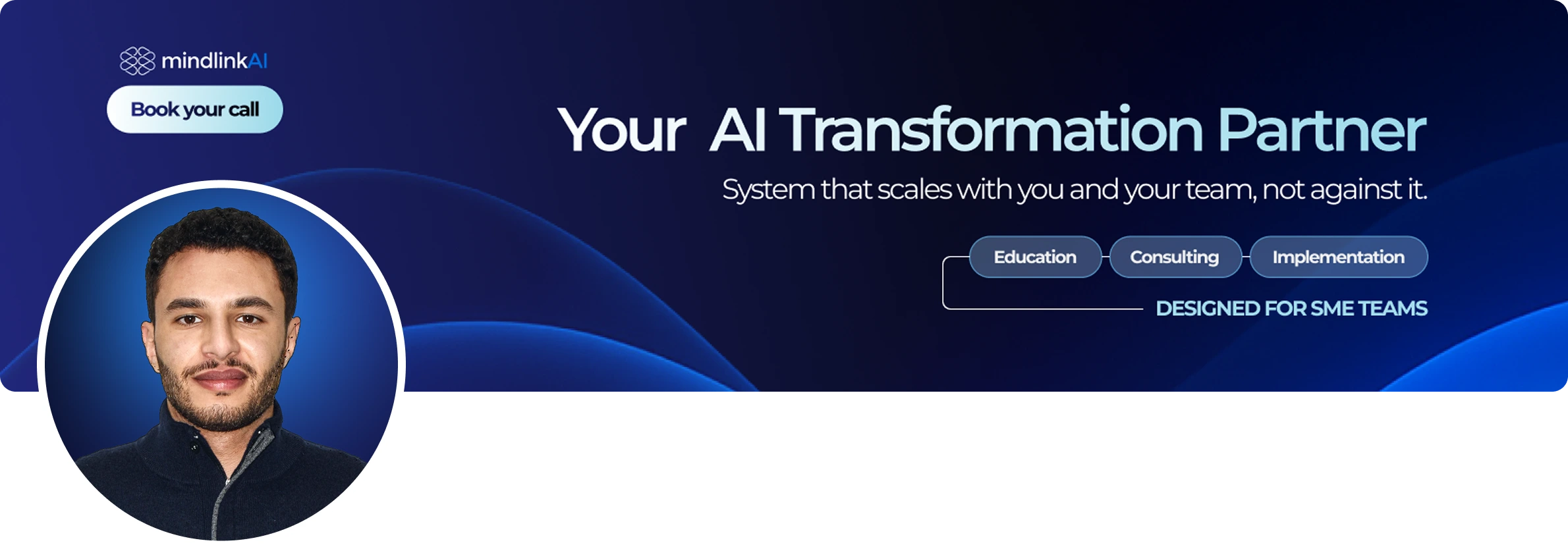
Profile Banner & Headline
The banner was rebuilt to communicate:
His role as a Workflow Systems Partner
A clear outcome: Recovering 30–50 hours per week
Who it’s for: SME teams (11–200 employees)
The headline reinforced this positioning and framed Ramzi as a strategic operator, not a tool installer.
Profile banner and Profile image
Featured Section Design
The Featured Section was designed for action.
Book an audit
Visit the website
Start a direct WhatsApp conversation
Each element guides visitors toward the next logical step.

Featured section designs
About Section Positioning
The About section explains a real business problem:
As teams grow, workflows break. What works at 20 employees fails at 50 and collapses at 120.
The copy reframes Ramzi as the solution architect who builds systems that scale with growth not against it.
The Result
The finished profile now:
Communicates Ramzi’s value within seconds
Positions him as a long-term strategic partner
Speaks directly to growing teams facing operational strain
Acts as a credibility and conversion asset
The profile now does the explaining before the DM.
Color Palette & Typeface Choice
The color palette was chosen to communicate clarity, trust, and operational maturity. Qualities essential for companies navigating growth and complexity. Muted, professional tones were used to signal reliability and long-term partnership, while subtle accents help guide attention without adding visual noise.
For typography, Montserrat was selected for its clean geometry and excellent readability. Its modern structure reinforces Ramzi’s positioning as a systems architect; Precise, scalable, and structured. The typeface works seamlessly across banners and featured visuals, ensuring consistency and a polished, professional presence throughout the profile.
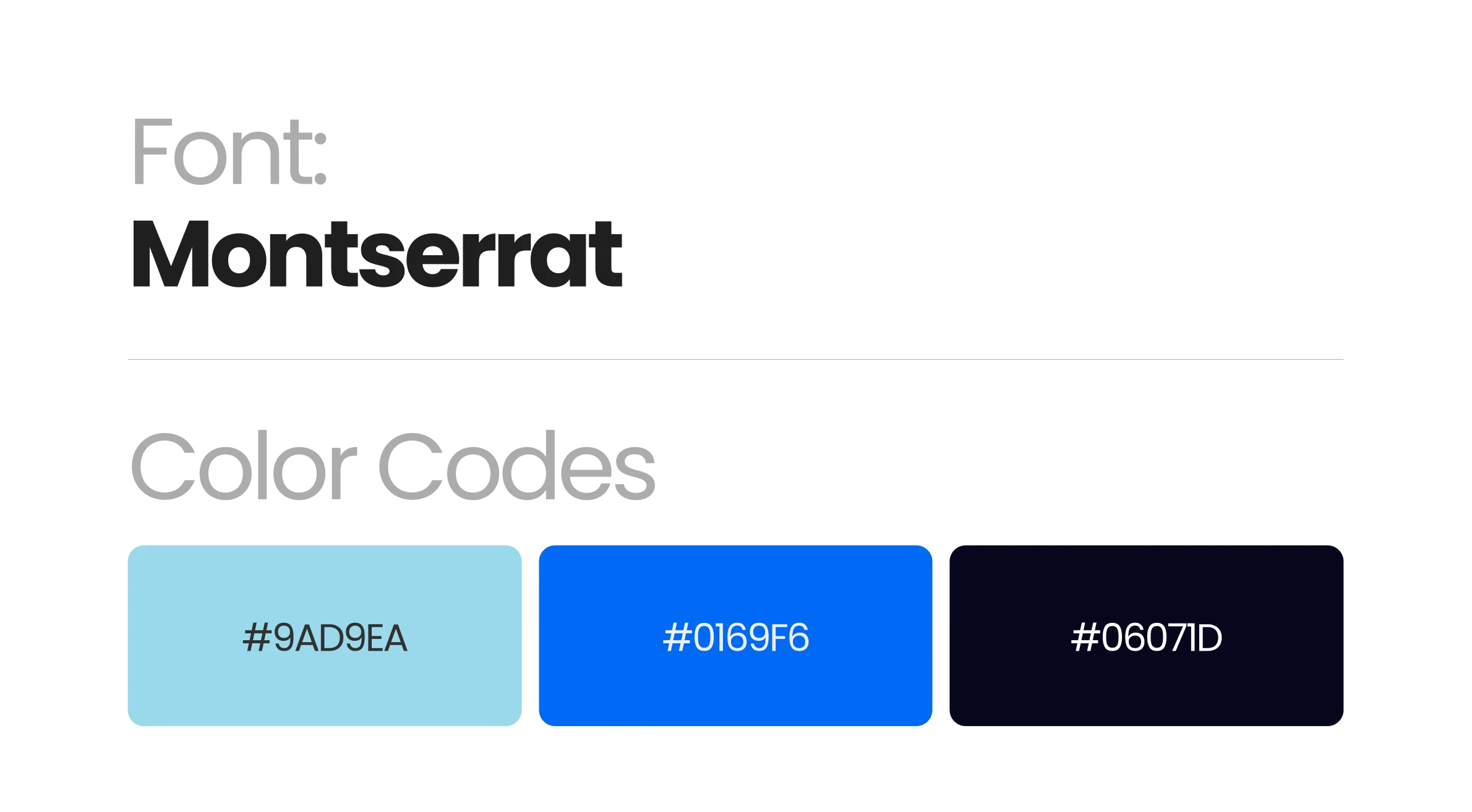
Typeface and Color code
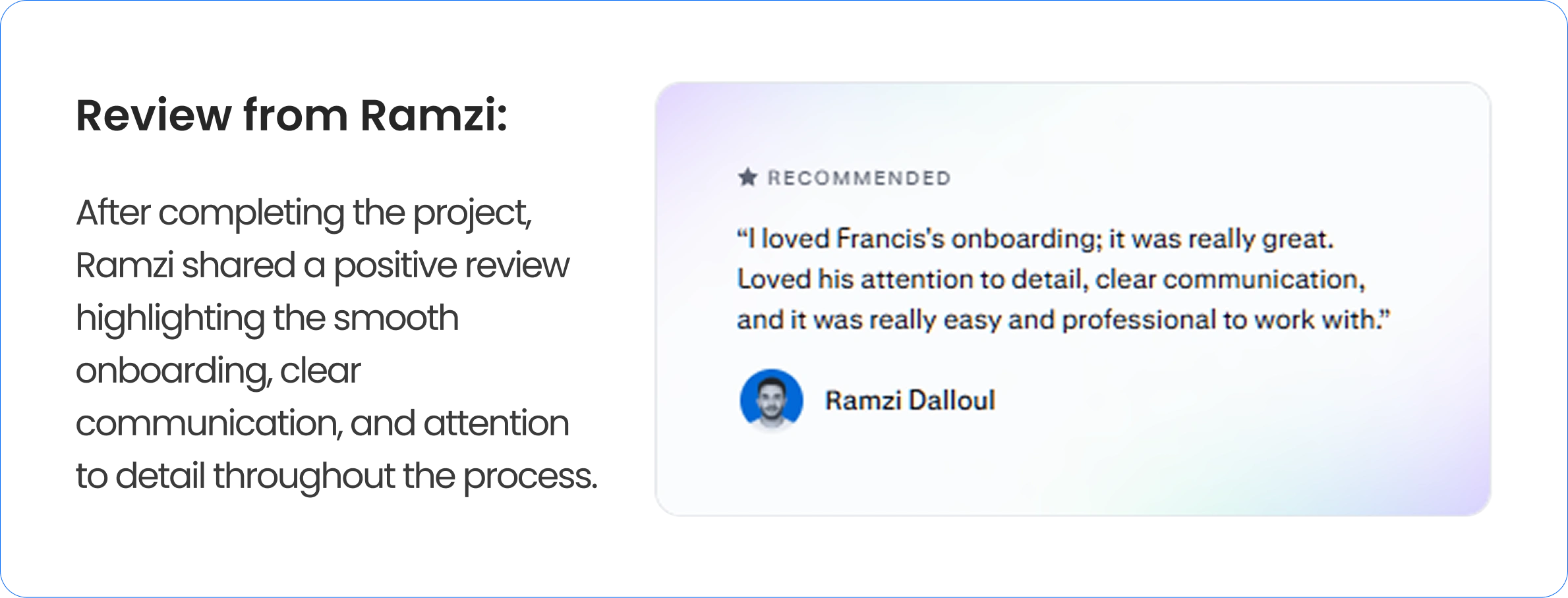
Review from client
Conclusion
This project is a reminder that LinkedIn branding isn’t about aesthetics. It’s about being understood correctly. When positioning is clear, trust follows. And when trust is clear, opportunities follow.
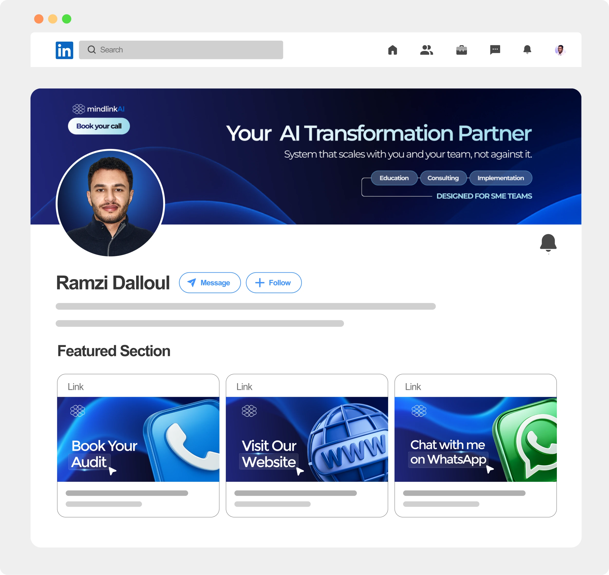
LinkedIn profile mockup
Like this project
Posted Dec 17, 2025
LinkedIn profile branding for a workflow architect, focused on clarity, authority, and positioning as a long-term systems partner for SME teams.
Likes
2
Views
50
Timeline
Dec 6, 2025 - Dec 10, 2025