LinkedIn Profile Redesign for Automation Expert
Francis Adediran
LinkedIn Branding Case Study
Erwan came through with a strong offer, but his profile wasn’t communicating the value of his work.
He’s an Automation Expert who helps business owners recover more than +20 hours per month without hiring. A result that deserves a profile built with clarity and authority.
So we rebuilt his LinkedIn identity from scratch.
When I got Erwan’s assets, one thing was immediately obvious:
His offer was strong, but the branding wasn’t carrying the same weight.
Erwan is an Automation Expert who helps business owners reclaim +20 hours every month without hiring. Everything he does is built around efficiency, clarity, and measurable results. So the goal was to make his LinkedIn profile reflect exactly that from the first glance.
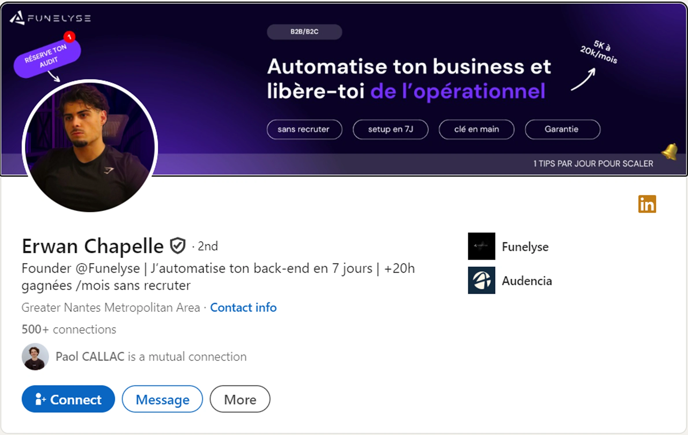
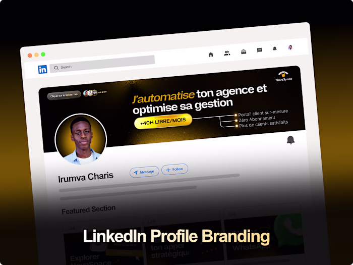
Old Banner and Profile Picture
I redesigned his LinkedIn presence from top to bottom, crafting a clean profile picture, a professional banner, and three featured section designs, all tied together with a cohesive brand banner.
The full redesign included:
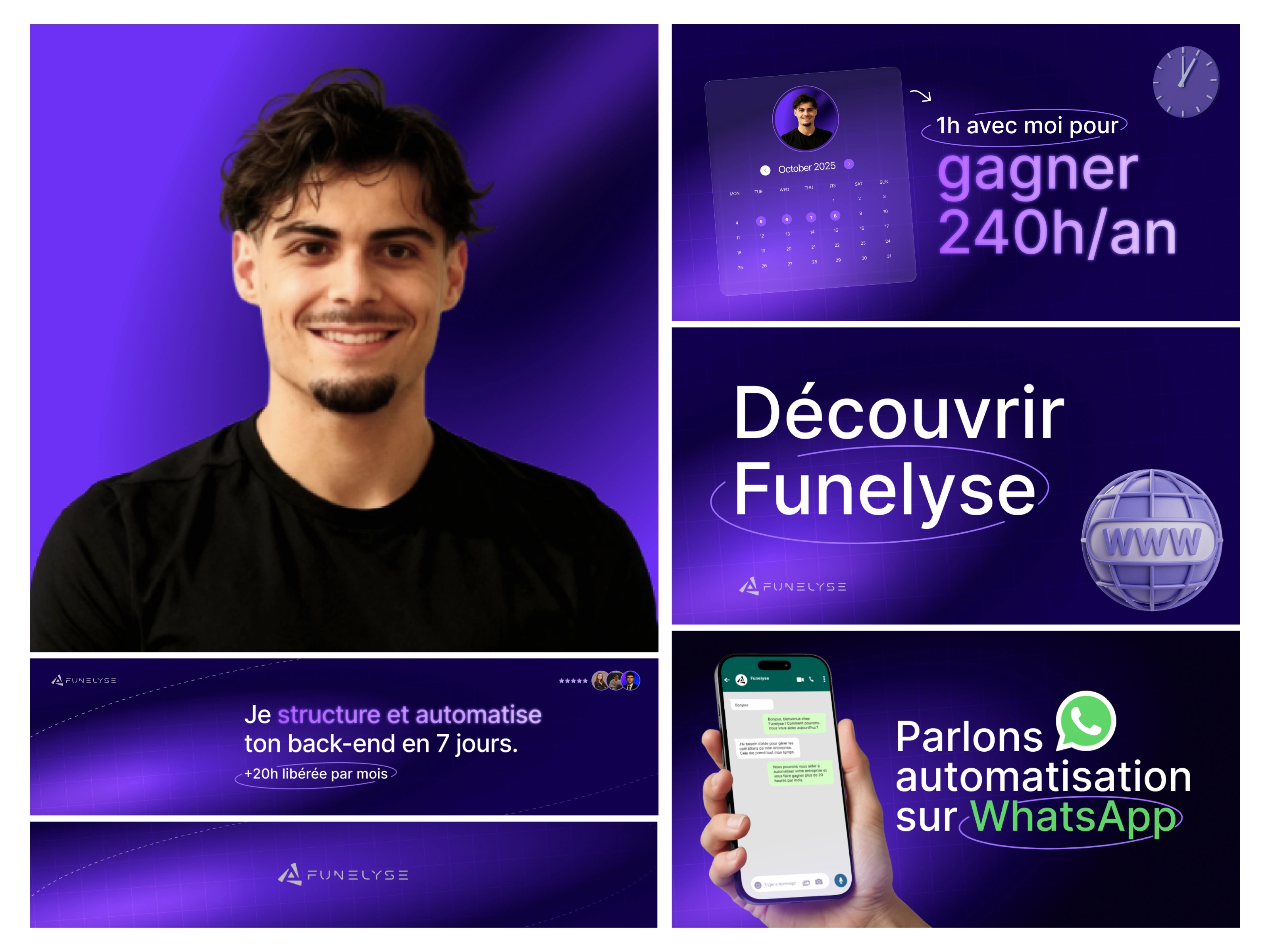
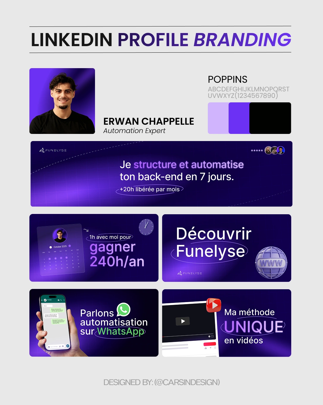
Profile Picture: I cleaned up the lighting, improved the contrast, and created a smooth gradient background that matches his Funelyse brand colors.
This instantly made him look sharper, more trustworthy, and more aligned with a tech-focused identity.
Profile Banner: His banner now communicates his core promise:
“I free up +20h per month without hiring.”
I used a futuristic purple palette, a subtle grid system, and a guided visual flow that makes the message impossible to miss.
This gives him a positioning that feels premium, modern, and very automation-driven.
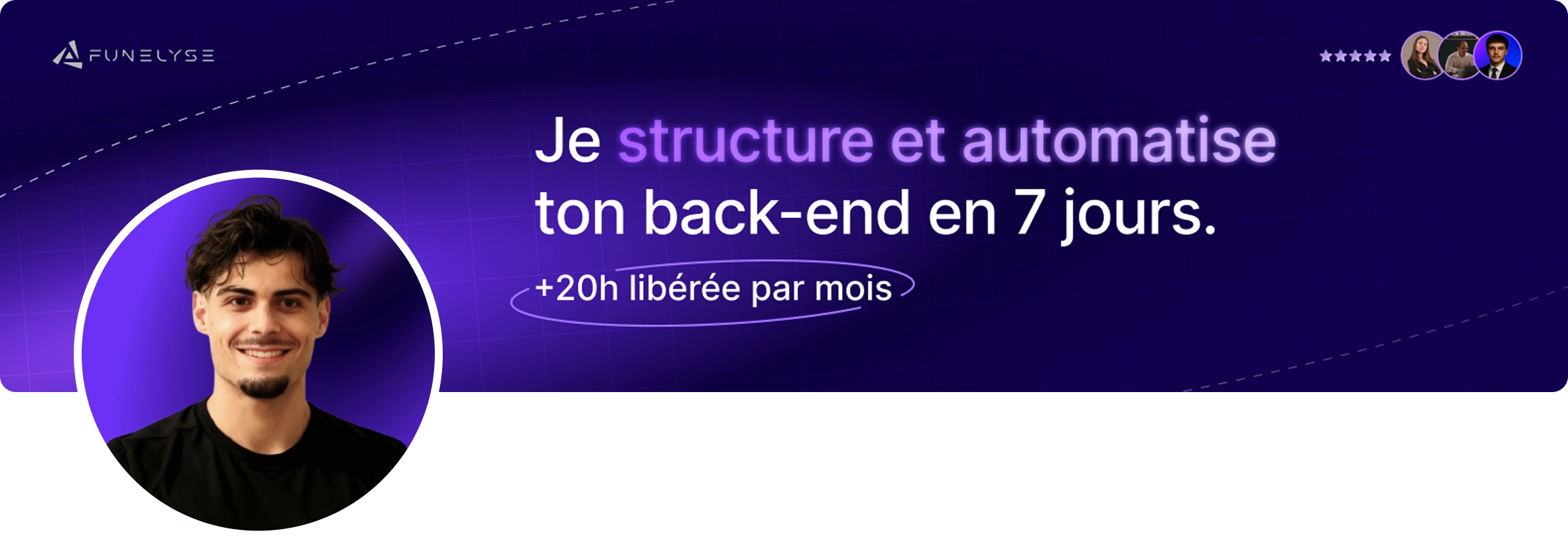
New Banner and Profile Picture
Featured Section Designs (4 Total)
Calendar Automation (Gain 240h/yr): This visual highlights time savings, using a bold calendar interface and clean typography. It quickly communicates the long-term impact of automating everyday processes.
Discover Funelyse: A branded cover that introduces his automation system. The styling is sleek, minimal, and intentional, giving his personal brand a strong visual foundation.
WhatsApp Automation: A direct and engaging design showing a real phone interface. It reassures viewers that Erwan works with practical automations they can understand instantly.
Unique Method in Video: A graphic built around his video-driven teaching style. This positions him as someone with a structured, repeatable method not just “another automation guy.”
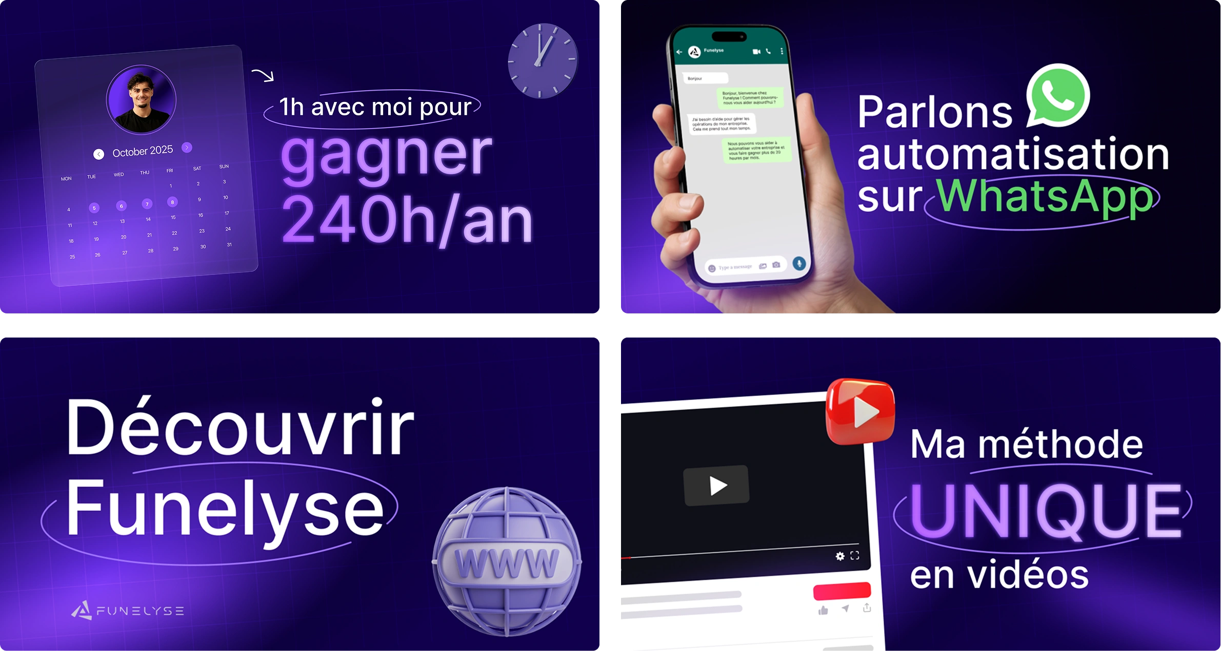
Four(4) featured section designs
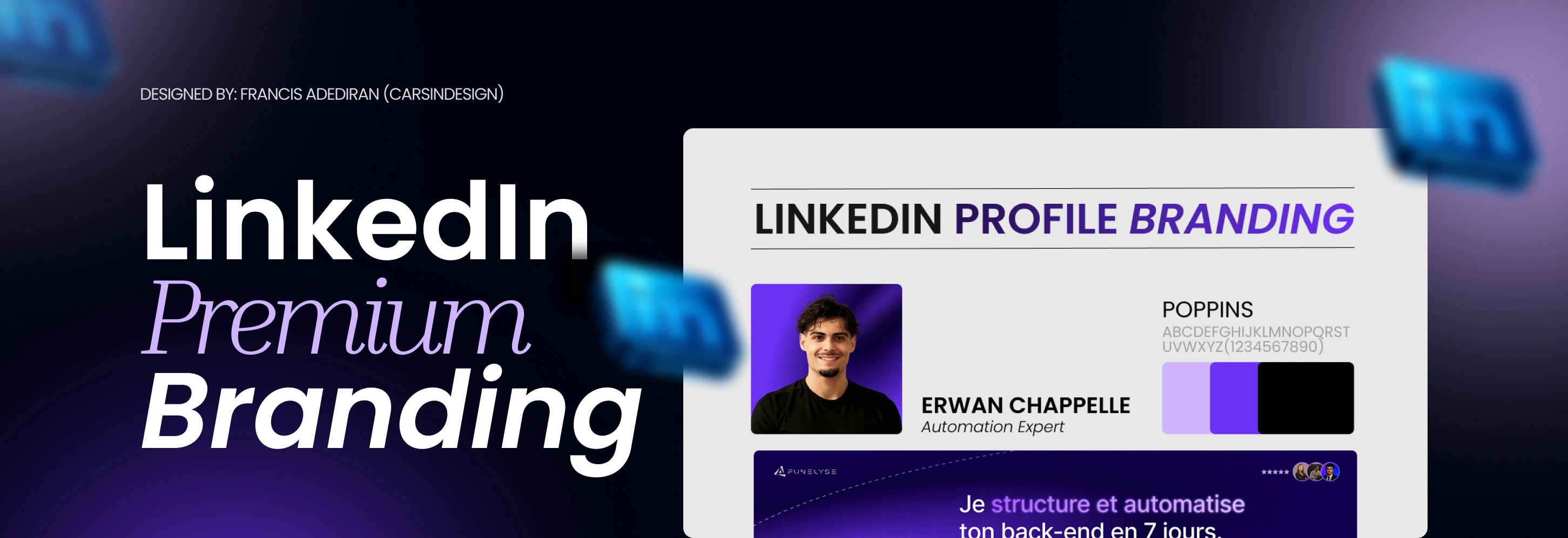
Color Palette & Typeface Choice
Erwan’s entire brand runs on deep purples, neon violet accents, and clean black/white contrasts. Purple communicates innovation, automation, and high-level problem-solving, so the visuals lean heavily into that futuristic identity.
I paired the palette with the Poppins typeface, chosen for its:
Geometric structure
Modern feel
High legibility
Ability to look clean even in dense layouts
Together, they form a system that feels consistent, premium, and unmistakably “automation.”
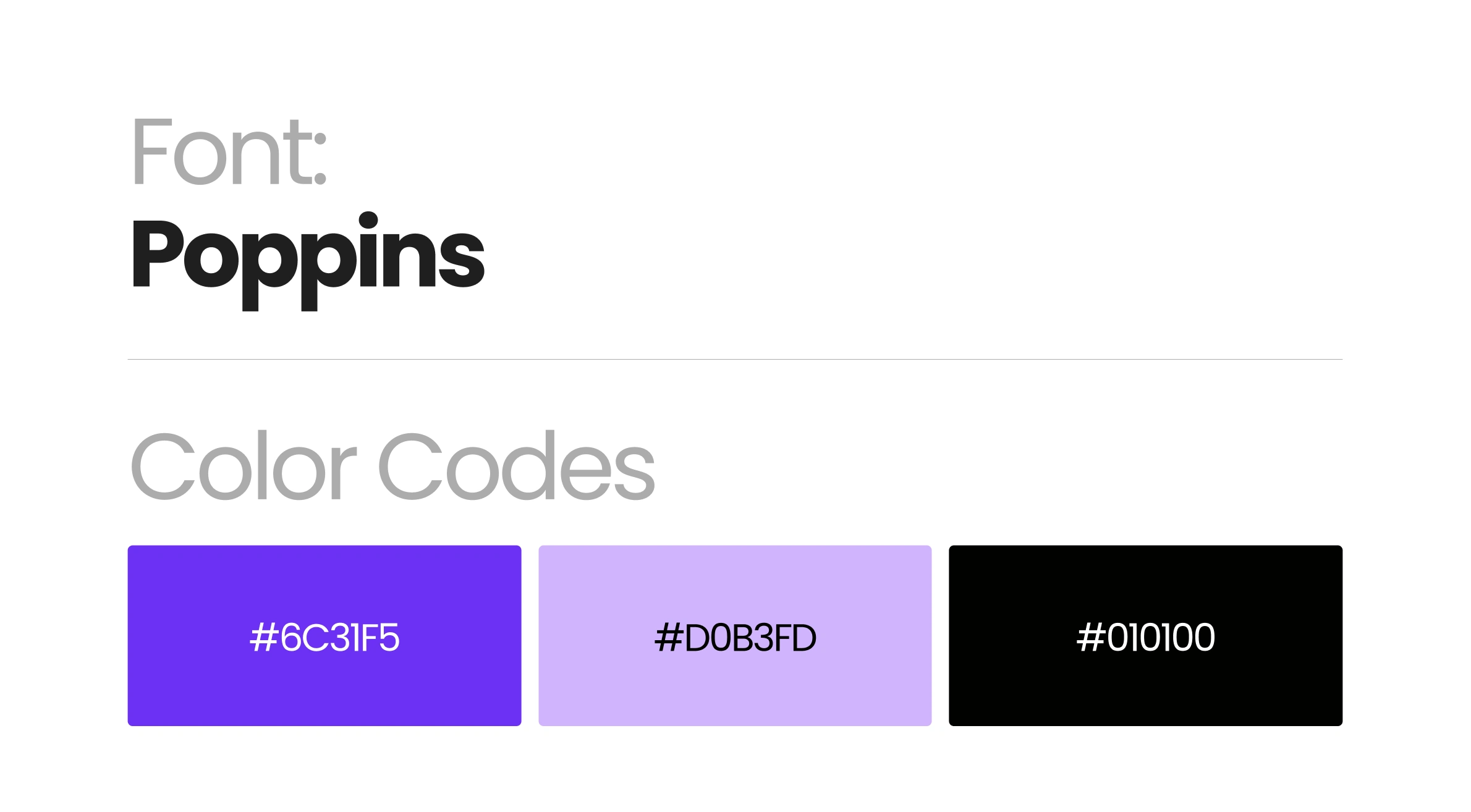
Typeface and color codes
Erwan’s new branding positions him exactly where he belongs: A premium automation expert with a distinctive, modern, and conversion-driven identity.
His profile is now clearer, more persuasive, and instantly more professional which increases trust and encourages more booked calls.
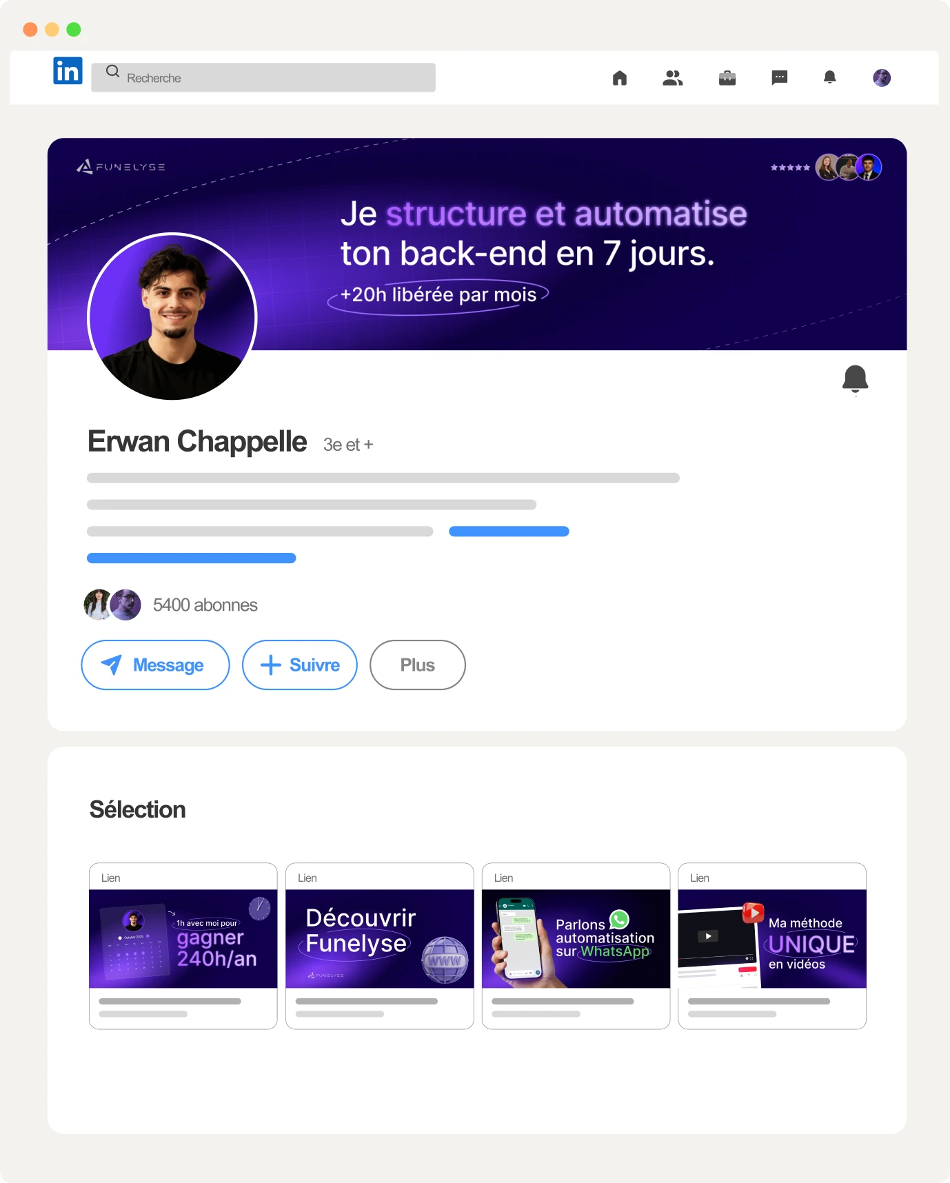
LinkedIn Mockup
Brand Presentation
Like this project
Posted Nov 24, 2025
Redesigned Erwan's LinkedIn profile to reflect his automation expertise and enhance his professional branding.
Likes
1
Views
51
Timeline
Nov 19, 2025 - Nov 21, 2025