

01. THE CHALLENGE & UX JOURNEY
The healthcare ecosystem in Brazil is historically overwhelmed by complex, gray, and bureaucratic interfaces. The UX challenge at Medflow was to transform a fragmented 180-day analog process into a linear, safe, and intuitive flow.
To solve the client's pain (hospital C-Levels losing revenue with idle operating rooms), we mapped the journey and eliminated all intermediaries. The UX strategy was anchored on three pillars: data transparency, lower cognitive load, and financial predictability.
DATA TRANSPARENCY
Full visibility of the credentialing process.
COGNITIVE LOAD
Simplified interfaces for complex data.
PREDICTABILITY
Predicting revenue and room occupancy.
02. COMPONENTIZED ANALYSIS
A) A Primeira Impressão e Impacto de Dados (Hero Section)
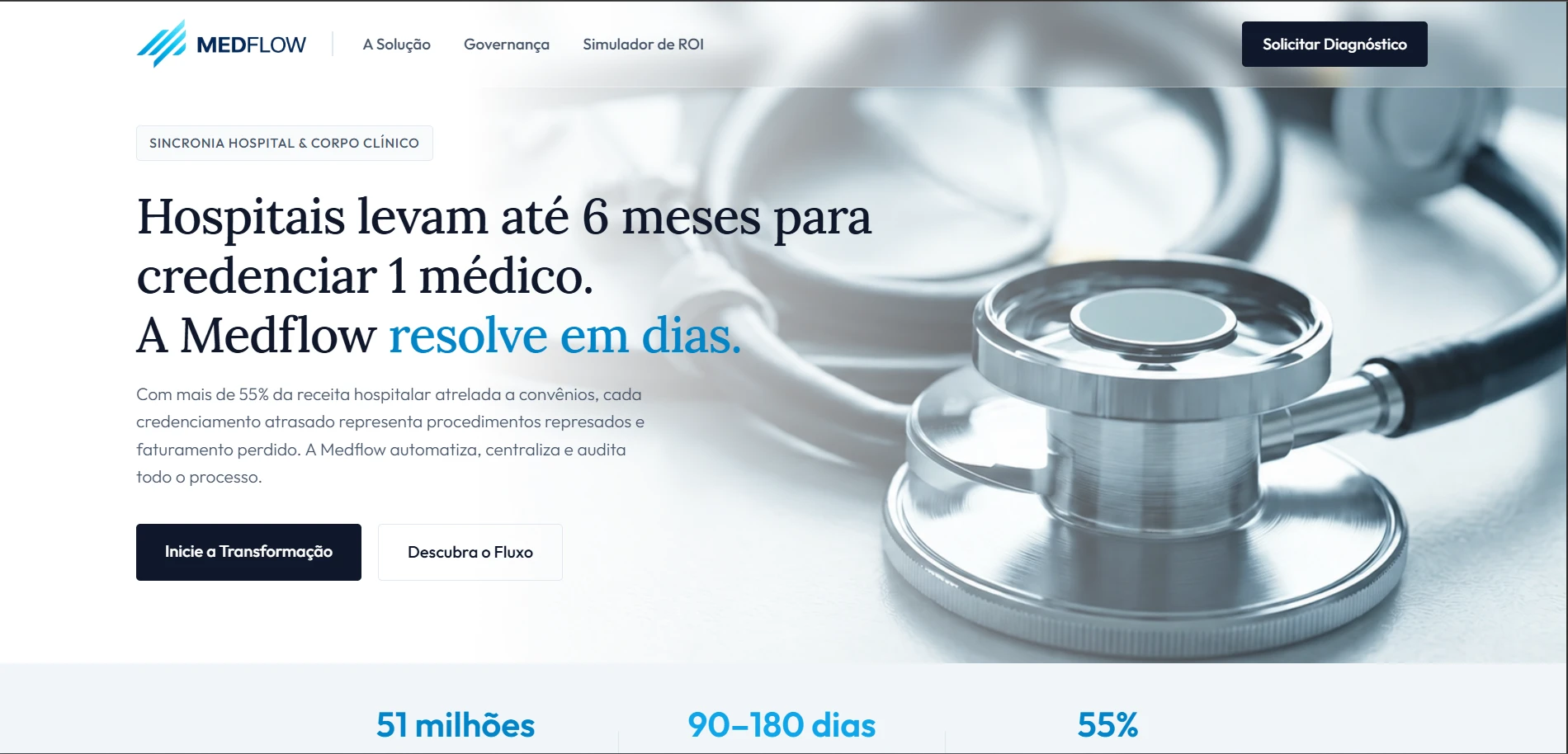
Design Choice: A clean Hero Section where visual breathing (white space) is the main protagonist. The serif typography in the main titles gives an institutional tone of authority and seriousness.
Interface Decision: The main CTA uses a deep dark blue to convey governance and stability, strategically placed next to an outline secondary button.
B) Arquitetura de Contraste e Proposta de Valor
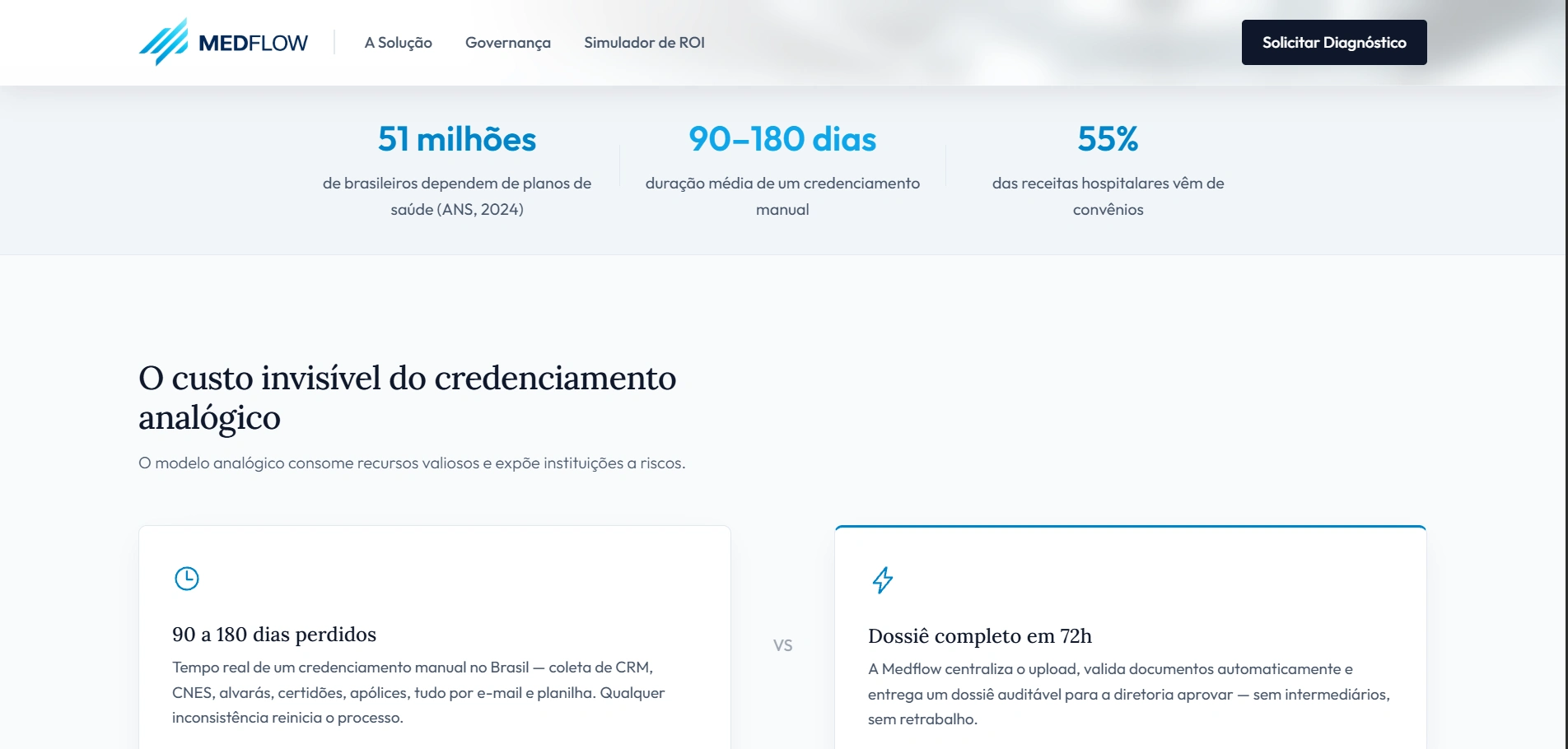
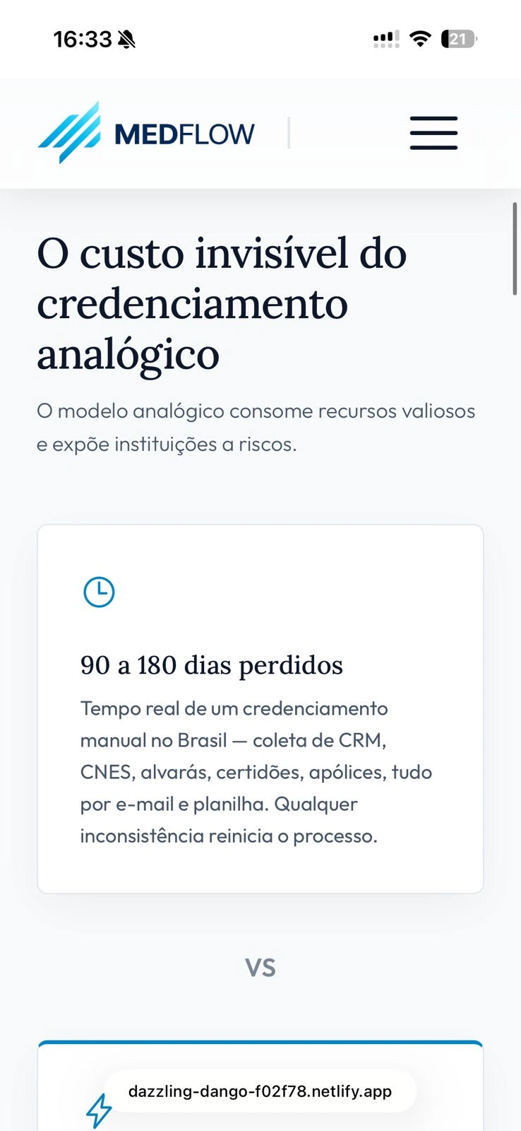
Design Choice: The break from the analog to the digital model needed to be visually obvious. We created a section of symmetrical comparative blocks (VS).
Interface Decision: The left side (the problem) uses a subtle clock icon. The right side (Medflow) introduces a lightning icon, symbolizing speed and efficiency.
C) Jornada Linear e Componentes Sequenciais
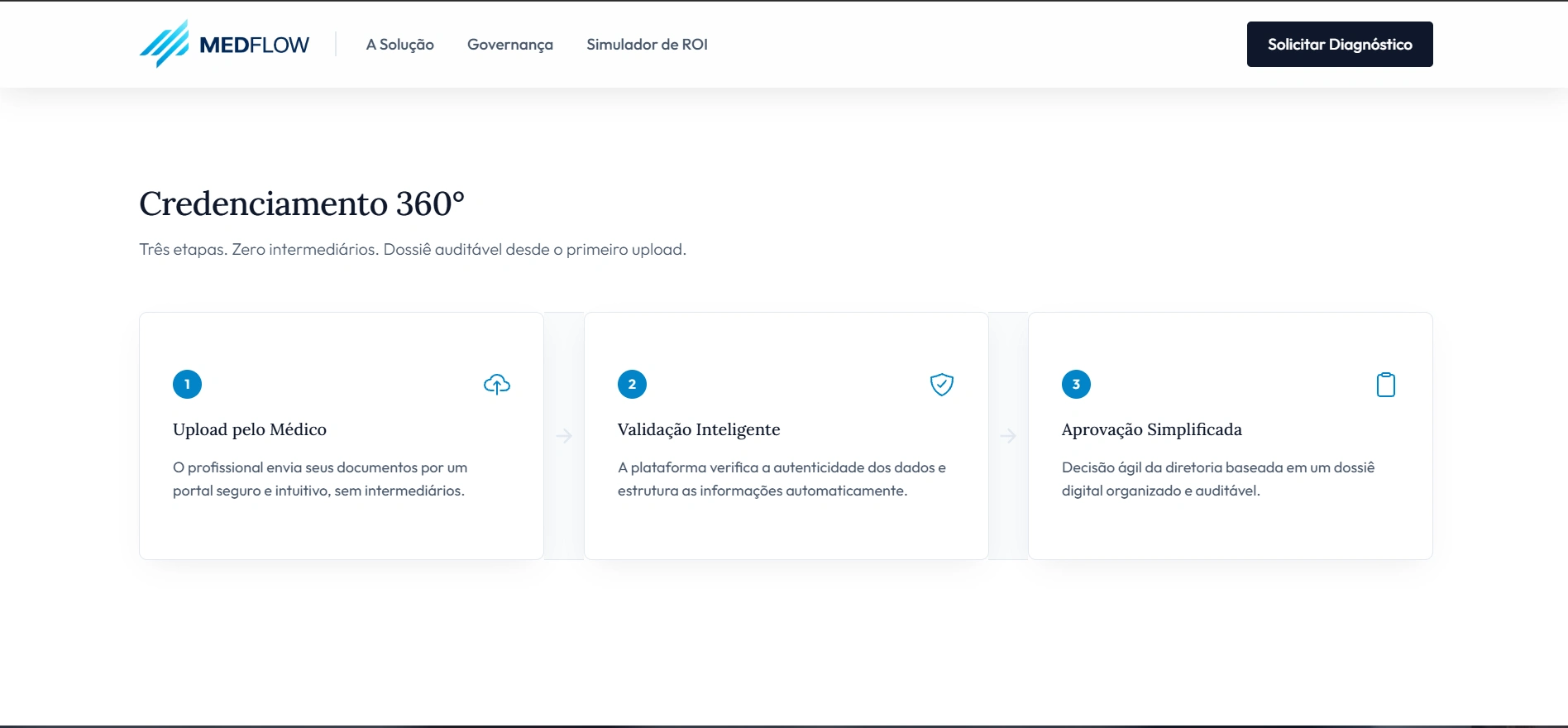
Design Choice: To mitigate user anxiety in a process involving complex documents, the interface was fragmented into a linear progress trail with three clear steps.
Interface Decision: Each stage is isolated in a card with rounded corners and minimalist icons. The flow is guided by discreet connection arrows.
D) Seções de Quebra de Ritmo Visual e Governança
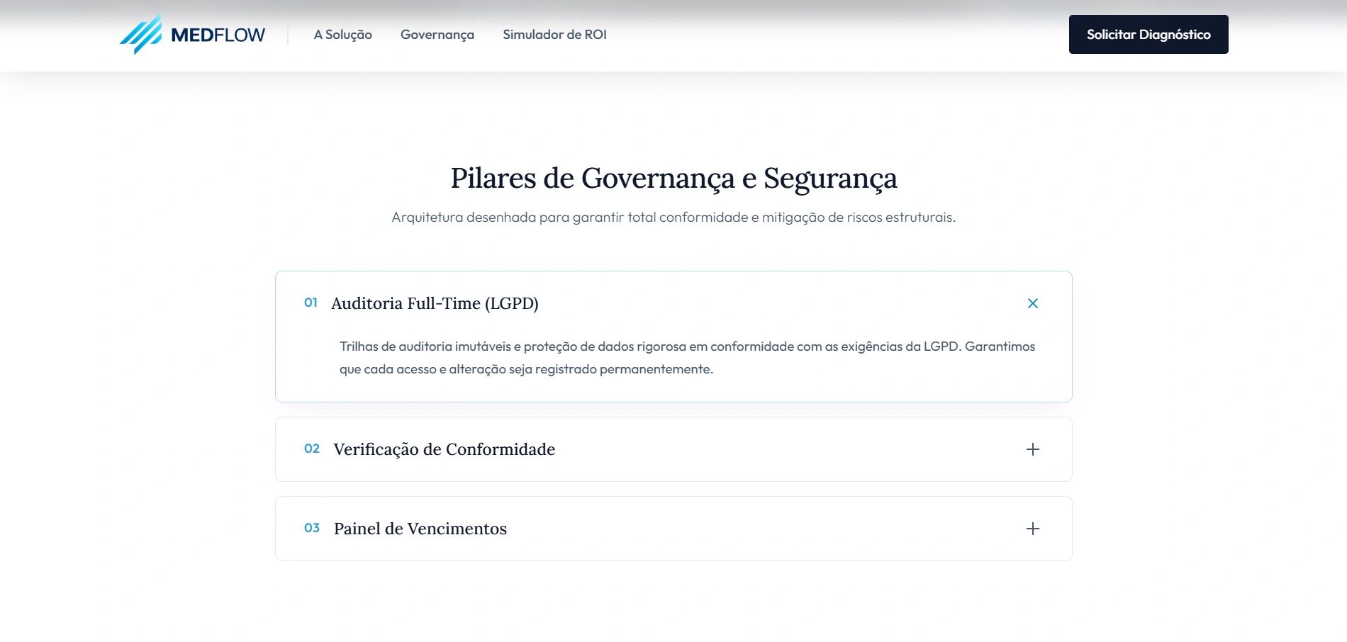
Design Choice: To avoid user fatigue during scrolling, we introduced sections with contextual background images at low opacity.
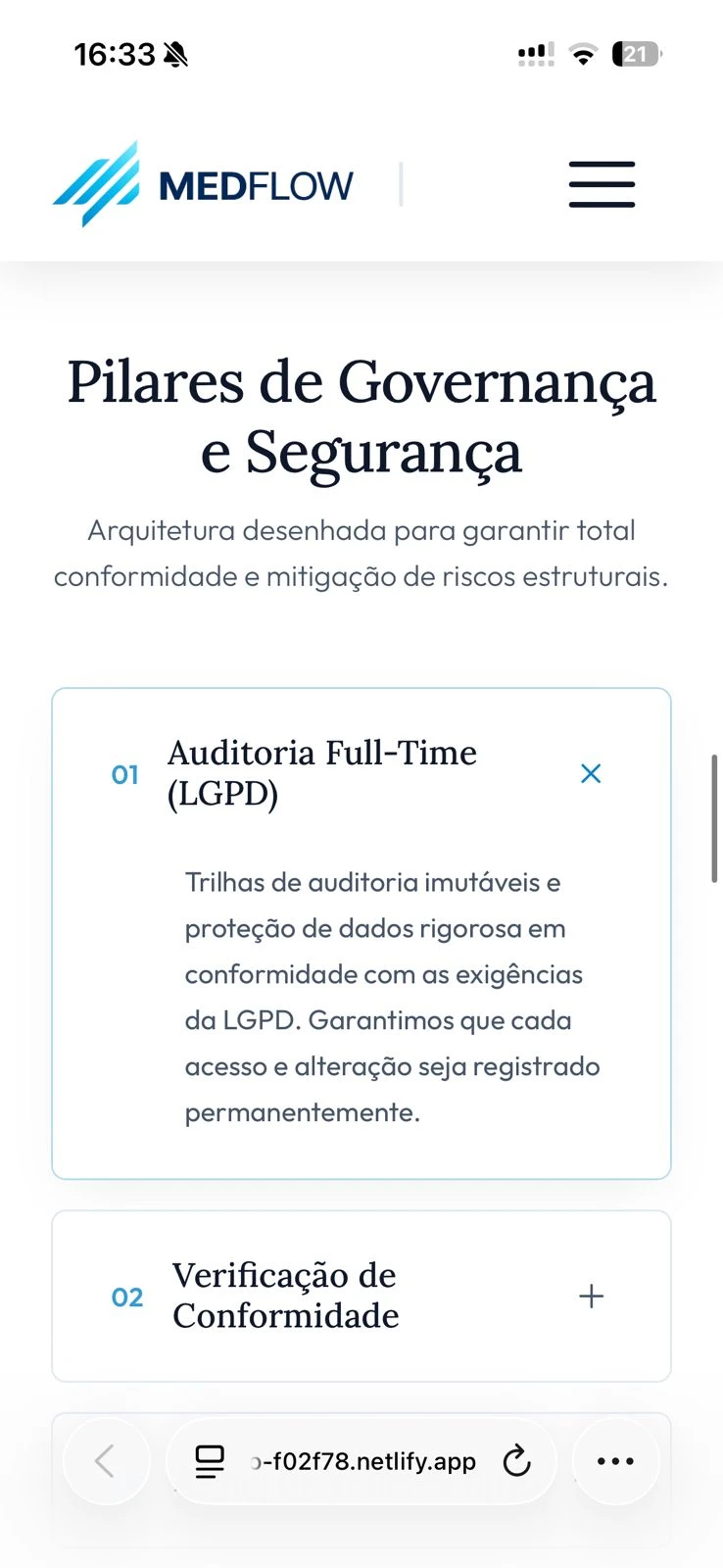
Interface Decision: Governance pillars were organized through interactive Accordion components. The use of + and x signals works as clear micro-interactions.
E) Interatividade Orientada a Dados (O Simulador de ROI)
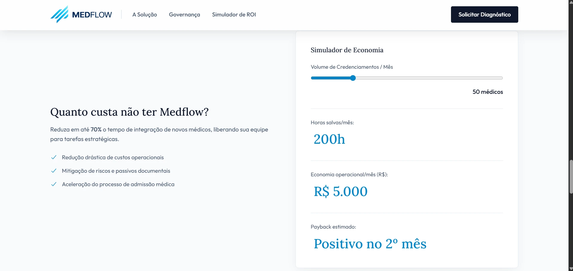
Design Choice: Instead of simply listing benefits, we created a tool for calculating tangible and dynamic financial returns.
Interface Decision: The Slider component allows the user to drag the volume of doctors. Data below updates in real-time with increased scale fonts.
F) Centralização de Ecossistema e Captura Final
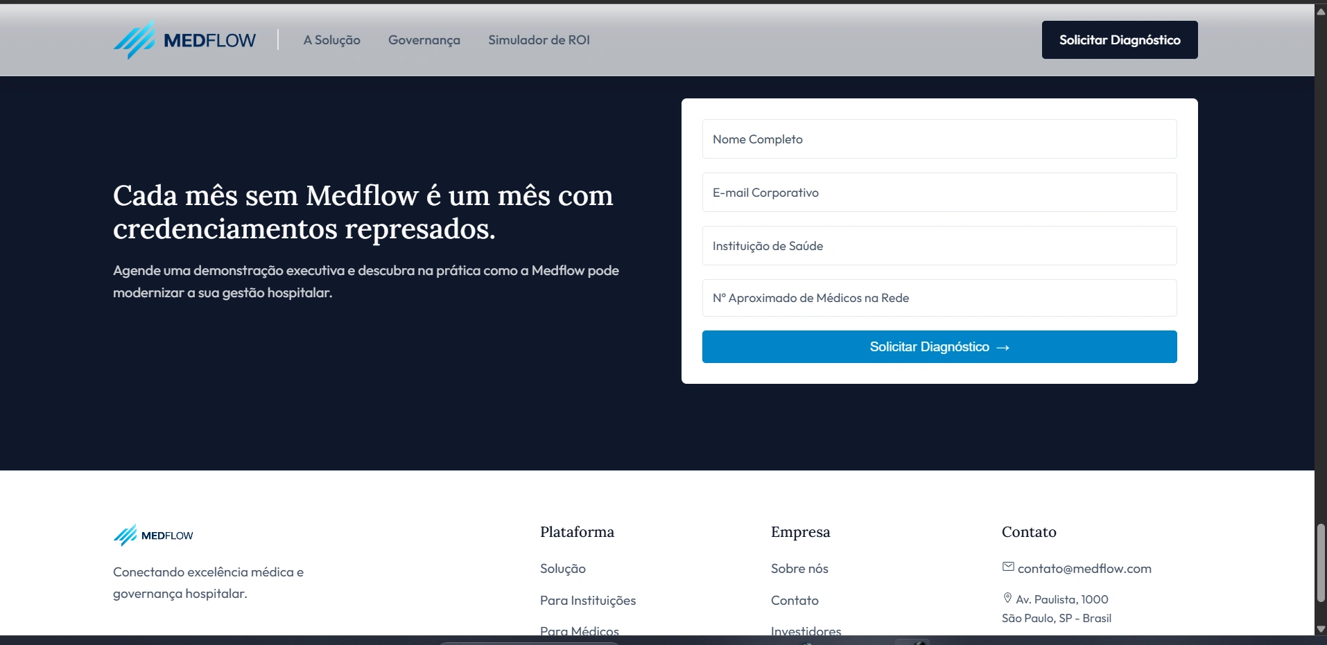
Design Choice: Medflow needed to position itself as a central hub. The footer closes the journey in an inverted contrast block.
Interface Decision: The capture form is clean, with well-spaced text inputs and refined typography.
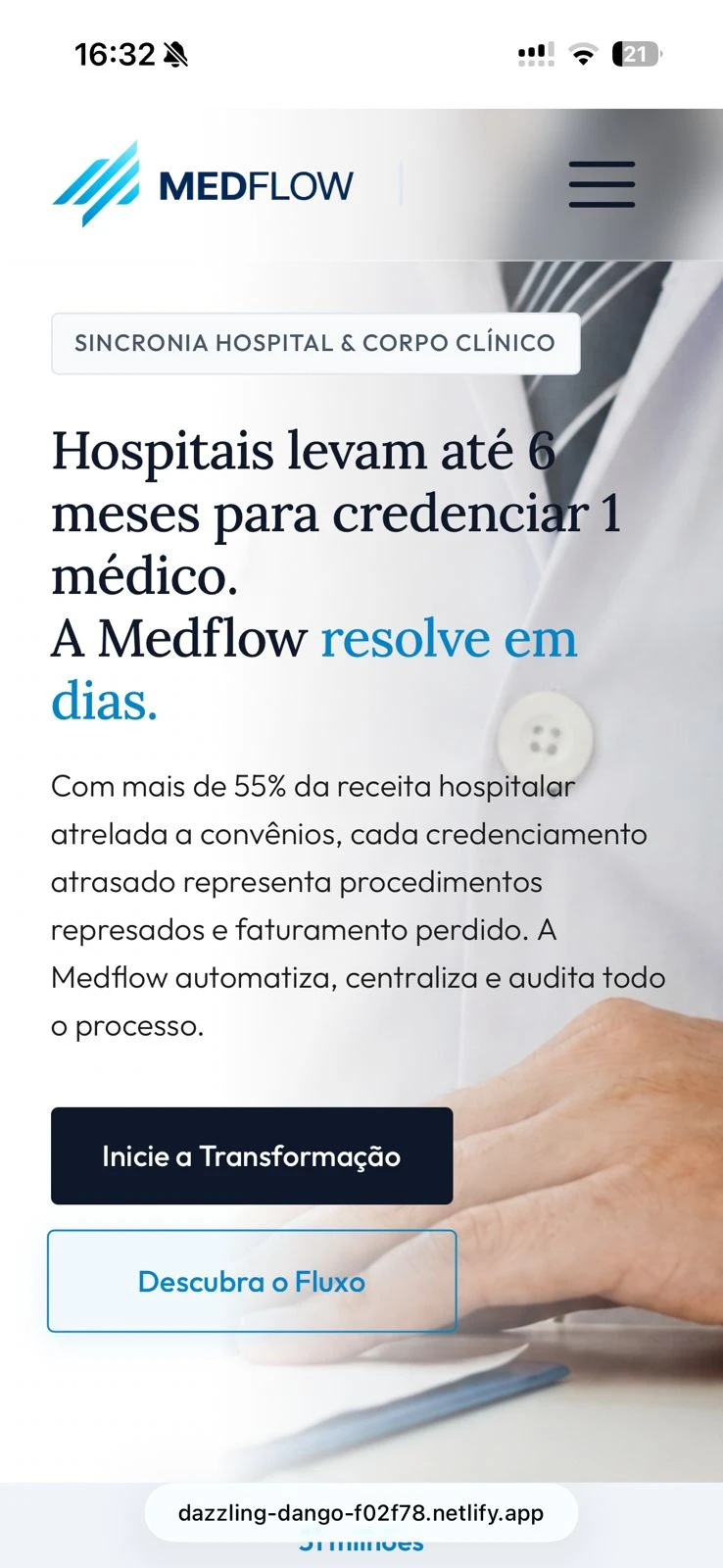
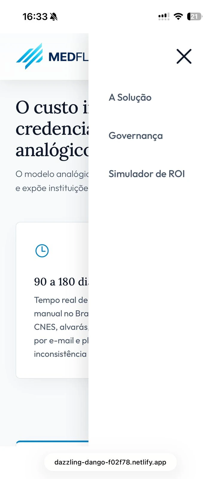
MOBILE EXPERIENCE

03. CASE CONCLUSION
The final result for Medflow reflects the product vision we advocate at BAZE: removing excess to focus on utility. By aligning precise typography, fluid feedback interactions, and a strictly clean layout, we proved that solutions for industries as robust as healthcare can be elegant, efficient, and extremely easy to use.
MVP IS LIVE Netlify MVP
0 likes · 0 views · Nov 9, 2026
Transformed complex hospital processes into a simple, efficient digital experience for Medflow.


