
01. THE CHALLENGE & STRUCTURAL DIAGNOSIS
Agrola is a fictional agricultural intelligence company created by BAZE as a self-initiated project. It combines satellite data, sensors and field agronomists to help rural properties produce more with fewer inputs.
The starting point was a common problem in the sector. Agtech companies sell sophisticated solutions, but they usually present themselves with websites that are either too technical, loaded with jargon, or too generic, with stock imagery and vague promises. The farmer, who decides based on concrete results and trust, can’t find a clear answer to three questions: what this company does, how much it costs and whether it really works.
The challenge was to design a digital presence that translates complex technology into simple language. The idea was to treat the farmer as the client of a premium service, with transparent pricing and proof of results, without losing the scale and visual strength of the field.
02. PRODUCT INTELLIGENCE & UX/UI DECISIONS
We mapped how purchasing decisions happen in agribusiness. Farmers want to see results in numbers, understand the cost before talking to a salesperson and know that the company understands the crop they grow. The information architecture was built to answer those questions in sequence, from visual impact to contact.
The visual system rests on three principles:
MONUMENTAL · FIELD SCALE
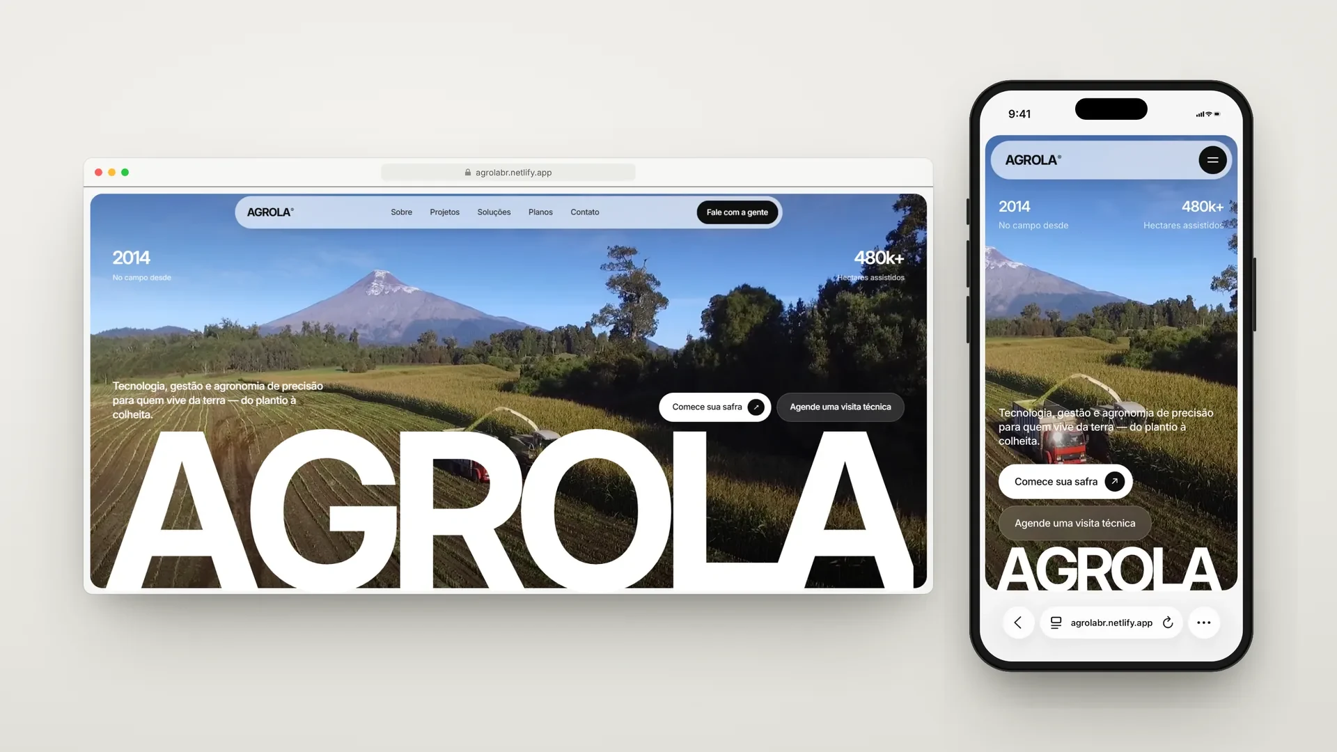
The AGROLA wordmark spans the full width of the hero, layered over aerial harvest footage. The heavy-weight grotesque typeface conveys the size of the operations served and creates a brand signature recognizable from the very first second.
TRANSPARENT · DATA AS ARGUMENT
Numbers appear throughout the site as proof: years in operation, hectares assisted, productivity gains, input reduction. The lime-green accent is reserved for indicators and active states, so the eye finds the results first.
MODULAR · PRODUCT, NOT BROCHURE
Rounded cards, a capsule header and interface components (toggles, accordions, badges) bring the site closer to the language of software. This reinforces that Agrola sells technology, not just consulting.
03. WHAT WAS BUILT
Opening and Immersive Hero
The experience starts with a preloader on a dark background, with the wordmark and a lime-green progress bar. Then the hero opens onto aerial harvest footage framed by a rounded card, with two indicators at the top (in the field since 2014, 480 thousand hectares assisted) and two CTAs for different moments: “Start your harvest” for those who have already decided and “Book a technical visit” for those who still want to talk.
Animated Indicators and Manifesto
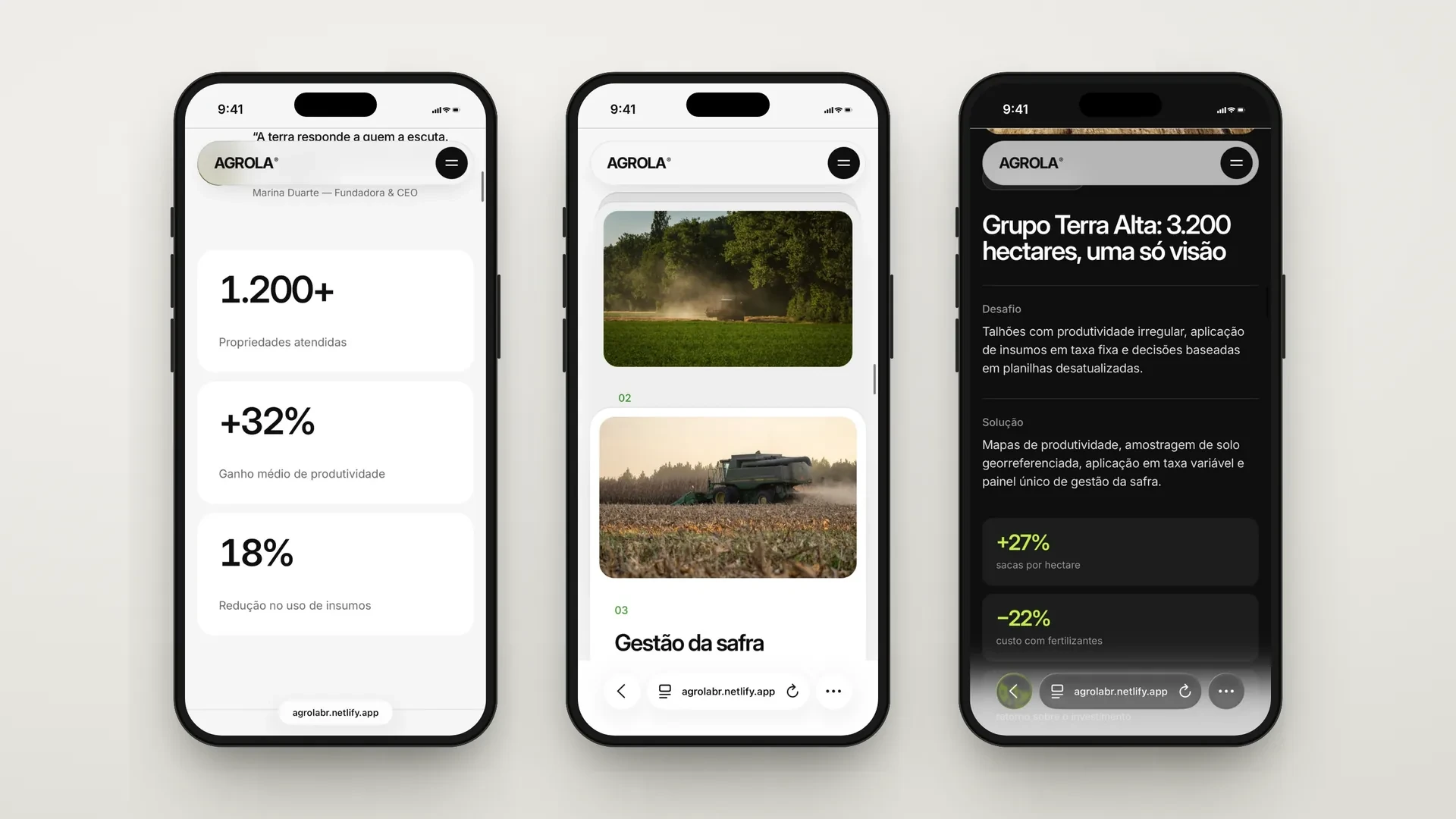
The About section presents the company in a manifesto text that reveals itself as you scroll, followed by a quote from the founder. Right below, three indicators (properties served, average productivity gain and reduction in input use) count up as they enter the screen, turning proof of authority into a moment of reading.
Services in Stacked Cards
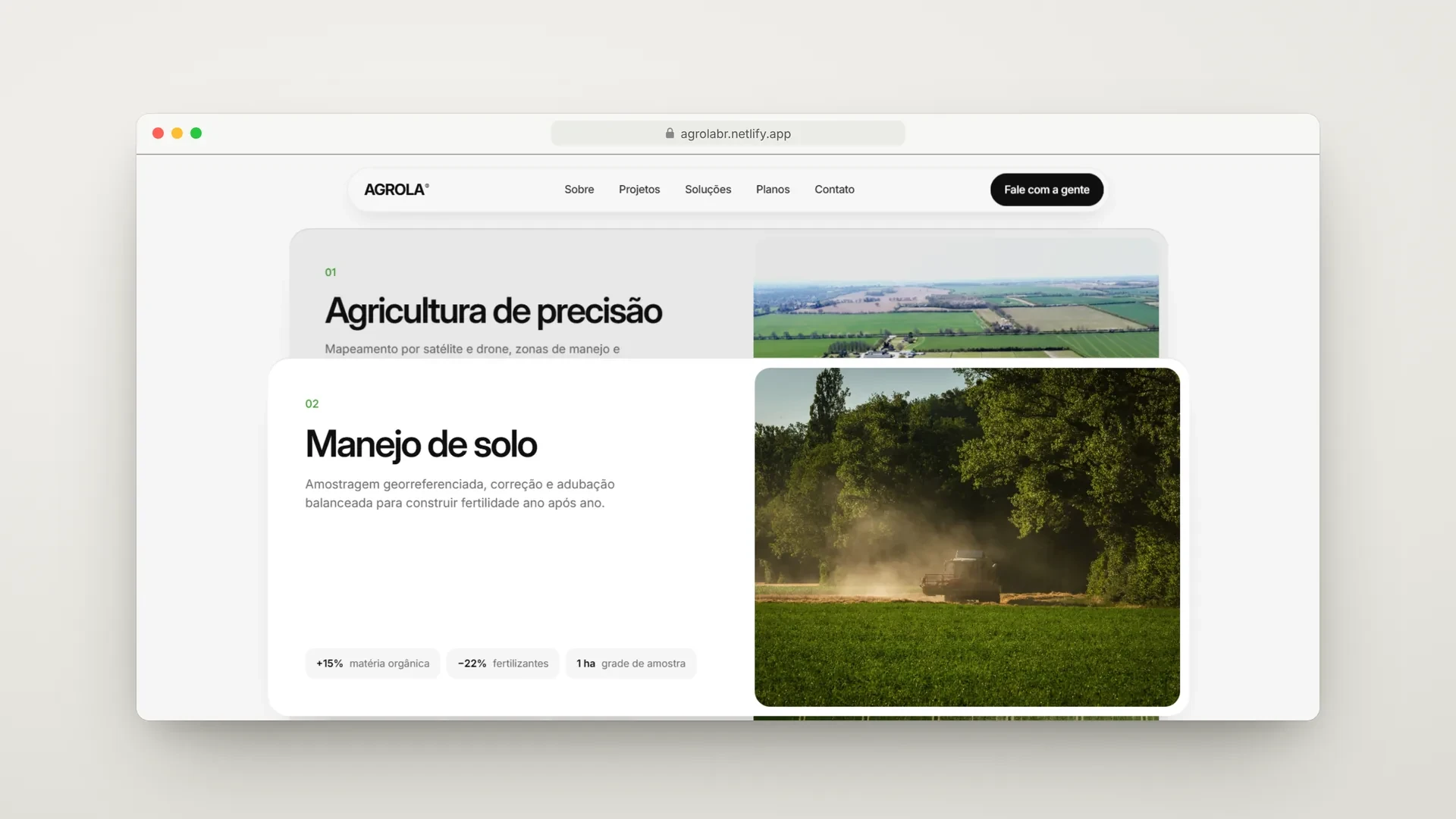
The solutions (Precision agriculture, Soil management, Harvest management, Logistics and trading) were organized into numbered cards that stack as you scroll. Each card covers the previous one, creating a sense of moving through the crop cycle, from planting to sale, without needing tabs or clicks.
Crops Ticker and Projects
A continuously moving typographic band (Coffee, Cotton, Sugarcane, Livestock, Soy) shows at a glance the crops served. Next, the section “Harvests that became a reference” opens the project portfolio.
Integrated Case Study
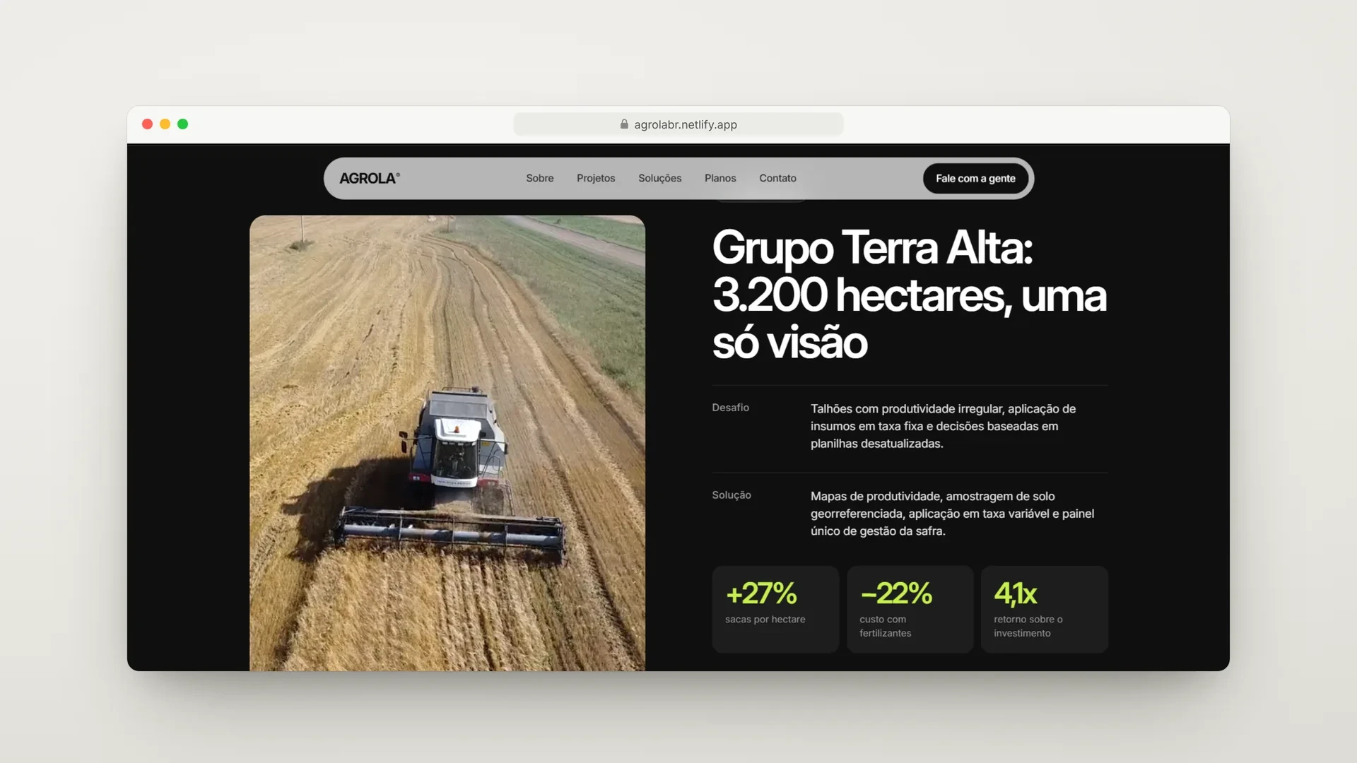
The case “Grupo Terra Alta: 3,200 hectares, a single view” gets a dark section that breaks the rhythm of the page and signals importance. The Challenge, Solution and Results structure presents the project figures (+27% bags per hectare, −22% fertilizer costs and return on investment) in cards highlighted in lime green, closing with the client’s testimonial.
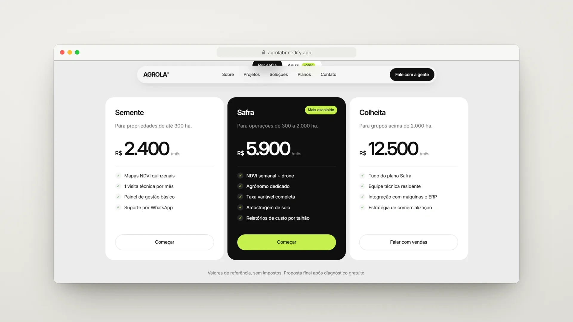
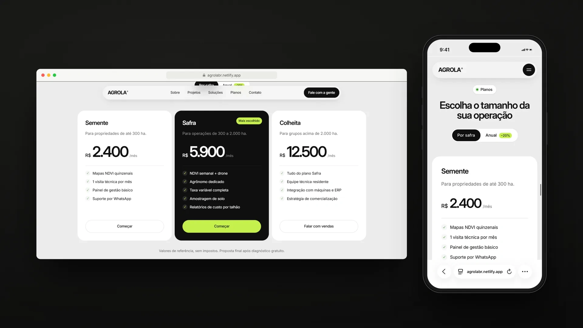
Plans with Public Pricing
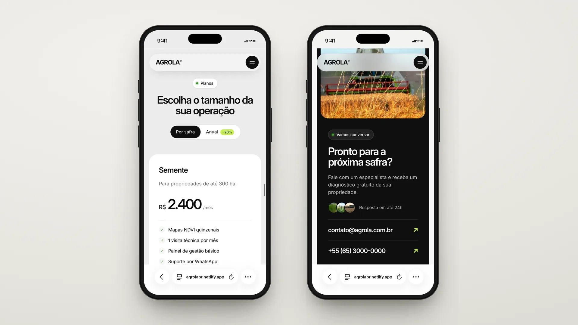
The section “Choose the size of your operation” shows three plans (Seed, Harvest and Yield) segmented by hectares, with visible pricing and a list of deliverables. A toggle switches between per-harvest and annual billing, with a −20% badge, and the middle plan is visually highlighted as the most chosen. Showing the price before contact filters leads and shortens the negotiation.
Social Proof, FAQ and Conversion
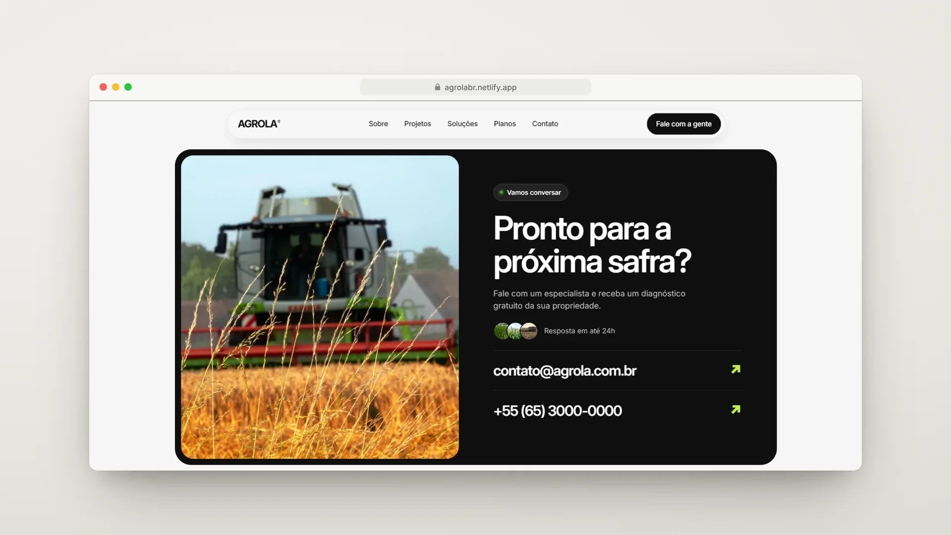
Farmer testimonials, a 4.9 average rating and the section “Why AGROLA?” consolidate trust. An accordion FAQ answers the most common objections (crops served, whether machinery needs replacing, how support works). The closing “Ready for the next harvest?” offers a free diagnosis, a promise of a reply within 24 hours and direct contacts by email and phone.
04. MOBILE-FIRST PERFORMANCE
A large share of the rural audience accesses the internet mainly via phone, often in the field itself and with an unstable connection. That is why the interface was designed for touch and quick reading, with desktop working as a natural expansion.
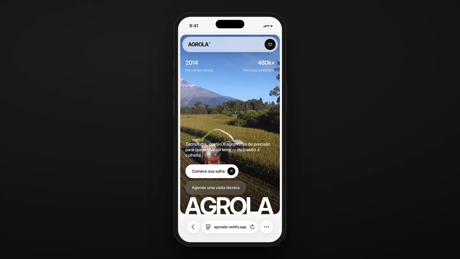
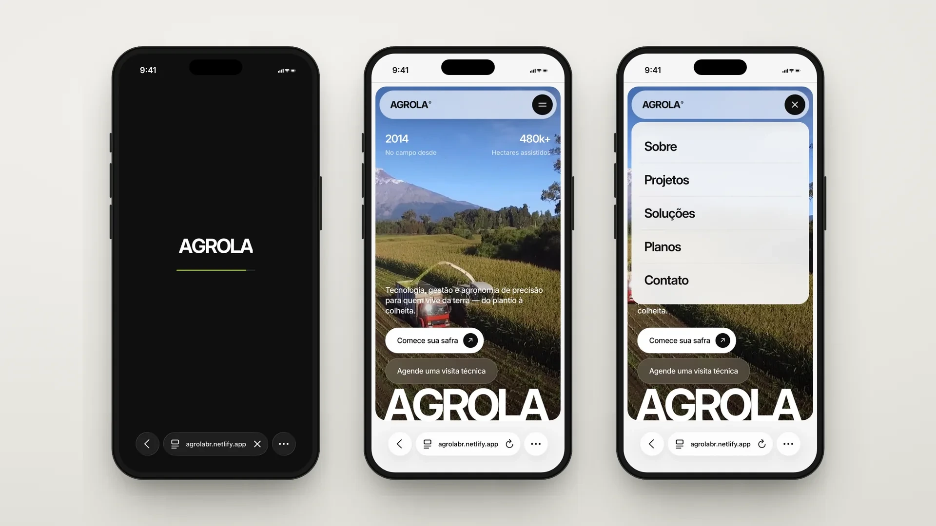
Floating capsule header: the navigation bar is always visible as a glass-effect pill, taking up little space and letting the image breathe.
Overlay panel menu: the menu opens as a card over the hero, with items in large, easy-to-tap type, without taking the user out of context.
Single-column cards: indicators, services, results and plans reorganize into one column, preserving hierarchy and the full width of the images.
One-tap contact: email and phone appear as clickable rows with an action arrow, ready to open the corresponding app.
05. WHAT THE CONCEPT DEMONSTRATES
Agrola is an exercise in how an agribusiness company can present itself with the same clarity as a modern digital product: visual impact first, proof in numbers next, transparent pricing and a direct path to the conversation.
The project brings together the decisions BAZE applies to brands that sell complex solutions: translating technology into concrete benefit, using data as a sales argument and treating the phone as the main entry point.
VIEW CONCEPT SITE agrolabr.netlify.app
DATA-DRIVEN UX
0 likes · 0 views · Nov 9, 2026
Created a user-friendly website for Agrola with a focus on clear communication and transparent pricing.


