
01. THE CHALLENGE & STRUCTURAL DIAGNOSIS
Marina Vale is a fictional architecture and interiors studio created by BAZE as a self-initiated project. The premise: a boutique practice, founded in 2012, with a lean team and a focus on only a few residential projects at a time.
The starting point was a recurring pattern in the sector. Most architecture firm websites work like a photo album: a grid of beautiful images, little hierarchy and almost no guidance for someone who arrives wanting to understand what the studio does, how it works and where to begin. The result is a showcase that impresses but does not lead.
The challenge was to design the digital presence of a studio that sells something intangible (the confidence to deliver an entire home) and turn it into an experience that tells a story, organizes the offer and leads the visitor to contact without losing the sophistication the high-end segment demands.
02. PRODUCT INTELLIGENCE & UX/UI DECISIONS
We mapped how high-end clients choose an architecture firm: first by aesthetic sensibility, then by confidence in the process and, finally, by closeness to the person who signs the project. The information architecture was built to answer those three questions, in that order.
The visual system rests on three principles:
CINEMATIC · NARRATIVE BEFORE CATALOGUE
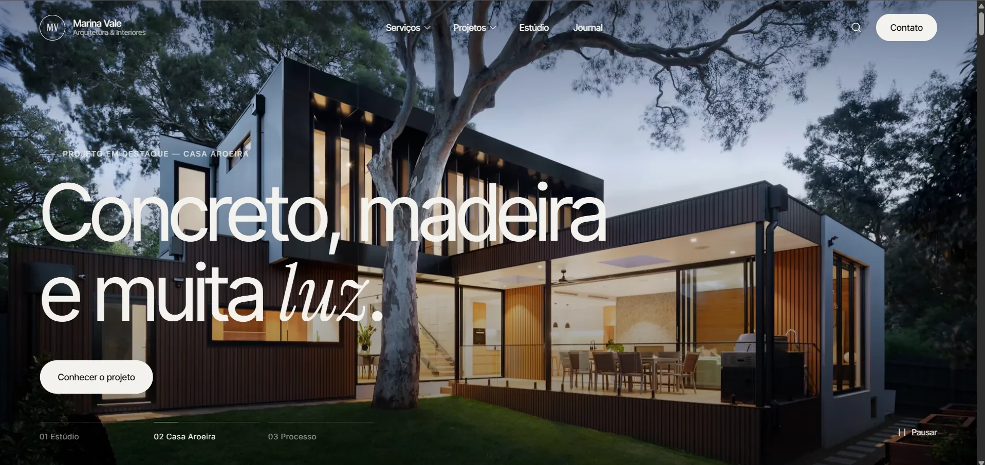
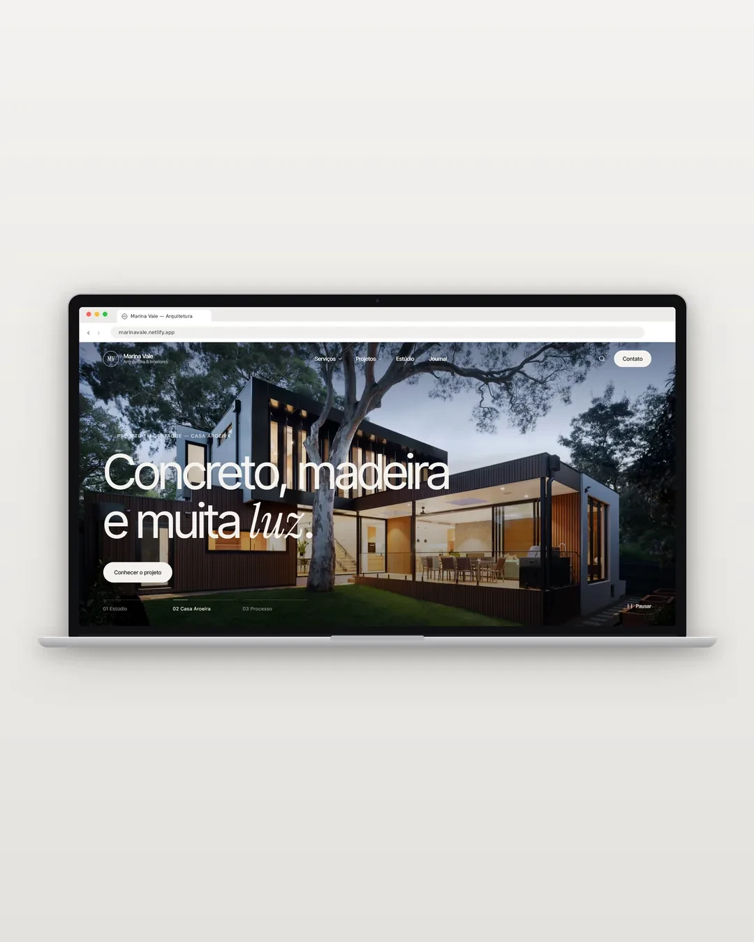
The home opens with a hero in chapters, not a grid. Each slide is a scene with a beginning, middle and end, and the visitor understands the studio, sees a project and learns the process before even scrolling the page.
EDITORIAL · TYPOGRAPHY AS VOICE
A large-scale, tightly spaced sans-serif structures the headlines, while an italic serif appears on a single word per sentence (durar, luz, atento). The contrast gives a magazine rhythm and creates a signature without needing ornament.
STRUCTURED · A LEGIBLE OFFER
Services and way of working were separated into clear layers, so the visitor knows exactly what the studio delivers and how it delivers it, without having to hunt for the information.
03. WHAT WAS BUILT
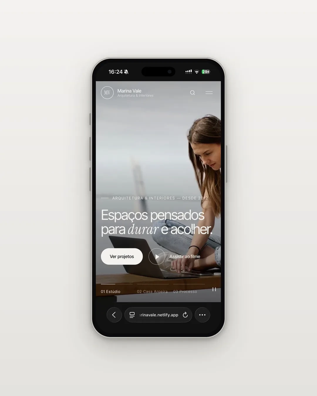
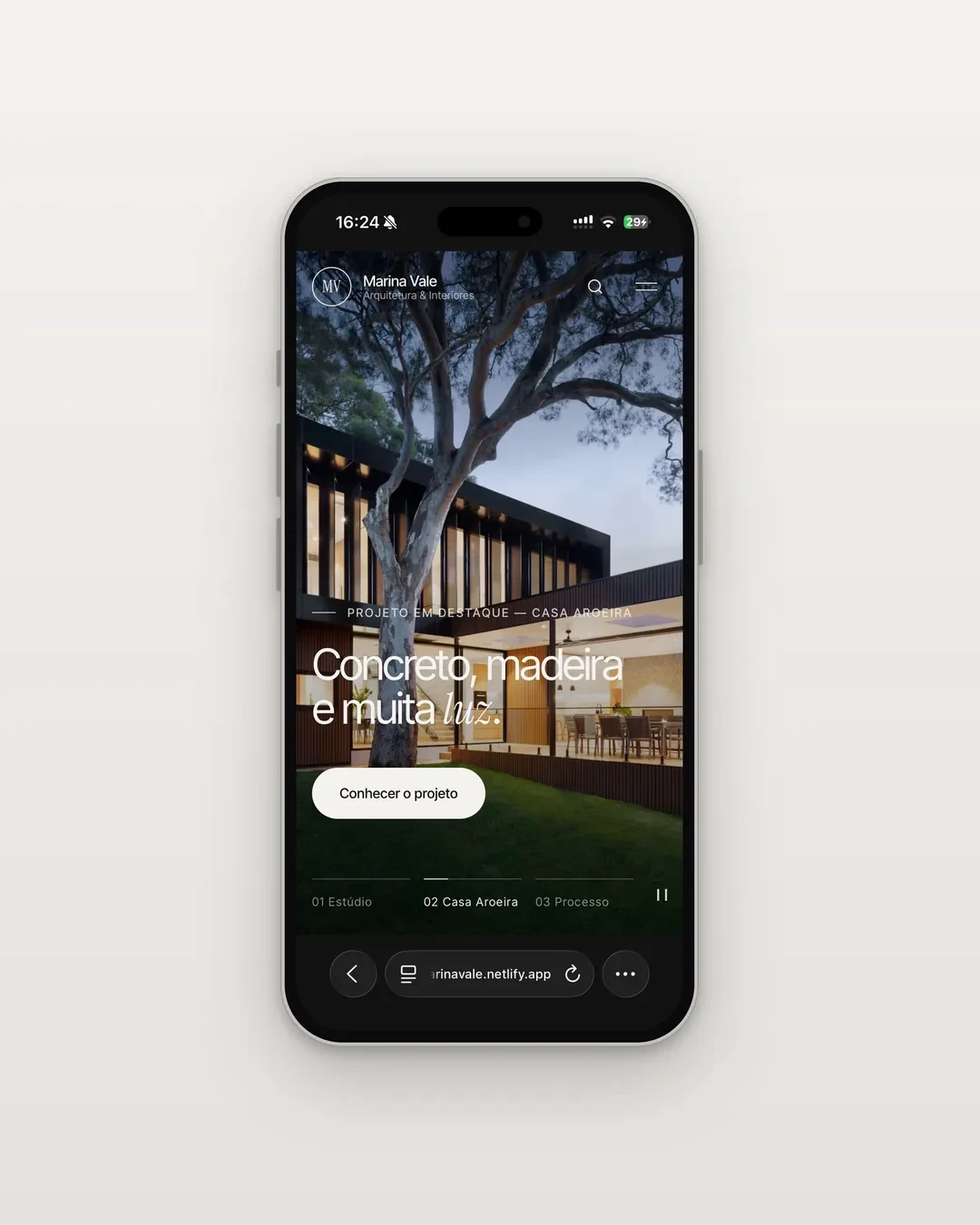
Narrative Hero in Three Chapters
The hero works like a short film divided into chapters (01 Studio, 02 Casa Aroeira, 03 Process), each with its own label, headline, CTA and progress bar. The CTA changes with the context: “See projects” and “Watch the film” in the introduction, “Discover the project” on the featured project. The always-visible pause control respects those who want to read calmly and follows accessibility best practices for moving content.
Mega Menu with Two-Layer Architecture
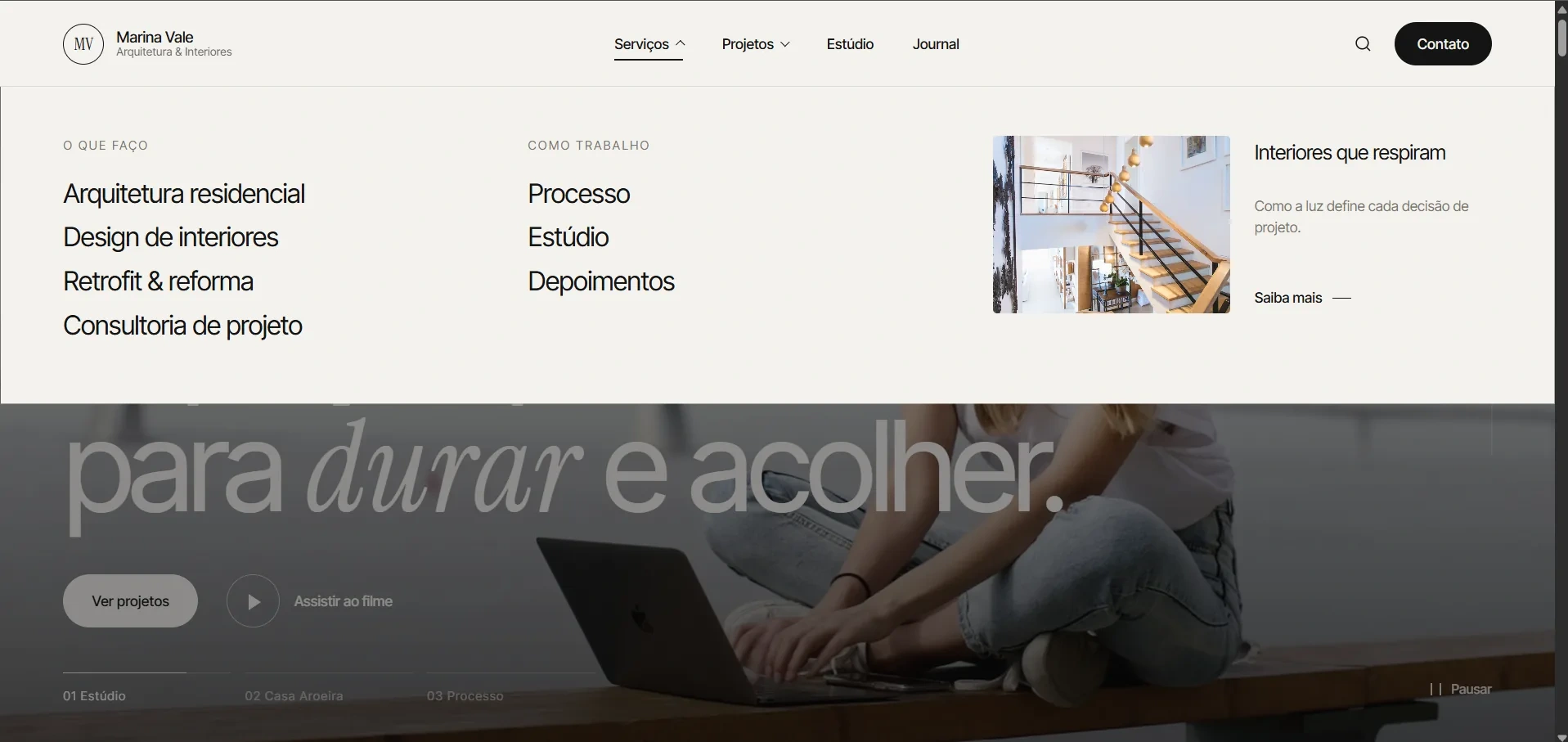
On desktop, the Services menu opens into a panel organized in two columns: “What I do” (Residential architecture, Interior design, Retrofit & renovation, Project consulting) and “How I work” (Process, Studio, Testimonials). Beside them, an editorial card from the Journal (“Interiors that breathe”) turns navigation into a point of content discovery. The background dims when the panel opens, keeping focus without taking the visitor off the page.
Adaptive Header
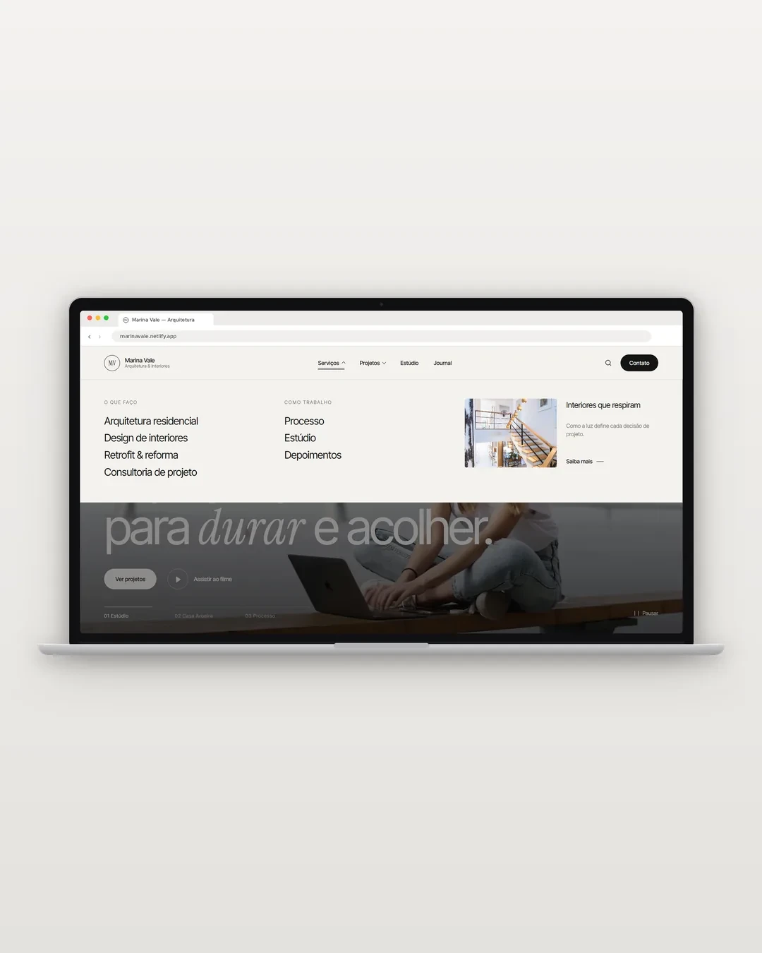
The header is transparent over the hero, with logo and text in white, and becomes solid off-white when a menu opens. The “Contact” button follows the change, inverting from light to dark, and remains a fixed conversion CTA at any point of the navigation.
Studio Section with Proof of Authority
The section “Pequeno por escolha, atento por natureza.” (Small by choice, attentive by nature) presents the studio in the first person, reinforcing closeness to the person who signs the project. Right below, three indicators (projects delivered, years of practice and national awards) work as proof of authority readable in a second.
04. MOBILE-FIRST PERFORMANCE
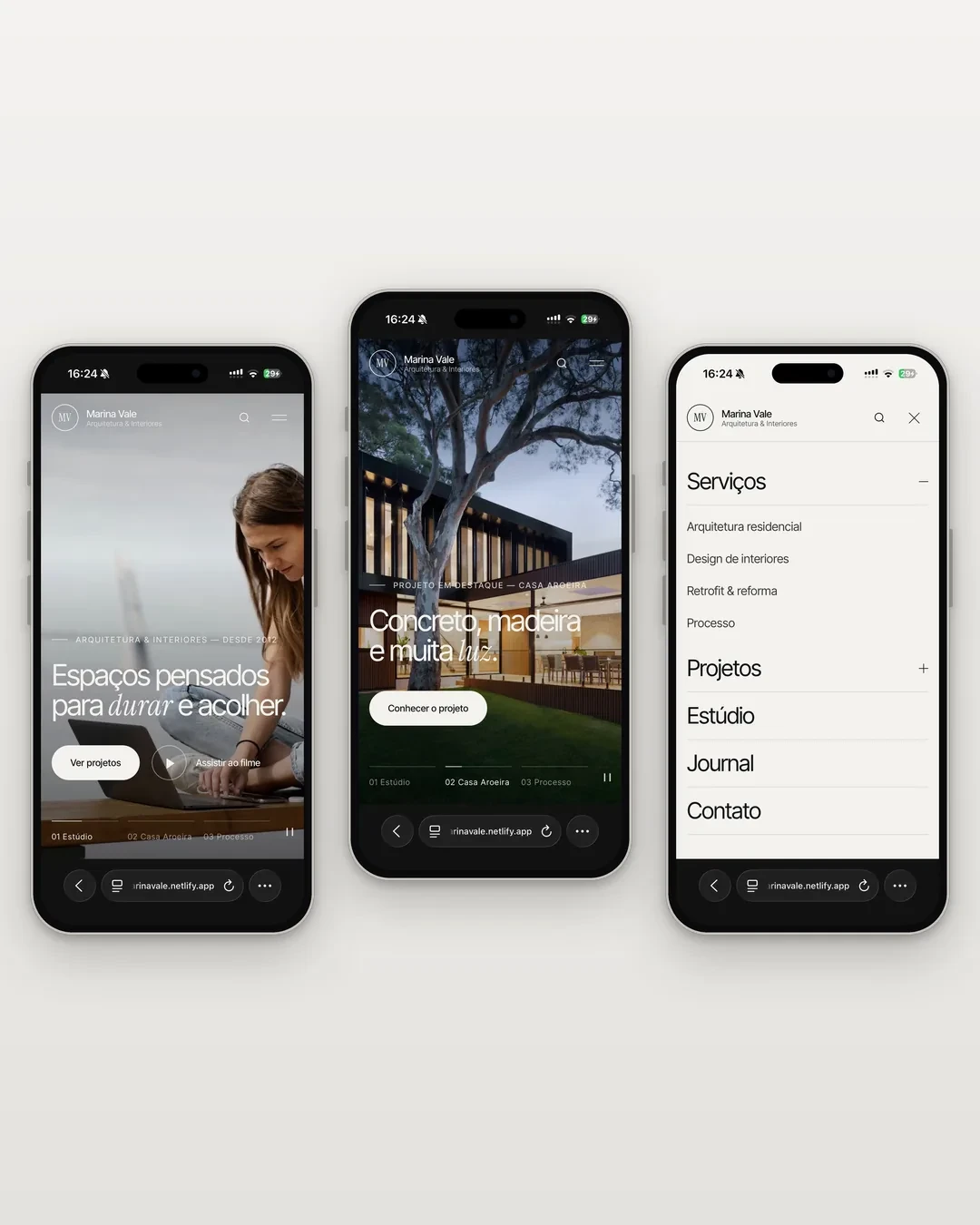
High-end architecture clients usually discover firms on Instagram and arrive at the site on their phone. That is why the mobile experience was designed as the main product, not as an adaptation of desktop.
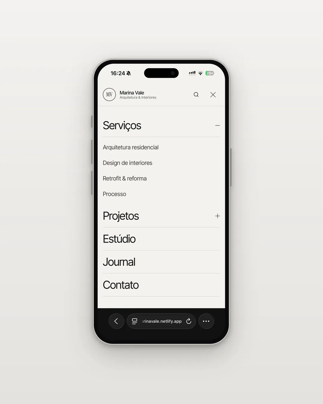
Full-screen menu: items in large-scale type, easy to tap and consistent with the site’s editorial language.
Submenu accordion: Services and Projects expand inside the menu itself with a +/− indicator, keeping the mega menu hierarchy without changing screens.
Contact always at hand: email and location sit at the bottom of the menu, accessible without navigating to the contact page.
Immersive hero: the chapters keep headline, CTA and progress bar legible over the image, with a pause control adapted to touch.
05. WHAT THE CONCEPT DEMONSTRATES
Marina Vale is an exercise in how an architecture website can stop being a static portfolio and start working as a guided presentation: first it moves, then it organizes, finally it invites.
The project brings together the decisions BAZE applies to high-end brands: visual narrative instead of information overload, navigation architecture that speaks the client’s language and an interface that treats the phone as the main entry point.
VIEW CONCEPT SITE marinavale.netlify.app
0 likes · 0 views · Nov 9, 2026
Designed a narrative-driven website for the fictional Marina Vale architecture studio, enhancing user engagement through a cinematic approach.


