FROST - Premium Hydration Brand Identity
Shezaan Ansari
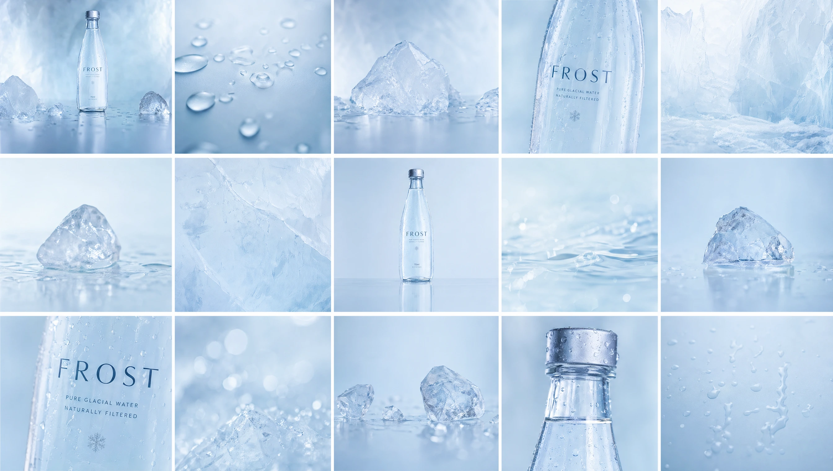
🧊 FROST — Premium Hydration Brand Identity
Nothing extra.
Overview
FROST is a luxury hydration brand built around purity, clarity, and restraint.
In a category often driven by noise and over-design, FROST takes the opposite approach—removing everything unnecessary to create a product that feels precise, minimal, and elevated.
The brand positions water not just as a necessity, but as a refined, intentional choice.
Objective
Create a premium water brand rooted in minimalism and clarity
Develop a cohesive visual system across product and packaging
Design an identity that feels modern, precise, and high-end
Establish strong shelf presence through simplicity
Brand Strategy
Positioning
A luxury hydration brand for individuals who value precision and simplicity.
Core Idea
Purity is power.
Brand Traits
Minimal · Precise · Cold · Refined · Controlled
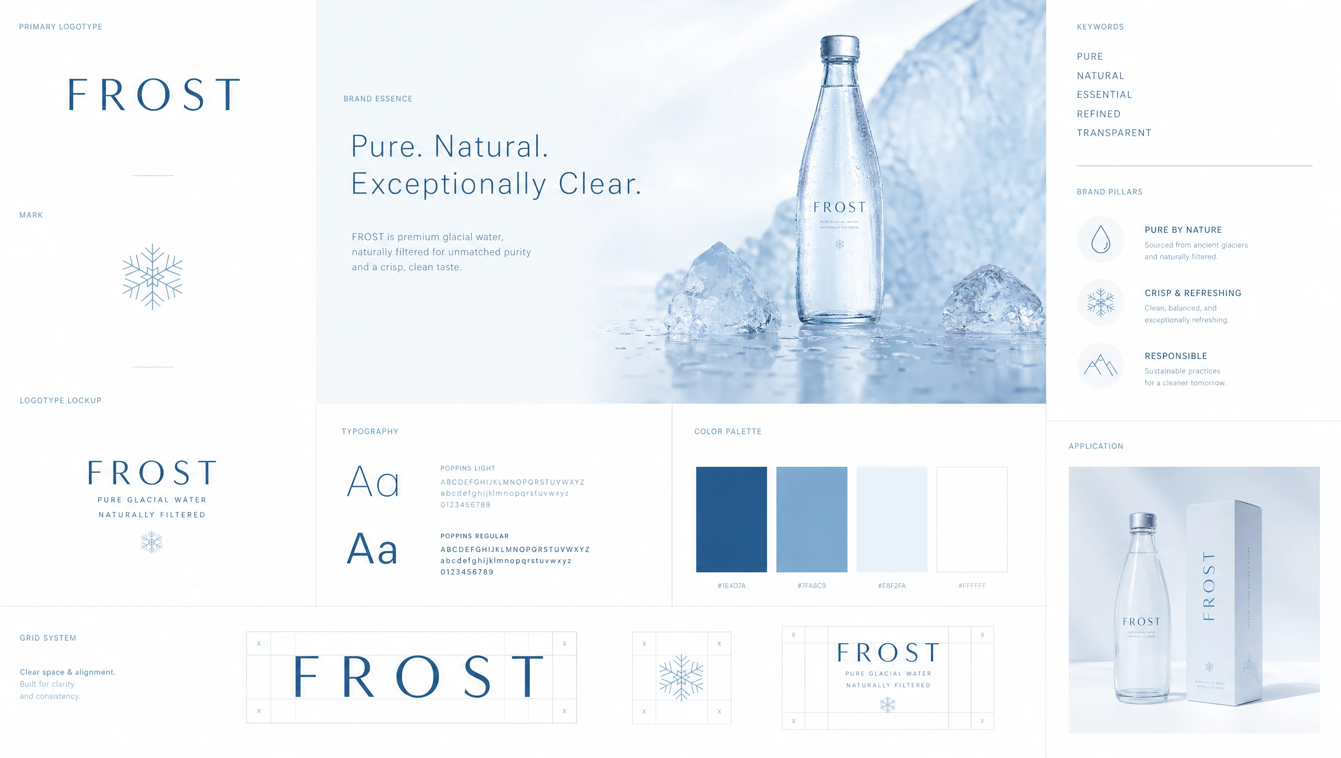
Visual Identity
Color System
A restrained palette inspired by water and light:
White
Ice blue
Soft grey
Transparent tones
The palette is intentionally limited to reinforce clarity and avoid visual noise.
Typography
Primary: Clean, modern sans-serif
Approach: Tight hierarchy, minimal variation
Typography is used sparingly, allowing space and alignment to define structure.
Material Language
The brand draws from pure, physical elements:
Glass
Water
Condensation
Light reflections
These materials create a tactile, real-world connection to the product.
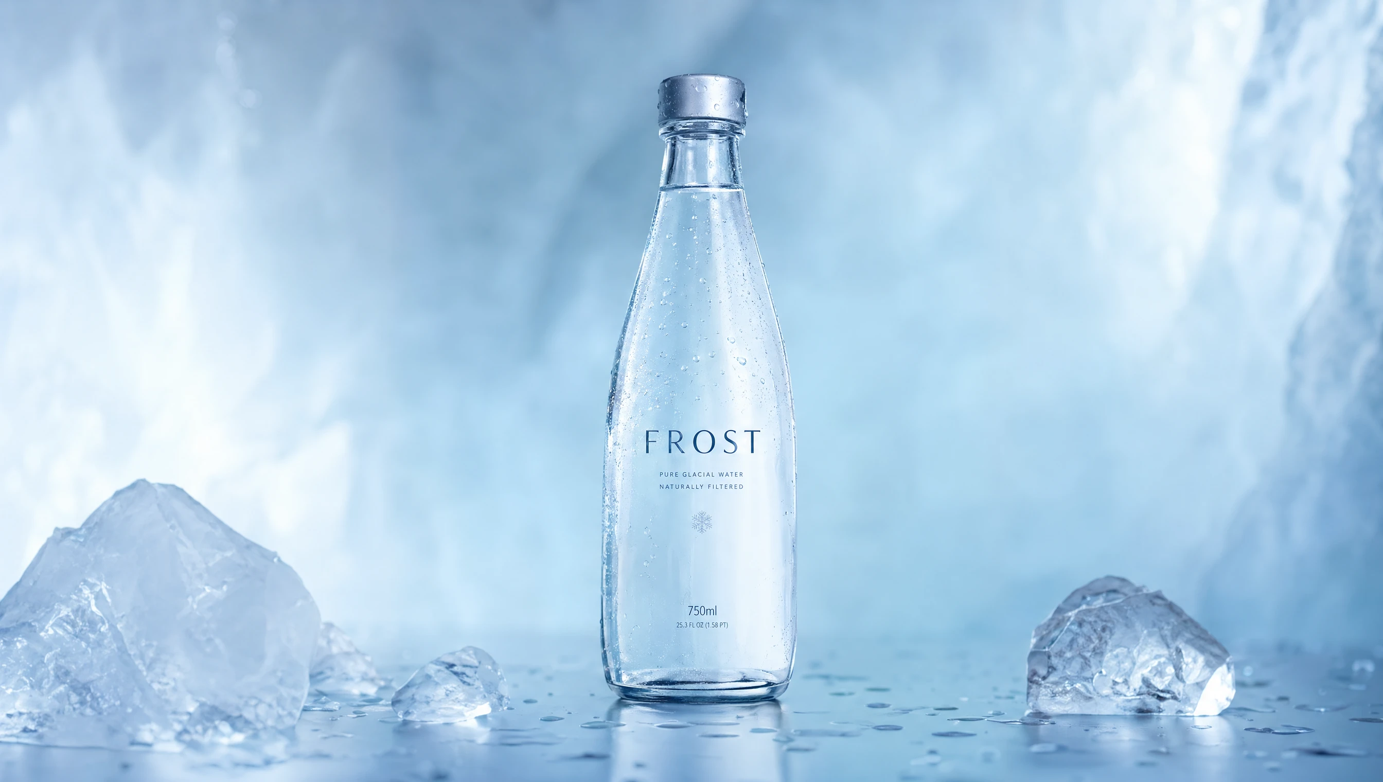
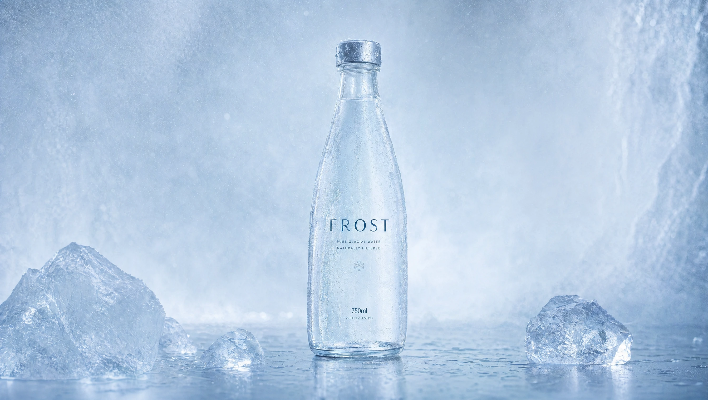
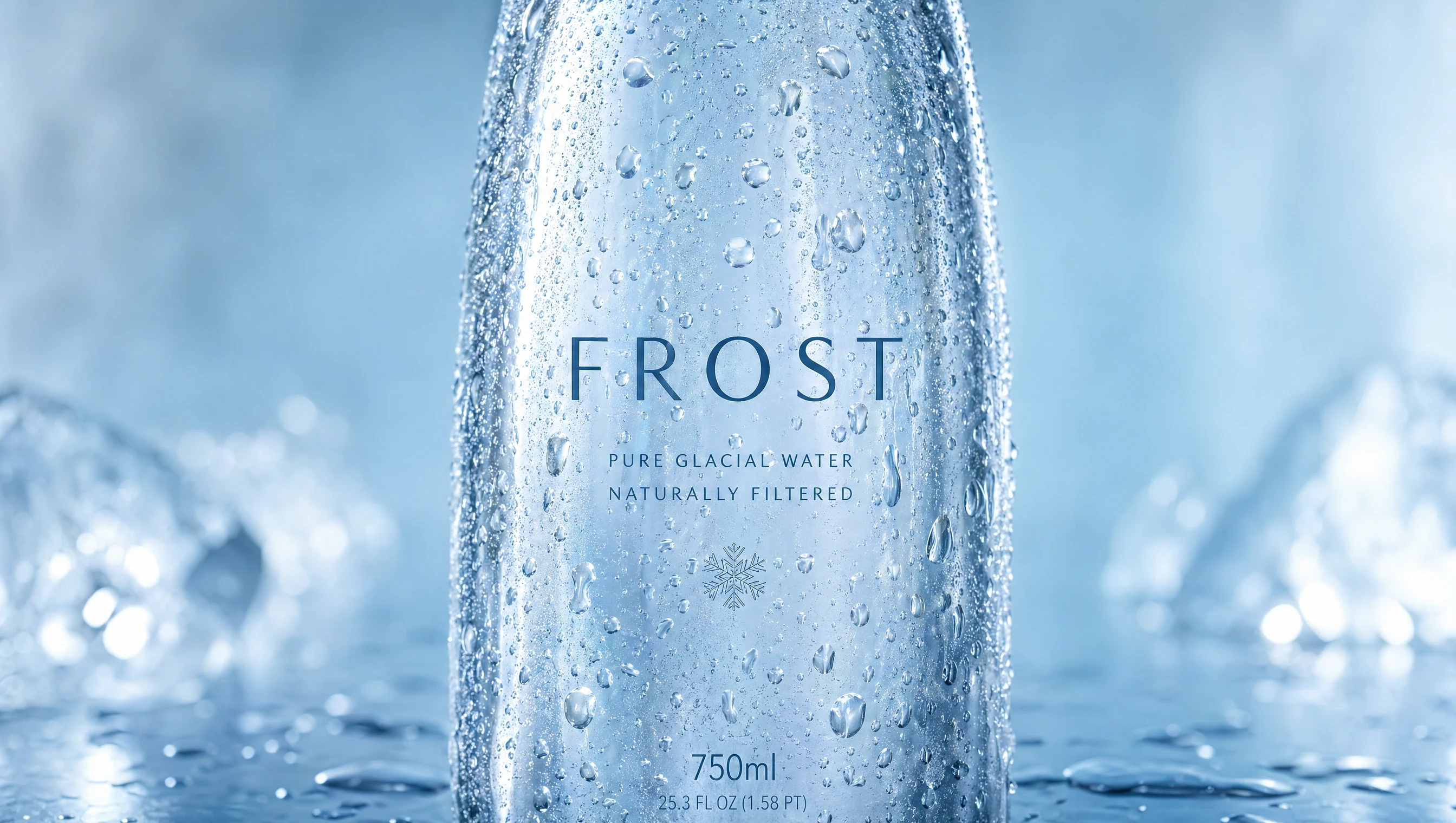
Product Design
The product is designed with extreme restraint:
Transparent glass bottle
Minimal label
Balanced proportions
Every element is reduced to its essential form, ensuring clarity and elegance.
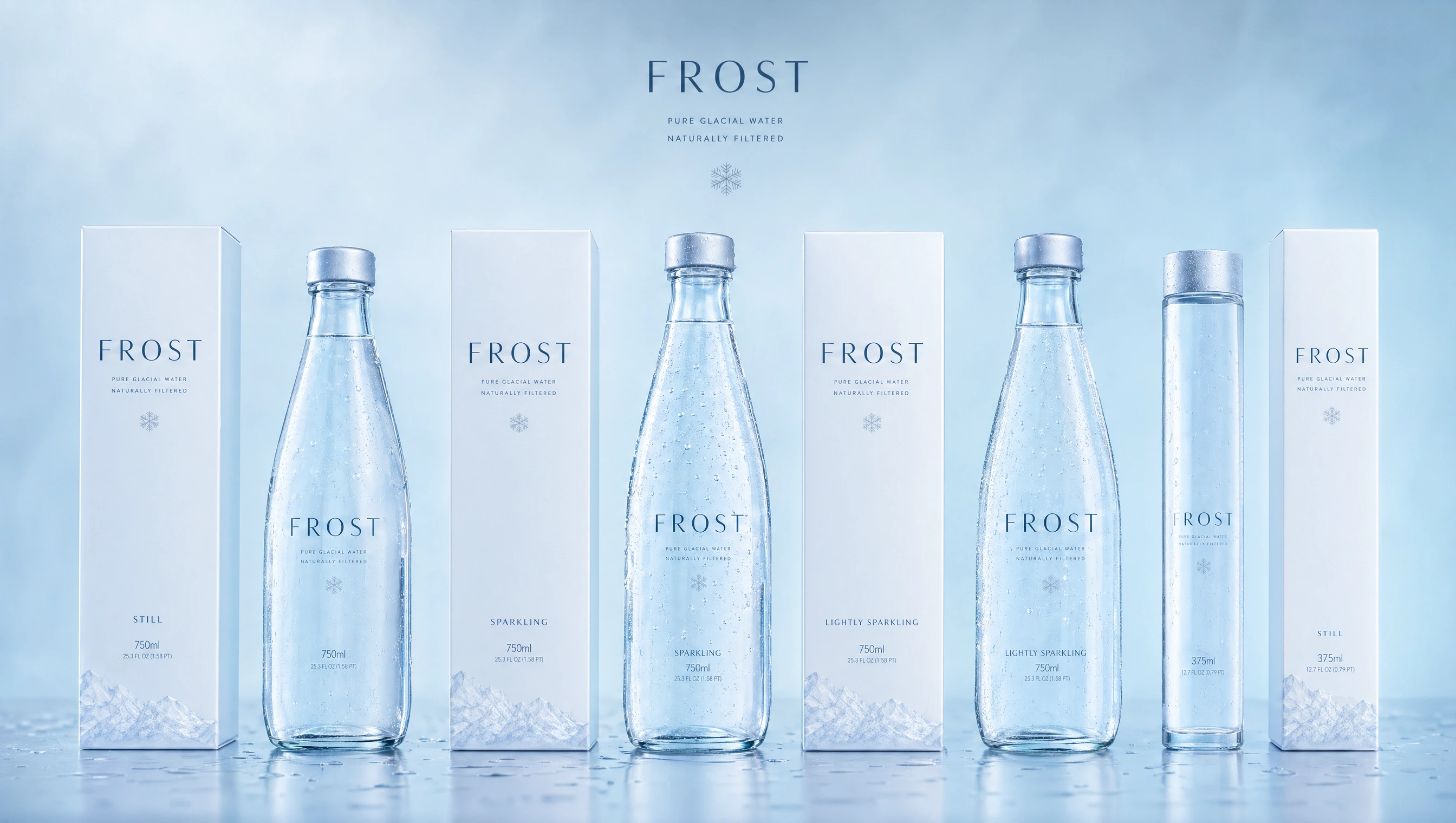
Packaging System
A consistent and scalable system:
Bottle variations with subtle differences
Minimal outer packaging
Clean alignment and spacing
Designed for:
visual clarity
premium perception
strong shelf differentiation

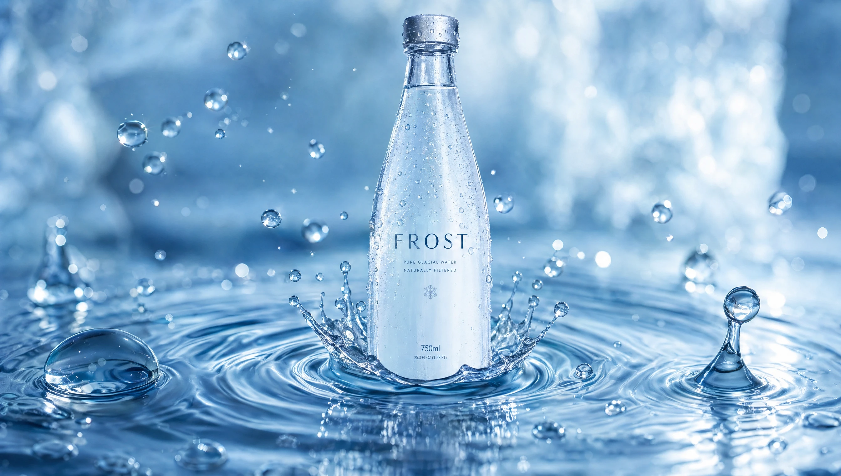
Sensory Experience
Water & Texture
The brand focuses on the physical qualities of water:
Surface tension
Ripples
Droplets
These visuals replace decoration with natural detail and realism.
Condensation & Temperature
Cold is communicated through:
condensation droplets
crisp highlights
subtle mist
This reinforces freshness without exaggeration.
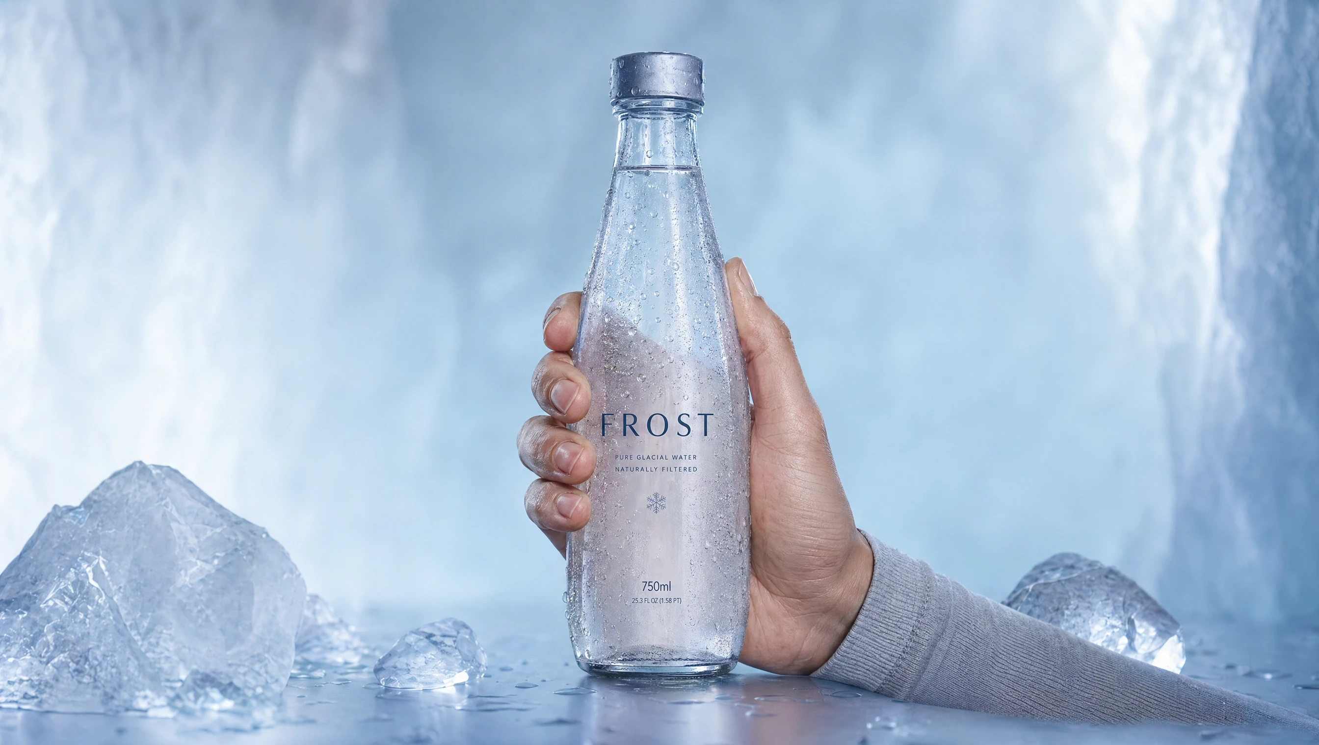
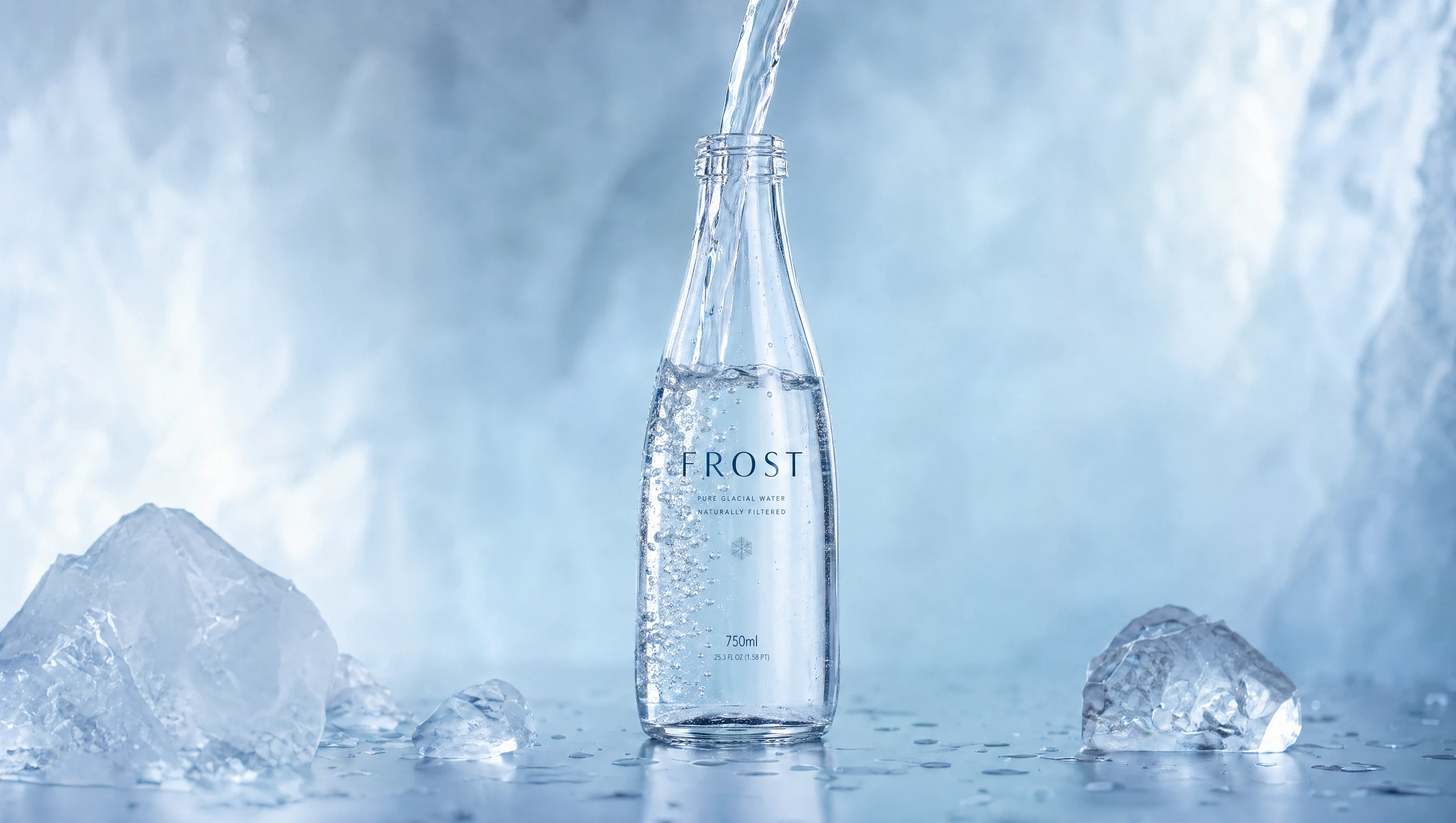
Product Interaction
Interaction is simple and controlled:
holding the bottle
pouring water
subtle movement
The experience is quiet and intentional.

Campaign Direction
The messaging is minimal and direct:
“Nothing Extra.”
“Pure by Design.”
“Clarity in Every Drop.”
Typography is understated, allowing space and composition to lead.
Outcome
FROST demonstrates how minimal design, when executed with precision, can create a strong and premium brand presence.
By focusing on clarity and removing excess, the brand achieves impact through simplicity and control.
Final Thought
Less, when done right, becomes everything.
FROST
Premium Hydration
Nothing extra.
Like this project
Posted May 2, 2026
A clean, cold-driven identity focused on clarity, freshness, and restrained visuals that feel crisp, modern, and premium.