FIZZON: Brand Identity for Energy Drink
Shezaan Ansari
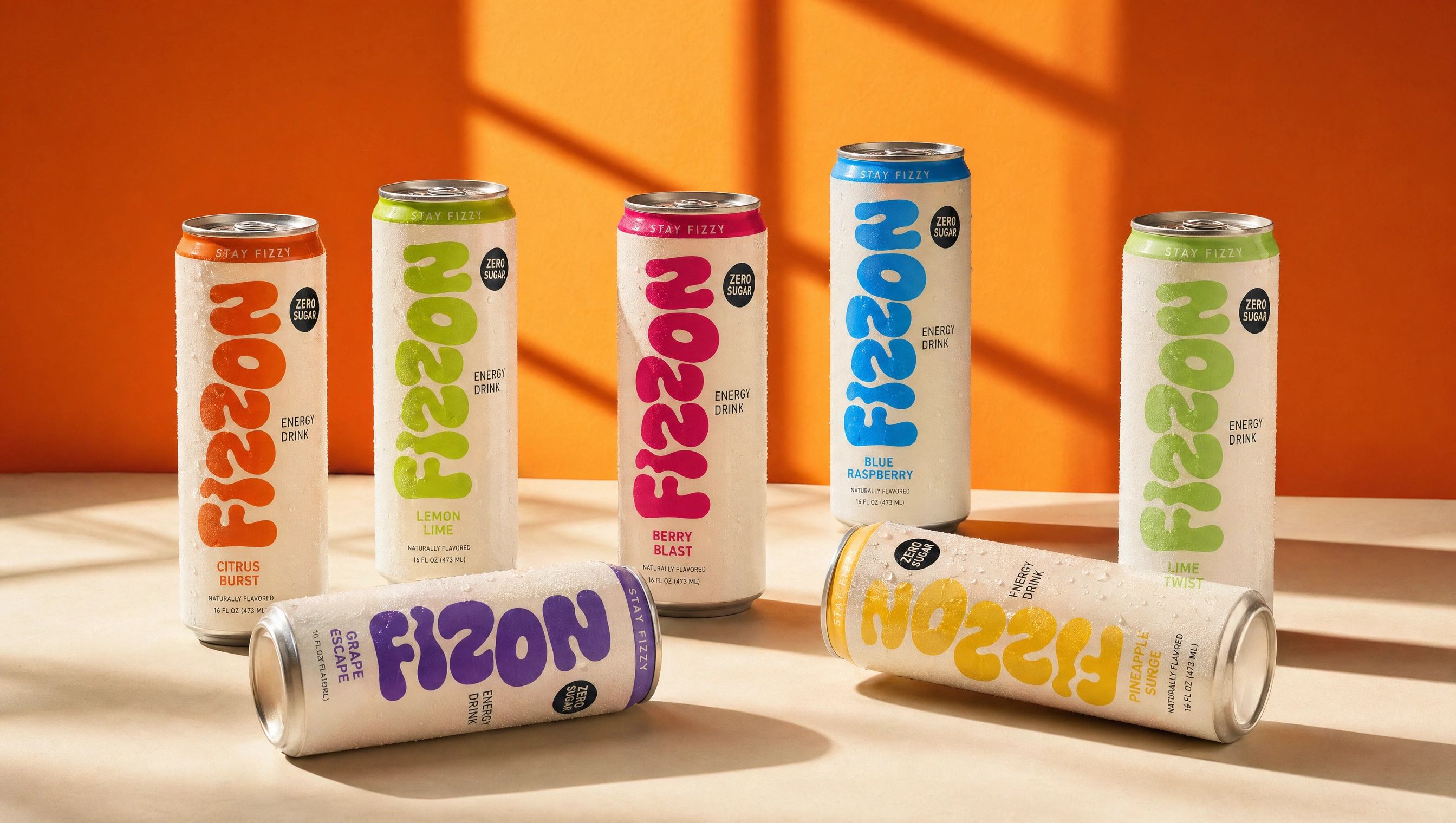
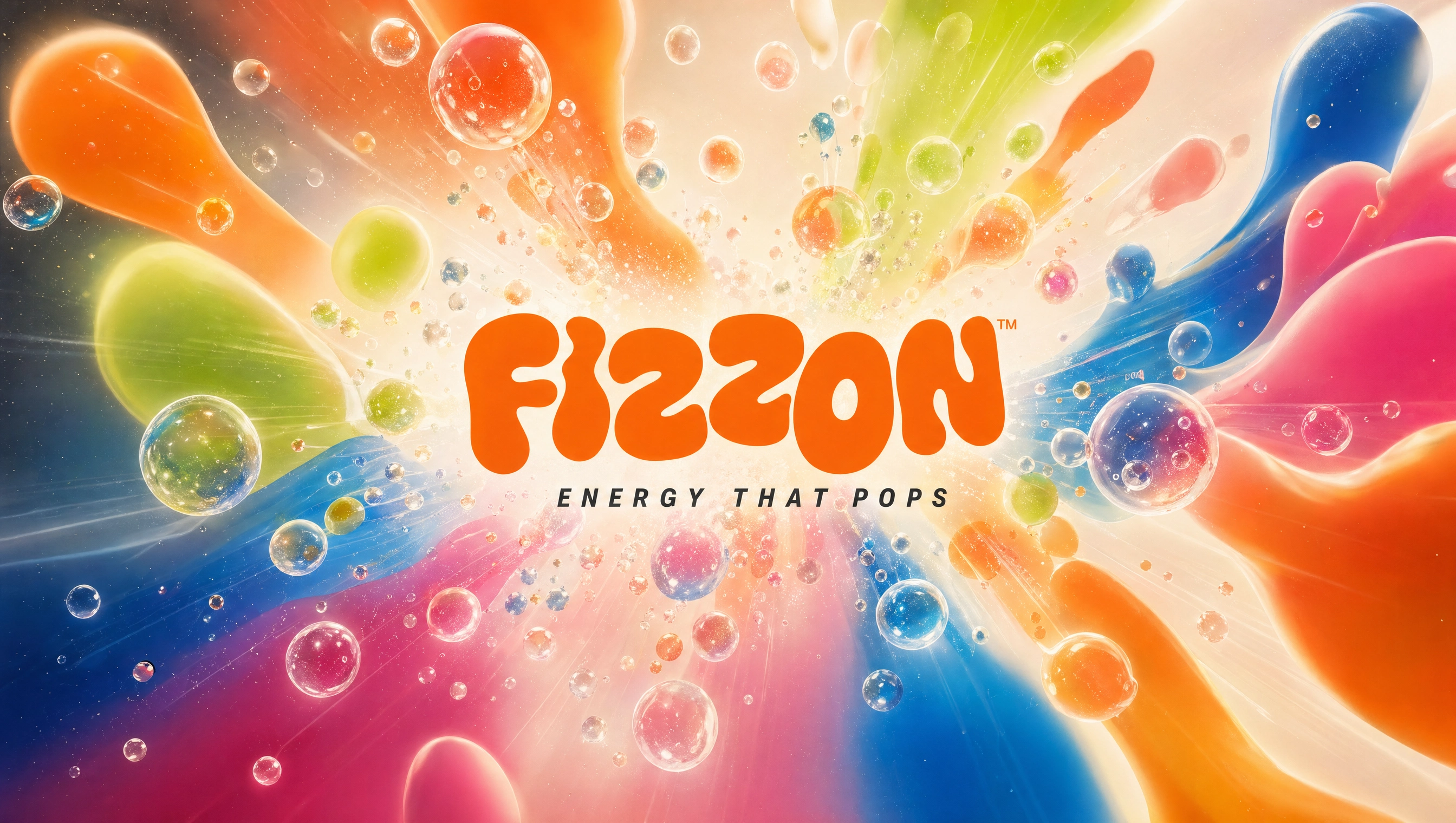
FIZZON — Energy That Pops
A playful, high-energy brand identity designed to stand out on shelves and deliver a bold, refreshing experience.
A vibrant, flavor-driven system designed to instantly communicate variety, energy, and freshness through bold color and dynamic compositions.
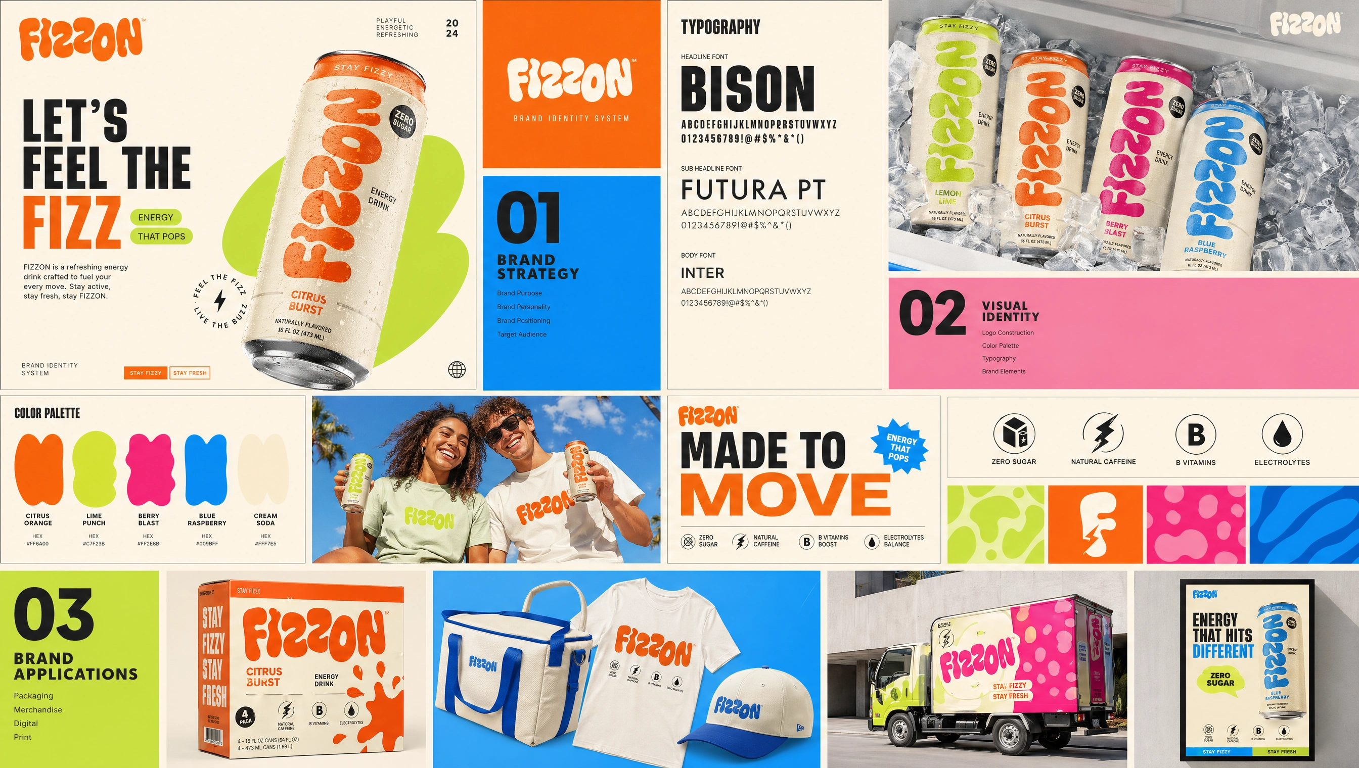
BRAND STRATEGY
Objective
Create a standout energy drink brand that feels playful yet premium.
Approach
Blend bold typography with fluid, organic shapes to reflect motion, energy, and refreshment.
Outcome
A distinctive identity system that balances fun, clarity, and strong shelf presence.
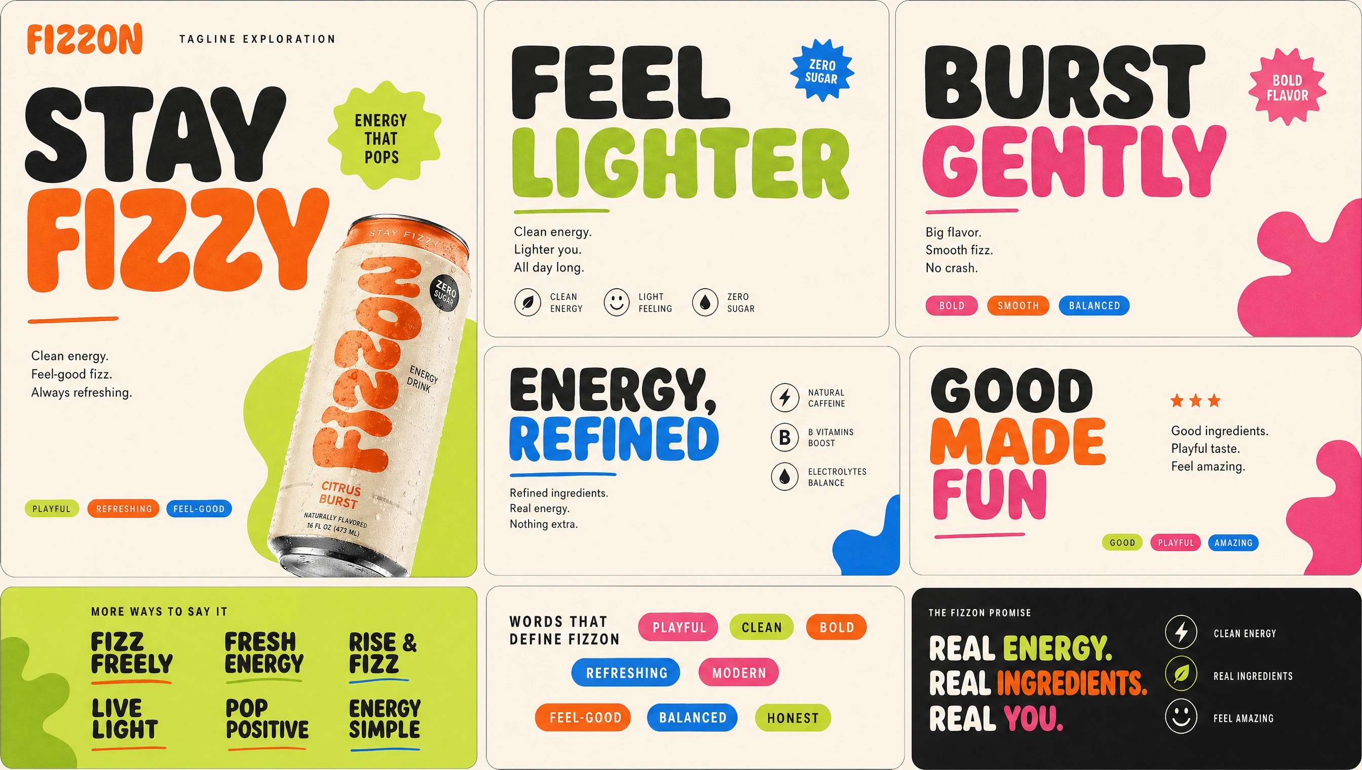
VOICE & TAGLINES
FIZZON’s voice is energetic, positive, and approachable—built around short, punchy phrases that reinforce movement and feel-good energy.
Key Lines:
Stay Fizzy, Stay Fresh
Energy That Pops
Feel the Fizz
Good Energy Only
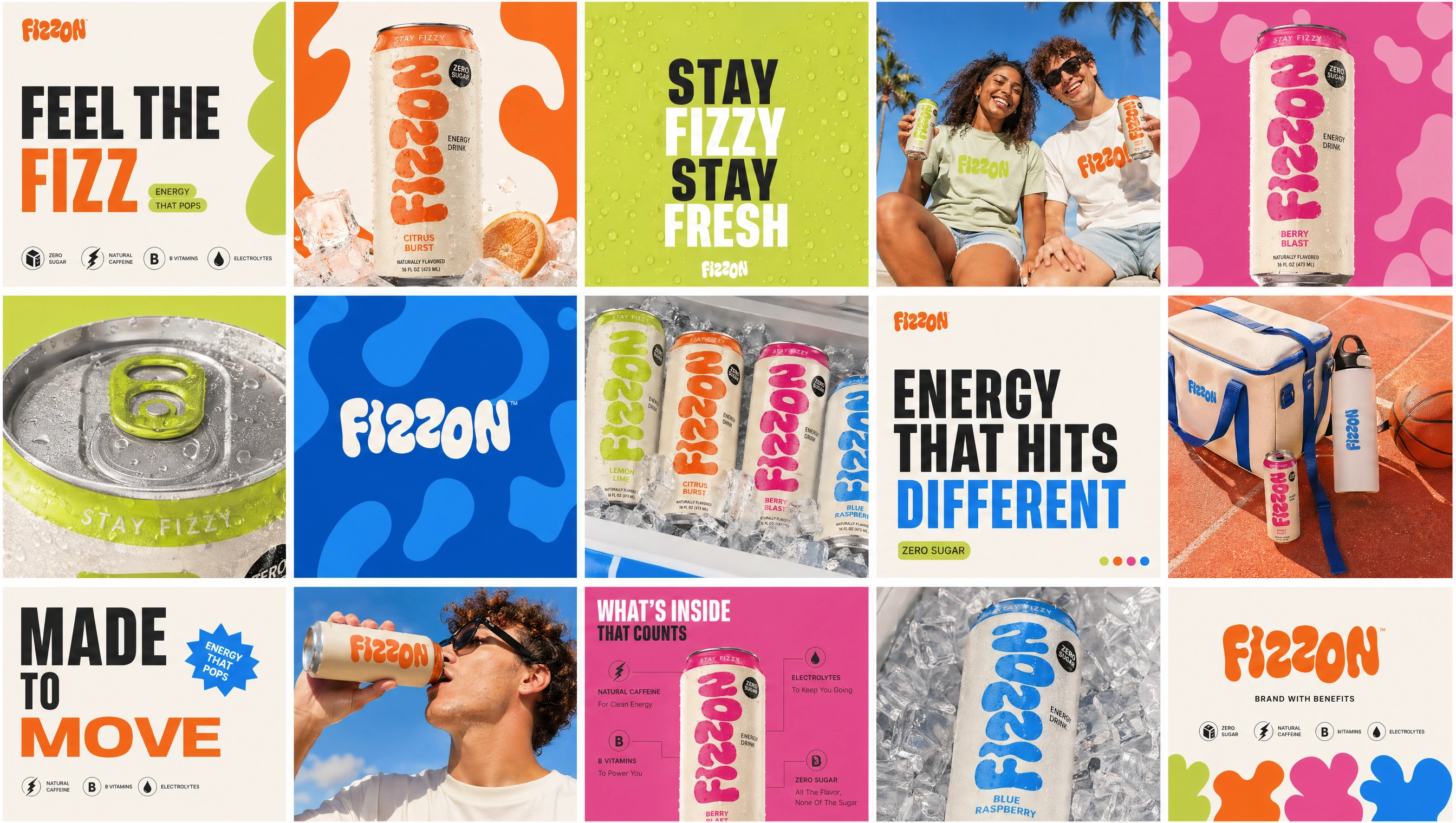
TYPOGRAPHY
A bold, rounded display type creates instant recognition, paired with clean supporting fonts for clarity and readability across applications.
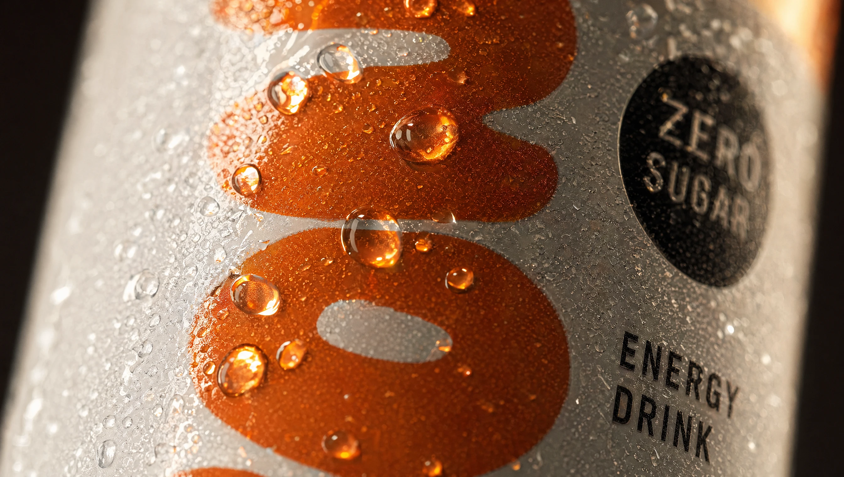
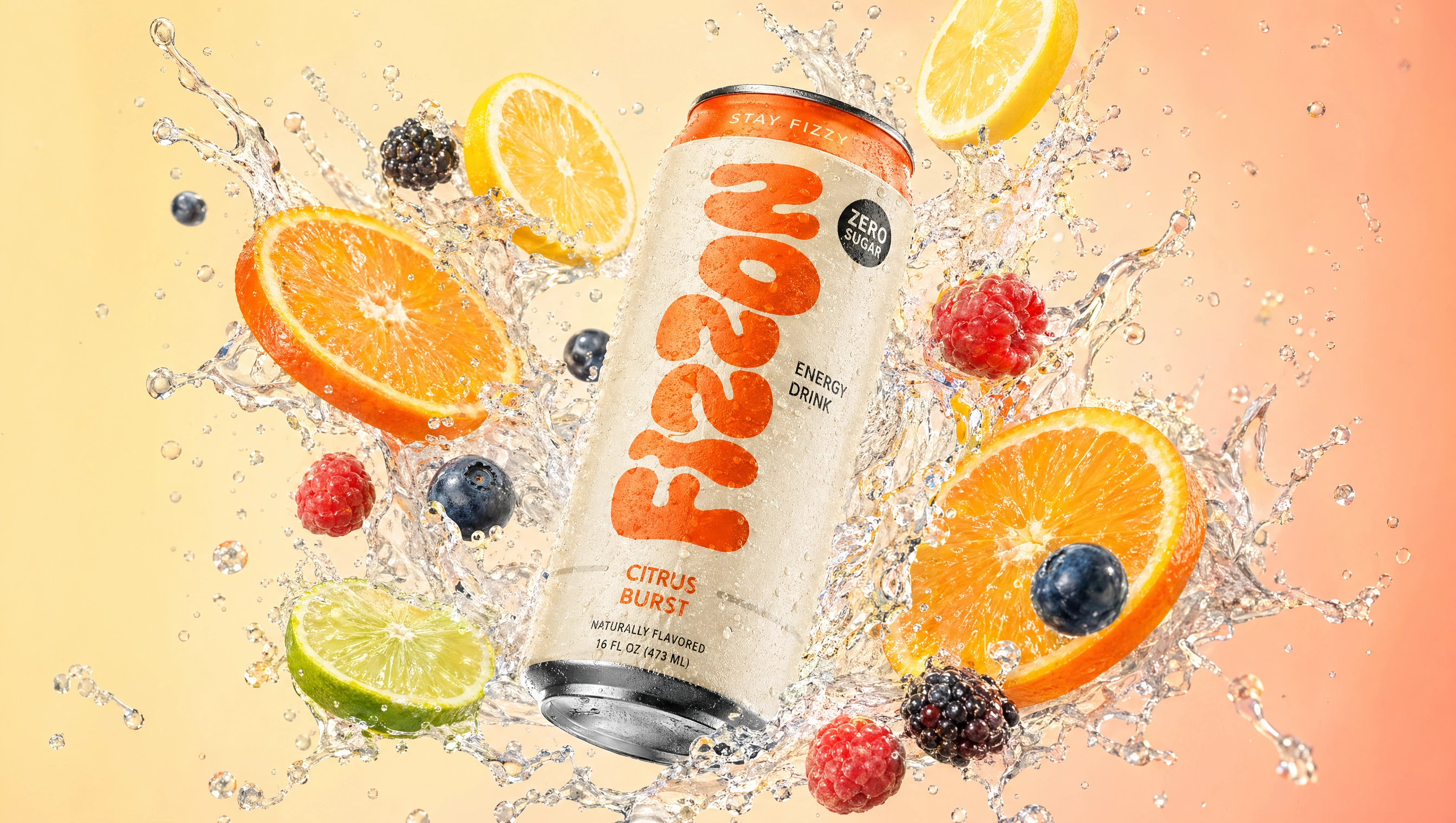
PRODUCT DETAIL
Close-up detailing highlights texture, freshness, and product realism—reinforcing the premium and refreshing feel of the drink.
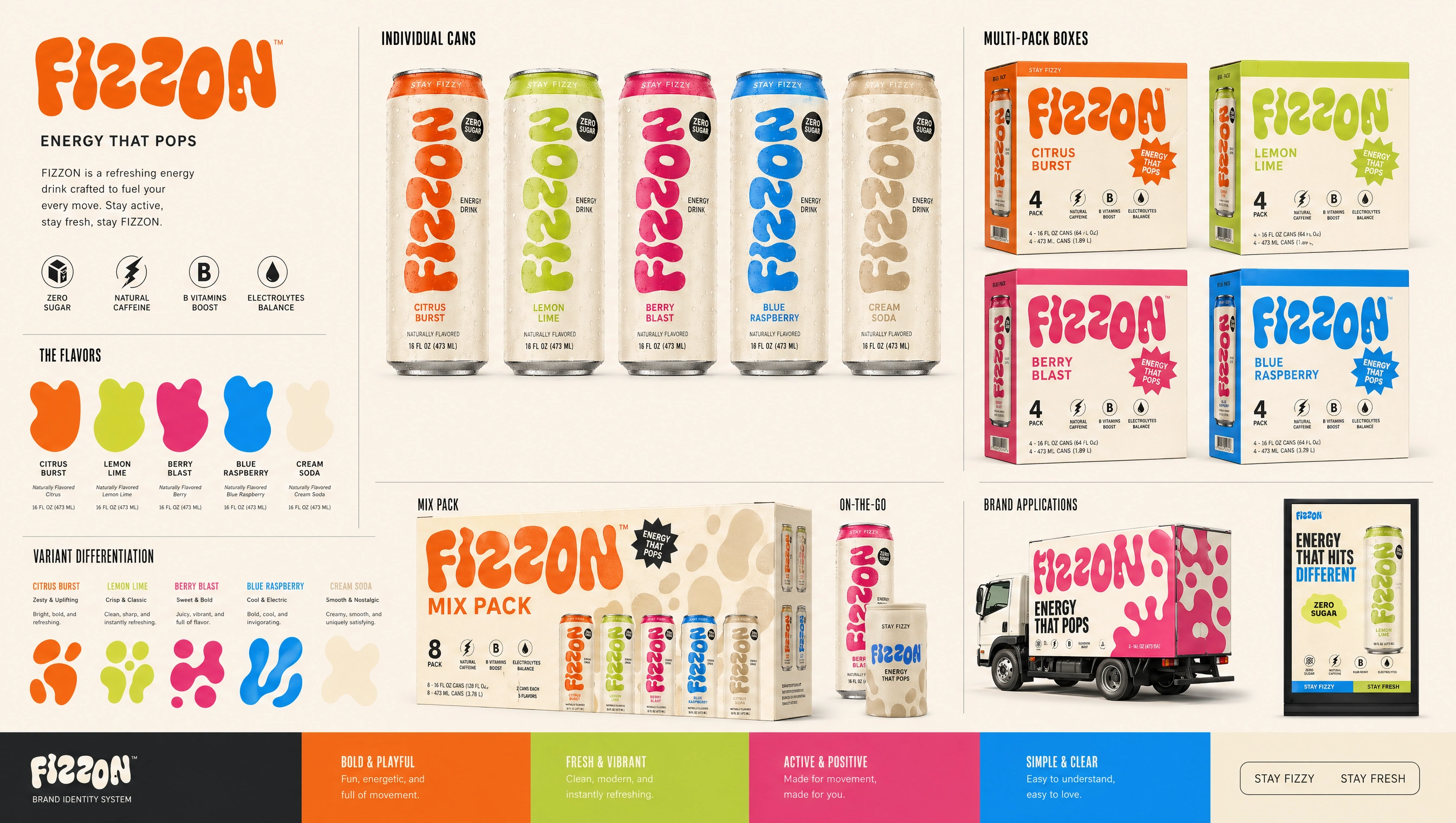
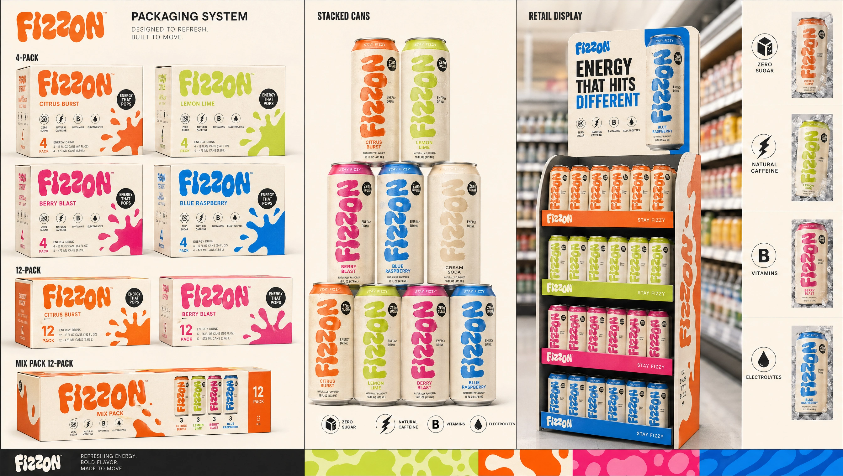
PACKAGING SYSTEM
A scalable packaging system designed for clarity and consistency across individual cans, multi-packs, and retail displays.
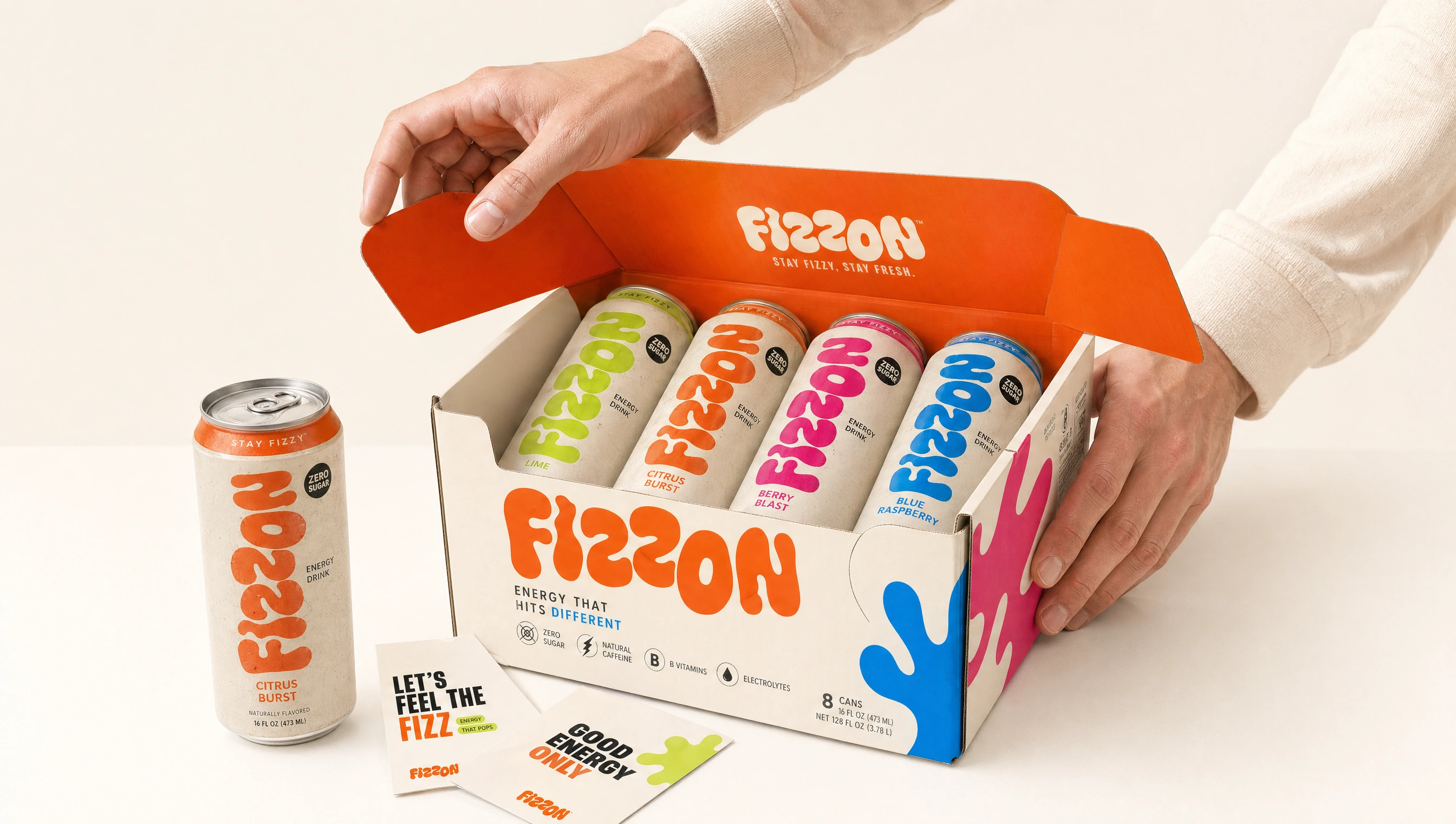
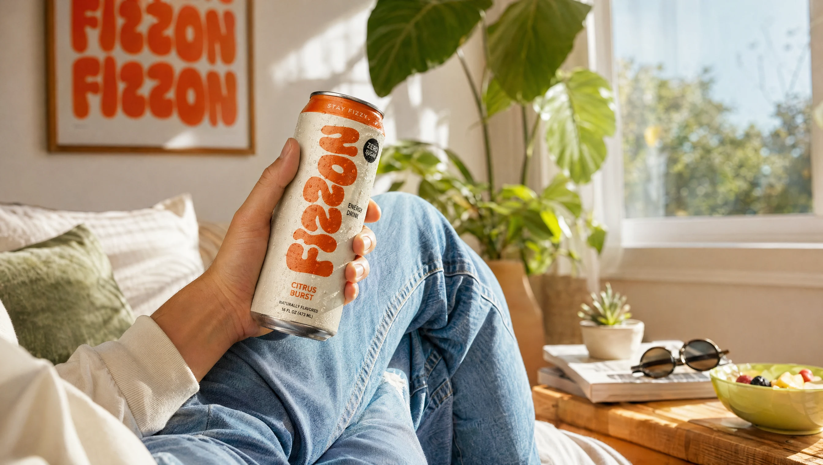
PRODUCT EXPERIENCE
Designed for real-world interaction, the packaging experience is intuitive, tactile, and visually engaging from unboxing to consumption.
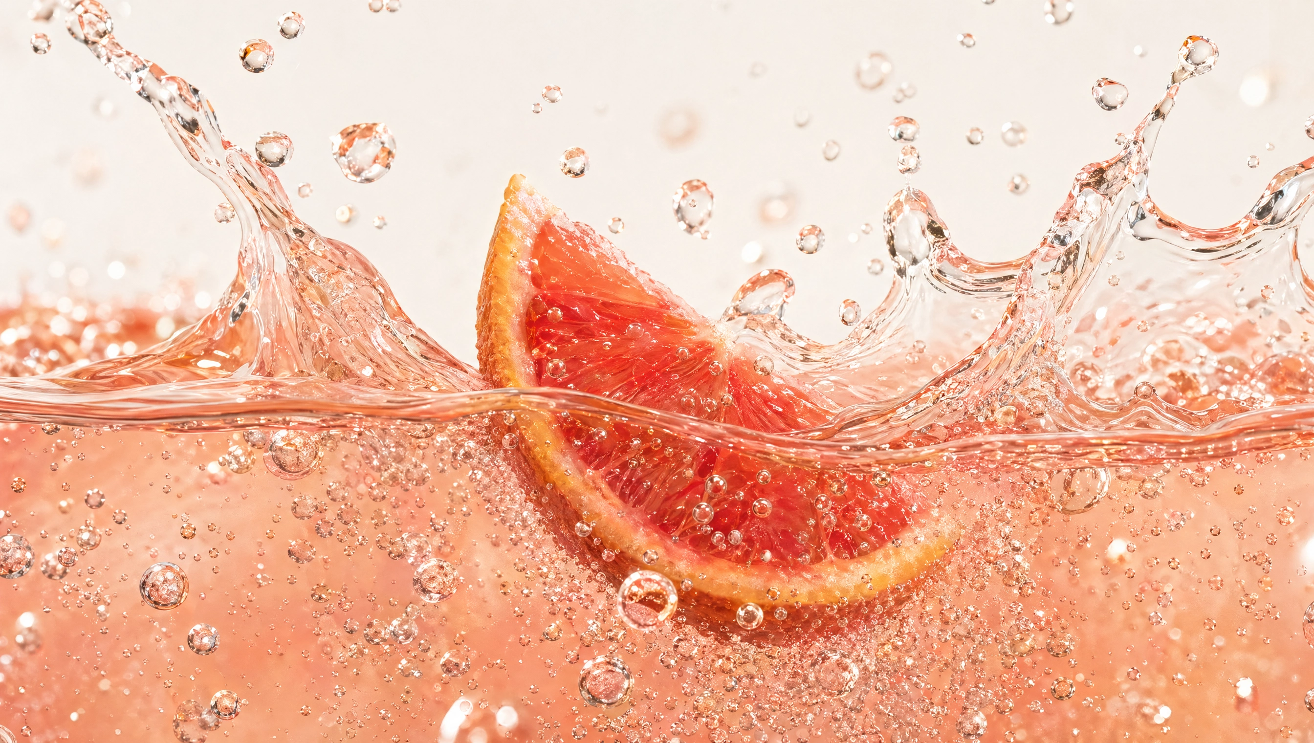
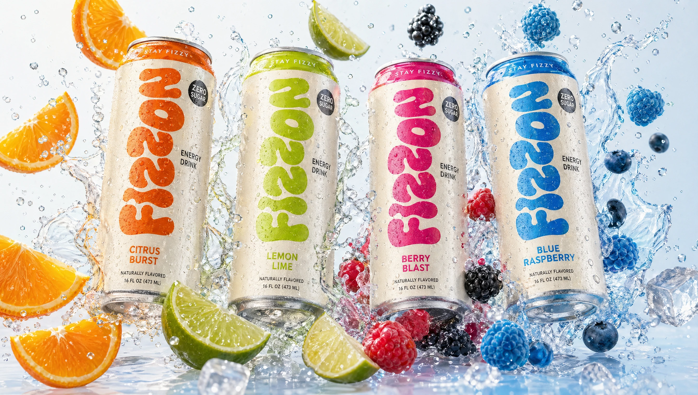
FLAVOR EXPERIENCE
Dynamic visuals bring each flavor to life—combining motion, freshness, and bold color to create an immersive sensory experience.
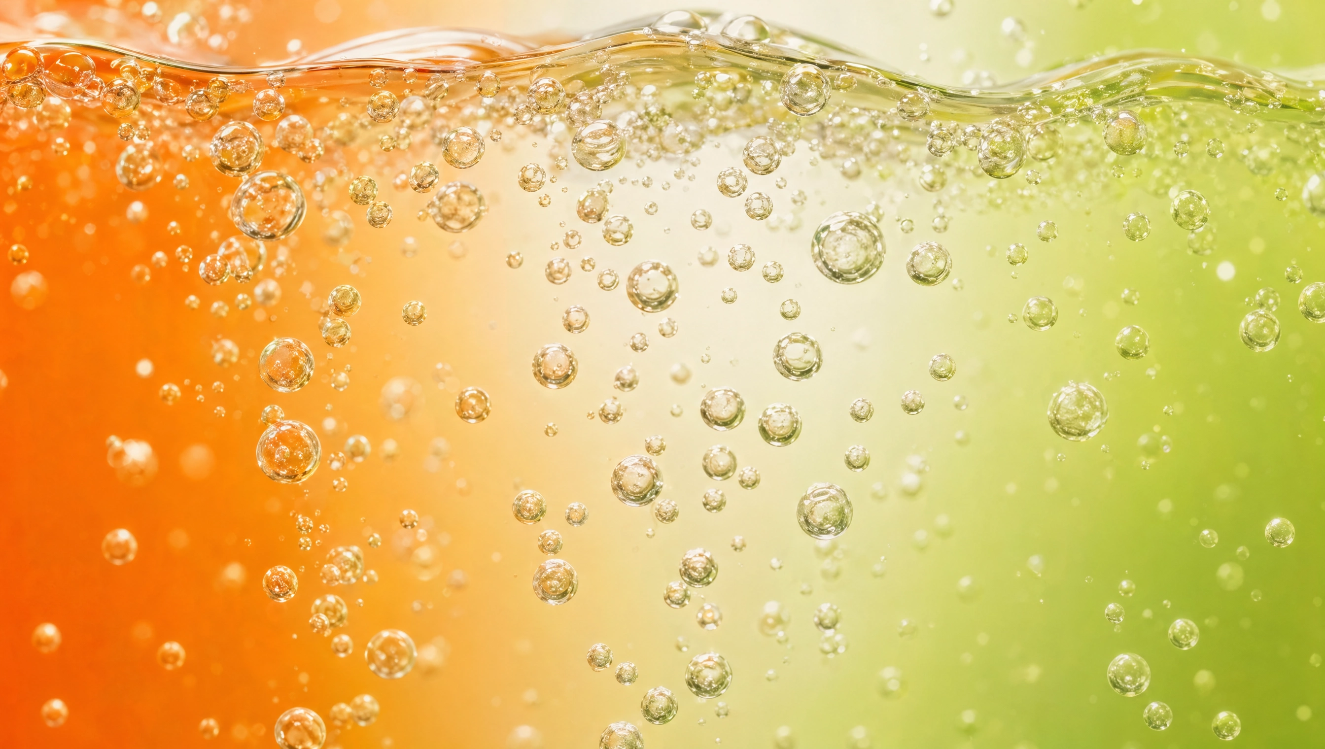
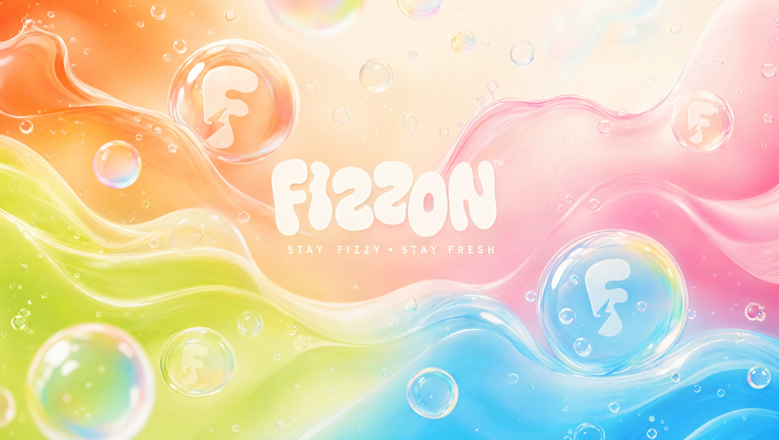
BRAND ATMOSPHERE
Fluid shapes and effervescent textures reinforce the core idea of “fizz,” adding depth and motion to the overall identity.
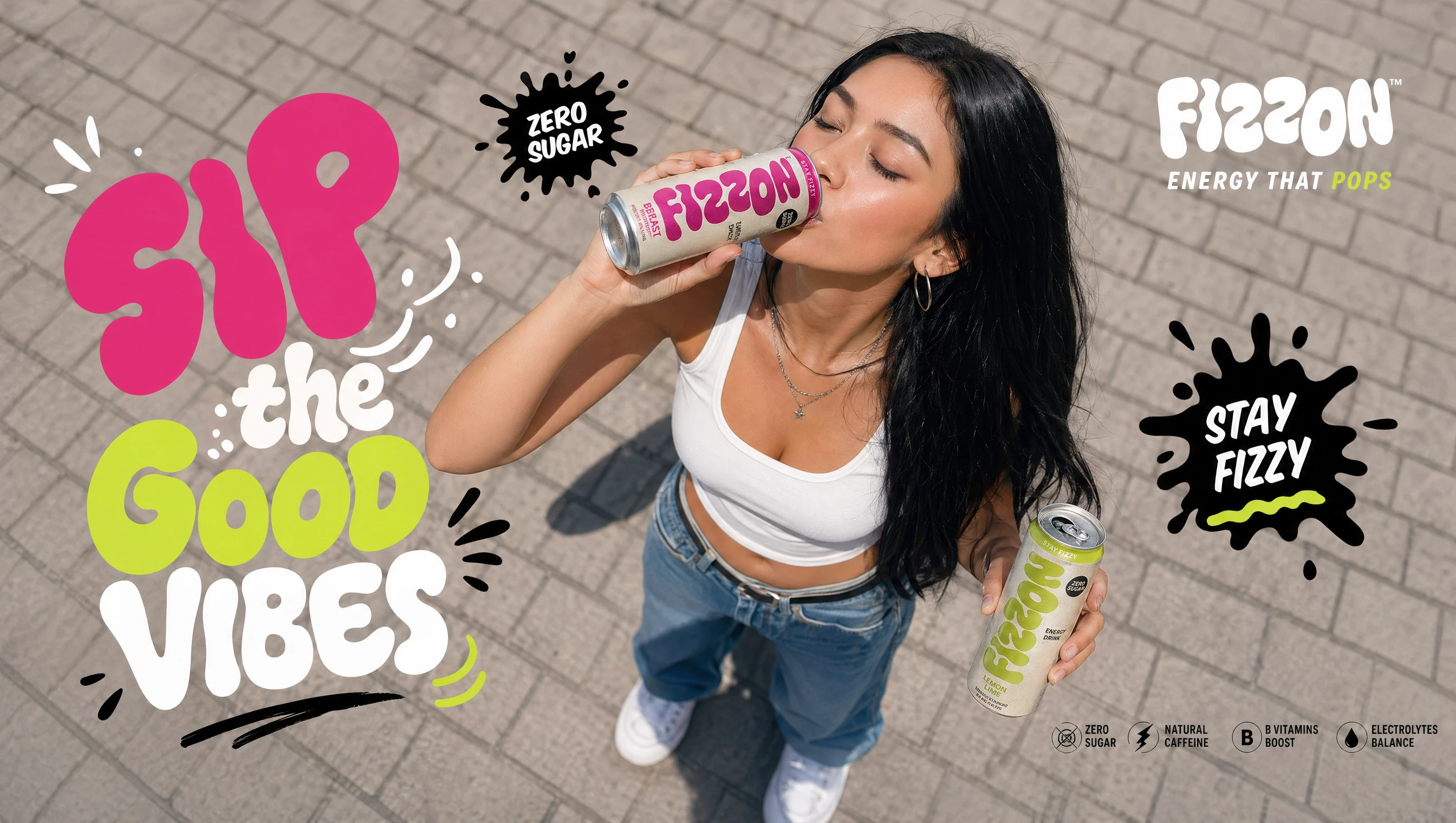
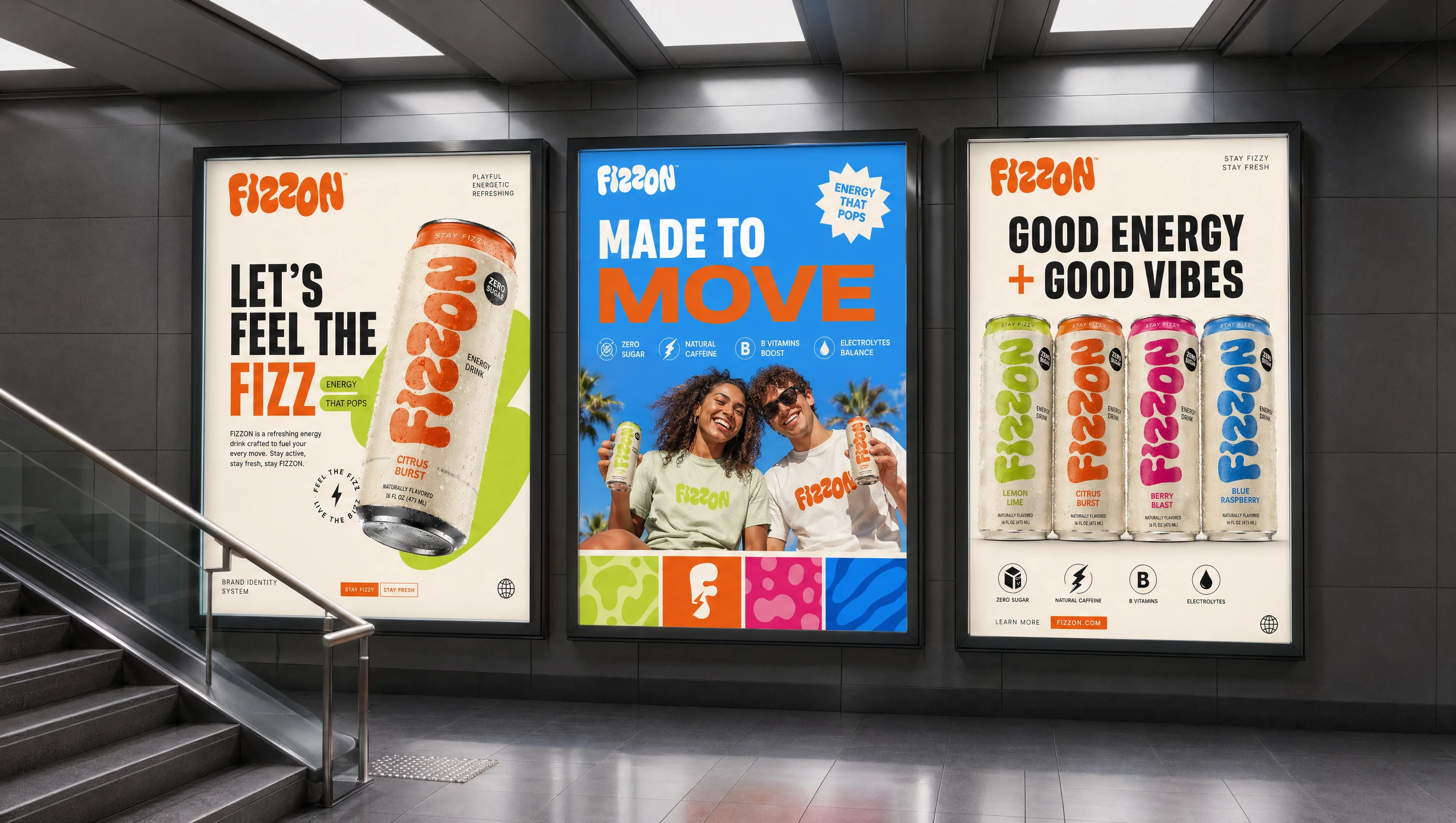
LIFESTYLE
FIZZON is built for an active, social audience—capturing moments of energy, movement, and everyday refreshment.
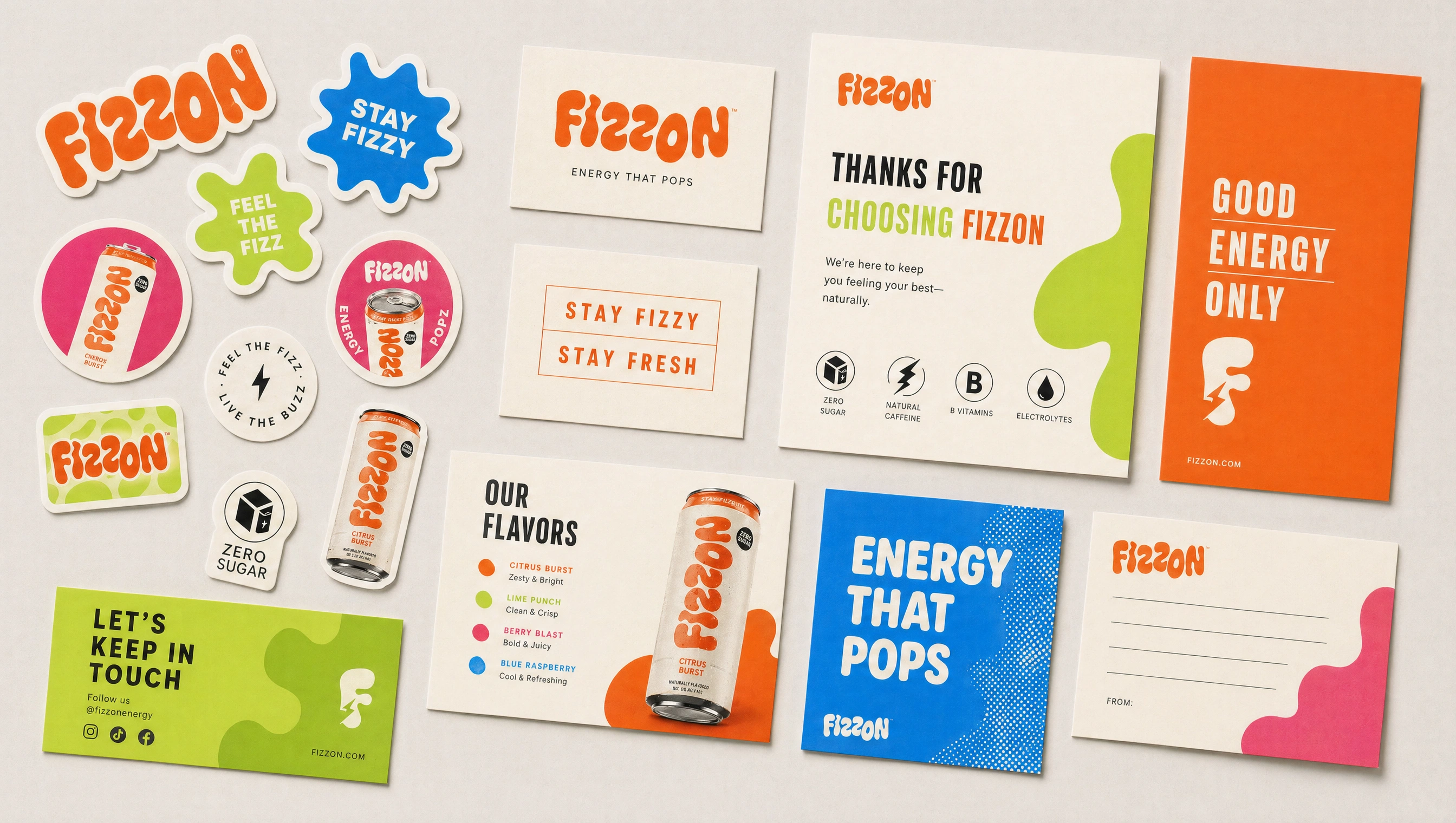
BRAND EXTENSIONS
Supporting assets extend the brand experience across digital and physical interactions while maintaining a cohesive visual language.
FIZZON
Stay Fizzy. Stay Fresh.
Like this project
Posted Apr 29, 2026
A vibrant, high-energy brand identity for FIZZON, blending bold typography, dynamic visuals, and a cohesive system across packaging, campaigns, and digital.