EMBER — Premium Hot Sauce Brand Identity
Shezaan Ansari
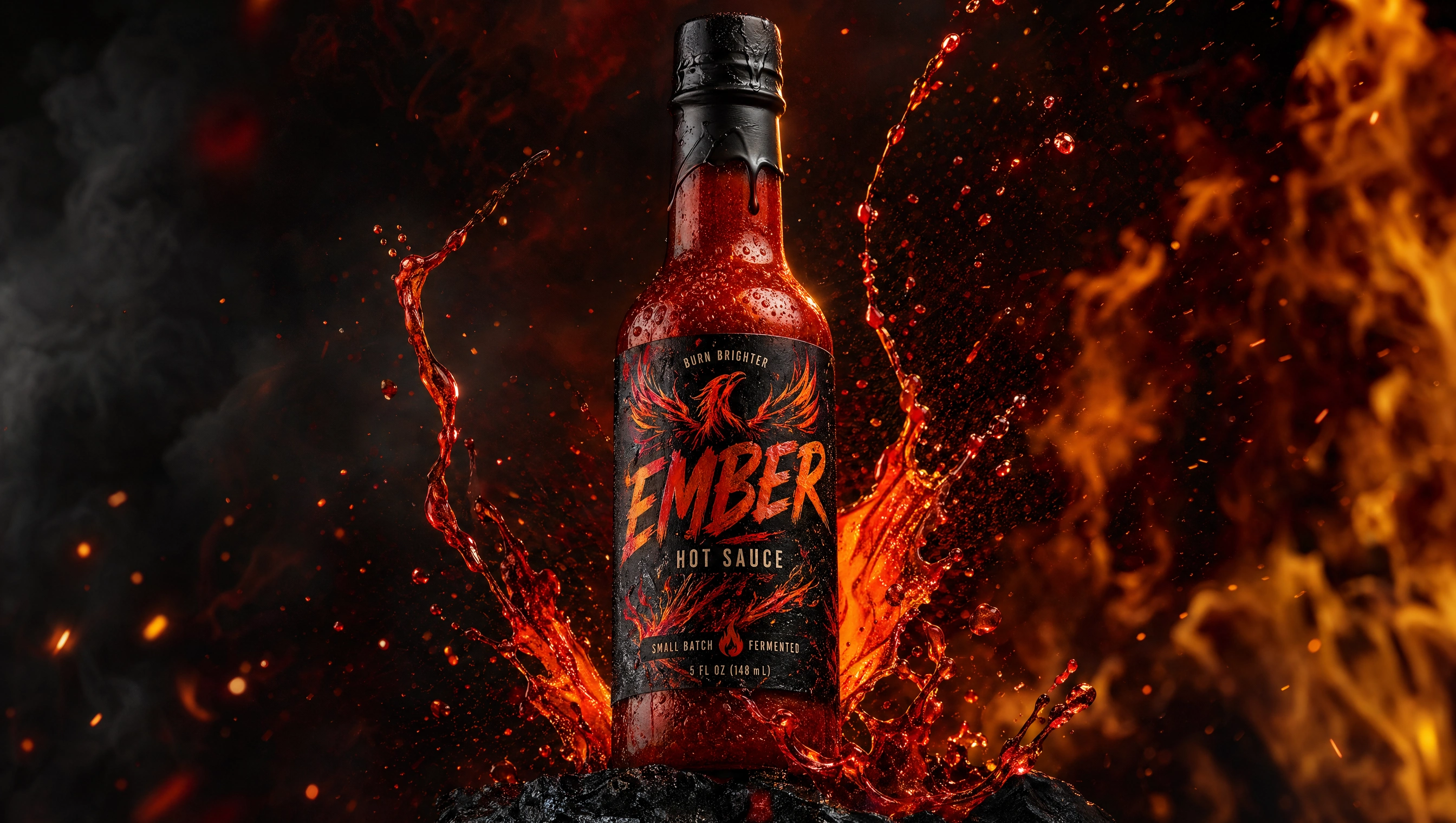
EMBER — Premium Hot Sauce
Heat with character.
Overview
EMBER is a premium hot sauce brand designed to transform heat into a bold, expressive experience.
The goal was to create a system that feels intense and energetic while maintaining a refined, high-end visual language.
Instead of relying on cliché fire imagery or exaggerated visuals, EMBER builds its identity through texture, contrast, and controlled motion.
Objective
Create a distinctive hot sauce brand that stands out in a saturated category
Balance aggression with refinement in both visuals and messaging
Develop a scalable packaging system across multiple heat levels
Design a cohesive experience across product, campaign, and retail
Brand Strategy
Positioning
A premium hot sauce for people who treat flavor as expression.
Core Idea
Heat is not just intensity—it’s personality.
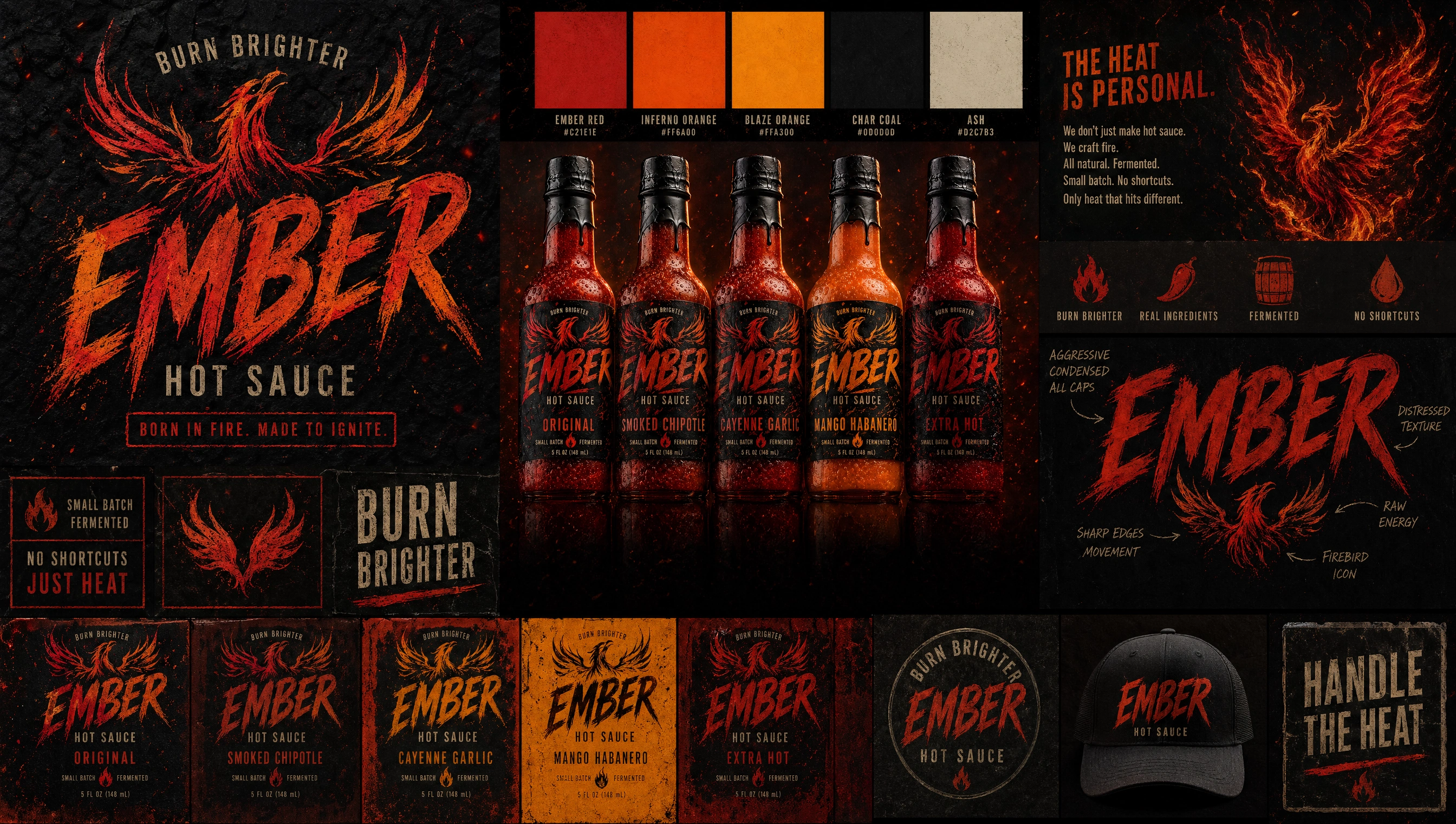
Brand Traits
Bold · Intense · Expressive · Controlled · Sensory
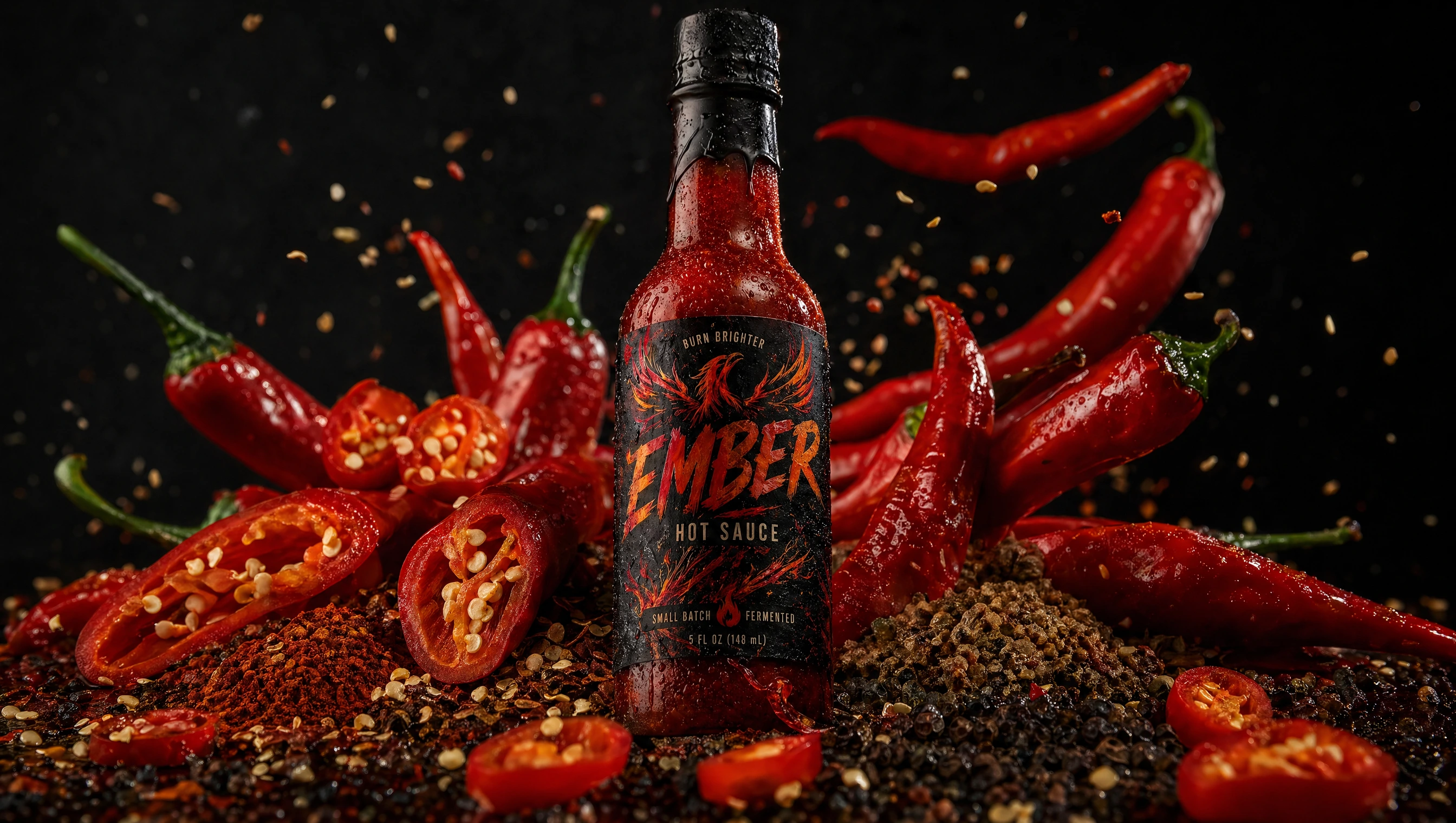
Material Language
Inspired by physical, sensory elements:
Glass bottles
Thick sauce textures
Chili surfaces and seeds
Glossy liquid motion
Every element reinforces richness and intensity.
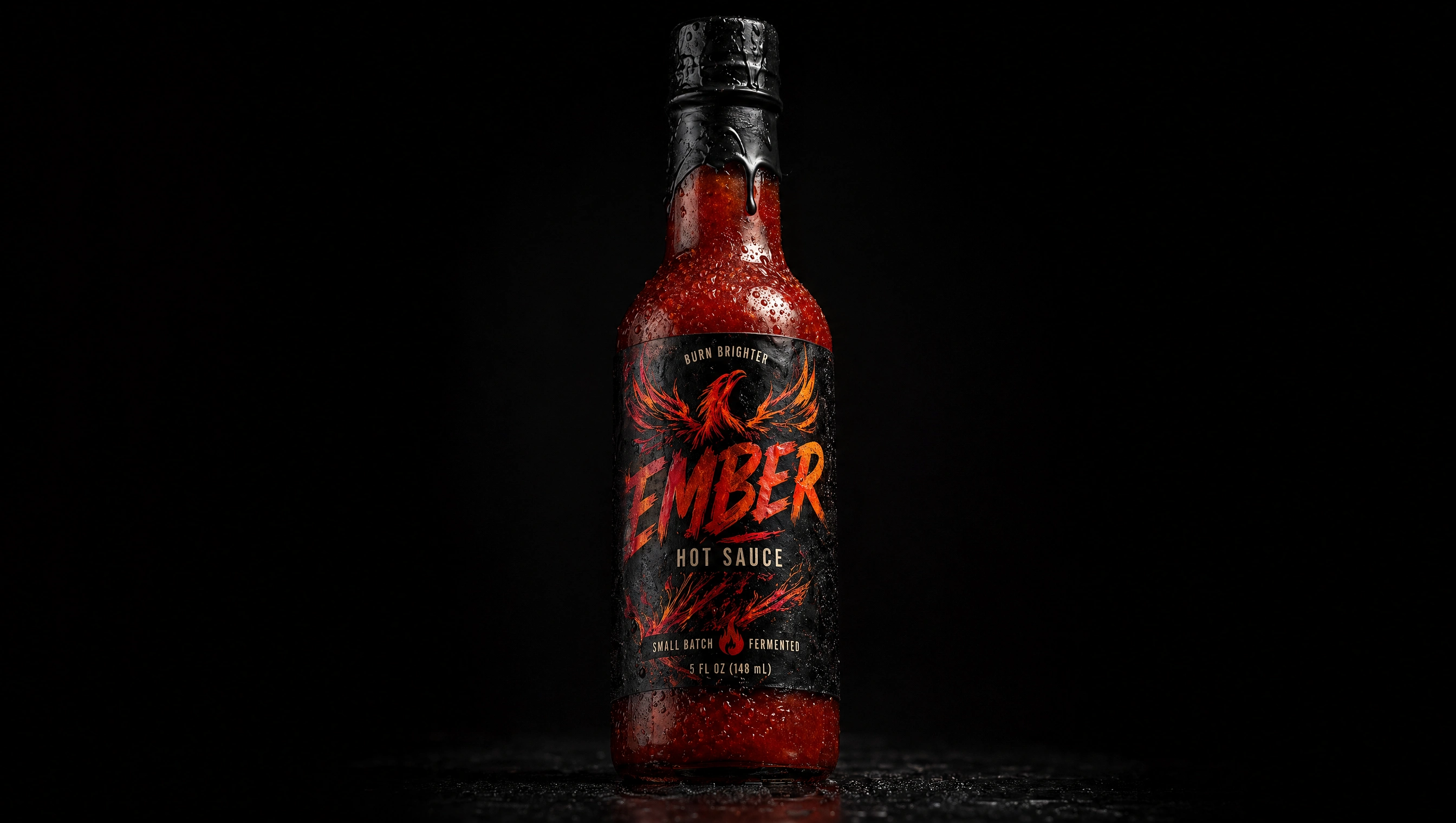
Product Design
The core product focuses on clarity and presence:
Minimal label design for maximum impact
Transparent glass to showcase the sauce
Strong silhouette for shelf recognition
The result is a product that feels confident and unmistakable.
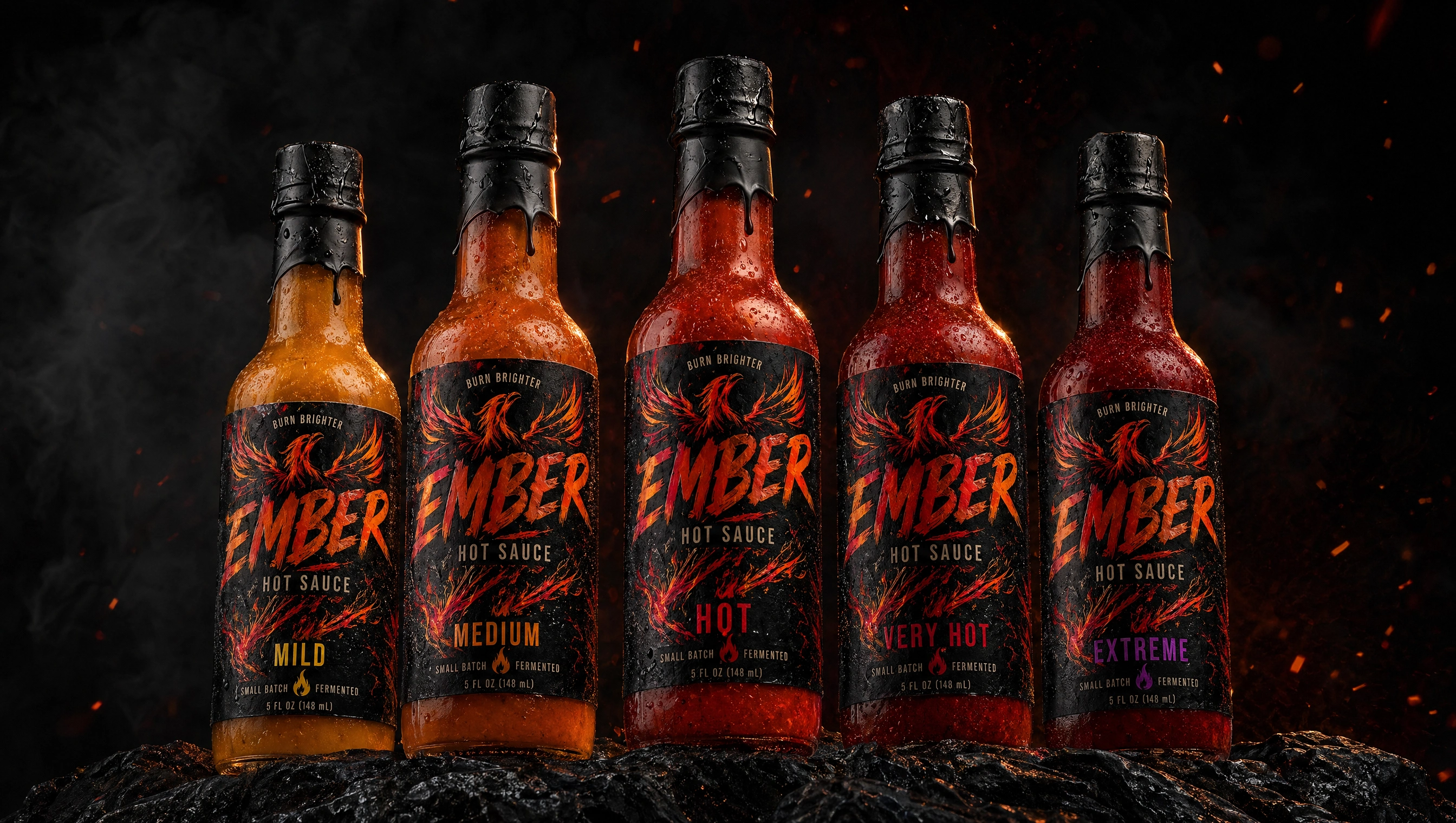
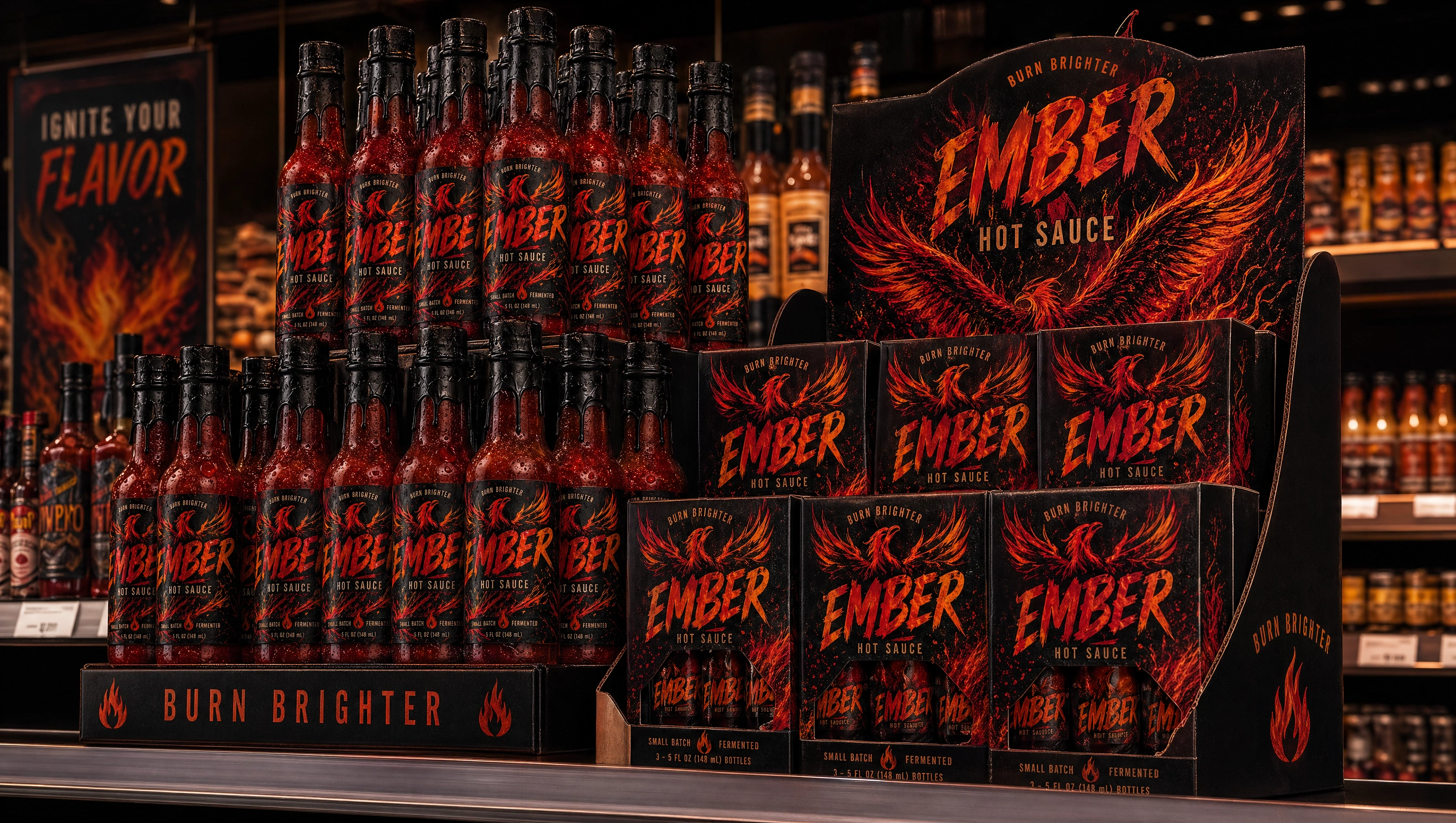
Packaging System
A scalable system built around heat levels:
Mild → Medium → Hot → Extreme
Subtle variation in color intensity
Consistent layout across all variants
Designed for:
easy recognition
strong shelf presence
clean visual hierarchy
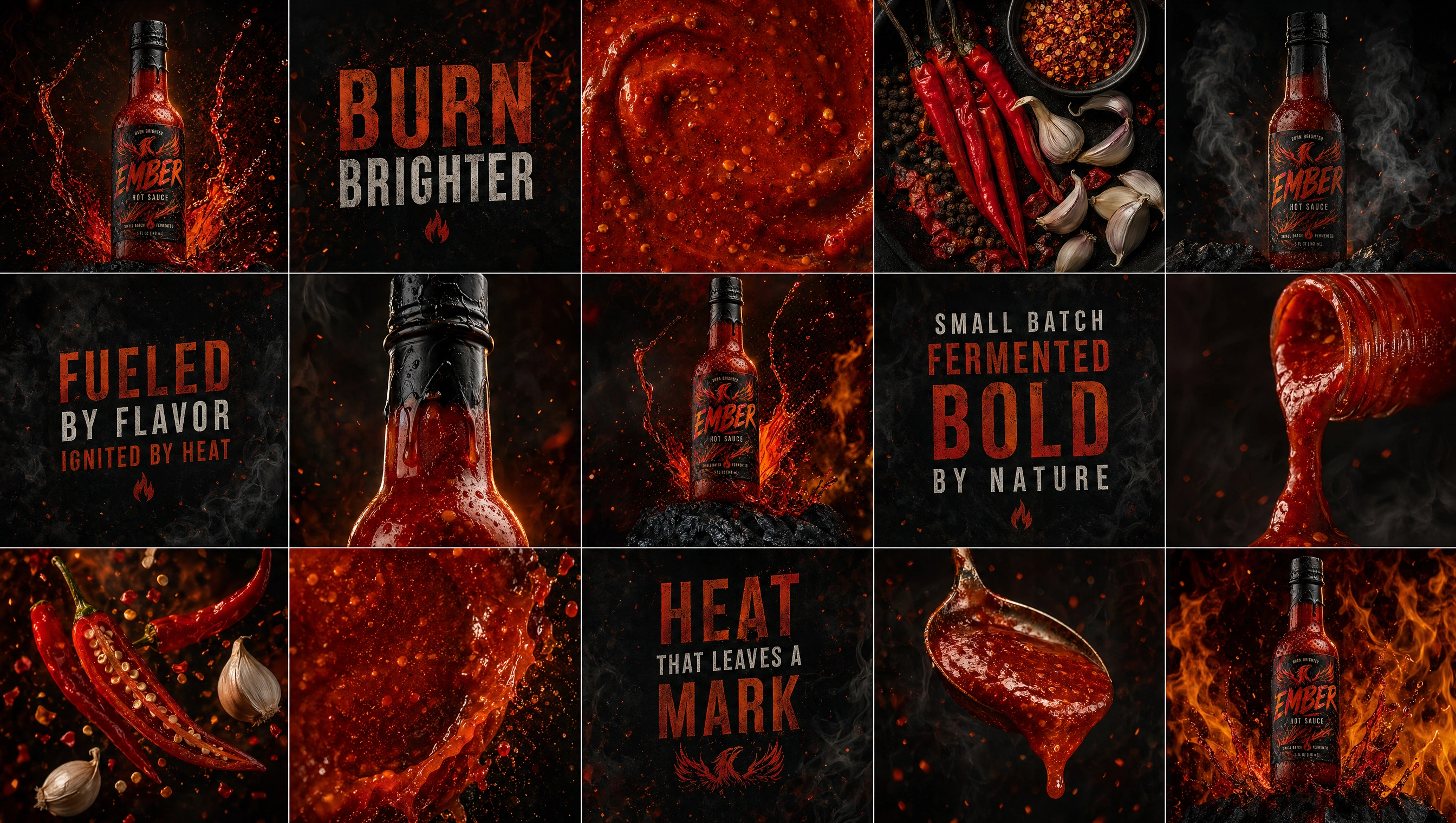
Sensory Experience
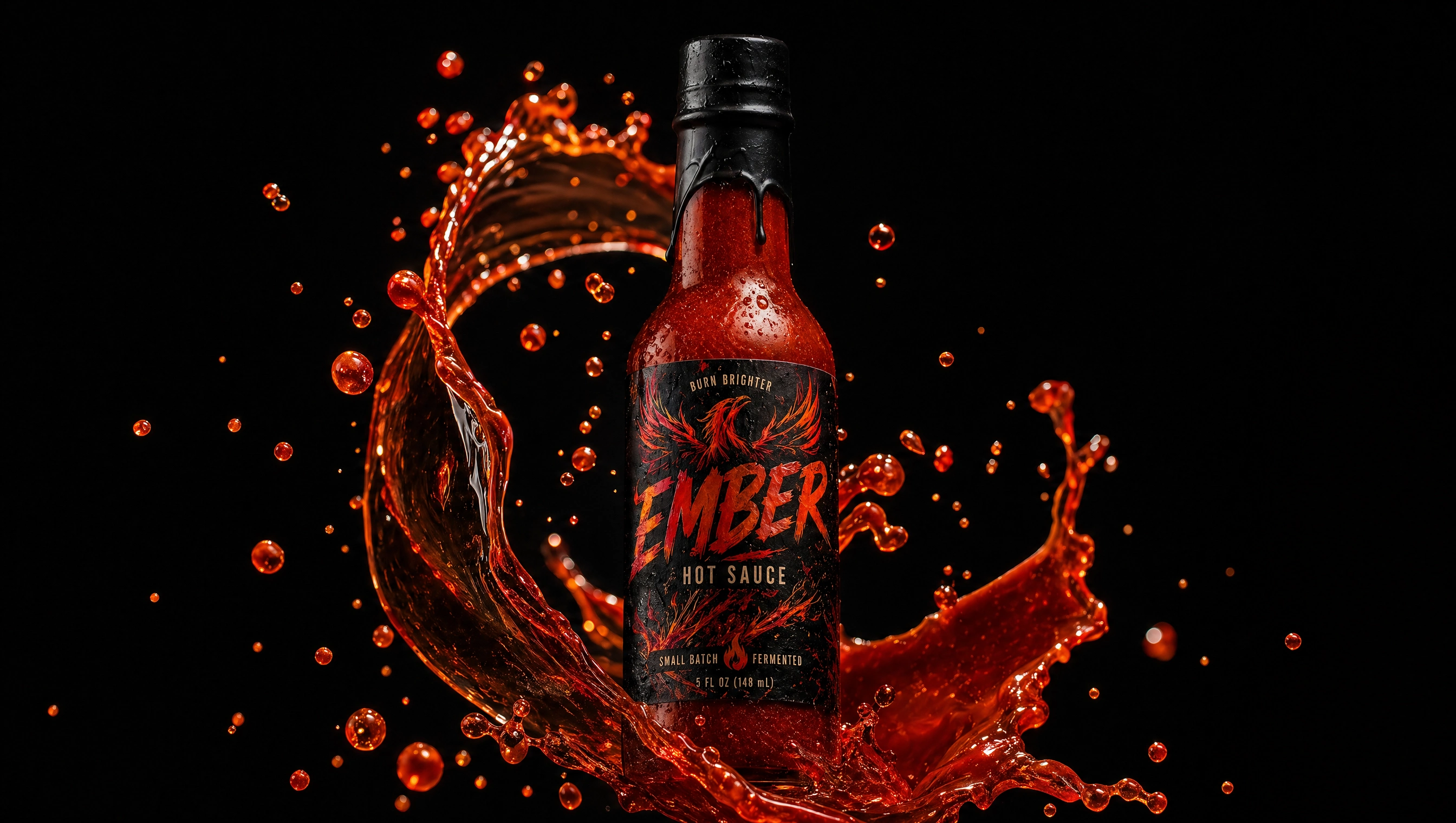
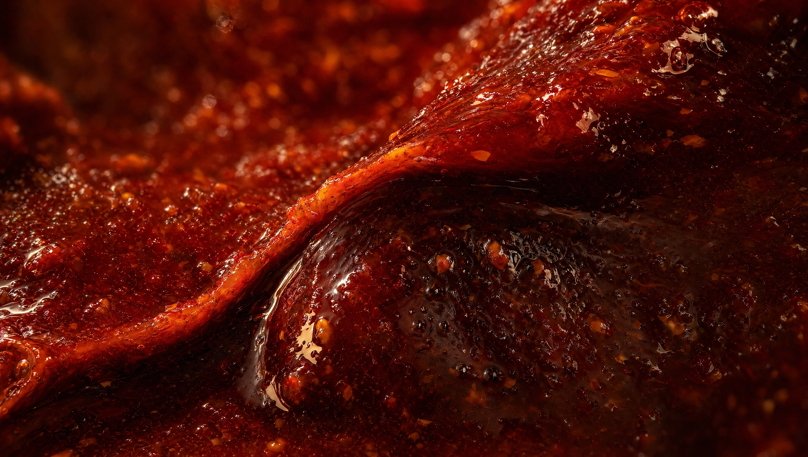
Texture & Motion
The brand emphasizes viscosity and movement:
Thick sauce flow
Controlled splashes
Glossy surfaces
These visuals replace cliché fire elements with something more tactile and real.
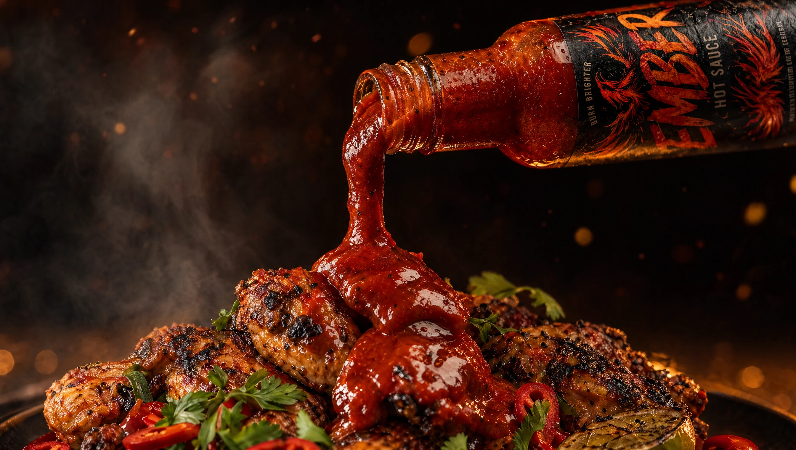
Product Interaction
The brand experience extends into real usage:
Sauce being poured
Dripping over food
Close-up consumption moments
These interactions reinforce:
desirability, realism, and appetite appeal.
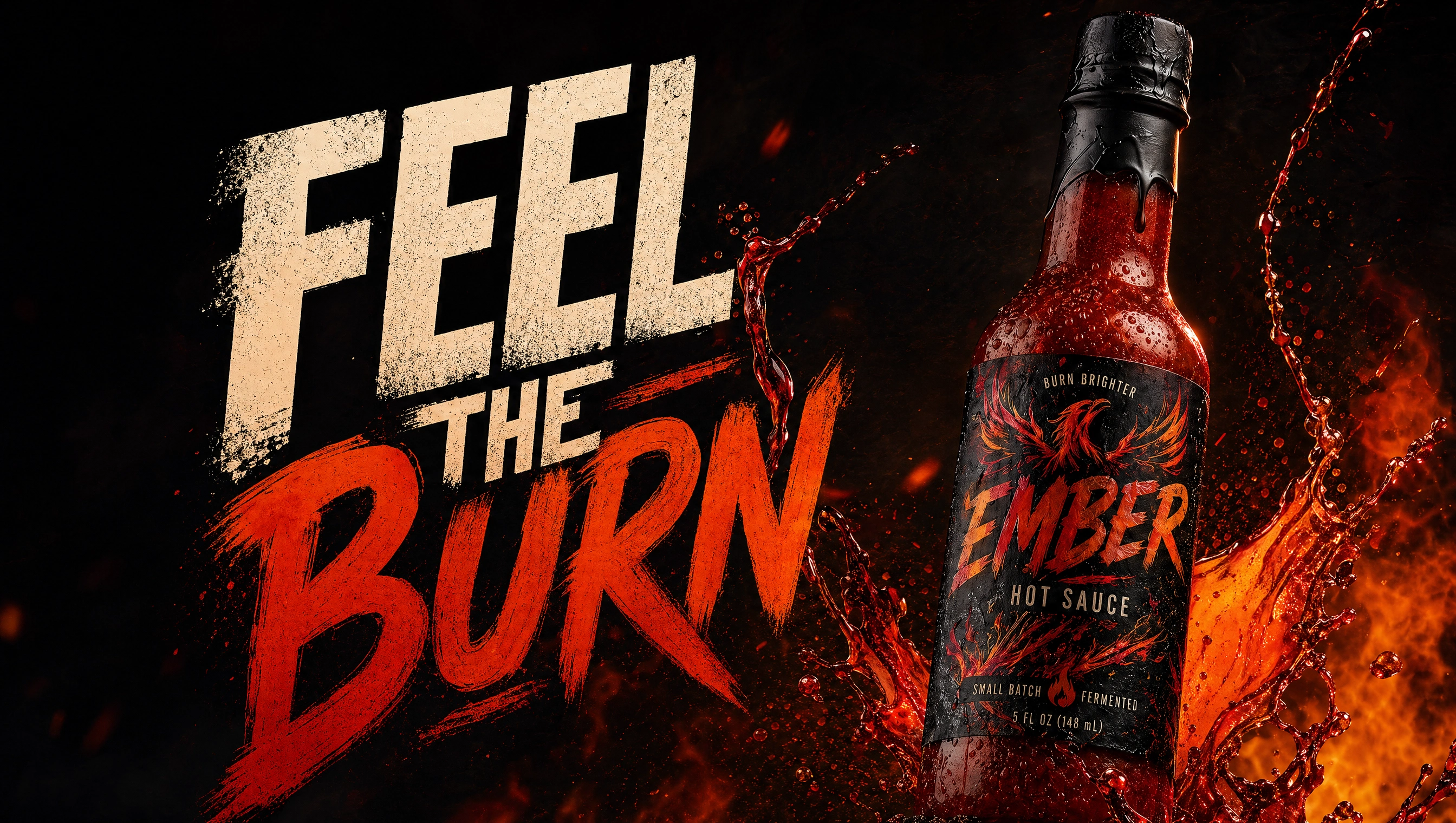
Campaign Direction
The messaging is sharp and direct:
“Feel the Burn”
“Built for Heat”
“Turn Up the Flavor”
Typography is bold, often pushing or breaking layout boundaries to reflect energy.
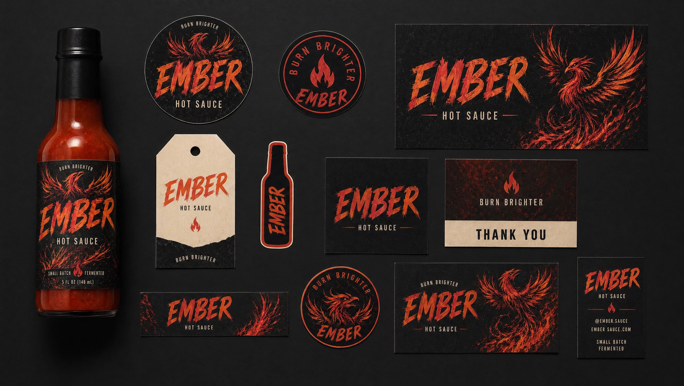
Brand Applications
The system extends across:
Retail displays
Posters
Packaging systems
Digital assets
Maintaining consistency while adapting to different environments.
Outcome
EMBER stands as a premium, expressive hot sauce brand that redefines how heat is communicated visually.
By focusing on texture, motion, and restraint, the brand achieves impact without relying on overused visual clichés.

Like this project
Posted Apr 29, 2026
A bold, high-contrast hot sauce brand blending rich textures, dynamic motion, and a refined visual system built around heat, flavor, and attitude.