Apotheek Maertens
Marcos Silfa
Project Overview
Apotheek Maertens is a pharmacy chain based in Belgium.
The project focused on developing a clear and consistent brand identity system while maintaining recognisability in a highly standardised sector. Rather than replacing familiar elements, the branding work refined them into a modular system centred around each pharmacy’s name, designed to work across physical spaces, digital platforms, and packaging.
The scope of work included brand identity design, logo system development, brand guidelines, website design, and packaging for in-house dietary supplements.

Brand Identity
The brand identity for Apotheek Maertens is built around a clear and recognisable symbol: the pharmacy cross.
The visual system is based on a modular cross shape designed to function consistently across multiple applications and pharmacy locations. Its simplicity allows the identity to remain flexible while maintaining a strong and trustworthy presence in both physical and digital environments.
The use of a reduced colour palette and geometric forms reinforces clarity and legibility, supporting the brand’s role as an accessible and professional healthcare provider.
Symbol flexibility
The cross was developed as a modular symbol system, allowing multiple visual configurations without losing recognition.
Solid and hollow versions ensure correct reproduction across different applications, including embroidery, single-colour printing, and low-resolution environments.
Colour, black, and grayscale variations were defined to guarantee consistency and legibility across digital and physical touchpoints.
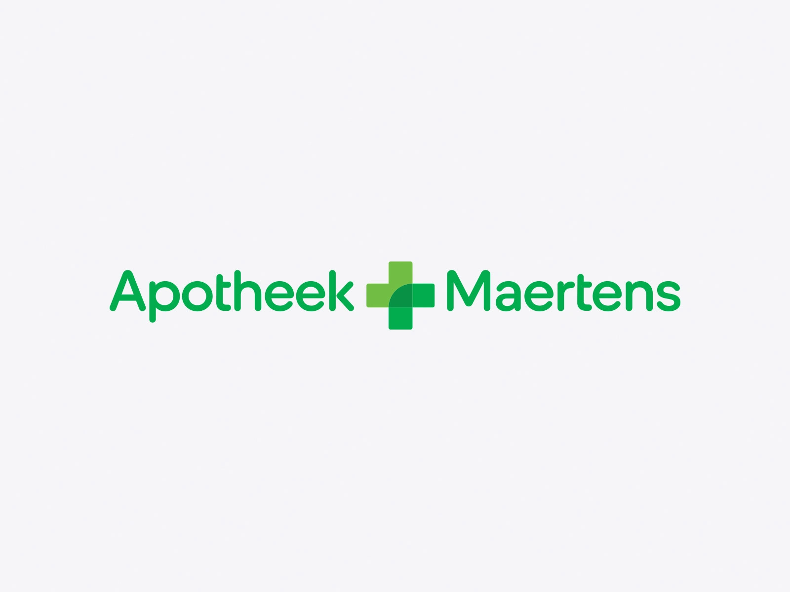
Primary logo
The main wordmark combines the modular cross symbol with the pharmacy name.
The logotype is based on the brand’s core typography, with subtle custom adjustments to improve balance, legibility, and character. Rounded forms were emphasised to create a warmer, more approachable appearance and to ensure a natural connection between the wordmark and the symbol.
This version serves as the reference point for all logo variations within the identity system.
Logo system
A modular logo system was created to support multiple pharmacy locations under a single visual identity.
The “Apotheek +” naming structure remains consistent, while the pharmacy name adapts per location, ensuring clarity, recognition, and brand cohesion across all touchpoints.
Typography
The typographic system is based on Duplet Rounded, selected for its open shapes, rounded terminals, and high legibility across digital and physical environments.
Its friendly yet professional character supports the healthcare context, ensuring clarity in informational content while maintaining a warm and approachable tone across the brand.
Colour System
A reduced and functional colour palette was developed to reinforce clarity, trust, and consistency across all brand applications.
The system is built around a primary green, supported by secondary tones and neutral colours, allowing flexibility while maintaining strong recognition in both digital and physical environments.
Website — Desktop version
Website — Mobile version
Web Design
The website design translates the brand system into a clear and accessible digital experience.
Simple navigation and intuitive interactions were prioritised to support a wide range of users, from younger audiences to older visitors, while maintaining consistency across devices.
Brand Applications
The identity system was applied across a range of physical and printed materials, ensuring clarity, consistency, and recognisability in real-world contexts.
Packaging System
A modular packaging system was developed to support a growing range of in-house dietary supplements.
The system ensures scalability while maintaining a cohesive and recognisable visual language across all products.
This approach allows new products to be added without compromising clarity or brand consistency.
Like this project
Posted Dec 25, 2025
Brand identity system for a Belgian pharmacy chain, designed to work consistently across physical spaces, digital platforms and in-house products.