Sanaraíz Foods – Brand Identity & Packaging Design
Marcos Silfa
(Mood footage)
Project Overview
Sanaraíz Foods is a natural, additive-free food brand in a highly saturated Spanish market.
The project developed a clear and scalable identity and packaging system focused on trust and differentiation.
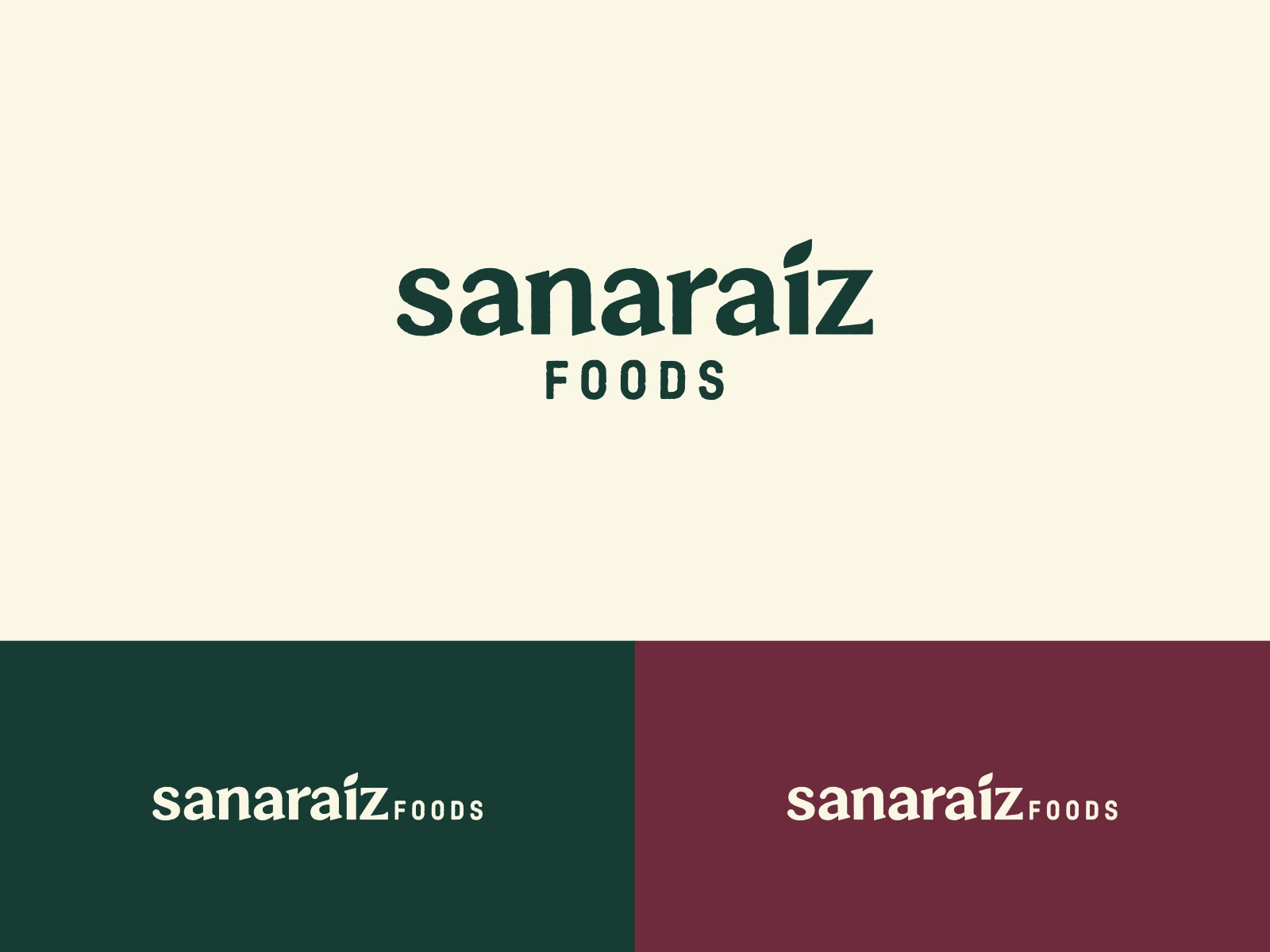
Brand Identity
A distinctive wordmark with handcrafted edges and a leaf integrated into the “I” reflects the brand’s commitment to natural, wholesome ingredients.
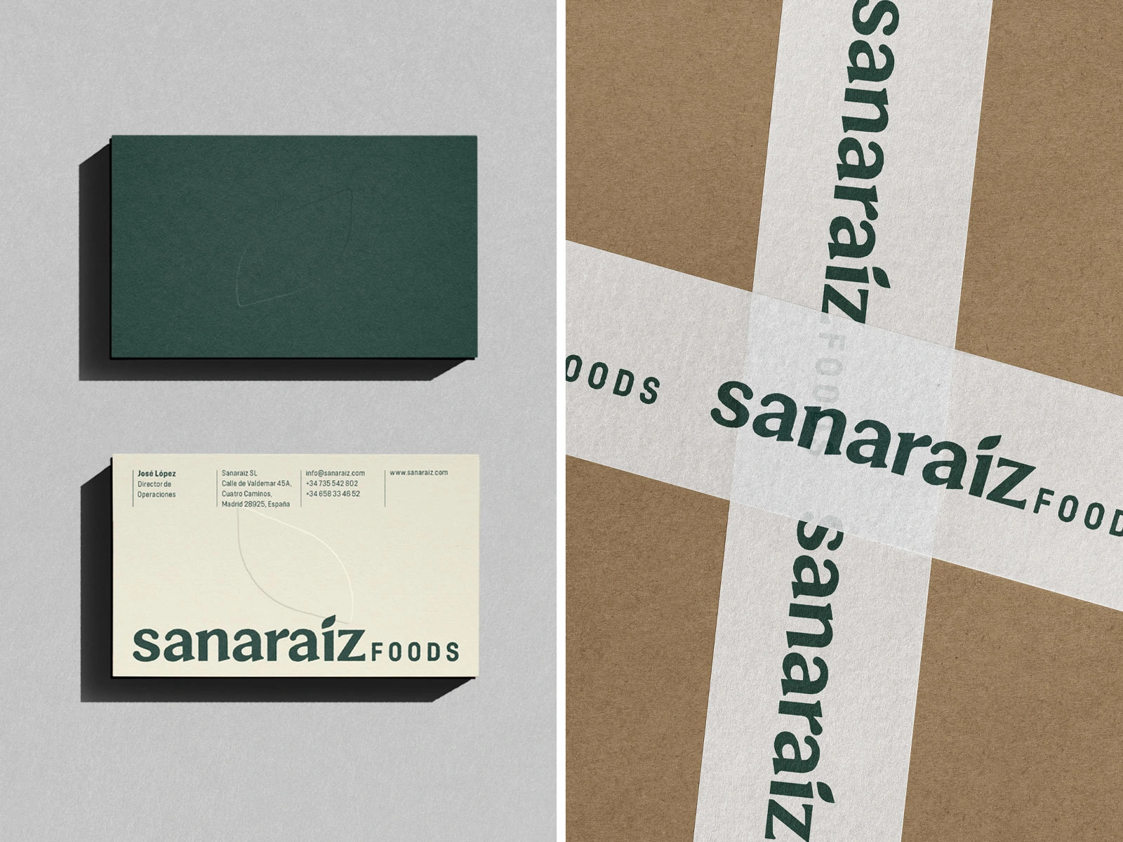
Logo Applications
The identity adapts seamlessly across real-world applications, maintaining clarity and character across materials.
Visual System
A flexible visual system built from a warm natural palette, rustic textures, and a custom iconography set that adapts across products and categories.
Storytelling & Illustration
Illustrated characters introduce their ingredients with warmth and humour, reinforcing brand personality and creating an emotional connection with consumers.
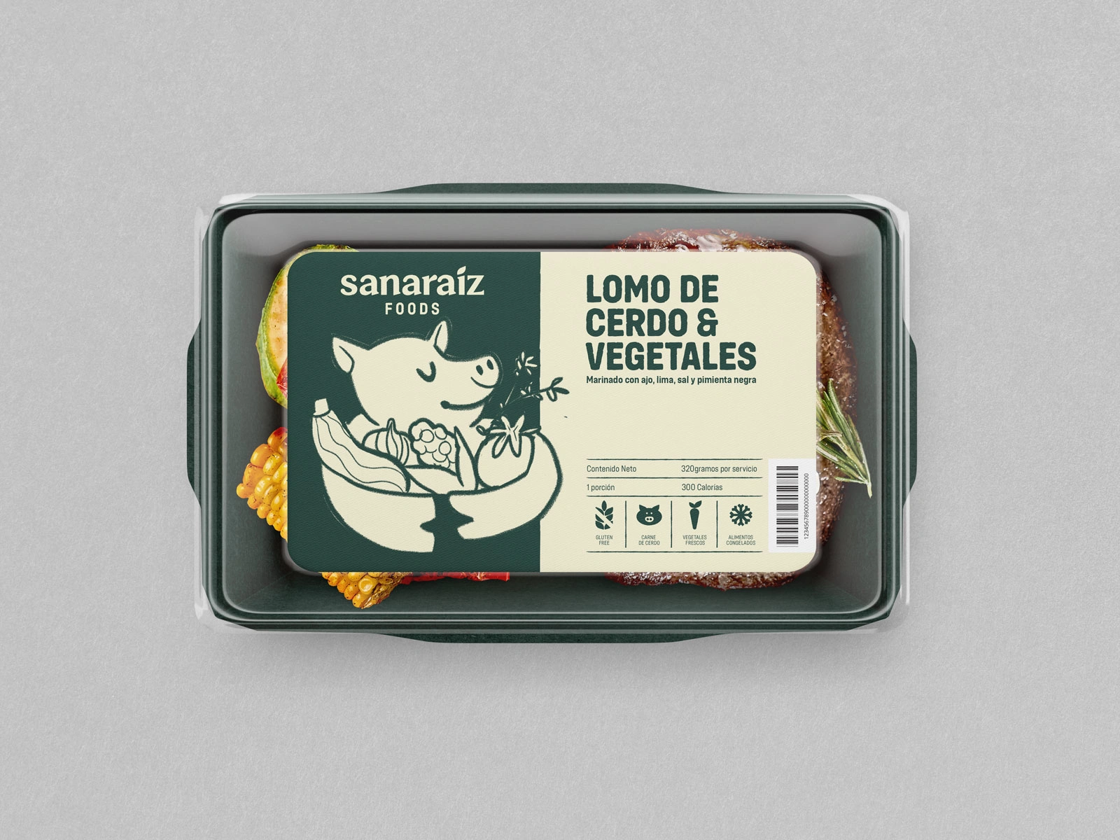
Packaging Direction
The label system blends illustration with clear hierarchy, functional iconography, and warm colour coding, ensuring clarity and shelf impact.
Packaging System
A cohesive and scalable structure that adapts across proteins and flavour profiles while maintaining a unified brand presence.
Brand Applications
Extended brand applications demonstrate how the identity system scales across logistics, merchandise, and production touchpoints.
Like this project
Posted Dec 11, 2025
A cohesive brand and packaging system that strengthened the brand’s identity and established a clear visual direction for future product lines.
Likes
4
Views
25
Timeline
Dec 20, 2024 - Feb 10, 2025