Casa Bação Charcutarie Idendity
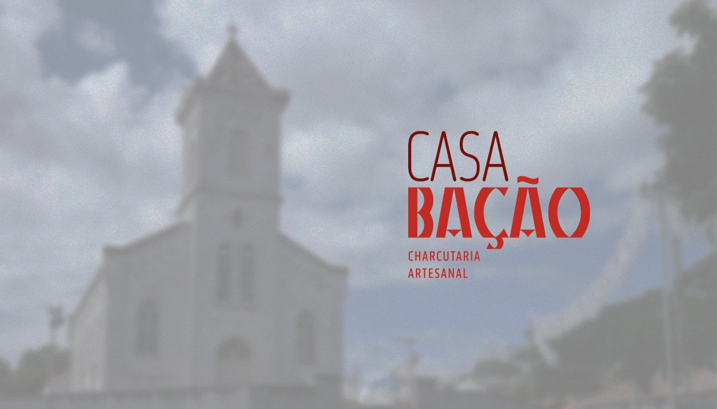
Casa Bação is an artisan charcuterie and inn located in the district of São Gonçalo do Bação, located in the municipality of Itabirito in Minas Gerais. The village of Bação emerged during the Gold Cycle, in the 18th century, and preserves its culture and tradition through its small population and its main symbol: the Mother Church.
-
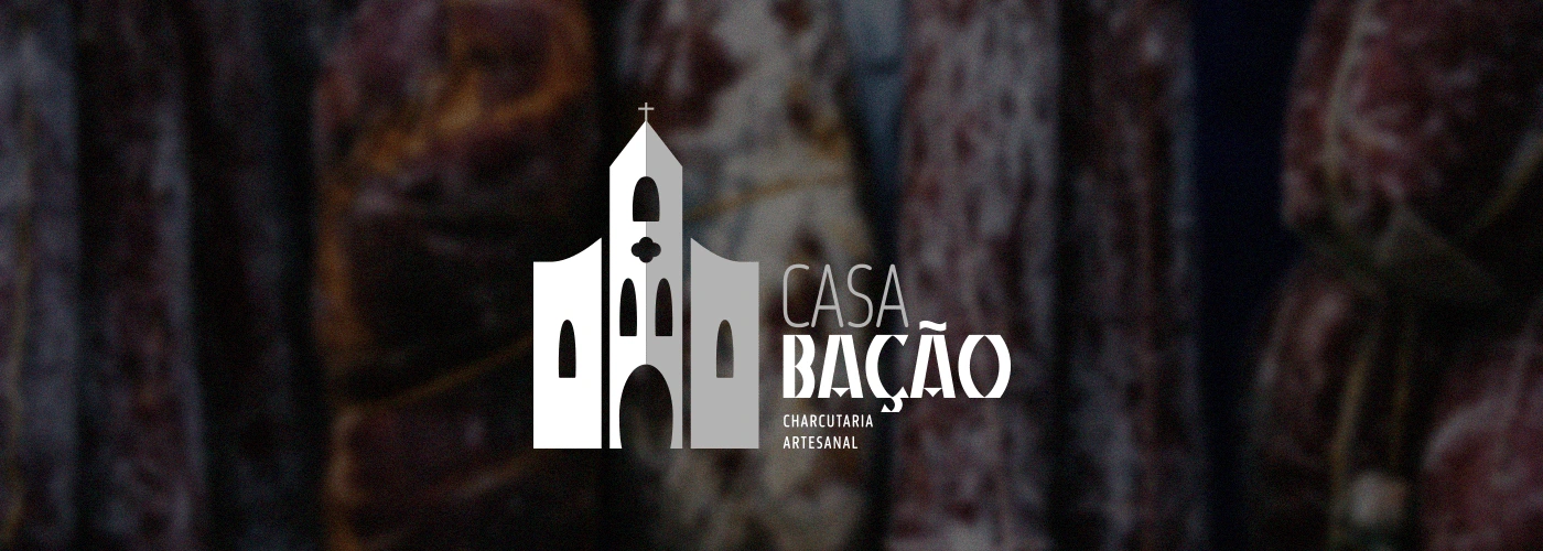
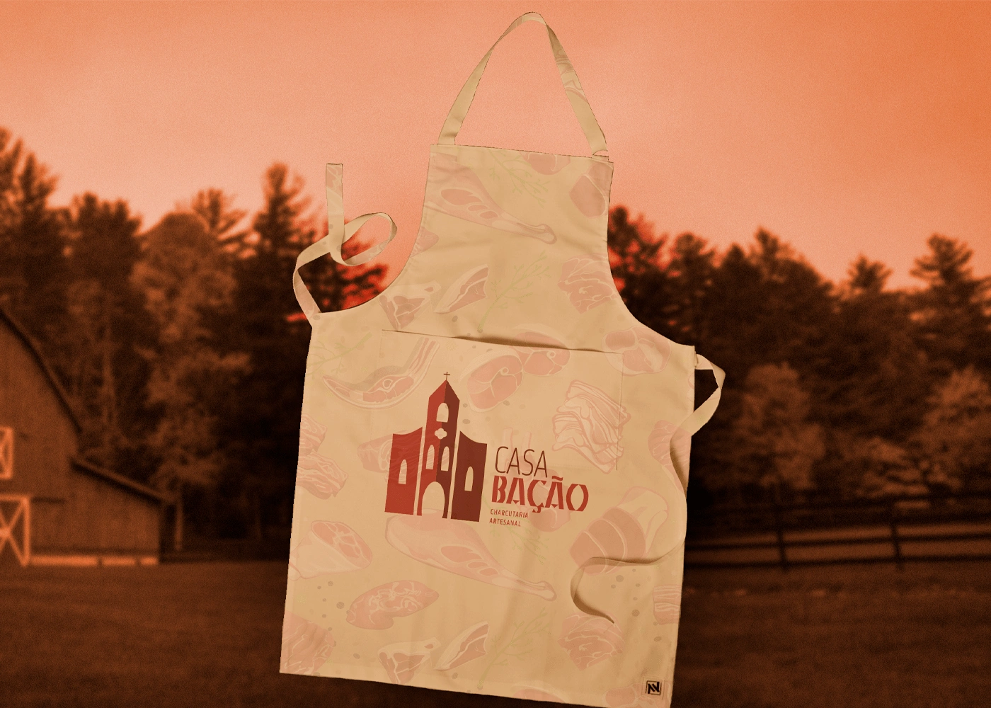
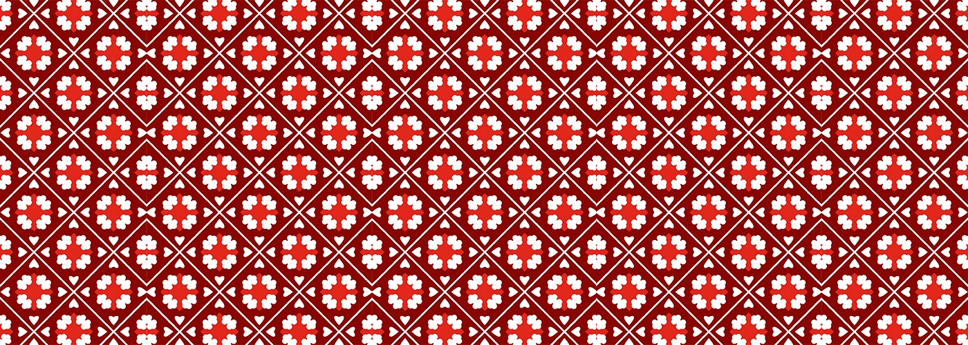
This visual identity, as well as the handmade sausages and sauces sold by the charcuterie, was hand-drawn. The symbol of the Igreja Matriz reflects the magnificence and cultural tradition preserved until today, while the typography used to build the brand reflects the strength of the name Bação, originating from the Portuguese Antônio Alves Bação. The colors chosen for this brand have the main reference to ore and the local land, known for its mineral wealth.
Like this project
Posted Oct 4, 2023
This visual identity, as well as the handmade sausages and sauces sold by the charcuterie, was hand-drawn.

