Healthcare Mobile App Full UI/UX Redesign for a US Psychiatrist

Muhammad Ashraf Khan


Mental Health Mobile App Redesign: UI/UX Strategy, Design System, UX Writing & Visual Overhaul for a US-Based Psychiatric Practice
Redesigning a Mental Health App Built Around the People Who Need It Most
A psychiatrist reached out with a simple, painful complaint. Her mental health app, the one meant to support people in some of their hardest moments, looked nothing like the care she wanted it to represent. She'd built it with good intentions, but the design had become a barrier instead of a bridge. Her words were direct: it looked terrible, and she wanted to change everything.
The brief wasn't just "redesign this app." It was "make this app stop getting in the way of someone who's already struggling."
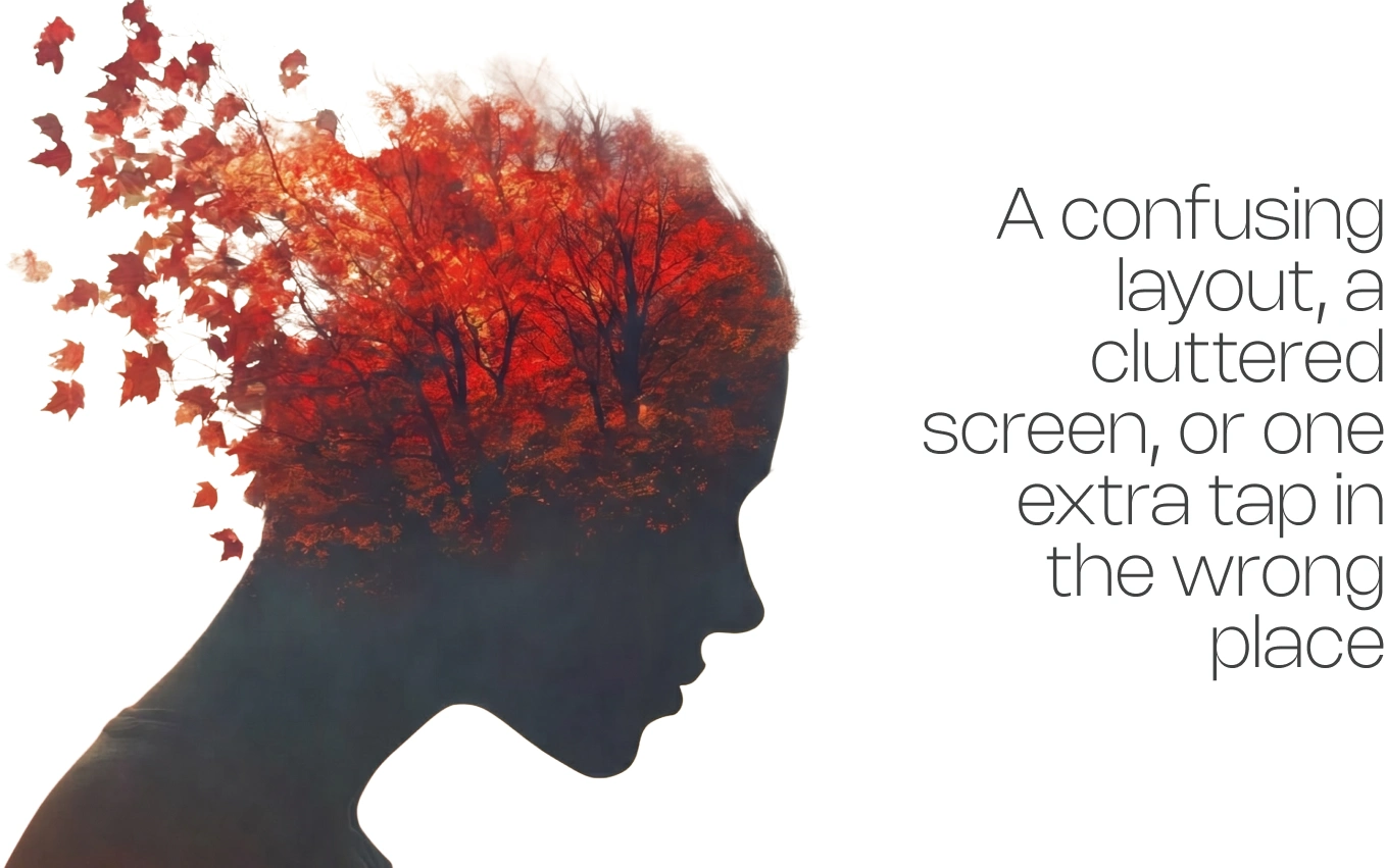
Layout.png
The Challenge
Designing for People Who Don't Have Room for Frustration
Most app redesigns start with a wishlist of features. This one started with a constraint: every person opening this app might already be at their limit. A confusing layout, a cluttered screen, or one extra tap in the wrong place isn't a minor UX flaw here, it's a real obstacle for someone trying to reach help. The existing design didn't account for that. It looked like a generic app, not like something built with empathy.
The client, a practicing psychiatrist in the US, understood her users better than any brief could explain. She didn't need convincing on why this mattered. She needed a partner who could turn that understanding into an interface, end-to-end.
The Approach
Simplicity as a Clinical Decision, Not a Style Choice
Early conversations weren't about color palettes or fonts. They were about the user's state of mind the moment they open the app. From that, one principle shaped every decision that followed: reduce friction wherever possible, because added effort is added distress for someone already in crisis.
That meant stripping the interface down to what was essential, removing visual noise, simplifying navigation, and rebuilding the information hierarchy so the most important actions were never more than a glance and a tap away. Every screen was tested against one question: Does this make a hard moment easier, or does it add to it?
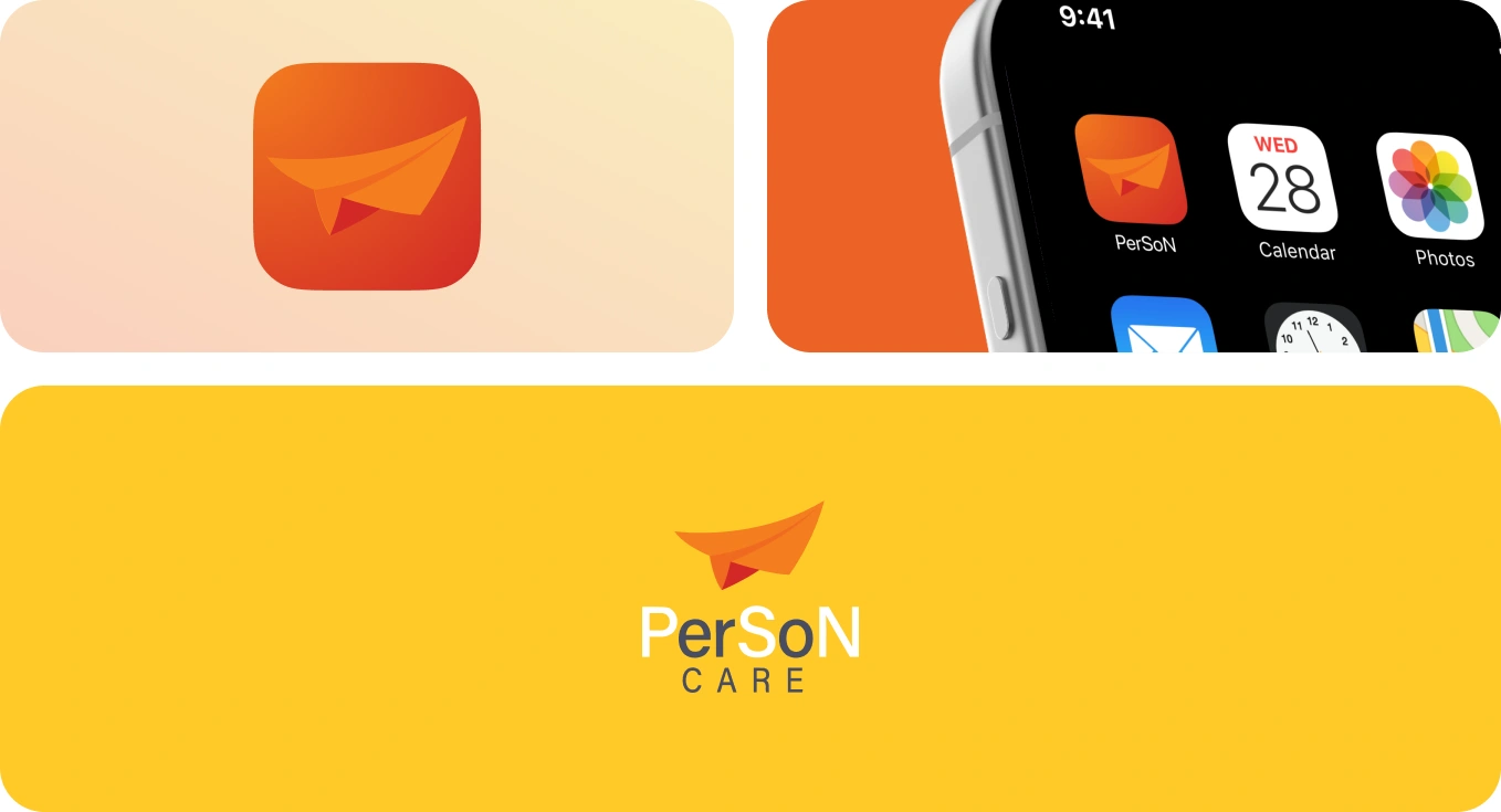
Logo Branding.png
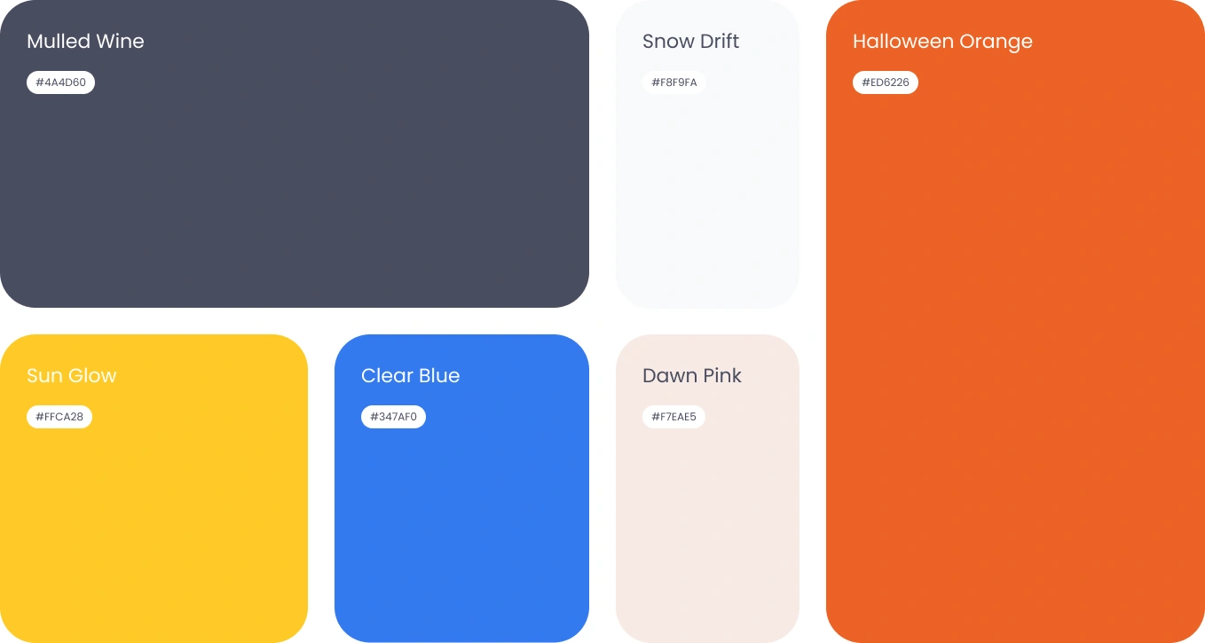
Typeface and Colors.png
The Build
A Complete Rebuild, Not a Surface-Level Refresh
This wasn't a visual touch-up. It was a full, ground-up reconstruction of the product:
UX Writing: every label, prompt, and microcopy line was rewritten to be calm, clear, and free of clinical jargon, language that reassures instead of instructs.
User Flow: the entire navigation was remapped so users could move from "I need help" to "help is here" with the fewest possible steps.
Wireframes: low-fidelity structure was rebuilt screen by screen before a single visual decision was made, so the foundation was right before the polish went on.
Design System: a consistent, scalable system of components, color, type, and spacing was built from scratch, replacing a patchwork interface with one coherent visual language.
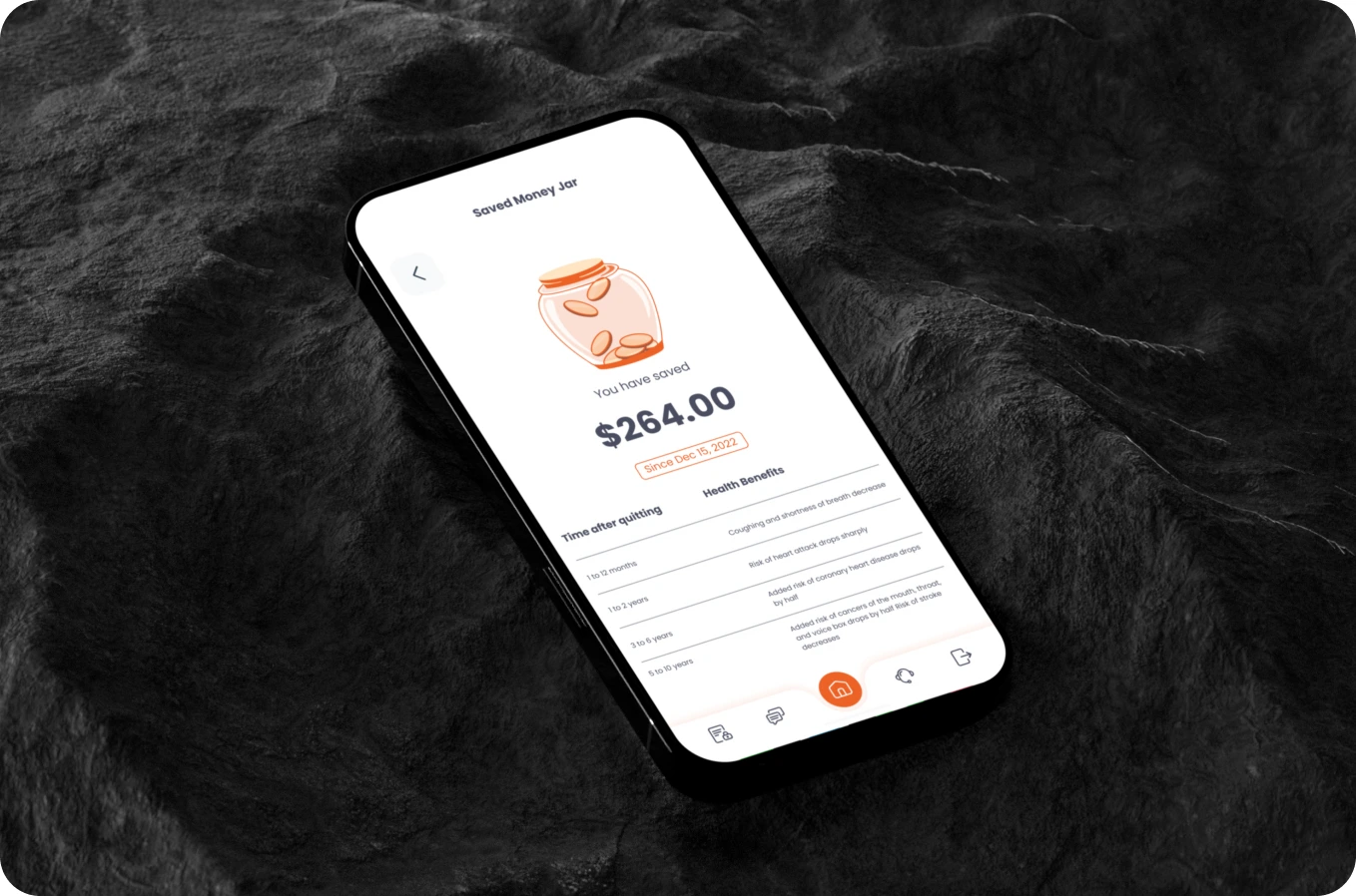
High-Fidelity Design: every screen was taken to final, App Store-ready polish, soft, low-contrast colors, flattened navigation, and spacing chosen to feel calm rather than clinical-cold.
Together, these covered every weakness the original product had, from structural UX problems to surface-level UI issues, leaving nothing carried over from the old version.
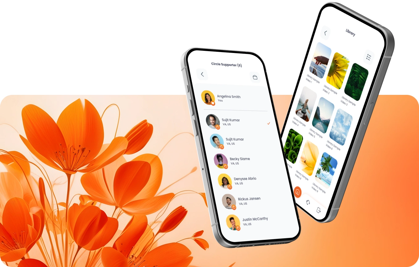
design1.png
Scope & Timeline.png
Process
Discovery and UX Audit: reviewing the existing app firsthand, identifying every point of friction, confusion, or visual clutter that could add stress for a distressed user.
UX Writing and Content Strategy: rewriting copy across the app to be simple, reassuring, and free of clinical or technical language.
User Flow Mapping: restructuring navigation so core actions were always within easy reach, removing unnecessary steps between a user and the help they came for.
Wireframing: building out a low-fidelity structure for every screen to validate the new flow before any visual design began.
Design System Development: establishing a consistent component library, color palette, and typography system to replace the old, inconsistent interface.
High-Fidelity UI Design: designing every final screen in Figma, refined for calm, clarity, and usability under stress.
Handoff and Launch: delivering final assets and specs, supporting the app through to its live release on the App Store.
Scope & Timeline.png
Timeline
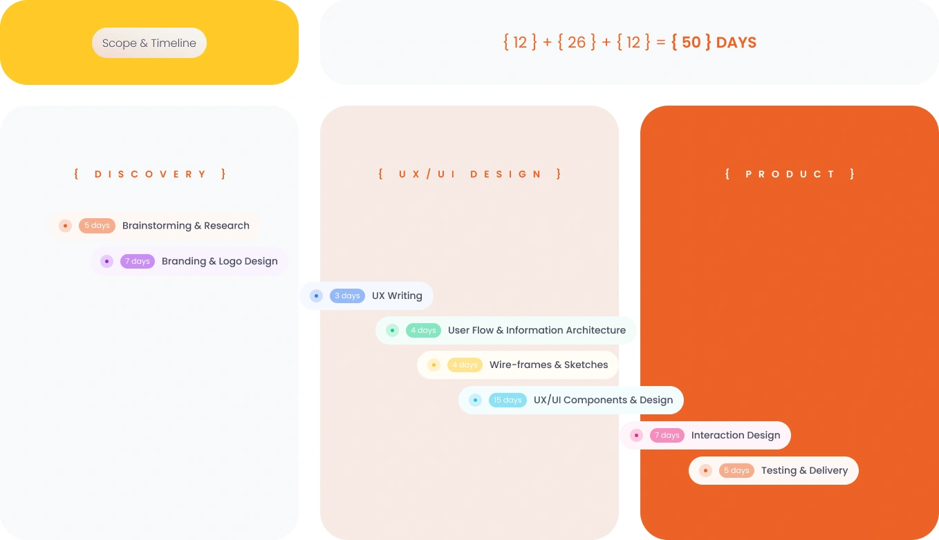
A 50-Day Sprint, Broken Into Three Phases
Discovery — 12 days
Brainstorming and research (5 days) to understand the existing app's failures and the emotional context users were navigating, followed by branding and logo design (7 days) to lay the visual foundation before any screen work began.
UX/UI Design — 26 days
The core of the rebuild: UX writing (3 days), user flow and information architecture (4 days), wireframes and sketches (4 days), and UX/UI components and design (15 days), the bulk of the timeline, where the new design system and every high-fidelity screen took shape.
Product — 12 days
Interaction design (7 days) to bring the static screens to life, followed by testing and delivery (5 days) to validate the experience and hand off App Store-ready files.
12 + 26 + 12 = 50 days, from first conversation to a finished product ready to ship, with the heaviest investment placed exactly where it mattered most: turning research and structure into a design that actually reduces friction for someone who's struggling.
Appointment.png
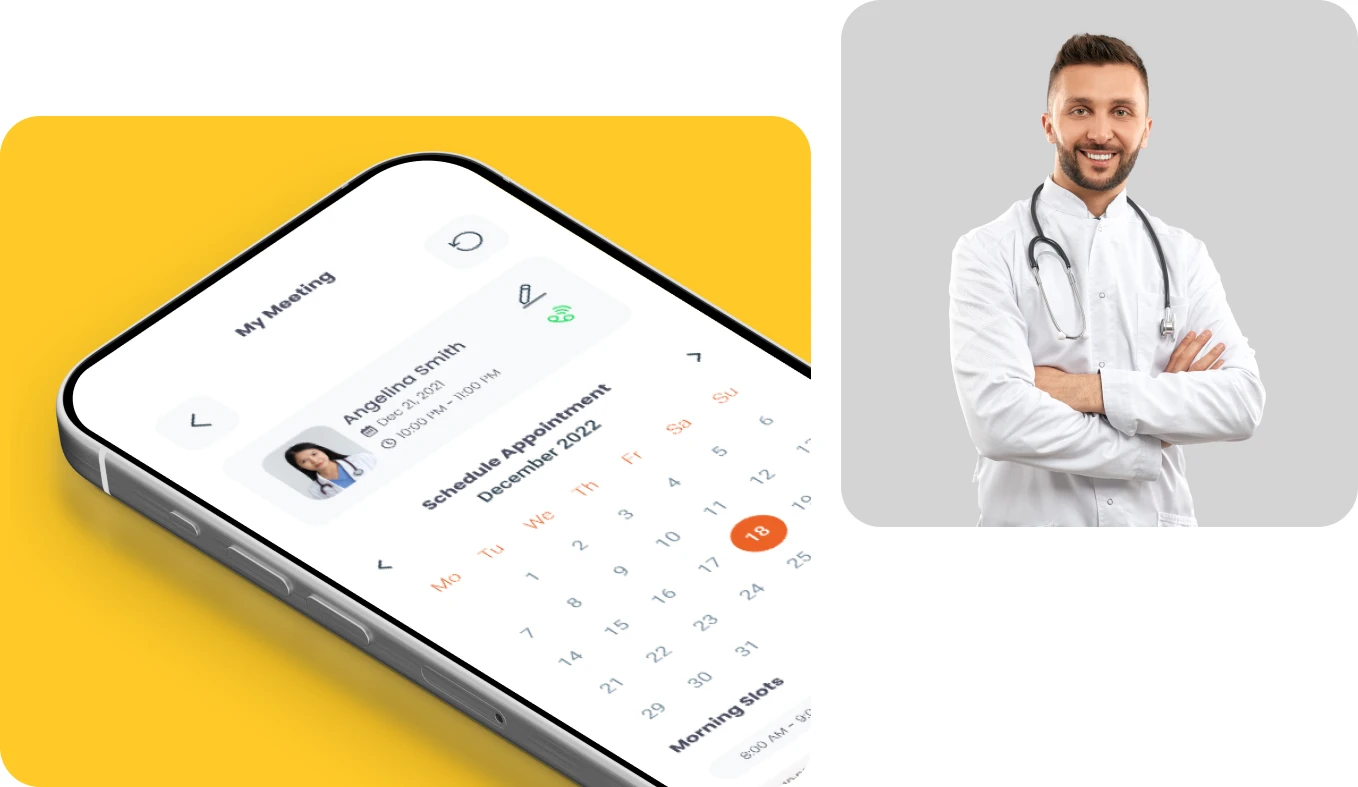
Effortless Appointment Scheduling
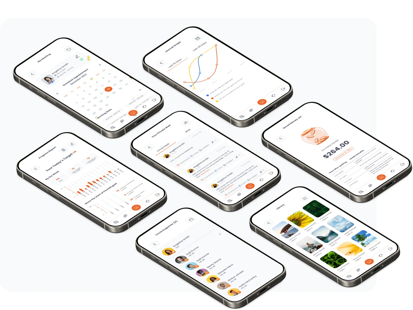
booking support shouldn't feel like a chore, so the flow was reduced to its simplest form. Users see their upcoming session at a glance, counselor's name, photo, date, and time, then pick a new appointment straight from a clean monthly calendar. Available days are clearly marked, morning slots are laid out without clutter, and the whole experience reads less like filling out a form and more like picking a time that works. For someone already anxious about reaching out for help, removing even small decisions, where to tap, what to fill in, what happens next, makes the difference between booking the session and giving up halfway through.
Person.png
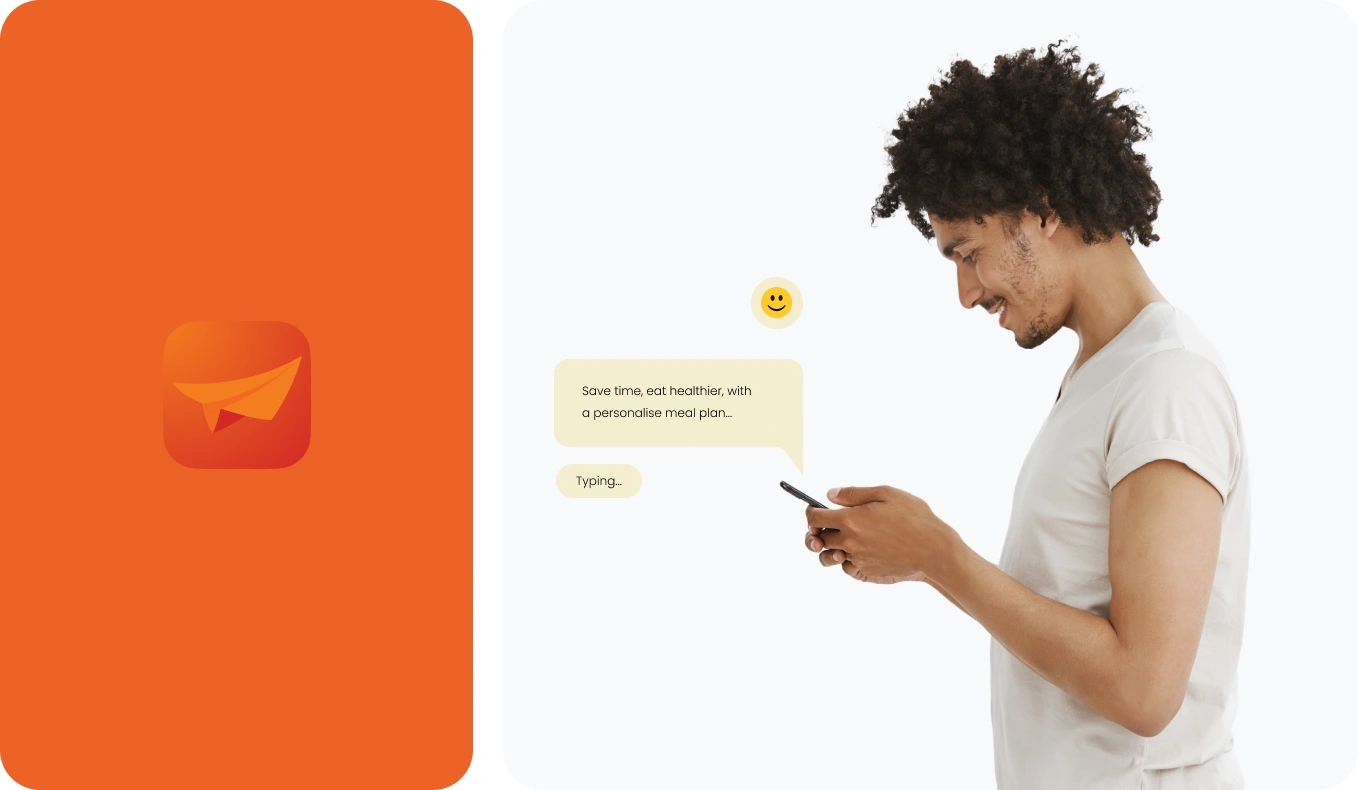
Community and Peer Support Chat
Sometimes the most reassuring thing isn't a counselor, it's knowing someone else gets it. The app opens up a space to connect, one-on-one or in groups, with others navigating the same struggles, where people can share what's helped them, ask questions without judgment, and feel less alone in the moment. The interface stays light and conversational by design, a quick message, a typing indicator, a simple reply, so reaching out for peer support feels as easy as texting a friend rather than opening a clinical forum. For users managing anxiety or isolation, that small shift in tone can be the difference between staying silent and finally speaking up.
screens.png
The Outcome
An App That Finally Matches the Care Behind It
The result, Person Care, now live on the App Store, gave the client a product she could stand behind completely, one where the design finally reflects the same care she brings to her patients. What started as "I hate how this looks" became a complete reimagining of how the app behaves, not just how it appears.
The numbers backed it up. Since launch, the App Store rating climbed from 3.7 to 4.6, a direct reflection of how much friction was removed for the people who needed this app to just work.
For an app meant to help people through difficult moments, the best design is the one you barely notice, because it never gets in your way.
Client Testimonial
When I first reached out, I was honestly embarrassed by how my app looked. It didn't reflect the care I wanted my patients to feel the moment they opened it. Working through the redesign, every conversation came back to one thing: how do we make this easier for someone who's already struggling? That's exactly what happened. The new design is calm, simple, and finally feels like an extension of my practice rather than something separate from it. The difference between the old app and what's live now is night and day. I couldn't be happier with the result.

Client.png
Like this project
Posted Jun 15, 2026
Redesigned a US psychiatrist's mental health app. App Store rating climbed from 3.7 to 4.6 after replacing a cluttered UI with a calm, friction-free design.
Likes
0
Views
20
Timeline
Dec 20, 2024 - Feb 9, 2025