Information architecture revamp for better discoverability
UX RESEARCH - UX DESIGN
Quick Summary
Through research, we realized people constantly converge and diverge at every step to synthesize the data. To replicate this mental model, we prototyped and tested a few variations with the people so they could get insights faster.
My Role
I looked at the data from user interviews and redesigned the Information architecture of the product to match the new flows and file structures.
Outcome
People found it easier to find what they were looking & use the editor screen more efficiently.
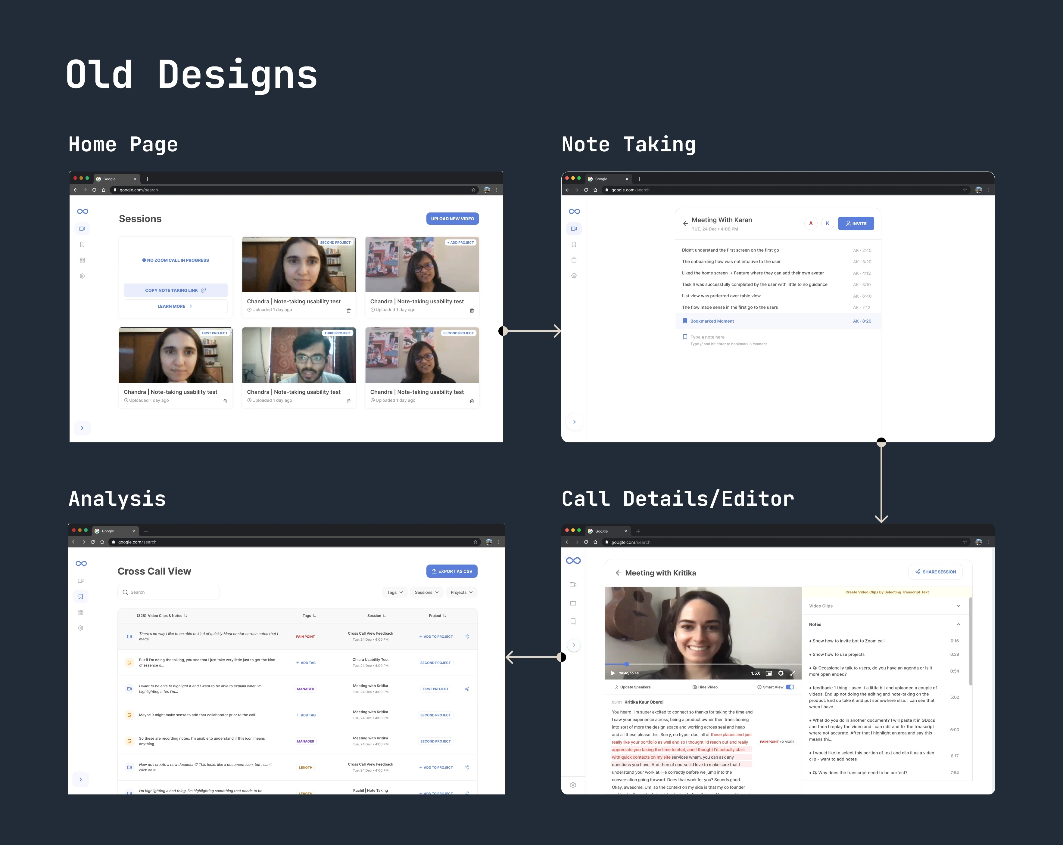
Old user flow and navigation
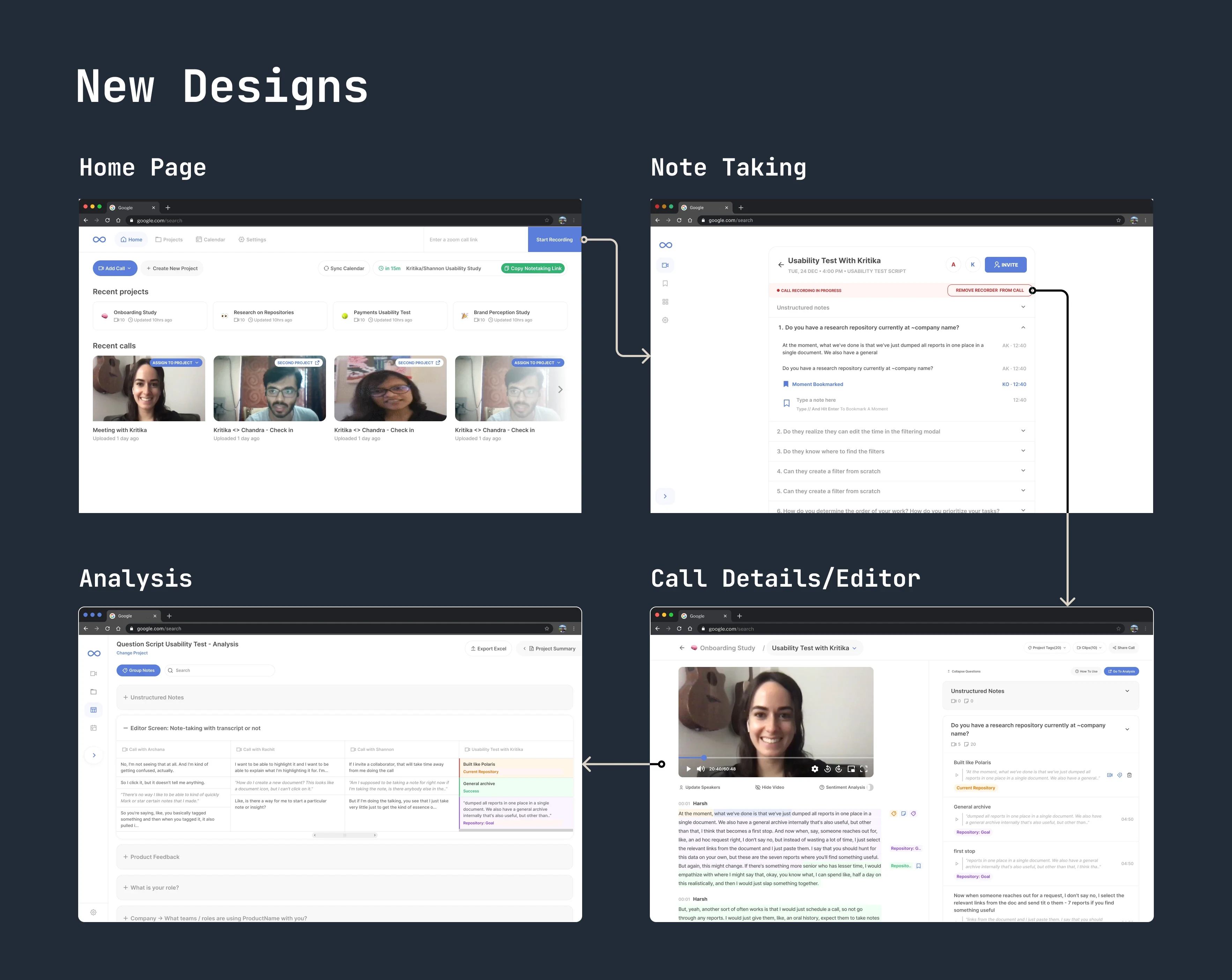
New user flow and top navigation
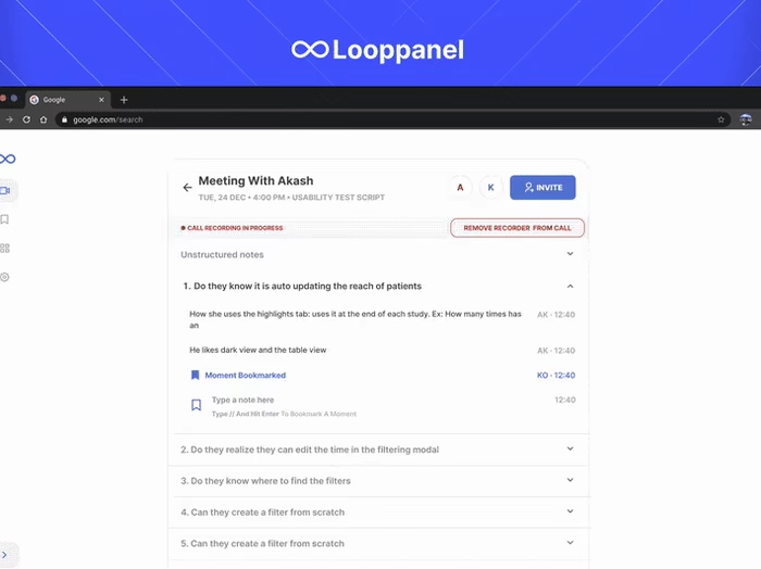
To make getting to insights faster, we introduced a question script across the product for easier segmentation of data which could lead to faster analysis and insights.
We put a lot of thought into the question script interface, from the script creation, to viewing call data, all up to the point of analysis. The interface is flexible and easy to use so that people can use it in their research process.
Home screen redesign
The home page was redesigned to make it look like a file explorer & have touchpoints to get into the workflow quickly.
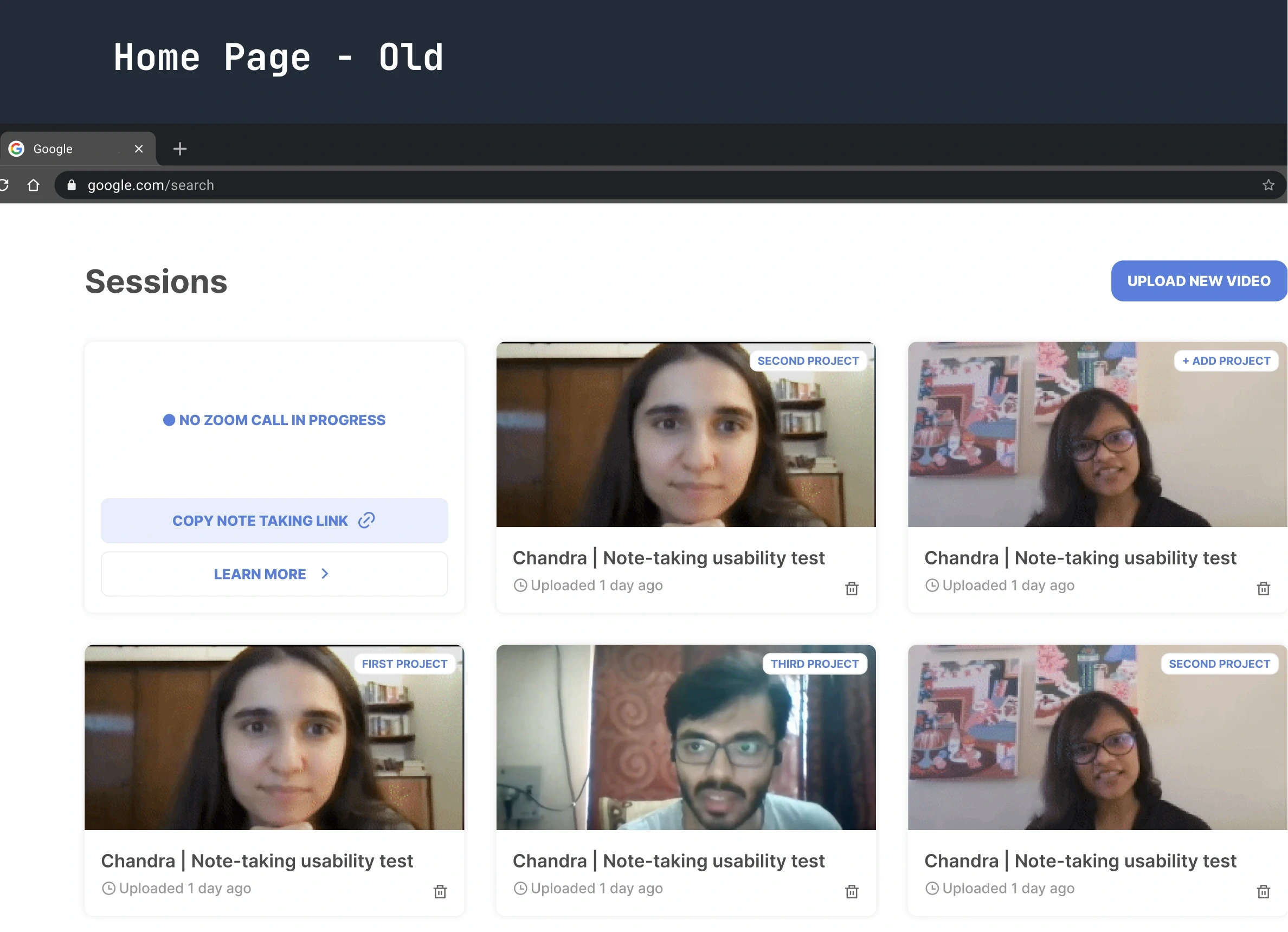
Old home page design with calls
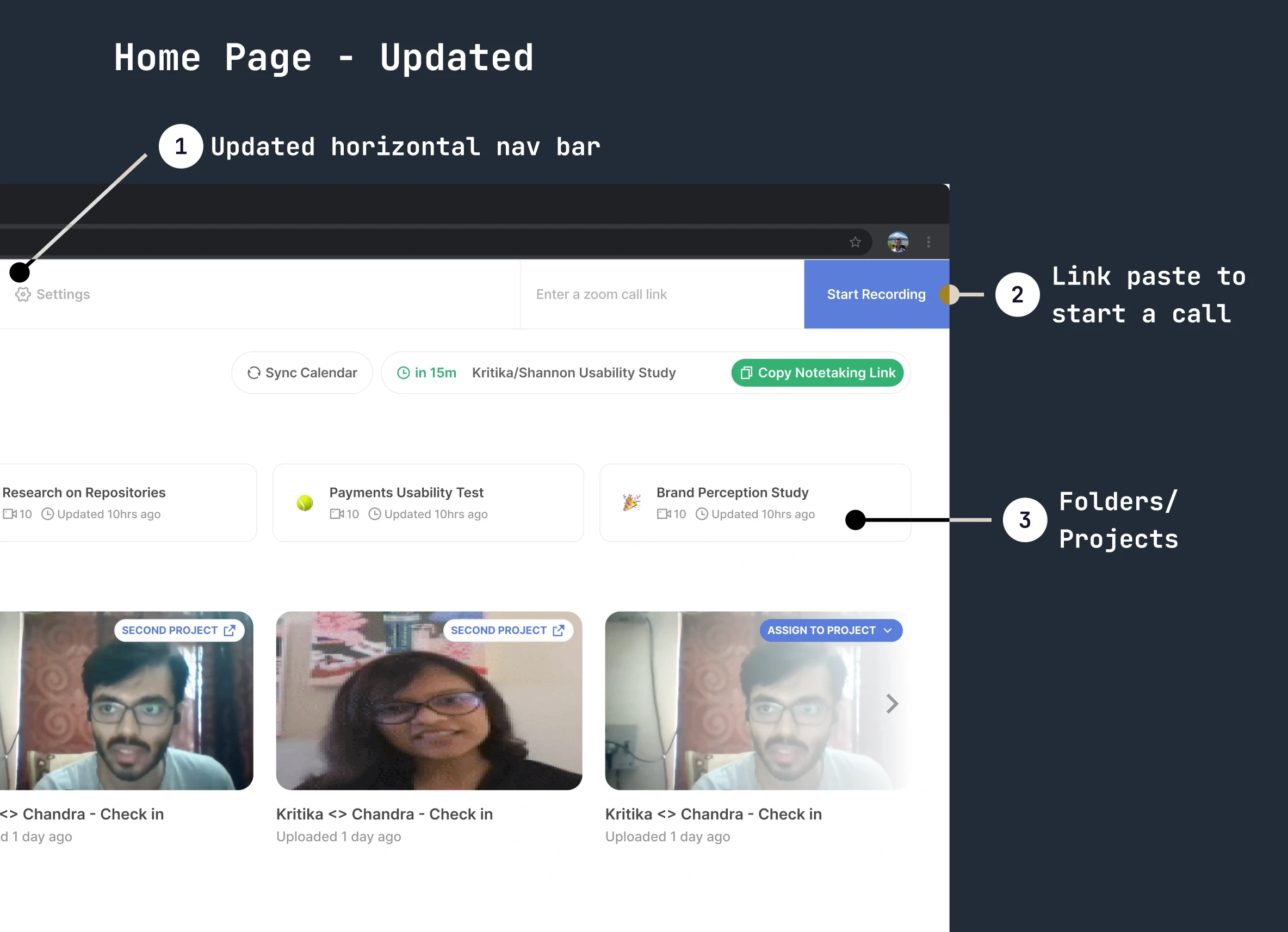
New home page with folders and recent calls
Updates to the home screen
Updated horizontal nav bar - As a information architechture rehaul exercise we made the nav bar at top to reflect the file structure.
Link paste to start a call - Easy way to invite the looppanel note taker into the zoom call.
Folders/Projects - All the calls would be put into projects so it's easier to attach them to a discussion guide/question script.
Note-taking screen redesign
The additions to the note taking screen were made in accordance with the research data from conversations with people and the direction company wanted to take w.r.t the question script.
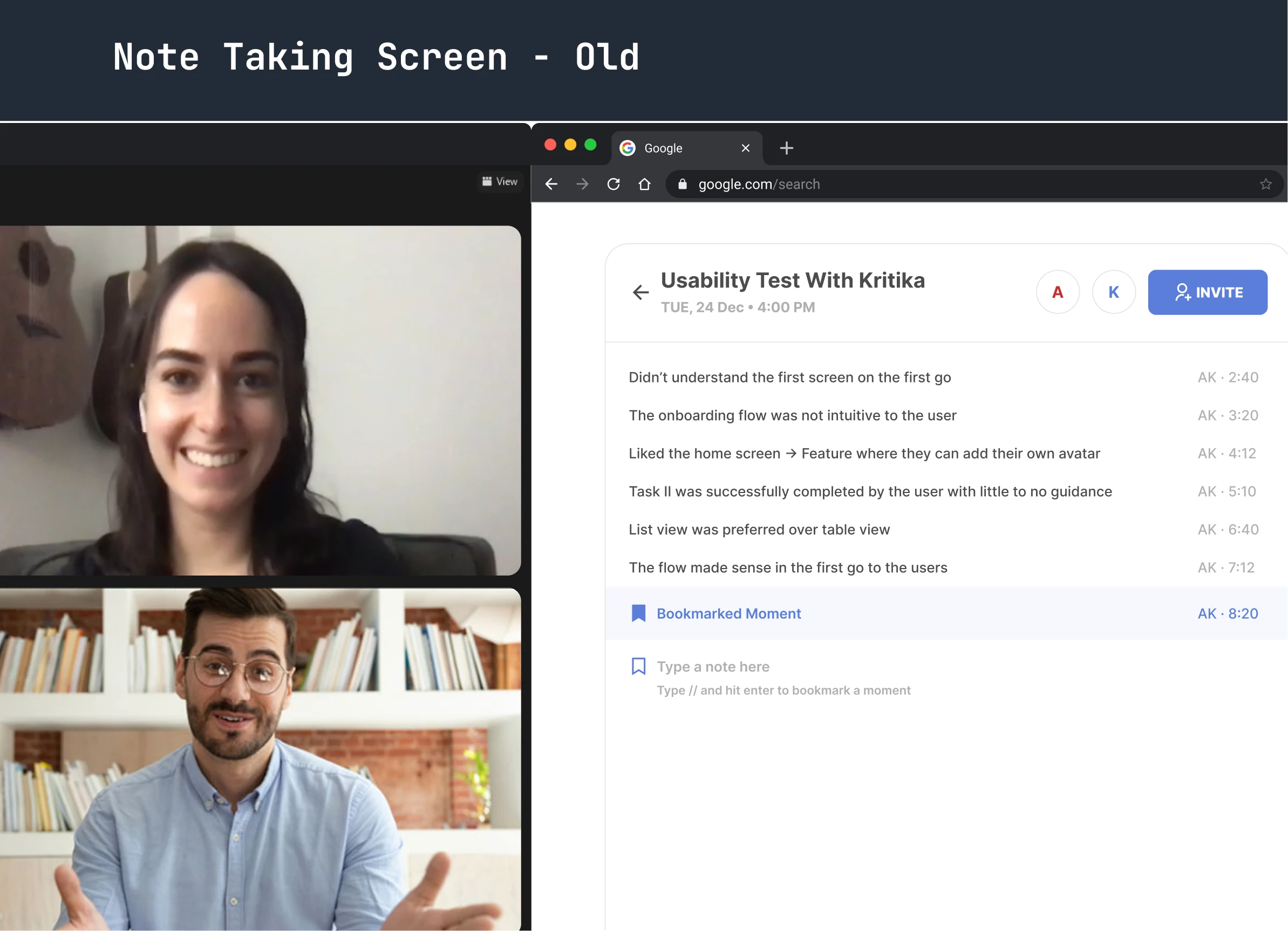
Old note taking screen sans question script
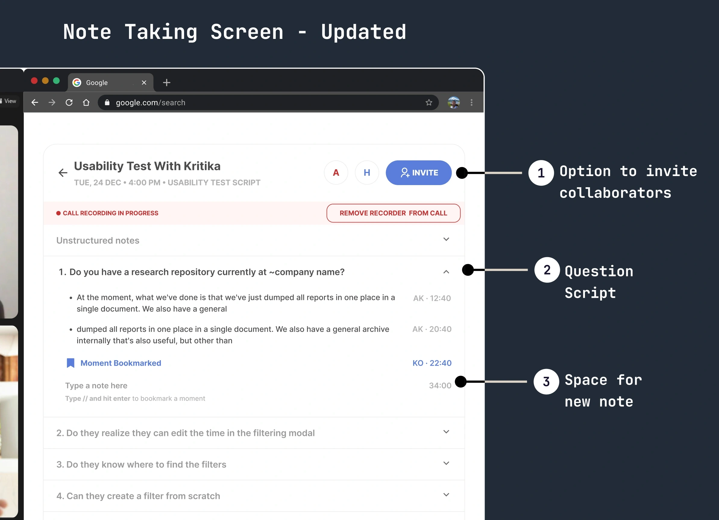
New note taking screen with question script
Updates to the note taking screen
Option to invite collaborators - We made the note taking screen a collaborative space where more than 1 person(s) can take notes simultaneously.
Question script - Space to take notes directly within the question.
Space for new note - Pressing enter creates a new space to type a new note.
Call/Editor screen redesign
Earlier, every note had to be attached to a video clip. But through our research we realized people don't always want a video clip. Also, they wanted to see a concise version of the notes in their own words.
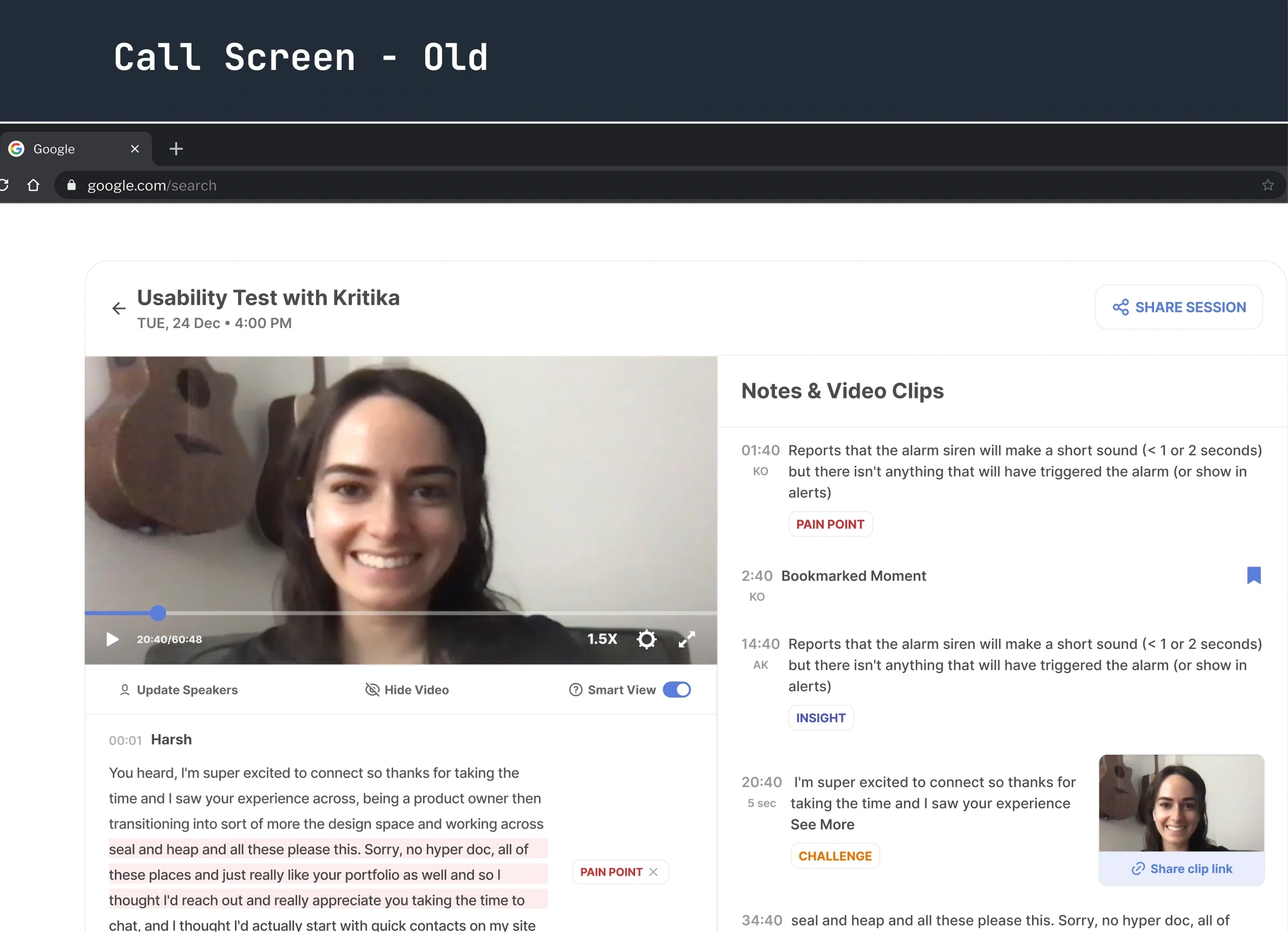
Call/Editor without question script
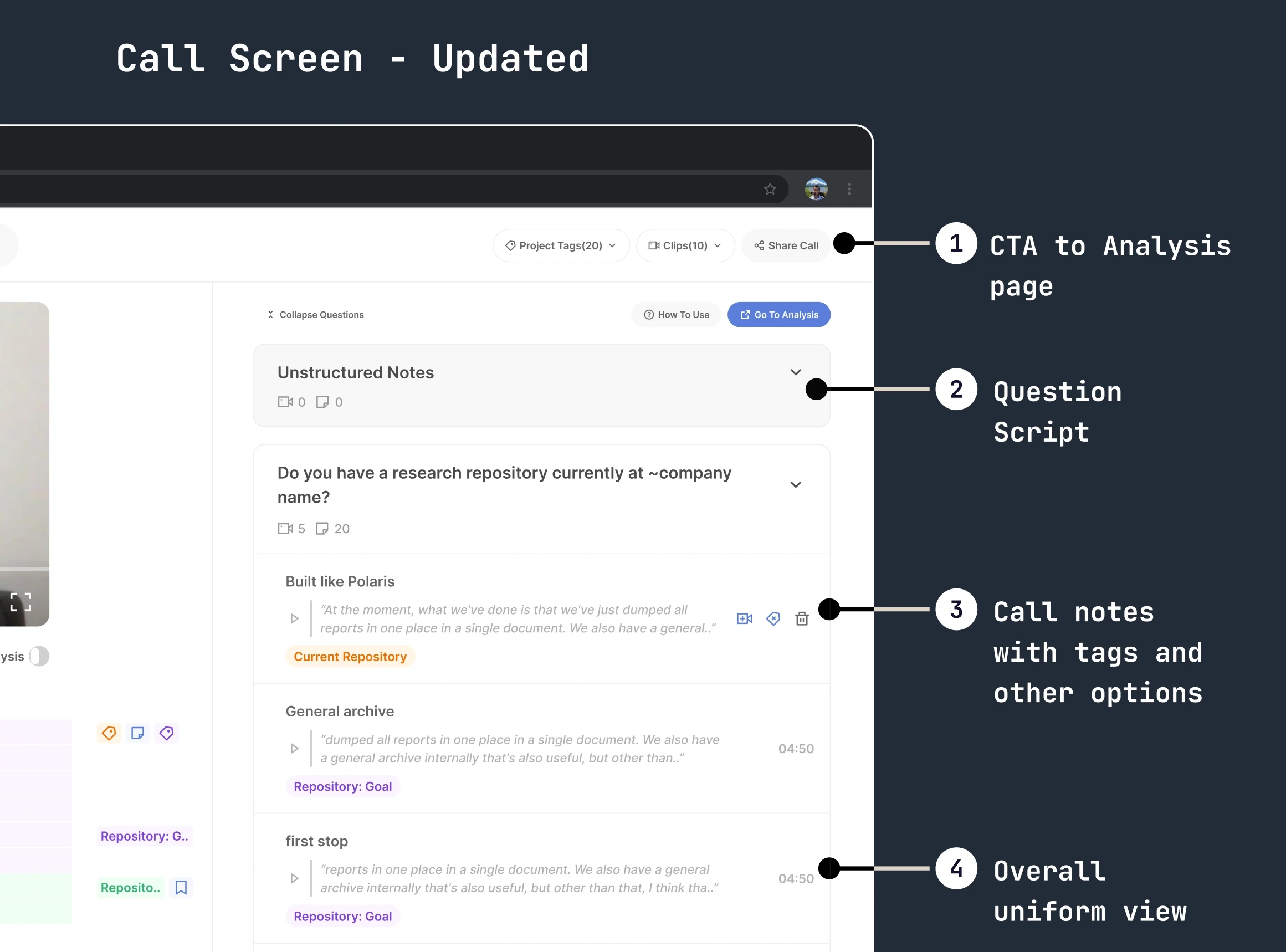
Call/Editor with question script
Updates to the Call/Editor screen
CTA to Analysis page - Easier way to jump to the analysis page to see data across calls for the same question script
Question script - Notes taken under specific questions in accordance with the question script used during note-taking.
Call notes with tags and other options - New view in which a summary can be added on top of the note taken during the user interview. Other options show that the note can be converted to a video clip* or tagged.
Overall uniform view - Cleaner view to add tags, see the time stamp, etc.
Analysis screen redesign
In this screen, we tried to create a view in which data across calls can be viewed easily and tagged.
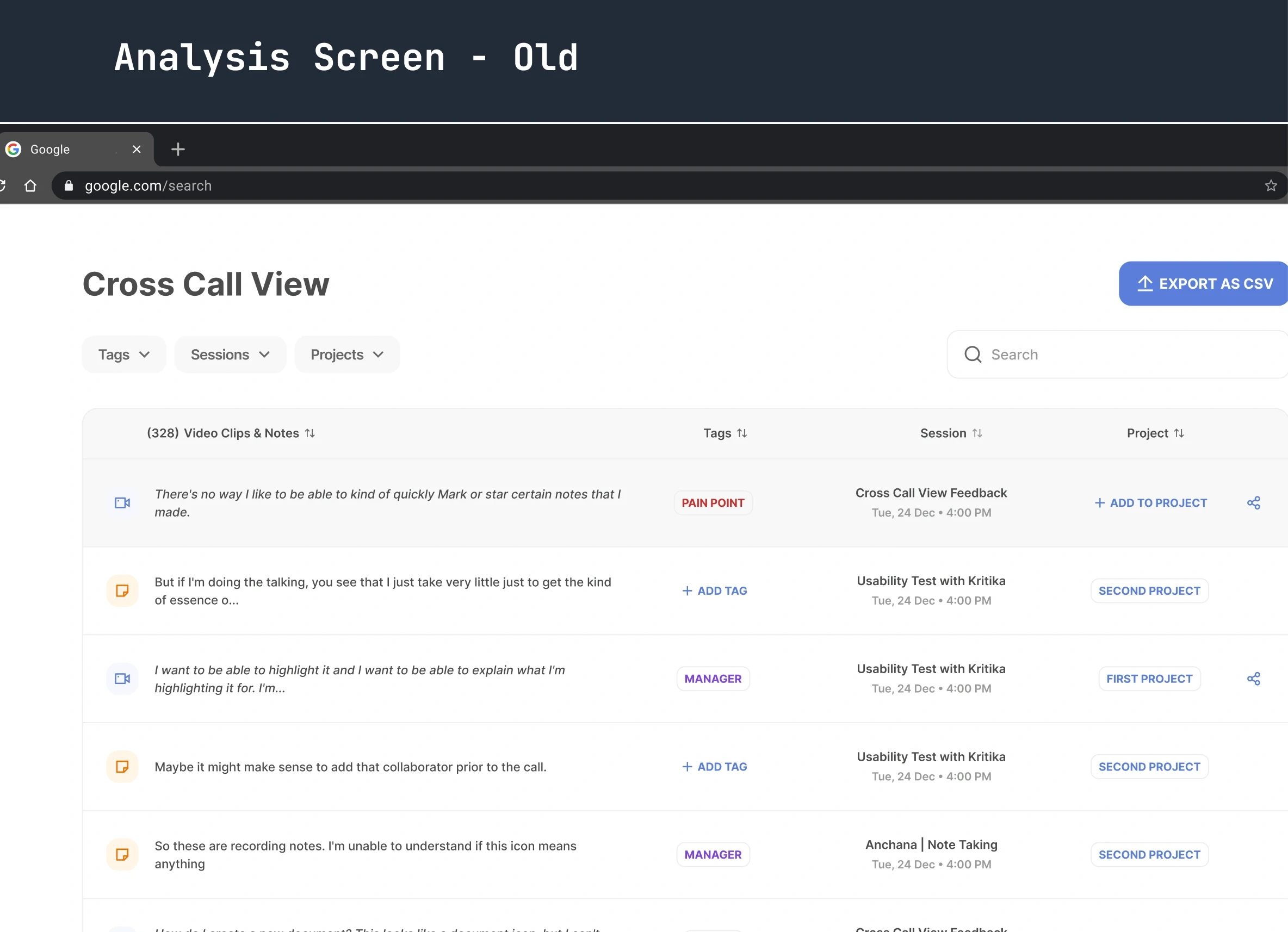
Analysis screen with tabular view
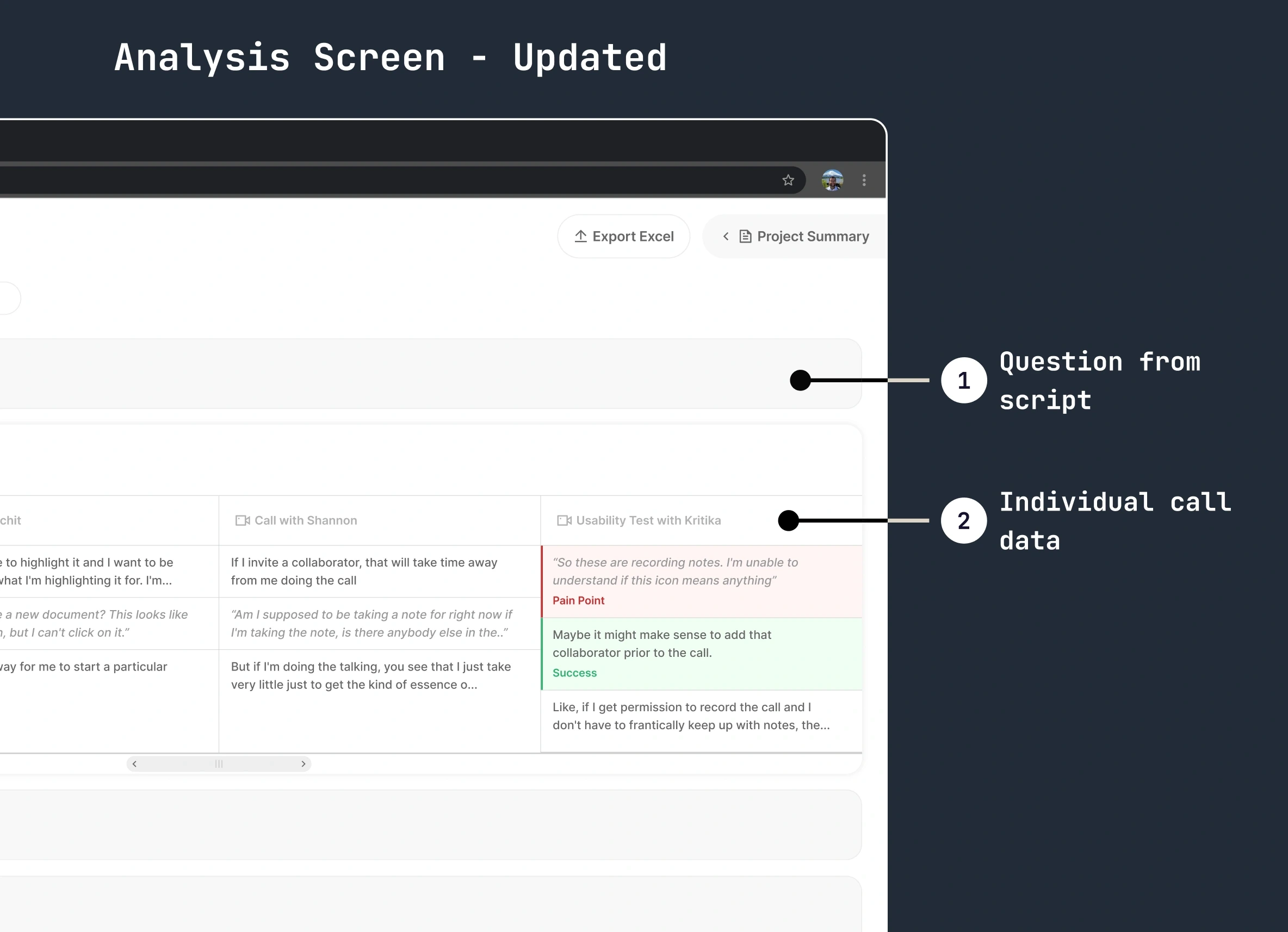
New analysis view with all calls
Updates to Analysis screens
Questions from the script - Concise version of the question script within a project with all call data.
Individual call data
The project took 3 months to execute and plan. If you want to know more, reach out on Twitter or karan26796@gmail.com.
Like this project
Posted Oct 26, 2023
Through research, we realized people constantly converge and diverge at every step to synthesize the data. To replicate this mental model, we prototyped and tes
Likes
0
Views
7

