Tableau Dashboard
Rebeca Viana
I was in charge of the UX/UI phase of this project.
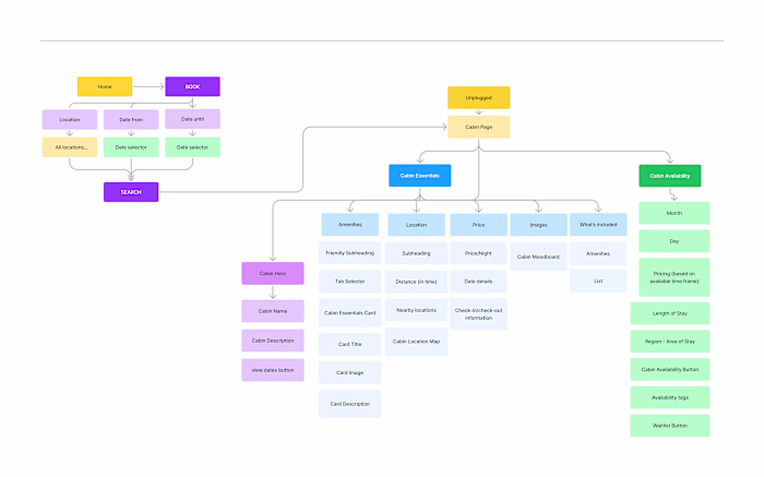
We had six sessions where we used Figjam to breakdown our user stories, their data's what-how-why about each view, what indicators to include, current workflows, expected results and most importantly in their setting, how they share and present data with other areas of the business. Operations, Management, Marketing and Sales teams need very different stories from the same data.
The hierarchy was:
Summaries (High-level, grouped views)
Table making and analysis (Multiple team members, for daily use, granular data with multiple filtering options)
We went over the user's daily routine, how they interact with the data, what they use it for, frequency, and a lot of other details to empathize with their day-to-day and automate what's possible by having the proper grouping and filtering.
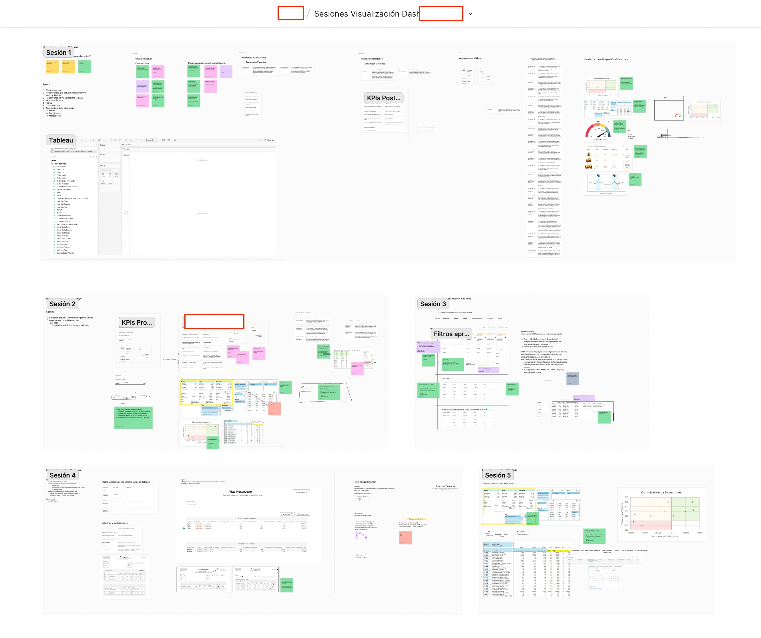
Figjam Open Sessions
We made agreements about the dashboards' text, navigation, filters and overall look and feel. We used Tableau characteristics to our advantage to meet and automate business needs.
The squad:
Product Owner: The department manager in charge of the project from the client's side.
SME: Very active in sessions and knowledgable of the data we're digesting into GCP, in charge of the project from the client's side.
Operations, Security and IT: Stakeholders present in the progress meetings once a week.
Our team:
Technical Lead: Architect in charge of the project, leads data discovery calls.
Backend Developer: API setup and management
Data Engineer: Works side by side with the architect. In charge of running the QA scripts that guaranteed acceptance criteria
UX/UI Expert: (me). Ran the discovery sessions with stakeholders, built mockups into an approved prototype using Figma and presented such prototype to the squad.
Tableau Expert: Made everything in the prototype possible by creating, configuring, moving, aligning, and more in Tableau.
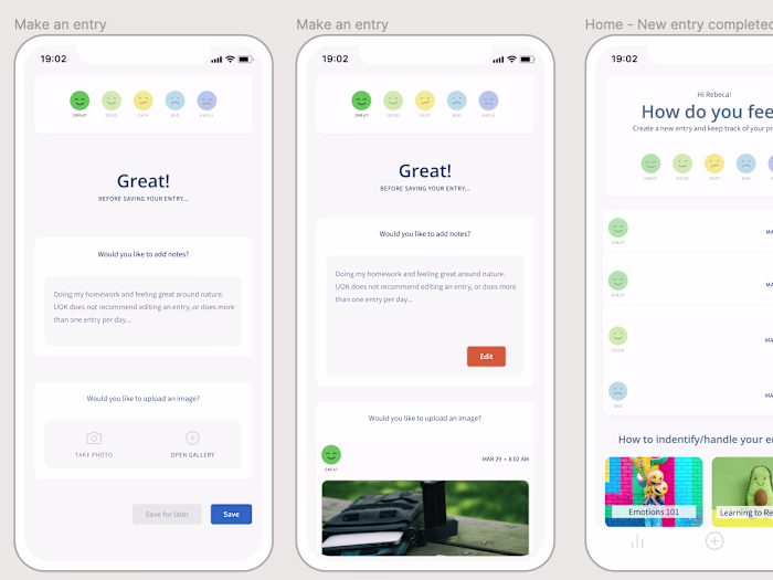
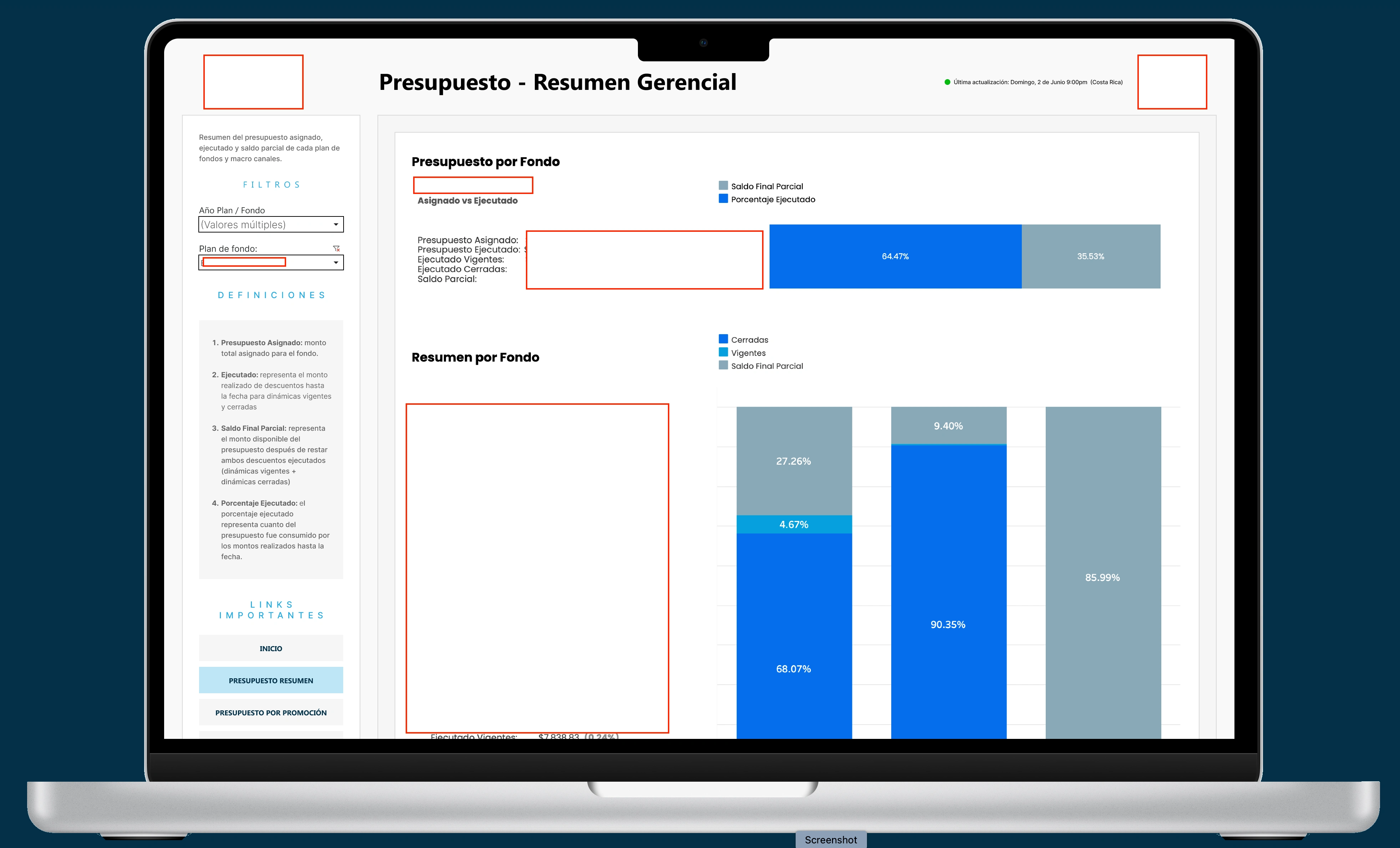
Prototype to Tableau
Due to NDA, logos and company details have been replaced with a white rectangle. Thank you for understanding.
The image here is from Figma prototype. The squad was able to move between views, click filters and view static information to validate everything except the actual time performance when changing filters/views in Tableau.
The perfect MVP to get everyone exciting for what's coming! (and prepare training material!)
End result in Tableau: Six views in total, including scatter charts, tables and % graphics that provide an immediate story. We built a tool for data analysts day-to-day routine.
10 secs to load initial data. The P&L view takes 20 seconds due to multiple tables involved. The below image displays a quick view and where users can download the filtered information: image, crosstab, PDF and PowerPoint- without access to the actual Data files.
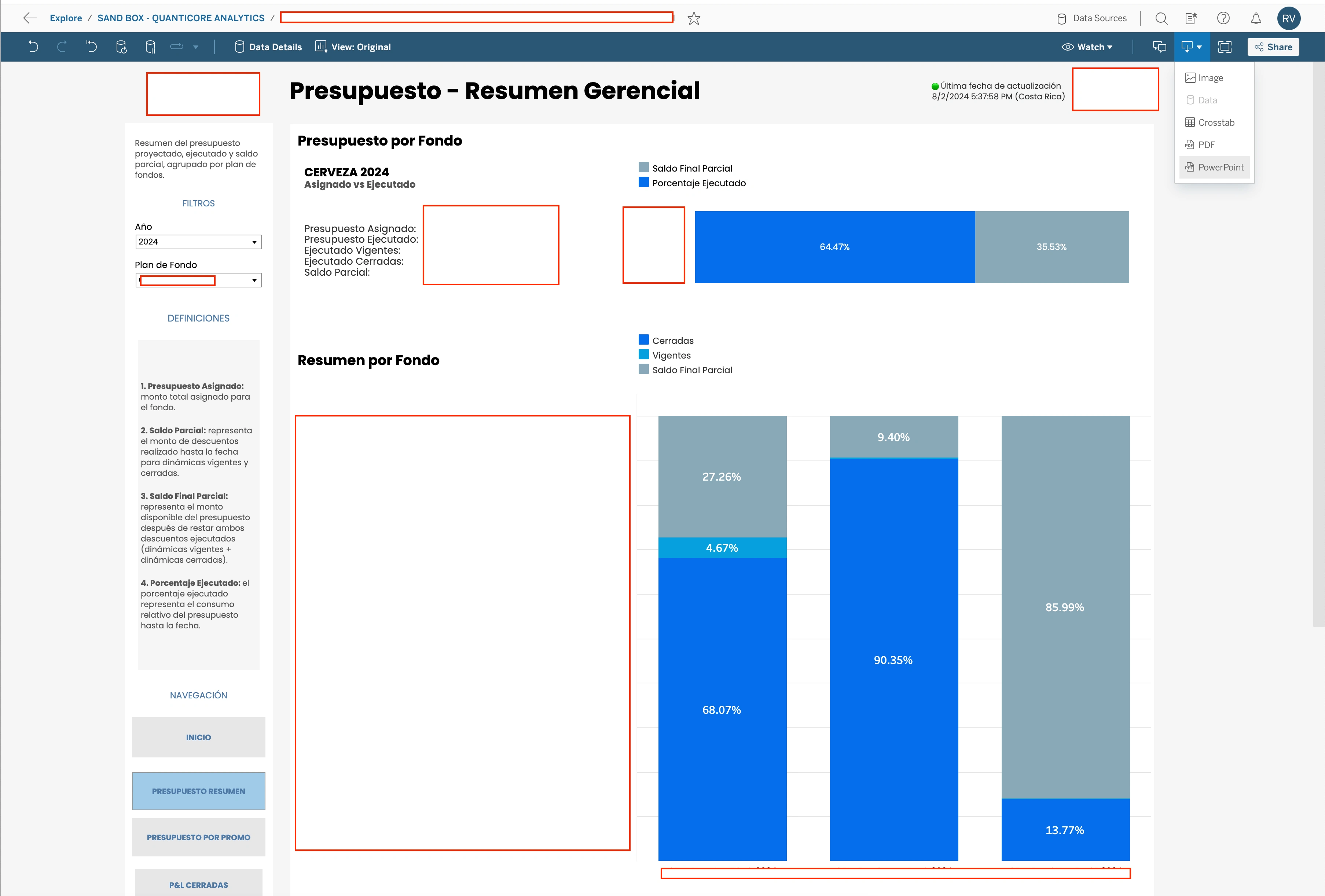
Tableau Dashboard
A highly sensitive view as you can see from the multiple rectangles across the image. Pure data for actionable insights.
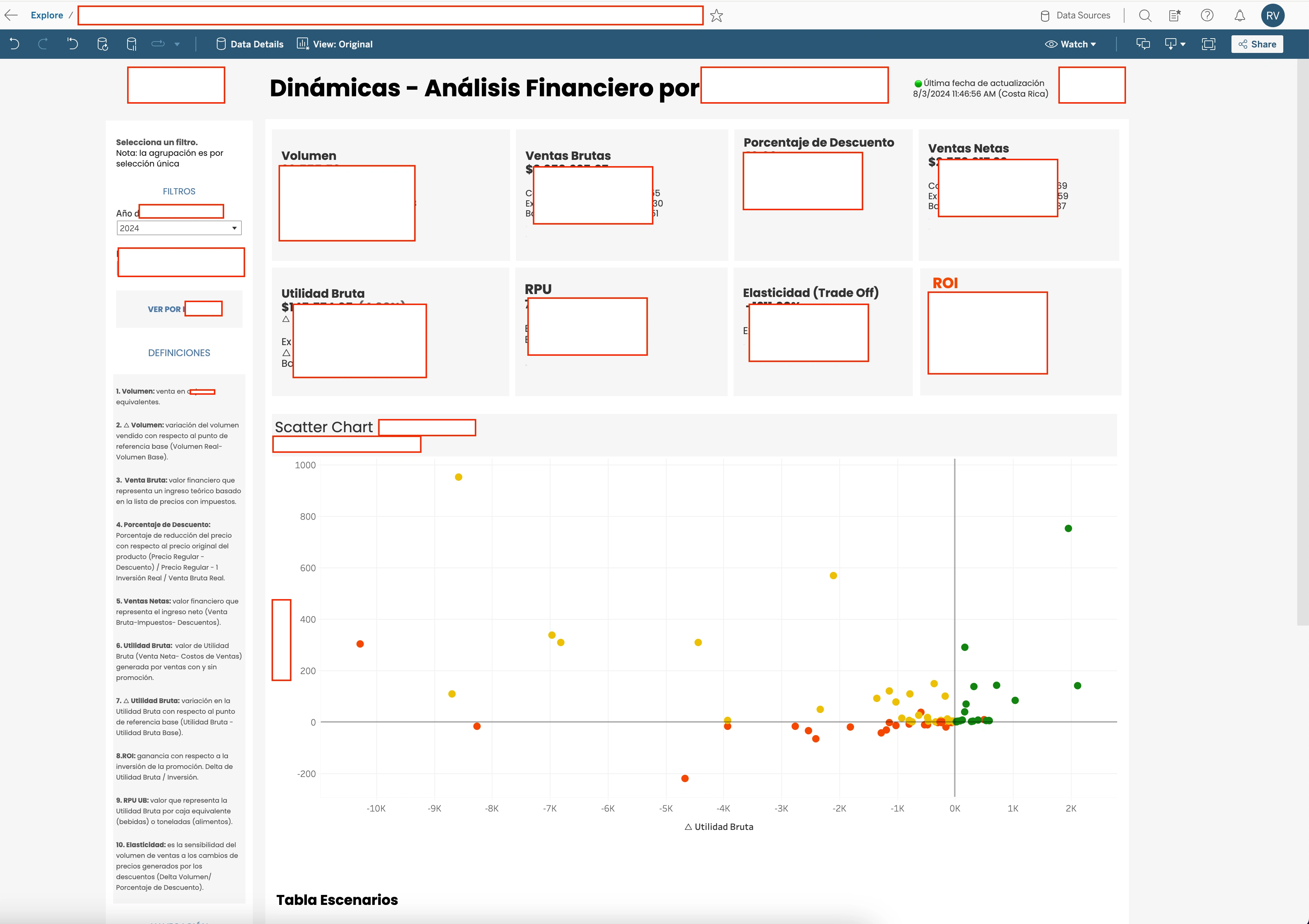
P&L Analysis
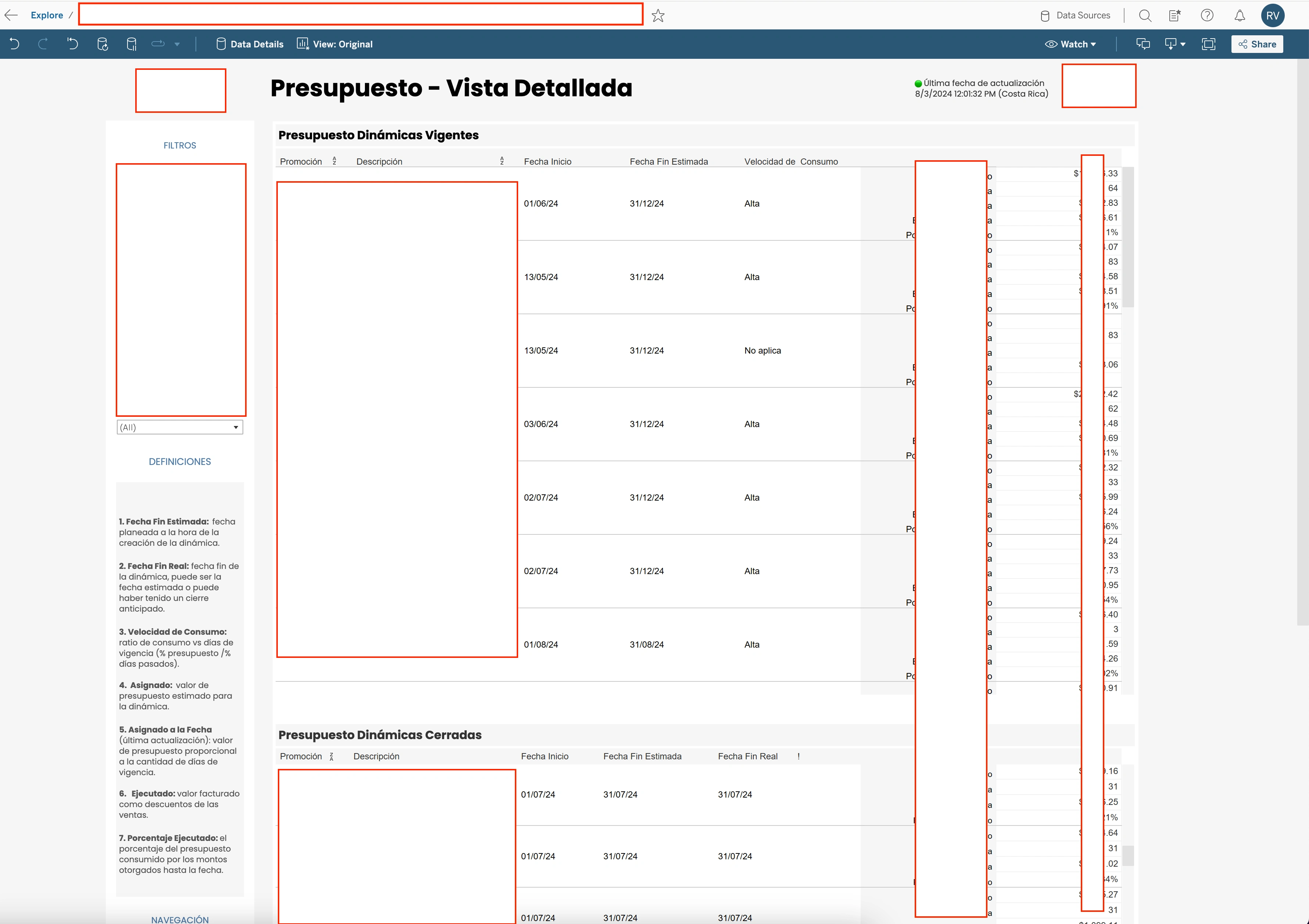
Table view
Let's chat about your dashboard needs. I also work with stand-alone data visualization SaaS.
Like this project
Posted Aug 3, 2024
From FigJam sessiones to a Figma prototype to a full Tableau Workbook with 6 Dashboards and 1 Story to tell with data.
Likes
0
Views
17