Case Study: UOK Wellbeing experience
Rebeca Viana
Brief✅ Deliverables🎁 Survey ResultsUOK Case Study⬇️ Intro🧑💼 Role🧰 Tools🕰️ Timeline❓ The Problem📓 Hypothesis✅ The Solution 🖐️ The Outcome👀 Usability Review📊 Synthesis💠 Validated observations❔ How Might We💡 Ideation🫂 User Flows🖱️ Mid-Fidelity Wireframes🖌️ Styles & Components🧱 High-Fidelity Prototype👉 Testing
Brief
💬 Product
UOK is a well-being product designed to help teachers proactively support their student's well-being. Every day students log in to UOK and answer a series of questions expressing how they feel. The current daily wellness check-in experience of UOK is basic with students answering a series of questions using a color-coded rating scale from 1-5.
We’d like to improve this daily wellness check-in experience by making it more appealing for students to answer questions each day and be able to visualize their wellness journey with UOK.
✅ Deliverables
Conduct a usability audit of the current wellness check-in experience
Conduct competitor benchmarking to establish patterns & inspiration
Synthesize survey results to identify key problems
Ideate with sketches on how to improve the current wellness check-in experience
Create User Flows of existing and improved experiences
Create Mid-fidelity wireframes of your solution
Design the UI Styles and Components for your experience in Figma
Create a Hi-fidelity Mobile Prototype of the improved wellness check-in experience
Conduct a Usability Test to analyze the success of your designs (optional)
🎁 Survey Results
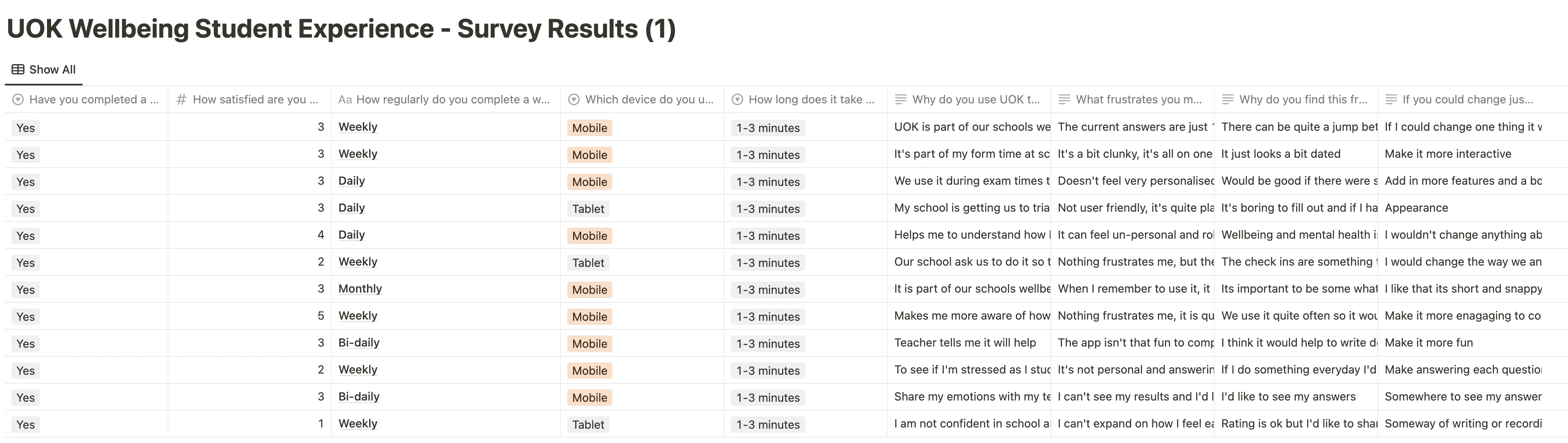
Survey Results in Notion
UOK Case Study
⬇️ Intro
I worked on this case study during Memorisely UX/UI Design immersive online Bootcamp. During the Bootcamp I worked with a small team designers around the world. The goal of this case study was to find a more engaging way for teenager students to answer how they’re feeling, everyday.
Navigation
🧑💼 Role
User Research
Product Strategy
UX Design
UI Design
Prototyping
Usability Testing
🧰 Tools
FigJam
Figma
Maze
🕰️ Timeline
5 weeks
❓ The Problem
The current daily wellness check-in experience of UOK is basic with students answering a series of questions using color-coded rating scale from 1-5. We’d like to improve this daily wellness check-in experience by making it more appealing for students to answer questions each day and be able to visualize their wellness journey with UOK.
📓 Hypothesis
We believe that creating an engaging journal experience
For students
Will allow them to share their feeling in a daily basis
✅ The Solution
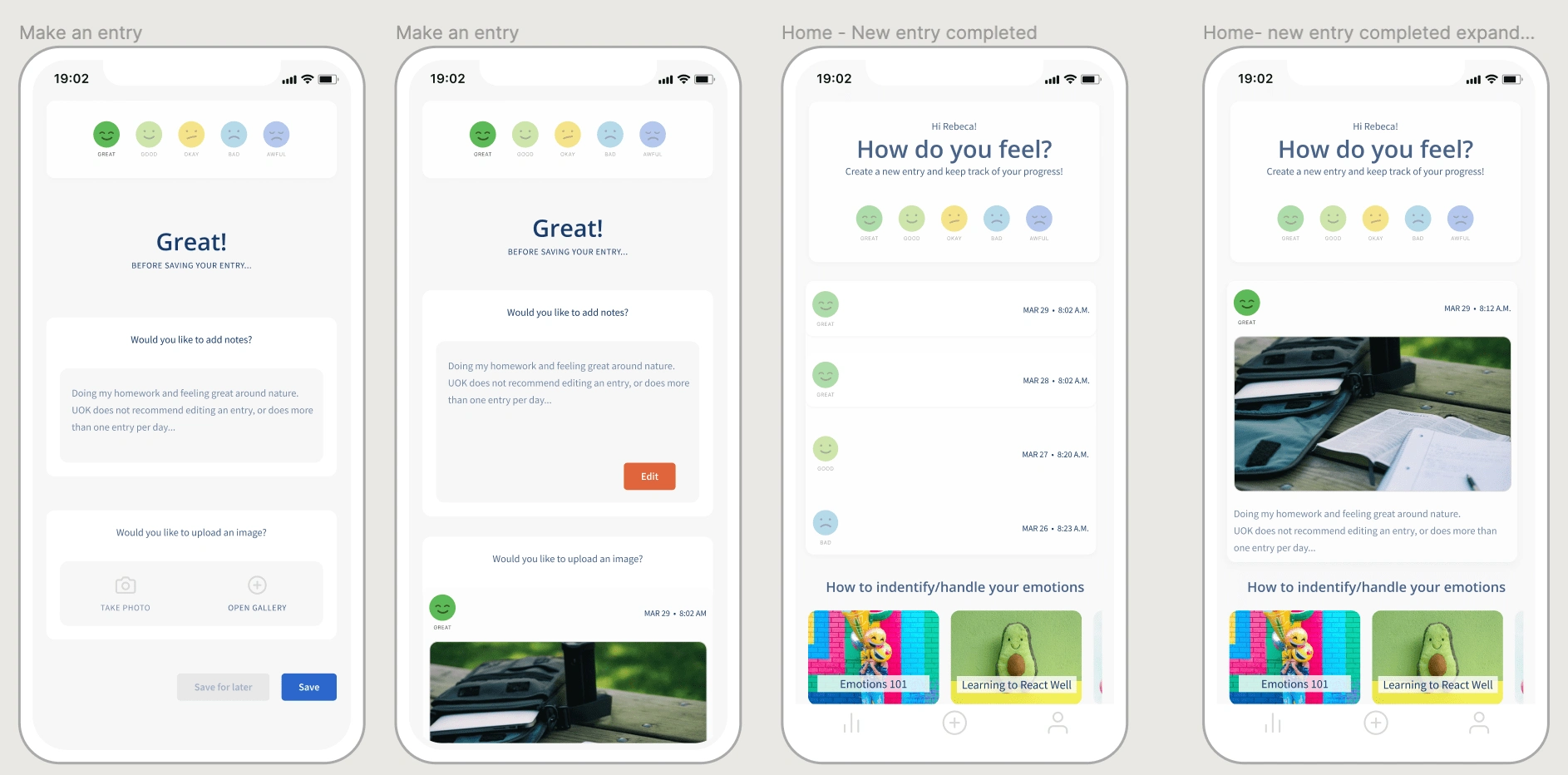
🖐️ The Outcome
An improved check-in experience with emojis vs numbers
Ability to add notes and individual photo to the entry
👀 Usability Review
To help me better understand the product, I conducted a usability to identify pain points and wow moments in the existing experience
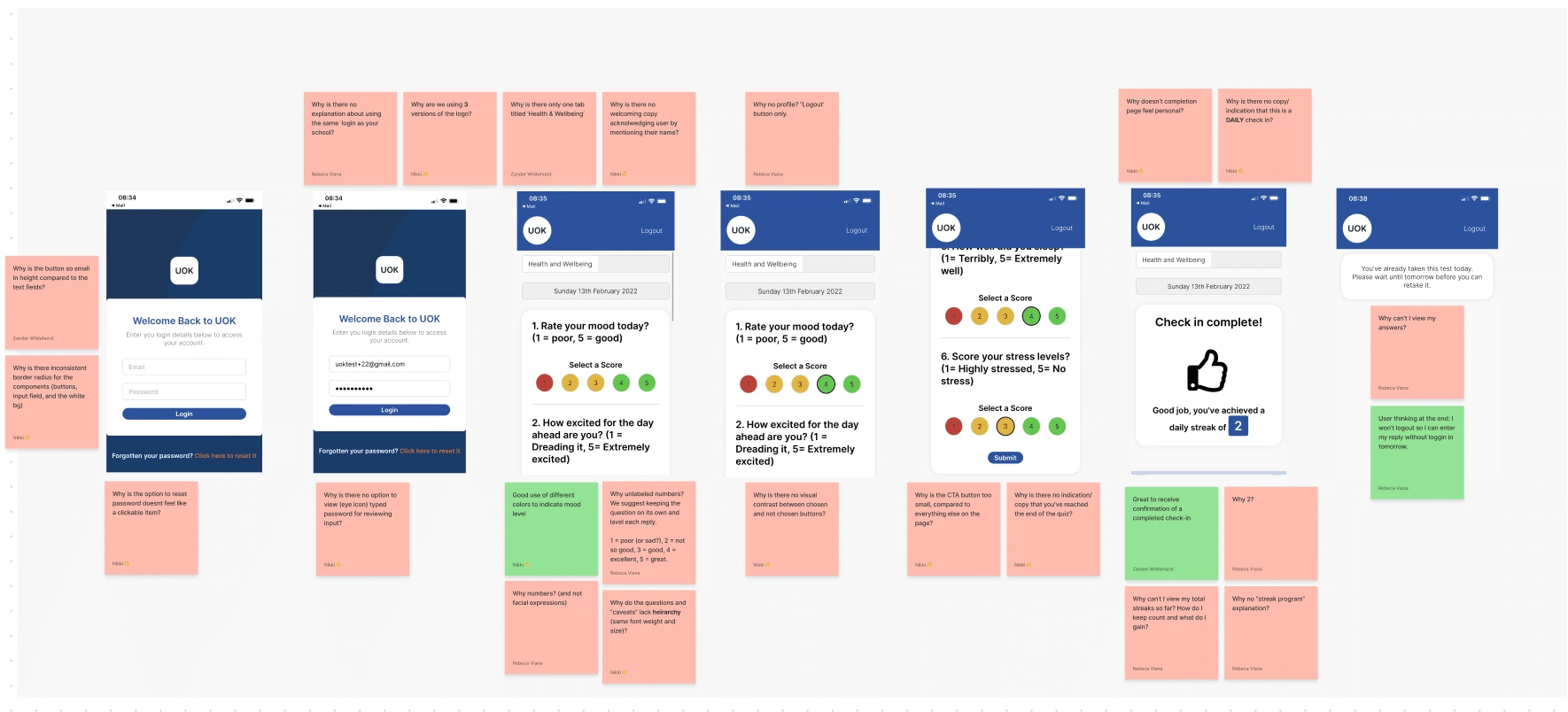
Usability Review
➡️ Friction Moments
Why is the button so small in height compared to the text fields?
Why is there inconsistent border radius for the components (buttons, input field, and the white background)
Why is the option to reset password doesnt feel like a clickable item?
Why is there no option to view (eye icon) typed password for reviewing input?
Why is there no explanation about using the same login as your school?
Why are we using 3 versions of the logo?
➡️ WOW Moments
Good use of stop light to indicate mood level
➡️ Friction Moments
Why is there only one tab titled ‘Health & Wellbeing
Why is there no visual contrast between chosen and not chosen buttons?
Why is the CTA button too small, compared to everything else on the page?
Why is there no indication/copy that you’ve reached the end of the quiz?
Why is there no welcoming copy acknowledging users by mentioning their name?
Why no profile? “Logout’ button only.
Why unlabeled numbers? We suggest keeping the question on its own and label each reply.1 = poor (or sad?), 2 = not so good, 3 = good, 4 = excellent, 5 = great.
Why do the questions and “caveats” lack hierarchy (same font weight and size)?
Why 1? Because it’s my day 1?
Why can’t I view my answers?
Why is there no copy/indication that this is a DAILY check-in?
Why doesn’t the completion page feel personal?
➡️ WOW Moments
Great to receive confirmation of a completed check-in
User thinking at the end: I won’t log out so I can enter my reply without logging in tomorrow.
👀 Competitor Benchmarking
With a usability review complete, I moved on to competitor benchmarking to help me identify standards in competitor products that could be used to improve the existing experience.
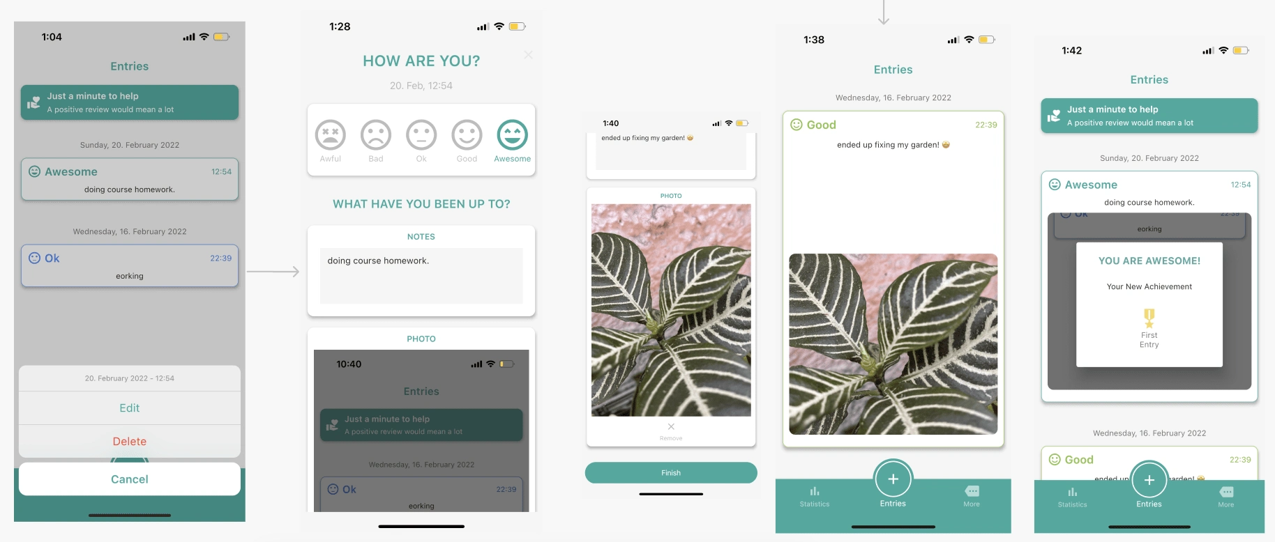
I really like the use of emojis
I like the stroke on my chosen response
The fact that I can add a note and a photo, makes it more personal and journal-like
YOU ARE AWESOME! is a great way to acknowledge my entry. Satisfaction of logging.
The homepage shows my entries.
When pressing over an entry, you get two choices, Edit or Delete. Of course, you can just Cancel if you clicked by mistake and don’t want to make any changes.
This won’t be permanent I’m guessing, but at the time I tested the app, I could get premium subscription WITH or WITHOUT leaving a review.
➡️ At this point, as a user, I was worried of having my notes at homepage.
I then had to change this concern because the app has a “Lock” option that would work like a key to your journal.
Edit an entry

I like making the experience more personal by asking “How Are You?”
I can add, edit or delete my notes. I can maybe notate why I’m changing the response.
I can delete and/or add a new one photo.
Statistics & More Menu
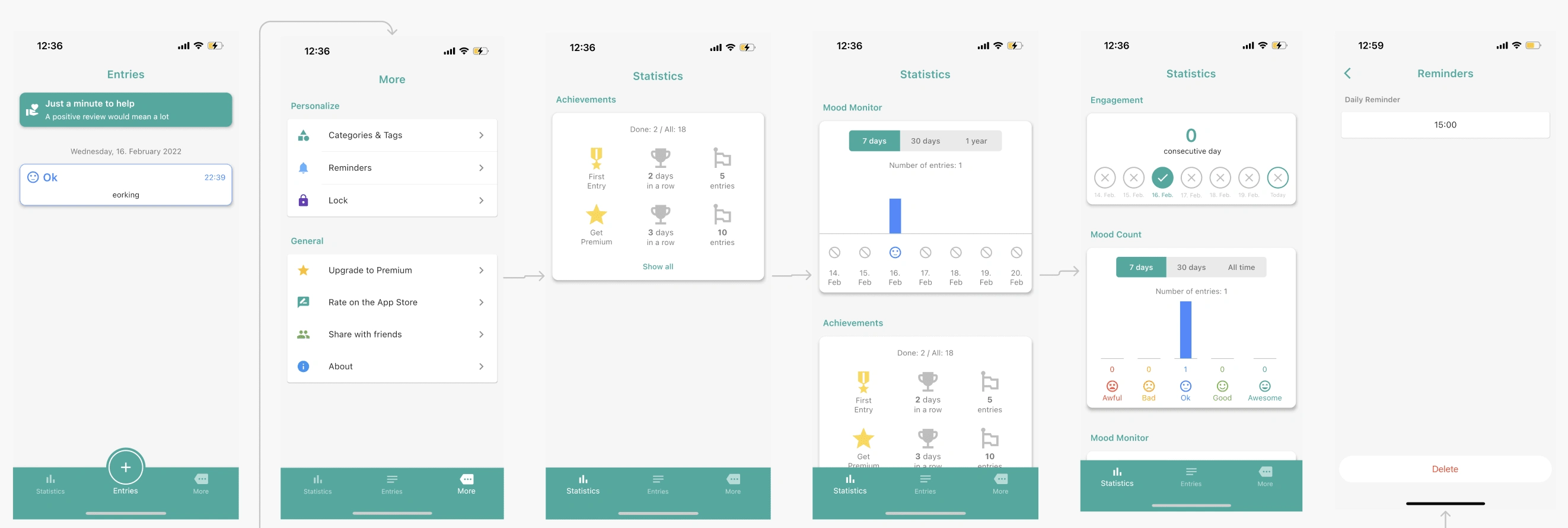
As mentioned before, you can activate a “LOCK” option within the “More” menu. This would make me more at ease about having my notes on the home screen.
You can edit the Lock and the Reminder options without leaving the app / going into the phone settings.
You get diff achievements, for consecutive days logged, unique challenges like the first entry, and the sum of entries.
👀 Questions & Observations
To help me better frame any problems with the product, I began by forming some questions and observations I have about the product. To easily document these I followed the structure [situation], [response], [problem to business or experience] to ensure I'm aware of users and business needs.
When the questionnaire is not engaging, the student might not answer genuinely, which causes an inaccurate response.
When there’s no app reminder, the student might forget to do their entry, which causes inactivity.
When the questionnaire is completed, the student gets streak points, which causes confusion about the app scoring system.
When the UOK App doesn’t display the entry history, the student can’t see their journal, which causes lack of trust as a mood tracker app.
When the UOK App doesn’t allow to view or edit your entry, the student feels disconnected with their log, which causes lack of trust as a mood tracker app.
✍️ Assumptions
Users goal Business goal
We believe that making the questionnaire more engaging [creating the experience]For the students using the UOK App [persona] Will allow the student to have a safety place to share their feelings and increase the use of the UOK app as a mood tracker [Achieve this outcome for the business and user]
📊 Synthesis
With a hypothesis set, my next step was to synthesise real survey data gathered from the product team to identify pain points from existing users
Survey Results. Used the UOK Wellbeing Student Experience - Survey Results for this phase.
Affinity Map
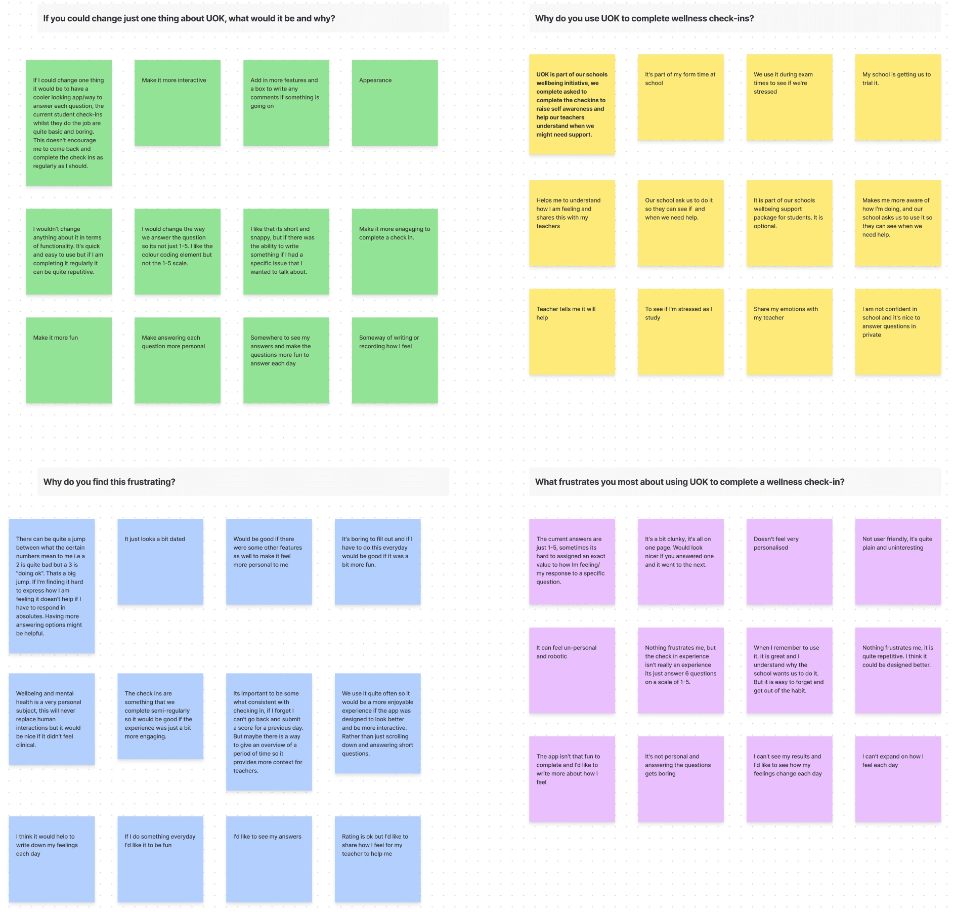
💠 Validated observations
Primary Frustration
When the questionnaire is not engaging, the student might not engage with the app, which causes inactivity or lack of use as a mood tracker app.
Other observations/frustrations
When there’s no app reminder, the student might forget to do their entry, which causes inactivity and inaccurate statistics.
When the UOK App doesn’t allow to view or edit your entry, the student might feel disconnected with their log, which causes lack of trust as a mood tracker.
❔ How Might We
With a picture of the problem at hand starting to come into place, we jumped into the ideation phase and worked through the solution design model, identifying the user's actual behavior, and optimal behavior. This allowed me to form a how might we statement to begin forming a solution.
How might we make it easier and more engaging for students to share their feelings everyday?
How might we improve the entry fields options for students to expand on their questionnaire answer and daily entry.
💡 Ideation
To avoid following the first idea I conducted a series of ideation techniques. This allowed me to consider an array of solutions. Following ideation, I mapped what could be improved or added to the product.
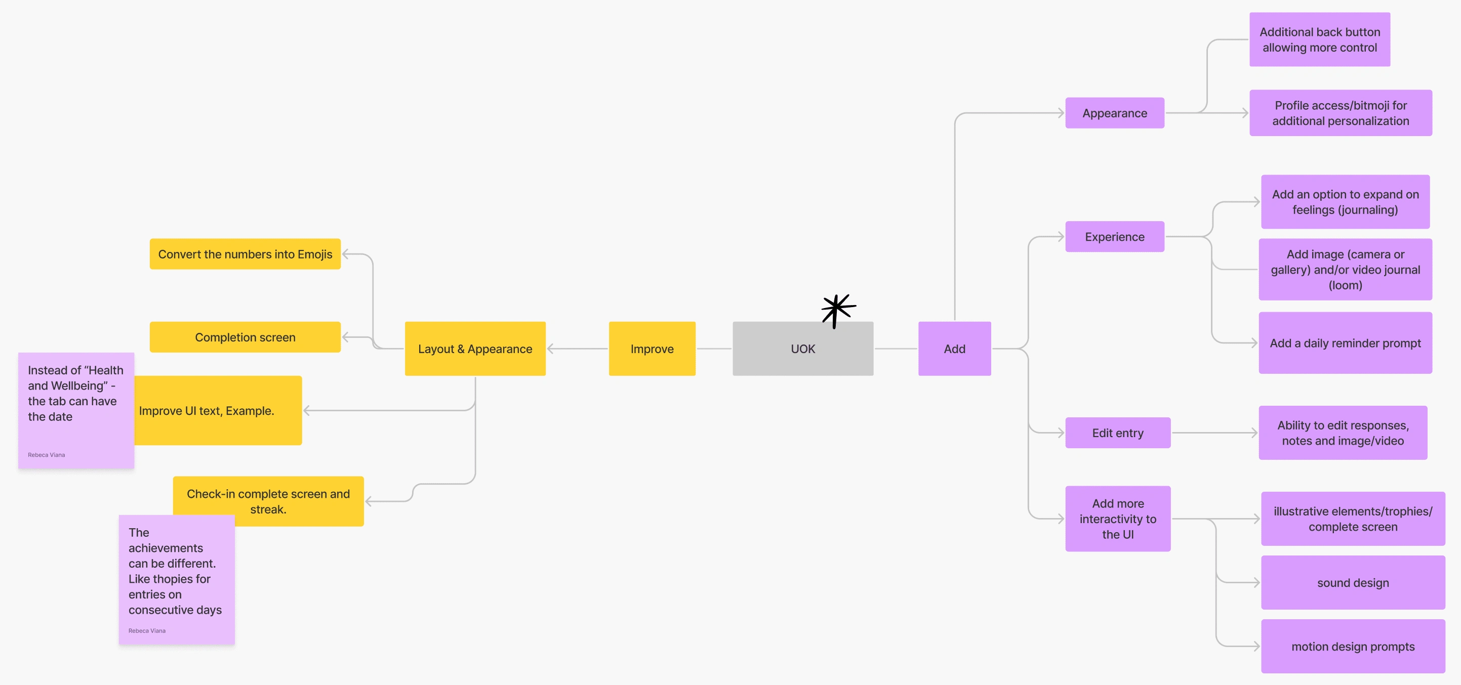
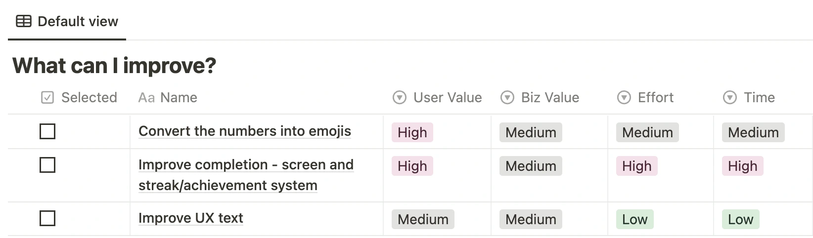
What can I improve?
Sprint pre-planning
What can I add?
Sprint pre-planning
🫂 User Flows
Following Ideation, I created user flows of the existing experience and improved the flow based on the idea that fit with business and user goals
User Story
As a High School Student, I want privately share how I feel, so I can navigate my feelings and get help.
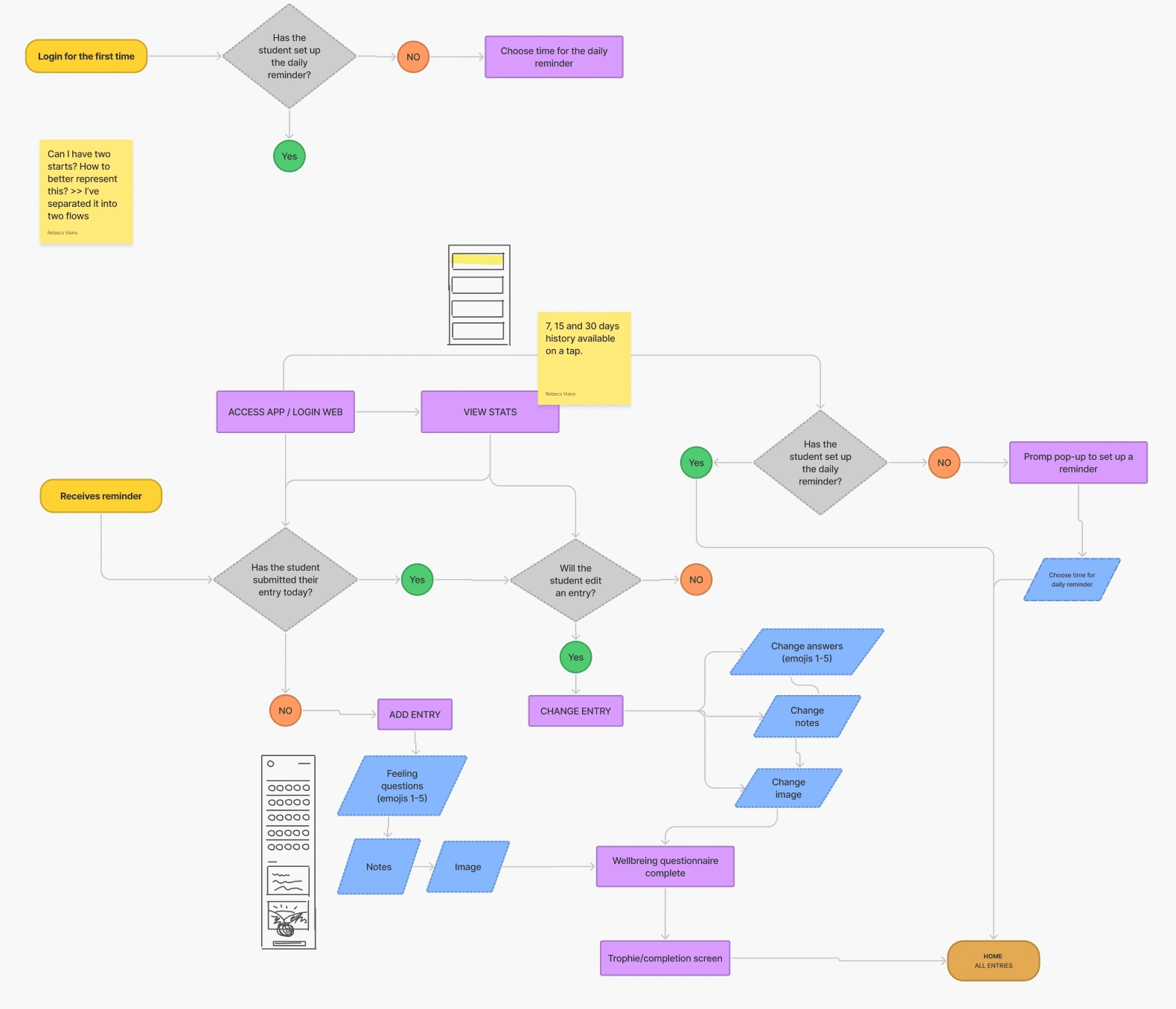
User flow
🖱️ Mid-Fidelity Wireframes
I used a neutral color palette to avoid any decision bias and would use this prototype to get feedback internally.
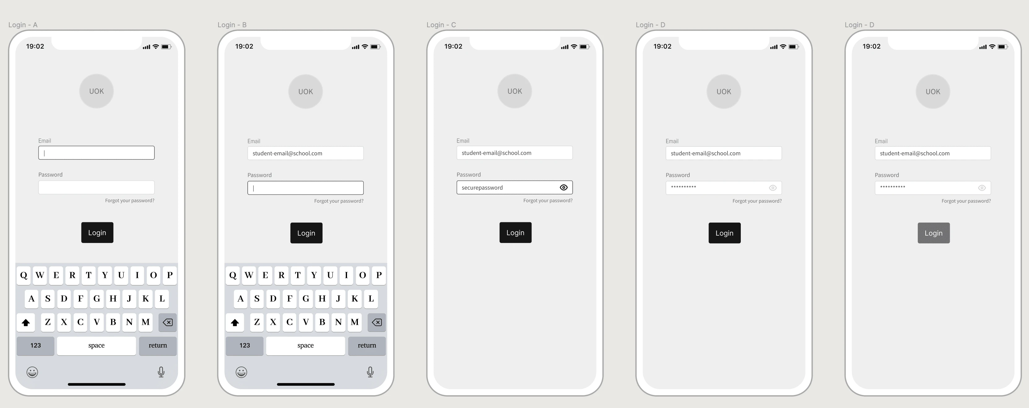
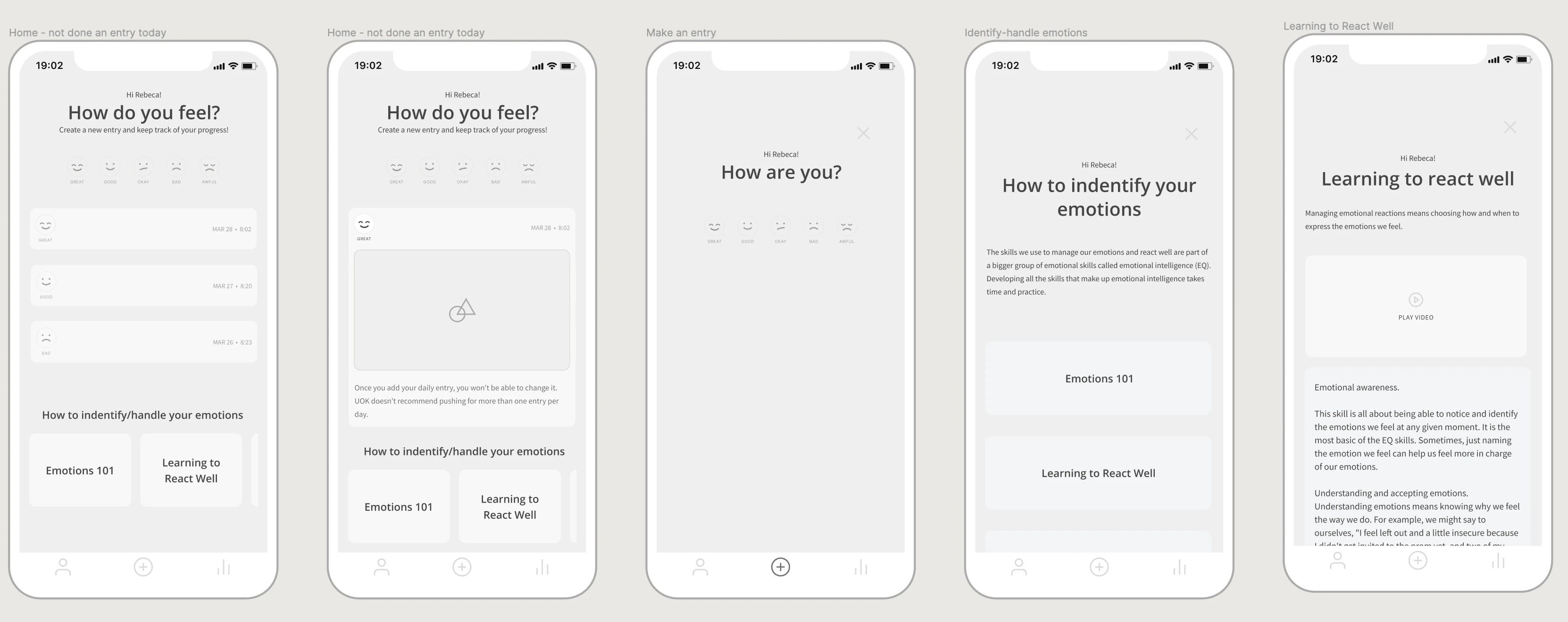
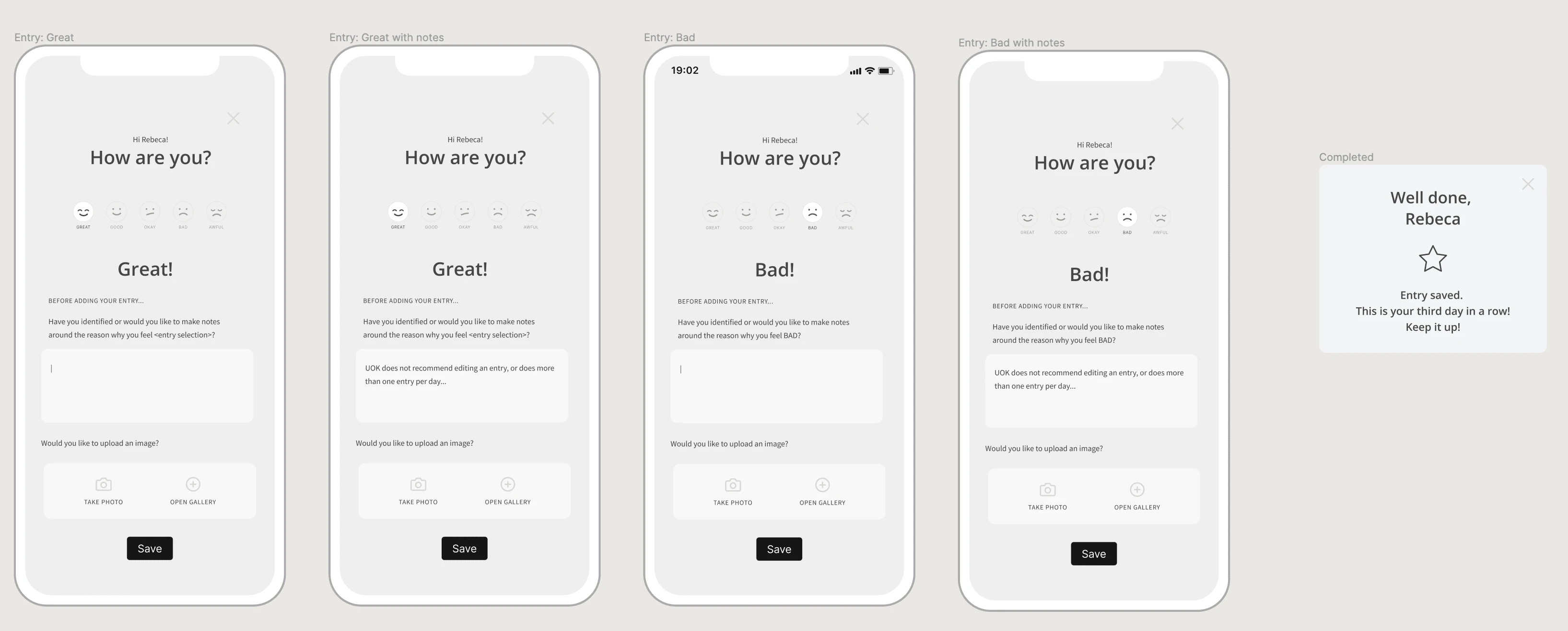
Mid-fidelity wireframes
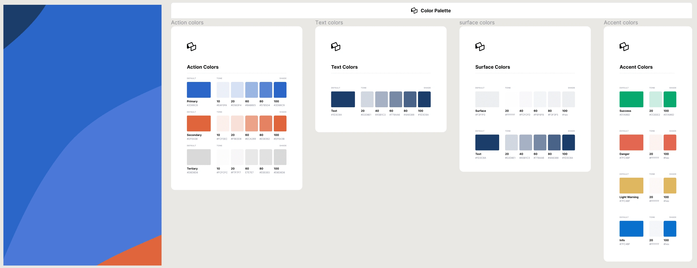
🖌️ Styles & Components
To create the high-fidelity prototype I inspected the style of the products and followed the 8pt rule to effectively and easily create a prototype that was consistent with the product styling. Before creating the prototype I defined styles and components to easily and quickly help me design consistently.
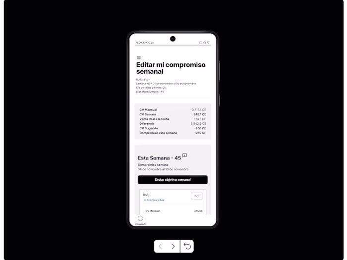
🧱 High-Fidelity Prototype
Below is the final version of the prototype that I created. I included interactions and transitions from Figma to match the product flow.
👉 Testing
With the hi-fi prototype created, I formed a testing script with scenarios and tasks for the user to complete to validate the prototype with real users. To test the prototype I used Maze and gathered feedback following every task.
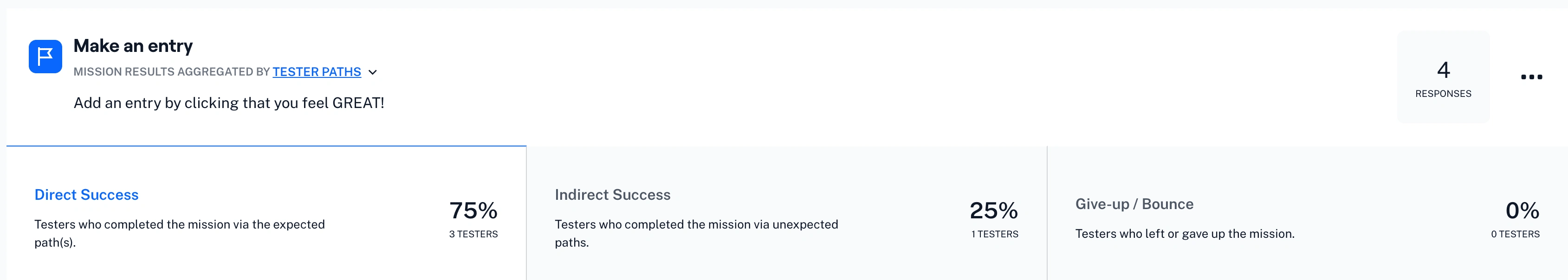
MAZE testing
Like this project
Posted Mar 7, 2023
I worked on this case study during Memorisely UX/UI Design immersive online Bootcamp. During the Bootcamp I worked with a small team designers around the world.
Likes
0
Views
33