Case Study: Unplugged
Rebeca Viana
Intro
The goal of this case study was to improve the search experience and make it easier for busy city workers to view available cabins and dates.
🧑💼 Role
User Research
Product Strategy
UX Design
UI Design
Prototyping
Usability Testing
🧰 Tools
FigJam
Figma
Maze
🕰️ Timeline
5 weeks
Case Study
❓ The Problem
The current search experience of Unplugged is confusing with busy city workers having results on dates they did not choose. We’d like to improve search experience by making it more obvious and intuitive the search capability with Unplugged.
📓 Hypothesis
We believe that improving the search experience
For busy city workers
Will allow them to easily find an unplugged experience and cabin
✅ The Solution
🖐️ The Outcome
An improved search experience
Clear path for busy city workers to book a cabin.
👀 Usability Review
To help me better understand the product, I conducted a usability review to identify pain points and wow moments in the existing experience
Usability Review
➡️ Friction Moments
The dates get changed if my selection is not available.
Why a BOOK button?
What is the difference between the “Find your escape” button?
Not the same logo as above. Branding confusion.
Why reset all?
Why 3 nights?
Why would they not allow them to start searching immediately?
Why would they make the hero so big (100% viewport?)
Why would they
Why London is distributed into only two options?
Why is there no date range?
No “I’m flexible” CTA on the date picker.
BOOK could be ESCAPE to be consistent with their UX writing
Black bold letters and different styles make it hard to read
Why is the contrast so soft on the book button and the view cabin?
Why main CTA is on the left side of the card?
Why is there the date font so big?
Why is the UC copy (CTA) inconsistent
➡️ WOW Moments
I like the subtitle - pretty descriptive
I like that there is a primary CTA
I like the title and subtitle, decent description of what to expect
I like that the search feature is large and front and center in the hero section
Love the image selected for the background, immediately shows you the vibe of the cabin
Love that the cabins have names
North of London as a hint of location
I like the “ESCAPE” wording on the search button
I like the chips
✍️ Assumptions
Users goal Business goal
We believe that improving the search experience for busy city workers will allow them to easily find an unplugged experience and cabin
🔍 Information Architecture
I mapped out the existing Information Architecture to uncover any paint points in navigating the product's search experience.
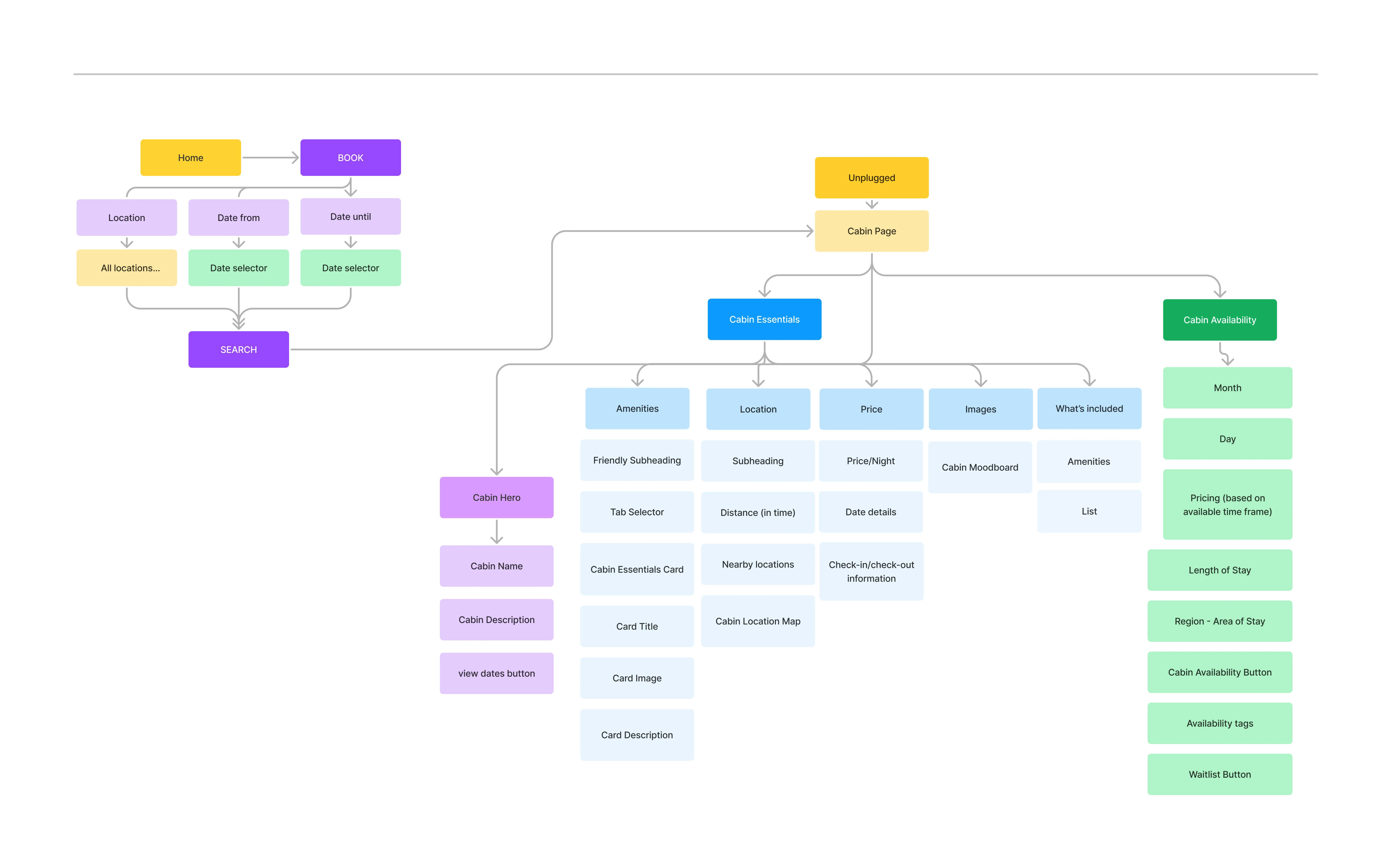
information architecture
Following IA, I created a customer journey map to empathize with users and understand the core problems users experienced at the search phase of their journey.
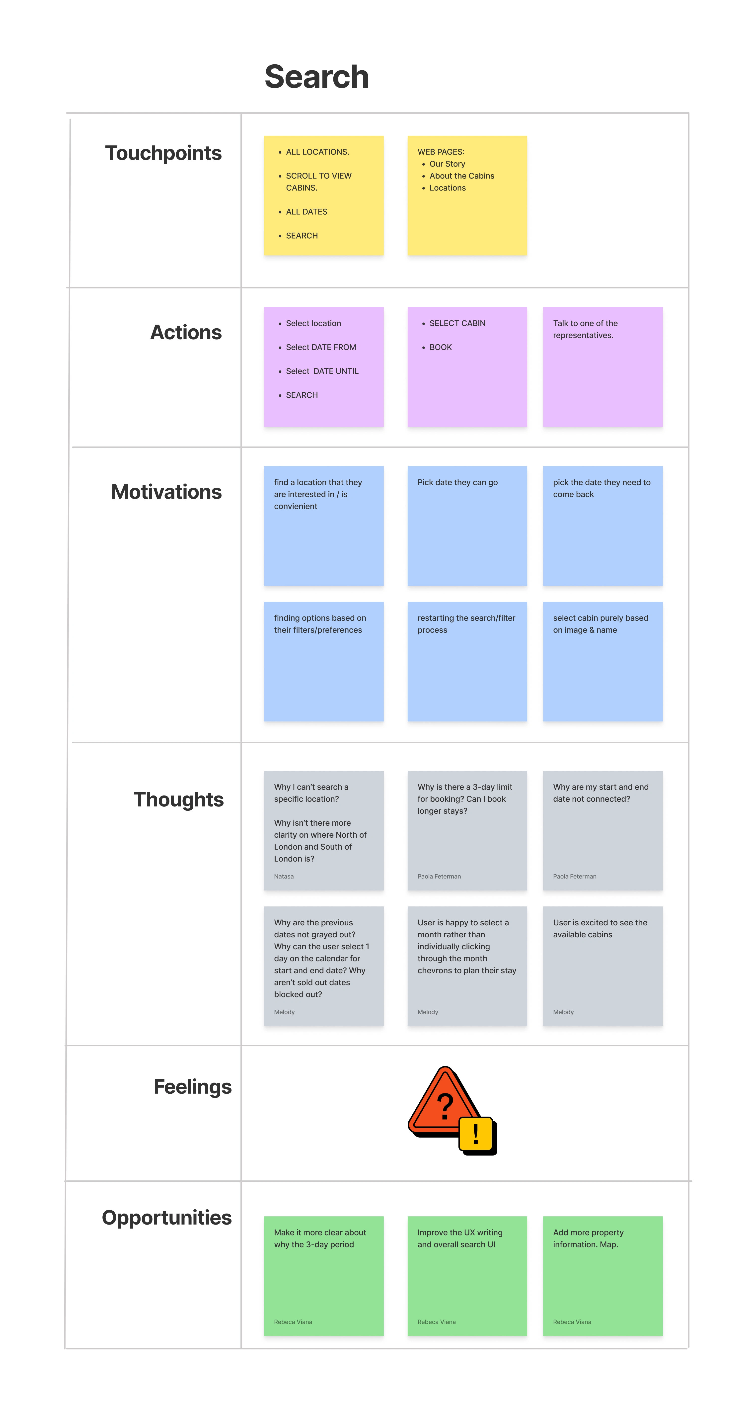
Customer Journey Map
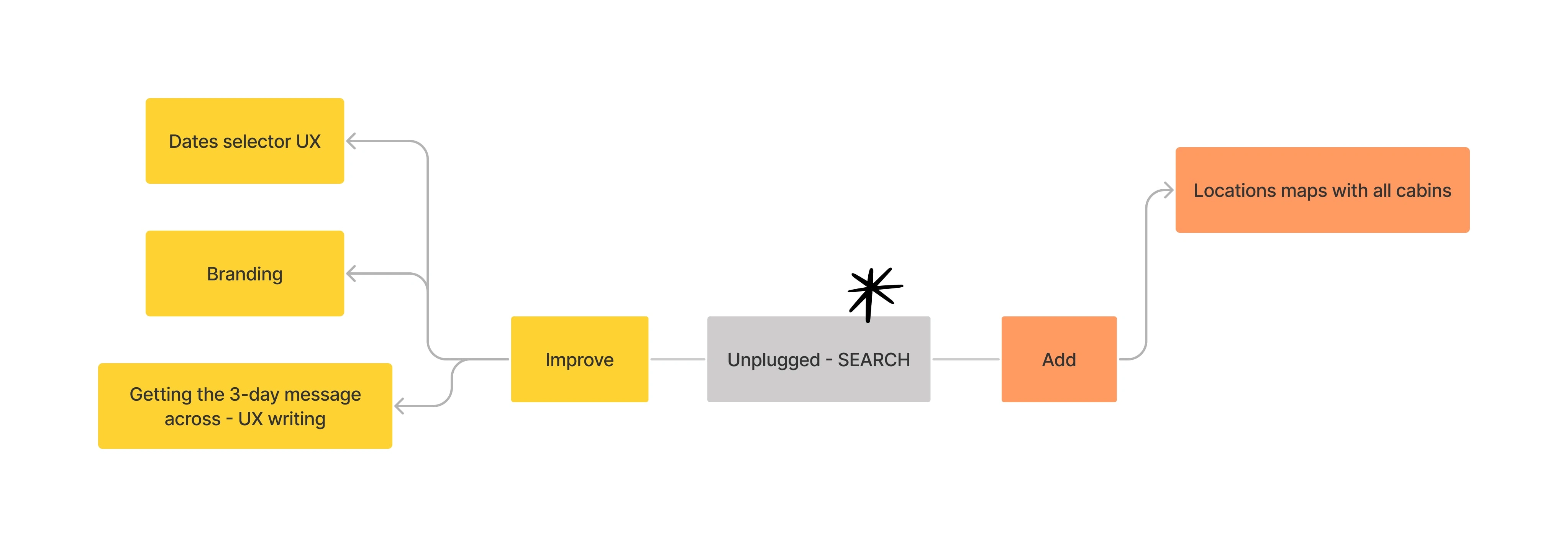
💠 Opportunities
With the customer journey map created, I focused on the search phase and identified a few opportunities to improve the experience.
Make it more clear about why the 3-day period
Improve the UX writing
Improve the search UI
Add more property informational tags and chips along the map.
❔ How Might We
With a picture of the problem at hand starting to come into place, we jumped into the ideation phase and worked through the solution design model, identifying the user's actual behavior, and optimal behavior. This allowed me to form a how might we statement to begin forming a solution.
How might we make it clear for busy city workers that the minimumof days for a reservation is three.
How might we make it easier for busy city workers to view available dates and cabins after choosing dates?
💡 Ideation
To avoid following the first idea I conducted a series of ideation techniques. This allowed me to consider an array of solutions. Following ideation, I mapped what could be improved or added to the product.
What can I improve in the search experience?
UX writing
Date selector and cabin availability UI
What can I add?
Property information
Chips in the map
🫂 User Flows
Following Ideation, I created simple flows of the existing experience in order to fit all search selectors within the next phase.
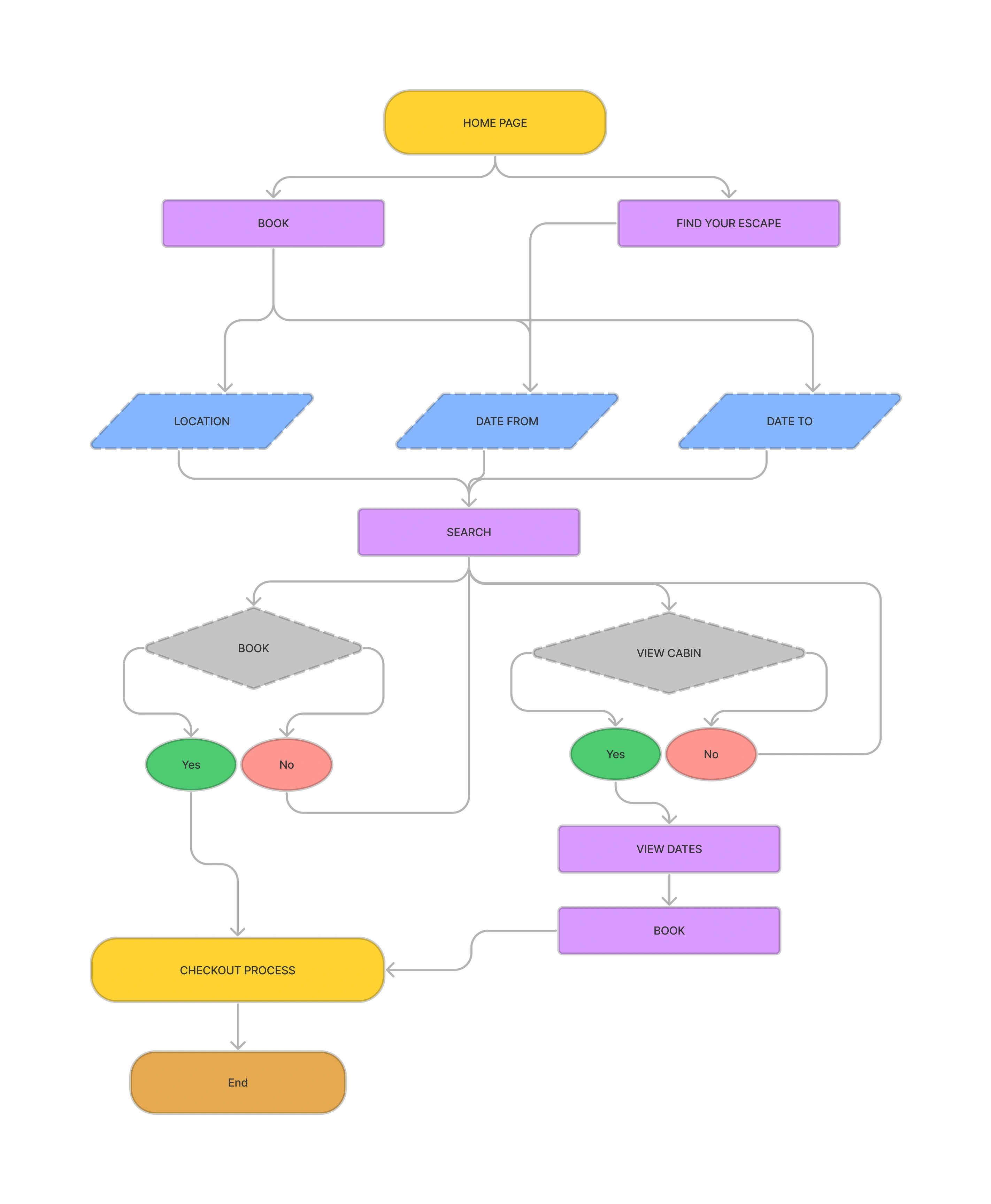
User flow
🖌️ Styles & Components
To create the high-fidelity prototype I inspected the style of the products and followed the 8pt rule to effectively and easily create a prototype that was consistent with the product styling. Before creating the prototype I defined styles and components to easily and quickly help me design consistently.
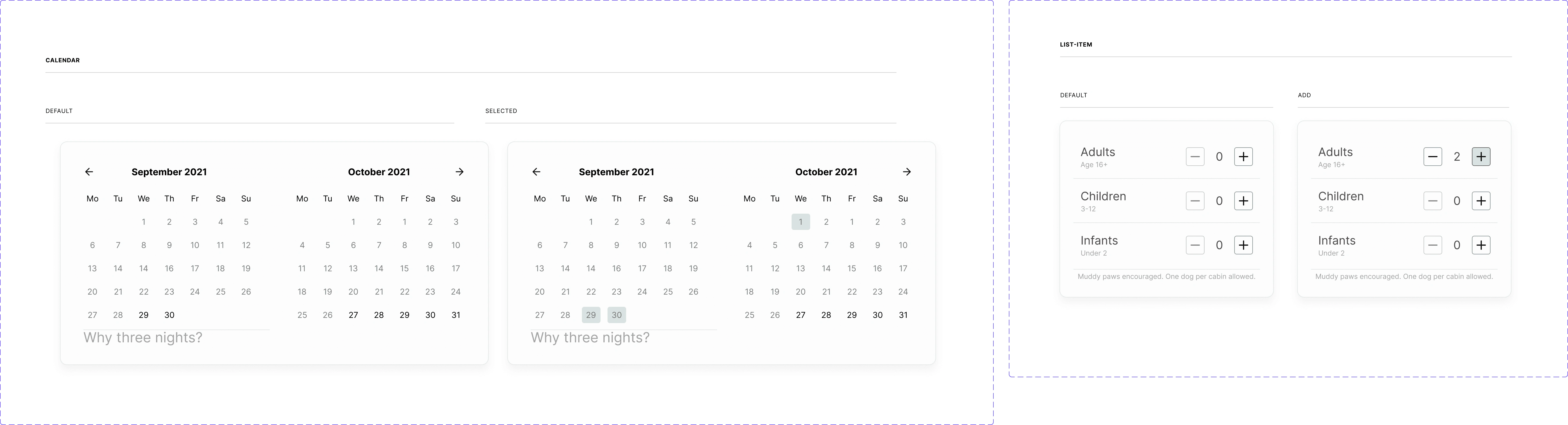
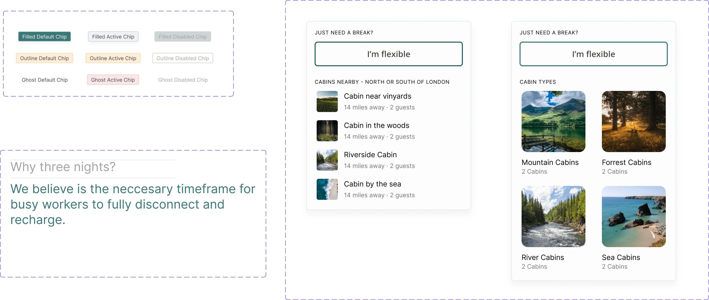
Search options components
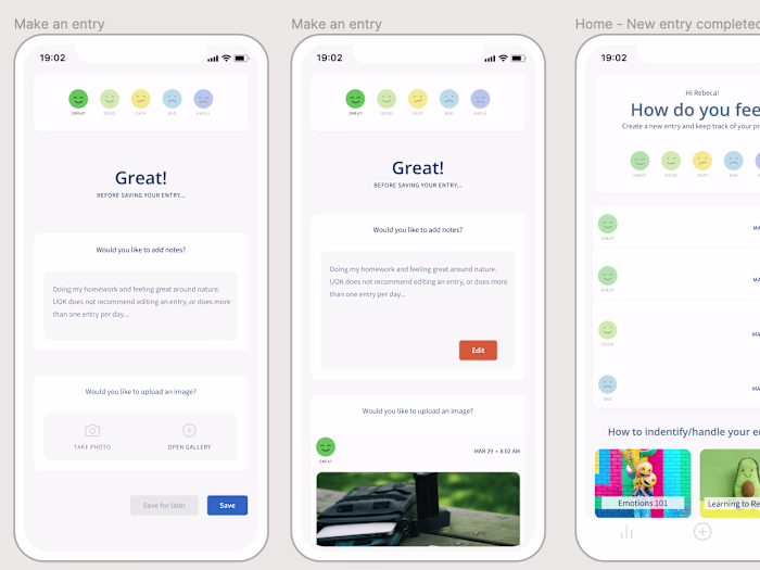
🧱 High-Fidelity Prototype
Below is the final version of the prototype that I created. I included interactions and transitions from Figma to match the product flow.
👉 Testing
With the hi-fi prototype created, I formed a testing script with scenarios and tasks for the user to complete to validate the prototype with real users. To test the prototype I used Maze and gathered feedback following every task.
Like this project
Posted Mar 8, 2023
The goal of this case study was to improve the search experience and make it easier for busy city workers to view available cabins and dates.
Likes
0
Views
44