Personal Finance App Design Project

Hatypo Studio
1 collaborator

A personal finance app that puts your money front and center.
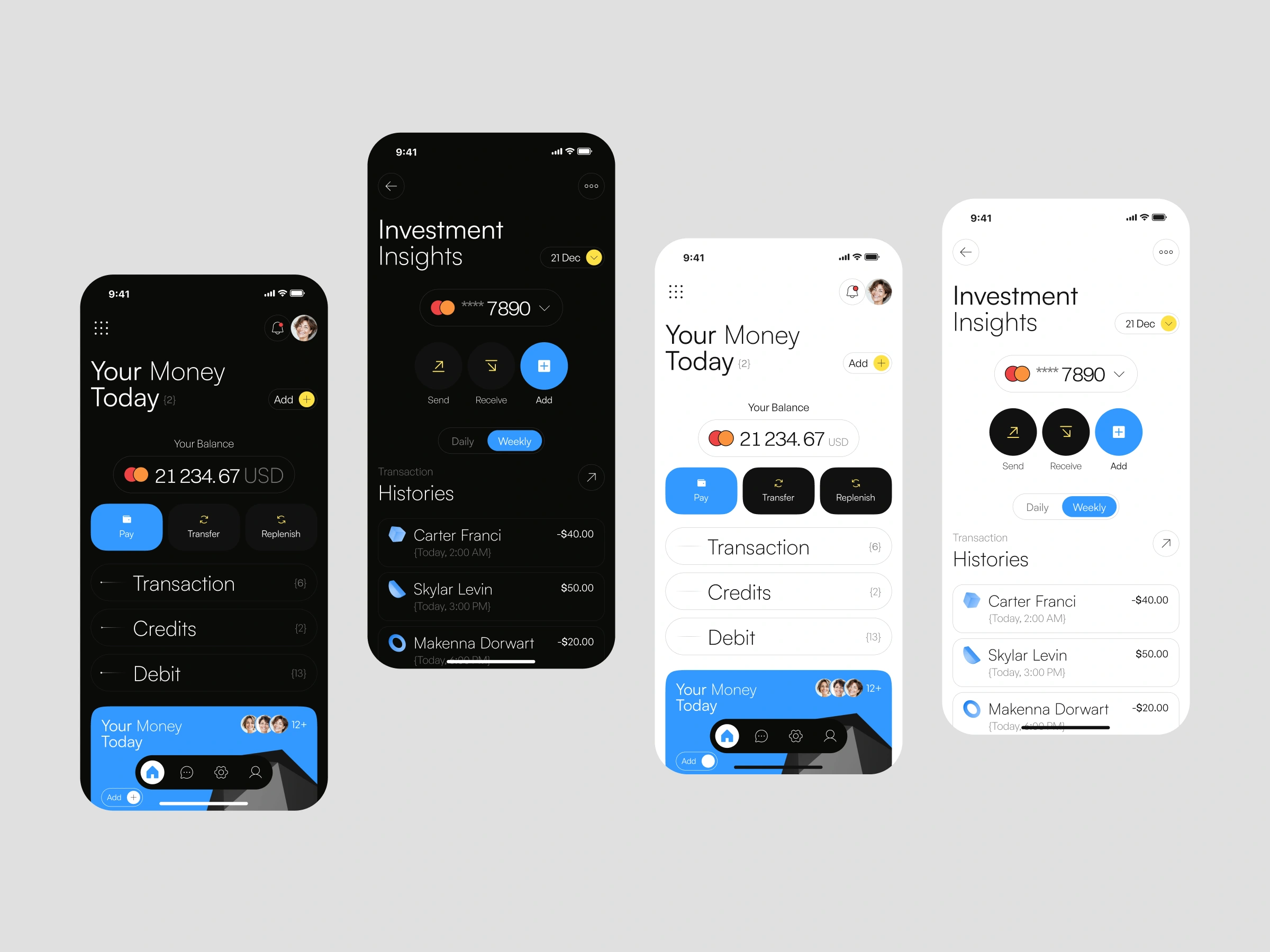
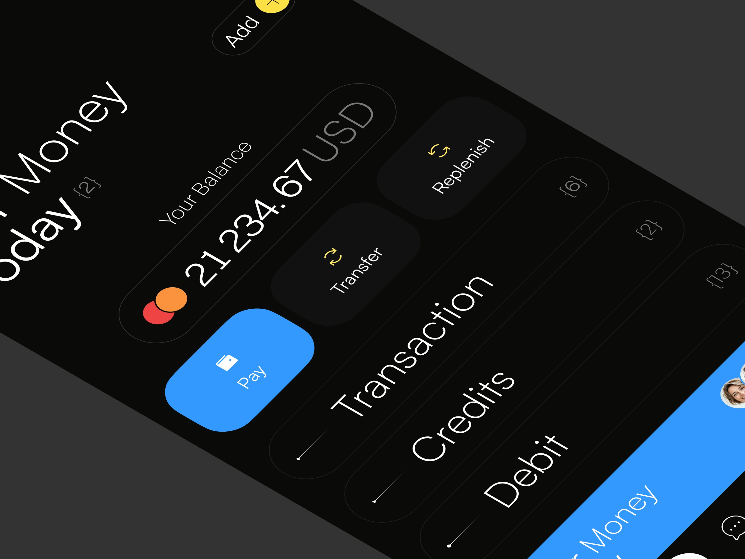
The home screen opens with a bold "Your Money Today" headline and your balance in large, confident type, so the most important number is the first thing you see. Right below, three quick actions (Pay, Transfer, and Replenish) let users move money in one tap, with Pay highlighted in a bright blue accent.
Transactions, Credits, and Debit are organized as simple, expandable rows, each with a live count in brackets for a clean, editorial feel.Designed in both light and dark mode, with oversized typography and minimal UI so finances feel calm, clear, and under control.
The Problem
Managing everyday money shouldn't feel stressful, yet most banking apps make it that way. Balances are buried under ads and promotions, key actions hide behind multiple menus, and transaction histories look like dense spreadsheets.
Users open the app just to answer one simple question, "how much do I have right now?", and end up scrolling through clutter. Many finance apps also feel cold and overly technical, which makes people avoid checking their money altogether. The goal was a finance app that feels clear, personal, and effortless to check every day.
The Approach
Positioning & Narrative:
We positioned the app as a calm daily companion for your money, not a complicated banking tool. The experience is built around three pillars: See, Move, and Understand. Instead of navigating through layers of menus, users can check their balance, send money, and review spending from a single, focused screen.
Visual System & Layout Execution:
Balance-First Home: A large "Your Money Today" headline and oversized balance make the total amount instantly readable at a glance.Quick Actions: Pay, Transfer, and Replenish sit right under the balance as rounded buttons, keeping the most common actions one tap away.
Organized Money Categories: Transaction, Credits, and Debit are shown as clean list rows with counts in brackets, giving a quick overview without visual noise.
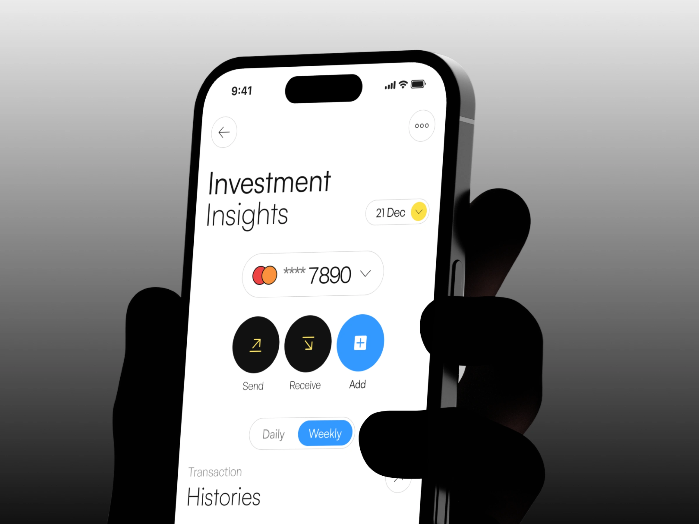
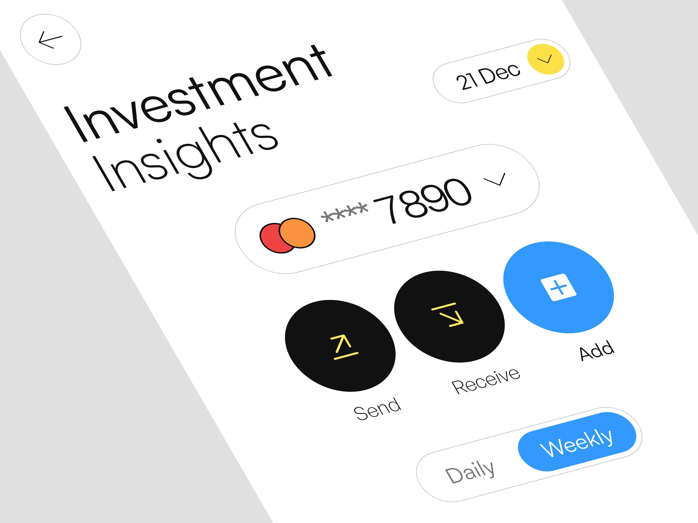
Investment Insights: A dedicated screen shows the selected card, Send, Receive, and Add actions, plus a Daily and Weekly toggle to switch the view in seconds.
Transaction Histories: Each entry displays the person, time, and amount, with incoming and outgoing payments clearly separated for easy tracking.
Editorial Typography: Bold, oversized headings and generous spacing give the app a premium, magazine-like character that stands out from typical finance apps.
Light & Dark Mode: Both themes share the same layout and components, with a vivid blue accent guiding attention to the main action.
Thanks for watching! Press "L" if you like it 💙
We are Hatypo Studio, a product design partner for SaaS, fintech and healthtech teams, from startups to corporate leaders. Since 2021, our team of 20+ designers and product managers has delivered 250+ projects across the US, Europe and the Middle East.
Help ambitious companies make complex products feel simple, bringing product, web and brand together in one design language. Products that look as good as they work.
We’re available for a new project, let’s talk!
Like this project
Posted Oct 19, 2026
Designed a personal finance app focusing on simplicity and user experience.
Likes
2
Views
3
Clients
Hatypo Studio
Collaborators