Marketing On a Menu Branding
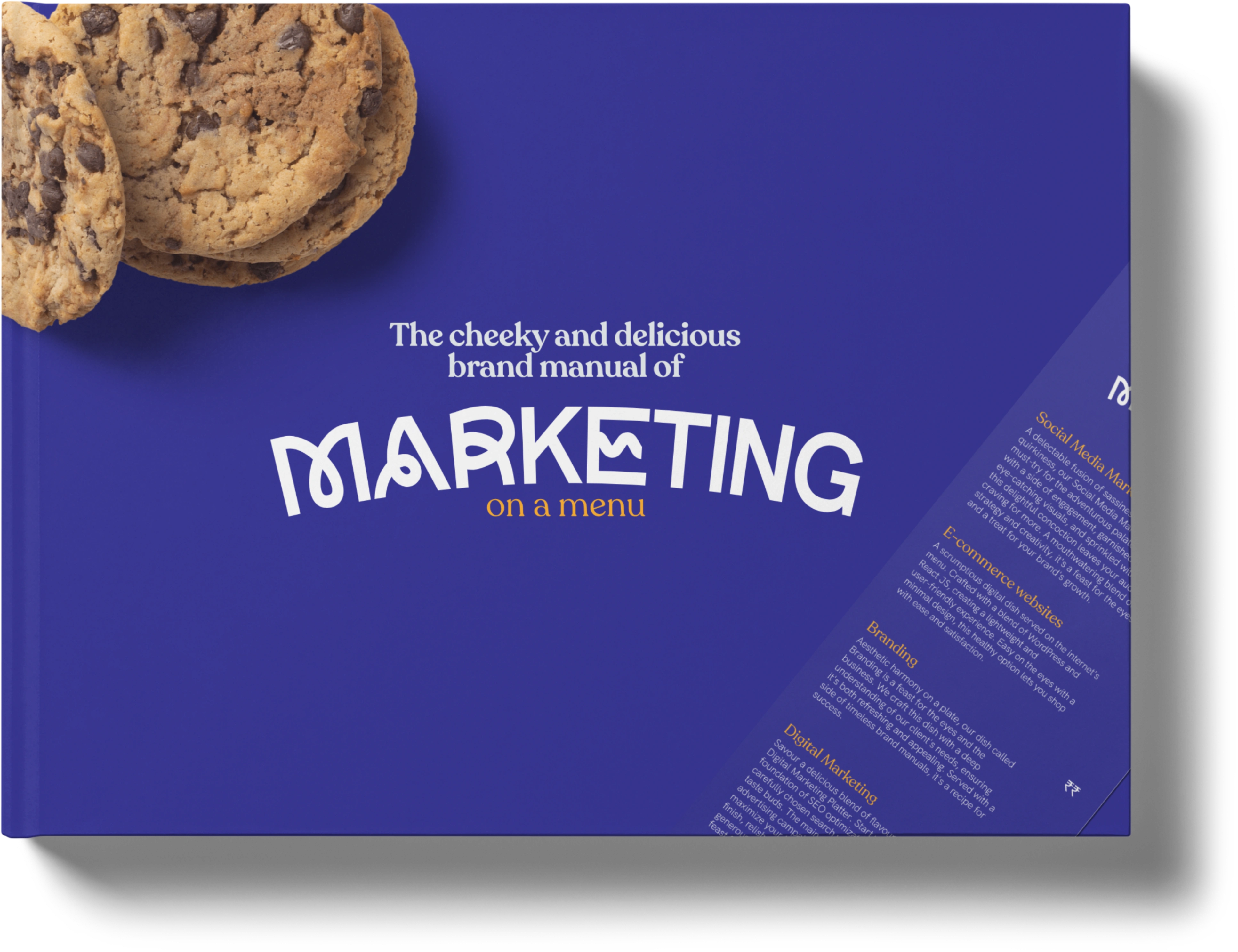
Welcome to the world of Marketing on a Menu!
Objective:
Create a kickass, friendly, quirky, young, cheeky yet confident and corporate brand design for a company that emulates the same values. They are a branding and advertising agency, on a mission to sprinkle some good design thinking for existing and upcoming brands in Goa that need to stand out.
What was the issue:
The client had created their initial logo by working with a designer on Fiverr and was unhappy with the results. They realised that the logo created was too corporate and did not showcase their vibe or the ethos they were going for.
What were the problems discussed:
A logo that did not meet their vibe and looked too corporate. It involved too much input from the clients instead of creativity from the designer.
A website based on this logo made them evaluate the need for redesign.
Initial logo:
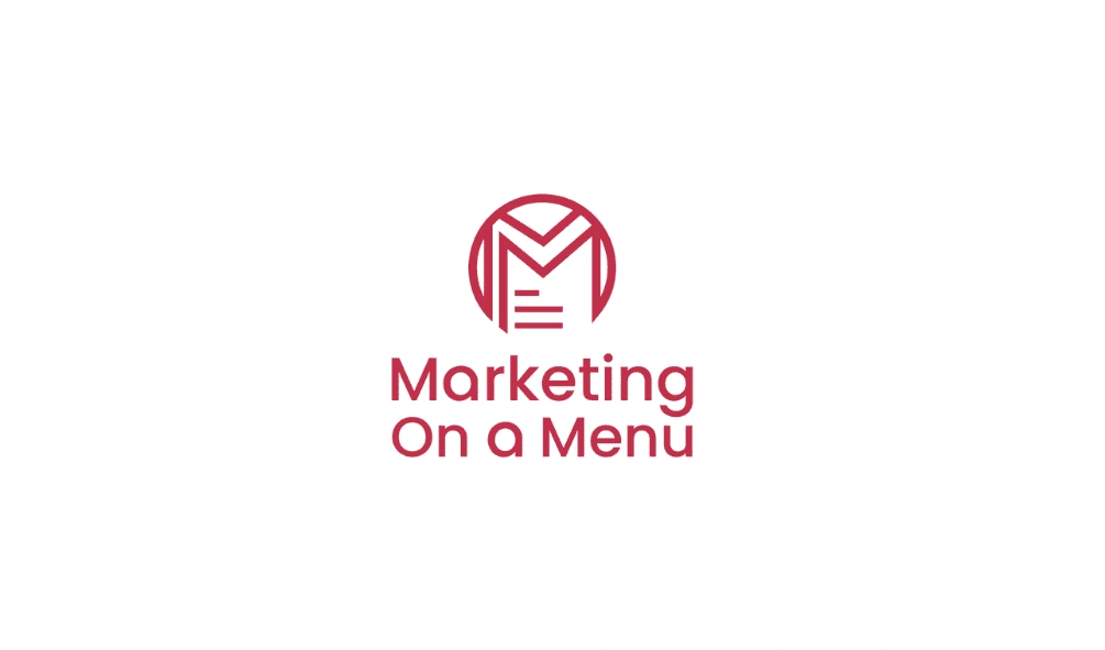
Old logo
Redesign:
The redesign involved hours of conversation and a lot of introspection as well as understanding the client's goals and expectations to create a logo design and subsequent branding elements and collaterals.
Key takeaways from brand discussions:
They are a young startup that has recognised that design thinking is missing in branding, advertising, websites and e-commerce and needs evaluation in Goa.
Marketing On a Menu: The name "Marketing On a Menu" was chosen to evoke the idea of choice and variety in marketing services, akin to selecting items from a menu. It conveys the concept of offering a range of options, tailored to suit each client's needs, similar to selecting dishes from a restaurant menu. This name emphasizes the customizable nature of the services offered, inviting clients to "order" their preferred marketing solutions from a diverse and appetizing selection.
They refer to themselves by their abbreviation MOaM.
While they understand that due to the name restaurants immediately come to mind, they don't want that to be their focus.
It should be more typographical, easy to read and create a fun vibe. No mascots or any symbol they relate to.
The Design:
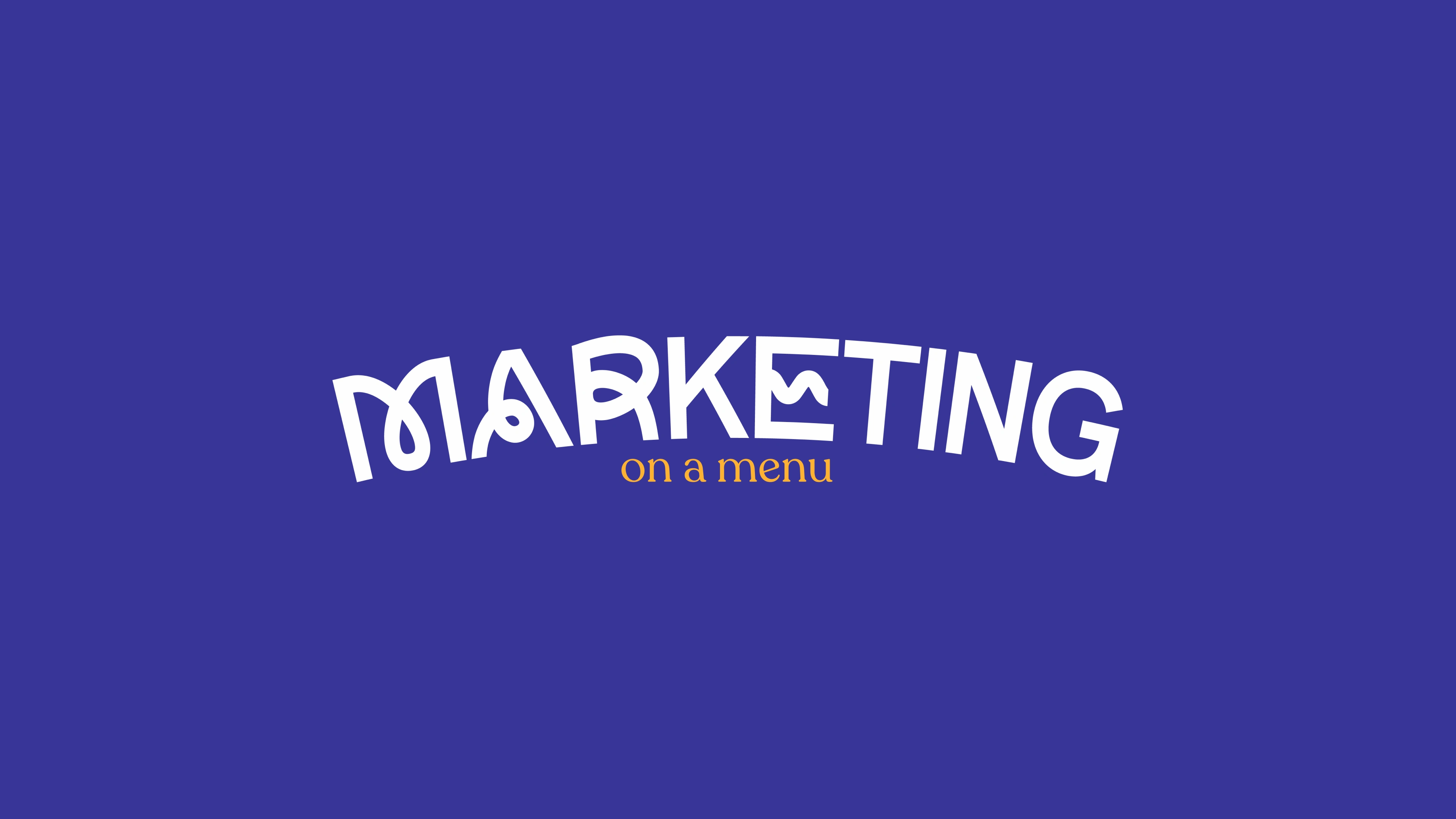
The logo design
Using a mix of funky sans-serif typeface, along with ligatures from a regular sans-serif font, the word 'Marketing' was created. It is paired with a stylish and readable serif to create the words 'on a menu' (clients preferred the word 'Marketing' to be in focus).
An important requirement any designer thinks of is the responsiveness of the logo. The above logo is a wordmark logo and has a letter mark/monogram variation and an icon too to help with responsiveness across different digital and print media.
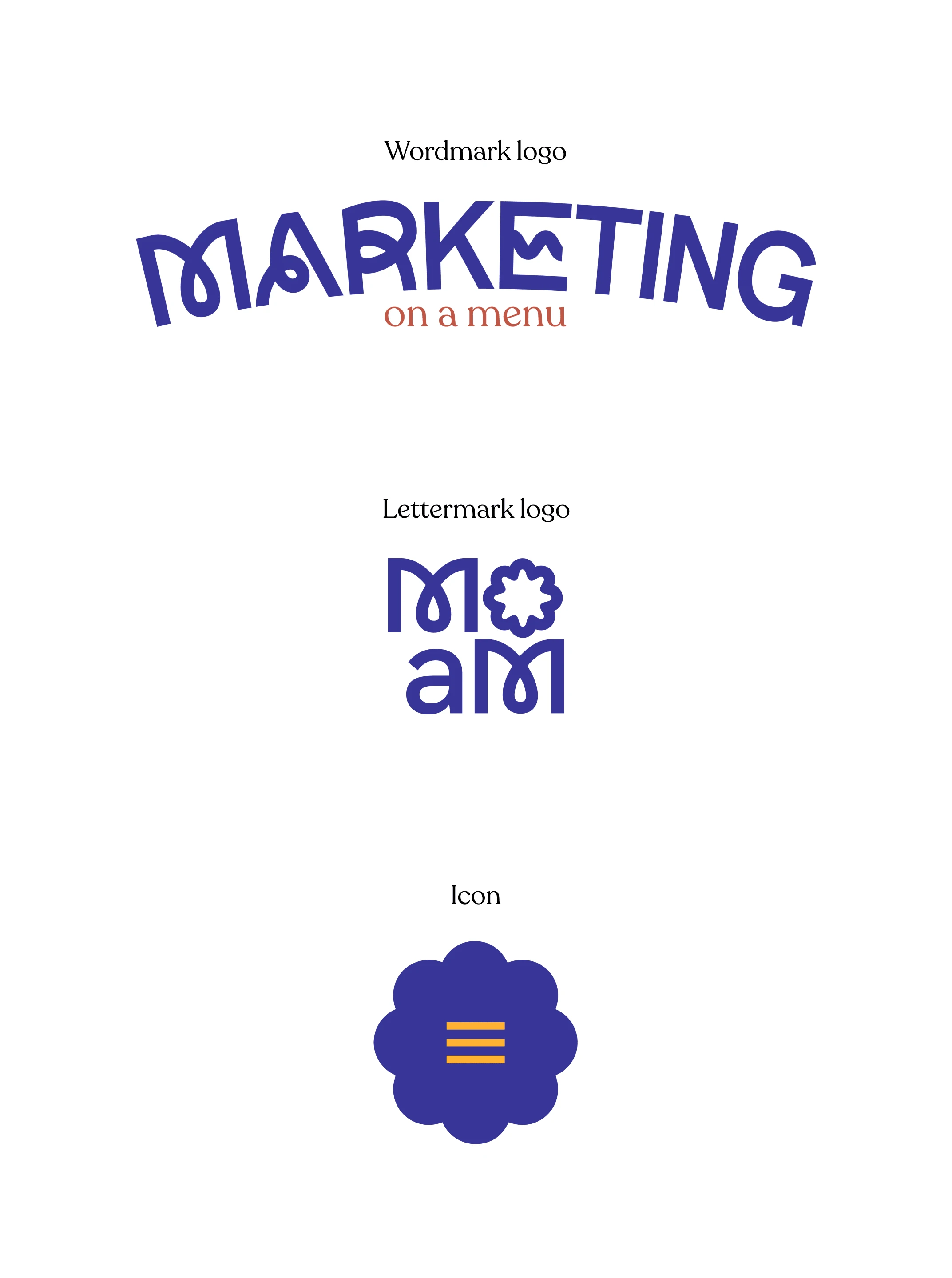
The Logo variations for MOaM
What is a wordmark logo?
Most wordmark logos are a starting point for new firms with long names until they become familiar and end up being recognised by their lettermark/monogram. Example: IBM

The wordmark logo on a white background has an orange tinge rather than yellow for better contrast.
What is a lettermark/monogram logo?
Lettermarks or monograms are abbreviations of long names and become the norm when people are familiar enough with the brand, making it easier to pronounce or spell out. In this case, Marketing On a Menu is abbreviated to MOaM for brand value, brand recognition and aesthetic purposes. This would be their frequent logo.
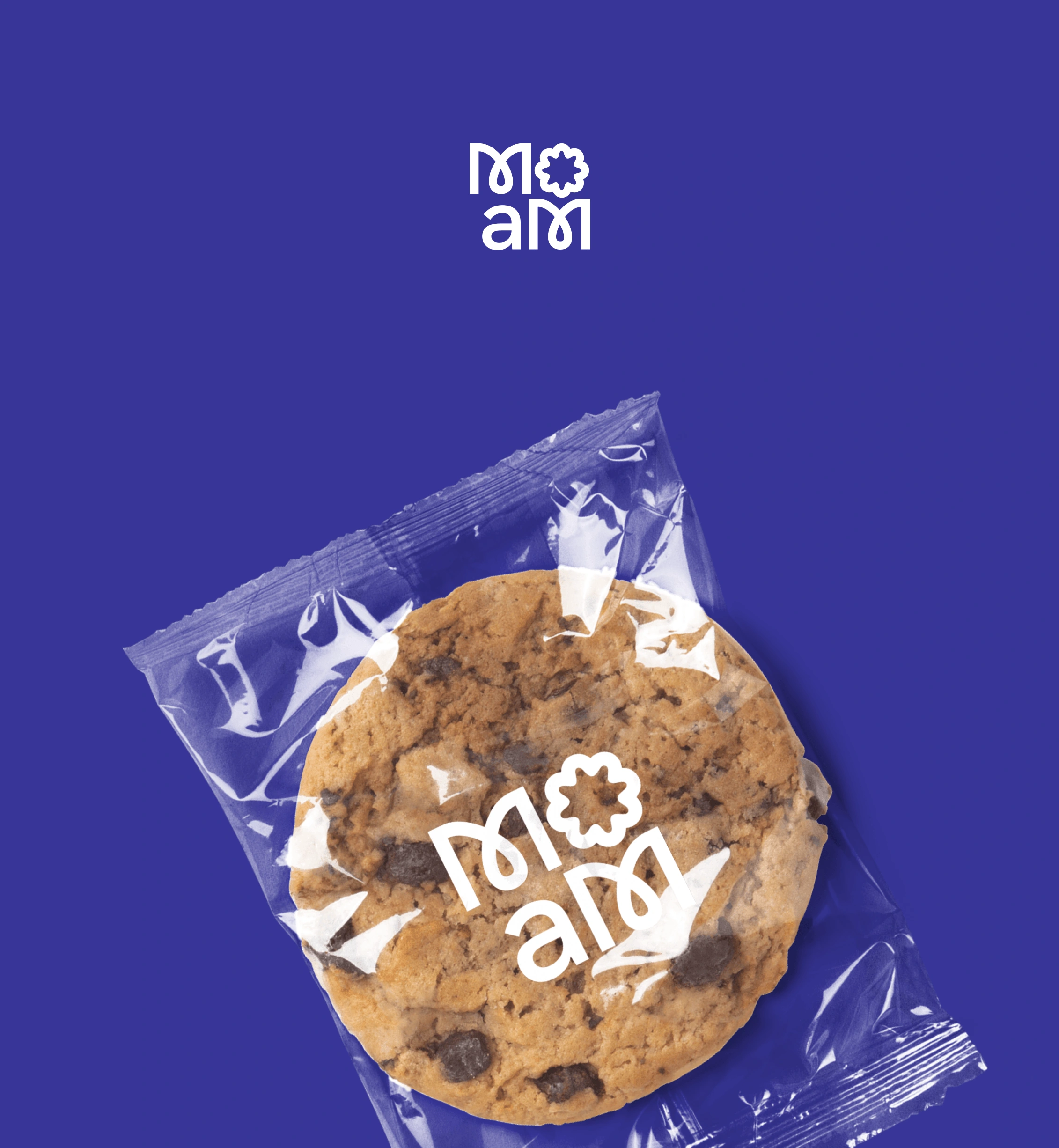
Lettermark/Monogram Logo for MOaM
What is a submark logo or an icon?
The icon is a visual representation of a company that is widely recognised across the world and is unique to the particular company.
The icon for MOaM has been ideated from the concept of a menu.
Comprised of three horizontal lines, it serves up a playful fusion of web and culinary menus as we deal with social media marketing, e-commerce websites and branding. The lines symbolize not just website navigation but also the delightful choices you'll find on a restaurant menu.
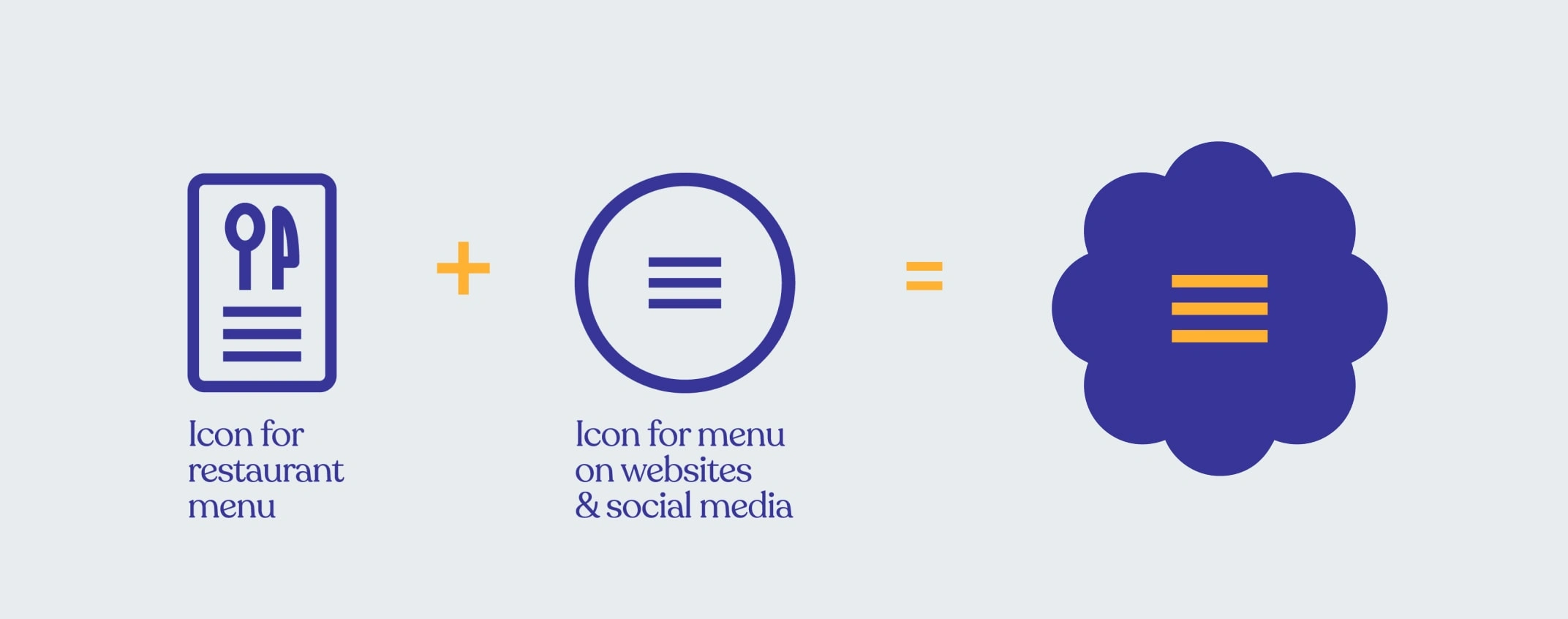
Creation of the icon
Why cookies?
I believe that in the realm of Marketing On a Menu (MOaM), cookies serve as a multifaceted representation of visuals, seamlessly blending into various aspects of branding. In the digital landscape, cookies are not just delectable treats but also integral components of websites and social media platforms. Much like the digital cookies that track user interactions and preferences online, MOaM's visual elements leave a lasting impression, tailoring marketing strategies to suit individual tastes and needs.
Moreover, cookies extend beyond the digital realm, finding a home within the physical menus of cafes and restaurants. Just as customers peruse menus to select their preferred dishes, MOaM offers a visual "menu" of marketing solutions, enticing clients with an array of options to satisfy their branding cravings. Whether it's crafting eye-catching social media graphics or designing captivating website visuals, MOaM's visual cookies add flavour and flair to every aspect of branding, leaving a memorable and mouth-watering impression on audiences.
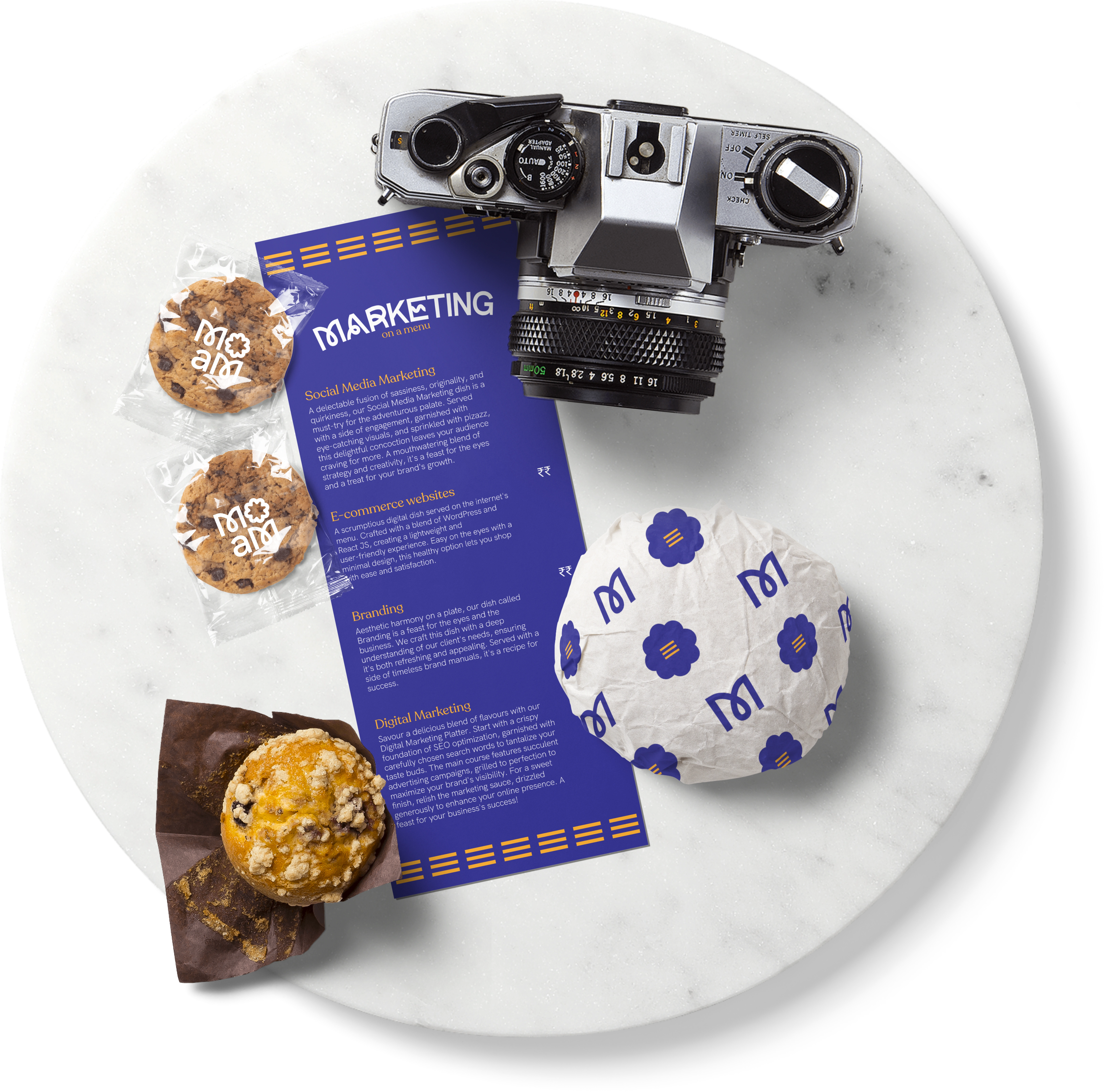
Mockup for MOaM with all logos and a menu for their services
Why these particular colours?
As the designer behind MOaM's logo variations, I've carefully selected colours that speak volumes about our brand's personality and values.
Let's explore the psychology behind the primary colours::
1. Egyptian Blue: This rich, royal hue, reminiscent of luxury chocolates like Cadbury and Milka, exudes sophistication and trust. It reflects their commitment to professionalism and creativity, instilling confidence in their marketing solutions.
2. Yellow Orange: Vibrant and energetic, this colour radiates warmth, optimism, and enthusiasm. It embodies the brand's lively, cheeky and dynamic approach, inviting clients to engage with them joyfully and positively.
3. White: Clean, pure, and versatile, white symbolizes simplicity, clarity, and transparency. It reflects their commitment to honesty and openness, providing a backdrop for their vibrant blue and yellow-orange hues to shine.
By understanding the psychology behind these colours, I ensured that every aspect of MOaM's branding resonates with its audience, evoking the desired emotions and perceptions to strengthen their connection with clients.
In addition, I incorporated secondary colours such as Jasper, Anti-flash white, and Davy's Grey to further enhance the brand identity. Each colour choice is deliberate, aiming to create a visually appealing and emotionally resonant brand presence for MOaM.
I had so much fun creating this project as it made me explore things out of the box.
Speaking of out-of-the-box...
The Launch
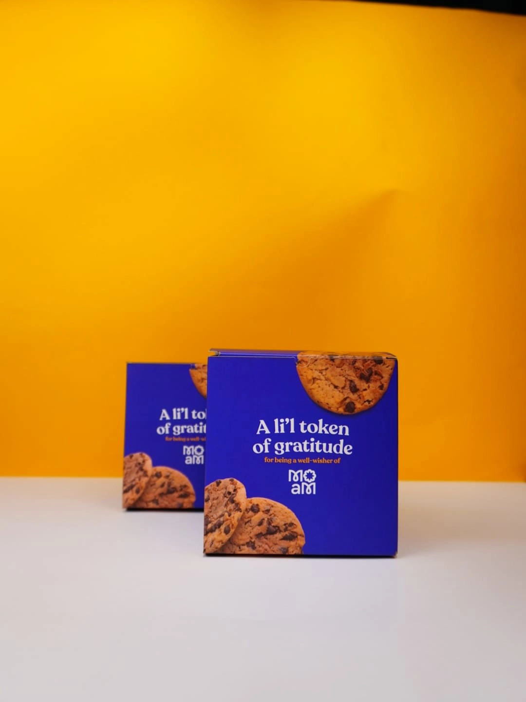
Unconventional cookie boxes to show their appreciation to their well-wishers
This company started 8 months ago with their initial design but waited to launch it to the world once their design, systems and clientele were in place. As "A li'l token of gratitude for being a well-wisher of MOaM", we created these novelty cookie boxes that had cheeky writing about them and the brand along with two delectable pieces of dark chocolate chip cookies, just like they aim to be.
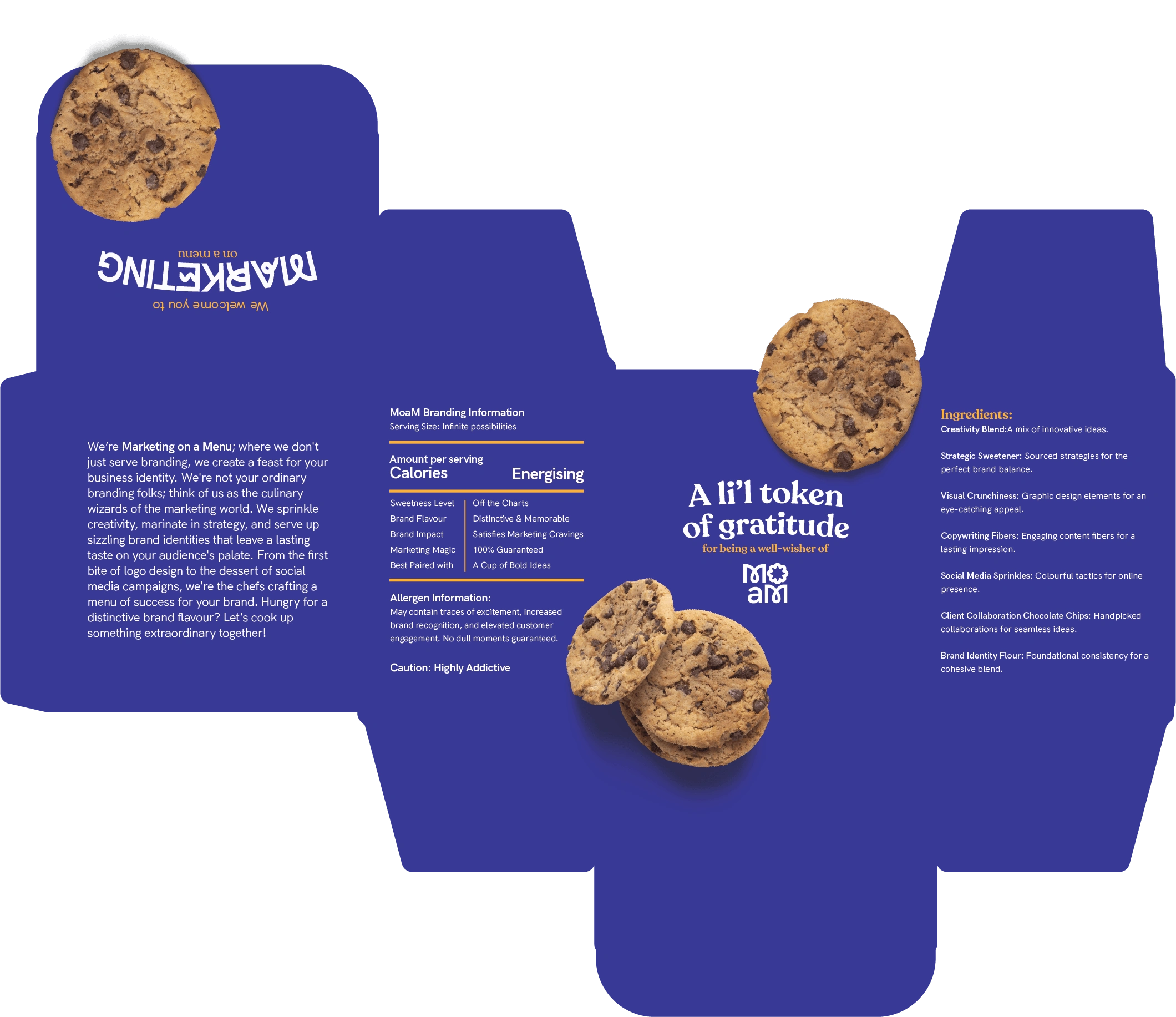
Cookie Box Packaging
Hope you like this project :)
Check them out on social media:
Like this project
Posted Mar 21, 2024
How do you create branding for a quirky, friendly yet kickass startup that wants to reinvent the wheel in Goa for branding & advertising while being corporate?


