Baker Boy Logo Design
A bakery in Goa, specialising in customised cakes, was looking to revamp their old logo and still hoping to retain a few elements from their older logo. Here's what I came up with...
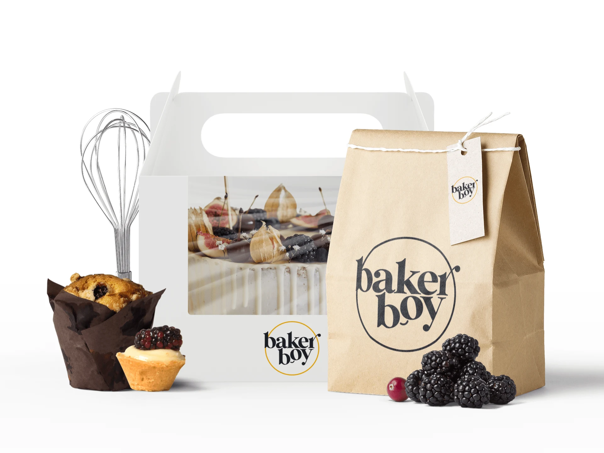
Mockup for Baker Boy Logo
Baker Boy's older logo was simple, elegant and minimal - made with a template from Canva. They were looking to create something outstanding that would also serve as an awesome signboard to display their new blazing logo!
While the older logo was neat, to the point and created a minimal vibe, the shade of yellow would often fade while posting on social media and the font denoting the words 'Baker Boy' required change.

Christmas Menu using their older logo
Using this as a guideline for the new logo, I used a darker yellow that wouldn't fade a lot, changed the font to something bolder and made it sleeker so that it would be legible (small or big). I created variations using a colour palette that would suit best for today's design climate.

From the above palette was born the following logo:

New Logo Design for Baker Boy
The new logo takes the yellow circle from the older logo and gives a tinge of sunset orange to the colour to illustrate the sunshine and joy these customised cakes bring to the lives of their clients. The alphabets 'b' and 'o' of 'boy' reminded me of the childlike wonder and big eyes Disney and most animated children are often portrayed in cartoons and comics. Therefore, I added a curved line as a smile to subtly indicate the boyishness of Baker Boy.
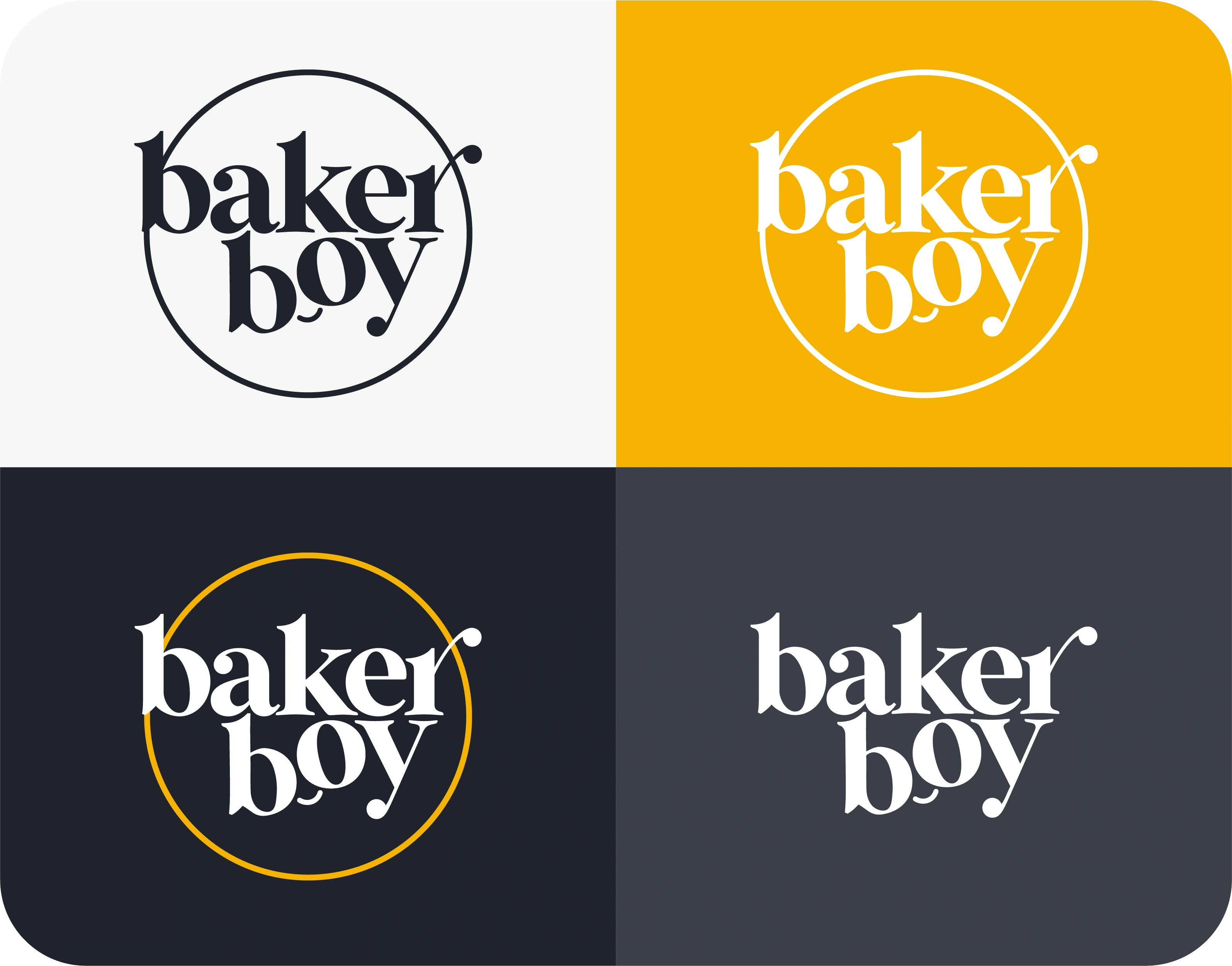
From left to right, top to bottom; Dark Logo, White Logo, Logomark, Wordmark
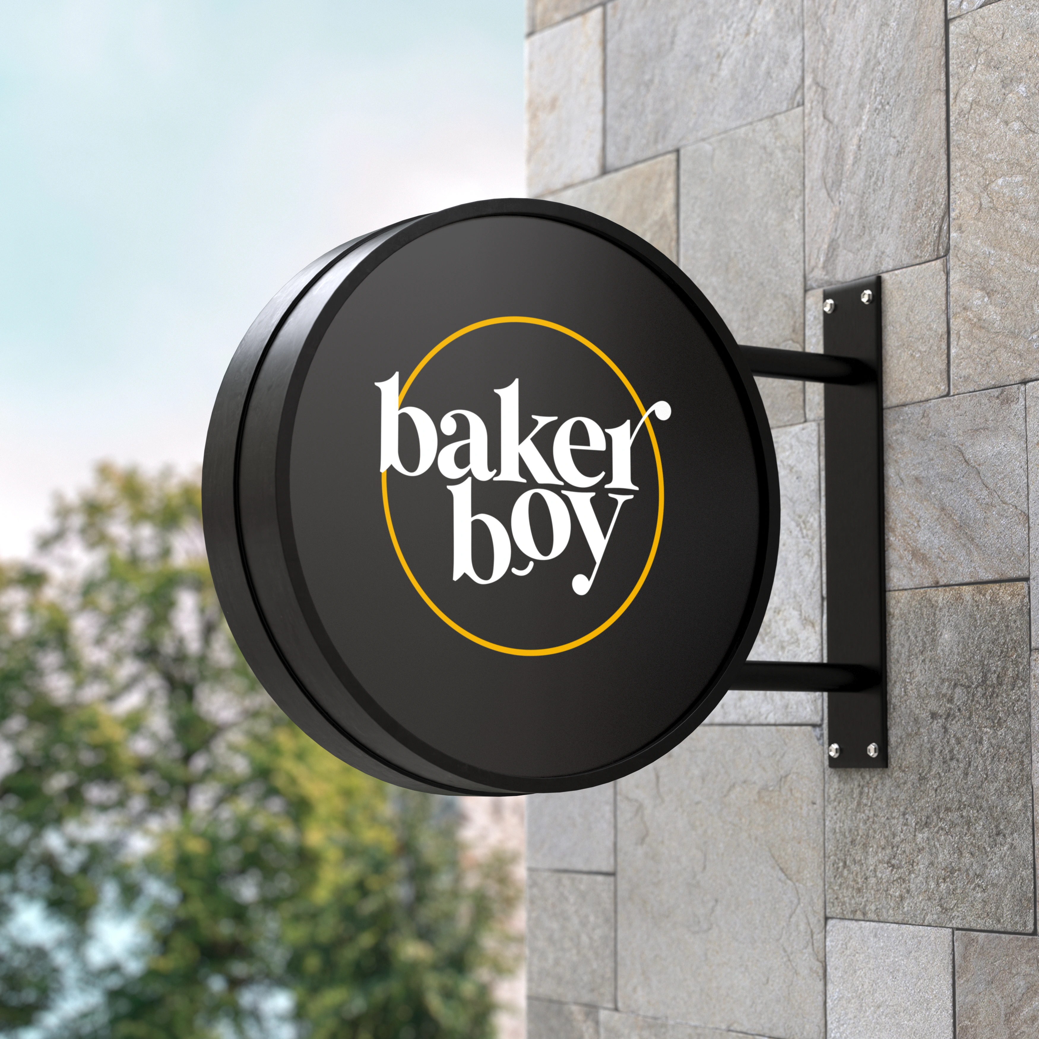
Logomark Signboard Mockup
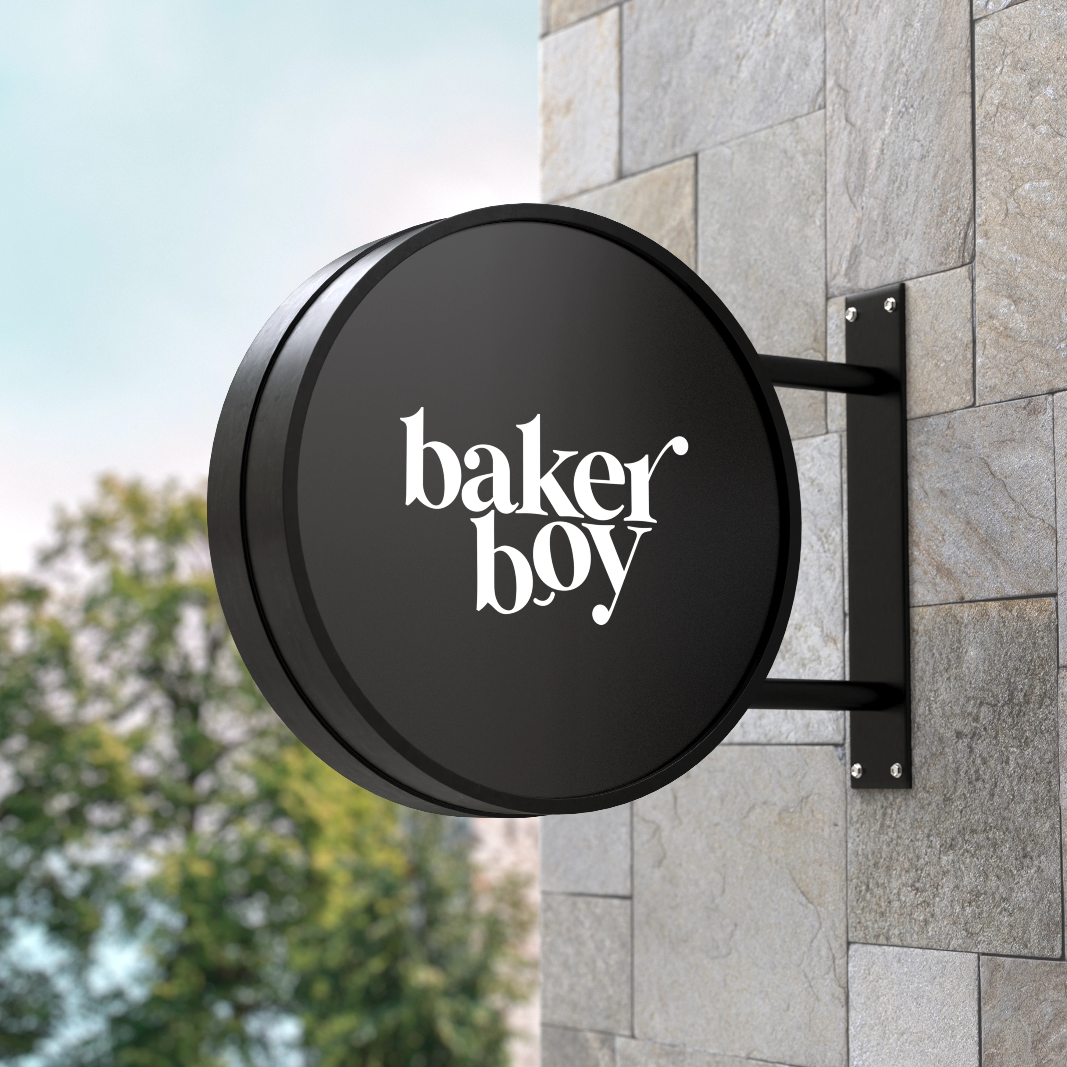
Wordmark Logo Signboard Mockup
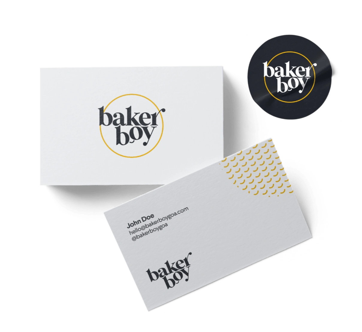
Mockup for Branding/Corporate Identity
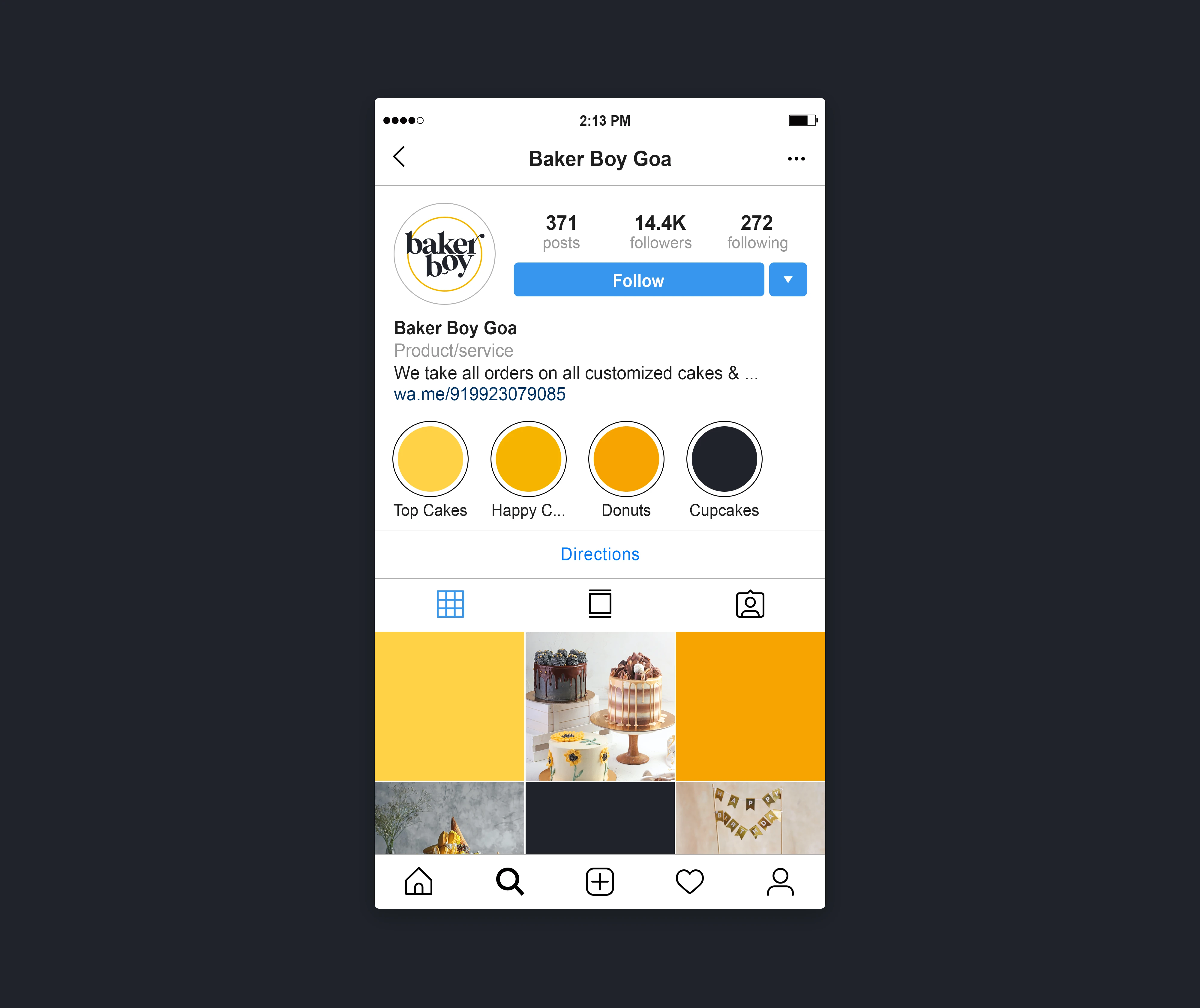
Social Media Grid Mockup

An insight into the moodboard that could define the aesthetic
Hope you enjoyed this project as much as I did in bringing this together! Thank you for your time and patience.
Like this project
Posted Feb 14, 2022
A bakery in Goa was looking to revamp their old logo and still hoping to retain a few of elements from their older logo. Here's what I came up with...
Likes
0
Views
37

