Wckd Branding & Product Packaging
A homemade, delectable chocolate toffee almond bark, made by a local chocolatier and truly irresistible, required branding and product packaging that would be equally irresistible to pick off the shelf 😍
The name 'Wicked' was chosen as they are sinfully addictive and one bite is not enough to satisfy your sweet tooth. The play on that word is 'Wckd'
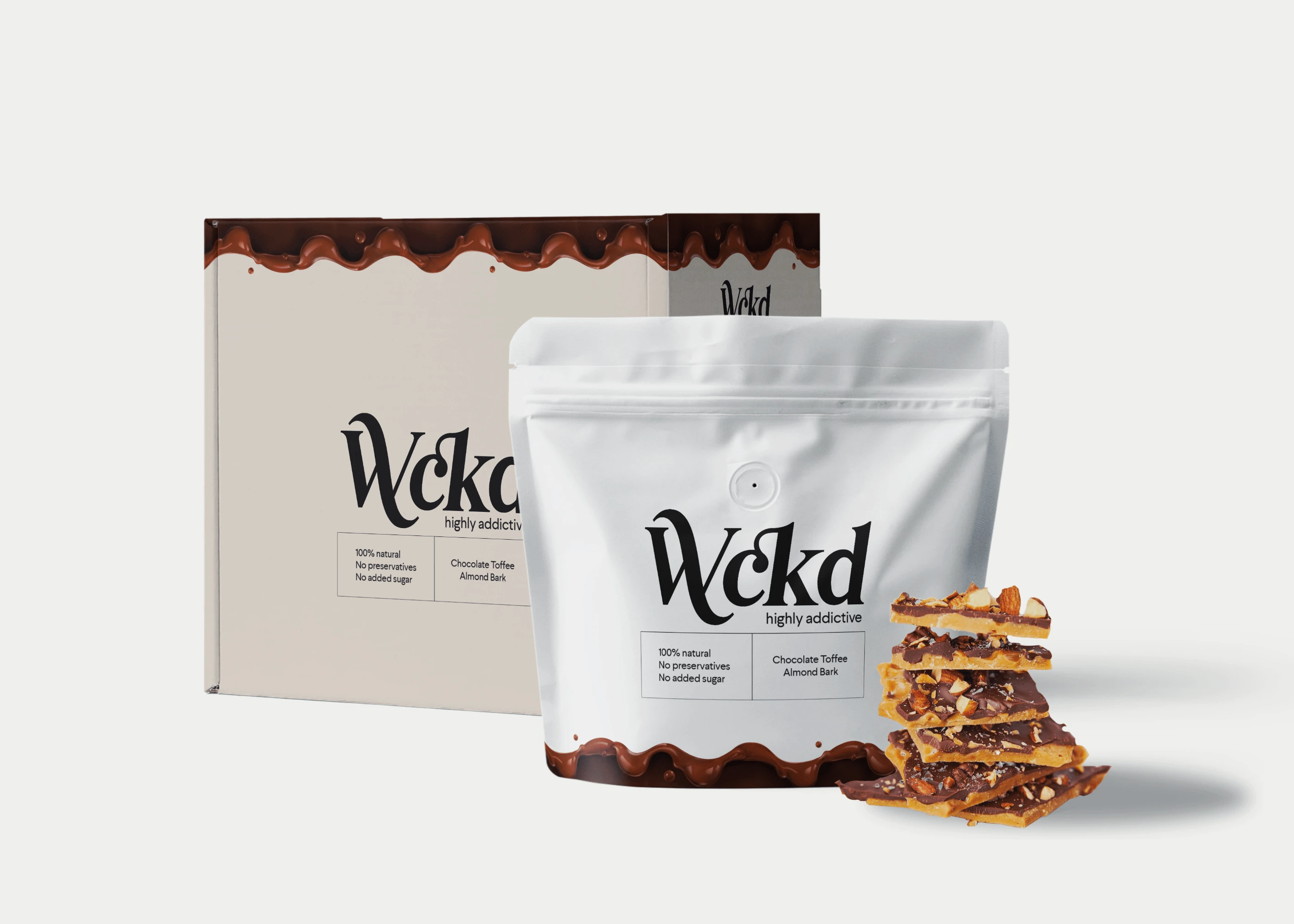
Product Packaging Mockup
The inspiration behind the logo
The brand personality is all about being sophisticated, yet quirky. The logo design is more typographical with a font that shows the wickedness and sinful side of the chocolate bark 😈 but is also sleek, modern and elegant. The tail of the glyph of 'W' plays on the sinful side of the brand while the 'ck' ligature is united to bring quirkiness to the logo.

Logo Design
Like this project
Posted Mar 11, 2022
A chocolate toffee almond bark produc that is irresistible, required branding and product packaging that would be equally irresistible to pick off the shelf.
Likes
0
Views
37

