Brand Identity Design : Leila in Lisboa
Nadine Thaslim
Project Overview
Leila in Lisboa is a brand that aims to be the ultimate guide for those curious about exploring or relocating to Lisbon. My goal was to create a brand identity that reflects this mission—welcoming, informative, and adventurous—while visually capturing the essence of Lisbon's vibrant culture.
Logo Design
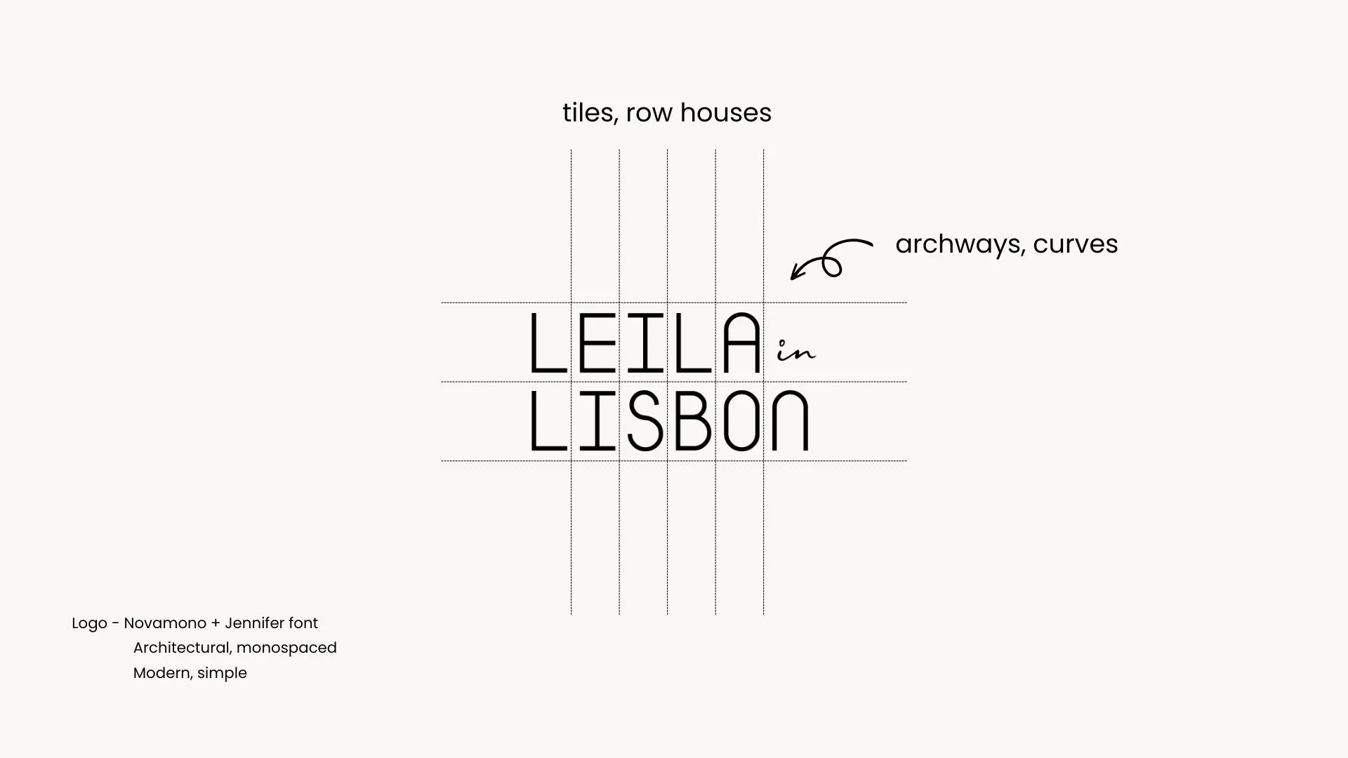
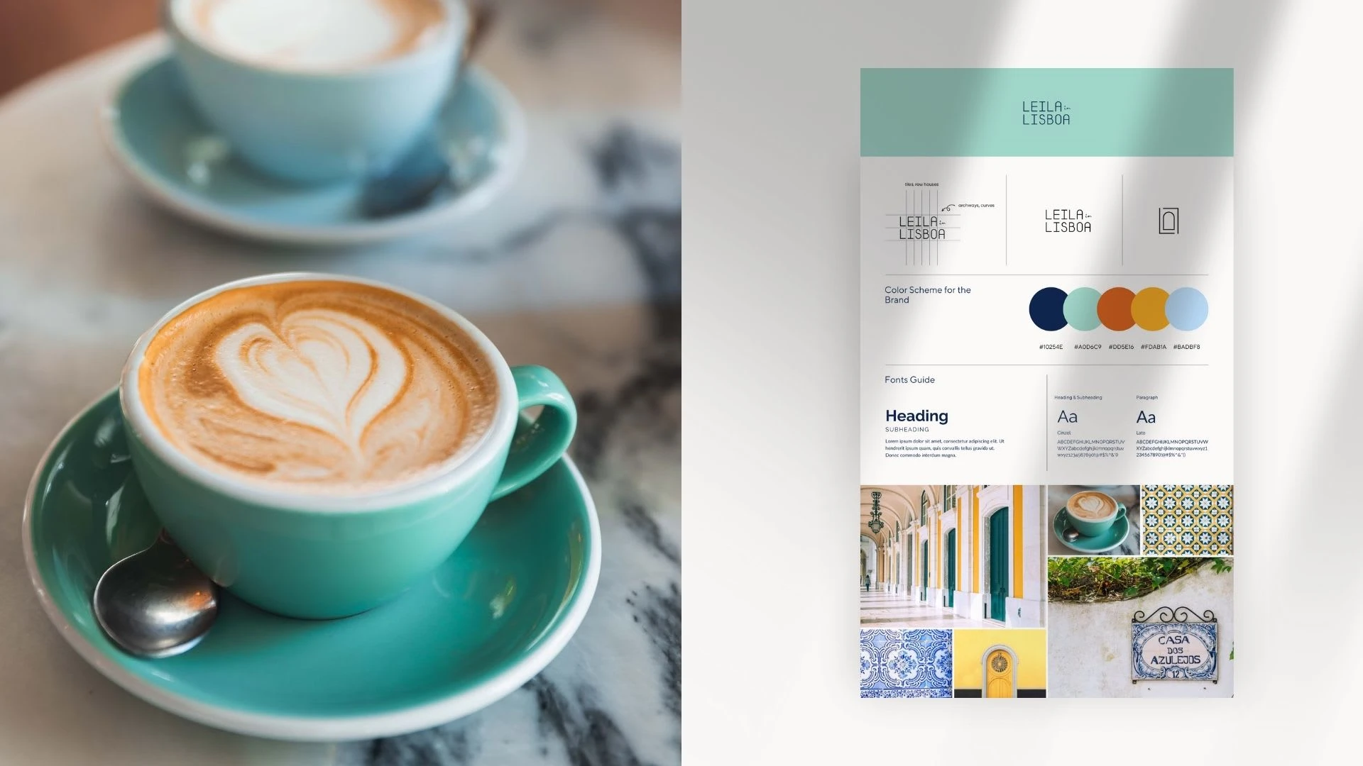
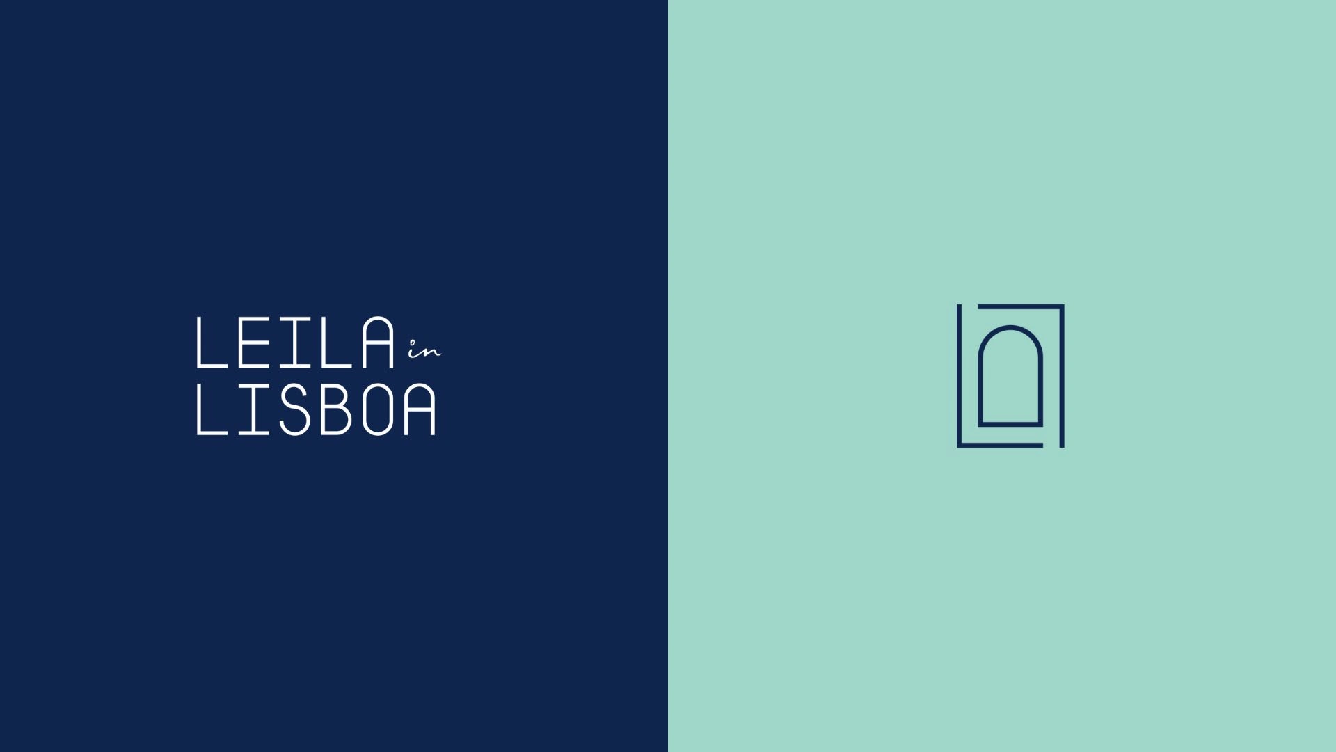
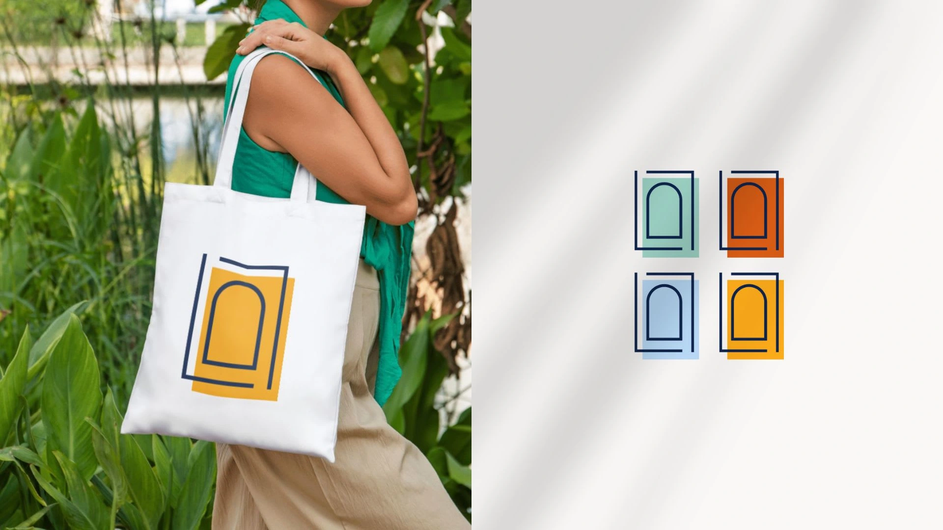
Inspired by Lisbon's iconic architecture, the logo features elements like tiles, row houses, and arches. Using the monospaced Novamono font, each letter is equally spaced, symbolizing the idea of tiles. The logo uniquely incorporates both "Lisbon" and "Lisboa," with an animated "n" that transitions into an "a" to highlight the city's dual identities. The brand mark—a window formed by the two "L"s from Leila and Lisboa—represents a gateway to discovering the city's wonders.
Design Strategy:
Informative: A clear hierarchy in layouts and easy-to-read fonts ensures smooth user experiences, whether the content is educational or inspirational.
Welcoming: The colors and design elements create a warm, friendly environment, making visitors feel at home when engaging with the brand.
Adventurous: The brand identity supports inspirational content with lively imagery, encouraging users to explore everything Lisbon has to offer.
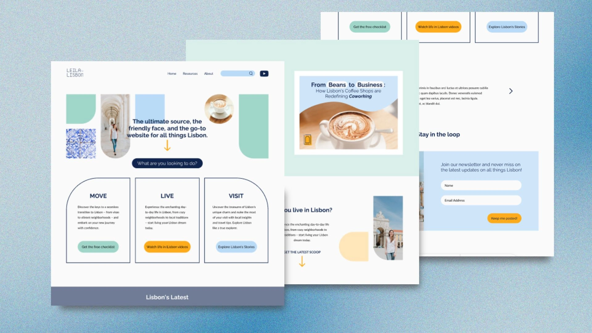
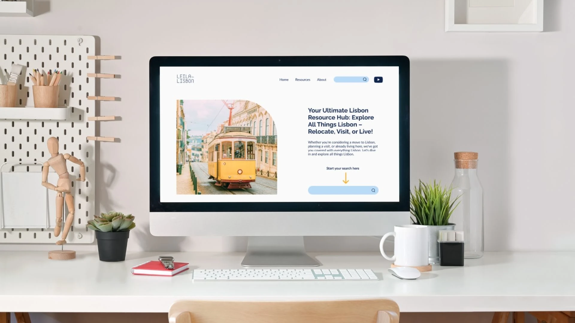
Further Potential: Website & Beyond
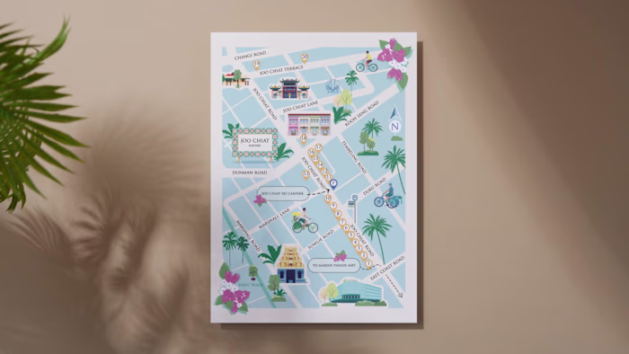
Though we’re focusing on brand identity for now, the concept could naturally extend to a website. A user-friendly, informative site could showcase the logo’s animated transitions, along with products like maps, guides, and even video content like YouTube series or Lisbon city tours.
Like this project
Posted Sep 24, 2024
Brand identity design for Leila in Lisboa that captures the vibrant, welcoming spirit of Lisbon, helping guide visitors and newcomers to explore in the city.