
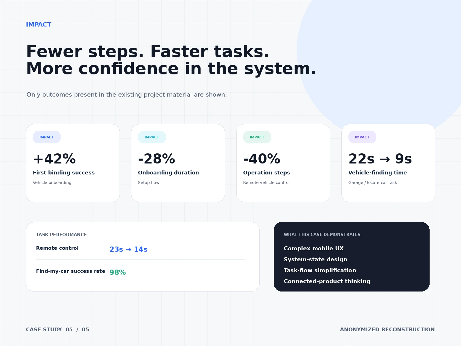
Reflection: This case demonstrates complex mobile UX, system-state design, task-flow simplification, and connected-product thinking. The core takeaway: for connected products, trust is a UX metric — it is built from explicit states, predictable feedback, and recovery paths, not from visual polish.
Impact: Only outcomes present in the existing project material are shown: first binding success in vehicle onboarding +42%; onboarding duration −28%; operation steps for remote vehicle control −40%; vehicle-finding time reduced from 22s to 9s; remote control task time from 23s to 14s; find-my-car success rate 98%.
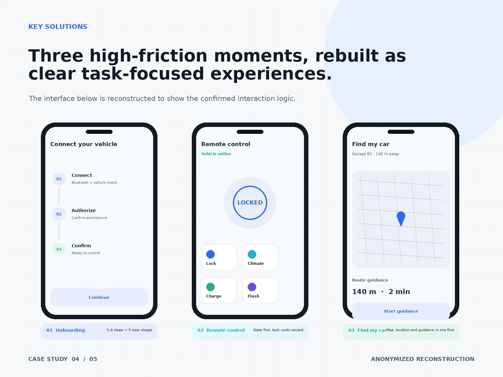
Solution: Three high-friction moments rebuilt as clear task-focused experiences: a guided 3-stage vehicle binding flow; a remote control screen led by explicit vehicle state with predictable action feedback; and a find-my-car flow combining live map, distance, and route guidance with one-tap navigation.
Key Decisions: Onboarding compressed from 5–6 steps into 3 clear stages: Connect (Bluetooth + vehicle check) → Authorize (confirm permissions) → Confirm (ready to control). Remote control redesigned state-first: the vehicle's current state (e.g., LOCKED) is the hero, with task cards (Lock, Climate, Charge, Flash) secondary. Find-my-car unified map, location, and route guidance into one flow instead of three separate destinations.
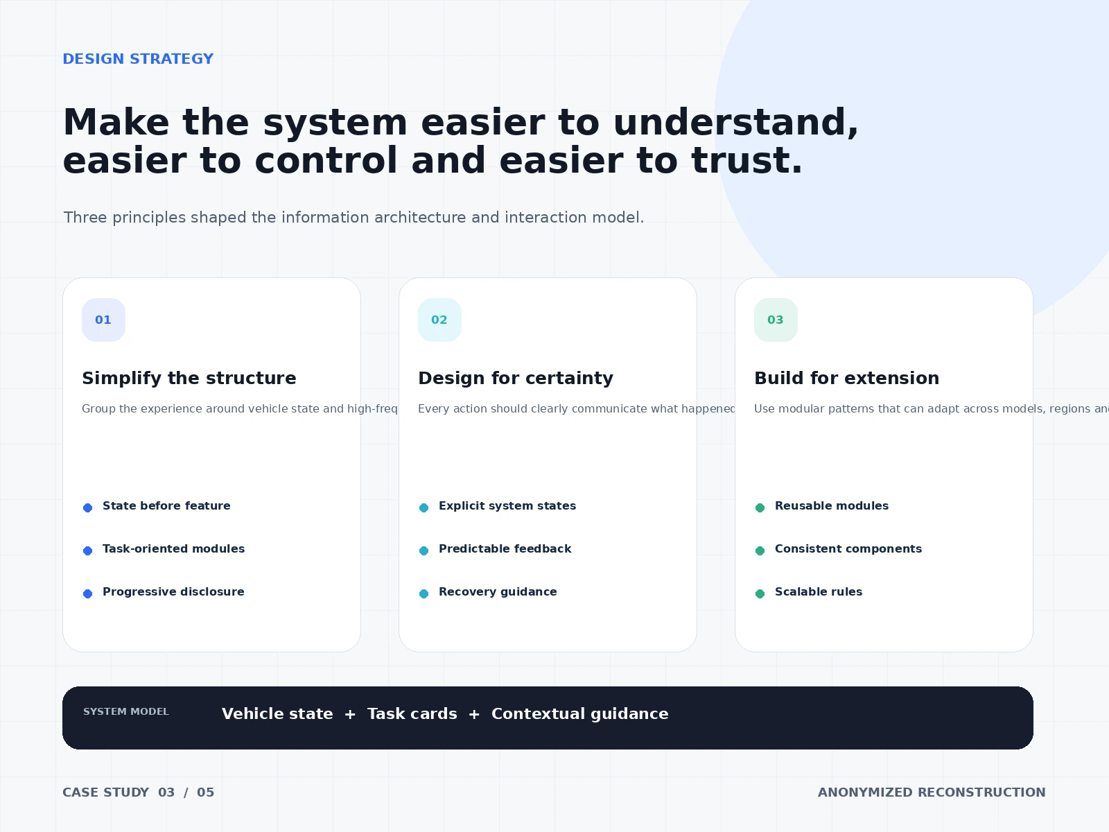
Design Strategy: Three principles shaped the information architecture and interaction model: (1) Simplify the structure — group the experience around vehicle state and high-frequency tasks, with task-oriented modules and progressive disclosure. (2) Design for certainty — explicit system states, predictable feedback, and recovery guidance so every action clearly communicates what happened. (3) Build for extension — reusable modules, consistent components, and scalable rules that adapt across models and regions.
Key Insights: A companion app is a remote control for a high-stakes physical object. Every moment of ambiguity — "did the lock command go through?", "where exactly is my car?" — directly erodes trust. The fix wasn't more features but a clearer system model: vehicle state first, task cards second, contextual guidance throughout.
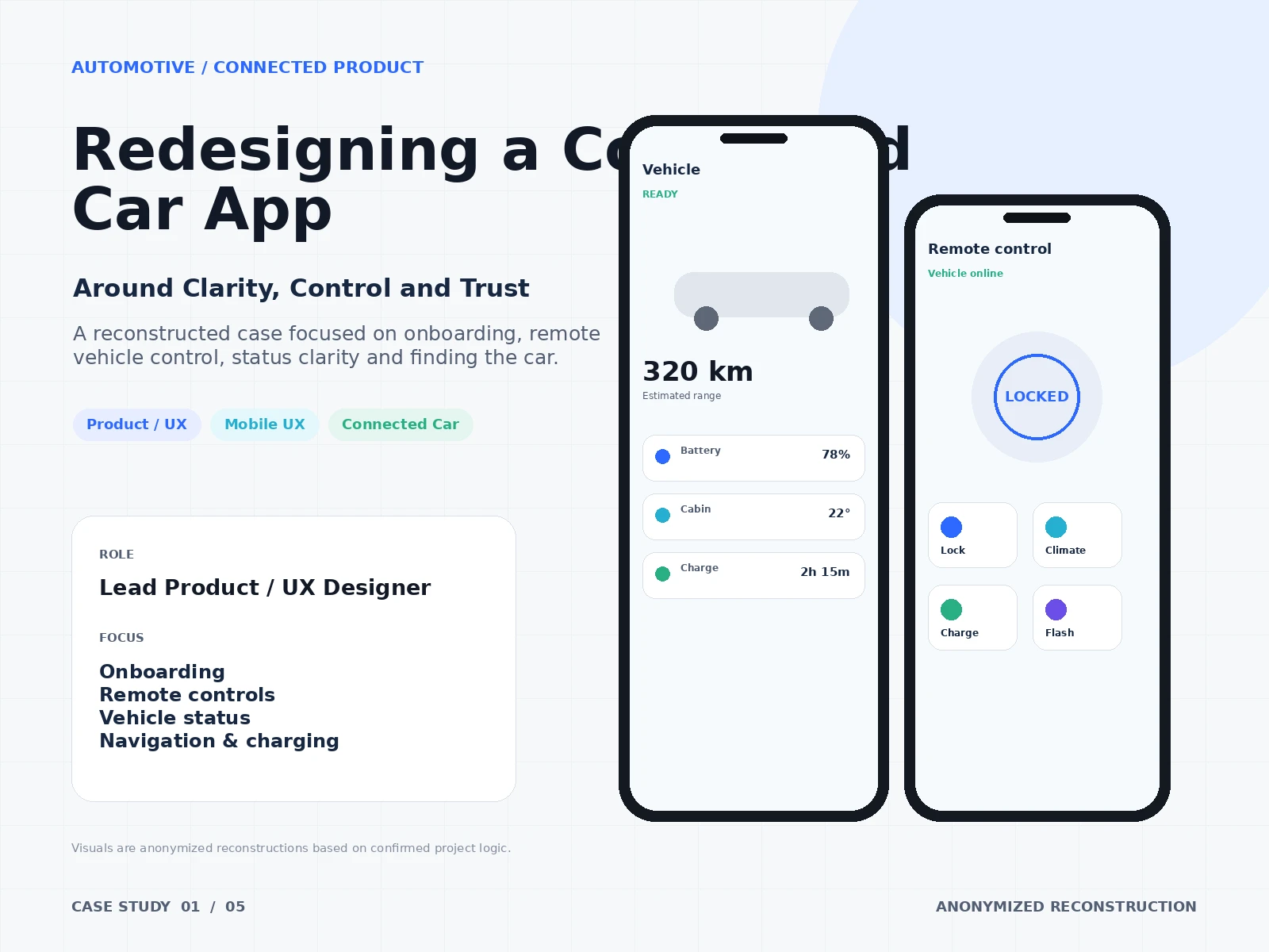
My Role: Lead Product / UX Designer, focused on onboarding, remote controls, vehicle status, and navigation & charging.
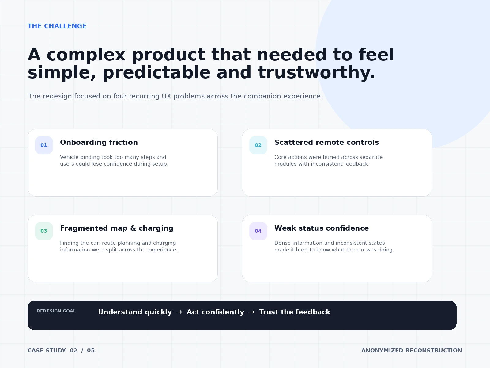
Challenge: A complex product that needed to feel simple, predictable, and trustworthy. Four recurring UX problems ran across the companion experience: onboarding friction — vehicle binding took too many steps and users lost confidence during setup; scattered remote controls — core actions buried across separate modules with inconsistent feedback; fragmented map and charging — finding the car, route planning, and charging information split across the experience; and weak status confidence — dense information and inconsistent states made it hard to know what the car was doing. Redesign goal: understand quickly → act confidently → trust the feedback.
Context: An anonymized redesign of a connected-car companion app covering vehicle onboarding and binding, remote vehicle control, vehicle status, navigation, charging, and find-my-car. Visuals are anonymized reconstructions based on confirmed project logic; no brand names are shown.
0 likes · 2 views · Oct 7, 2026
Anonymized connected-car app redesign focused on onboarding, remote control and vehicle status. Binding success +42%; onboarding time −28%.
