
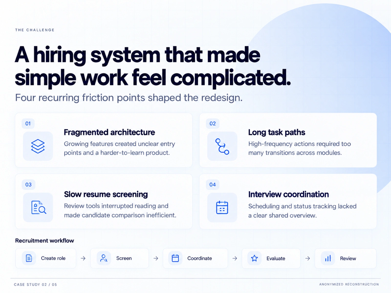
My Role: I owned the product and UX design, focused on workflow redesign, information architecture, and decision-suKey Insights: The core workflow — Create role → Screen → Coordinate → Evaluate → Review — was sound, but the interface forced users to navigate the org chart of the product instead of the logic of their task. Recruiters needed one focused workspace, candidate context that survives navigation, and status language they could scan at a glance.
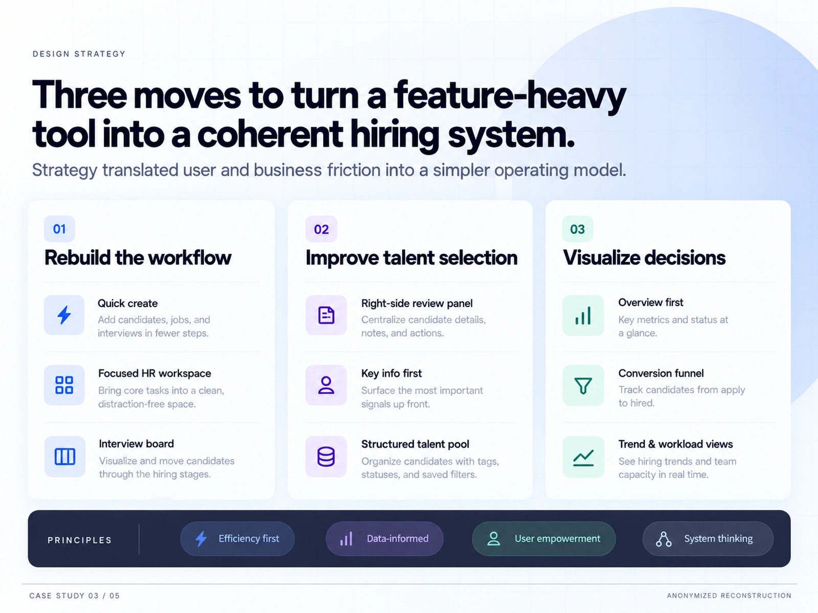
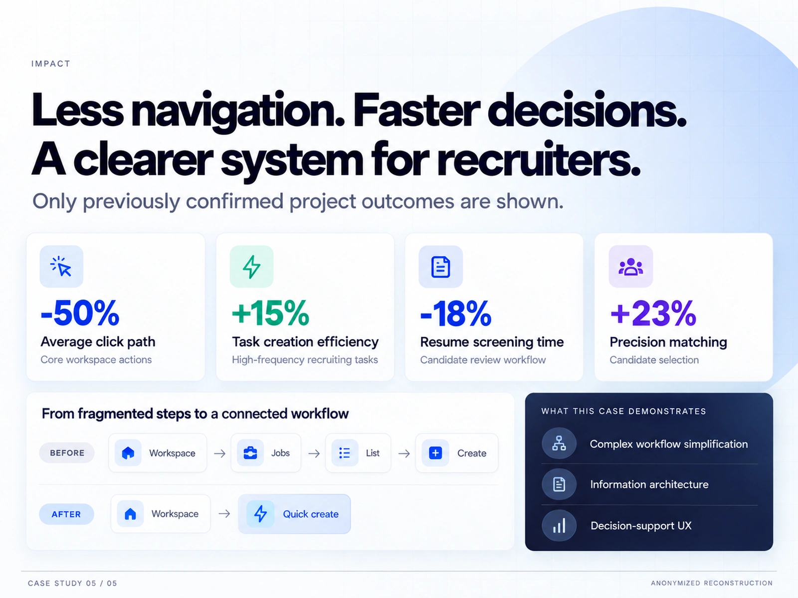
pport UX.Design Strategy: Three moves turned a feature-heavy tool into a coherent hiring system: (1) Rebuild the workflow — quick create, a focused HR workspace, and an interview board that visualizes candidates through hiring stages. (2) Improve talent selection — a riIReflection: This case demonstrates complex workflow simplification, information architecture, and decision-support UX. The biggest lesson: in dense B2B tools, the highest-leverage design move is usually subtraction — fewer steps, fewer screens, and one place where the user's actual job gets done.mpact: Only previously confirmed project outcomes are shown: average click path for core workspace actions reduced by 50%; task creation efficiency for high-frequency recruiting tasks improved by 15%; resume screening time reduced by 18%; precision matching in candidate selection improved by 23%.
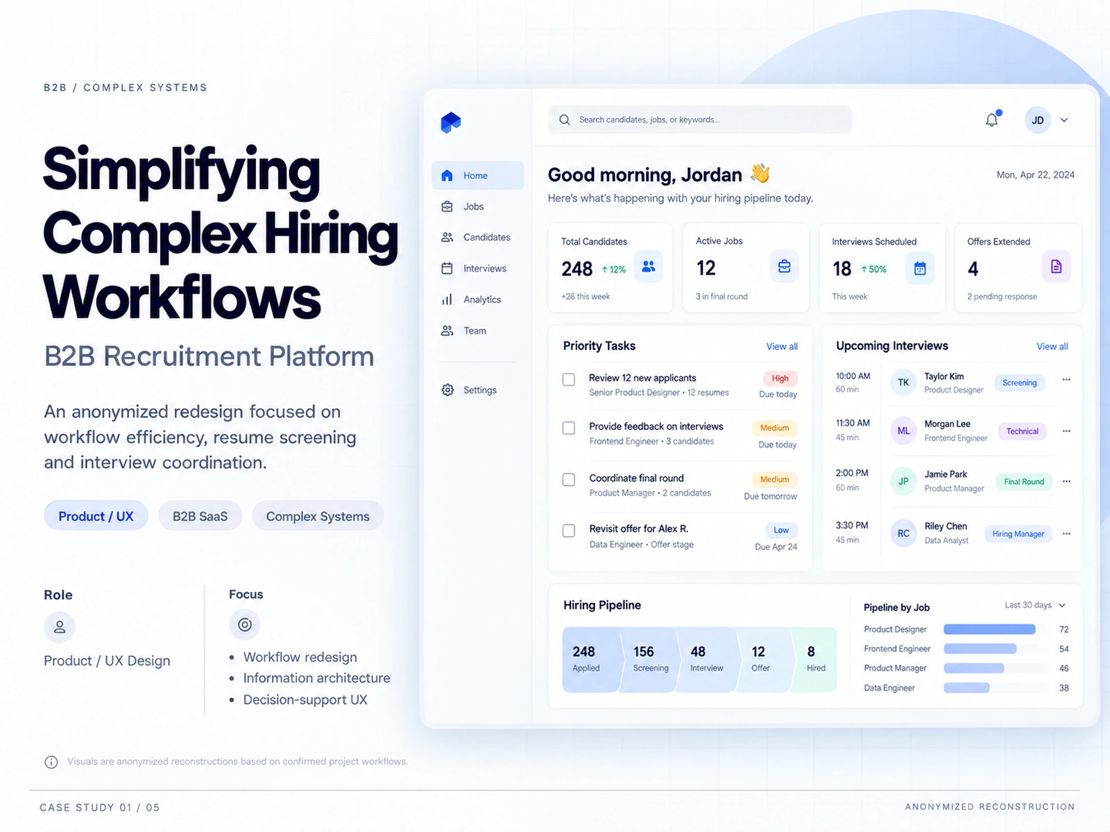
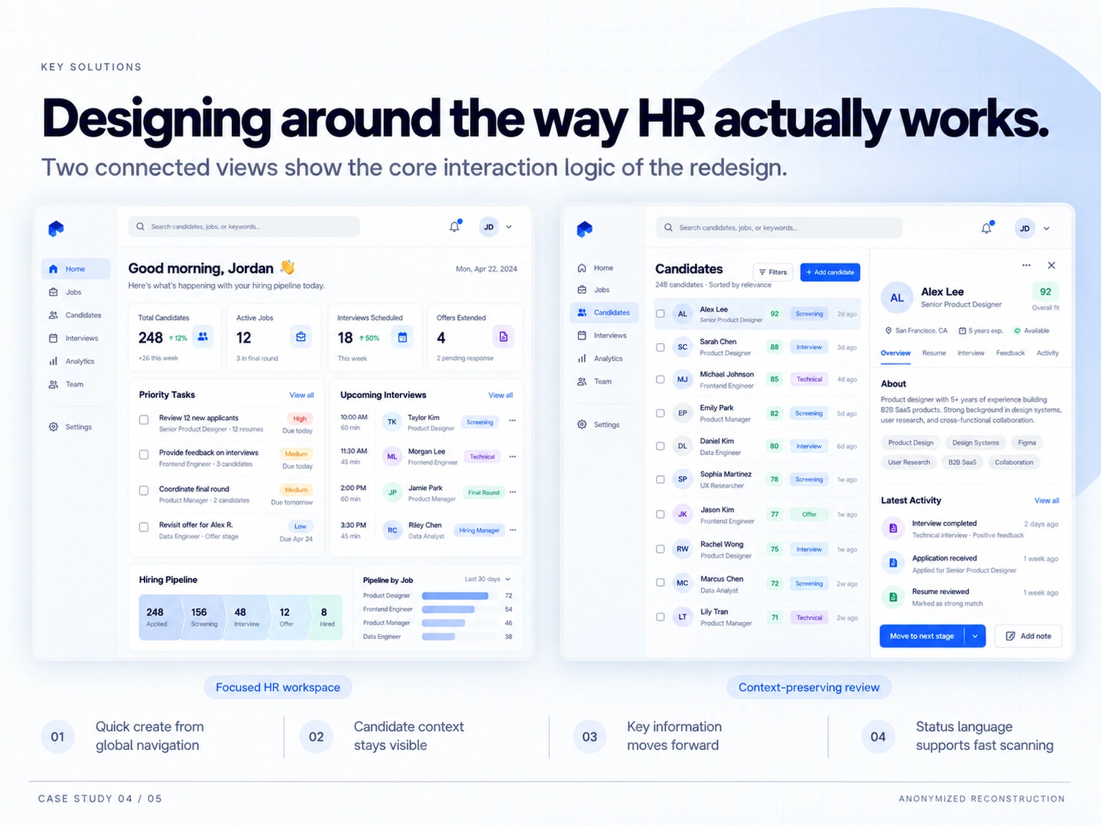
Solution: Two connected views carry the core interaction logic: a focused HR workspace (priority tasks, upcoming interviews, hiring pipeline, pipeline-by-job) and a context-preserving candidate review (sortable candidate list with fit scores plus a persistent right-side detail panel with overview, resume, interview, feedback, and activity tabs).
Key Decisions: Quick create from global navigation replaced a four-step path (Workspace → Jobs → List → Create) with a two-step one (Workspace → Quick create). Candidate context stays visible: the review panel preserves screening context instead of resetting it on every navigation. Key information moves forward through stages so nothing decided earlier is lost. Status language was redesigned to support fast scanning across long candidate lists.
ght-side review panel centralizing candidate details, notes, and actions; key information surfaced first; a structured talent pool with tags, statuses, and saved filters. (3) Visualize decisions — overview-first metrics, a conversion funnel from apply to hired, and trend and workload views in real time. Guiding principles: efficiency first, data-informed, user empowerment, system thinking.
Challenge: A hiring system that made simple work feel complicated. Four recurring friction points shaped the redesign: fragmented information architecture with unclear entry points as features grew; long task paths forcing high-frequency actions across too many modules; slow resume screening where review tools interrupted reading and made candidate comparison inefficient; and interview coordination with no clear shared overview of scheduling and status.
Context: An anonymized redesign of a B2B recruitment platform used by HR teams to manage the full hiring cycle — from creating a role through screening, interview coordination, evaluation, and offer review. Visuals are anonymized reconstructions based on confirmed project workflows; no client or company names are shown.
Challenge:
0 likes · 1 view · Oct 7, 2026
Anonymized B2B recruitment redesign focused on workflow efficiency, resume screening and interview coordination. Click path −50%; screening time −18%.
