
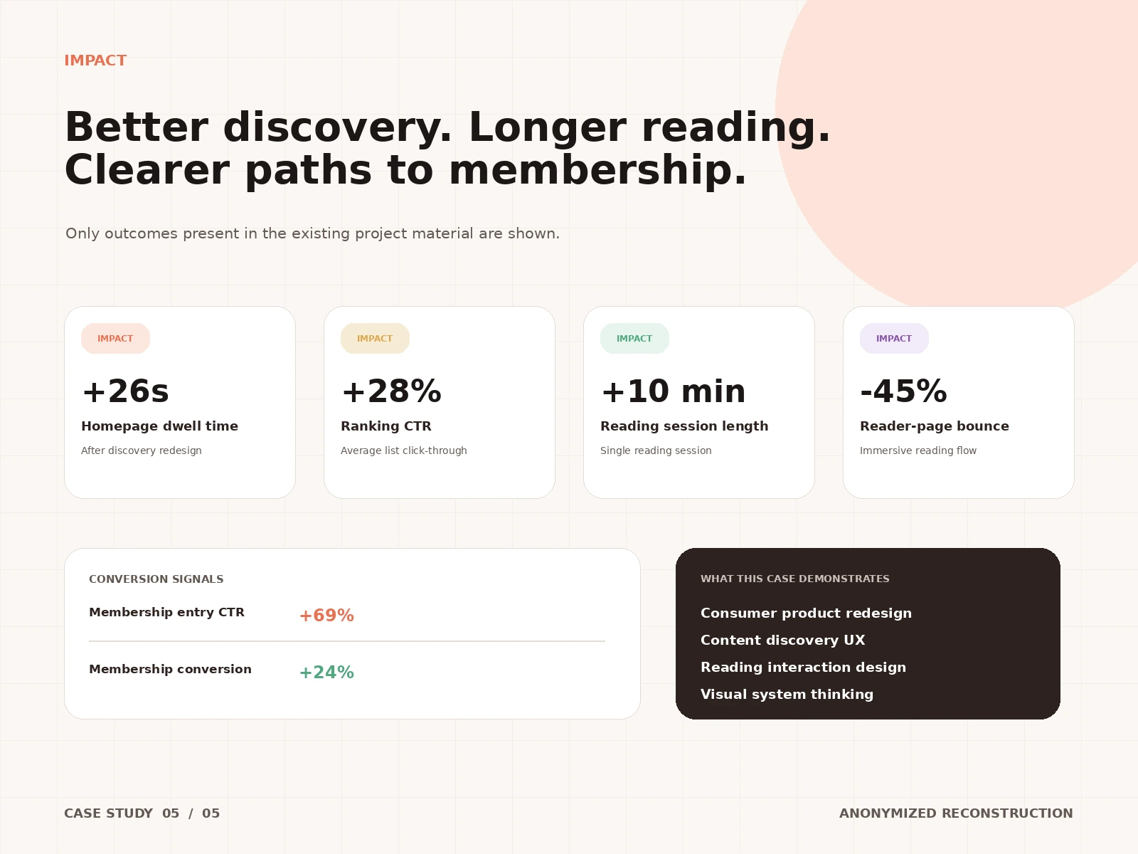
Reflection: This case demonstrates consumer product redesign, content discovery UX, reading interaction design, and visual system thinking. The lesson: in content products, the design system is a growth lever — consistent typography, cards, and controls compound across every screen the user touches.
Impact: Only outcomes present in the existing project material are shown: homepage dwell time +26s after the discovery redesign; ranking CTR +28%; reading session length +10 min; reader-page bounce −45%; membership entry CTR +69%; membership conversion +24%.
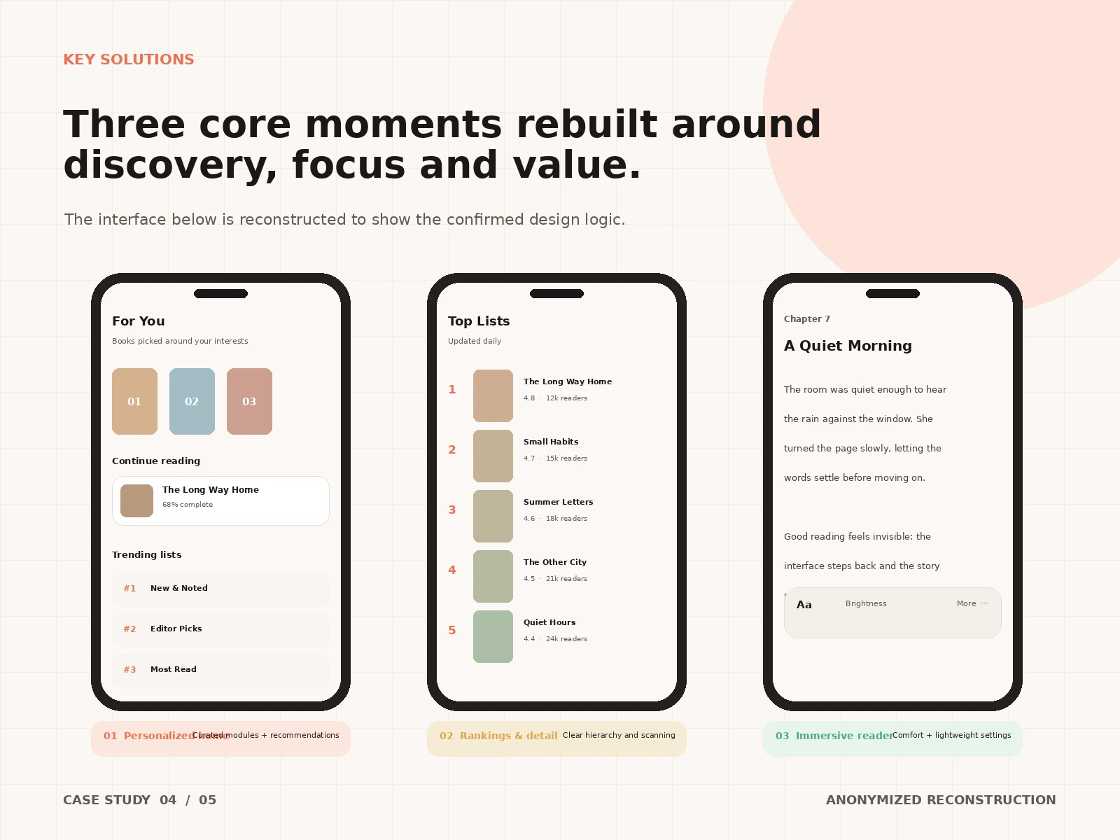
Solution: Three core moments rebuilt around discovery, focus, and value: a personalized home (For You, Continue reading, Trending lists); rankings with clear hierarchy and scannable detail; and an immersive reader with comfortable typography and in-flow settings.
Key Decisions: The home combined curated modules with personalized recommendations instead of choosing one. Rankings were redesigned as scannable lists with ratings and reader counts up front. Reader settings moved into a lightweight bottom sheet so typography and brightness adjustments never break the reading flow. Membership entry points were placed where intent is strongest — e.g., at natural pauses in the reading journey.
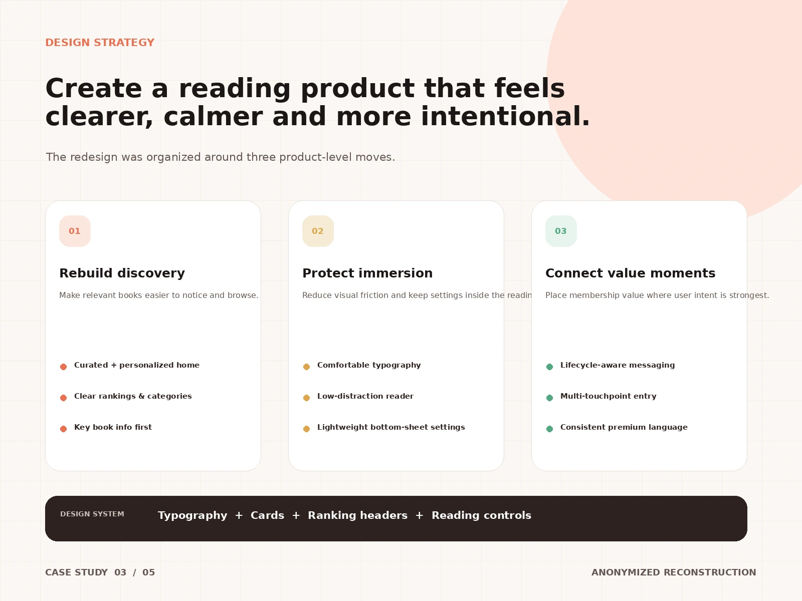
Design Strategy: Three product-level moves: (1) Rebuild discovery — a curated + personalized home, clear rankings and categories, key book info first. (2) Protect immersion — comfortable typography, a low-distraction reader, lightweight bottom-sheet settings kept inside the reading flow. (3) Connect value moments — lifecycle-aware messaging, multi-touchpoint membership entry, and a consistent premium language. Underpinning it all, a design system of typography, cards, ranking headers, and reading controls.
Key Insights: Discovery and reading are one loop, not two features: what a user finds determines how long they stay, and how comfortable reading feels determines whether they come back. Membership value had to be felt inside the reading flow — not pitched on a separate paywall page.
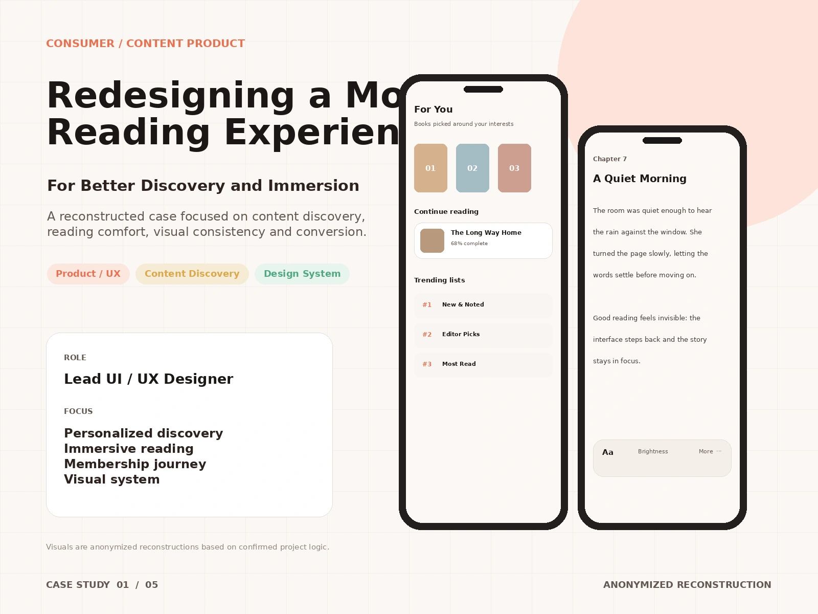
My Role: Lead UI / UX Designer, focused on personalized discovery, immersive reading, the membership journey, and the visual system.
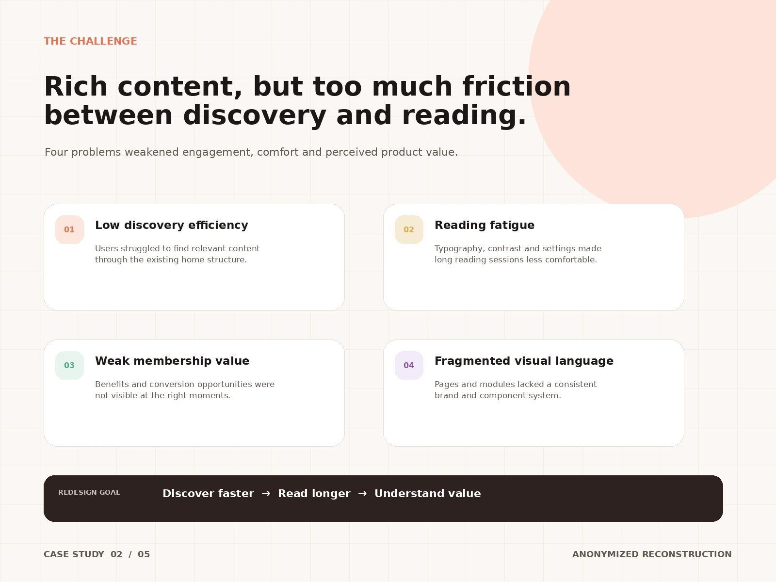
Challenge: Rich content, but too much friction between discovery and reading. Four problems weakened engagement, comfort, and perceived product value: low discovery efficiency — users struggled to find relevant content through the existing home structure; reading fatigue — typography, contrast, and settings made long sessions uncomfortable; weak membership value — benefits and conversion opportunities were not visible at the right moments; and a fragmented visual language — pages and modules lacked a consistent brand and component system. Redesign goal: discover faster → read longer → understand value.
Context: An anonymized redesign of a mobile reading app covering content discovery, personalized recommendations, immersive reading, membership conversion, and the supporting visual and interaction system. Visuals are anonymized reconstructions based on confirmed project logic; no brand names are shown.
0 likes · 2 views · Oct 7, 2026
Anonymized mobile reading redesign focused on discovery, immersive reading and membership. Reading session +10 min; reading-page bounce −45%.
