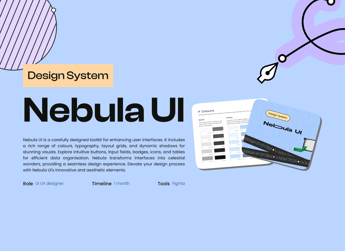
Nebula UI
Problem at hand
Each time I initiated a new project or entered a new project phase, I found myself starting from scratch, setting up a new components library. This resulted in repeatedly designing the same components, with the style adapting each time to meet specific functionalities.
I had to:
1. Recreate previous components.
2. Compile all past use cases and generate use cases for each component.
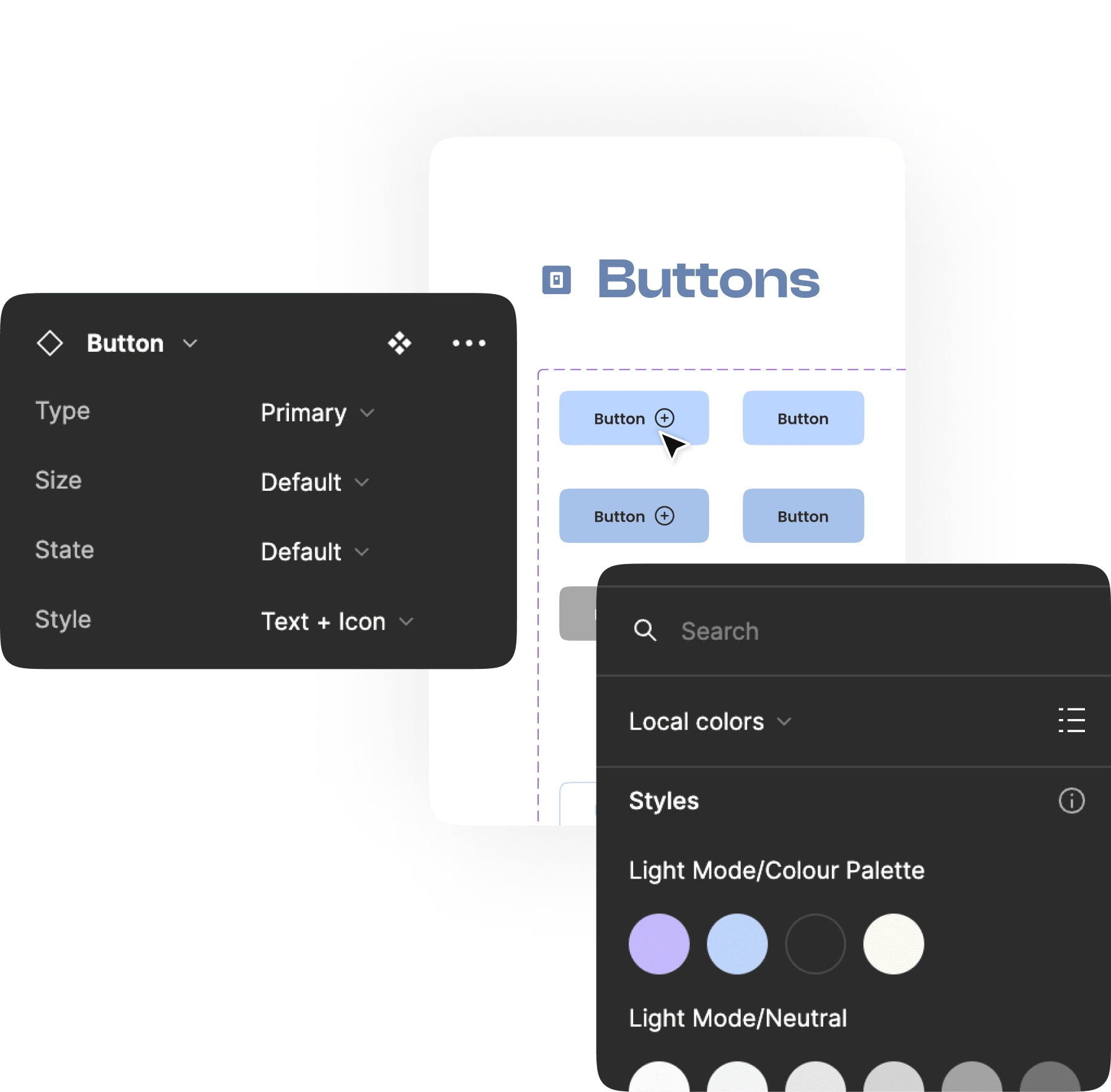
Elements
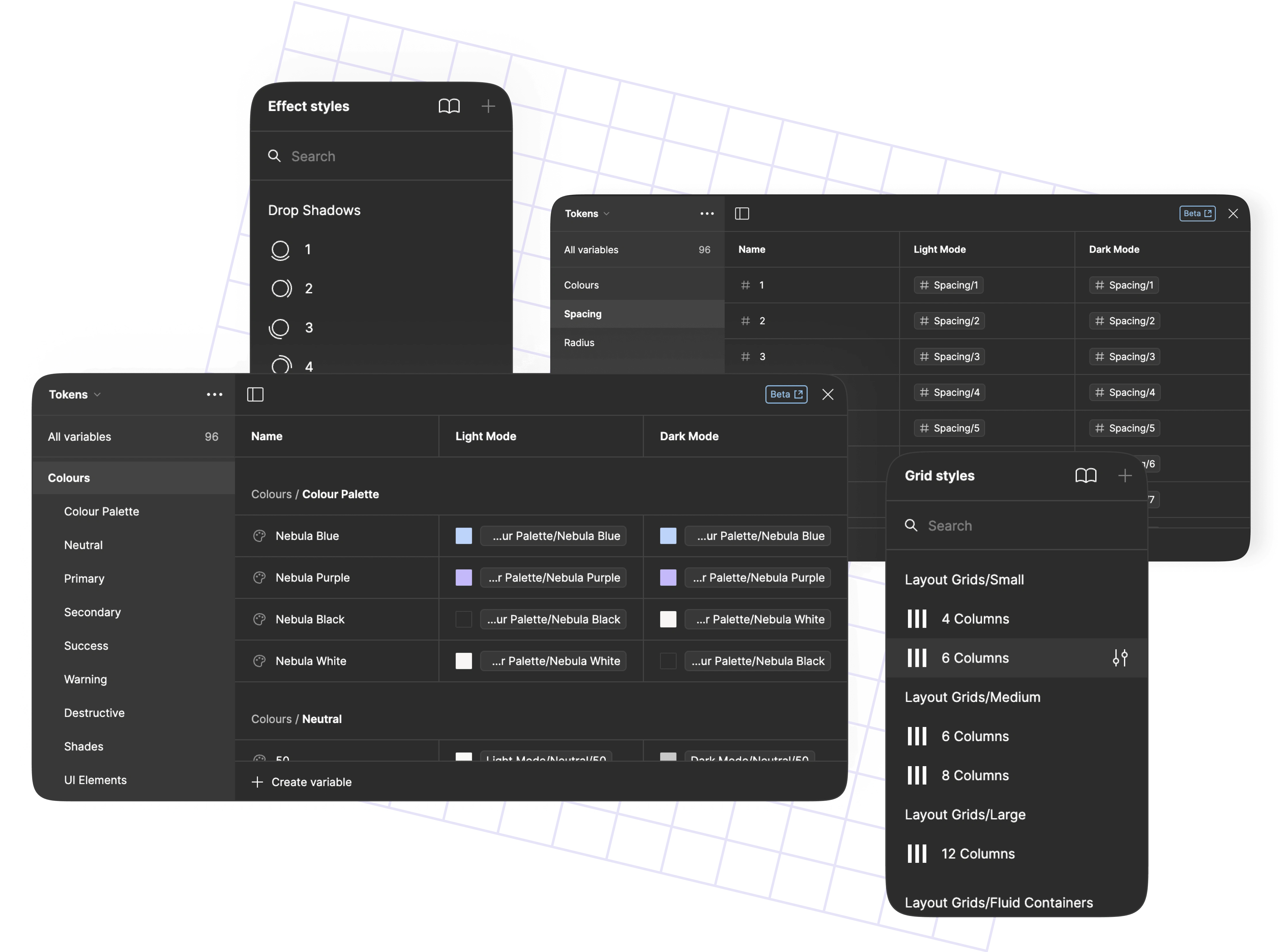
Local Variables & Local Styles
The benefits
Consistency Across Designs: Nebula UI provides a unified design language, ensuring consistency in visual elements, colours, and components throughout your projects.
Efficient Workflow: With a comprehensive toolkit, Nebula UI streamlines the design process, enabling designers to create interfaces seamlessly and efficiently.
Scalability: Designed to accommodate projects of varying scales, Nebula UI allows for easy scalability, making it suitable for both small and large applications.
Easy Adoption: The system is crafted to be easily understood by designers, ensuring quick adoption and integration into their workflow.
Enhanced Visual Aesthetics: Nebula UI's rich colour palette, dynamic shadows, and meticulous design elevate the visual aesthetics of user interfaces, creating a delightful user experience.
Adaptable Design Elements: Nebula UI's components are adaptable and can be customised to suit the unique requirements of different projects, maintaining flexibility without compromising consistency.
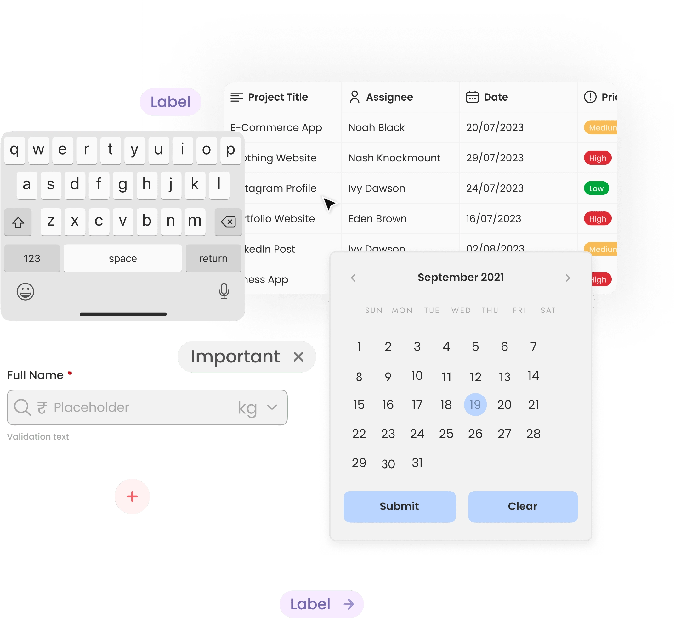
Molecules
How can I make this helpful for designers?
Nebula UI is crafted with designers in mind, aiming to simplify and enhance the design process. By providing a consistent design language and a comprehensive toolkit, it ensures that designers can seamlessly integrate visually appealing and user-friendly components into their projects. The system's scalability accommodates designers working on diverse scales of applications, promoting efficiency and adaptability. Nebula UI's emphasis on time-saving components eliminates redundant tasks, allowing designers to channel their efforts into more creative and innovative aspects of their work. With an intuitive design that is easy to understand and adopt, Nebula UI becomes a valuable asset for designers, empowering them to create aesthetically pleasing and functional interfaces without the need for repetitive groundwork.
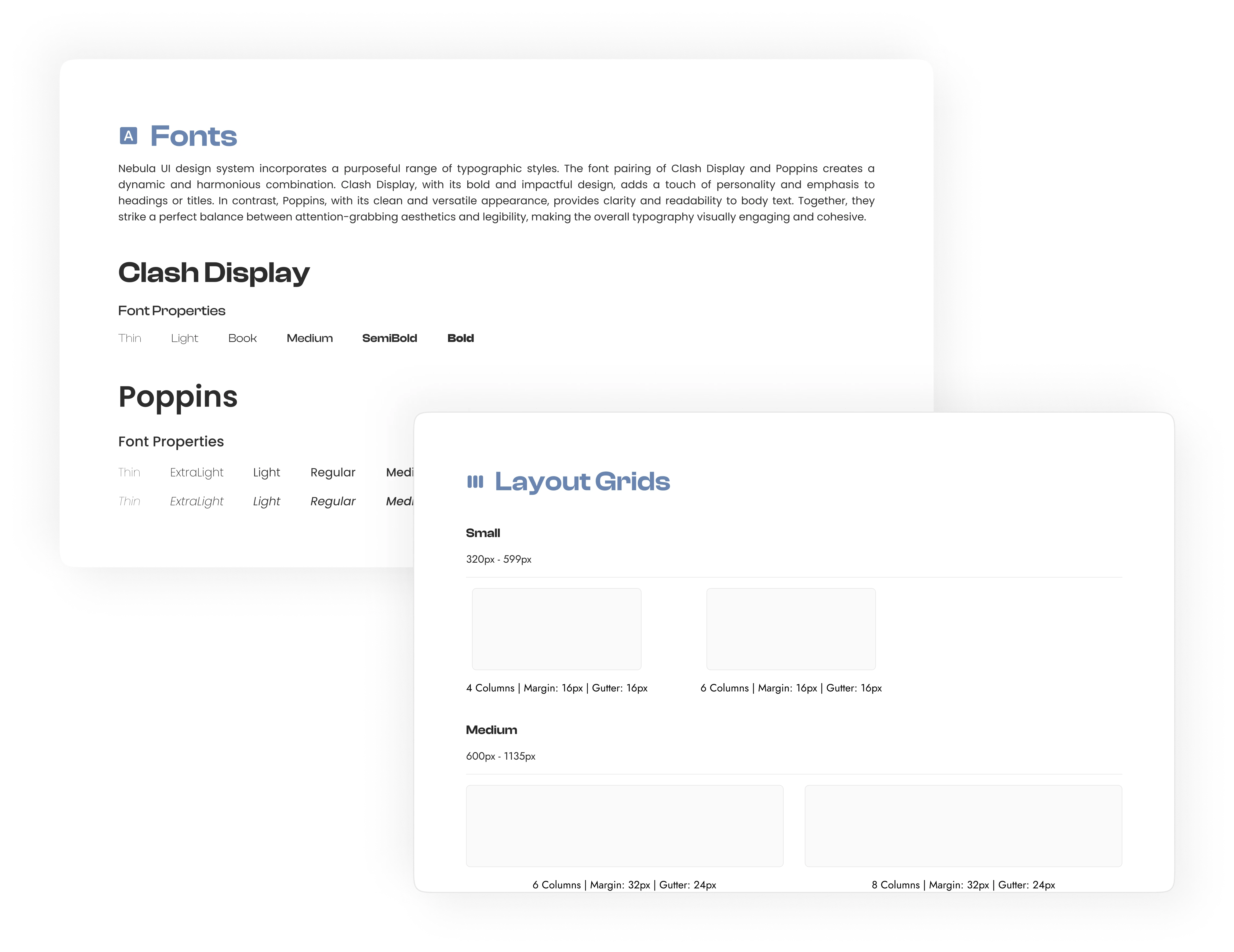
Atoms
What does the style guide consists of?
In-page annotations: Instructions on how to use each component within the library.
Branding: Details about colours and typography that define the brand.
Spacing Guidelines: Guidelines regarding the appropriate spacing between elements.
Layout Grids: Structured grids to maintain consistency in layout design.
Shadows and Blur: Instructions on implementing shadows and blur effects for depth and visual appeal.
Icon Pack & Misc Icons: A collection of icons for consistent visual language and additional miscellaneous icons.
Breakpoint Indicators: Indicators to guide designers on responsive design breakpoints for different screen sizes.
What does the component library consists of?
Component name:
An explicit and distinct UI component identifier to prevent any confusion among designers. Clarity in naming ensures that the components function as intended without errors.
Component states:
Suggested default appearances & the corresponding alterations in the component's look.
Annotations:
In-page annotations and descriptions are provided to comprehend which component is under consideration.
Breakpoints indicators:
Size indications and breakpoints are included to assist developers in optimising designs for various screen sizes.
To make the system scalable for multiple users, I adhered to atomic design principles and utilised nested components. Using component properties allowed me to simplify variants. Identifying reusable components versus elements specific to edge cases remains an ongoing learning experience.
Like this project
Posted Feb 4, 2024
Nebula UI is a carefully designed toolkit for enhancing user interfaces & providing a seamless design experience.
Likes
0
Views
23


