Cacao —Falling in love with your skin
Dara Fakoya
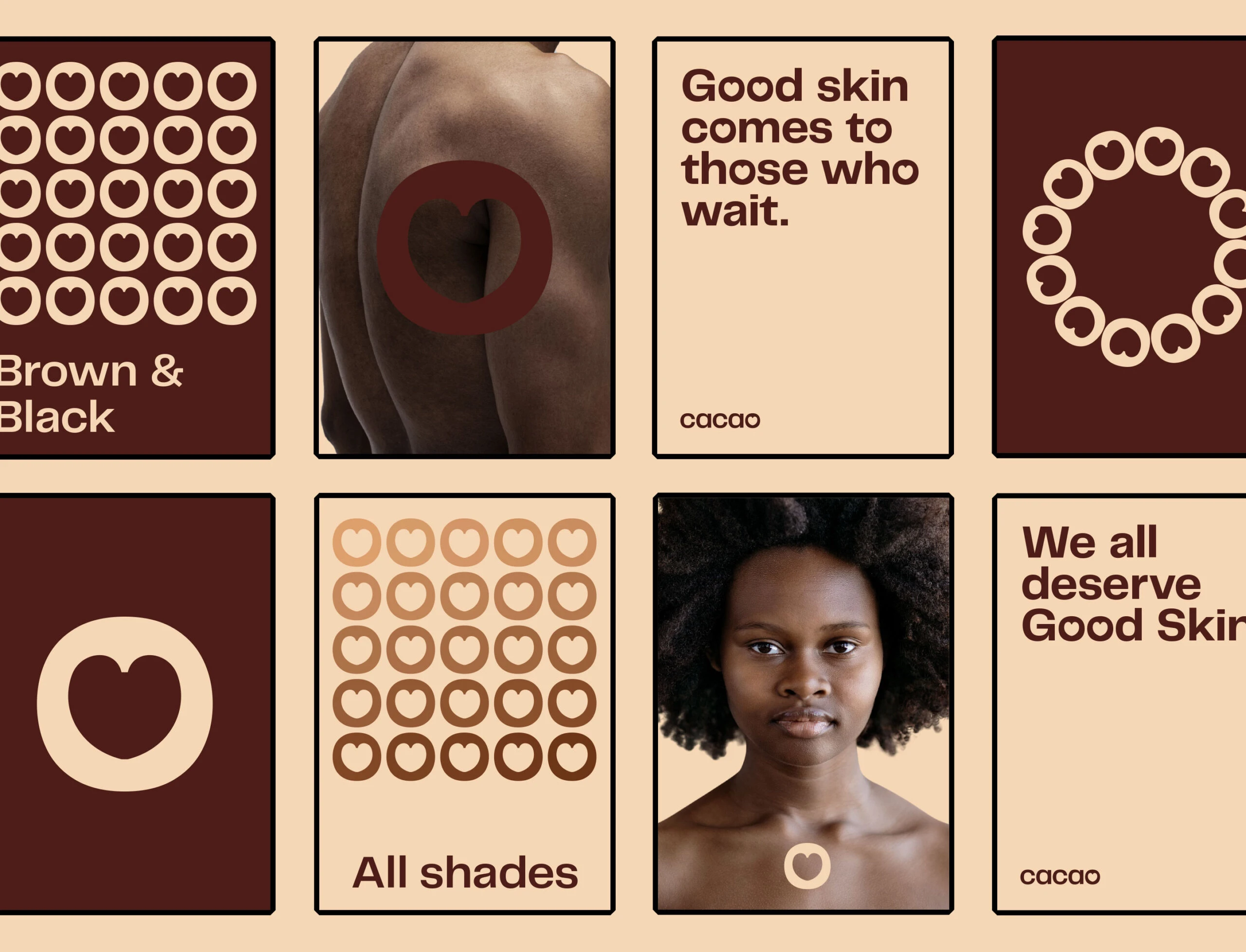
Falling in love with your skin.
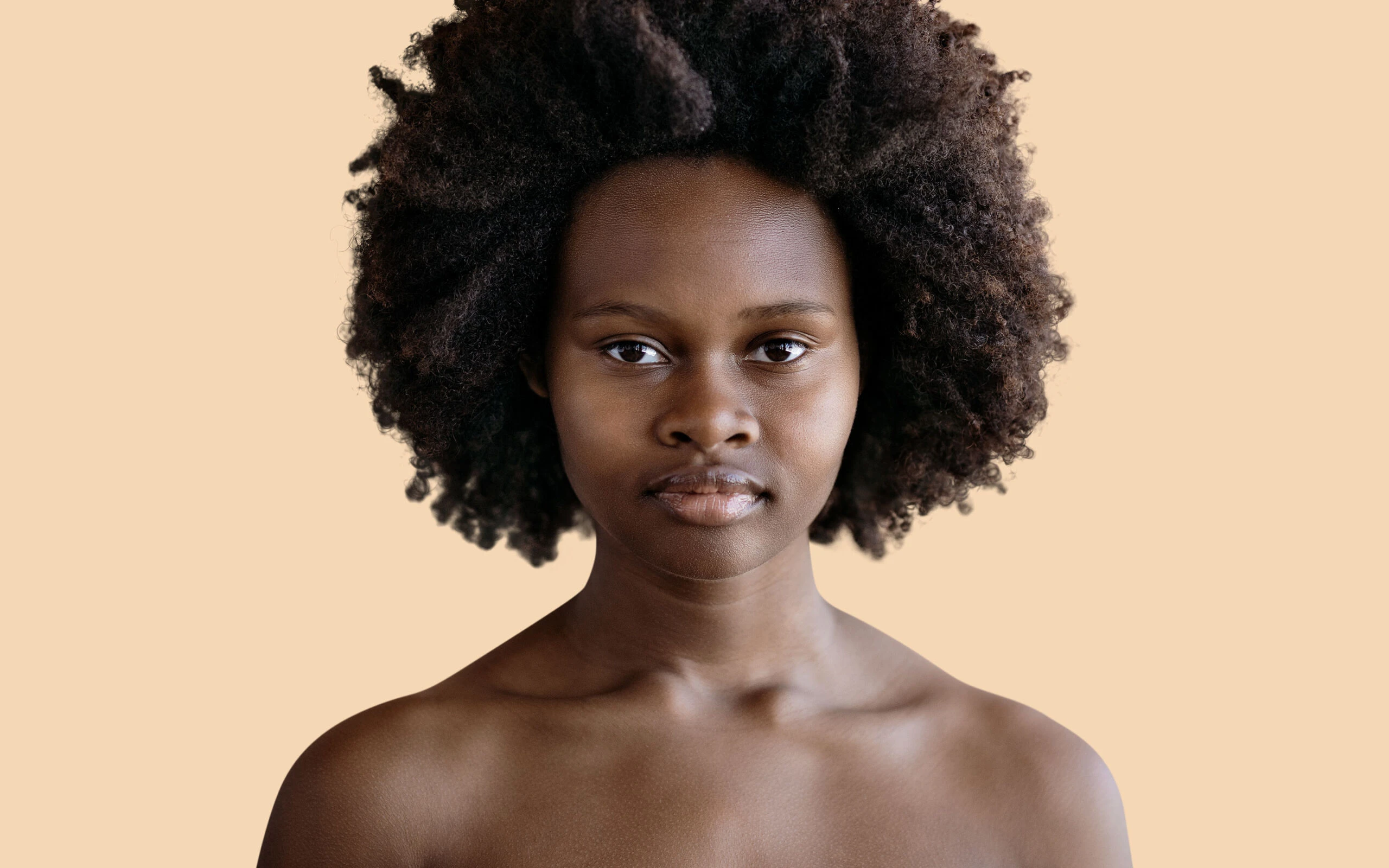
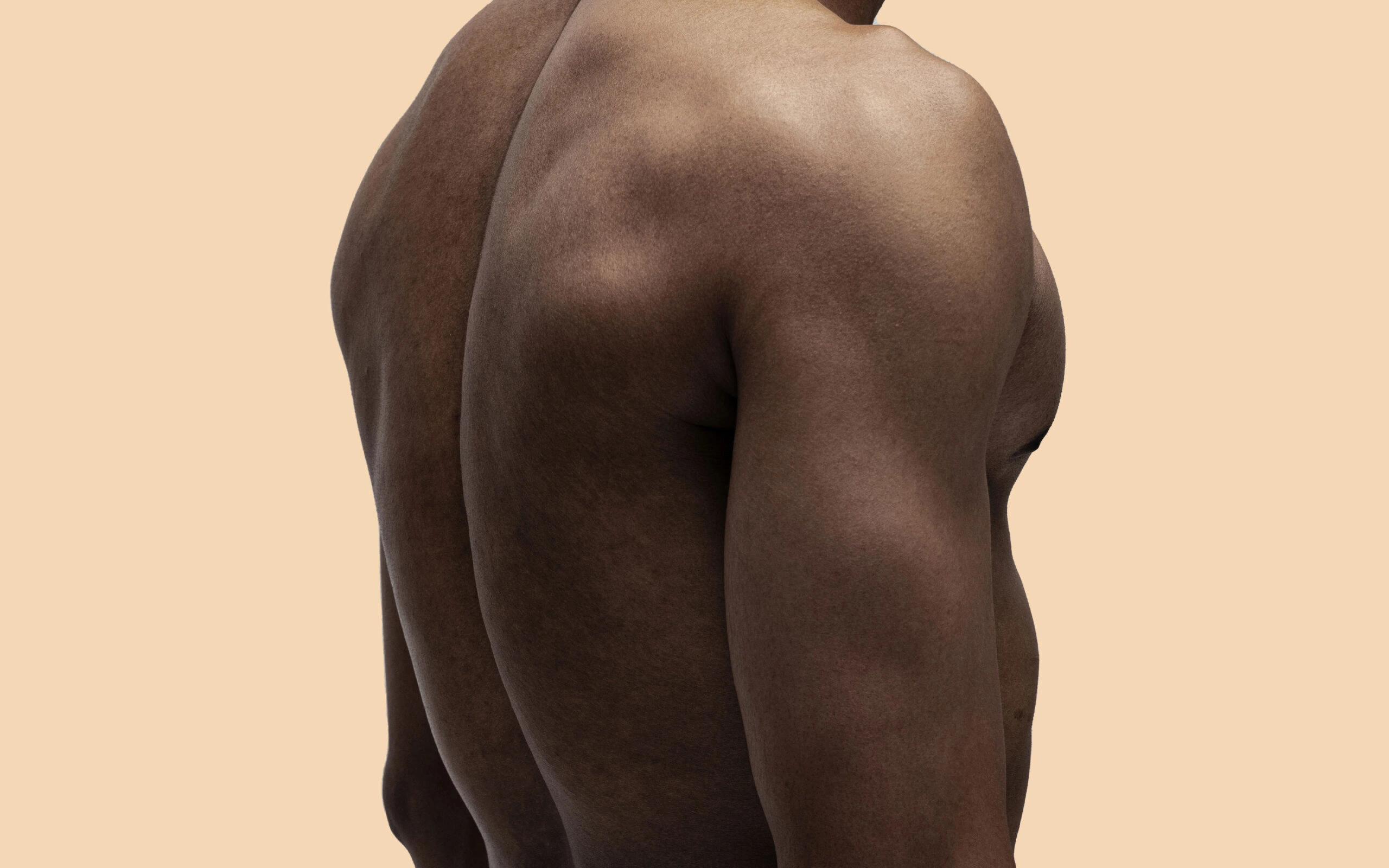
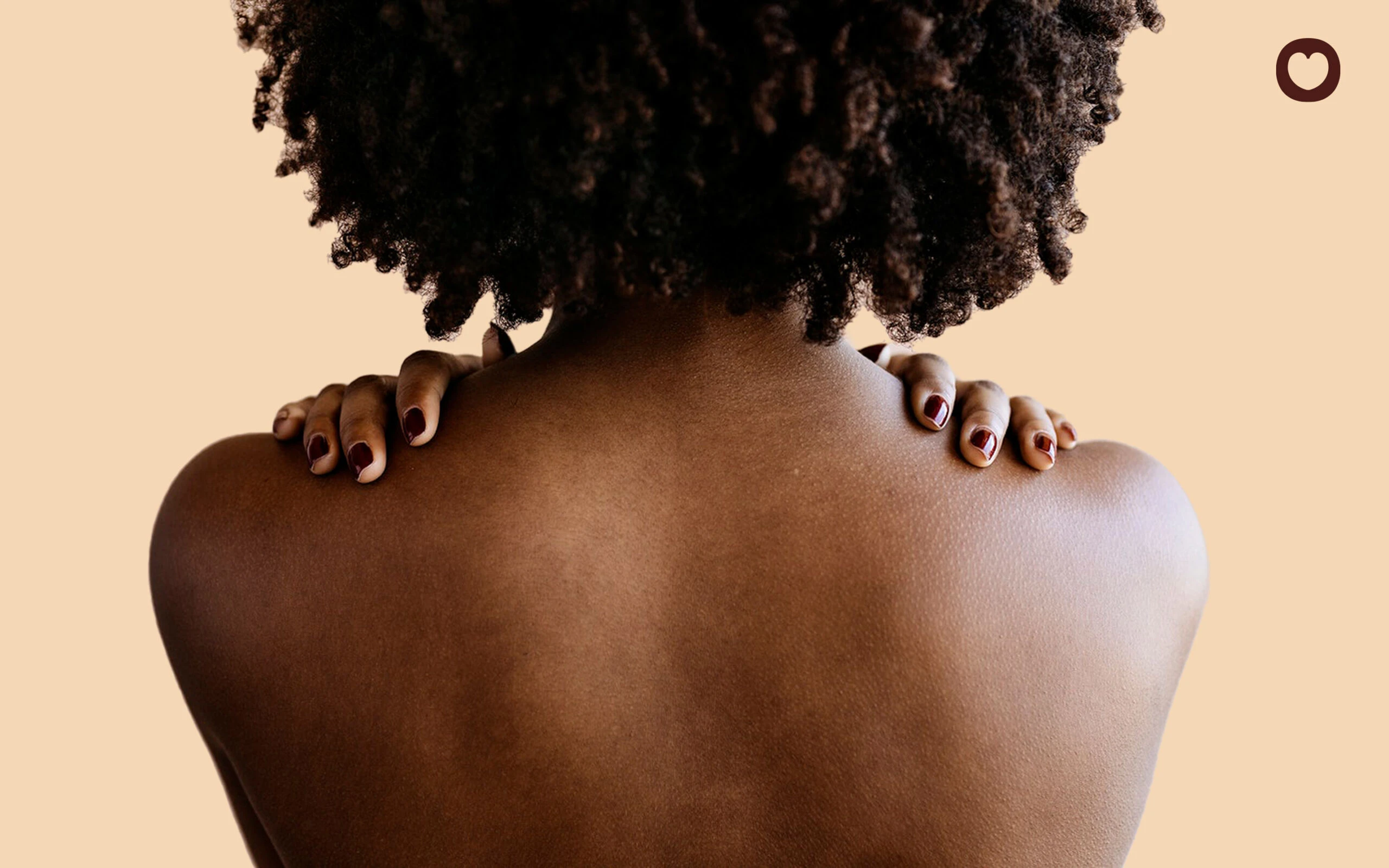
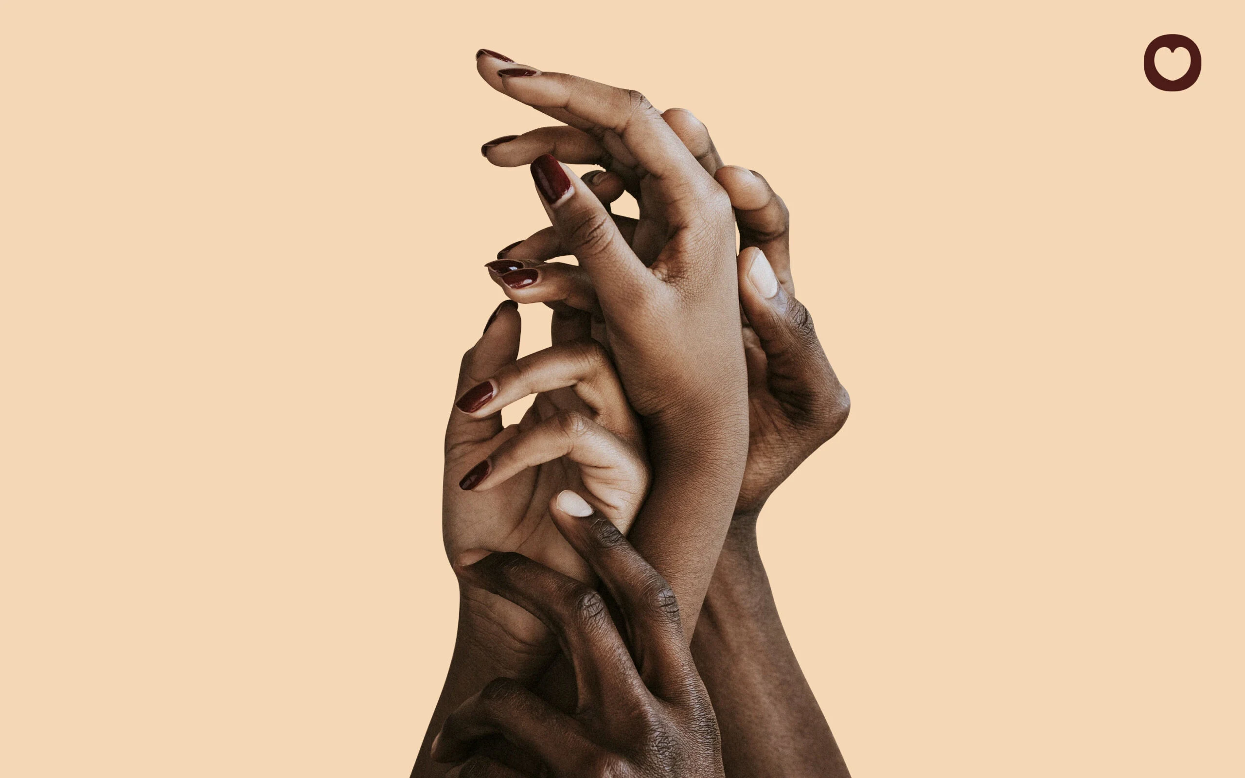
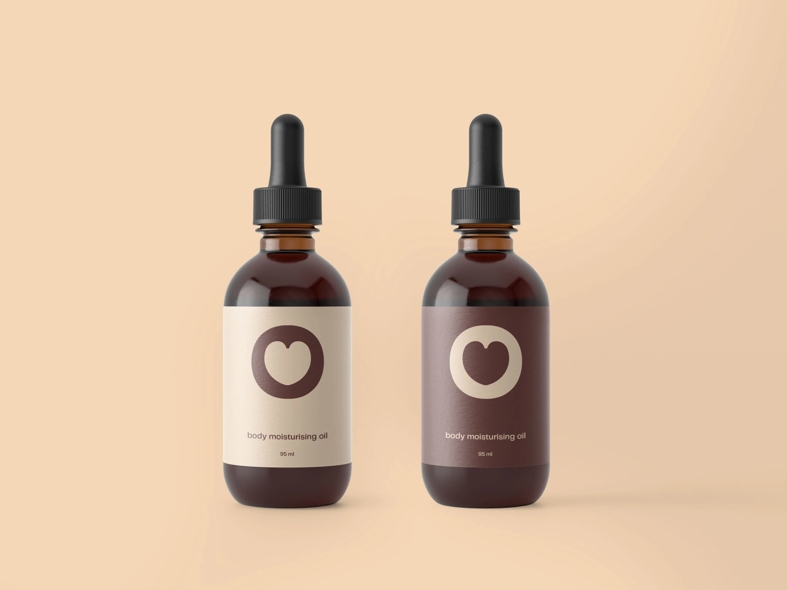
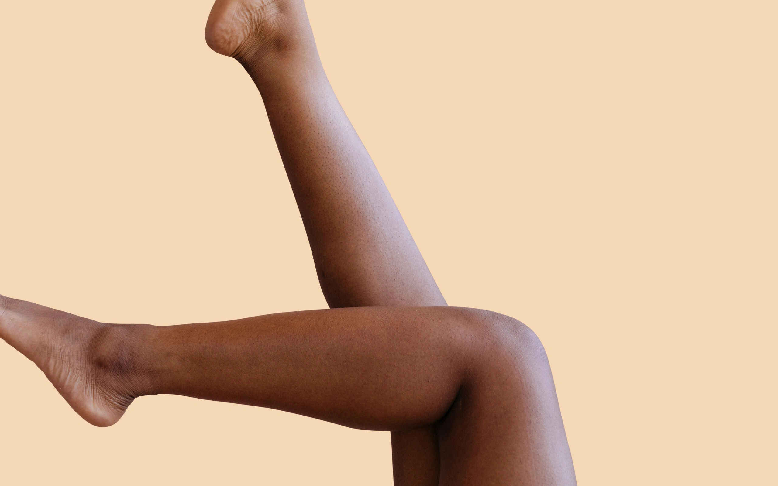
Cacao is more than just a skincare brand; it is about having an intimate relationship with your skin. The brand identity is carefully crafted to strike a perfect balance between elegance and approachability, encapsulating the belief that clear, radiant skin should be tasteful, accessible, and affordable for everyone. Cacao represents the epitome of affordable luxury.
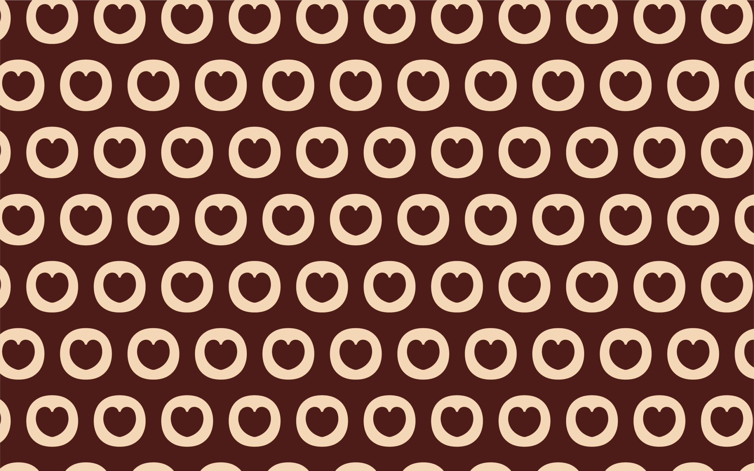
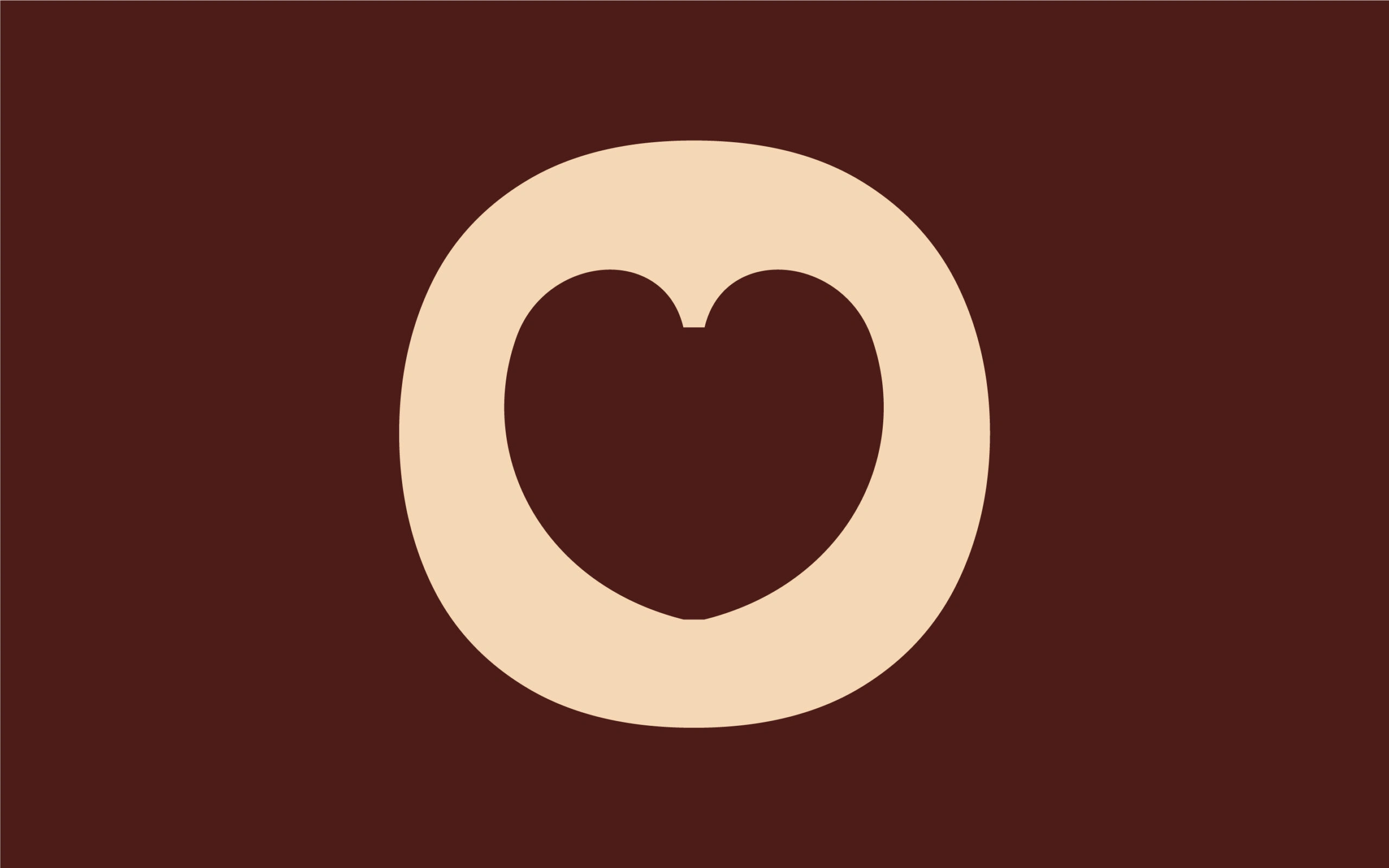
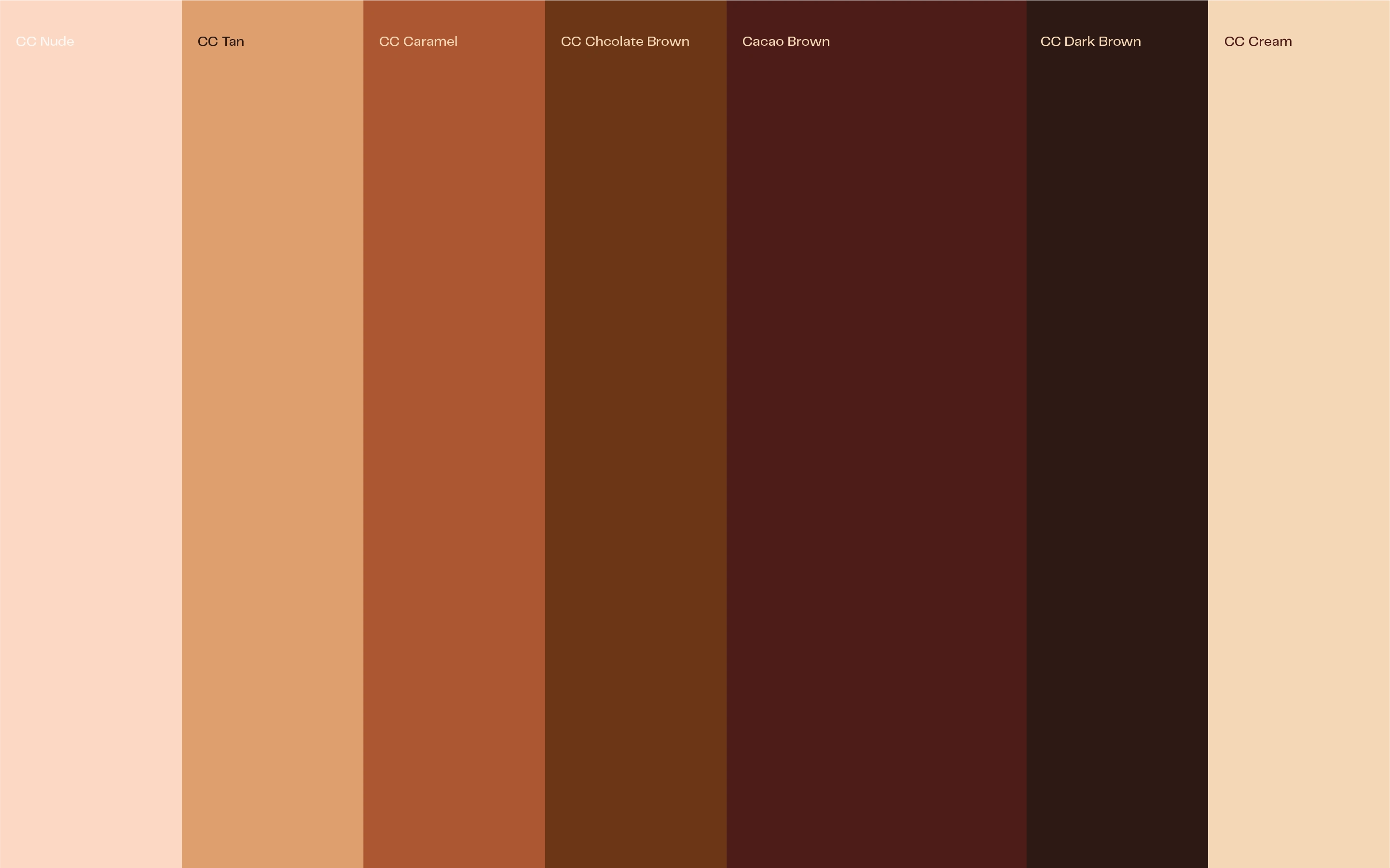
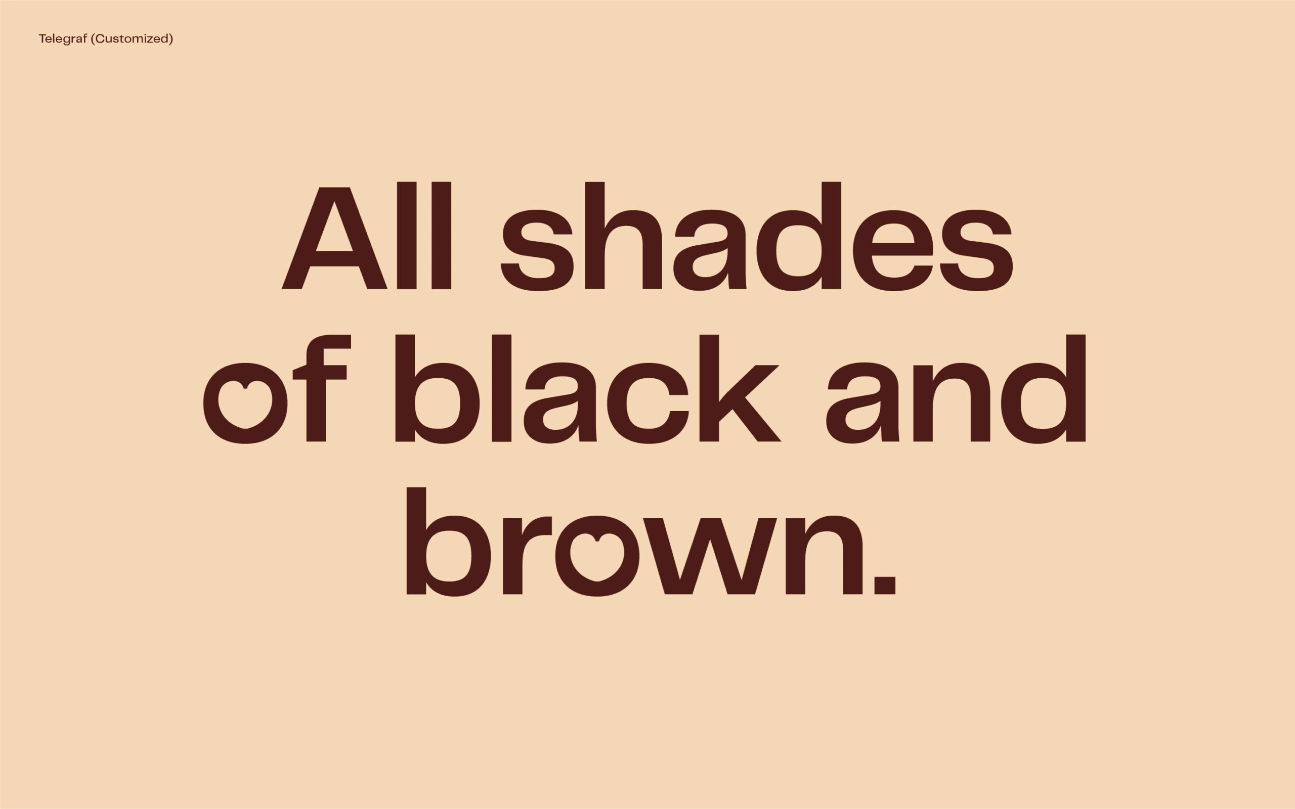
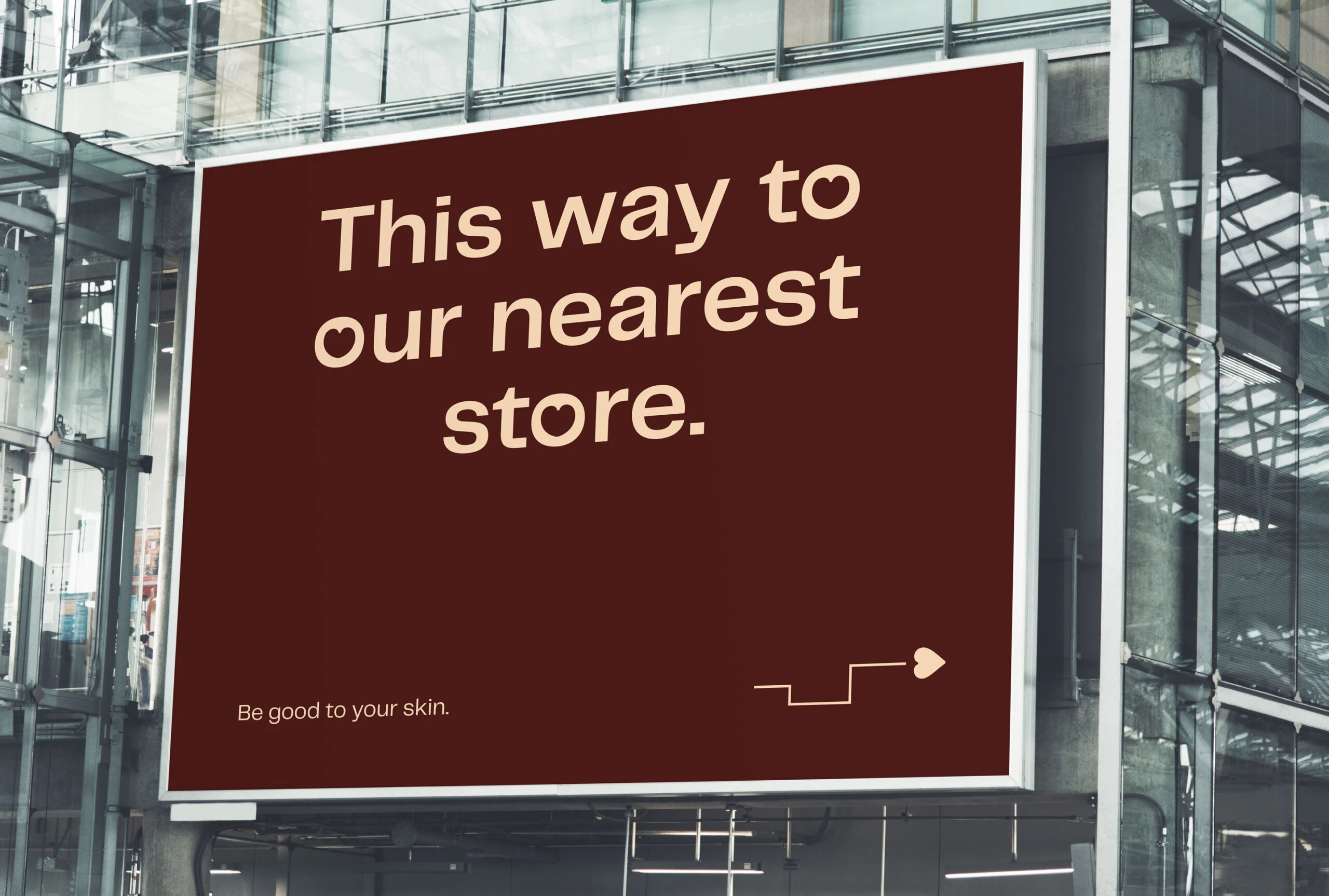
The logo features a customized interpretation of the universal symbol of love, enhanced with chiseled edges to replace traditional pointed vertices. This design choice echoes the brand's essence by merging softness with sophistication. The typeface is meticulously chosen to embody both roundness and sharpness, enhancing its welcoming yet refined appearance. We also customized the typeface with the logo to further enhance the brand. Cacao's visual palette takes inspiration from the rich and diverse shades of black and brown skin, reinforcing our commitment to inclusivity. Through this thoughtful combination of design elements, we convey a narrative of elegance and empowerment. We are dedicated to making the journey towards clear, glowing skin a reality for individuals with black and brown skin, embracing the beauty that is inherently yours.
Design Process:
At the outset, I engaged in insightful discussions with the client, Dami, to deeply understand her vision and objectives for the brand. These conversations were pivotal in grasping the underlying business strategy and the foundational ideas that guide the brand. With this detailed understanding, I crafted a compelling concept statement that encapsulated the brand's essence and core values. This statement became a strategic anchor, steering our creative direction throughout the project. Subsequently, I collaborated closely with Dami over several months to meticulously design the logo and develop a suite of brand assets, ensuring that each element aligned seamlessly with the brand vision.
Lagos, Nigeria.
Like this project
Posted Nov 15, 2024
Storytelling and visual identity for a skincare brand exploring and exposing the beauty in black and brown skin.