Kairos — Brand Identity | AI SaaS RFP Platform

Chris Nijhof
Verified


Overview
Kairos is a high-end sales platform with offices in Vancouver, Brisbane, Sweden and New York. They help teams AI-engineer RFPs, DDQs and security questionnaires so the answers come back faster, and better, than a manual fill. The product is the deal weapon the other side doesn't see coming.
They came in through Contra. Small team, 2–10 people, already a thousand followers on LinkedIn, and a category that still looks like enterprise software from 2014. The brief was to give them a brand that can sit next to a Series A deck and still work on a t-shirt.
I built the identity and the first campaign system around it. Logo, type, colour, posters, merch, lifestyle photography, LinkedIn.
Challenge
RFP software has a trust problem. Buyers are sales leaders who have been burned by tools that overpromise. Most competitors look interchangeable: purple gradients, dashboard screenshots, "AI-powered" in the first line.
Kairos needed the opposite. Quiet. Expensive. A brand that feels like a private sales advantage, not another SaaS tab. The name already does half the work. Kairos is the opportune moment. The second you actually close.
The commercial tension we had to hold: look premium enough for enterprise buyers, while still feeling like a 2–10 person team you can get on a call with.
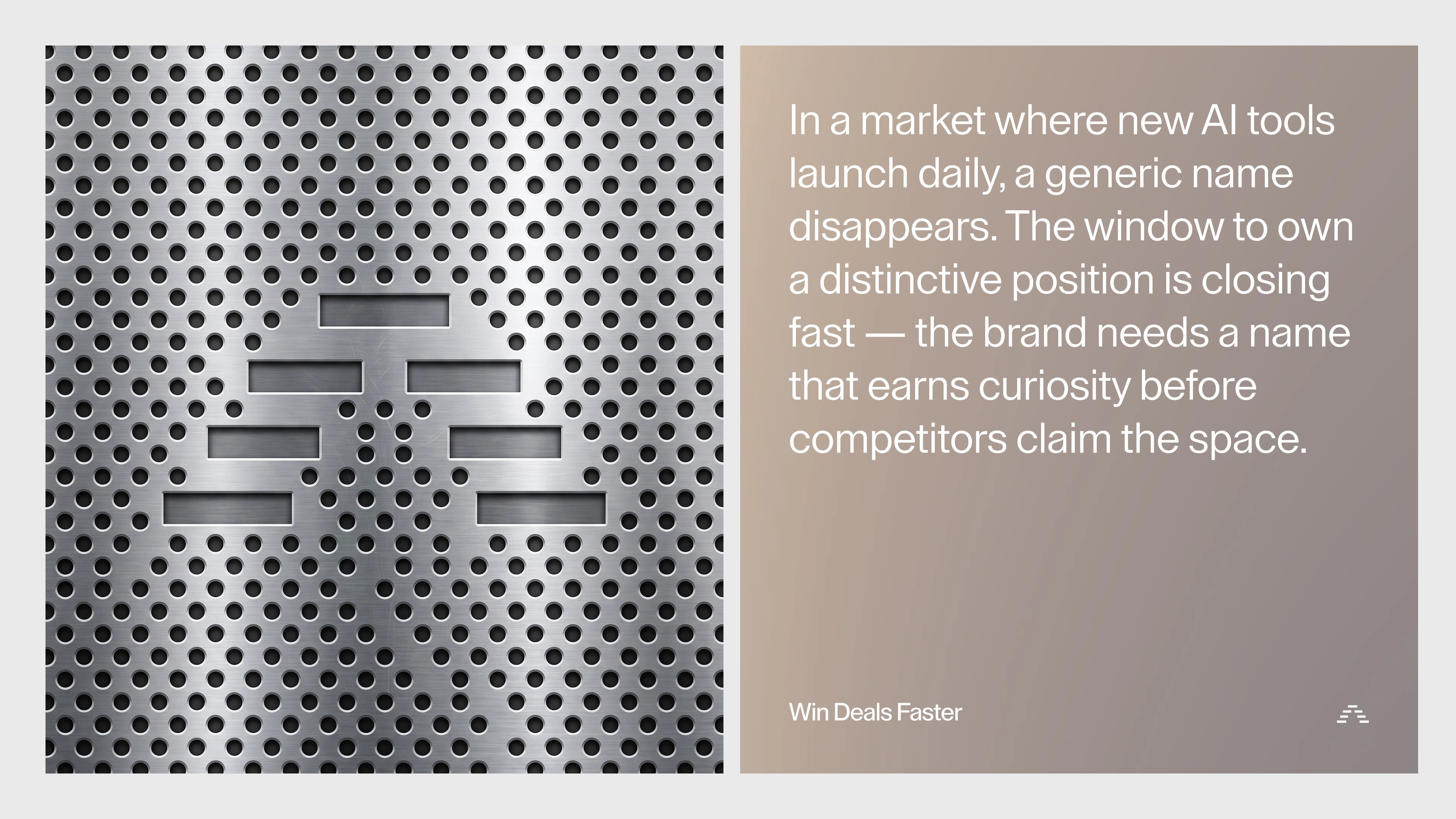
Market Opportunity + Logo teaser as backside of a Mac server cooling.
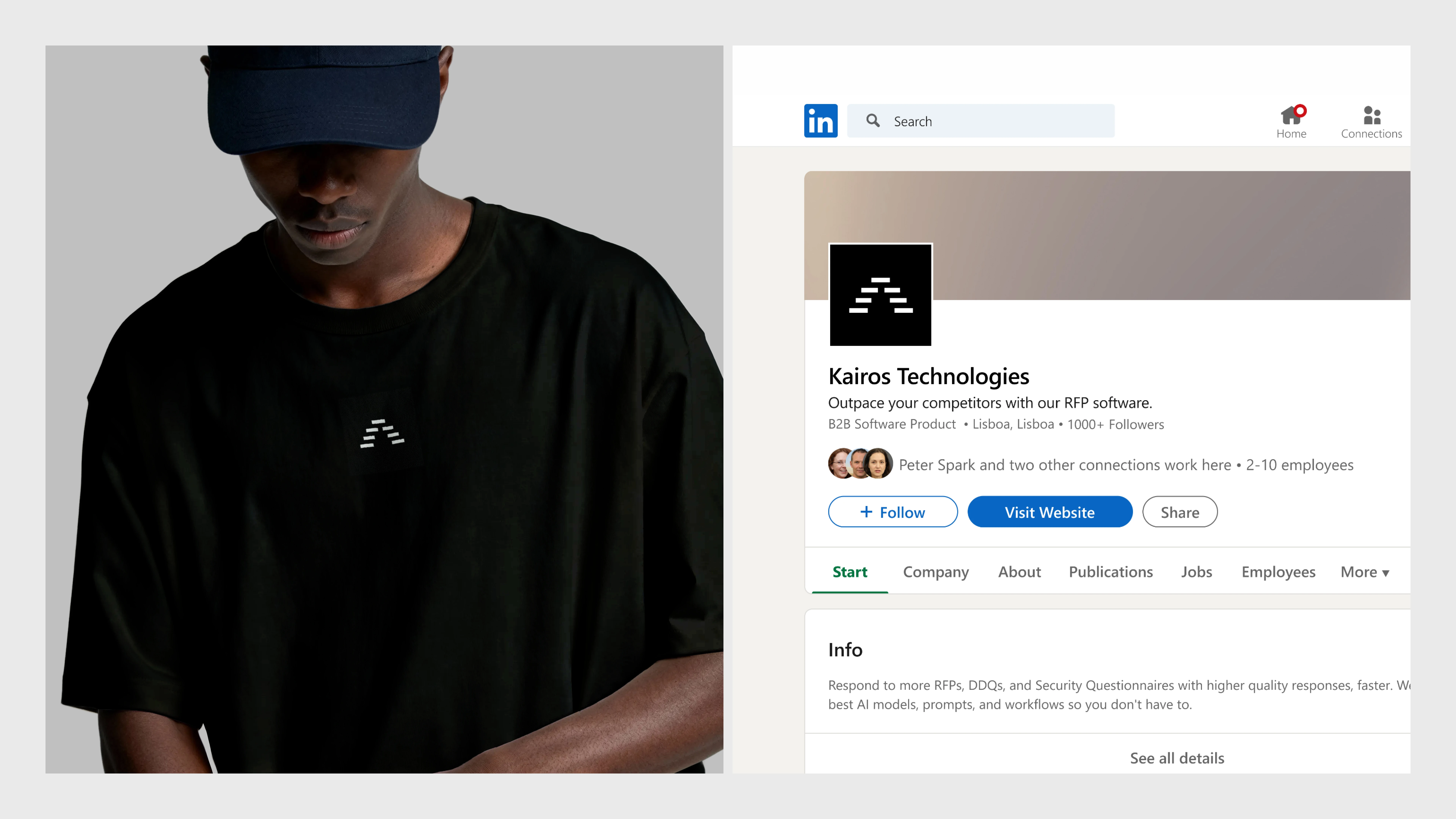
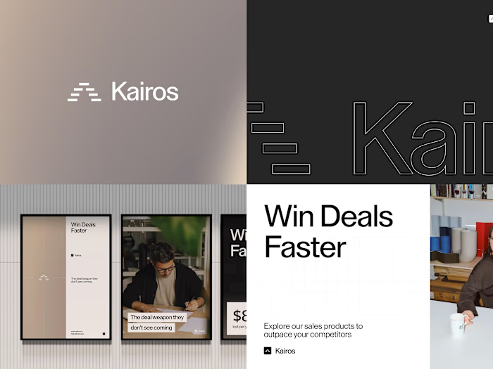
Sleek apparel design combined with a strong social presence on LinkedIn
The Mark
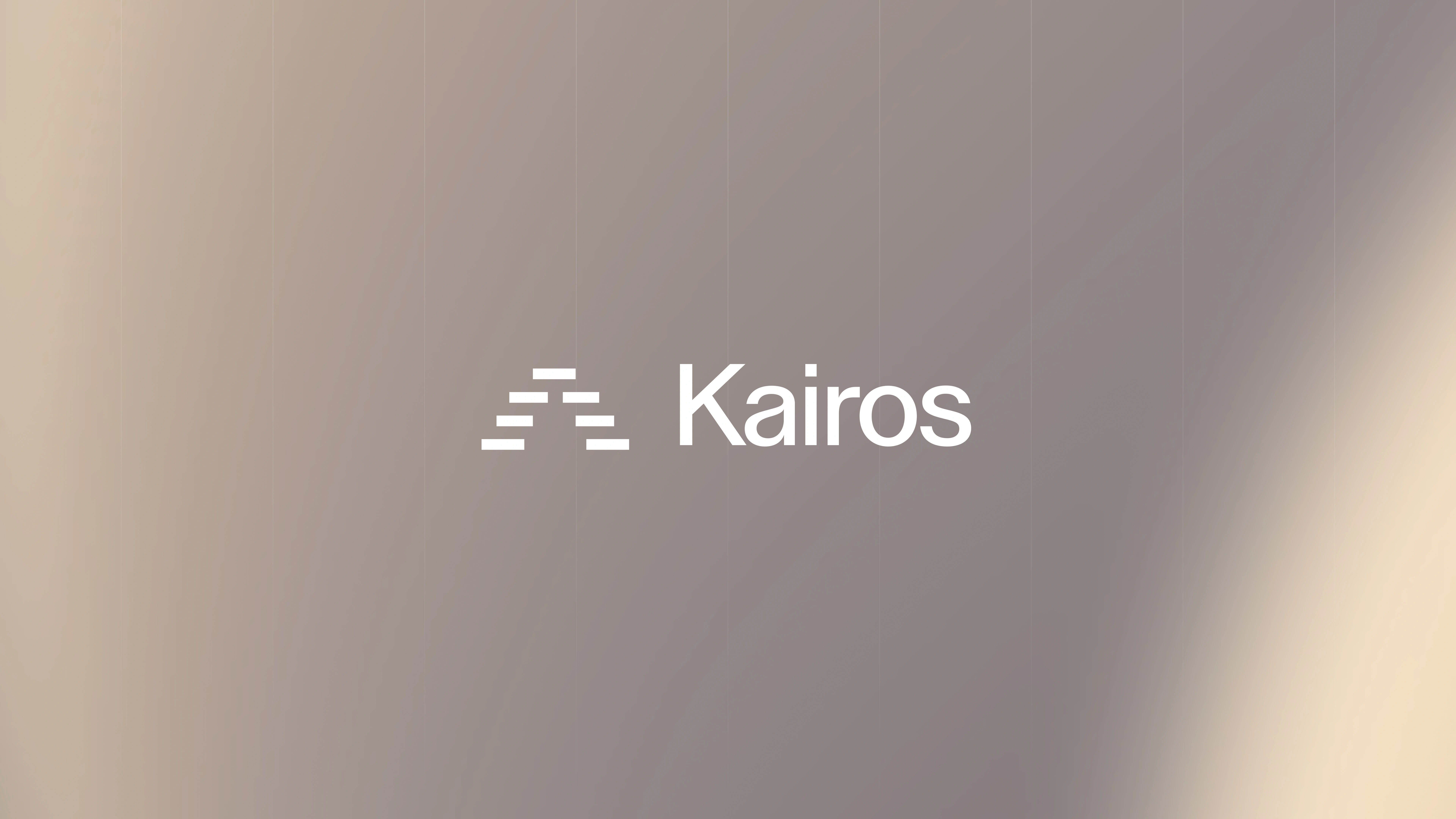
The symbol is a stack of horizontal bars that climb into a pyramid. It reads as three things at once.
A staircase. You move up a deal. An "A", cut open. Advantage, without spelling it. A progress bar, frozen at the moment before close.
It has to work at every size. Favicon on LinkedIn. Chest print on a heavy tee. Outline lockup on a dark wall. Solid square next to the wordmark. Same geometry, three weights: outlined, solid white, solid black.
We kept the construction honest. No decoration around it. The bars are the brand.
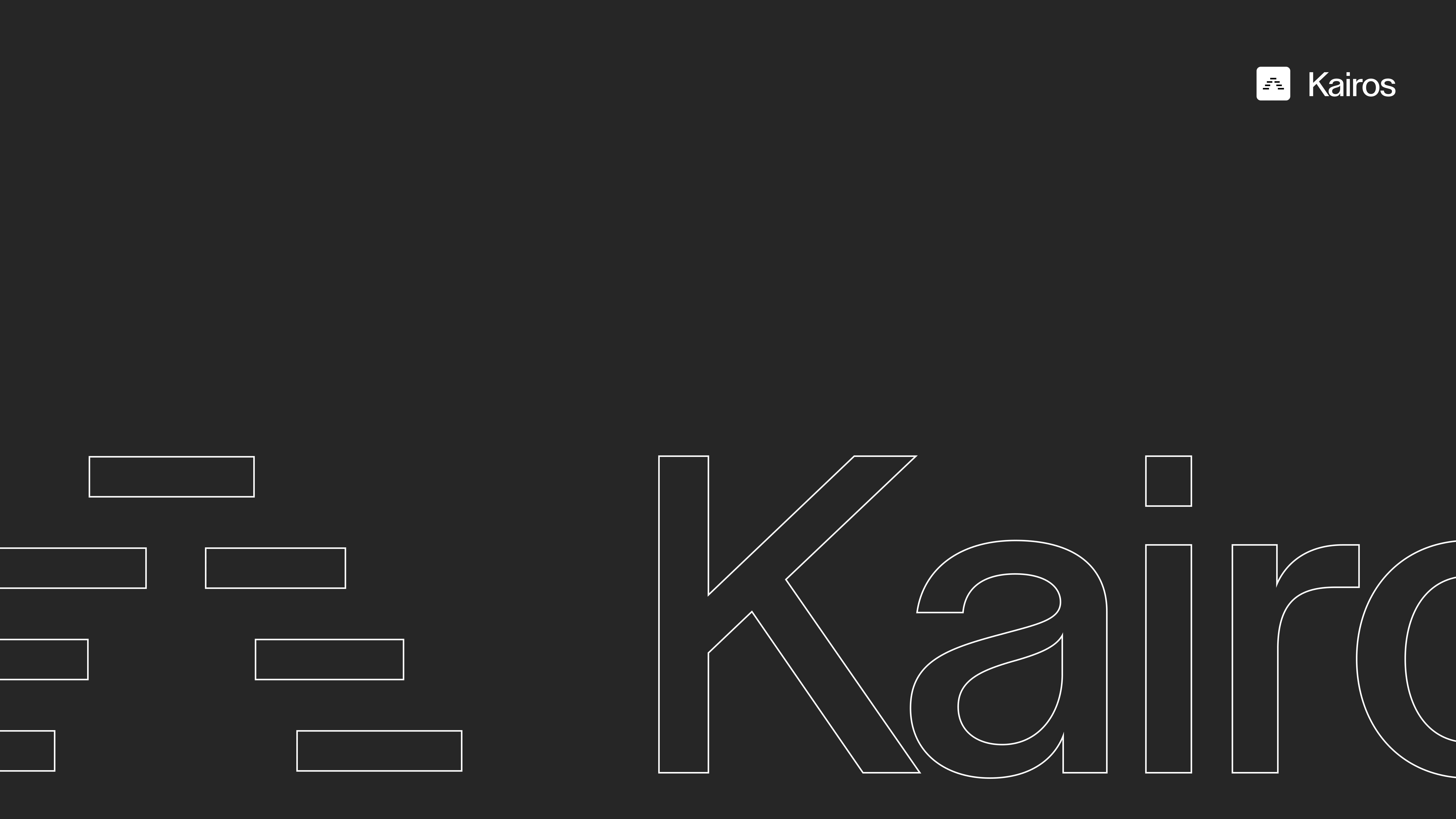
The wordmark outlined. Shows the weight of the icon vs the weight of the font.
Product Family
The bar is also the unit for the product family. Same rounded square, same white-on-black, the bars just rearrange.
AutoDDQ.ai stacks them into a tight brick field. A questionnaire. Rows of answers, already filled. AutoRFP.ai splits them into two columns, short and long. A document. A form that has been worked. AutoDemo.ai tilts them into a chevron. Play. Next. The deal moving forward.
You never need a second logo language. One bar, three products, and the parent mark still sits in the corner as the house.
We kept the construction honest. No decoration around it. The bars are the brand.
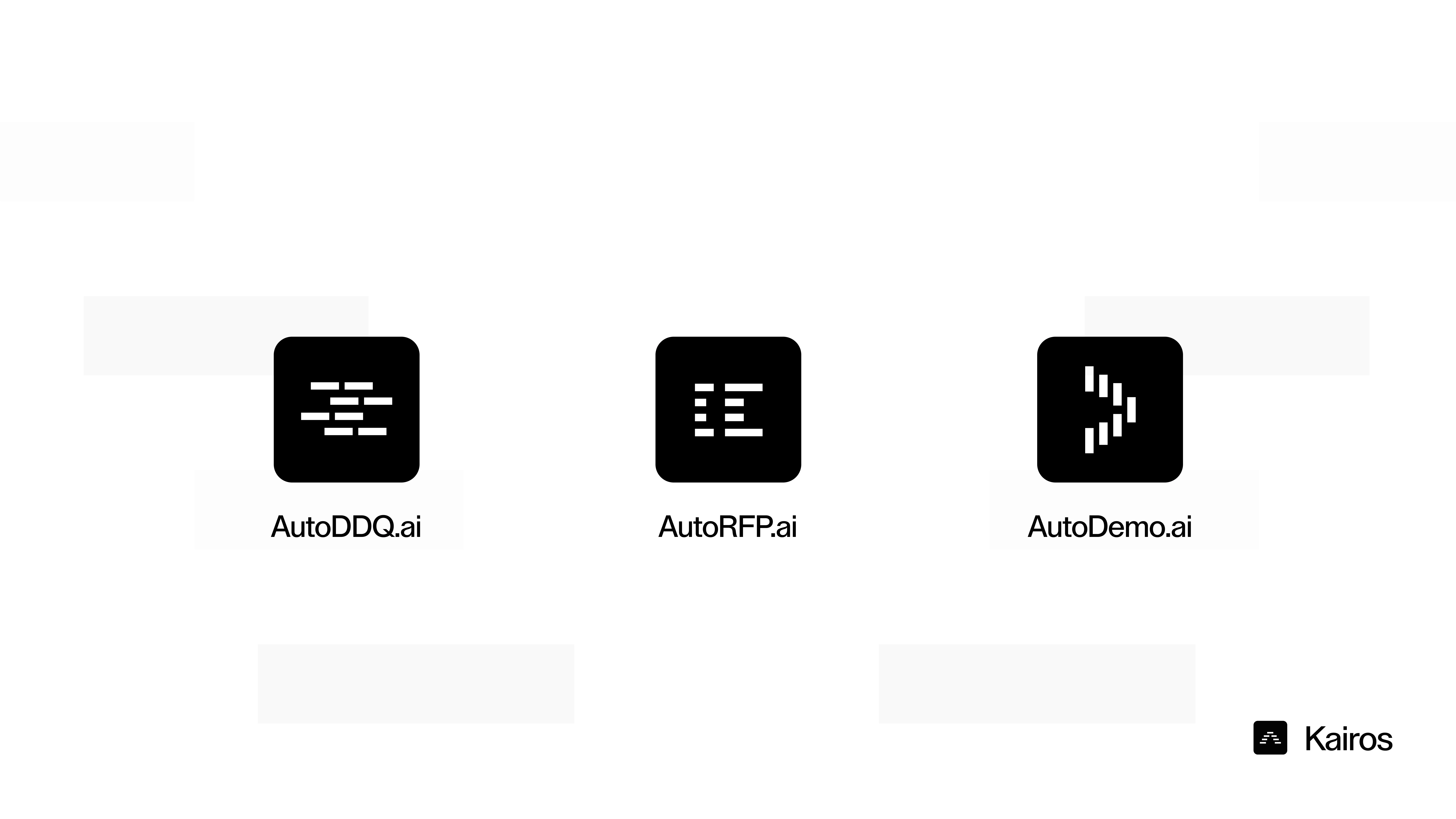
Full product suite. Shows the expandability of the logomark.
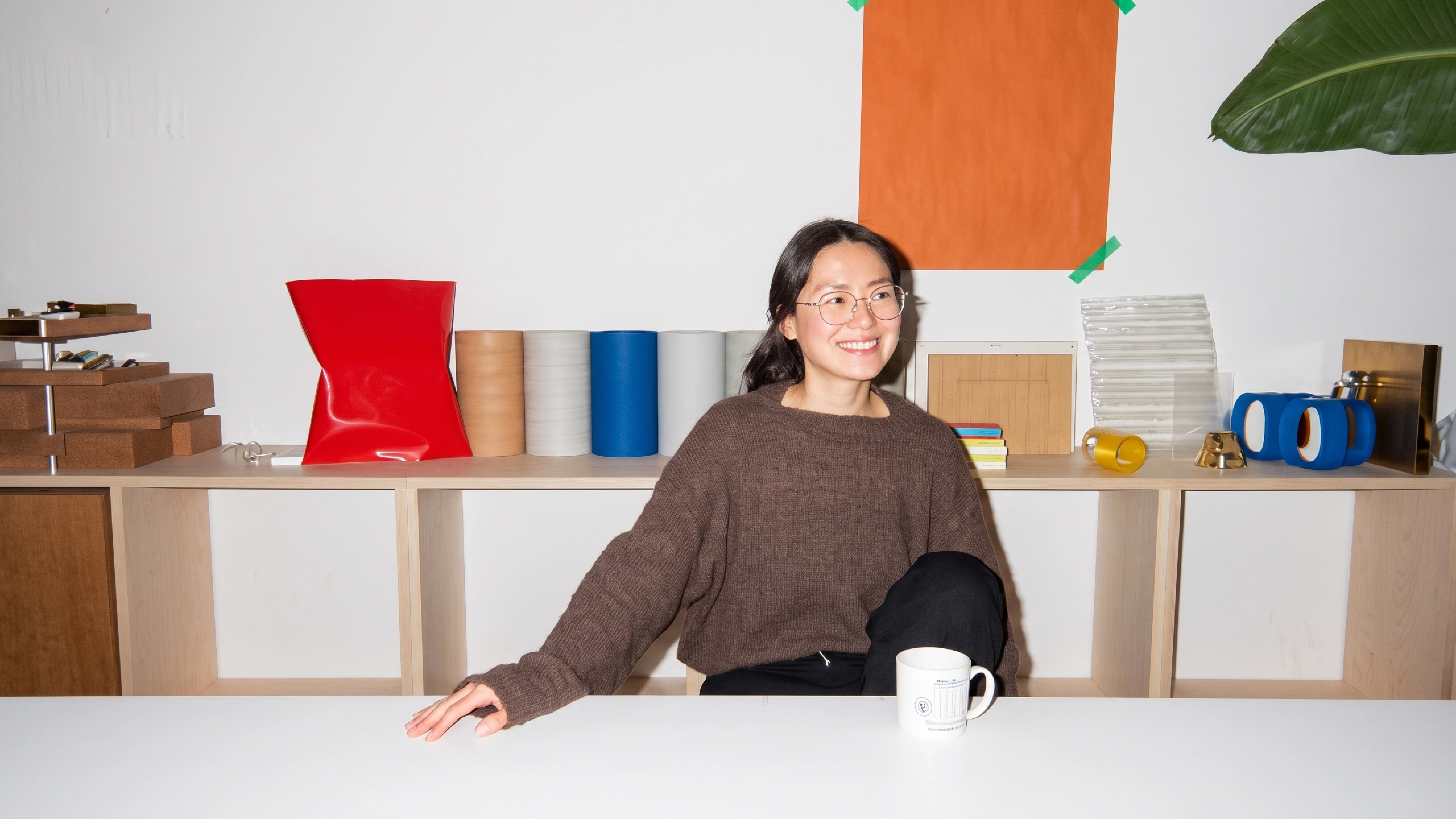
Photography style, flashy photography of people "not worrying" or "not feeling pressure" regarding their deals or work. Comfortable settings.
Voice
Three lines do the talking.
Win Deals Faster. The promise. The deal weapon they don't see coming. The attitude. $875K lost per year from never finished RFP's. The reason to care. Their number, not ours.
Secondary line for product surfaces: "Explore our sales products to outpace your competitors." LinkedIn headline stays even drier: "Outpace your competitors with our RFP software."
The brand never explains the model. It states the outcome and gets out of the way.
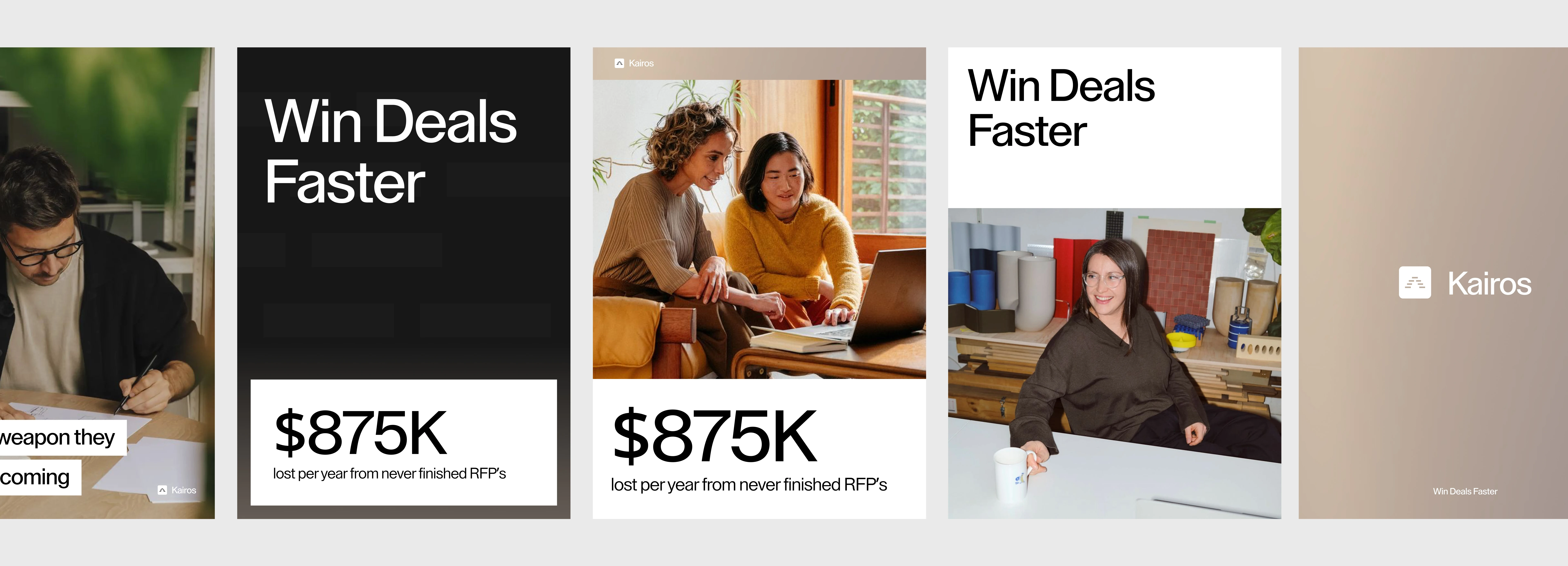
The voice is straightforward. We tell you exactly what is going wrong. We always talk in opportunities.
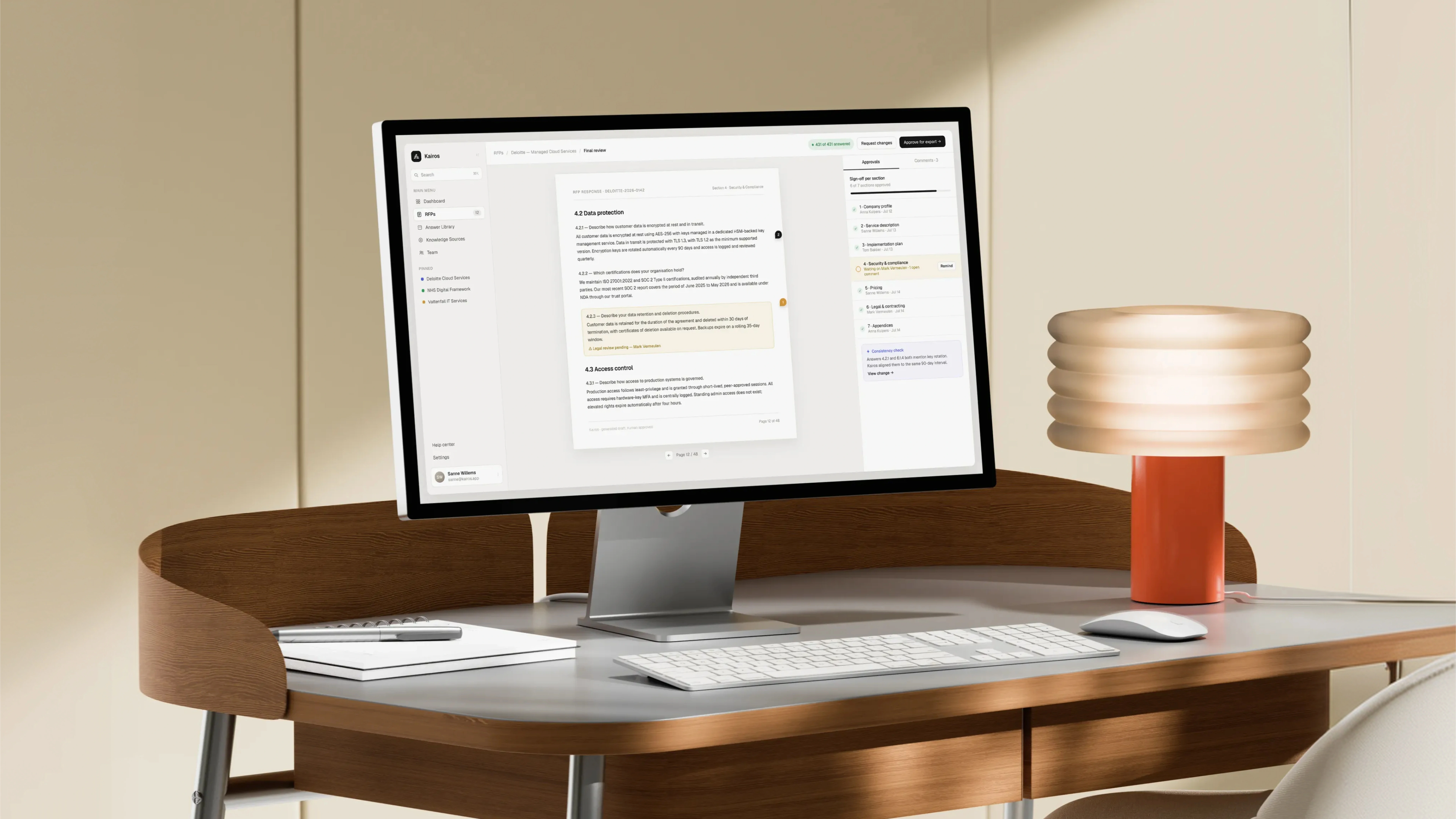
Product Design in practice. Document answering on a iMac display.
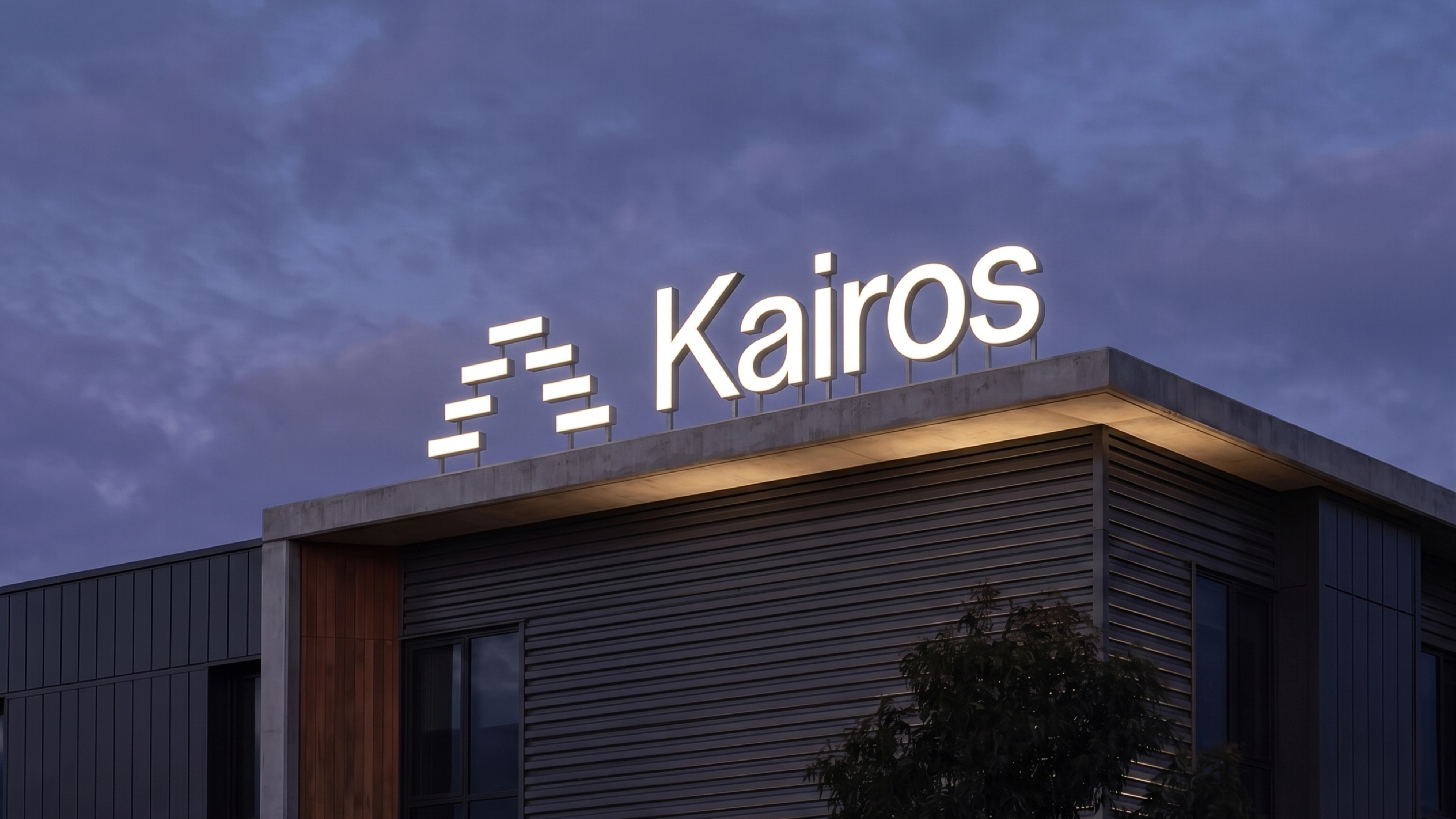
Kairos wordmark as LED sign on the roof of an office building.
The Outcome
A 2–10 person AI company can now show up as a sales weapon, not a tool. Poster, profile, merch, and a photo all lock to the same mark and the same three lines. Nothing in the set asks you to understand the product first.
That's the job of this identity. Win the room before the demo.
🟢 I'm currently available for new projects.
My name is Chris, I'm a brand and web designer from The Netherlands. If you're building a B2B or AI product that needs to look like the advantage it is, send me a message or book a time 👇
Like this project
What the client had to say
Great to work with, was very patient with us while we made decisions internally and fast to deliver once we were ready.

Jasper Cooper
Jun 1, 2026, Client
Posted Aug 18, 2026
Brand system for Kairos, a worldwide AI sales platform. Mark, campaign, merch, LinkedIn. The deal weapon they don't see coming.
Likes
10
Views
114
Timeline
Mar 20, 2026 - Jun 1, 2026
Clients
AutoRFP.ai