Voolta's Brand, Website & Webapp Design
The company
Voolta is an online marketplace that enables enterprise IT buyers to connect with the best-fit sellers of technology products and services.
Responsabilities
UX/UI design of the web app.
Website Design (Voolta.io)
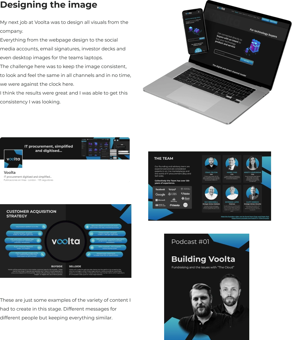
Brand design, style guide and creating presentations and investor decks, keeping visual consistency across all visuals, from the web to decks and the digital product.
High Fidelity prototyping, crafting the UI Kit, accounting for usability and iterating on designs.
Context
Our users are company employees who want to buy technology products and services such as Cyber Security, Colocation Data Centres, Hardware, Disaster Recovery, etc.
These products and services are not easy to find, they require contacts and lots of knowledge in the area, so buyers need to reach out to a consultant or agent who manages the purchase for them.
There are lots of technical requirements to cover and it makes the search process harsh and long.
The problem
Enterprise IT procurement today is offline and in desperate need of digitalisation.
Procurement timelines are slow (16 weeks approx.), costly and fragmented. This means big inneficiencies all across the buying process.
The goal
Build an online platform to fix the current inefficiencies, fragmentation and cost challenges faced in the IT marketplace by creating a smart-match system that connects buyers with the best fit sellers simply and quickly.
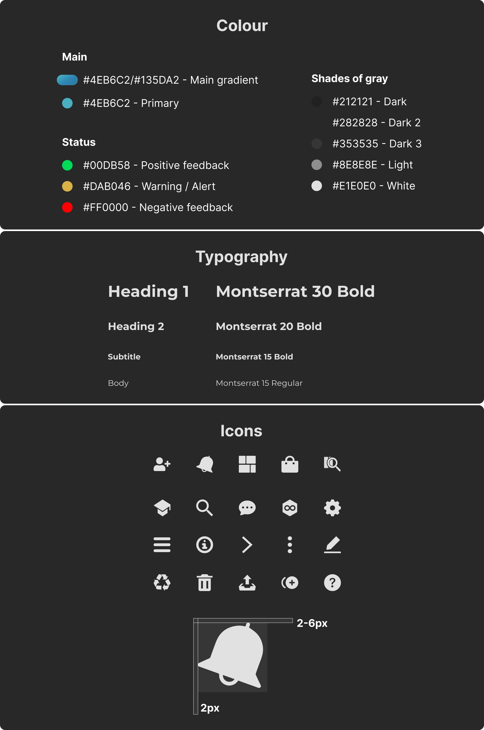
Brand Identity
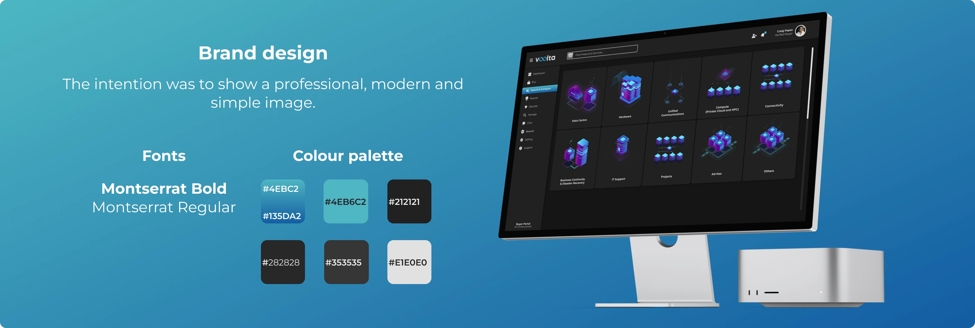
Basic tokens
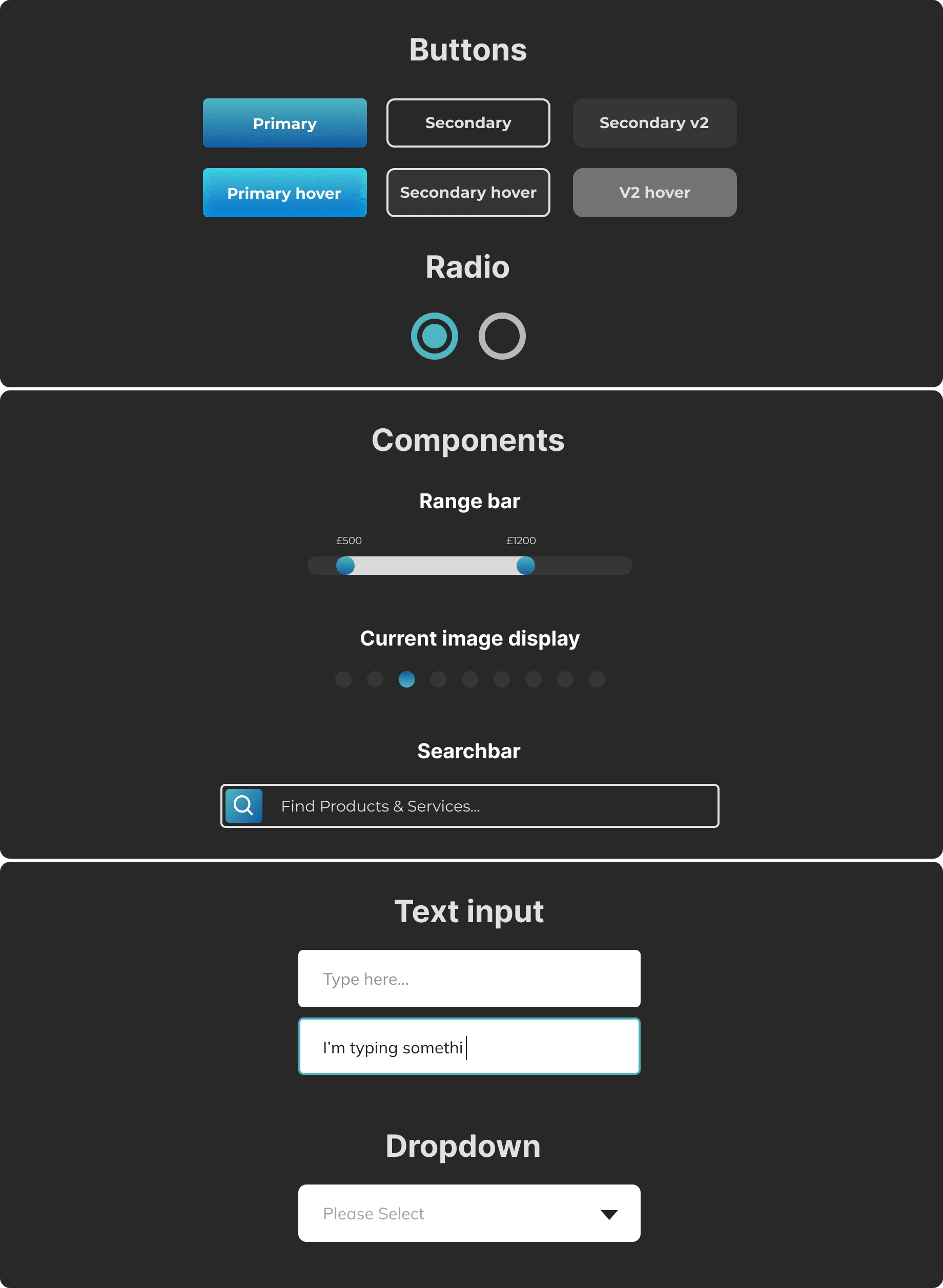
Examples of the UI Kit
Final thoughts & Impact
This project was oriented mostly in the UI side. It helped me a lot to polish my workflow to get cleaner files, quicker and with better designs.
Keeping everything tidy is tricky, but at the end it saves you tons of time and effort, so I think that was the key takeaway for me in this project.
We launched the Closed Beta in only 6 months, I traveled to London to meet the team and made very good connections and friends working with them.
That's a wrap! Thanks for reading ;)
Like this project
Posted Jul 25, 2024
♦ Website Design and creation ♦ Branding and Identity ♦ UX/UI Design: - Wireframing - Prototyping - UI Kit creation
Likes
0
Views
6
Clients
Voolta

