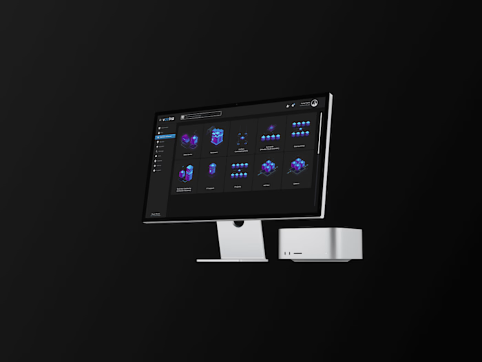
Puulga Website, Android and iOS app
The company
Puulga is a tool for resellers, called Nenis in México, women who sell second hand and handmade products through social media.
Responsabilities
Website Design and creation in Wordpress.
High Fidelity prototyping, conducting usability studies, accounting for usability and iterating on designs.
UI Kit creation & Brand and Design Guidelines.
Creating presentations and investor decks, keeping visual consistency across all visuals, from the app to decks and social media.
Our User's Problem
Today, our users don't have the right tools to manage their business in a professional, relying in a combination of online and offline methods to keep track of the different aspects of their business.
Our Goal
Create an app that gives them the tools to manage their catalog in a more organized way, centralizing communication and inventory management, providing a professional presentation and a way to track their reach and audience with advanced analytics, in addition to optimising the sharing of their catalog.
Context
In Mexico there is a very large and organized community of women who sell second-hand and handmade products as micro-entrepreneurs through social media, mainly Facebook Groups and Instagram.
The word "Nenis" came up to make fun of these empowered women who through offers of second-rate clothes, makeup, jewelry and others to support household economies.
Brand Design
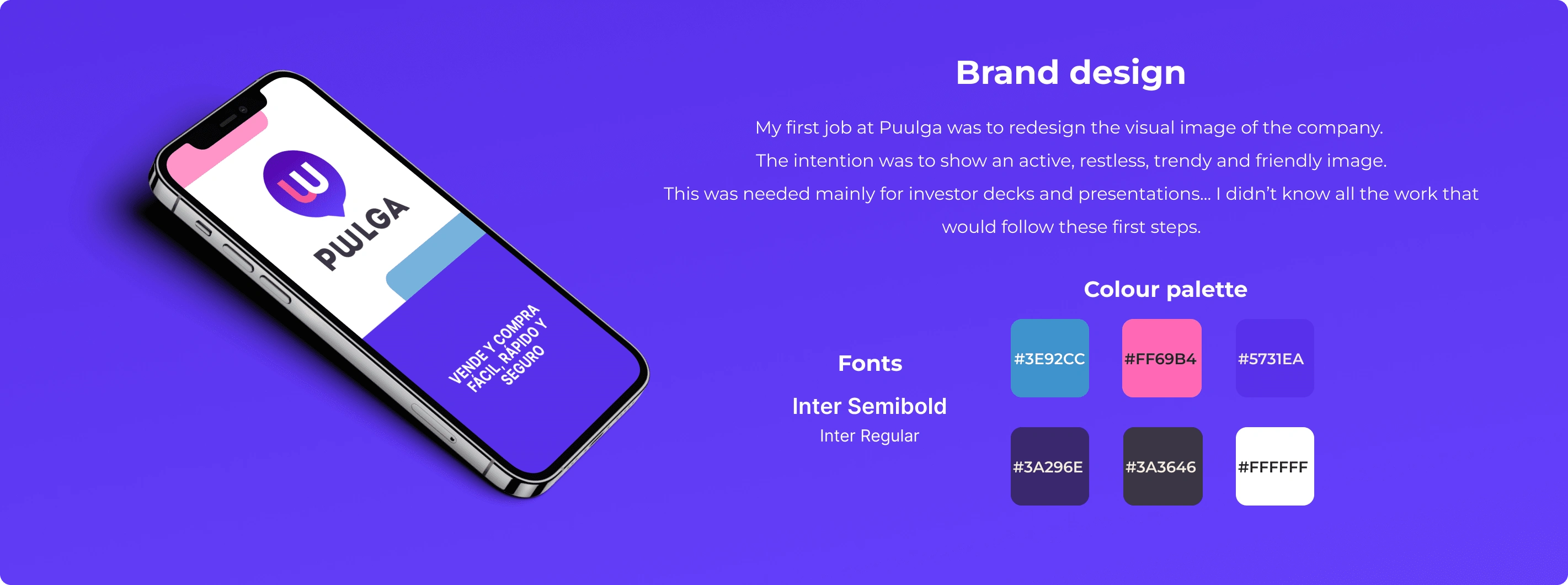
Colours and font selection

Logo design
Android & iOS app design
The app design involved lots of challenges, tweaks and scope adjustments. It has been a long process (2-3 years of constant development and evolution).
When I first jumped in, they had a very basic app with lots of problems:
Mixed and inconsistent graphic style.
The User Experience wasn't intuitive and simple.
Lot's of wasted screen space.
Messy information architecture.
Features that didn't really add value, and overcomplicated the product.
Unclear research, with unclear goals.
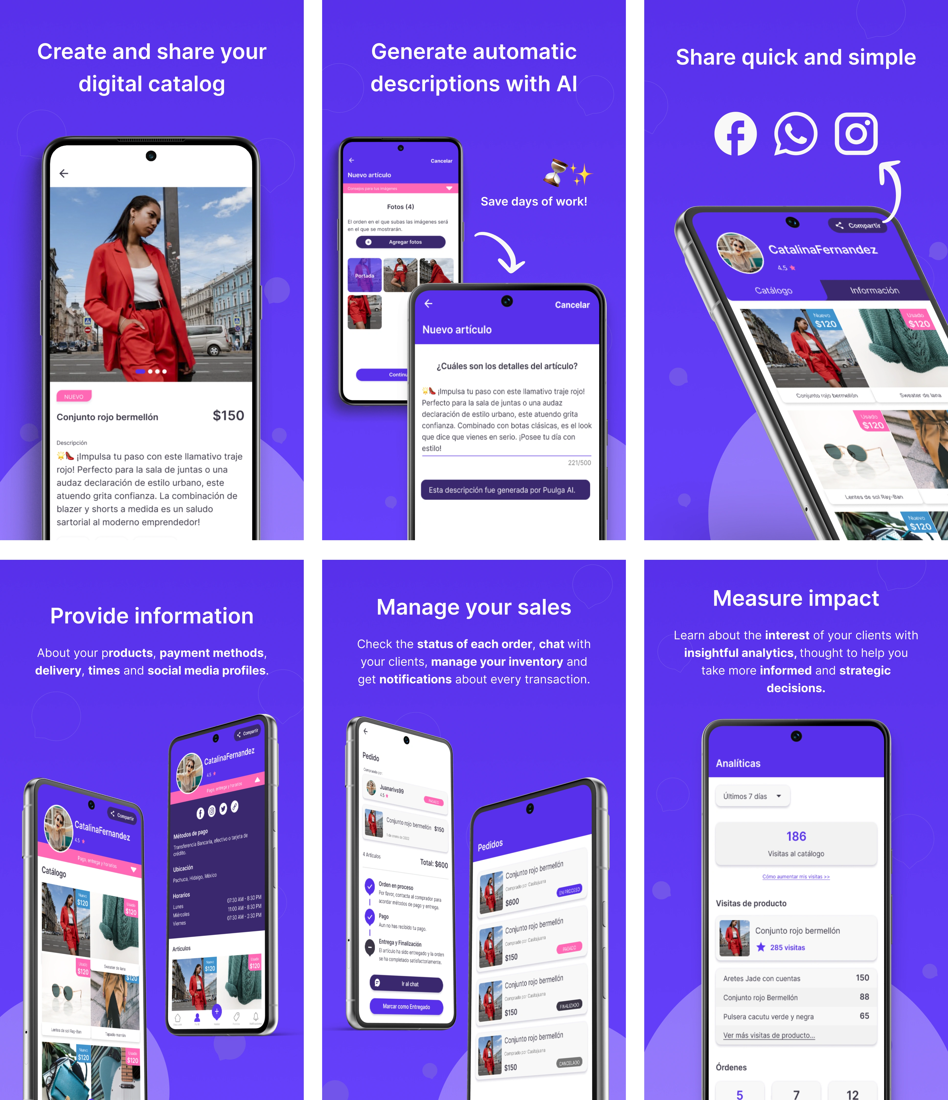
Our current Store images with a quick overview of the app's features.
The design process
To fix these inicial problems I did a heuristic analysis, and also double checked each feature, in order to establish the value it added and how it addressed the existing pain points.
With this in mind I was able to clean up the UX and UI as well, and gave me some key points to cover with some research with our users.
Once I gathered the information I needed to first understand the problem/project and bring up with some ideas, I continued to polish the brand identity, ensuring consistency in the style across all visual content.
This wasn't linear, of course, but in general the process went more or less like this.
After I defined the graphic style I worked for the next 6 months on cleaning and fixing existing features, screens, etc.
Achievements after this first phase
After this first design phase (which involved many iterations and stages) we landed our first round of investment, ensuring the company had the mains to keep the project ongoing for the next year.
I got the role as the Head of Design.
We launched the Alpha with a reduced group of users (30).
The product changed
After the Alpha, we learnt that our users needed a way to digitise and share their catalog, rather than receiving orders, messages and tracking sales.
This meant a big turn for the product & team.
Guess what: Yes! We simplified even more the product, focusing all our efforts in the features that added value for our users.
The main goal is to keep the app simple, as our users are not very tech savvy.
We redesigned the navigation, improved the catalog sharing, added multiple catalogs with filters, incorporated AI to simplify the product upload flow, enhanced inventory management and added analytics with custom notifications, focusing in tracking the catalog reach and audience.
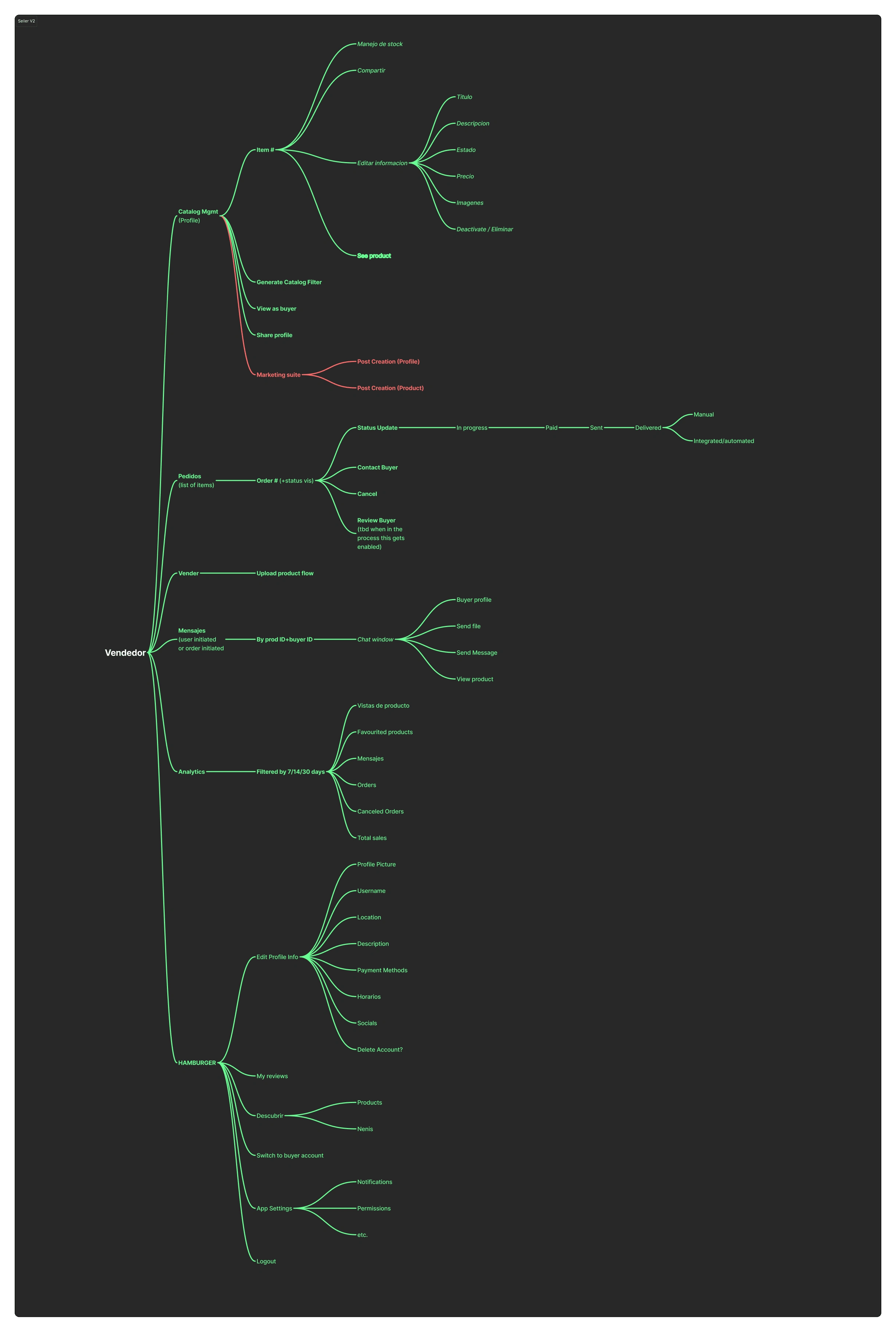
New information architecture for the seller perspective.
Since then, our user base has been growing 15%+ MONTHLY! It was an incredible and unexpected number.
Now, we're opening in 3 new countries. Argentina, Perú and Colombia.
Monetisation is on it's way with a reverse trial scheme.
The team is currently in the search for more investment to expand the team.
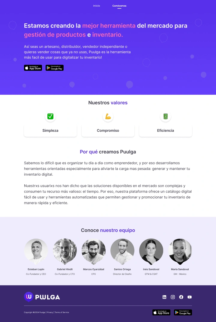
Website Design
We wanted to keep it simple, friendly and clear.
This was the result:

That's a wrap! Thanks for reading. ;)
Like this project
Posted Jul 25, 2024
♦ Website Design and creation in Wordpress ♦ Branding and Identity ♦ UX/UI Design: - Research - Heuristic Analysis - Wireframing - Prototyping - UI Kit creation


