Everest Fitness Website Development

Victor Adebayo


Everest — Fitness & Personal Training Website
Webflow Design · UX/UI Design · Responsive Development · CMS
Project Type: Fitness / Personal Training / Wellness
Primary Objective: Build credibility, showcase training services, simplify class discovery, and drive class bookings
Platform: Webflow
Role: Webflow Designer & Developer
Deliverables: UX/UI Design · Responsive Website Design · Webflow Development · Service Pages · Class Schedule · CMS Blog · Lead Generation · Interactions & Animations · SEO & Performance Optimization
1. Project Overview
Everest is a fitness and personal-training website designed to give trainers and fitness businesses a stronger digital presence while making it easier for potential clients to discover services and book classes.
The experience brings together personal training, Pilates, CrossFit, fitness programs, trainer credibility, class scheduling, educational content, testimonials, and lead generation within one cohesive website.
My focus was to structure the experience around a simple customer journey:
Discover the trainer → Explore services → Build trust → Find a class → Book
The result is a high-energy fitness experience that combines strong visual storytelling with clear conversion pathways.
2. The Challenge
Fitness websites often contain strong imagery but lack the structure needed to turn interest into action.
For Everest, the challenge was balancing several types of content without making the experience feel crowded:
Trainer positioning
Multiple fitness services
Class schedules
Social proof
Nutrition and wellness messaging
Educational content
FAQs
Contact and booking actions
The website needed to help users quickly understand who the trainer is, what programs are available, why they should trust the service, and how they can get started.
The design therefore needed to solve three important problems:
Clarity, credibility, and conversion.
Instead of treating every section equally, I created a visual hierarchy that gives the most important information and booking actions greater prominence.
3. Design Strategy
I approached the project around four key principles:
Energy → Trust → Discovery → Action
Communicate the Offer Immediately
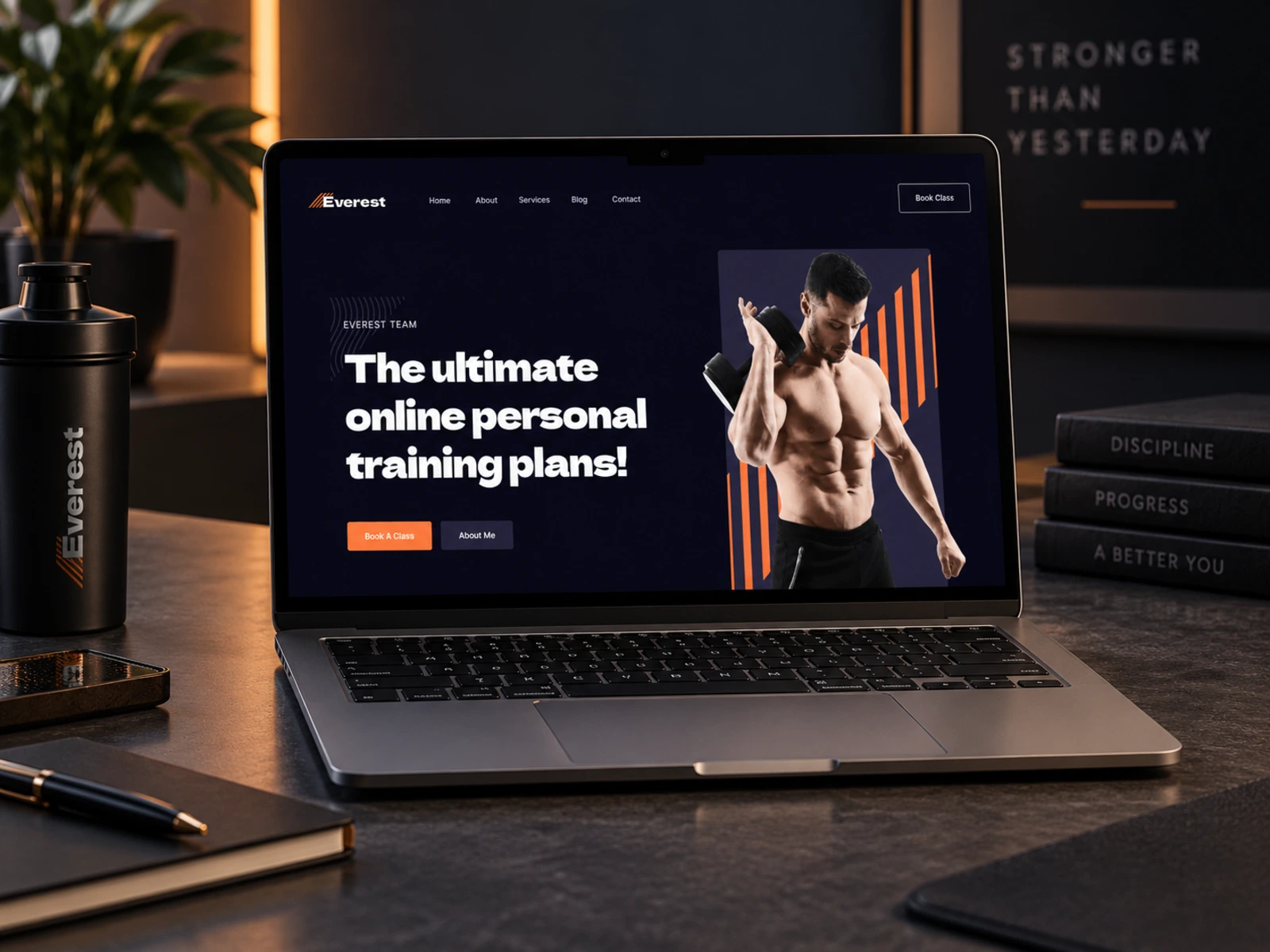
The hero establishes the fitness and personal-training proposition immediately and pairs it with a direct Book a Class CTA.
This gives visitors a clear understanding of what is being offered without requiring them to explore multiple pages first.
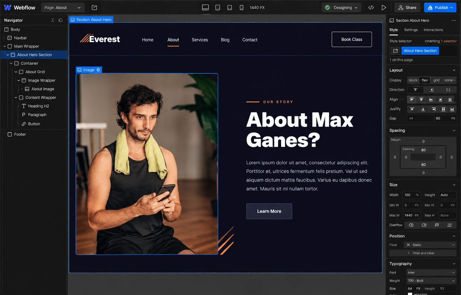
Build Trainer Credibility
Personal training is highly relationship-driven.
Sections highlighting certification, nutrition knowledge, experience, one-to-one training, support, motivation, and client feedback were used to reduce uncertainty and strengthen trust.
Make Services Easy to Explore
Training options are separated into clear service categories rather than buried inside long paragraphs.
This allows visitors interested in Pilates, CrossFit, or general fitness training to quickly identify the most relevant pathway.
Keep Conversion Consistent
Booking actions are repeated strategically throughout the experience so visitors never have to search for the next step.
The CTA appears after key moments where confidence is likely to increase, including the hero, trainer benefits, testimonials, class information, and supporting content.
4. UX/UI Design
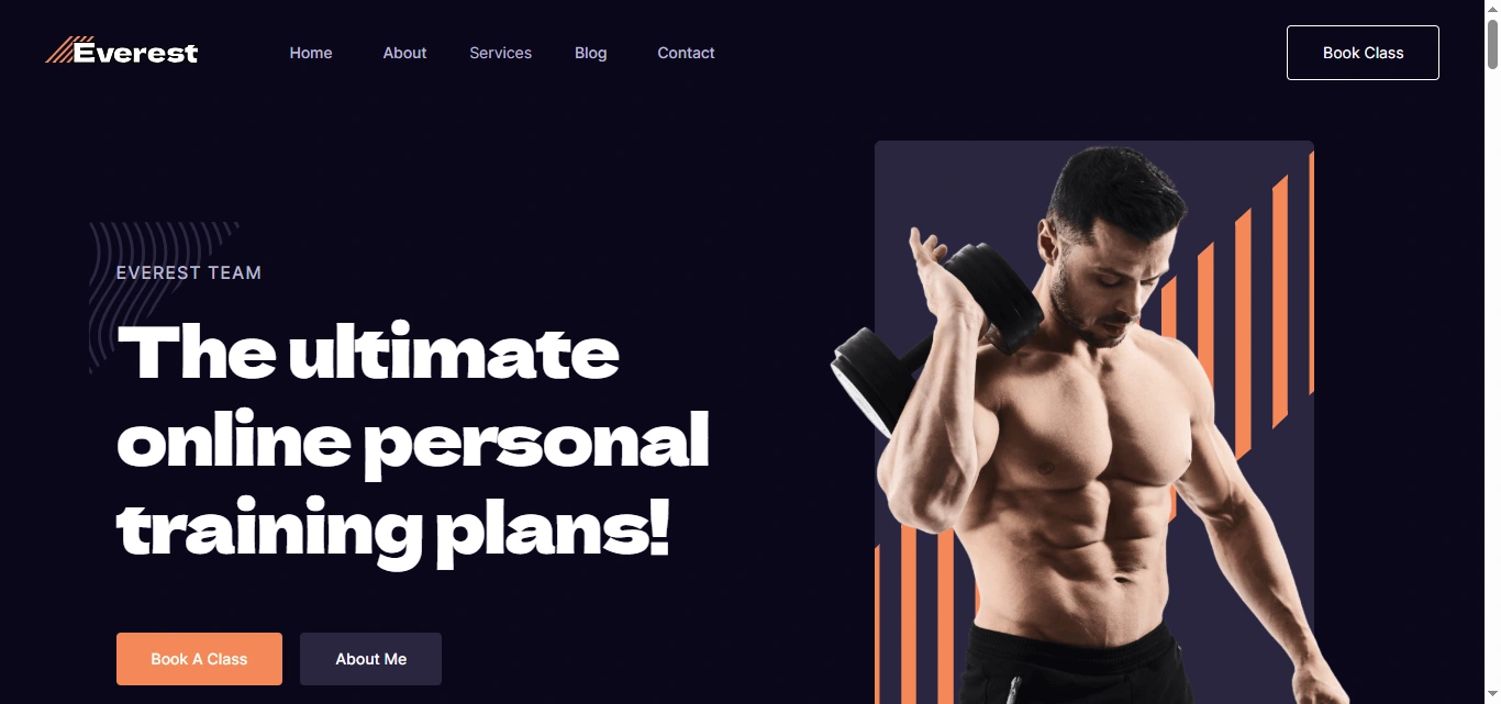
Hero Section
The hero was designed to feel energetic and immediately action-oriented.
Strong fitness photography creates emotional impact while the headline introduces the core offering.
Primary CTAs give users two natural options:
Book a Class or Learn More
This supports both high-intent visitors and people who still need additional information.
Visual Hierarchy
The homepage follows a deliberate progression:
Value Proposition → Trust Signals → Trainer Introduction → Services → Benefits → Testimonials → CTA → Class Schedule → Blog → FAQ
The order gives visitors enough information to make a decision without forcing them through unnecessary content.
Typography System
The typography uses bold, high-impact headlines to match the energy of the fitness industry while keeping body content simple and readable.
Styles were created for:
Hero headlines
Section headings
Service names
Trainer information
Statistics
Testimonials
Schedule details
Article titles
Calls-to-action
The strong contrast between display text and supporting copy makes longer pages easier to scan.
Color & Visual Direction
The interface uses a bold, modern fitness aesthetic supported by high-energy photography.
The design intentionally gives imagery a major role while keeping UI elements clean and controlled.
This creates an experience that feels:
Active
Modern
Motivational
Professional
Performance-focused
The visual system remains consistent across service pages, schedules, blogs, and supporting content.
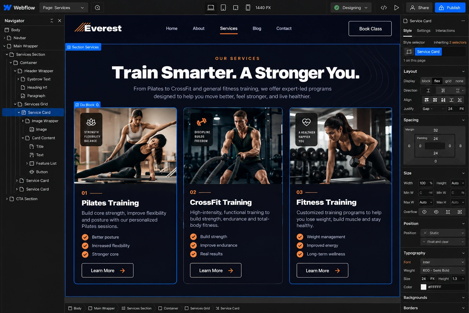
Service Cards
The primary training programs are presented using reusable cards for:
Pilates Training
CrossFit Training
Fitness Training
Each card provides an immediate overview and creates a clear pathway into deeper service information.
This prevents visitors from having to interpret a large combined list of fitness offerings.
Trainer Credibility Sections
Rather than relying on a single About section, credibility is reinforced throughout the experience.
Key selling points include:
Certified training
Nutrition and diet support
Years of experience
Motivation and accountability
One-on-one coaching
Commitment to client progress
This keeps the trainer’s value proposition visible as users move toward booking.
Statistics & Social Proof
The About experience incorporates statistics around experience, clients, classes, and audience reach to visually reinforce credibility.
Testimonials then add a more personal layer by showing the experience from the client perspective.
Combining quantitative trust signals with personal feedback helps create a stronger overall trust system.
Class Schedule
One of the most useful functional areas is the weekly schedule.
Users can view classes across different days and times, including Pilates, CrossFit, Yoga, and Fit Body sessions.
Rather than making potential clients contact the trainer just to discover availability, the schedule gives them useful information earlier in the decision journey.
Lead Generation
The website also introduces a secondary conversion pathway through a free meal-plan offer.
This gives users who may not be ready to book a class an alternative reason to engage with the brand.
Instead of losing lower-intent visitors, the website can capture their interest through valuable fitness and nutrition content.
Responsive Experience
Every major section was considered across desktop, tablet, and mobile.
Particular attention was given to:
Navigation
Hero imagery
Service grids
Typography
Class schedules
Testimonials
Blog cards
Buttons
FAQs
Content spacing
The mobile experience simplifies layouts into a clear vertical journey while preserving the same hierarchy and conversion flow.
5. Website Architecture
The website architecture supports users at different stages of their fitness journey.
Homepage
Acts as the primary conversion page and combines trainer positioning, services, benefits, testimonials, scheduling, educational content, FAQs, and booking CTAs.
About
Provides deeper information about the trainer, experience, core values, achievements, and fitness team.
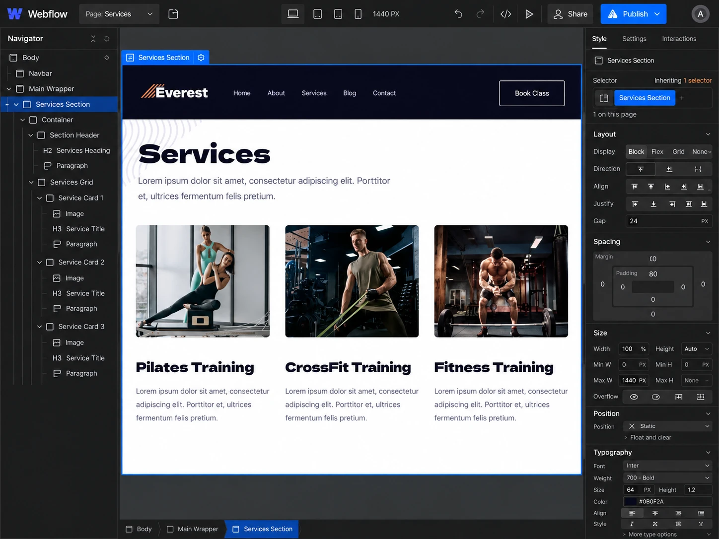
Services
Creates a central overview of available fitness programs.
Pilates Training
Provides a dedicated experience for users specifically interested in Pilates sessions.
CrossFit Training
Creates a focused path for visitors looking for higher-intensity CrossFit training.
Fitness Training
Introduces broader fitness and personal-training services.
Schedule
Provides a weekly class timetable so users can understand availability before booking.
Blog
Supports ongoing educational content around fitness, training, exercise, physical health, and wellness.
Contact / Booking
Provides the primary conversion pathway for users ready to enquire or book a class.
6. Webflow Development
After establishing the UX structure and visual direction, I translated the experience into a responsive Webflow build.
Development focused on creating reusable systems rather than building every page independently.
Key considerations included:
Responsive Webflow development
Reusable components
Structured class system
Service-page templates
Responsive navigation
Interactive buttons and states
Class-schedule layout
CMS-powered blog
Reusable article cards
FAQ interactions
Lead-generation forms
Contact forms
Responsive images
Subtle hover animations
Scroll-based interactions where appropriate
SEO-conscious heading structure
Accessibility considerations
Performance optimization
Cross-browser testing
Cross-device testing
This component-based approach keeps the project easier to maintain as new training programs, trainers, or educational content are introduced.
7. Design & Development Process
Research → UX Structure → Wireframes → UI Design → Design System → Webflow Development → Responsive Optimization → Testing → Launch
Research
I started by identifying the primary user groups, training services, booking requirements, trust factors, and content needed before someone would feel comfortable choosing a personal trainer.
UX Structure
The customer journey was organized around several simple questions:
What do you offer? → Who is the trainer? → Why should I trust you? → Which program suits me? → When are classes available? → How do I book?
Wireframes
I mapped the hero, service sections, trainer positioning, trust content, testimonials, schedule, blog, FAQs, and conversion areas before detailed visual styling.
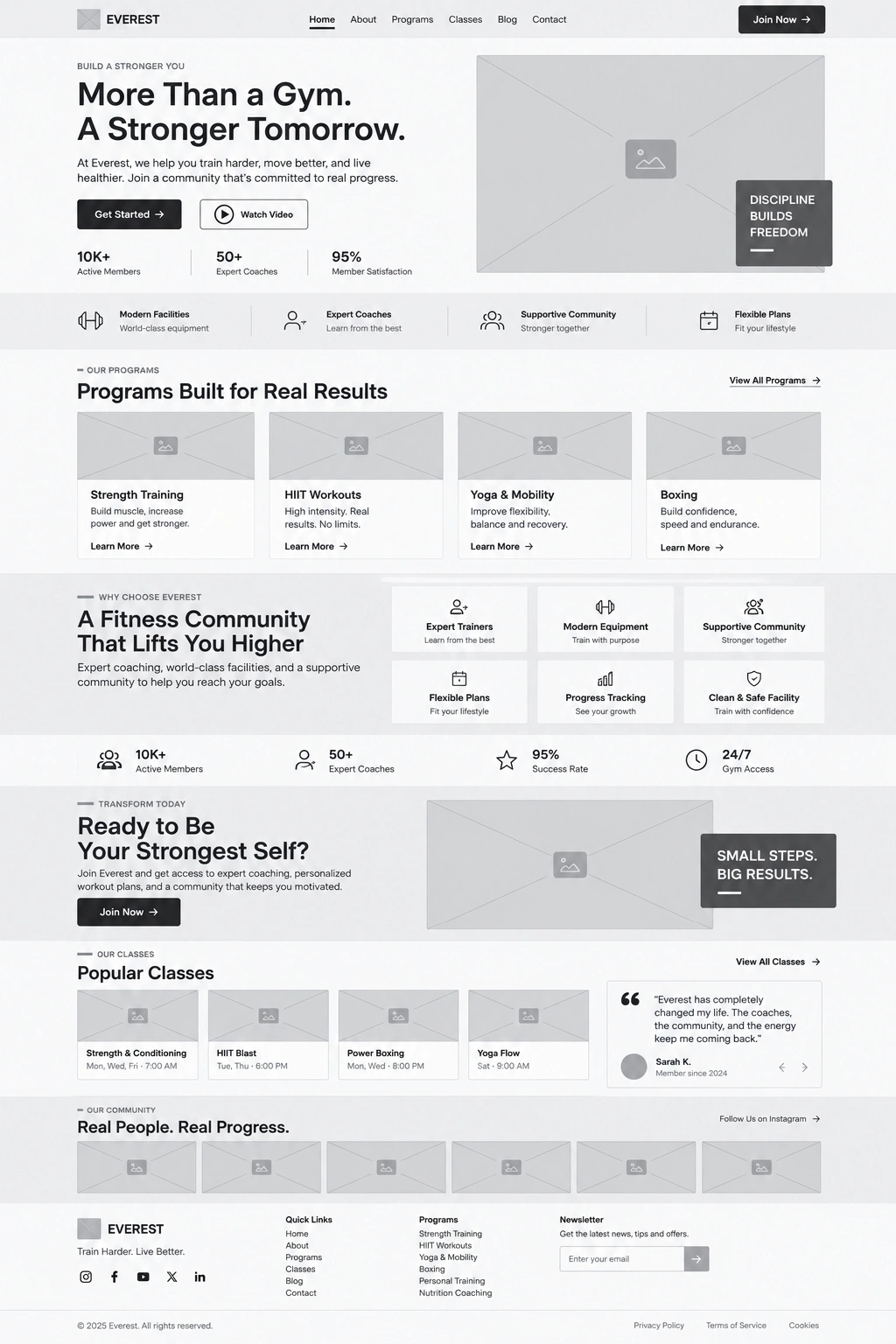
UI Design
The wireframes were translated into a high-energy fitness interface using strong photography, bold typography, structured layouts, and prominent CTAs.
Design System
Reusable rules were created for:
Typography
Colors
Buttons
Service cards
Trainer cards
Testimonials
Forms
Blog cards
Schedule elements
FAQs
Navigation
Responsive spacing
Webflow Development
The approved layouts were translated into reusable Webflow components while maintaining consistent structure and responsive behavior.
Responsive Optimization
Each section was refined across desktop, tablet, and mobile.
Complex elements such as service grids and the class schedule received additional attention so they remained usable on smaller screens.
Testing
Before completion, I reviewed:
Navigation
Forms
CTA links
Service pages
Schedule behavior
Blog content
FAQ interactions
Responsive layouts
Browser consistency
Launch
Final refinements focused on usability, accessibility, performance, responsive behavior, SEO structure, and visual consistency.
8. Key Features
Conversion-focused fitness website
Responsive Webflow development
Personal trainer positioning
Pilates service page
CrossFit service page
Fitness training service page
Class booking CTAs
Weekly class schedule
Trainer/team profiles
Client testimonials
Credibility statistics
Nutrition lead magnet
Interactive FAQs
CMS-powered fitness blog
Reusable Webflow components
Responsive service cards
Contact and enquiry experience
Mobile-friendly navigation
Custom hover interactions
SEO-ready architecture
Performance optimization
Cross-device responsiveness
9. Final Result
The final Everest website brings together fitness services, personal branding, scheduling, education, and lead generation within one cohesive Webflow experience.
Visitors can immediately understand the training offer, learn more about the trainer, explore different fitness programs, review credibility indicators, check available classes, read educational content, and move directly toward booking.
The strong imagery and typography create the energy expected from a modern fitness brand, while the structured UX prevents the website from becoming visually overwhelming.

The class schedule adds practical value beyond marketing, while testimonials, trainer benefits, FAQs, and educational content help strengthen confidence throughout the customer journey.
The result is a modern, responsive, and conversion-focused fitness website that gives personal trainers and fitness businesses a scalable digital platform for attracting clients, showcasing expertise, and turning interest into booked classes.
Like this project
Posted Sep 19, 2026
Designed a responsive fitness website for Everest to boost credibility, showcase training, and drive bookings.
Likes
1
Views
0
Clients
Everest