YUNG Sidekick Kajabi Website Design

Victor Adebayo


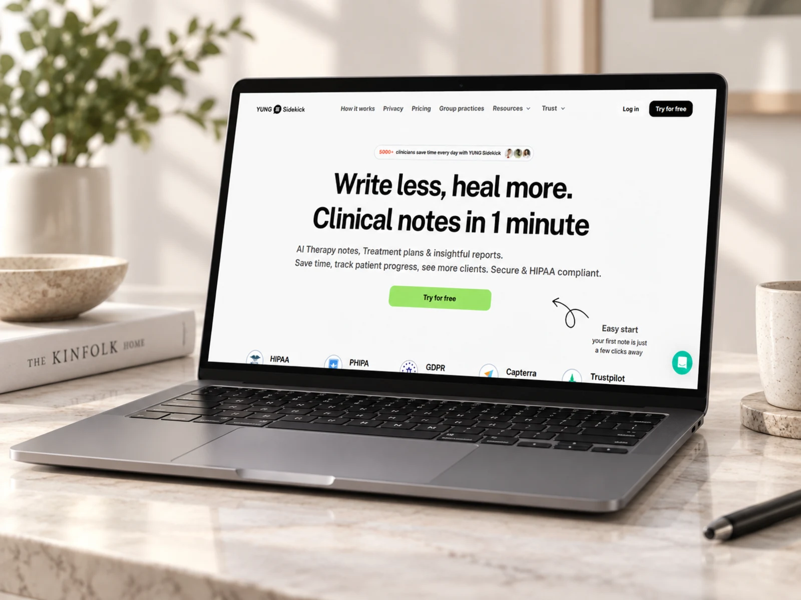
YUNG Sidekick — AI Therapy Documentation Website
Kajabi Website Design · UX/UI Design · SaaS Landing Pages · Conversion Strategy
Project Type: AI SaaS / Healthcare Technology / Mental Health
Primary Objective: Clearly communicate a complex AI product, build clinician trust, and convert visitors into free-trial users
Platform: Kajabi
Role: Kajabi Web Designer & Developer / UX/UI Designer
Deliverables: UX/UI Design · Responsive Kajabi Website · Landing Page Design · Pricing Experience · Product Education · Lead Generation · Blog/Resource Structure · Custom Sections · Interactions · SEO & Performance Optimization
1. Project Overview
YUNG Sidekick is an AI-powered clinical documentation platform designed for therapists and mental-health professionals.
The platform helps clinicians transform recorded sessions, uploaded audio, or dictated recaps into structured clinical documentation such as SOAP, DAP, BIRP, and GIRP notes, treatment plans, session reports, transcripts, and progress insights.
The website needed to communicate a technically advanced healthcare product in a way that felt simple, trustworthy, and approachable.
My goal was to create a conversion-focused Kajabi website that could educate clinicians, demonstrate the product, answer security concerns, explain pricing, and guide visitors toward starting a free trial.
Kajabi was used as the marketing and content layer of the experience, while the secure clinical application remained separate from the public-facing website.
2. The Challenge
YUNG Sidekick solves a very specific but significant problem: clinicians spend substantial time completing documentation after therapy sessions.
The challenge was that the product combines several concepts at once:
Artificial intelligence
Therapy documentation
Session transcription
Treatment planning
Clinical analytics
Privacy and data security
Individual and group-practice workflows
Presenting all of these features at once could easily make the product feel complicated.
The website therefore needed to:
Explain the product within seconds
Translate technical functionality into clinician-focused benefits
Build trust around privacy and security
Show how AI-generated documentation actually works
Differentiate individual and group-practice solutions
Present pricing without creating unnecessary friction
Make the free trial feel low-risk
Support clinicians who need more product education before converting
Maintain clarity across desktop, tablet, and mobile
Create a scalable structure for articles, resources, and future product updates
The central UX challenge was making advanced technology feel simple enough to try and credible enough to trust.
3. Design Strategy
I structured the experience around four stages:
Problem → Proof → Product → Conversion
Lead With the Outcome
Instead of opening with a technical explanation of artificial intelligence, the hero focuses on what clinicians actually want:
less documentation and more time with clients.
The messaging quickly establishes that YUNG Sidekick can turn session information into clinical notes in approximately one minute.
This shifts attention away from the technology itself and toward the practical outcome.
Explain the Product Visually
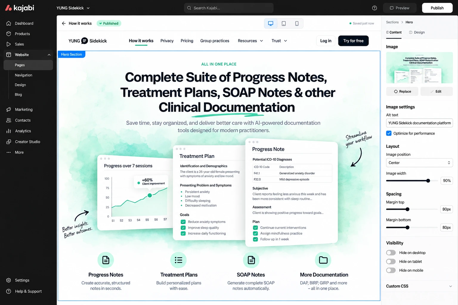
Because AI clinical documentation can be difficult to understand through copy alone, product interface demonstrations became a key part of the experience.
The website shows outputs such as:
Session transcripts
Client reports
Therapist reports
Progress notes
SOAP notes
DAP notes
BIRP notes
GIRP notes
This makes the product feel tangible before visitors ever create an account.
Build Trust Early
Healthcare professionals need significantly more reassurance than users evaluating a typical SaaS product.
Trust indicators were therefore positioned near the beginning of the journey rather than hidden in the footer.
The site communicates security and compliance credentials alongside external review signals and clinician adoption.
This gives visitors a reason to continue exploring before being asked to trust the platform with their workflow.
Maintain a Clear Conversion Path
The primary action throughout the website is simple:
Try YUNG Sidekick for free.
Instead of introducing several competing CTAs, I repeated this action at moments where users have gained additional confidence:
Hero → Product Demo → Features → Pricing → Group Practices → FAQ → Final CTA
This creates a consistent conversion journey without making the experience feel overly aggressive.
4. UX/UI Design
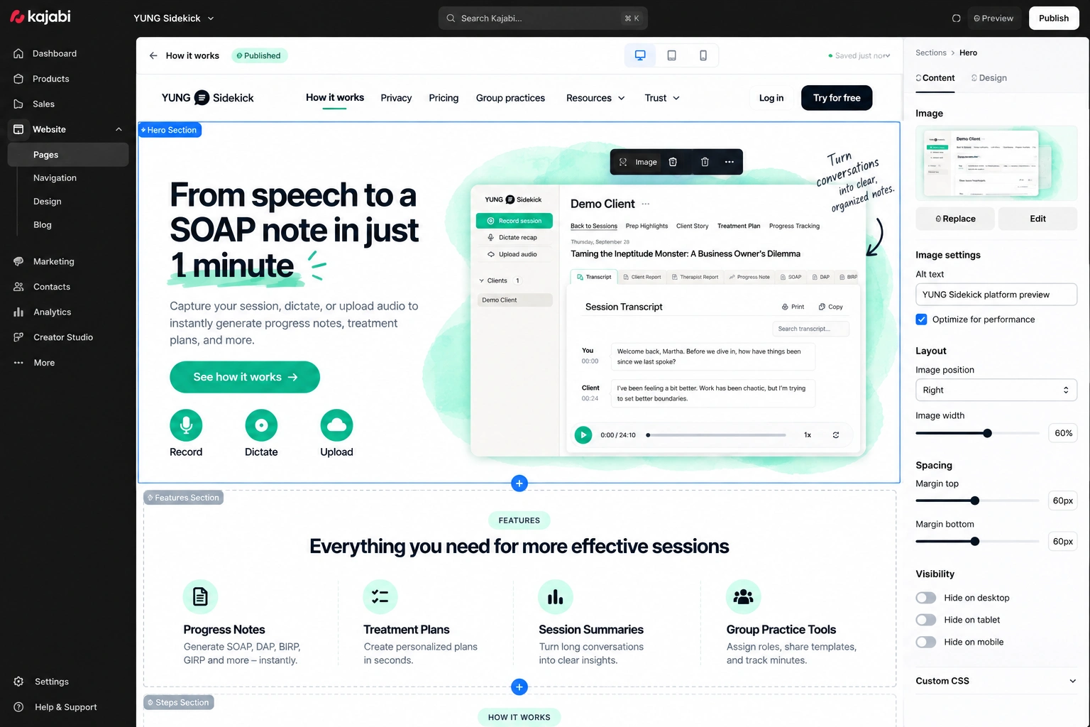
Hero Section
The hero was designed around one clear promise:
Write less. Heal more.
Supporting content explains the product in straightforward language and immediately connects AI documentation with time savings, patient progress tracking, and a reduced administrative workload.
A strong free-trial CTA provides the primary next step.
The interface also introduces adoption and compliance indicators early, helping reinforce trust before visitors explore deeper product functionality.
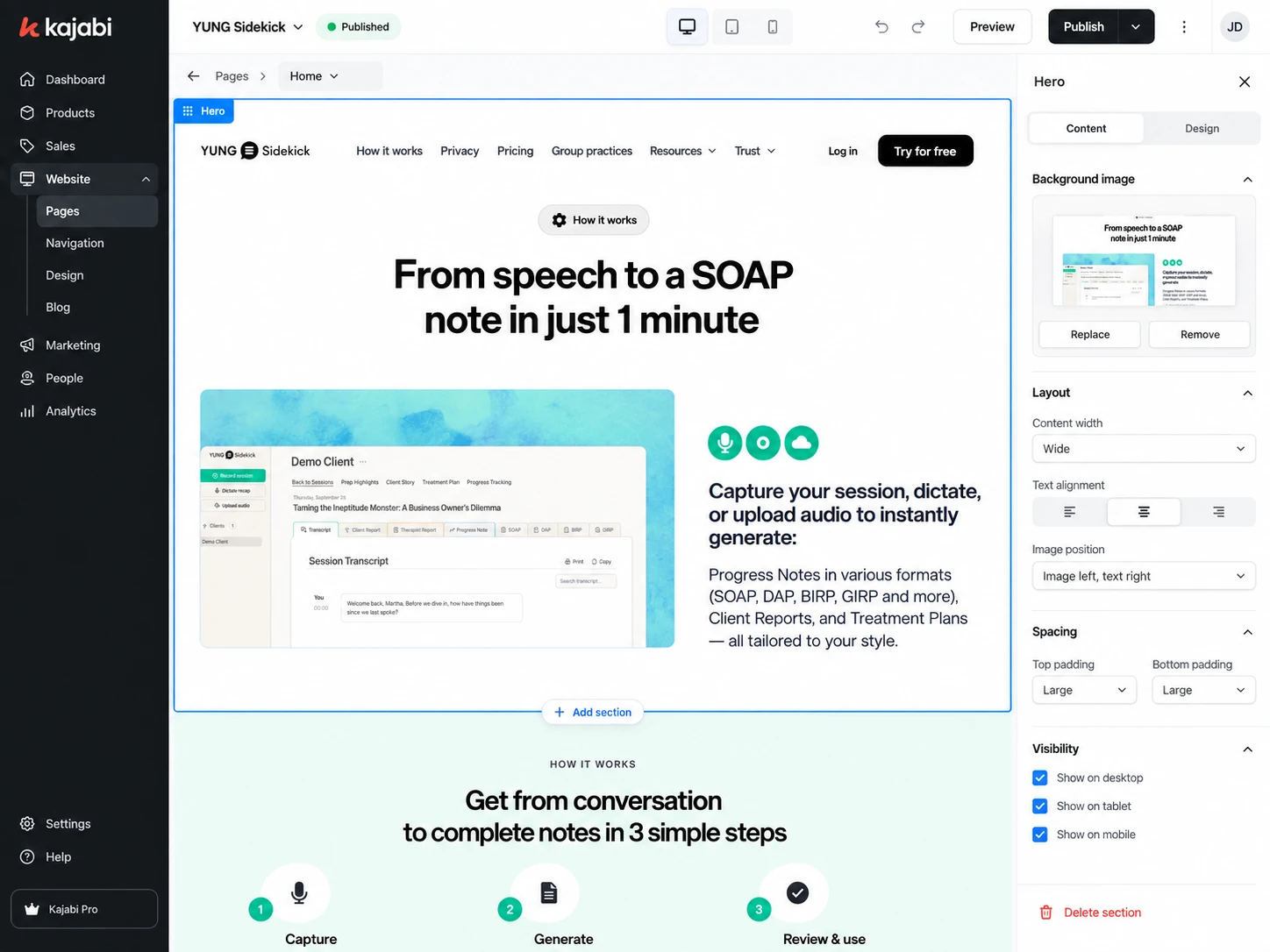
Product Demonstration
One of the most important UX decisions was allowing the interface itself to explain the product.
Instead of relying on long paragraphs about AI, product previews demonstrate how a session moves from:
Recorded conversation → Processing → Structured clinical documentation
Users can then see different outputs and note formats.
This reduces the conceptual gap between understanding the service and believing it can fit into an existing therapy workflow.
Typography System
The typography was structured for fast scanning.
I established clear levels for:
Hero messaging
Product benefits
Feature headings
Compliance information
Pricing
FAQs
Testimonials
Calls-to-action
Educational content
Large, confident headings communicate the core benefit while supporting copy remains concise.
Because clinicians may already be reviewing the website between appointments, the experience needed to communicate value quickly without requiring long periods of reading.
Color & Visual Direction
The visual direction balances healthcare credibility with modern SaaS design.
A traditional clinical website could make an AI product feel dated, while an overly futuristic interface could make the product feel experimental.
I used a cleaner product-led system with:
Controlled brand colors
Soft backgrounds
Rounded interface elements
Strong product imagery
Clear cards
Generous spacing
Focused accent colors
The result positions YUNG Sidekick as advanced technology without sacrificing the professionalism expected in healthcare.
Feature Architecture
Rather than showing every capability in one large section, features are introduced according to the problems clinicians are trying to solve.
The experience highlights functionality around:
Progress notes
Session transcription
Treatment planning
Client reporting
Therapist reporting
Session preparation
Progress tracking
Multiple documentation formats
Each feature is connected back to a practical workflow benefit.
Pricing Design
The pricing experience needed to work for clinicians with very different levels of usage.
Plans are visually separated and structured around individual practice requirements while maintaining a separate pathway for group practices.
The pricing architecture makes it easy to compare:
Entry-level use
Session allowances
Monthly cost
Popular plan recommendations
Higher-volume plans
Group-practice options
Trial availability
A clearly emphasized recommended plan reduces decision fatigue without preventing visitors from exploring other tiers.
Group Practice Experience
Group practices have different requirements from solo clinicians, so I treated them as a separate audience instead of simply adding another pricing card.
The group-practice messaging focuses on benefits such as:
Team organization
Shared documentation workflows
Usage tracking
Administrative efficiency
Documentation consistency
Reducing clinician burnout
A dedicated sales pathway allows higher-intent organizations to move into a more appropriate conversation.
FAQ Experience
Healthcare AI naturally generates questions around security, accuracy, documentation, integrations, and workflow.
The FAQ was designed as an interactive accordion to keep the page compact while still giving users access to deeper information.
Questions help remove objections close to the conversion point without overloading earlier sections.
Responsive Design
The Kajabi implementation was designed individually across desktop, tablet, and mobile.
Responsive considerations included:
Navigation behavior
Product demonstrations
Pricing cards
CTA visibility
Typography scaling
Trust badges
Feature grids
FAQ interactions
Image positioning
Section spacing
On mobile, the interface shifts toward a simpler vertical journey while preserving product clarity and conversion opportunities.
5. Website Architecture
The website architecture supports both visitors ready to try the product and clinicians who need more information before committing.
Homepage
The main conversion page communicates:
Core Value → Trust → Product Demonstration → Features → Pricing → Group Practice → FAQs → Final Conversion
How It Works
A deeper educational page explains how clinicians can capture session information and transform it into structured documentation.
The goal is to reduce uncertainty before signup.
Pricing
A dedicated pricing experience allows users to compare individual plans and understand usage allowances before starting a trial.
Group Practices
Provides a separate conversion journey for clinics and larger organizations that require team-level functionality and customized pricing.
Privacy & Trust
Security and data-handling content provides additional reassurance for clinicians evaluating whether the product is appropriate for professional use.
Because the product operates within healthcare, this content is treated as a core part of the conversion experience rather than secondary legal information.
Resources
Educational resources support clinicians who are researching documentation workflows, therapy notes, treatment plans, clinical templates, and related topics.
Blog
The Kajabi blog structure provides a scalable environment for publishing educational and SEO-focused content.
Topics can target search intent around:
SOAP notes
Treatment plans
Therapy documentation
Progress notes
Clinical note examples
Mental-health documentation
AI tools for therapists
This gives the website a long-term organic acquisition pathway alongside paid and referral traffic.
Contact / Sales
A dedicated contact experience provides different pathways for general questions and larger practice inquiries.
6. Kajabi Development
After establishing the UX structure and visual direction, I translated the design into a responsive Kajabi website.
Kajabi's standard page-building system was extended with custom styling and reusable section patterns to give the site a more product-led SaaS experience rather than the appearance of a standard course website.
Development focused on:
Responsive Kajabi page development
Custom page sections
Reusable content blocks
Consistent typography styles
Global button styling
Custom pricing components
Product demonstration layouts
Interactive FAQ sections
Navigation and mobile menu behavior
Kajabi forms
Lead capture
Email opt-in pathways
Blog configuration
SEO metadata
Custom CSS where appropriate
Lightweight interactions
Image optimization
Responsive embeds
Performance-conscious implementation
Cross-browser testing
Cross-device testing
Kajabi serves as the marketing, education, and conversion layer of the platform.
Sensitive clinical information and AI documentation workflows are intentionally kept within the separate secure application rather than collected directly through standard Kajabi marketing forms.
7. Design & Development Process
Research → UX Structure → Wireframes → UI Design → Design System → Kajabi Development → Responsive Optimization → Testing → Launch
Research
I began by understanding the therapist workflow and the friction surrounding clinical documentation.
I reviewed the different types of notes clinicians create, the importance of privacy, differences between individual and group practices, and the questions users would likely ask before trusting an AI documentation tool.
UX Structure
The experience was mapped around the visitor's natural decision process:
What problem does this solve? → How does it work? → Can I trust it? → What does it create? → How much does it cost? → Will it work for my practice? → How do I try it?
This became the foundation of the website architecture.
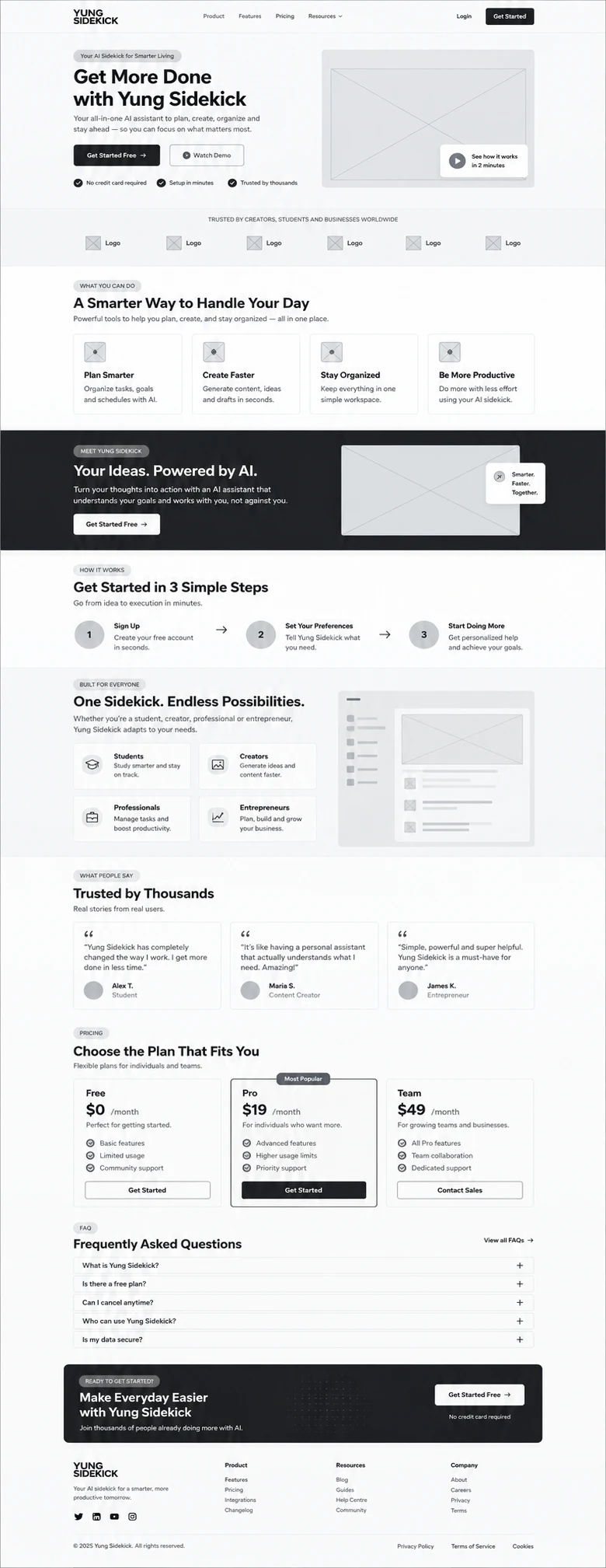
Wireframes
Wireframes established:
Hero messaging
Product demonstration
Trust positioning
Feature hierarchy
Pricing structure
Group-practice messaging
FAQ placement
Conversion points
The goal was to validate the user journey before introducing detailed visual styling.
UI Design
The wireframes were transformed into a polished healthcare SaaS interface.
Product visuals were given priority while the supporting interface remained restrained enough to maintain trust and readability.
Design System
A consistent system was created for:
Typography
Brand colors
Buttons
Cards
Pricing components
Trust indicators
Product previews
Forms
FAQs
Section spacing
Mobile behavior
This made it possible to maintain visual consistency as new Kajabi pages were added.
Kajabi Development
The approved interface was recreated inside Kajabi using reusable page sections, custom styling, responsive layouts, and carefully structured content blocks.
Where Kajabi's native styling was too restrictive, custom CSS and layout adjustments were used to maintain the intended visual experience.
Responsive Optimization
Every important section was checked independently across desktop, tablet, and mobile.
Particular attention was given to pricing tables, interface previews, long product sections, and conversion CTAs.
Testing
Before launch, I tested:
Navigation
Forms
Free-trial links
Pricing pathways
Mobile menus
FAQ interactions
External application links
Blog templates
Contact pathways
Responsive layouts
Browser consistency
Launch
The final stage focused on visual consistency, performance, accessibility, SEO structure, and ensuring that every major journey had an obvious next step.
8. Key Features
Custom Kajabi website design
Healthcare SaaS landing page
AI product presentation
Conversion-focused homepage
Free-trial user journey
Product UI demonstrations
Clinical documentation feature sections
HIPAA-focused trust messaging
Compliance and credibility sections
Multiple pricing tiers
Group-practice sales pathway
Responsive pricing experience
Interactive FAQ
Kajabi lead-capture forms
Email marketing-ready structure
Educational resource pages
Kajabi blog
SEO-focused content architecture
Reusable custom sections
Custom CSS styling
Mobile-responsive design
Performance-conscious implementation
External secure-app integration
9. Final Result
The final YUNG Sidekick website transforms a technically complex healthcare AI product into a clear, credible, and conversion-focused Kajabi experience.
Rather than asking clinicians to understand the technology first, the website begins with the outcome that matters most to them: spending less time documenting sessions and more time focused on client care.
Interactive product demonstrations make the workflow easier to understand, while prominent security messaging, compliance information, pricing transparency, FAQs, and social proof help reduce the uncertainty associated with adopting AI in a clinical environment.
The Kajabi implementation also creates a scalable marketing foundation for landing pages, educational content, lead generation, email campaigns, product updates, and organic search, while keeping sensitive clinical workflows inside the separate secure product environment.

The result is a modern healthcare SaaS website that combines product education, trust, conversion strategy, and Kajabi development into one cohesive experience, giving YUNG Sidekick a clearer path from first-time visitor to active trial user.
Like this project
Posted Sep 14, 2026
Developed a Kajabi website for YUNG Sidekick to convert visitors into free-trial users.