MyPrefabHomes Website Design and Development

Victor Adebayo


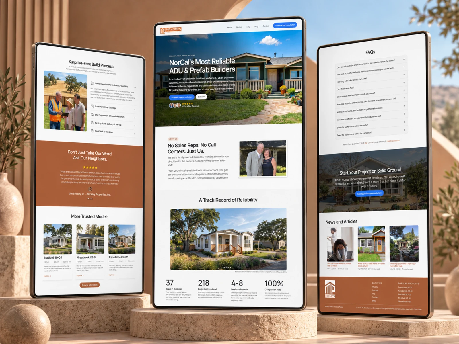
MyPrefabHomes — Prefab & ADU Website
UX/UI Design · Construction Website · Responsive Development
Project Type: Construction / Real Estate / Prefab & ADU Homes
Primary Objective: Build credibility, showcase available home models, explain the construction process, and generate consultation leads
Role: Web Designer & Web Developer
Deliverables: UX/UI Design · Responsive Website Design · Development · Product/Model Pages · CMS Content Structure · Lead Generation Flow · Interactions · SEO & Performance Optimization
1. Project Overview
MyPrefabHomes is a Northern California construction company specializing in prefabricated homes, manufactured homes, and Accessory Dwelling Units (ADUs).
The company combines factory-built housing with a full-service process covering site evaluation, model selection, permitting, foundation work, delivery, installation, and final project completion.
The goal of the website was to translate that complete construction service into a digital experience that felt established, trustworthy, easy to understand, and action-oriented.
Rather than simply showcasing homes, the website needed to help homeowners understand the building process, explore available models, evaluate whether prefab construction was right for them, and confidently schedule a consultation.
2. The Challenge
Building an ADU or prefab home is a significant investment, and potential clients often arrive with questions around:
Cost
Permits
Property suitability
Construction timelines
Available models
Site preparation
Installation
Quality
Contractor reliability
The challenge was therefore not just visual.
The website needed to reduce uncertainty around a process that can initially feel complicated.
The key UX problems were:
Explaining prefab and ADU construction without overwhelming visitors
Making a large selection of home models easier to browse
Building credibility in an industry where trust is critical
Clearly differentiating MyPrefabHomes from newer or less-established providers
Showing exactly what happens after a homeowner makes an inquiry
Balancing technical information with approachable messaging
Creating consistent consultation pathways throughout the site
Ensuring the experience worked smoothly across desktop, tablet, and mobile
The website needed to communicate one thing clearly: this is a structured, guided process, not a construction guessing game.
3. Design Strategy
I structured the experience around four priorities:
Trust → Education → Exploration → Conversion
Establish Trust Early
The homepage immediately communicates the company’s long-standing construction experience, active licensing, family-owned approach, and local Northern California focus.
This was important because visitors need confidence in the team before considering a high-value construction project.
Simplify the Process
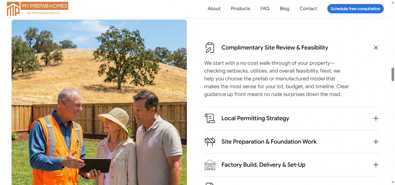
Instead of presenting construction as one complicated service, I broke it into recognizable stages.
The website explains the journey from:
Site Review → Permitting → Site Preparation → Factory Construction → Delivery & Set-Up → Final Completion
This gives prospective clients a clearer idea of what working with the company looks like.
Make Models Easy to Explore
Prefab buyers are highly visual, so the product experience needed to make home models a central part of the journey.
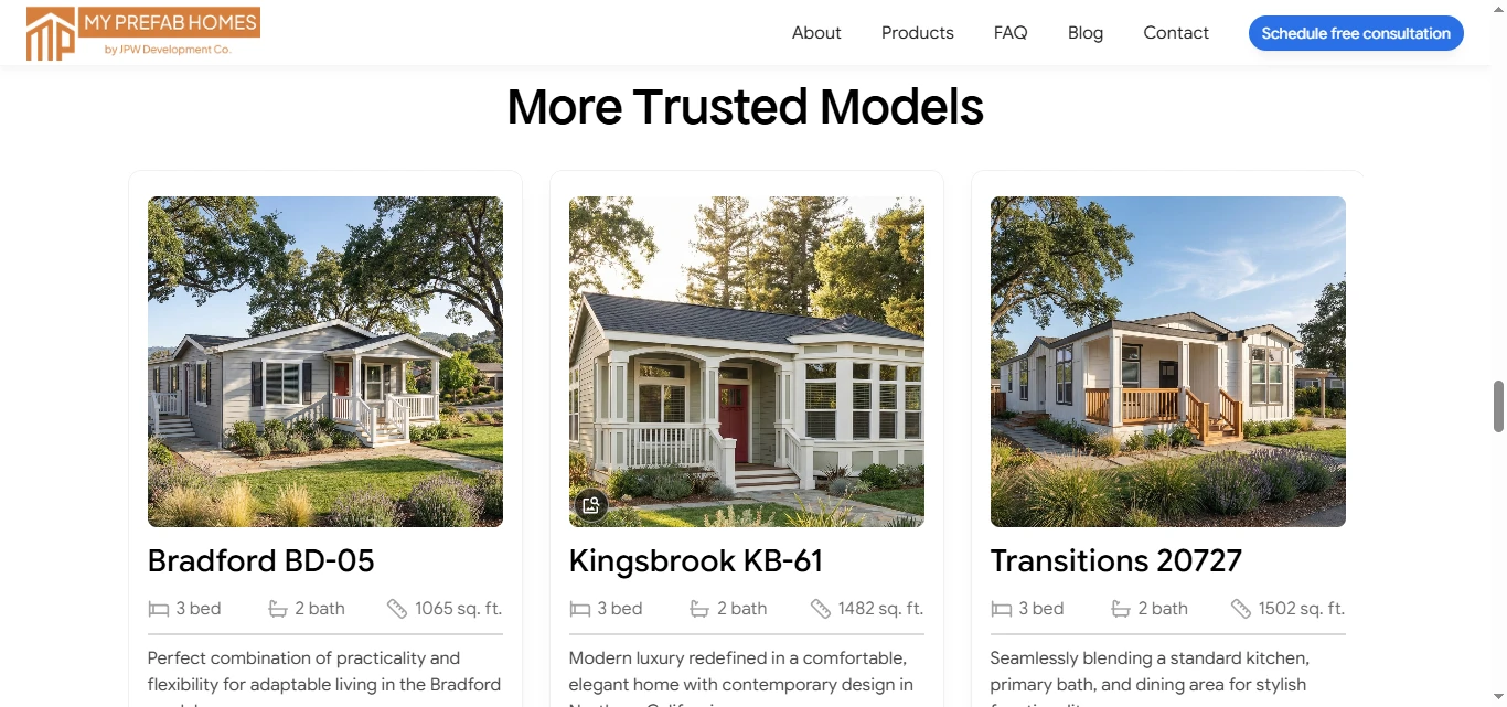
The model catalogue allows visitors to compare properties using useful information such as:
Bedrooms
Bathrooms
Square footage
Model names
Visual previews
This turns the website into both a lead-generation tool and a useful home-discovery experience.
Create Consistent Conversion Paths
Instead of relying on a single contact form at the bottom of the website, consultation CTAs appear throughout key decision points.
Once a user understands the company, sees a suitable model, or learns about the process, they have a clear next action: schedule a free consultation.
4. UX/UI Design
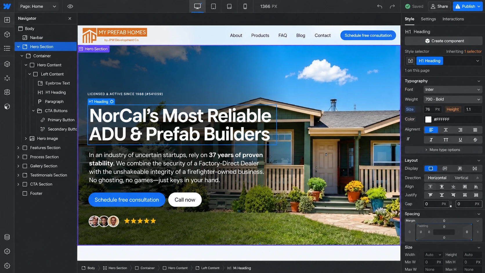
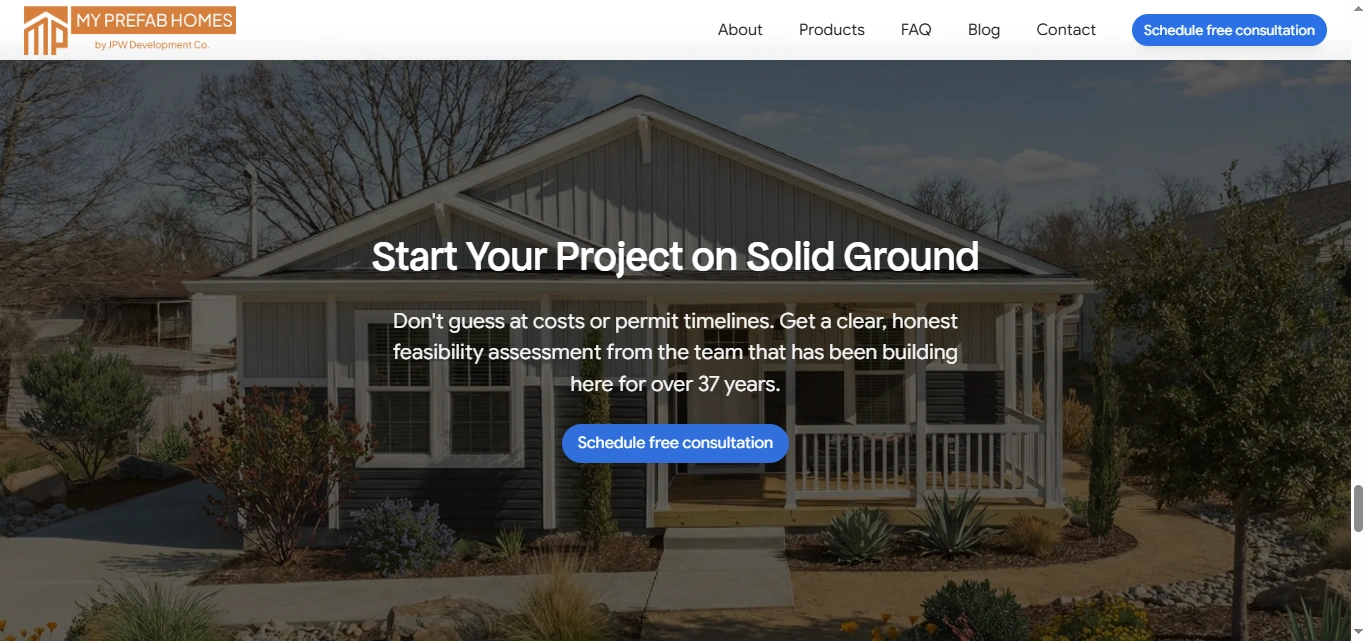
Hero Section
The hero was designed around credibility rather than generic construction messaging.
A strong headline immediately communicates the company’s focus on prefab and ADU construction in Northern California, while supporting messaging reinforces experience and reliability.
Primary actions such as Schedule Free Consultation and Call Now make the next step immediately visible.
Visual Hierarchy
I structured the homepage so users progressively gain confidence as they scroll:
Value Proposition → Company Credibility → Project Experience → Build Process → Social Proof → Consultation → Educational Content
This hierarchy allows the website to answer questions in roughly the same order a prospective homeowner might have them.
Typography
The typography system was designed to make longer construction information easier to scan.
Clear levels were established for:
Hero headlines
Section titles
Service steps
Home model names
Specifications
Supporting descriptions
Testimonials
Calls-to-action
Larger typography communicates major benefits, while supporting copy remains readable and restrained.
Color & Visual Direction
The visual direction combines a clean architectural feel with warm residential imagery.
Rather than making the website feel like a corporate construction company, the interface keeps the end result, a comfortable home at the center of the visual experience.
A restrained design system also allows architectural renders and property imagery to receive most of the visual attention.
Model Cards
The home catalogue uses reusable cards to present key information in a predictable format.
Visitors can quickly understand the difference between models by scanning bedrooms, bathrooms, square footage, imagery, and descriptions before exploring individual options.
Process Sections
One of the most important interface decisions was turning the construction process into a visual sequence.
Each stage is treated as an individual component, helping users understand responsibilities, expectations, and project progression without reading large blocks of technical information.
Trust & Social Proof
Client testimonials, company experience, licensing information, project examples, and the family-owned story were integrated throughout the website rather than hidden on a single About page.
For a construction business, these elements play an important role in reducing risk perception.
Calls-to-Action
CTAs were intentionally positioned after sections where users are most likely to have gained enough information to move forward.
The repeated consultation pathway creates a clear conversion route without making the site feel overly sales-focused.
Responsive Experience
The layouts were adapted across desktop, tablet, and mobile with attention to:
Navigation
Architectural imagery
Model grids
Typography
Process sections
Testimonials
Buttons
Content spacing
Consultation CTAs
On smaller screens, content is simplified into a clear vertical flow while keeping important actions easily accessible.
5. Website Architecture
The site structure supports both visitors who are ready to start a project and those still researching prefab homes.
Homepage
Acts as the main conversion experience, combining the company proposition, credibility, construction process, testimonials, FAQs, educational content, and consultation CTAs.
About
Provides deeper context around the family-owned company, construction experience, approach, and full-service prefab process.
Products / Models
Creates a browsable catalogue of ADU, prefab, and manufactured home options.
Models include different floor plans and sizes, giving homeowners a clearer starting point before discussing feasibility.
Individual Model Pages
Give specific homes more space for imagery, layout information, specifications, and project details.
FAQ
Addresses common questions around prefab construction, property requirements, utilities, permitting, and other concerns prospective homeowners may have.
Blog
Supports education and organic discovery through topics such as ADU permitting, prefab construction, modular housing, and local considerations.
Contact / Consultation
Provides the main lead-generation pathway for homeowners who want a property feasibility assessment or more information about available models.
6. Website Development
After establishing the UX structure and visual system, I translated the design into a responsive and maintainable website.
The development approach focused on creating reusable systems that could support a growing catalogue of home models and educational content.
Key development considerations included:
Responsive page development
Reusable model cards
Reusable process components
Consistent section structures
Product/model content architecture
CMS-ready blog structure
Responsive image treatment
Consultation form integration
Interactive navigation
FAQ interactions
Subtle hover and transition effects
Consistent class structure
SEO-conscious heading hierarchy
Image and asset optimization
Accessibility-conscious interaction states
Cross-browser testing
Cross-device optimization
The goal was to keep the experience polished for visitors while making future updates easier to manage.
7. Design & Development Process
Research → UX Structure → Wireframes → UI Design → Design System → Development → Responsive Optimization → Testing → Launch
Research
I started by understanding the prefab home market, the customer decision process, common concerns around ADUs, available models, and the information homeowners need before contacting a builder.
UX Structure
The experience was structured around a natural customer journey:
Who are you? → Can I trust you? → What can I build? → How does the process work? → Which model fits me? → How do I get started?
Wireframes
I mapped the main page sections, model catalogue, service process, trust content, testimonials, educational sections, and conversion points before moving into detailed visual design.
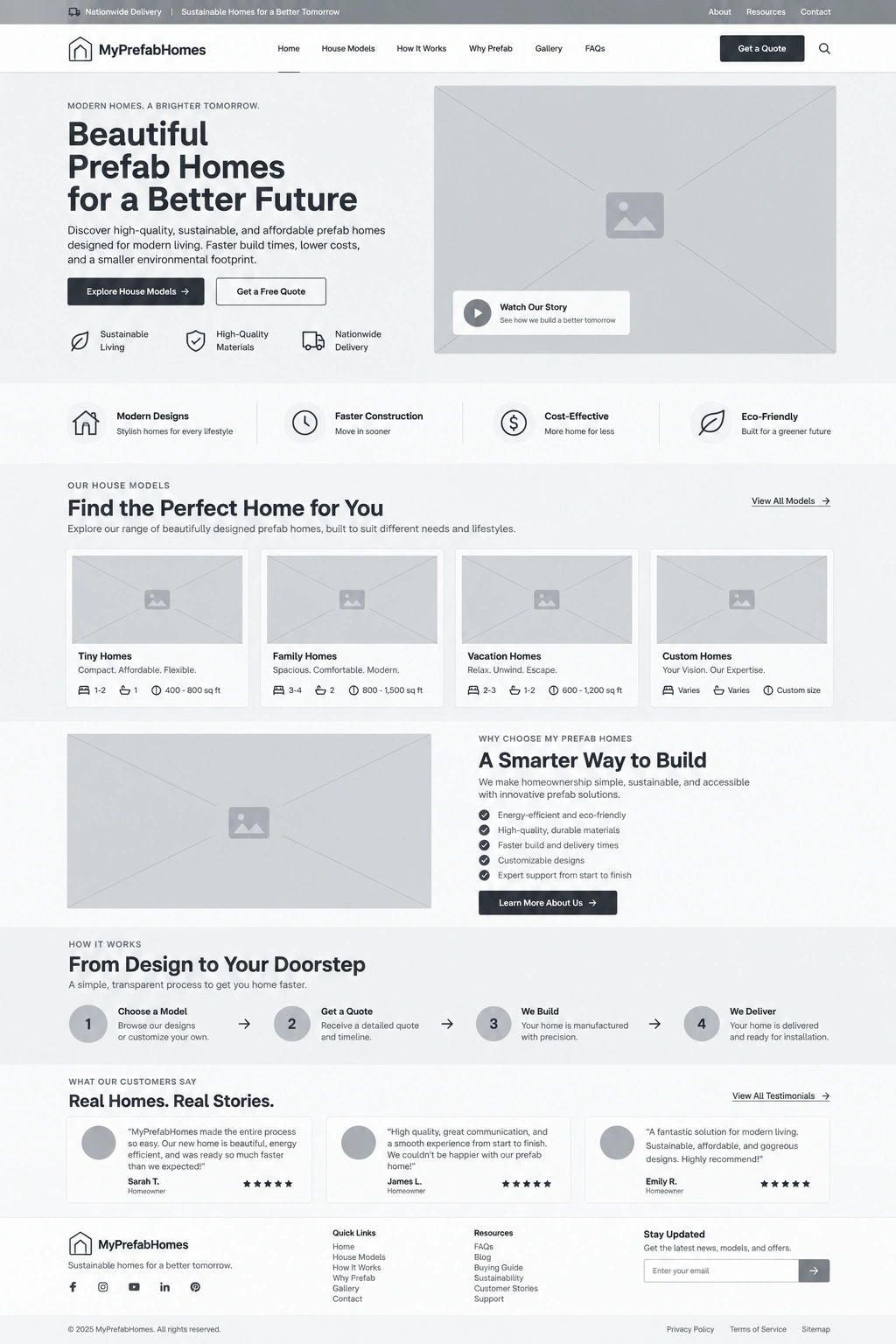
UI Design
The wireframes were developed into an architectural, modern interface using strong imagery, clear typography, spacious layouts, structured cards, and prominent CTAs.
Design System
Reusable styles were established for:
Typography
Buttons
Cards
Navigation
Forms
Model specifications
Testimonials
Process steps
Spacing
Responsive behavior
Development
The approved design was translated into reusable sections and page components, with particular attention given to the product catalogue and content structure.
Responsive Optimization
Each layout was reviewed independently across desktop, tablet, and mobile to ensure model information and important actions remained clear.
Testing
Navigation, forms, responsive layouts, links, model pages, interactions, and conversion pathways were tested across common screen sizes and browsers.
Launch
The final stage focused on consistency, usability, accessibility, SEO structure, asset optimization, and overall presentation.
8. Key Features
Conversion-focused construction website
Prefab and ADU model catalogue
Dedicated home model pages
Bedrooms, bathrooms, and square-footage specifications
Consultation-focused user journey
Free site-review CTA
Step-by-step construction process
Responsive product/model grids
Family-owned brand positioning
Contractor credibility and trust messaging
Customer testimonials
FAQ experience
Educational blog
CMS-ready content structure
Reusable website components
Interactive navigation
Responsive design system
SEO-conscious structure
Performance optimization
Mobile-friendly conversion paths
9. Final Result
The final MyPrefabHomes website turns a potentially complicated construction decision into a clearer and more reassuring digital journey.
Visitors can immediately understand what the company specializes in, explore available prefab and ADU models, learn how the construction process works, evaluate the company’s experience, read from previous customers, and schedule a consultation when they are ready.

The model catalogue makes the website more useful during the research stage, while the process sections remove uncertainty around permitting, site preparation, construction, delivery, and installation.
At the same time, the visual system gives the company a more established and professional presentation while maintaining the personal character of a family-owned builder.
The result is a trust-focused, lead-generation website that combines architectural presentation, product discovery, education, and conversion into one cohesive experience, giving prospective homeowners a clearer path from exploring an idea to starting a real prefab home project.
Like this project
Posted Sep 8, 2026
Designed a responsive lead-generation website for a prefab and ADU home builder.