Sentz Fintech Landing Page & Webflow Development

Victor Adebayo


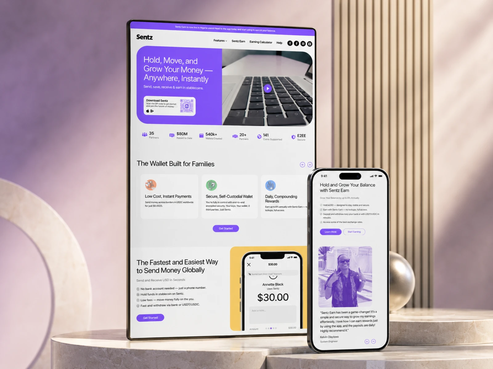
Sentz — Fintech Landing Page & Webflow Development
UX/UI Design · Fintech Website · Webflow Development
Project Type: Fintech / Digital Payments / Stablecoin Wallet
Primary Objective: Communicate a complex financial product clearly, build trust, and drive app downloads
Platform: Webflow
Role: Web Designer & Webflow Developer
Deliverables: UX/UI Design · Responsive Web Design · Webflow Development · Interactions & Animations · SEO & Performance Optimization
1. Project Overview
Sentz is a fintech platform built around fast global payments, stablecoin-based money management, and a secure self-custodial wallet.
The platform allows users to send, receive, hold, withdraw, and earn with stablecoins, while also supporting use cases such as international freelancer payments and invoicing.
My goal for the website was to turn a technically complex financial product into a clear, approachable, and conversion-focused digital experience.
The landing page needed to explain what Sentz does quickly, communicate trust and security, demonstrate real-world use cases, and consistently guide visitors toward downloading the app.

2. The Challenge
Fintech products often have to communicate several things at once: speed, security, functionality, credibility, and financial value.
Sentz also introduces concepts such as eUSD, stablecoins, self-custody, encrypted payments, global transfers, and earning rewards. Without the right hierarchy, that amount of information could easily overwhelm a first-time visitor.
The main UX challenge was therefore to:
Simplify a technically complex product
Make the core value proposition immediately understandable
Establish trust before asking users to download the app
Separate different product benefits into easy-to-scan sections
Explain how payments, funding, withdrawals, and earning work
Create clear conversion paths throughout a long landing page
Balance financial credibility with a modern, approachable visual identity
Maintain a strong experience across desktop, tablet, and mobile
Rather than presenting every feature at once, I structured the experience progressively so visitors could understand the product one benefit at a time.
3. Design Strategy
The strategy centered around clarity, trust, product education, and conversion.
Lead With the Core Value
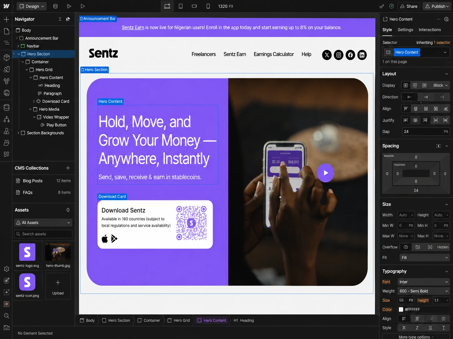
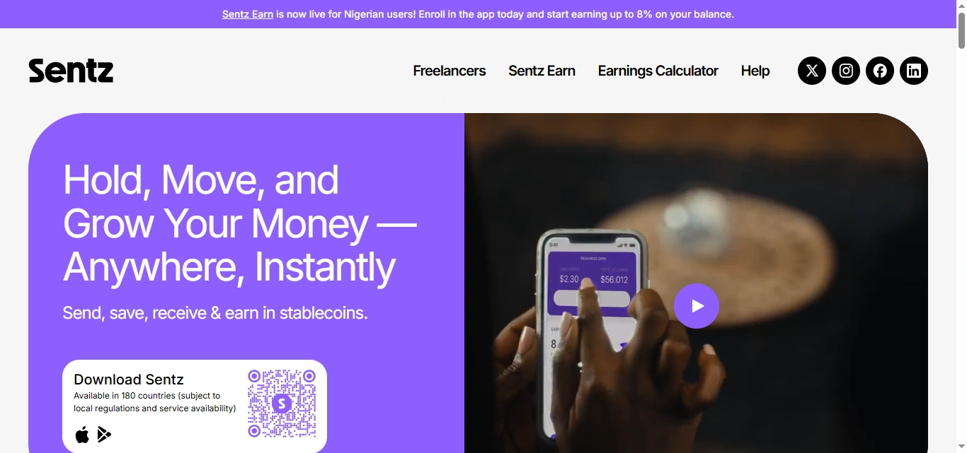
The hero immediately communicates the main product promise around holding, moving, and growing money globally, followed by a direct Download Sentz action.
This gives visitors both the value proposition and next step without unnecessary friction.
Turn Features Into Benefits
Instead of relying heavily on fintech terminology, the page breaks the product into recognizable benefits including:
Low-cost global payments
Secure self-custody
End-to-end encryption
Flexible funding and withdrawals
Stablecoin payments
Earning on balances
This makes the product easier to understand even for visitors who may not already be familiar with stablecoins.
Build Trust Throughout the Journey
Because users are being asked to manage money through the platform, trust could not be limited to one section.
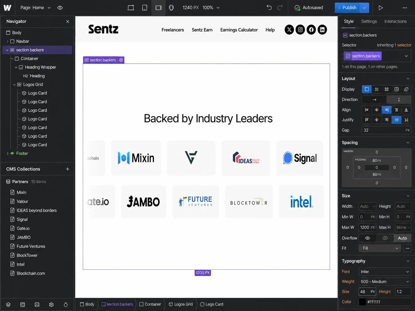
Security messaging, customer testimonials, industry backing, FAQs, product explanations, and financial disclosures were integrated throughout the experience to reinforce credibility.
Maintain Conversion Momentum
Primary CTAs such as Download Sentz, Get Started, and Start Earning appear naturally after relevant product sections, reducing the distance between understanding a benefit and taking action.
4. UX/UI Design
Information Hierarchy
I structured the page so the content moves from the broad product promise into specific capabilities and use cases.
The experience progresses through:
Value Proposition → Core Benefits → Global Payments → Freelancer Use Case → Sentz Earn → Social Proof → Setup → Product Education → Trust → FAQ → Conversion
This keeps the page informative without presenting visitors with too much information at once.
Hero Section
The hero was designed to communicate the product in seconds.
A concise headline establishes the financial benefit, supporting copy explains the stablecoin proposition, and the primary CTA directs visitors toward downloading the product.
The app-focused visual direction helps users immediately understand that Sentz is a real digital product rather than an abstract financial service.
Typography System
The typography uses strong headline contrast and shorter supporting text to make a content-heavy fintech page easier to scan.
I established clear styles for:
Hero messaging
Section headlines
Feature titles
Product explanations
Supporting information
Testimonials
FAQs
Calls-to-action
This creates visual consistency while keeping technical information readable.
Color & Visual Language
The interface uses a modern fintech aesthetic with controlled color usage, clean backgrounds, bold visual moments, and product-focused imagery.
The visual system is designed to feel contemporary and technology-driven without sacrificing the seriousness expected from a financial product.
Feature Components
Complex functionality is separated into reusable feature blocks rather than long paragraphs.
This allows visitors to quickly understand specific advantages while keeping the interface visually engaging.
Product Demonstrations
Phone and product visuals help connect website messaging to the actual Sentz experience.
Rather than simply describing payments or wallet functionality, the interface gives users visual context for how those features exist within the product.
Social Proof
Testimonials from designers, writers, engineers, and other users support key use cases such as international payments, invoices, withdrawals, and earning.
Positioning these after the main product benefits helps transform feature claims into more relatable scenarios.
FAQ Experience
The FAQ section answers important questions around wallet creation, receiving funds, stablecoin funding, and withdrawals.
This reduces uncertainty near the bottom of the conversion journey and gives users another level of confidence before downloading the product.
Responsive Design
Layouts, visual assets, spacing, typography, feature sections, buttons, and navigation were considered independently across desktop, tablet, and mobile.
The goal was to preserve the same information hierarchy and conversion flow regardless of screen size.
5. Website Architecture
The Sentz experience is supported by a simple architecture that separates product education from company and support content.
Main Landing Page
Acts as the primary conversion experience and explains Sentz’s core wallet, payment, freelancer, and earning features.
Wallet
Provides deeper information about the payment experience, invoicing, stablecoin payments, self-custody, and withdrawal options.
Sentz Earn
Provides a dedicated path for users interested in earning rewards on eligible balances.
Learn / FAQ
Answers common questions around downloading the app, creating a wallet, funding, withdrawals, and receiving money.
About
Communicates the broader Sentz mission around enabling people to send payments globally and securely while introducing the company leadership.
Blog & Resources
Supports product education, fintech knowledge, announcements, and organic content discovery.
Contact
Provides a direct support and communication pathway for users who need additional assistance.
6. Webflow Development
After establishing the UX and visual system, I translated the approved interface into a responsive Webflow build.
The development approach focused on creating a website that was both polished on the front end and maintainable behind the scenes.
Key areas included:
Responsive Webflow development
Reusable sections and components
Structured class architecture
Responsive typography and spacing
Product-focused visual sections
Interactive navigation
FAQ interactions
CTA states and hover interactions
Subtle scroll and micro-interactions
CMS-ready content structures where appropriate
SEO-conscious heading hierarchy
Optimized assets and responsive imagery
Accessibility-conscious interaction states
Performance optimization
Cross-browser and cross-device testing
Animations were kept purposeful rather than decorative, helping direct attention and reinforce the product experience without distracting from important financial information.
7. Design & Development Process
Research → UX Structure → Wireframes → UI Design → Design System → Webflow Development → Responsive Optimization → Testing → Launch
Research
I started by understanding the product, target users, core financial concepts, major use cases, and the questions a first-time visitor would need answered before trusting the platform.
UX Structure
I organized the information around user intent, prioritizing what Sentz does, why it is useful, how it works, why users can trust it, and how they can get started.
Wireframes
Low-fidelity layouts were used to establish content hierarchy, section order, CTA placement, product demonstrations, testimonials, and educational content.
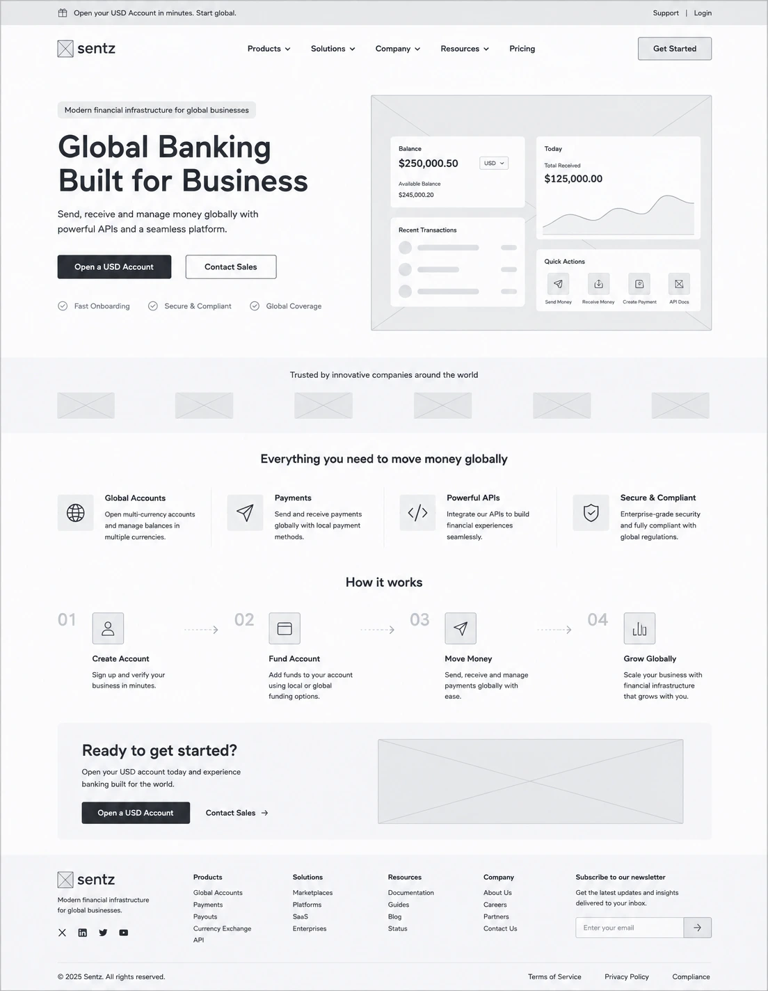
UI Design
The wireframes were translated into a polished fintech interface with a stronger visual hierarchy, modern typography, structured components, product imagery, and consistent spacing.
Design System
Reusable styles were established for typography, buttons, feature cards, navigation, FAQs, testimonial components, spacing, and responsive behavior.
Webflow Development
The approved interface was translated into structured, reusable Webflow components while preserving the intended visual hierarchy and interactions.
Responsive Optimization
Each major section was adjusted for desktop, tablet, and mobile to maintain readability, usability, and CTA visibility.
Testing
I reviewed links, navigation, interactive states, responsiveness, content hierarchy, and conversion paths across screen sizes and browsers.
Launch
The final stage focused on presentation quality, usability, performance, accessibility, SEO structure, and consistency before deployment.
8. Key Features
Conversion-focused fintech landing page
Clear product value proposition
Responsive Webflow implementation
Global payment feature presentation
Self-custodial wallet messaging
Security and privacy-focused UI
Freelancer payment use-case section
Sentz Earn product section
Product/app interface showcases
Strategic CTA placement
Customer testimonials
Trust and credibility sections
Interactive FAQ
Reusable Webflow components
Responsive design system
Custom micro-interactions
SEO-ready structure
Performance-conscious implementation
Mobile-first optimization
9. Final Result
The final Sentz website turns a feature-rich financial product into a clear and approachable digital journey.
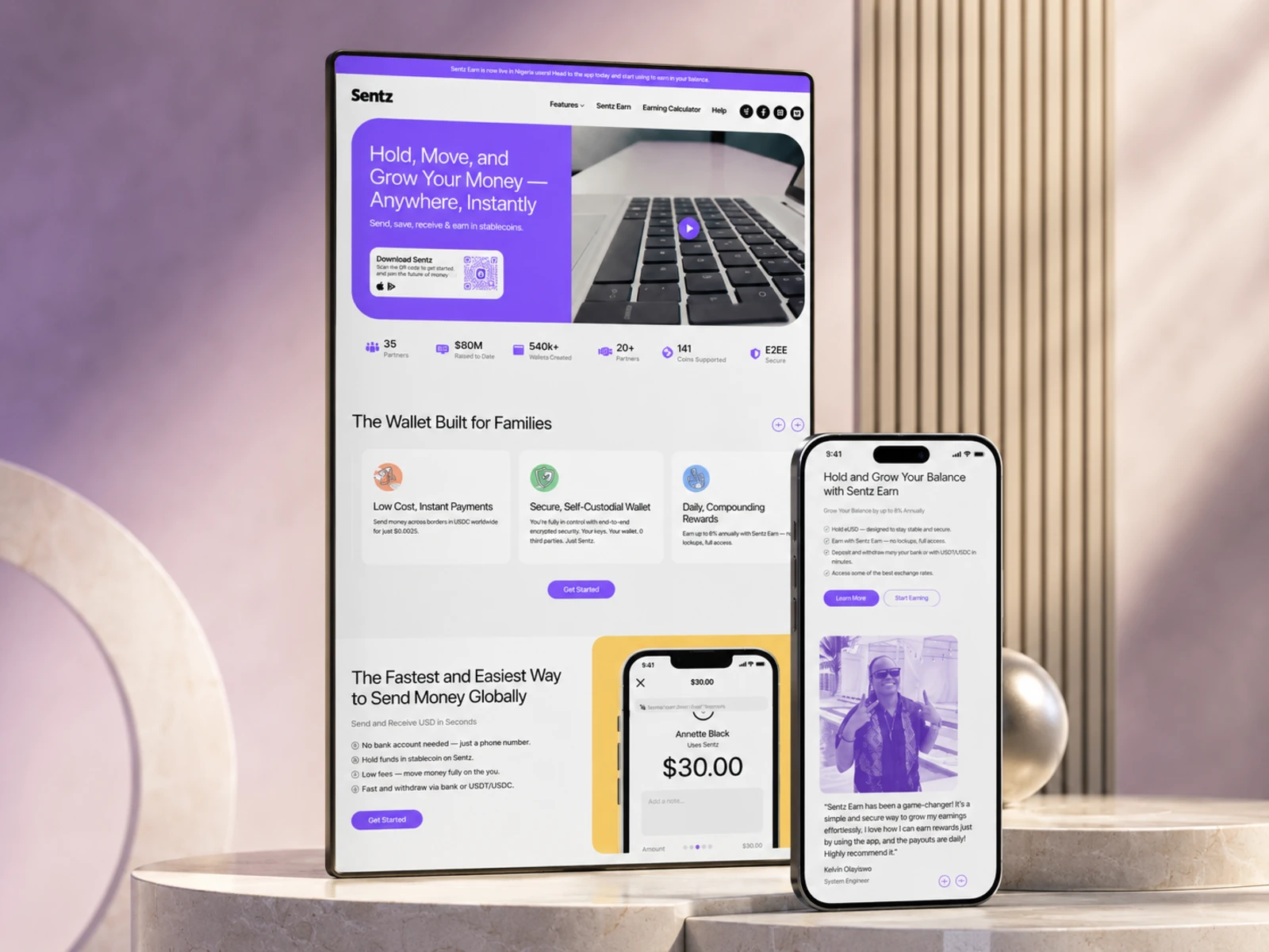
Rather than expecting users to understand stablecoins or fintech terminology immediately, the experience introduces the platform through familiar benefits: sending money, receiving payments, protecting funds, withdrawing money, and growing a balance.
Strong information hierarchy makes complex financial information easier to scan, while product visuals, security messaging, testimonials, FAQs, and trust signals help reinforce credibility throughout the page.
The repeated but contextual CTAs also create a smoother conversion journey, giving users opportunities to take action once they understand the part of the product most relevant to them.
The result is a responsive, product-led fintech experience that balances financial credibility, modern visual design, clear communication, and conversion-focused UX while giving Sentz a scalable foundation for communicating additional products and features as the platform grows.
Like this project
Posted Aug 28, 2026
Designed and developed a fintech landing page for Sentz, focusing on UX/UI and Webflow implementation for clear communication.