Sandeep Nayak Photography Portfolio Website

Victor Adebayo


Project Overview
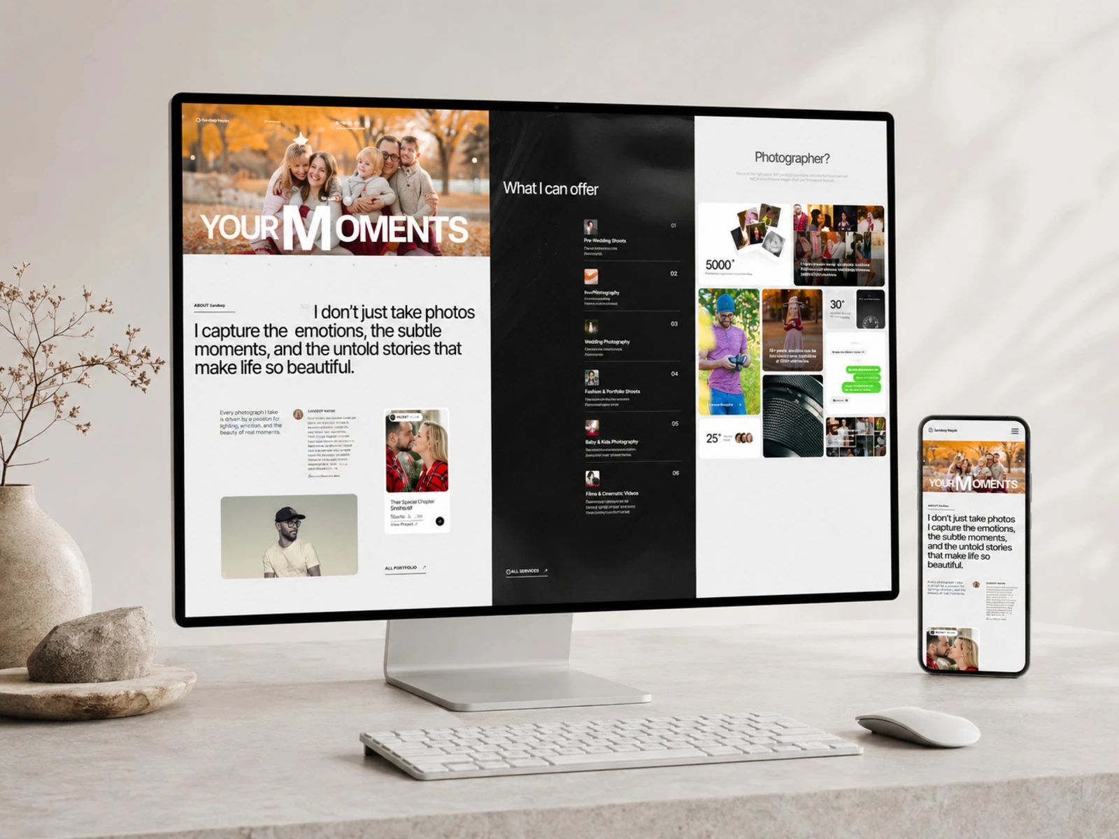
This project focused on designing and developing a premium photography portfolio website for Sandeep Nayak, a photographer whose work spans weddings, portraits, fashion, food, travel, and lifestyle photography.
The goal was to turn a large body of visual work into a clear, immersive, and easy-to-navigate digital experience, one that communicates the photographer’s style, builds trust, and encourages potential clients to get in touch.
Role: Web Designer & Webflow Developer
Platform: Webflow
Deliverables: UX/UI Design, Responsive Web Design, Webflow Development, CMS Structure, Interactions & Animations, SEO & Performance Optimization
The Challenge
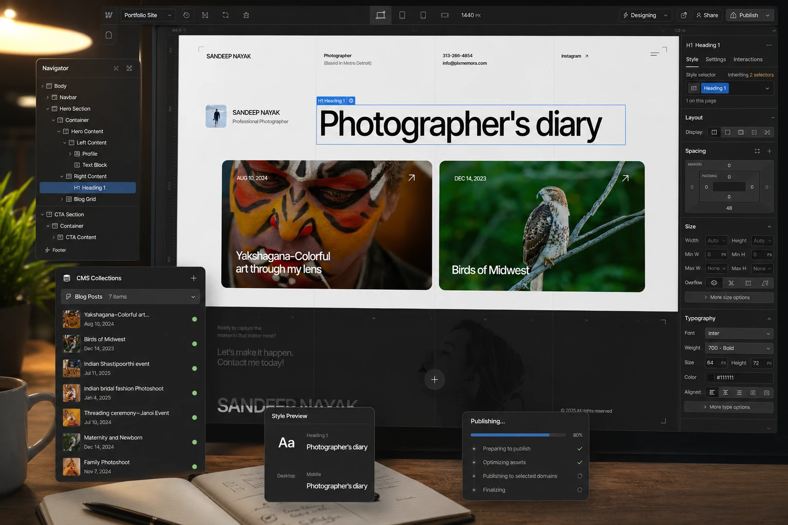
Photography websites can easily become image galleries without a clear user journey. The challenge here was to make the portfolio feel editorial and expressive while still functioning as a professional business website.
The experience needed to:
Establish credibility immediately through strong visual storytelling
Create a clear hierarchy between the photographer, services, and portfolio
Organize different photography categories without overwhelming visitors
Make the portfolio easy to explore
Create stronger pathways toward enquiries and bookings
Maintain a premium visual experience across screen sizes
Balance large imagery with readable supporting content
The design therefore needed to do more than showcase photographs—it needed to guide visitors through the photographer’s story and services.
Design Strategy
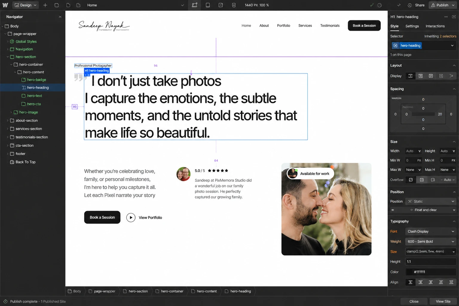
I approached the website as a combination of visual storytelling and conversion-focused UX.
The homepage begins with a full-width photography hero and a bold “Your Moments” message, immediately establishing the emotional nature of the brand. From there, the content moves through the photographer’s story, services, selected work, testimonials, and contact-oriented sections.
The visual direction uses:
Large editorial photography
Generous whitespace
Strong typographic hierarchy
Minimal interface elements
Dark and light section contrasts
Asymmetrical image compositions
Clear, understated CTAs
This creates a portfolio that feels artistic without sacrificing usability.
UX/UI Design
Hero & First Impression
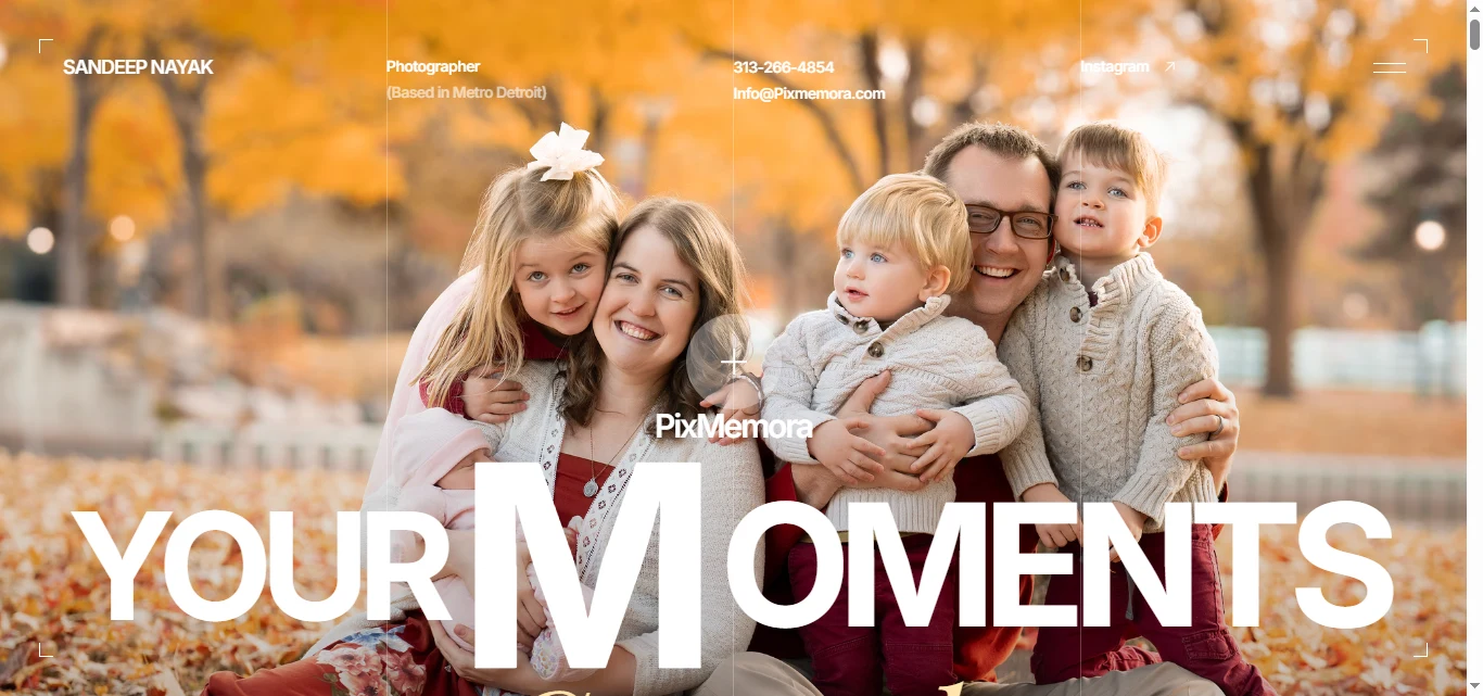
The hero section uses a powerful full-width image with oversized typography to communicate the core value proposition immediately.
Rather than placing too much information above the fold, the design lets the photography establish the emotional connection first, followed by supporting content and navigation.
Typography & Layout
The interface uses large headlines, compact supporting text, and generous spacing to create an editorial feel.
Different section compositions prevent the page from feeling repetitive, while consistent spacing and typography maintain visual continuity throughout the experience.
Portfolio Presentation
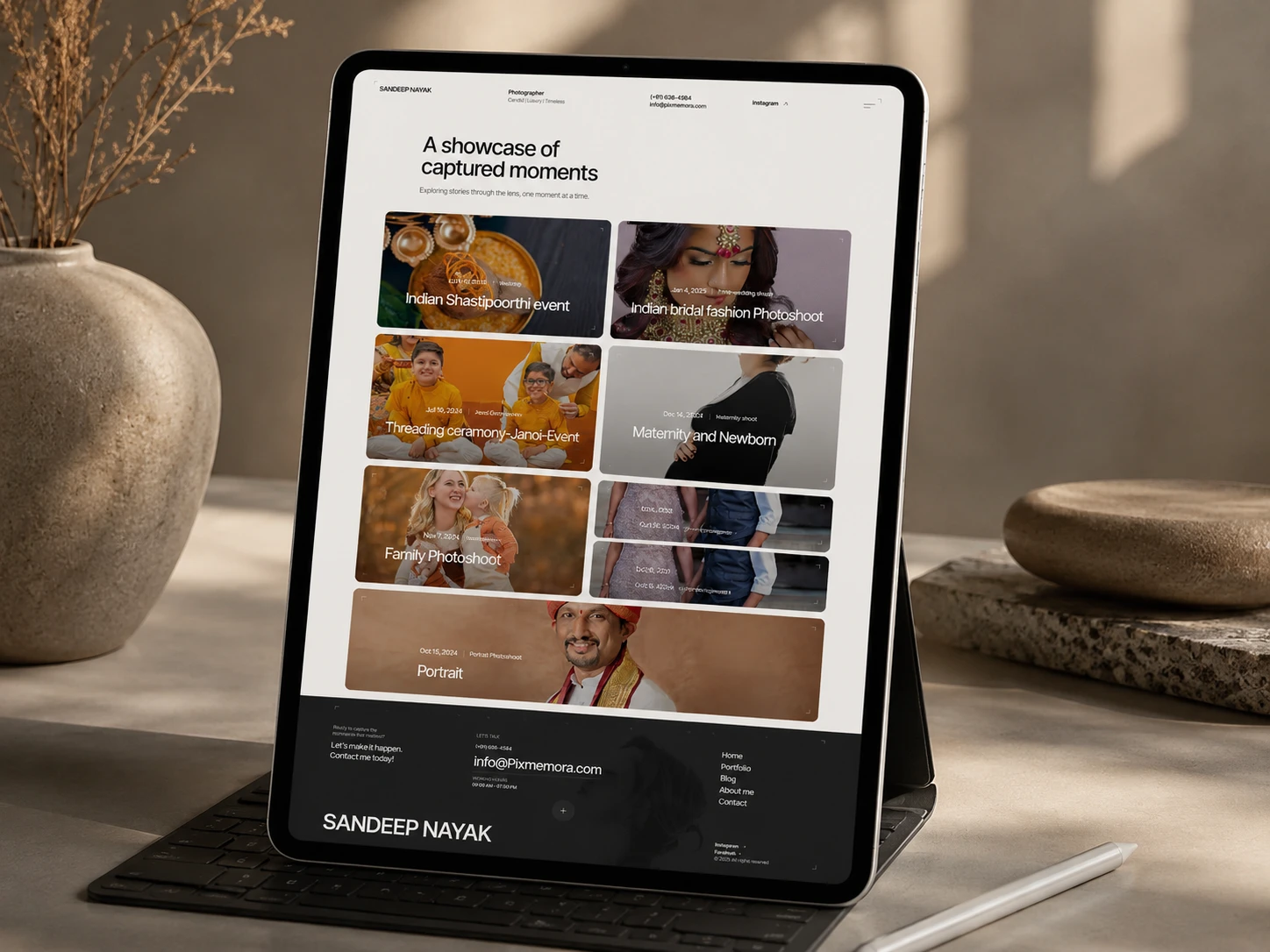
The portfolio is organized into distinct photography categories, including:
Indian Wedding Photography
Fashion & Portraits
Travel
Food
Family
Social/Cultural photography
The gallery uses varied image sizes and masonry-style compositions to make the portfolio feel curated rather than like a standard grid.
Trust & Conversion
Testimonials, service information, the photographer introduction, and enquiry sections are positioned throughout the journey instead of being isolated on one page.
This helps visitors progressively move from discovering the work → understanding the photographer → evaluating the services → making contact.
Website Architecture
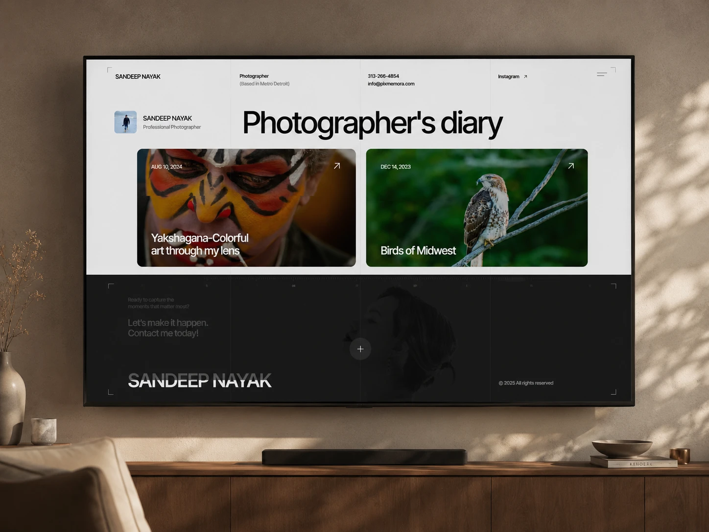
The structure was designed around the natural questions a potential photography client would have:
Who is the photographer? → What do they offer? → What does their work look like? → Can I trust them? → How do I get in touch?
Key sections include:
Homepage
About / Photographer introduction
Services
Portfolio / Photography categories
Testimonials
FAQ
Blog
Contact / Enquiry
Footer navigation
The blog also provides a space for ongoing content, photography stories, and discoverability through search.
Webflow Development
Once the visual system was established, I translated the design into a responsive Webflow experience with reusable structures and scalable content.
The implementation focused on:
Responsive Webflow development
Reusable components and styles
CMS-ready portfolio/blog structures
Responsive image layouts
Custom interactions where appropriate
Mobile and tablet optimization
SEO-ready page structure
Performance-conscious image implementation
Accessible typography and contrast
Cross-device testing
The development approach kept the visual experience flexible enough to accommodate new photography work without requiring the entire site structure to be redesigned.
Design & Development Process
01 — Research
Reviewed the photography brand, content, audience needs, and existing visual direction to establish the right positioning.
02 — UX Structure

Mapped the information hierarchy and organized the website around the visitor's journey from discovery to enquiry.
03 — Wireframes
Defined page structure, content hierarchy, image placement, navigation, and CTA positioning before moving into detailed visual design.
04 — UI Design
Established the editorial visual language through typography, spacing, imagery, contrast, and reusable interface patterns.
05 — Design System
Created consistent rules for typography, buttons, cards, spacing, sections, and responsive behavior.
06 — Webflow Development
Built the approved experience in Webflow using reusable structures and responsive layouts.
07 — Responsive Optimization
Refined layouts for desktop, tablet, and mobile so photography remained impactful without compromising usability.
08 — Testing & Launch
Reviewed interactions, navigation, forms, responsive behavior, content presentation, and overall usability before launch.
Key Features
Editorial photography-focused homepage
Responsive Webflow design
Curated portfolio/gallery system
Multiple photography categories
Strong visual storytelling
Clear service presentation
Testimonial section
FAQ interaction
Blog/CMS structure
Responsive image compositions
Reusable Webflow components
Mobile-first optimization
SEO-ready structure
Conversion-focused enquiry pathways
Final Result
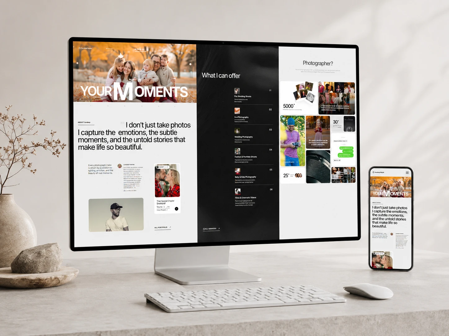
The final website brings together photography, storytelling, and business communication in one cohesive experience.
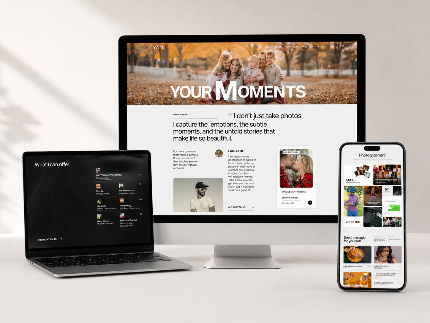
Instead of treating the portfolio as a collection of images, the design gives each section a purpose: introducing the photographer, communicating the services, showcasing the quality of the work, building credibility, answering common questions, and ultimately making it easier for potential clients to take the next step.
The result is a modern, editorial photography website that feels immersive without becoming difficult to navigate—giving the photographer's work the visual space it deserves while maintaining a clear and professional user experience.
Like this project
Posted Aug 24, 2026
Designed a premium portfolio website for photographer Sandeep Nayak using Webflow.