Icon Couture E-Commerce Website Design

Victor Adebayo


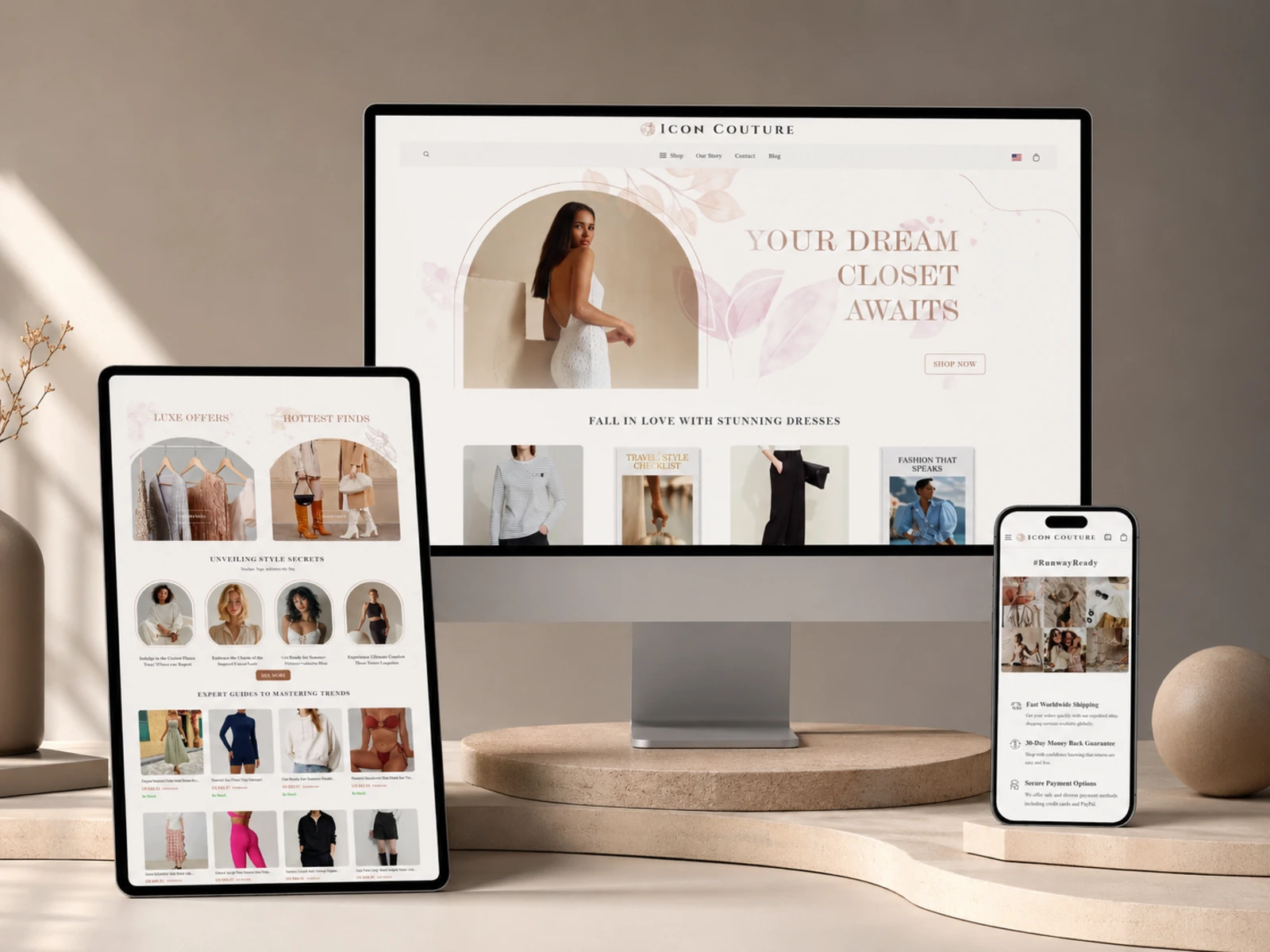
Icon Couture — Fashion E-Commerce Website
Web Design · UX/UI Design · Webflow Development · E-Commerce
Project Type: Fashion & Lifestyle E-Commerce
Primary Objective: Create a premium shopping experience that makes products easier to discover and purchase
Platform: Webflow
Role: Web Designer & Webflow Developer
Deliverables: UX/UI Design · Responsive Website Design · Webflow Development · E-Commerce Structure · CMS · Interactions · SEO & Performance Optimization
1. Project Overview
Icon Couture is a fashion-focused e-commerce brand offering women’s clothing, activewear, dresses, tops, bottoms, swimwear, and digital style resources.
The goal of the project was to create a shopping experience that felt more like a curated fashion destination than a large product catalogue.
With hundreds of products and multiple categories to organize, I focused on creating a clear path from discovery → product exploration → decision → checkout, while giving the brand a polished and editorial visual identity.
The experience also needed to support storytelling, fashion content, customer education, and trust alongside the core shopping journey.
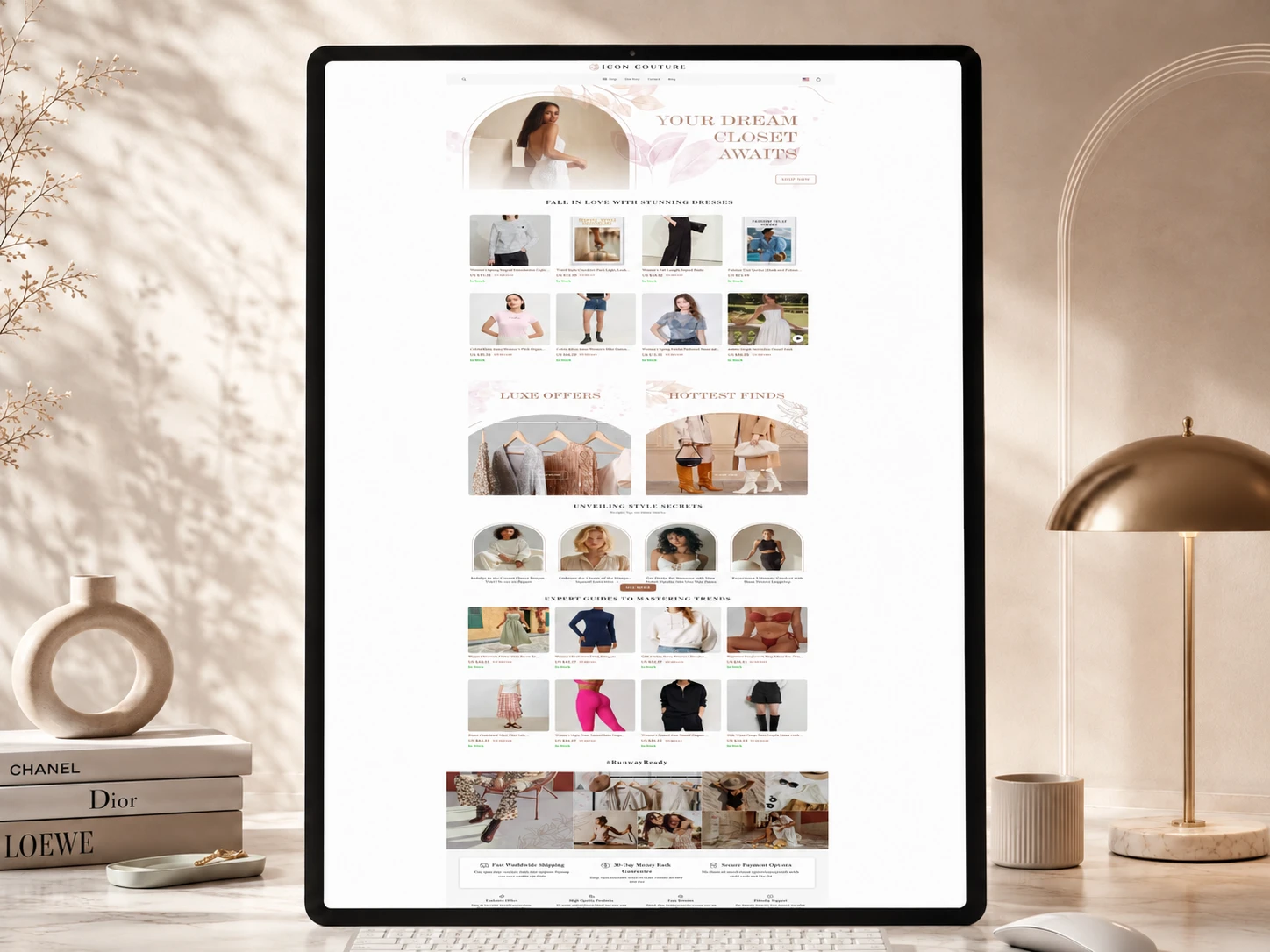
2. The Challenge
The main challenge was balancing a large amount of e-commerce content with a simple user experience.
A growing product catalogue can quickly become difficult to explore if categories, product information, navigation, and calls-to-action are not clearly structured.
The project needed to solve several key UX problems:
Organize a large product catalogue without overwhelming shoppers
Establish a stronger hierarchy between promotional, editorial, and shopping content
Make important product information easier to scan
Create clearer pathways from browsing to purchase
Build trust around shipping, payments, returns, and customer support
Maintain visual consistency across product, category, editorial, and support pages
Deliver a smooth experience across desktop, tablet, and mobile
Instead of adding unnecessary complexity, my approach was to simplify the experience and allow the products to remain the primary focus.
3. Design Strategy
I approached the project around three priorities: discoverability, confidence, and conversion.
Discoverability
The information architecture was structured around recognizable shopping categories so visitors could quickly move from the homepage into relevant collections.
Confidence
Trust information such as shipping, secure payments, returns, product details, FAQs, and customer support was positioned throughout the experience to reduce uncertainty before purchase.
Conversion
Calls-to-action were kept clear and action-oriented, with the user journey consistently guiding visitors toward exploring collections, viewing individual products, adding items to their cart, and completing checkout.
A consistent design system connected all three priorities across the site.
4. UX/UI Design
Wireframing & Page Structure
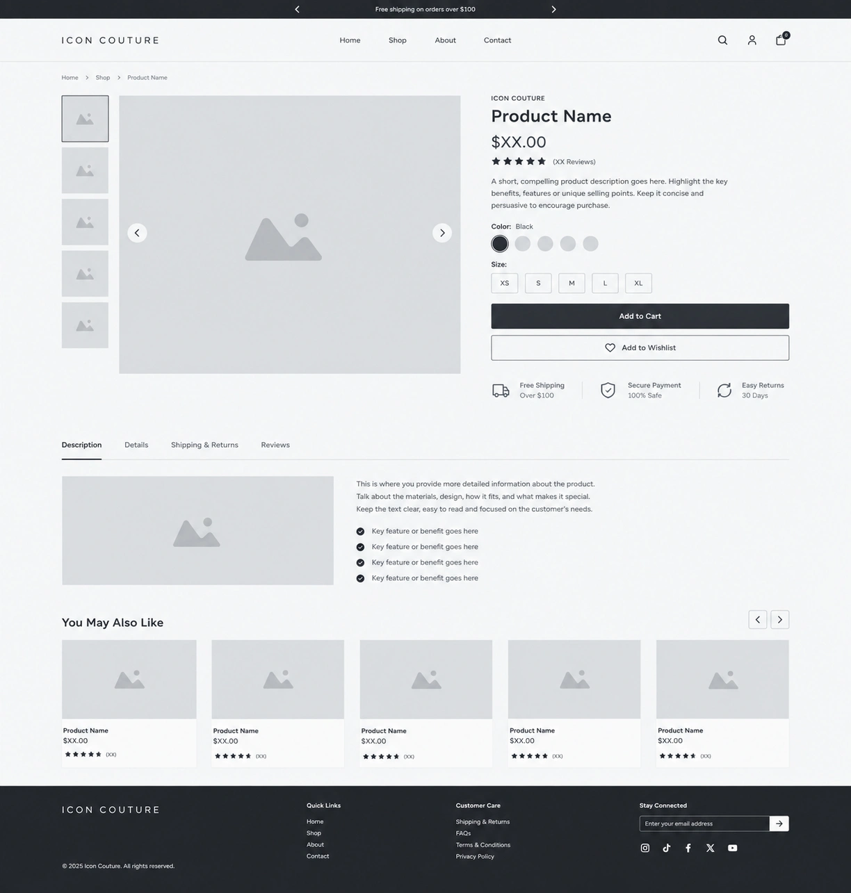
Before moving into final UI design, I mapped the key shopping journeys and established the hierarchy for homepage sections, collections, product pages, editorial content, and support pages.
This helped determine what shoppers needed to see first and where additional information should appear without distracting from purchasing decisions.
Hero & CTA Strategy
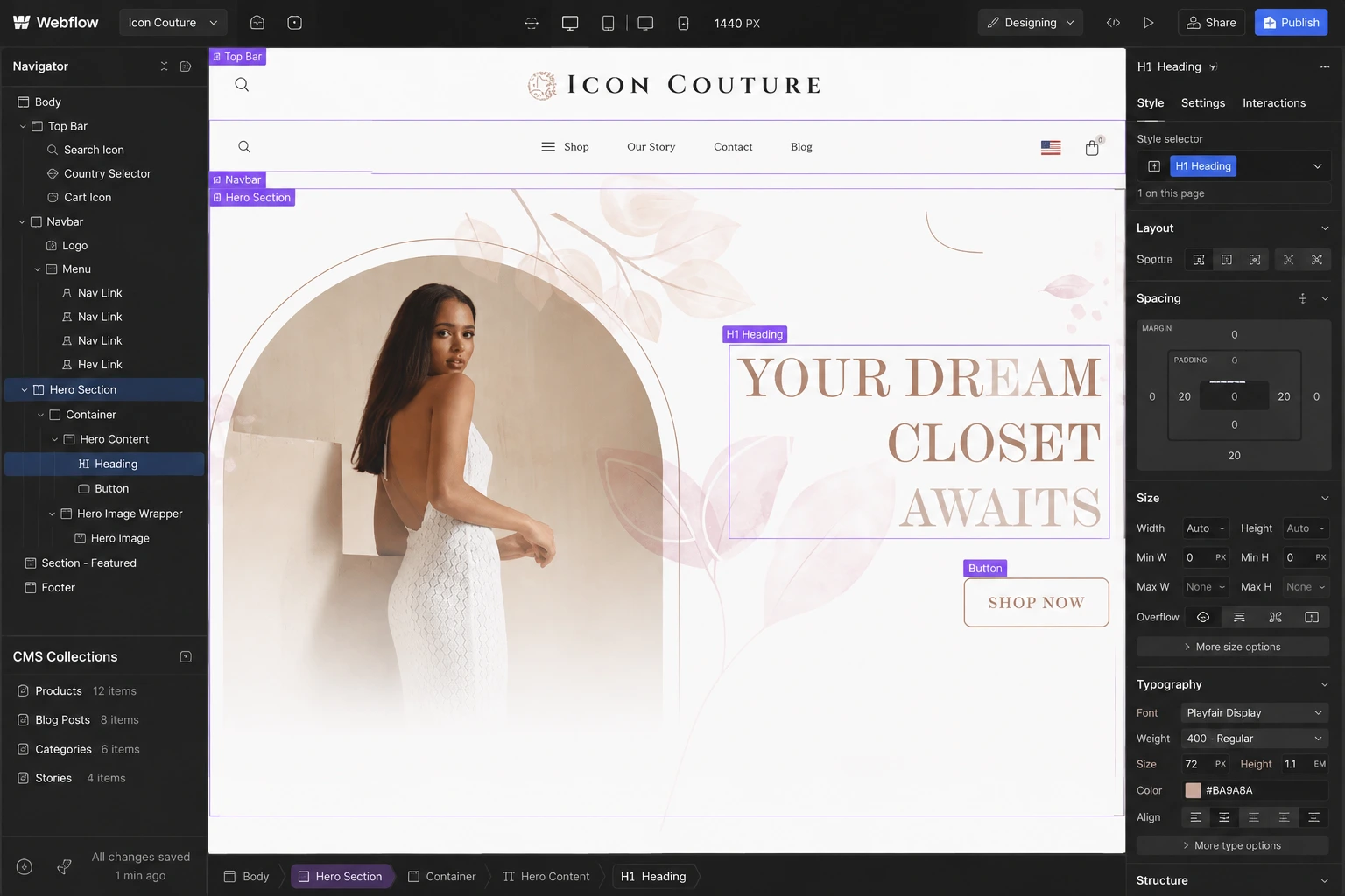
The homepage introduces the brand through a strong fashion-led visual direction paired with a direct shopping CTA.
Rather than overloading the opening section with information, the interface moves users quickly toward product discovery.
Typography
I used a clear typography hierarchy to separate:
Promotional messaging
Collection titles
Product information
Editorial content
Supporting details
Calls-to-action
The system gives the experience a fashion-editorial character while maintaining readability throughout longer product and informational pages.
Color & Visual System
The color direction remains restrained so photography, clothing, and product imagery stay dominant.
Supporting colors, buttons, typography, and UI states were used consistently to create familiarity as users move through the store.
Spacing & Layout
Generous spacing and structured content blocks prevent the large catalogue from feeling crowded.
Consistent margins, grid behavior, card spacing, and section rhythm give the website a cleaner and more premium presentation.
Product Components
Reusable product cards create consistency across collections and homepage sections, while individual product pages provide space for variants, product information, sizing, shipping information, reviews, and related recommendations.
Navigation
Navigation was organized around the customer’s shopping intent, with categories such as dresses, tops, bottoms, swimwear, activewear, and digital products making the catalogue easier to explore.
Search, account, cart, and checkout functions remain easily accessible throughout the experience.
Responsive Experience
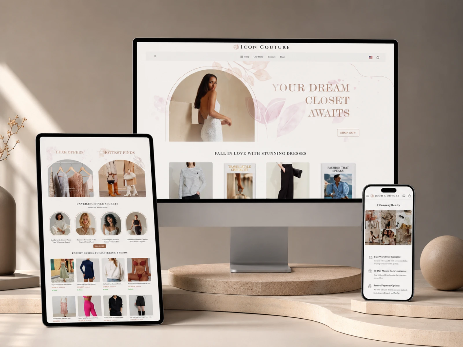
Every major layout and component was considered across desktop, tablet, and mobile.
Navigation, product grids, typography, spacing, imagery, buttons, and product information adapt to smaller screens without losing hierarchy or usability.
5. Website Architecture
The architecture was designed to support both shopping and brand discovery.
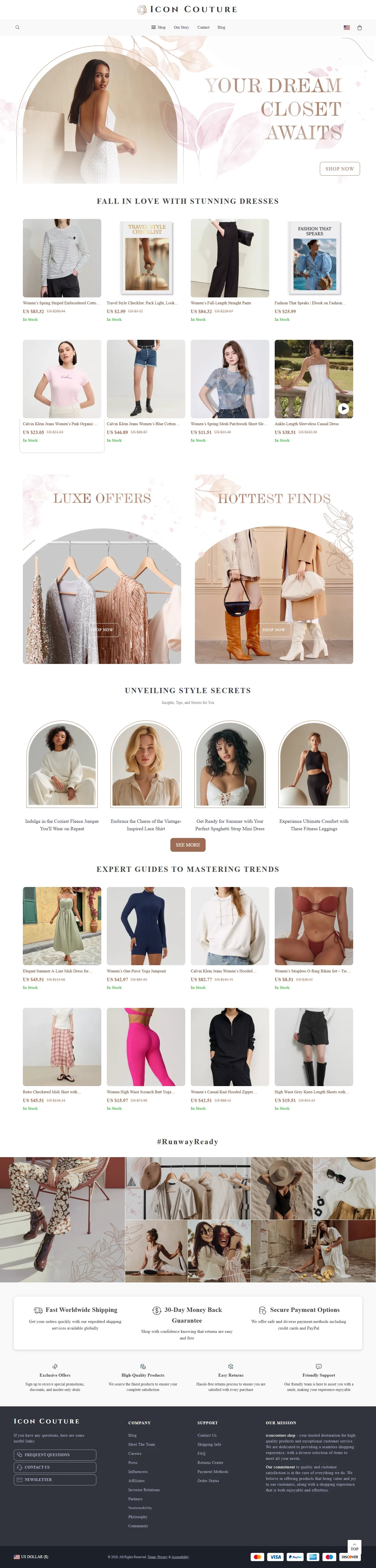
Homepage
Introduces the brand, highlights featured products and collections, surfaces editorial content, communicates customer benefits, and creates multiple shopping entry points.
Shop & Collections
The catalogue is divided into focused categories and subcategories, allowing shoppers to narrow their browsing experience instead of searching through one continuous product list.
Product Pages
Individual pages bring together product imagery, options and variants, descriptions, sizing information, shipping and return details, recommendations, and purchase actions.
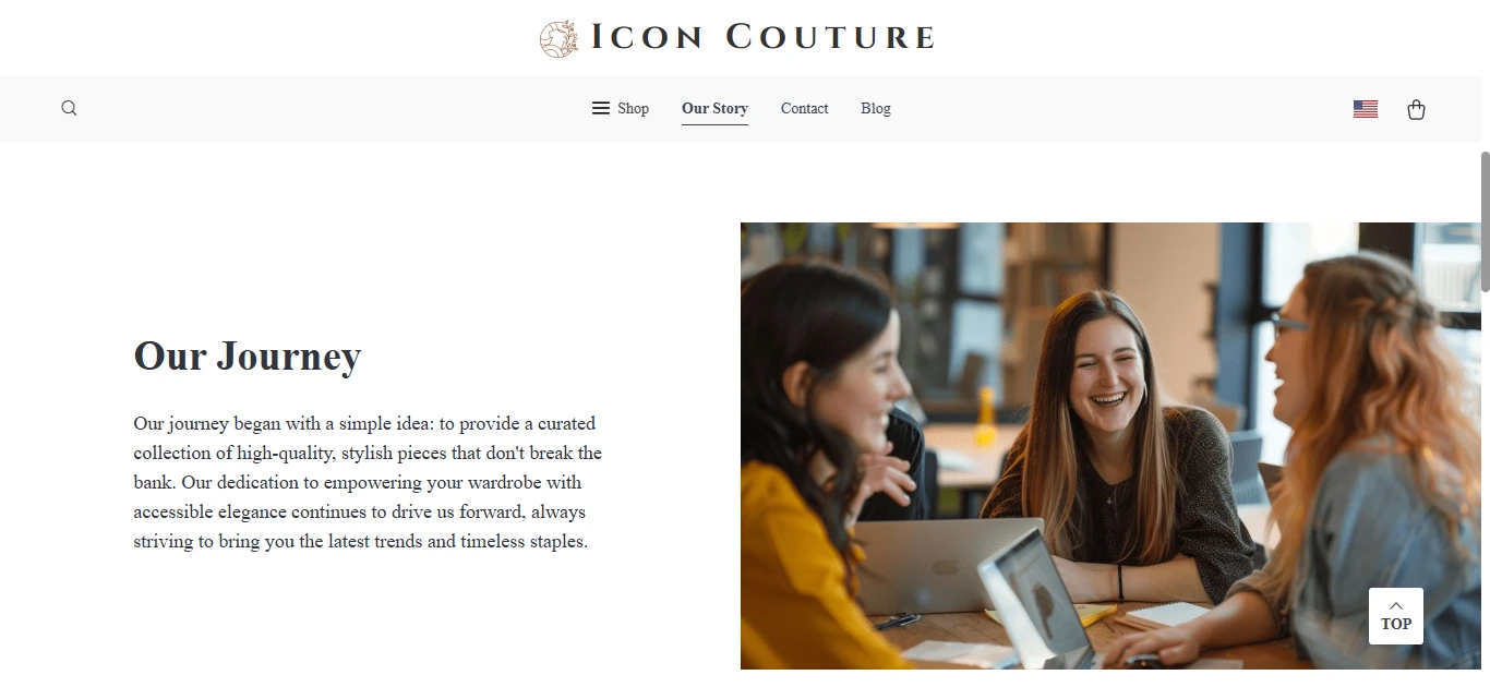
Our Story
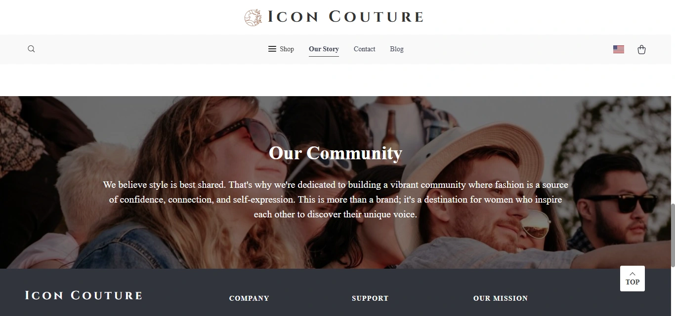
Provides additional context around the brand, its values, products, quality, and community.
Blog
Supports the e-commerce experience with fashion inspiration, product-focused content, styling advice, and editorial storytelling.
FAQ & Customer Support
Centralizes common information about ordering, payments, shipping, tracking, cancellations, and returns.
Contact
Provides a simple communication path for shoppers who need additional assistance.
6. Webflow Development
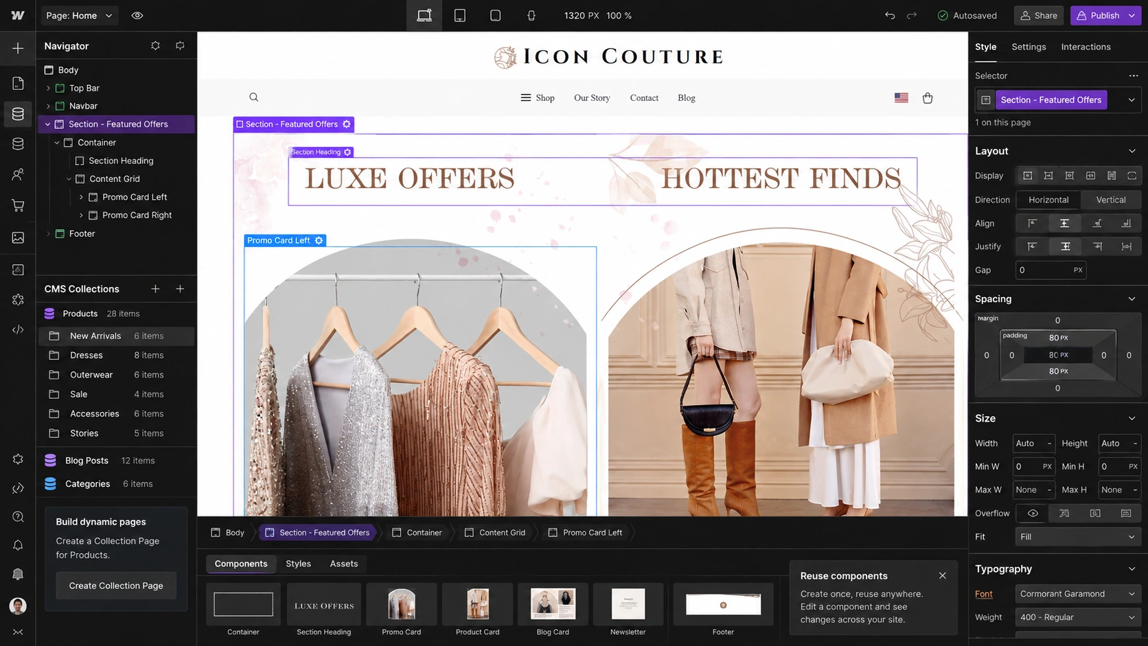
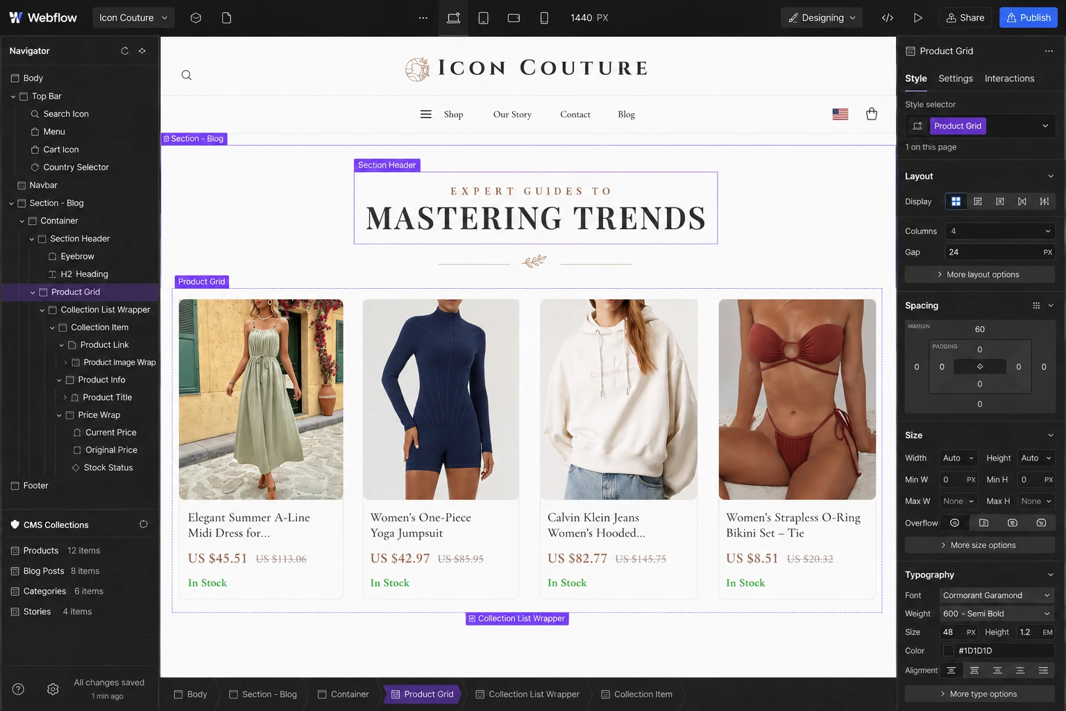
Once the visual direction and UX structure were established, I translated the design into a responsive Webflow implementation.
The development process focused on maintainability as much as presentation.
Key development considerations included:
Responsive layouts across desktop, tablet, and mobile
Reusable components for repeated interface patterns
Structured product and content management
CMS-driven editorial content where appropriate
Consistent class naming and styling architecture
Cart and conversion-focused interaction patterns
Subtle interactions and hover states
Responsive image treatment
Form implementation
Accessibility-conscious hierarchy and interaction states
SEO-friendly page structure
Performance-focused implementation
Cross-device and cross-browser testing
The goal was to ensure the final build remained manageable as the catalogue and editorial content continued to grow.
7. Design & Development Process
Research → UX Structure → Wireframes → UI Design → Design System → Webflow Development → Responsive Optimization → Testing → Launch
Research
I reviewed the product catalogue, brand positioning, content requirements, customer questions, and primary purchasing journeys.
UX Structure
I mapped the information architecture and organized products, collections, editorial content, support information, and conversion paths.
Wireframes
I established page hierarchy and content priority before introducing detailed visual styling.
UI Design
The approved structure was developed into a polished fashion-focused interface with stronger typography, imagery, spacing, cards, and calls-to-action.
Design System
Reusable typography, spacing, buttons, cards, forms, navigation patterns, and responsive rules were established to maintain consistency.
Webflow Development
The interface was translated into reusable Webflow components and structured pages.
Responsive Optimization
Layouts were refined individually for desktop, tablet, and mobile rather than simply scaling down the desktop design.
Testing
Navigation, forms, product interactions, content behavior, responsiveness, and major conversion paths were reviewed across devices.
Launch
Final refinements focused on usability, consistency, performance, accessibility, and presentation before launch.
8. Key Features
Fashion-focused e-commerce experience
Large, structured product catalogue
Category and subcategory navigation
Conversion-focused homepage
Responsive product grids
Detailed product pages
Product variant selection
Shopping cart and checkout journey
Search and account access
Editorial/blog content
CMS-powered content structure
Reusable Webflow components
Customer trust sections
FAQ and support experience
Contact form integration
Responsive navigation
Custom interactions and micro-animations
SEO-ready page hierarchy
Performance-conscious implementation
Desktop, tablet, and mobile optimization
9. Final Result
The final Icon Couture website brings brand presentation, product discovery, editorial content, and e-commerce functionality into one cohesive experience.
Instead of making shoppers navigate a complicated catalogue, the website creates clear pathways into relevant collections and gives each product enough space to communicate its value.
The redesigned hierarchy also gives supporting information, such as shipping, returns, payments, FAQs, and brand storytelling, a clearer role in building confidence without interrupting the shopping journey.
From desktop to mobile, the experience remains consistent, easy to navigate, and focused on helping customers move naturally from discovering the brand to exploring products and completing a purchase.
The result is a more credible, structured, and scalable digital storefront that presents Icon Couture as both an e-commerce store and a fashion destination.
Like this project
Posted Aug 27, 2026
Designed a cohesive e-commerce site for Icon Couture on Webflow, enhancing user experience and product discoverability.