Brush Dental Online Experience Design

Victor Adebayo


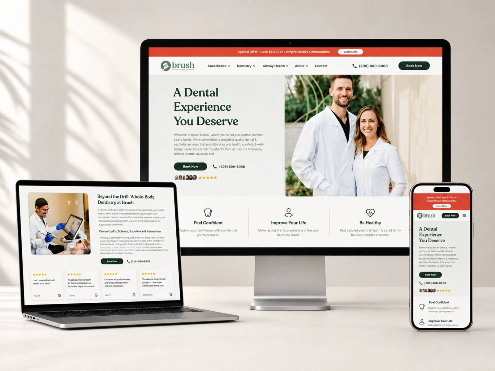
Brush Dental Seattle
A modern dental experience designed around trust, wellness, and conversion
Project Type: Healthcare / Dental
Role: Web Designer & Webflow Developer
Platform: Webflow
Deliverables: UX/UI Design, Responsive Web Design, Webflow Development, CMS Structure, Interactions, SEO & Performance Optimization
01 — Project Overview
Brush Dental is a modern dental practice in Seattle's University District that approaches dentistry through a broader whole-body wellness perspective.
The website needed to communicate more than dental treatments. It needed to present Brush as a place where patients could receive personalized dental care, explore aesthetic services, understand advanced treatment options, and feel confident taking the next step.
The goal was to create a digital experience that feels modern, trustworthy, approachable, and medically credible, while making the journey from discovering the practice to booking an appointment as straightforward as possible.
02 — The Challenge
Dental websites often fall into a familiar pattern: a list of services, generic healthcare messaging, and a booking button.
Brush required something more intentional.
Its offering extends from general dentistry into aesthetics and airway health, while its core philosophy focuses on whole-body wellness rather than treating oral health in isolation. That created a UX challenge: communicate a broad range of services without making the website feel fragmented or overwhelming.
The experience needed to:
Build trust within the first few seconds
Clearly communicate Brush's whole-body approach
Organize a broad range of services
Make complex treatments easier to understand
Introduce the dentists and wider care team
Create clear paths toward booking
Make the practice feel approachable rather than overly clinical
Work seamlessly across desktop, tablet, and mobile
The core problem was therefore not simply “How do we design a dental website?”
It was:
“How do we turn a comprehensive healthcare offering into an experience that feels simple, personal, and trustworthy?”
03 — Design Strategy
I structured the experience around three principles:
Trust → Education → Action
Every major section has a role in moving the visitor forward.
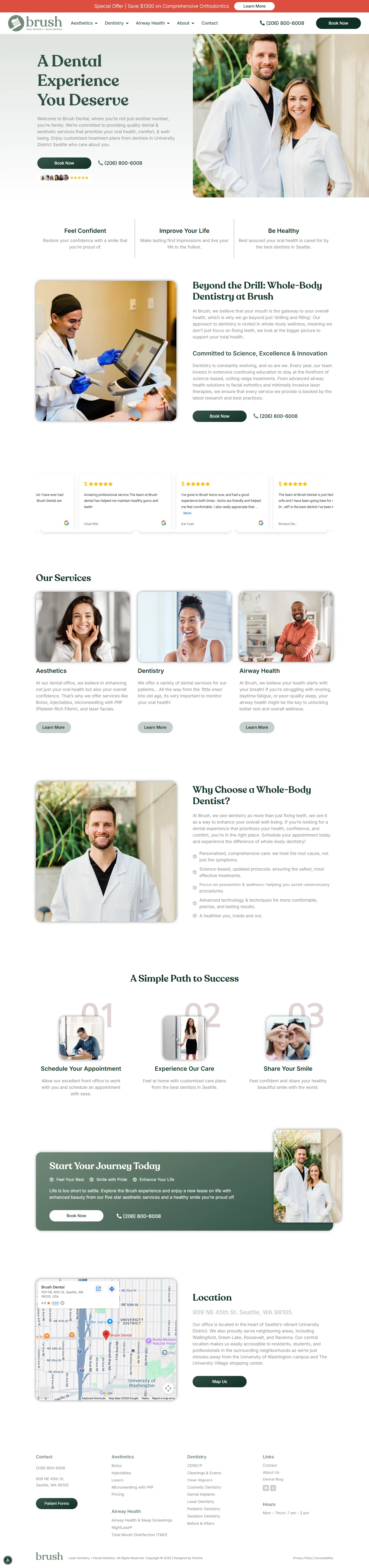
The homepage establishes the Brush philosophy and value proposition first. Service categories then help visitors understand what is available, while educational content, team profiles, and supporting information build confidence before the visitor reaches the booking stage.
The website also consistently reinforces the core message of health, confidence, and personalized care, rather than treating dentistry as a purely transactional service.
04 — UX/UI Design
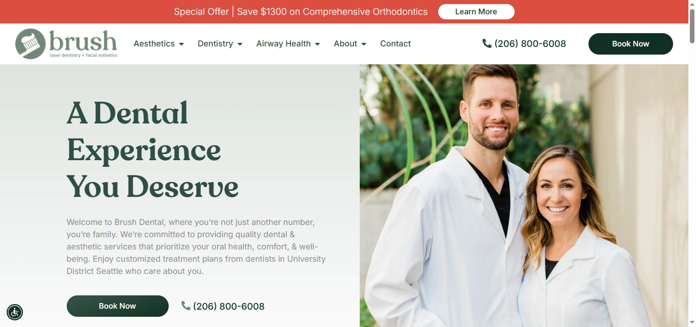
Hero Experience
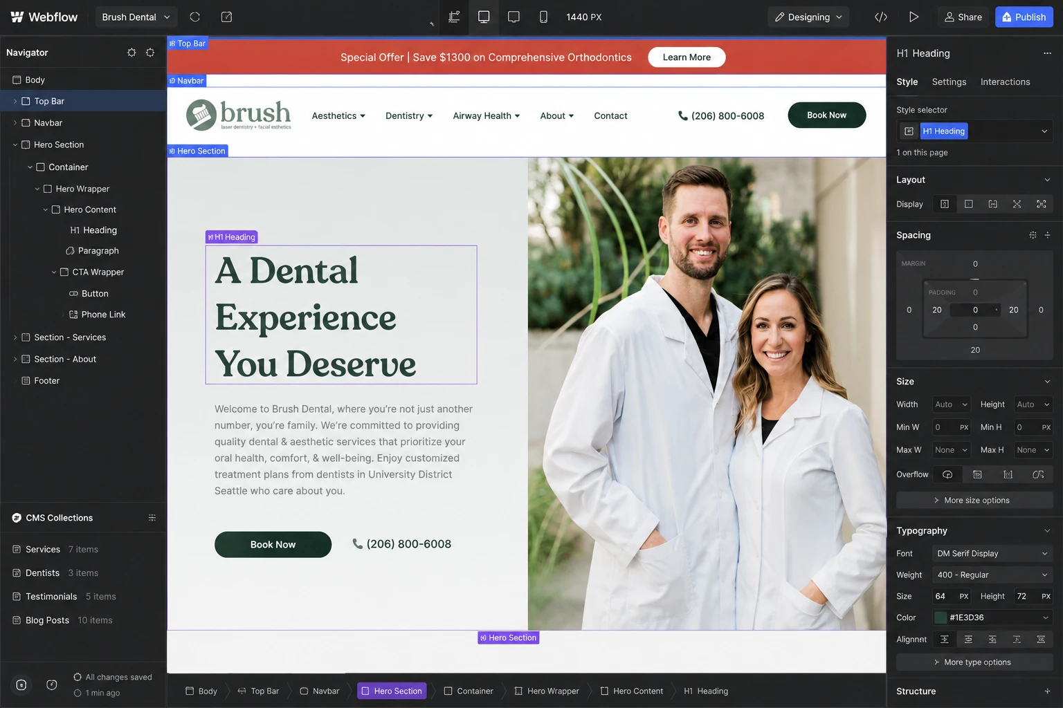
The hero immediately establishes Brush's positioning with the message:
“A Dental Experience You Deserve.”
Rather than leading with a long list of treatments, the opening focuses on the patient's experience and reinforces the clinic's commitment to comfort, well-being, and personalized care.
A prominent Book Now CTA creates an immediate conversion path for visitors who are already ready to schedule.
Clear Service Architecture
Brush offers three major service categories:
Aesthetics
Dentistry
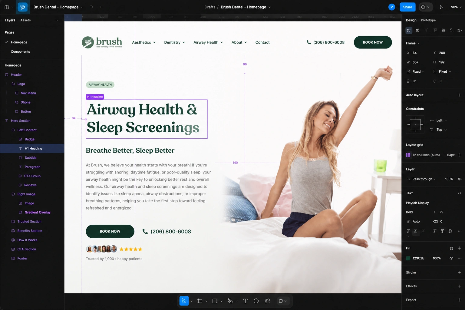
Airway Health
I treated these as distinct content pathways so visitors can quickly identify the area most relevant to them without having to navigate through a long, undifferentiated service list.
Whole-Body Dentistry
One of the most important UX decisions was giving Brush's philosophy its own dedicated space.
The “Beyond the Drill” section explains the practice's whole-body approach and provides context for why Brush offers a broader range of care.
This turns what could have been a brand statement into an educational moment that helps differentiate the practice.
Trust Through People
Healthcare decisions are personal, so the website gives significant attention to the people behind the practice.
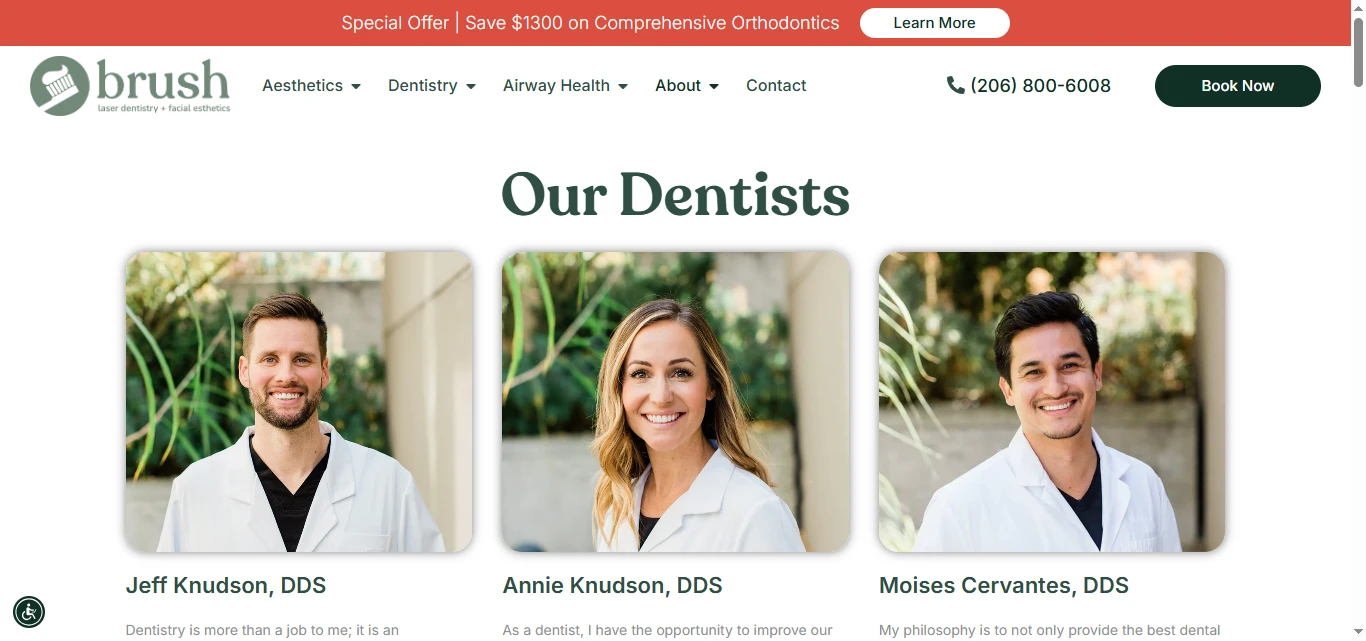
The About experience introduces the dentists and care team with individual profiles, professional backgrounds, philosophies, and personal details. This helps transform an otherwise anonymous healthcare brand into a team that prospective patients can understand and connect with.
Conversion Journey
The booking CTA appears throughout the experience instead of forcing visitors to return to the top of the page.
The journey is intentionally repetitive in the right way:
Discover → Understand → Build Trust → Book
The final “Start Your Journey Today” section reinforces the emotional benefit of care while providing another clear booking action.
05 — Website Architecture
The information architecture was designed around the questions a prospective patient is likely to ask.
Homepage
Introduces the Brush philosophy, key services, whole-body approach, benefits, and appointment pathway.
About
Introduces the dentists and wider team, helping establish professional credibility and personal connection.
Dentistry
Organizes the clinic's dental treatments and provides dedicated information for individual procedures.
Aesthetics
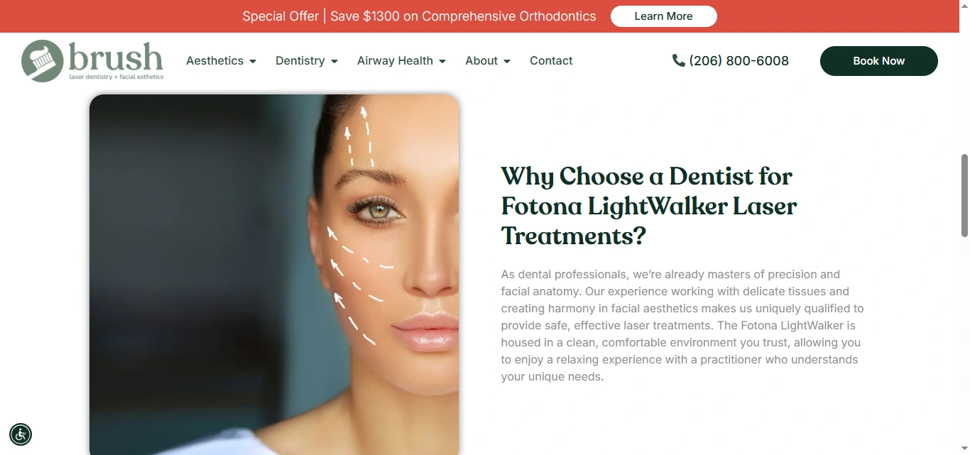
Presents services including Botox, injectables, microneedling with PRF, and laser facials.
Airway Health
Creates a dedicated pathway for patients interested in sleep, breathing, snoring, and airway-related concerns.
Blog
Provides educational content around dental treatments, aesthetics, wellness, and patient questions, creating an ongoing content structure for the website.
Contact / Appointment
Provides direct access to the clinic, phone contact, appointment pathway, location information, and parking instructions.
FAQ
Addresses common questions and reduces uncertainty around services and treatments.
06 — Content & Information Design
A major part of the design was making healthcare information scannable without stripping away useful detail.
Individual treatment pages follow a structured pattern:
What is it? → Why does it matter? → What are the benefits? → Why Brush? → What happens next?
For example, the CEREC page explains same-day crowns through convenience, precision, durability, comfort, and the practice's broader wellness philosophy.
This approach makes complex treatments easier to understand while giving visitors enough context to make an informed decision about contacting the clinic.
07 — Webflow Development
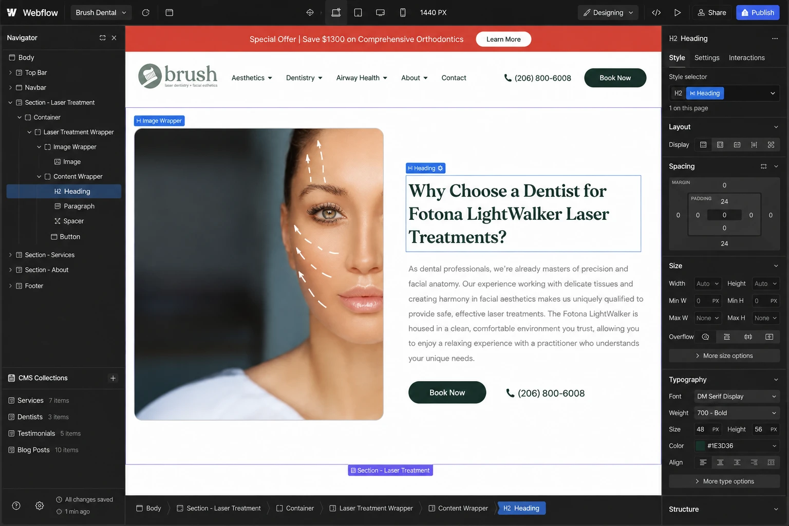
I translated the approved design into a responsive Webflow experience built around reusable structures and scalable content.
The development focused on:
Responsive Webflow development
Reusable components and class structures
CMS-powered blog/content architecture
Scalable service page structures
Responsive image handling
Interactive navigation
FAQ interactions
Contact and appointment pathways
SEO-ready content structure
Performance-conscious implementation
Accessibility considerations
Cross-device testing
The CMS approach also makes it easier to maintain and expand the website as Brush publishes new educational content and develops additional services.
08 — Design & Development Process
01 — Research
I examined the practice positioning, service offering, patient journey, and content requirements.
02 — UX Architecture
I mapped the site's information hierarchy around the patient's decision-making process.
03 — Wireframing
I established the page structures, navigation, content hierarchy, service pathways, and CTA placement.
04 — UI Design
I developed a contemporary healthcare visual direction that balances clinical credibility with warmth and approachability.
05 — Design System
I established reusable typography, spacing, buttons, cards, sections, forms, and responsive patterns.
06 — Webflow Development
I translated the approved interface into Webflow using reusable structures and responsive components.
07 — CMS & Content Structure
I organized repeatable content such as services, educational articles, and team information into scalable structures.
08 — Responsive Optimization
I refined layouts across desktop, tablet, and mobile to ensure the experience remained clear and usable at every breakpoint.
09 — Testing & Optimization
I reviewed navigation, forms, responsive behavior, interactions, accessibility, content hierarchy, and performance before launch.
09 — Key Features
Patient-focused homepage
Whole-body dentistry positioning
Clear service categorization
Dentistry, aesthetics & airway pathways
Strategic appointment CTAs
Dentist and team profiles
Treatment-focused content pages
Educational blog/CMS
FAQ interactions
Contact and appointment flow
Responsive Webflow implementation
Reusable components
SEO-ready structure
Accessibility-conscious design
Mobile optimization
Performance-focused development
10 — Final Result
The final experience positions Brush Dental as more than a traditional dental practice.
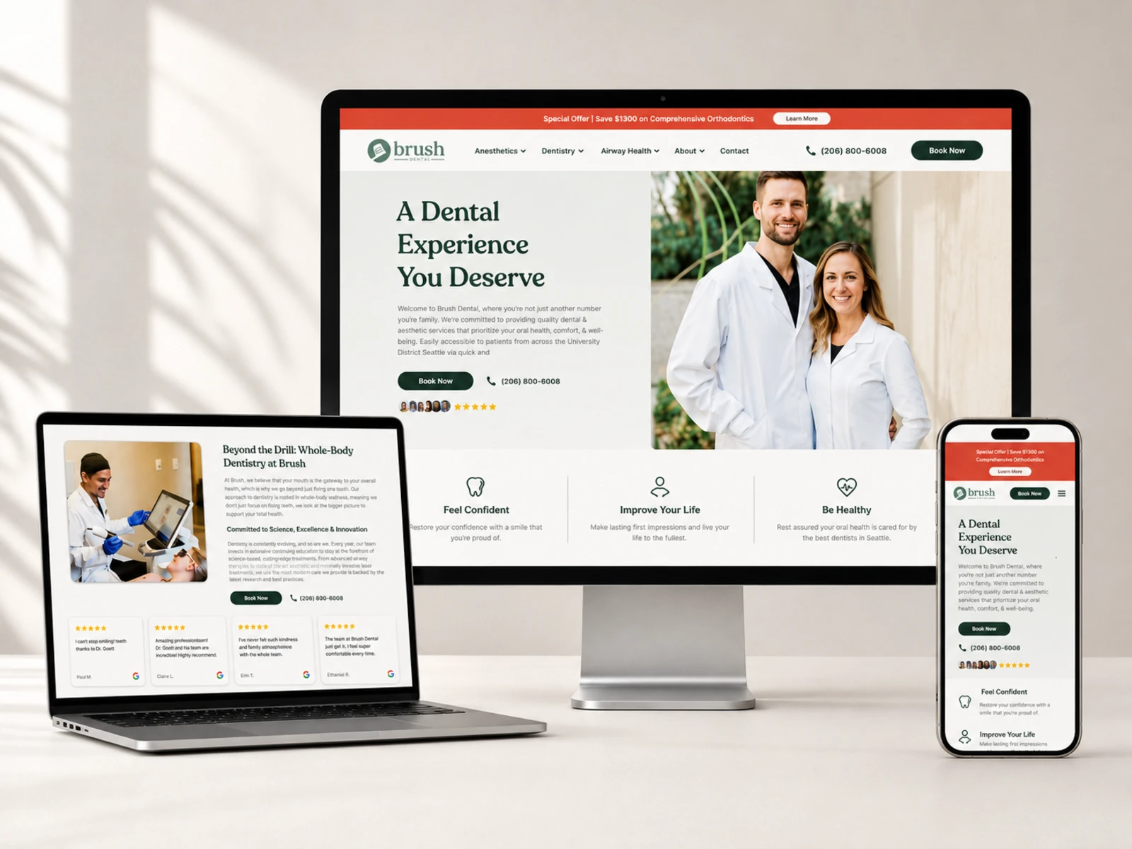
The website connects oral health, whole-body wellness, aesthetics, technology, and personalized care into one coherent digital experience.
Instead of overwhelming visitors with medical information, the experience progressively answers the questions that matter:
What does Brush believe?
What services do they offer?
Who will take care of me?
Why should I trust them?
What should I do next?
The result is a modern healthcare website designed to educate, build confidence, communicate expertise, and make taking the next step feel natural.
Most importantly, the design doesn't compete with the healthcare experience, it makes that experience easier to understand before the patient ever walks through the door.
Like this project
Posted Aug 26, 2026
Designed a user-friendly website for Brush Dental emphasizing wellness, trust, and conversion.
Likes
6
Views
4