J.G. Ross Craft Bakery Website Design

Victor Adebayo


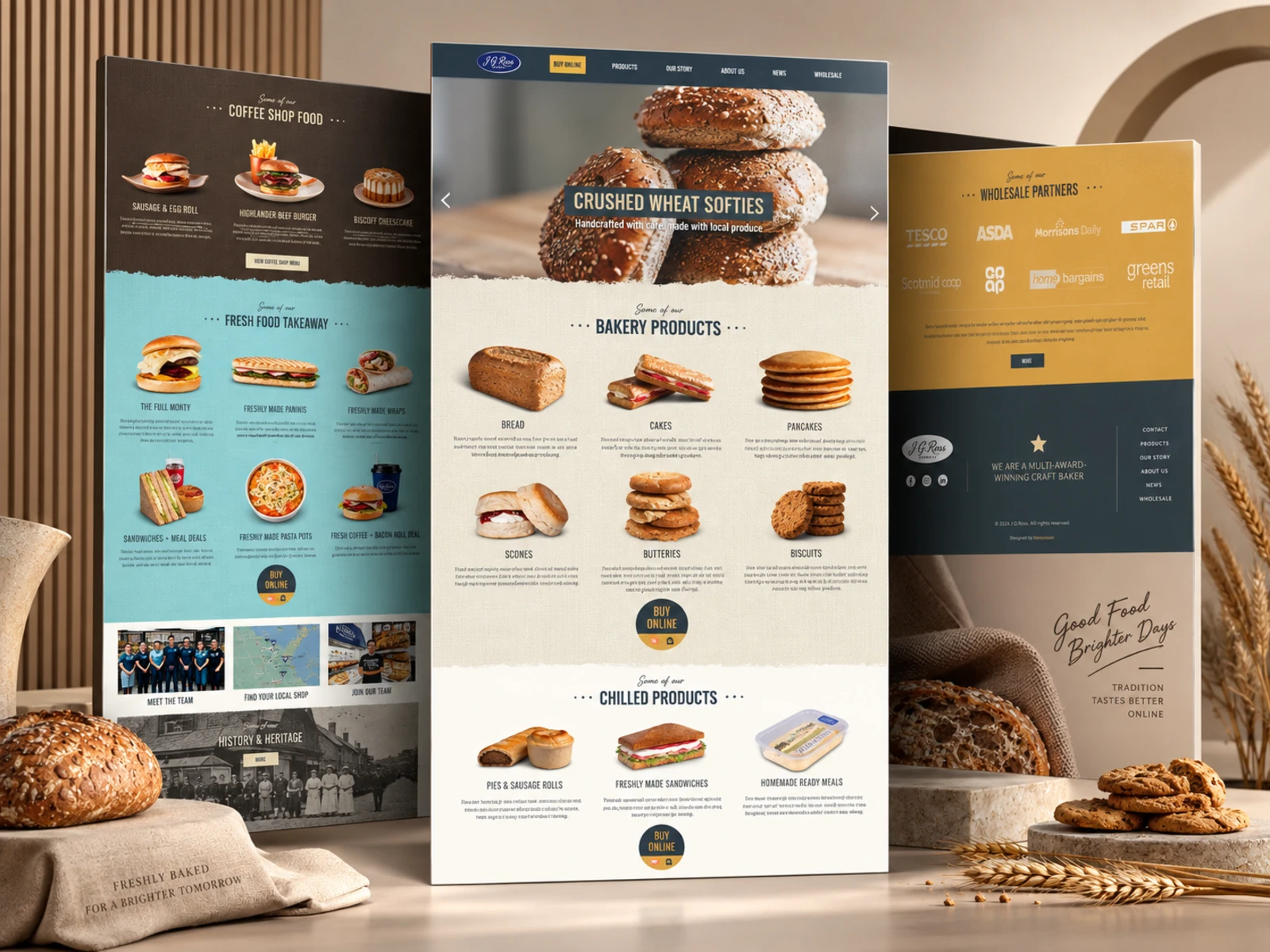
J.G. Ross — Craft Bakery Website
Web Design · UX/UI Design · Webflow Development · Local Retail Experience
Project Type: Food & Beverage / Bakery / Retail
Primary Objective: Modernize the digital brand experience, showcase the product range, help customers find local stores, and support retail and wholesale enquiries
Platform: Webflow
Role: Web Designer & Webflow Developer
Deliverables: UX/UI Design · Responsive Website Design · Webflow Development · Product Architecture · Location Experience · Wholesale Journey · CMS-Ready Content · SEO & Performance Optimization
1. Project Overview
J.G. Ross is a long-established Scottish craft bakery with roots dating back to 1962. The business produces a wide range of traditional baked goods, chilled food, sandwiches, takeaway meals and café products while supplying its own stores as well as supermarkets, convenience stores, cafés, restaurants and other wholesale partners across the North-East of Scotland.
The goal of the website was to translate that heritage into a digital experience that felt fresh, established and easy to explore without losing the warmth and personality of a traditional family bakery.
I focused on creating an experience that could serve several audiences at once: customers exploring products, people finding their nearest bakery, users looking to order food, wholesale businesses interested in stocking J.G. Ross products, and potential employees looking for opportunities.
2. The Challenge
J.G. Ross has a much broader offering than a typical bakery website.
Its digital presence needed to communicate decades of heritage while also supporting a large product range, numerous physical locations, coffee shops, wholesale operations, online ordering and recruitment.
The main UX challenge was preventing all of that information from competing for attention.
The website needed to:
Present a large food range without overwhelming visitors
Preserve the company's traditional identity while feeling current
Make products highly visual and easy to explore
Help users quickly locate their nearest shop or stockist
Create a clear route to Click & Collect and delivery
Separate consumer and wholesale journeys
Strengthen credibility around product quality and craftsmanship
Communicate the company's history without making the experience feel dated
Support recruitment and team storytelling
Maintain an intuitive experience across desktop, tablet and mobile
The solution was to treat the website as more than a company brochure—it needed to become a digital extension of the J.G. Ross retail experience.
3. Design Strategy
My strategy centered around four priorities:
Heritage → Product → Local Discovery → Action
Preserve the Heritage
J.G. Ross has been operating since 1962, with its history built around traditional baking, family involvement and continued expansion throughout the North-East of Scotland.
Rather than making the digital identity feel overly modern or disconnected from that history, I used the established brand character as the foundation of the experience.
The goal was to modernize the presentation without removing the sense of tradition behind the business.
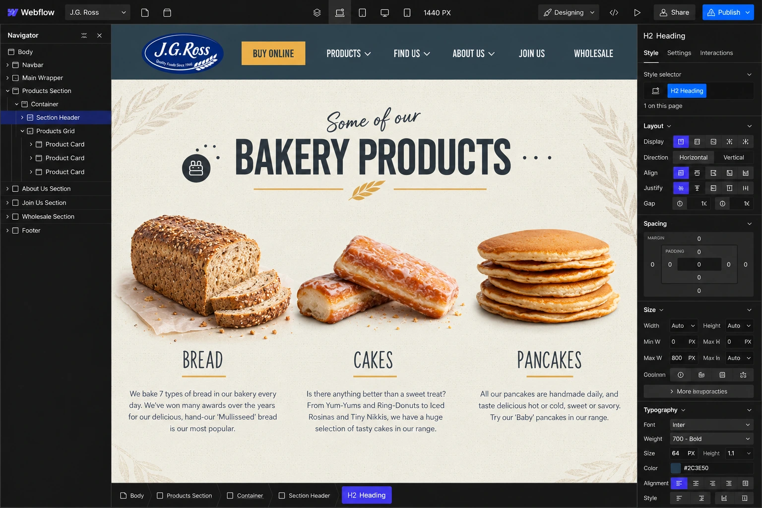
Make the Food the Hero
The strongest visual asset is the product itself.
Bread, cakes, pancakes, scones, butteries, biscuits, pies, sandwiches and ready meals are presented through large, appetizing imagery and concise supporting descriptions.
This allows users to understand the scale and variety of the offering visually rather than relying on long descriptive sections.
Support Local Discovery
For a business with physical stores and stockists, users often arrive with a simple question:
Where can I buy this?
The location experience was therefore treated as a primary customer journey rather than secondary contact information.
J.G. Ross provides an interactive location experience for discovering nearby shops and stockists across the North-East of Scotland.
Create Multiple Conversion Paths
Not every visitor has the same goal.
The website provides clear pathways to:
Find a Shop · Buy Online · Explore Products · Contact the Team · Become a Wholesale Partner · Join the Team
This lets each audience move toward the action most relevant to them without forcing everyone through the same journey.
4. UX/UI Design
Product-Led Homepage
The homepage was designed as a visual introduction to the J.G. Ross product ecosystem.
Rather than opening with dense company information, the experience quickly introduces core categories including bread, cakes, pancakes, scones, butteries and biscuits before transitioning into chilled products, takeaway food and coffee-shop offerings.
This makes the website immediately feel like a food brand.
Product Photography
Product photography plays a major role throughout the visual system.
Large close-up imagery gives individual foods enough space to feel desirable while creating natural visual breaks between categories.
The interface deliberately stays restrained around those images so the food remains the strongest element on screen.
Typography & Hierarchy
I used a clear typographic structure to differentiate:
Product categories
Product names
Supporting descriptions
Brand messaging
Calls-to-action
Location information
Wholesale content
Historical storytelling
Bold headings make longer pages easier to scan, while shorter supporting paragraphs prevent product information from becoming too dense.
Color & Brand Direction
The design system balances the established J.G. Ross identity with a cleaner contemporary web layout.
Rather than introducing unnecessary visual treatments, the interface uses controlled colors, generous spacing and large imagery to create a strong connection between the website and physical bakery experience.
The result feels familiar to existing customers while remaining accessible to new audiences.
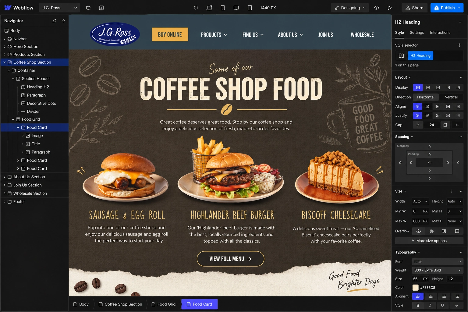
Product Categories
The product architecture separates different parts of the range into recognizable groups.
The bakery produces items including traditional breads, morning goods, cakes, pancakes, scones, butteries, biscuits, pies, sausage rolls, sandwiches and ready meals.
This category-led structure improves browsing and gives the website room to showcase a broad offering without forcing everything into one continuous list.
Location Experience
Location discovery is one of the most important utility features.
Visitors can find J.G. Ross shops and stockists throughout the region, with locations represented visually and supported by an interactive map.
This turns the website into a useful tool for existing customers rather than simply a marketing destination.
Click & Collect / Delivery Journey
The online ordering pathway was kept intentionally simple.
Customers can choose Click & Collect from a local J.G. Ross shop, while Aberdeen customers also have access to delivery through services including Just Eat, Deliveroo and Uber Eats.
Instead of rebuilding complex ordering functionality unnecessarily, the website directs users efficiently toward the appropriate fulfillment option.
Wholesale Experience
J.G. Ross serves both independent businesses and larger retailers, so the wholesale audience required a dedicated path.
The wholesale page introduces the partnership proposition, communicates distribution capability, provides access to a product list and uses existing partner testimonials to build credibility.
This keeps business-to-business information separate from the consumer shopping journey.
Human-Focused Brand Storytelling
The website also brings attention to the people behind the brand.
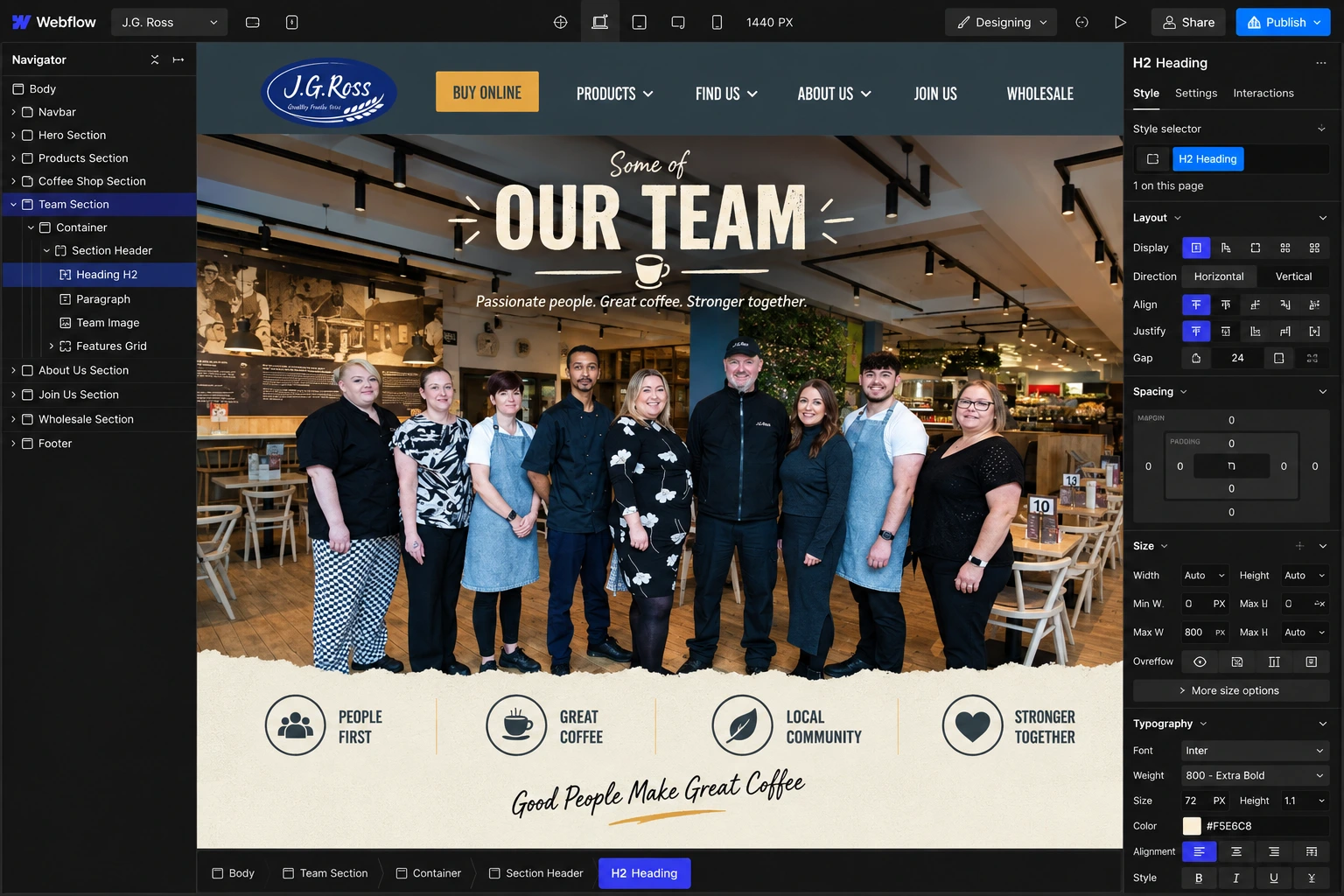
The team experience introduces bakers, packers, drivers, retail employees and customer-service staff, reinforcing the craftsmanship and operational work behind every product.
That human layer prevents the scale of the company from making the brand feel impersonal.
Responsive Design
The responsive system was structured around maintaining strong food imagery and simple navigation across smaller screens.
Key considerations included:
Flexible product layouts
Responsive image treatment
Mobile-friendly navigation
Readable typography
Clear CTA sizing
Touch-friendly location interactions
Simplified content stacking
Accessible contact pathways
The mobile experience keeps product discovery and location-finding straightforward without sacrificing the visual character of the desktop website.
5. Website Architecture
The website architecture separates J.G. Ross's major business functions into clear journeys.
Homepage
Introduces the bakery, core product categories, coffee-shop offering, team, local shops and wholesale proposition.

Products
Provides deeper product discovery across categories such as bakery goods, morning goods and chilled products.
Buy Online
Connects users to Click & Collect and third-party delivery services.
Locations
Helps customers identify nearby J.G. Ross shops and stockists throughout the North-East of Scotland.
Coffee Shops
Provides a dedicated pathway for customers interested in sit-down food, breakfast, coffee and café experiences.
History
Documents the company's journey from the purchase of Premnay Bakery in 1962 through decades of expansion, new production facilities and continued regional growth.
Meet the Team
Introduces the people responsible for production, packing, delivery, retail and customer service.
Wholesale
Provides information for supermarkets, convenience stores, cafés, hotels, restaurants and independent businesses interested in stocking J.G. Ross products.
Careers
Supports recruitment with current vacancies, company culture information and direct application pathways.
Contact
Provides business contact information, key team members and a straightforward enquiry form.
6. Webflow Development
Once the UX structure and visual direction were established, I translated the interface into a responsive Webflow build focused on consistency and maintainability.
The development approach included:
Responsive Webflow implementation
Reusable product sections
Modular content components
Consistent class architecture
Location and stockist layouts
Interactive navigation
Contact form integration
Wholesale enquiry pathways
Careers content structure
Responsive imagery
Hover and transition states
Accessible content hierarchy
SEO-conscious page structure
Image optimization
Performance optimization
Cross-browser testing
Cross-device testing
The modular approach makes it easier to expand products, locations, wholesale information or recruitment content without compromising the existing design system.
7. Design & Development Process
Research → UX Structure → Wireframes → UI Design → Design System → Webflow Development → Responsive Optimization → Testing → Launch
Research
I started by understanding the different sides of the business: traditional bakery production, retail stores, coffee shops, food-to-go, wholesale distribution and recruitment.
UX Structure
I mapped the primary user journeys around a few simple questions:
What does J.G. Ross make? → Where can I buy it? → Can I order online? → What is the story behind the business? → Can my business stock the products?
Wireframes
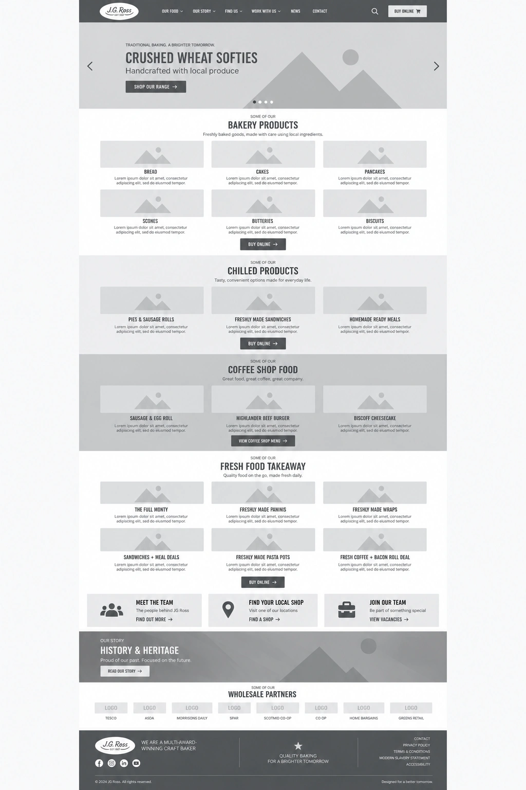
The wireframing stage established page hierarchy, product presentation, location discovery, wholesale CTAs and supporting brand content.
UI Design
The final visual direction combined strong food photography, clear typography, generous spacing and familiar brand elements to balance heritage with a modern browsing experience.
Design System
Reusable styles were established for:
Typography
Buttons
Product cards
Image treatments
Navigation
Content sections
Forms
Location components
CTA sections
Responsive spacing
Webflow Development
The approved layouts were translated into reusable Webflow components with consistent structure across the site.
Responsive Optimization
Each major section was refined for desktop, tablet and mobile, paying particular attention to large photography and product layouts.
Testing
I reviewed navigation, forms, product pathways, location discovery, external ordering links, responsive layouts and overall consistency.
Launch
Final refinements focused on accessibility, SEO structure, asset optimization, responsive behavior and presentation quality.
8. Key Features
Product-led bakery website
Responsive Webflow development
Large product-category experience
Food-focused visual storytelling
Bakery and chilled-food product pages
Interactive store and stockist discovery
Click & Collect pathway
Delivery-service integration
Coffee-shop content
Wholesale partnership experience
Downloadable wholesale product information
Business testimonials
Company-history storytelling
Team profiles
Recruitment and vacancy experience
Contact and enquiry forms
Reusable Webflow components
Mobile-responsive design system
SEO-conscious site architecture
Performance-focused implementation
9. Final Result
The final J.G. Ross website brings together more than six decades of bakery heritage with a cleaner, more useful digital experience.
Customers can quickly explore the product range, discover what is available from the bakery and coffee shops, find their nearest store or stockist, and access online ordering options without unnecessary friction. At the same time, the site provides dedicated pathways for wholesale partners, prospective employees and customers who want to learn more about the people and history behind the company.
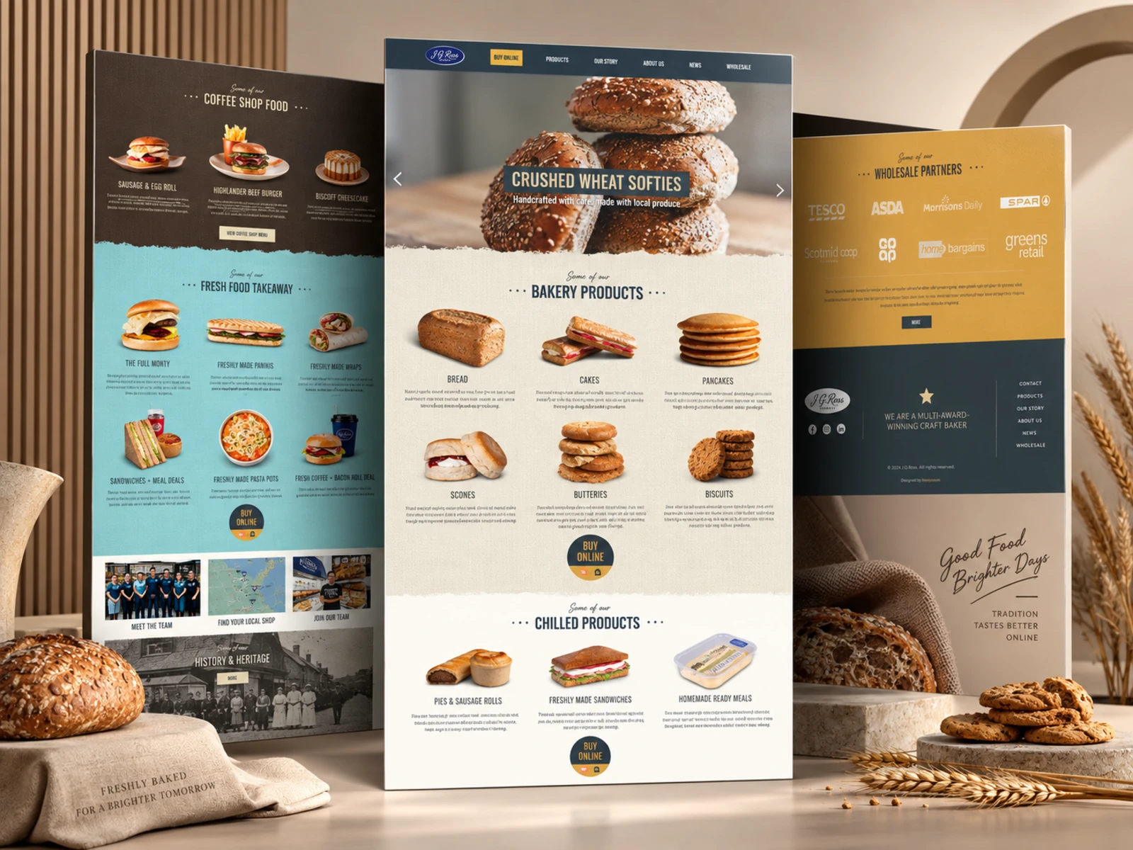
The visual direction keeps the food at the center of the experience while the information architecture handles the complexity of a business operating across manufacturing, retail, hospitality and wholesale.
The result is a warm, product-focused and scalable digital presence that respects J.G. Ross's traditional identity while presenting the brand in a way that feels current, accessible and easy to engage with.
Like this project
Posted Sep 11, 2026
Designed and developed a responsive website for J.G. Ross bakery using Webflow.
Likes
10
Views
3
Clients
J.G. Ross