Looby's Mobile Auto Care Website Design and Development

Victor Adebayo


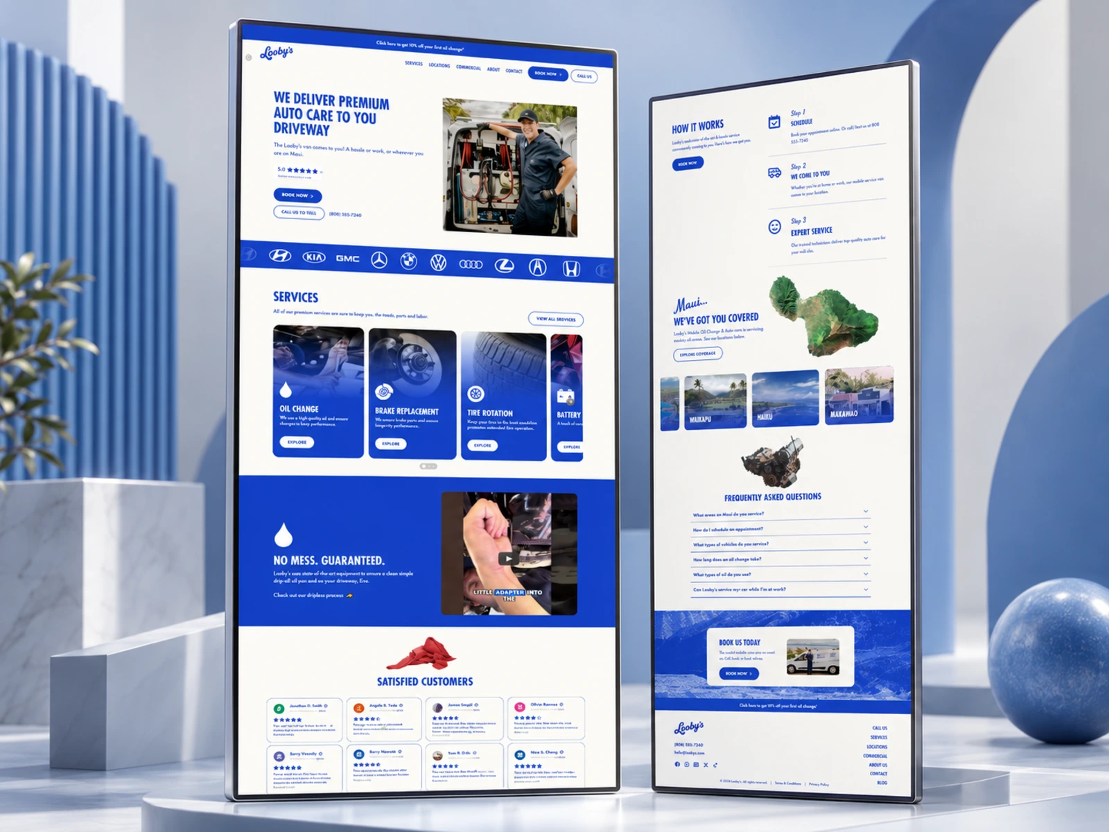
Looby’s — Mobile Auto Care Website
Website Design · UX/UI Design · Responsive Development · Conversion Optimization
Project Type: Automotive / Local Service Business
Primary Objective: Simplify service booking, communicate the convenience of mobile auto care, build customer trust, and generate more appointments
Role: Web Designer & Web Developer
Deliverables: UX/UI Design · Responsive Website Design · Service Pages · Booking Experience · Location Pages · Commercial/Fleet Experience · CMS/Blog Structure · SEO & Performance Optimization
1. Project Overview
Looby’s is a mobile auto-care company that brings vehicle maintenance directly to customers across Maui. Instead of requiring drivers to visit a traditional repair shop and wait for service, Looby’s technicians travel to the customer’s home, workplace, or another suitable location.
The website needed to communicate that convenience immediately while making services, pricing, coverage areas, and booking information easy to understand.
My goal was to create a digital experience that positioned Looby’s as a modern alternative to the traditional auto shop, professional enough to build trust, simple enough to book within minutes, and distinctive enough to reflect the personality of the brand.
The experience also needed to support both individual customers and businesses managing multiple vehicles.
2. The Challenge
The biggest challenge was changing the way users think about vehicle maintenance.
Most customers are familiar with the traditional process:
Drive to the shop → wait → deal with upselling → drive home.
Looby’s offers a different model entirely. Their service comes directly to the customer, so the website needed to explain the concept quickly and remove any uncertainty around how mobile vehicle maintenance works. The brand itself emphasizes effortless service, transparent pricing, convenience, and avoiding the traditional waiting-room experience.
The experience needed to solve several UX problems:
Explain the mobile service concept immediately
Make individual automotive services easy to explore
Give customers a clear path to online booking
Establish trust without making the website feel overly corporate
Communicate the company’s no-mess service process
Show customers exactly how an appointment works
Make coverage areas across Maui easy to understand
Support residential and commercial customers
Reduce uncertainty around vehicle compatibility and service expectations
Create a strong mobile experience for users booking from their phones
The design therefore needed to balance personality, professionalism, convenience, and conversion.
3. Design Strategy
I structured the experience around four principles:
Understand → Trust → Choose → Book
Lead With Convenience
The homepage immediately communicates the main differentiator:
premium auto care delivered directly to the customer’s driveway.
Supporting copy reinforces that Looby’s can provide service while customers are at home or work, followed by direct booking and call/text options.
This means users do not have to scroll through company history before understanding the value of the service.
Make Services Easy to Compare
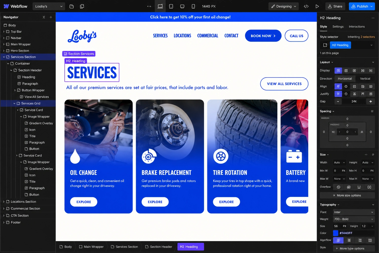
Rather than hiding everything inside a general automotive-services page, the website introduces individual services using clear cards and dedicated pages.
Services include oil changes, brake replacement, tire rotation, battery replacement, wipers, cabin air filters, and engine air filters.
This helps customers immediately identify what they need before moving into booking.

Reduce Perceived Risk
For an automotive service taking place at someone’s home or workplace, trust is important.
I therefore prioritized content around:
Professional technicians
Clear service information
Transparent pricing
Customer feedback
The no-mess process
Frequently asked questions
Service coverage
Direct phone and text access
Looby’s also specifically highlights its equipment and dripless process as part of its promise not to leave oil on customers’ driveways.
Keep Booking Within Reach
The primary conversion action—Book Now—is repeated at natural decision points throughout the experience.
Visitors can also call or text, giving users an alternative conversion path when they would rather speak with someone directly.
4. UX/UI Design
Hero Section
The hero was designed to explain Looby’s business model within seconds.
Instead of leading with generic automotive language, the messaging focuses on the core customer benefit: getting premium auto care without having to leave home or work.
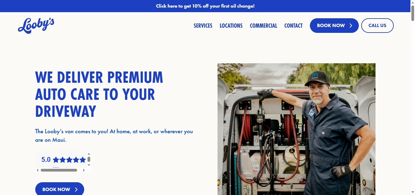
The main actions are kept straightforward:
Book Now
Call or Text
This keeps the opening experience focused on conversion rather than unnecessary information.
Visual Direction
The visual system needed to feel different from a conventional mechanic website.
Rather than relying on dark garages, aggressive automotive graphics, or highly technical visuals, the experience uses real people, vehicles, mobile-service imagery, generous spacing, bold typography, and a more approachable brand personality.
This supports Looby’s positioning as a cleaner, easier and more customer-friendly alternative to the traditional oil-change shop.
Service Cards
Each primary service is presented as a clear reusable component.
Customers can quickly scan the service name, understand its purpose, and move into more detailed information.
The consistency of the cards helps create a predictable browsing experience across a fairly broad range of vehicle-maintenance services.
Dedicated Service Pages
Individual service pages provide more detailed information without overloading the homepage.
For example, the oil-change experience communicates:
Price range
Premium synthetic oil
Oil-filter replacement
Fluid top-off
Tire-pressure checks
Battery-health checks
Booking options
Related services
This allows visitors who need more reassurance to investigate the service before committing to an appointment.
“No Mess” Trust Section
One of the brand’s strongest differentiators is the clean mobile-service process.
I treated this as more than a small feature callout.
The section directly addresses a likely customer concern: Will servicing my vehicle in my driveway create a mess?
By explaining the equipment and showing the process visually, the interface turns a potential objection into a competitive advantage.
How It Works
The customer journey is reduced to three simple steps:
1. Schedule
Book online or contact the company.
2. We Come to You
The mobile van travels to the customer’s location.
3. Expert Service
A technician performs the required vehicle maintenance.
This section is particularly important because the business model is less familiar than visiting an ordinary service center.
Visualizing the process makes the service feel straightforward and predictable.
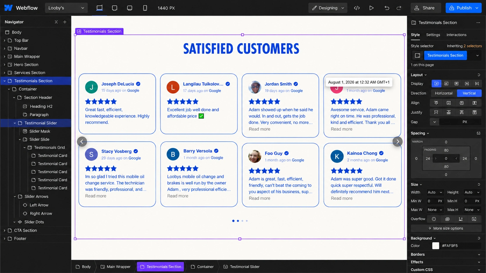
Social Proof
Customer feedback is positioned after users have already learned about the services and key differentiators.
This timing reinforces the brand promise instead of forcing testimonials into the opening section before users understand what the company actually does.
Location Experience
Because Looby’s is a mobile operation, service availability is an important part of the UX.
The website gives users direct access to location information across multiple Maui communities, including Kahului, Wailuku, Waikapu, Kihei, Wailea, Haiku, Paia, Lahaina, and Makawao.
Dedicated location pages also create stronger landing experiences for customers searching for services within specific areas.
FAQ Design
The FAQ handles practical questions that could otherwise prevent a booking.
Topics include:
Service areas
Appointment scheduling
Supported vehicle types
Oil-change duration
Oil type
Servicing a vehicle while the customer is at work
This keeps the primary pages concise while still providing deeper information for customers who need it.
Responsive Experience
A large percentage of local-service customers are likely to discover or book while using their phone, so the responsive experience needed to prioritize action.
I focused on maintaining:
Clear mobile navigation
Readable typography
Large touch-friendly buttons
Simple service cards
Strong CTA visibility
Easy phone/contact access
Clean stacked layouts
Optimized imagery
Simple booking pathways
The goal was to preserve the same conversion journey without forcing mobile visitors through a reduced version of the desktop experience.
5. Website Architecture
The website architecture separates different customer intentions without creating unnecessary complexity.
Homepage
The homepage serves as the primary introduction and conversion experience.
It combines:
Value Proposition → Services → No-Mess Advantage → Customer Trust → How It Works → Service Coverage → FAQs → Booking CTA

Services
A dedicated service directory allows visitors to quickly understand everything Looby’s provides.
Relevant services include:
Oil Change
Brake Replacement
Tire Rotation
Battery Replacement
Wiper Replacement
Cabin Air Filter
Engine Air Filter
Individual Service Pages
Each major service receives its own landing page with more detailed information and direct booking actions.
This makes the experience better for both navigation and search discovery.
Locations
Location-specific pages help customers determine whether mobile service is available in their area and provide locally relevant conversion paths.
Commercial / Fleet Services
The commercial section creates a separate journey for companies managing fleets or looking to offer mobile vehicle maintenance to employees.
The page focuses on reducing vehicle downtime, convenient scheduling, on-site servicing, employee benefits, and commercial inquiries.
Keeping this separate from the consumer journey prevents commercial messaging from complicating the main booking experience.
About
The About page communicates the reason behind the business: replacing inconvenient waiting rooms, sales pressure, and wasted time with an effortless mobile alternative.
This gives the brand personality while reinforcing its customer-first positioning.
Blog
The Loob Report supports the website with educational automotive content, customer-focused advice, service information, and maintenance guidance.
Topics around oil changes, tire rotations, fleet efficiency, and mobile servicing give the company opportunities to educate customers while supporting organic search visibility.
Contact & Booking
Direct contact and online booking are treated as separate but complementary conversion methods.
This gives customers the flexibility to either complete the process independently or speak directly with the business.
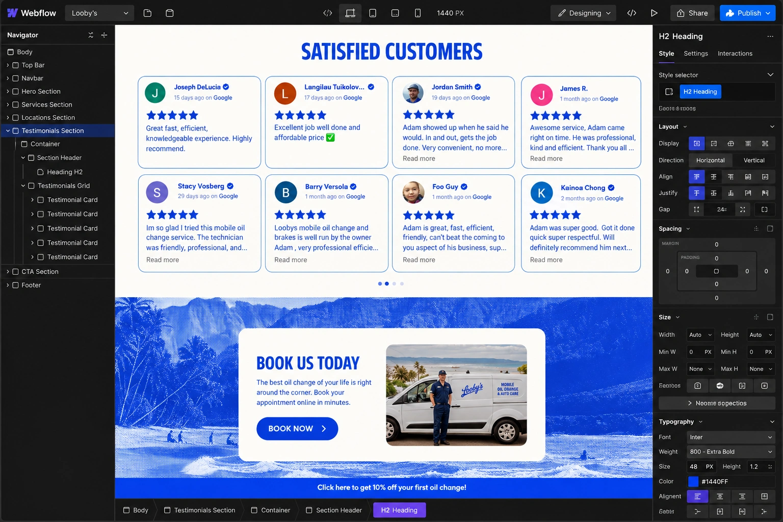
6. Website Development
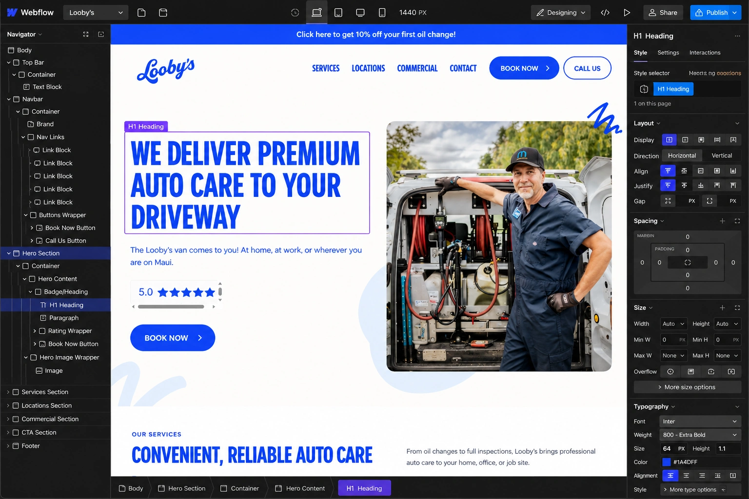
Once the UX structure and visual direction were approved, I translated the system into a responsive website designed for ongoing expansion.
The development focused on both front-end quality and maintainability.
Key considerations included:
Responsive website development
Reusable service components
Dedicated service-page structures
Reusable location-page structures
Commercial-service components
CMS-ready blog architecture
FAQ interactions
Responsive navigation
Online booking integration
Inquiry/contact forms
Click-to-call conversion pathways
Subtle hover and transition effects
Optimized image handling
Structured heading hierarchy
Accessibility-conscious interaction states
SEO-friendly page architecture
Performance optimization
Cross-device testing
Cross-browser testing
The reusable structure makes it easier to add future services, locations, or educational content while keeping the experience consistent.
7. Design & Development Process
Research → UX Structure → Wireframes → UI Design → Design System → Development → Responsive Optimization → Testing → Launch
Research
I started by understanding the mobile auto-care business model, customer concerns, service offerings, booking requirements, local coverage, and commercial use cases.
The key question was:
What does a customer need to understand before trusting someone to service their vehicle at their home or workplace?
UX Structure
I organized the content around a natural customer decision journey:
What is Looby’s? → What can they do for my car? → Why should I trust them? → How does it work? → Do they service my area? → How do I book?
This became the foundation for the page hierarchy.
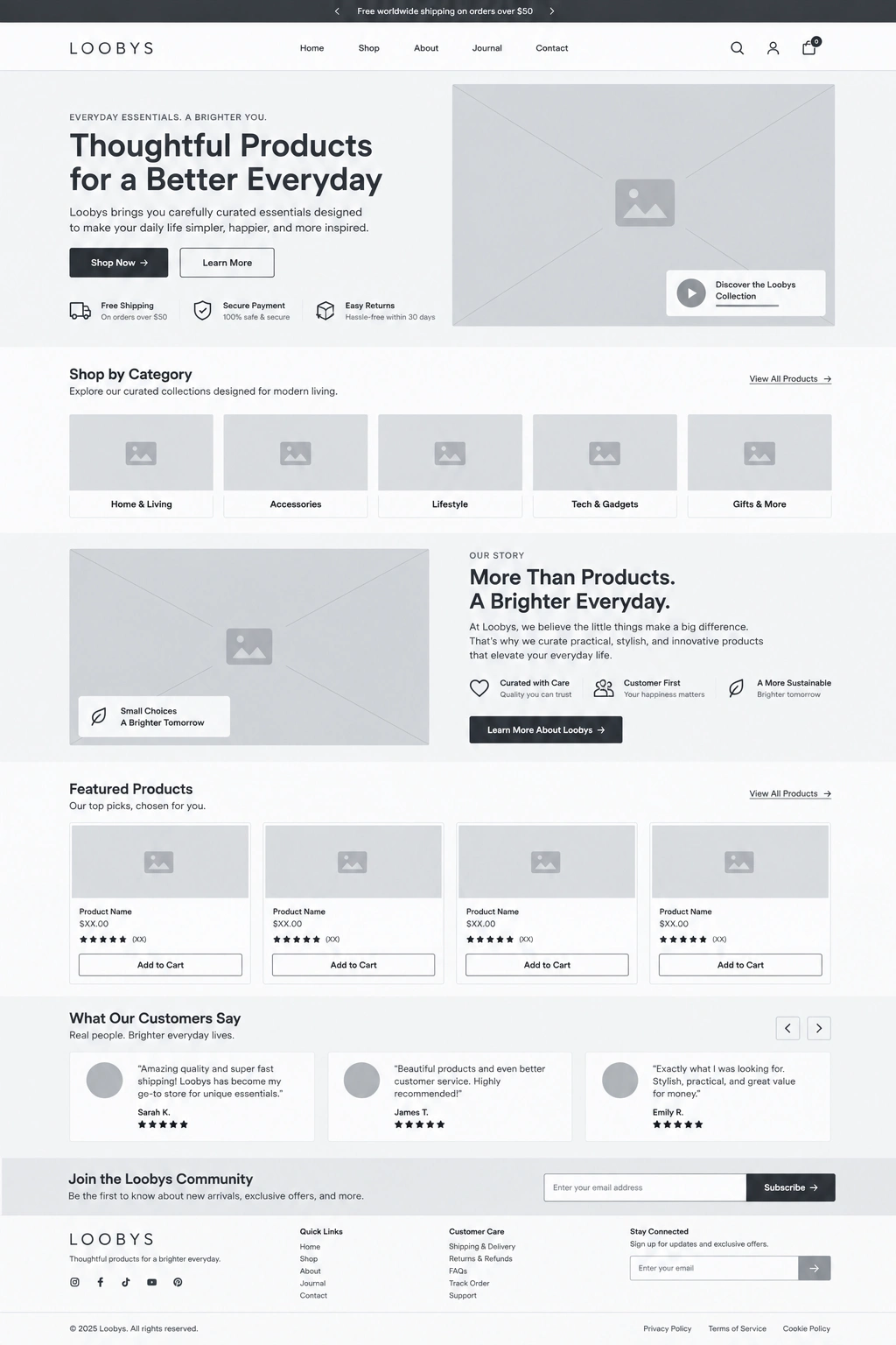
Wireframes
The wireframes established:
Hero positioning
Service hierarchy
Booking CTA placement
Trust sections
Process explanation
Location discovery
FAQs
Commercial pathways
Final conversion sections
This allowed the experience to be validated before detailed styling was introduced.
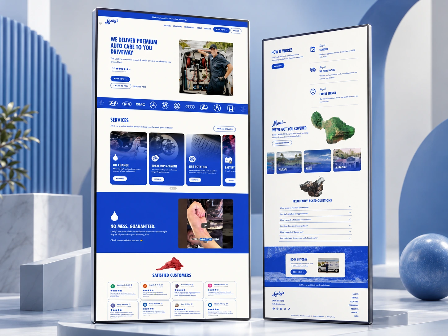
UI Design
I translated the UX into a clean, personality-driven automotive interface.
The visual direction deliberately avoids the heavy, industrial look commonly associated with mechanic websites.
Instead, the interface presents Looby’s as modern, convenient, clean and human.
Design System
Reusable rules were created for:
Typography
Buttons
Service cards
Navigation
Forms
Content containers
Section spacing
FAQs
Location components
Blog cards
Commercial sections
Responsive behavior
This maintains consistency across both marketing and content-driven pages.
Development
The approved layouts were translated into reusable components and responsive page structures.
Particular attention was given to keeping booking CTAs accessible while still allowing visitors to explore the brand and services naturally.
Responsive Optimization
Each section was adjusted independently for desktop, tablet, and mobile.
This included refining text sizes, card layouts, image positioning, navigation behavior, section spacing, and CTA placement.
Testing
Before launch, I reviewed:
Navigation
Booking links
Forms
Contact actions
Service pages
Location pages
Responsive behavior
FAQ interactions
Cross-browser consistency
Content hierarchy
Launch
The final stage focused on polishing the customer journey, checking responsive details, optimizing assets, and making sure every major page had a clear conversion path.
8. Key Features
Conversion-focused automotive website
Mobile auto-care positioning
Online appointment booking
Call and text conversion pathways
Dedicated service pages
Transparent service presentation
Responsive service-card system
Interactive “How It Works” journey
No-mess service education
Customer testimonials
Location-specific pages
Maui service coverage experience
Commercial fleet-services page
Employee-maintenance service pathway
FAQ experience
Automotive education blog
CMS-ready content structure
Reusable components
Responsive navigation
SEO-conscious architecture
Mobile-first optimization
Performance-focused implementation
9. Final Result
The final Looby’s website transforms a simple automotive service into a distinct and memorable digital experience built around convenience.
Instead of presenting the company as another mechanic, the website clearly communicates what makes the business different: customers can get essential vehicle maintenance completed at home or at work without spending part of their day sitting in a service center.

Clear service pages help customers understand what is available, while the three-step process removes uncertainty around how mobile servicing works. Location pages answer whether Looby’s can reach the customer, and commercial content gives fleet operators a dedicated path without complicating the consumer experience.
The combination of strong brand personality, straightforward UX, service transparency, social proof, local relevance and repeated booking pathways creates an experience designed to move visitors naturally from discovering the business to scheduling their vehicle service.
The result is a scalable local-service website that not only explains Looby’s offering, but makes the convenience of the business model feel obvious—and makes booking the next logical step.
Like this project
Posted Sep 9, 2026
Designed a responsive website for Looby's to simplify booking and enhance user experience for mobile auto care.