Aquila Electrical: Webflow Website for Trust & Quotes

Victor Adebayo


Aquila Electrical — Electrical Services Website
Web Design · UX/UI Design · Webflow Development · Local Lead Generation
Project Type: Electrical Services / Residential / Commercial / Industrial
Primary Objective: Build trust, organize a broad service offering, and make it easier for Adelaide customers to request quotes and contact the team
Platform: Webflow
Role: Web Designer & Webflow Developer
Deliverables: UX/UI Design · Responsive Website Design · Webflow Development · Service Pages · Project Showcases · Quote Forms · FAQ · Local SEO Structure · Custom Interactions · Performance Optimization
1. Project Overview
Aquila Electrical is an Adelaide-based electrical company providing services for homes, businesses, and industrial environments.
The company handles everything from small household repairs and appliance installations to commercial electrical systems, switchboard upgrades, pool electrical work, EV chargers, industrial motors, data cabling, air conditioning, and safety upgrades.
The goal of the project was to create a Webflow website that could communicate the full scope of the business without making the experience feel complicated.
I wanted visitors to quickly understand:
What Aquila does → Whether they handle my type of job → Why I can trust them → How to request a quote
The result is a service-led website built around clarity, trust, and fast enquiry conversion.
2. The Challenge
Electrical services can be difficult to present clearly because the same business may serve very different customers.
A homeowner replacing a power point has completely different concerns from a factory dealing with a motor breakdown.
Aquila serves:
Residential customers
Commercial businesses
Offices
Retail spaces
Industrial facilities
Pool owners and builders
EV owners
Property managers
The website therefore needed to communicate a wide range of services without overwhelming visitors.
The main challenges were:
Organizing a large number of electrical services
Separating residential, commercial, and industrial needs
Building immediate trust around safety and workmanship
Making urgent electrical help easy to access
Communicating transparent pricing and free quotes
Showing recent work instead of relying only on service descriptions
Making service pages useful for local search
Keeping phone and quote pathways visible
Explaining technical services in simple language
Creating a strong mobile experience
The central design problem was making Aquila feel capable enough for complex projects while still approachable enough for everyday household jobs.
3. Design Strategy
I structured the experience around four priorities:
Trust → Service Discovery → Proof → Enquiry
Lead With Local Credibility
The homepage immediately positions Aquila as an Adelaide electrical team trusted across residential, commercial, and industrial work.
Credibility is reinforced through business milestones, completed jobs, customer reviews, service guarantees, and local expertise.
Rather than asking visitors to take the company’s quality at face value, the website builds trust throughout the journey.
Make Services Easy to Understand
Aquila offers a broad range of services, so I avoided presenting everything as one large list.
The experience separates common needs such as:
Lighting
Air Conditioning
Power Points & Switches
Switchboard Upgrades
Pools
Appliances
Smoke Detectors
NBN / Data / AV
Safety Switches
EV Chargers
Commercial Electrical
Industrial Electrical
This makes it easier for visitors to identify their problem and move directly into the most relevant information.
Translate Technical Work Into Customer Benefits
Electrical terminology can quickly become difficult for everyday customers.
Instead of focusing only on technical specifications, I structured the content around practical outcomes.
For example:
Switchboard Upgrades
Safer circuits, better protection, and preparation for solar, batteries, and EV charging.
EV Chargers
Safe, convenient home or business charging with the correct electrical setup.
Pool Electrical
Reliable power for pumps, lighting, heat pumps, chlorinators, and automation.
Commercial Maintenance
Less downtime and safer day-to-day business operations.
This keeps the content useful even for visitors who do not understand electrical systems.
Keep the Quote Path Visible
The main conversion is simple:
Get a Quote
Rather than hiding the form on one contact page, quote and call actions appear throughout the experience.
This allows someone who already knows what they need to take action immediately, while other visitors can continue exploring services first.
4. UX/UI Design
Hero Section
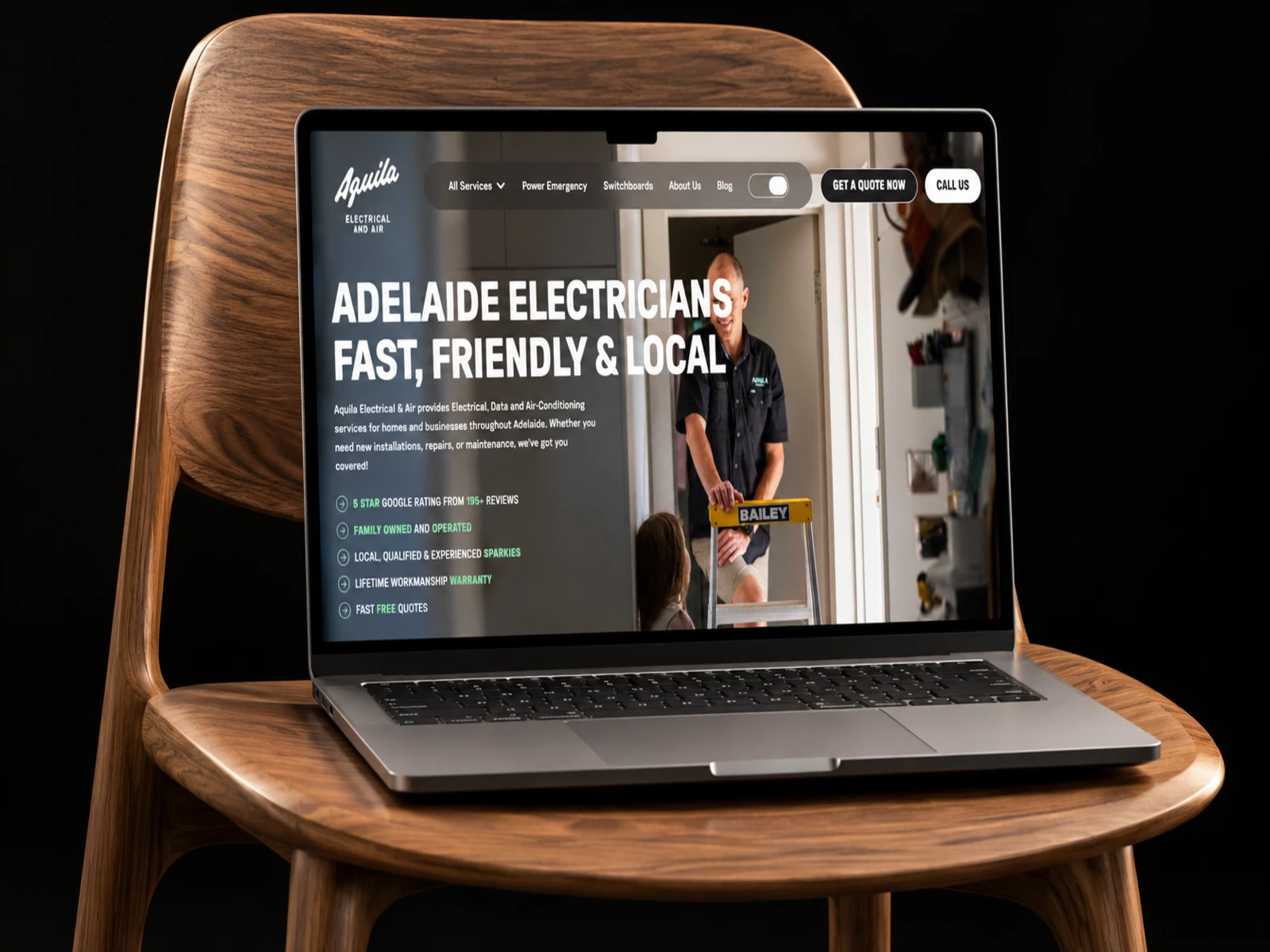
The hero was designed around Aquila’s local positioning and broad capability.
The opening message immediately communicates that the team handles electrical work across Adelaide for homes and businesses.
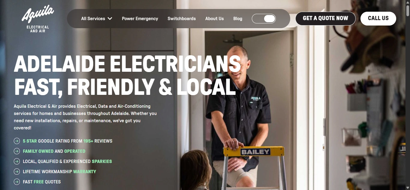
Primary CTAs give users two clear actions:
Get a Quote
and
Call Us
This is particularly important for electrical work, where some users may need help urgently and do not want to complete a long browsing journey.
Visual Direction
The visual system needed to feel professional, reliable, and technical without becoming cold.
I focused on:
Strong project photography
Clean typography
Clear service cards
Structured content blocks
High-contrast CTAs
Generous spacing
Simple iconography
Real installation imagery
The website feels like a modern trade business rather than a generic contractor template.
Typography System
I created a clear hierarchy for:
Hero statements
Service names
Service benefits
Project captions
FAQs
Reviews
Calls-to-action
Contact details
Large headings help visitors quickly understand each section, while supporting copy stays concise enough for mobile scanning.
Service Discovery
The service architecture is one of the most important parts of the website.
Visitors can quickly explore services relevant to their problem rather than trying to understand a generic “electrical solutions” page.
Each service page follows a consistent structure:
Service Overview → What We Can Do → Common Problems → Recent Projects → Contact CTA
This makes the website feel predictable and easier to navigate.
Residential Experience
Residential customers often need smaller but urgent services.
The website supports common household needs such as:
Lighting installations
New power points
Switch replacements
Switchboard upgrades
Appliances
Smoke alarms
Safety switches
Air conditioning
Data and AV
EV charging
Pool equipment
The messaging stays simple and benefit-led so homeowners understand what Aquila can help with without needing technical knowledge.
Commercial Experience
Commercial clients care about reliability, compliance, and avoiding interruptions.
The commercial service pathway focuses on:
New installations
Electrical maintenance
Lighting
Data points
Video conferencing
Switchboards
Workplace electrical systems
The messaging emphasizes keeping workplaces safe and operational while reducing unnecessary downtime.
Industrial Experience
Industrial customers have higher-risk and more complex requirements.
I gave this audience its own dedicated pathway covering:
Breakdowns and faults
New machinery installations
Motors
VSDs
3-phase power
Data infrastructure
Industrial maintenance
The website also emphasizes fast response because downtime directly affects business operations.
This makes the industrial experience feel appropriately specialized rather than simply another service card.
EV Charger Experience
EV charging is a growing service category, so it needed a modern dedicated page.
The page helps users understand:
Residential charging
Commercial installations
Electrical system requirements
Charger selection
Installation
Safety and compliance
It also shows examples from brands such as Tesla, Zappi, Mercedes, and other charger systems.
This turns a newer electrical service into something customers can understand visually.
Pool Electrical Experience
Pool electrical work is one of Aquila’s specialist services.
The website explains work around:
Pool pumps
Chlorinators
Lighting
Heat pumps
Power supplies
Automation
Earth bonding
Showing real project examples helps communicate that this is a genuine area of expertise rather than simply another item in the service list.
Switchboard Safety
Switchboard upgrades are positioned around safety first.
Instead of only discussing electrical components, the page explains why older switchboards can create risk and how modern circuit protection can improve household safety.
The content also connects switchboard upgrades to future requirements such as:
Solar
Battery systems
EV chargers
This helps customers understand why an upgrade may be necessary beyond simply replacing old equipment.
Recent Projects
Each service page includes recent project imagery.
This was an important UX decision.
Instead of only telling visitors that Aquila installs EV chargers, repairs motors, upgrades switchboards, or works on pool equipment, the website shows actual examples.
That creates visual proof of capability.
Trust & Social Proof
The site uses several trust signals throughout the experience:
Local experience
Thousands of completed jobs
Customer reviews
Transparent quotes
Workmanship guarantees
Licensed electricians
Safety-first messaging
Preferred supplier/partner relationships
The homepage also highlights a lifetime workmanship guarantee and free, no-obligation quotes.
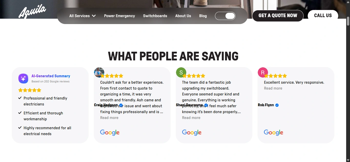
These details help reduce the uncertainty customers naturally feel when choosing a trade professional.
FAQ Experience
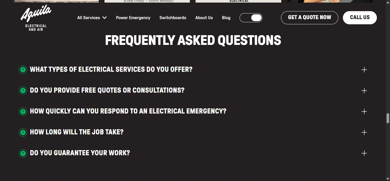
The FAQ answers common questions before someone contacts the business.
Topics include:
Services offered
Free quotes
Emergency response
Job duration
Work guarantees
Keeping these answers visible helps customers make a decision faster without requiring a phone call for every small question.
Quote Form
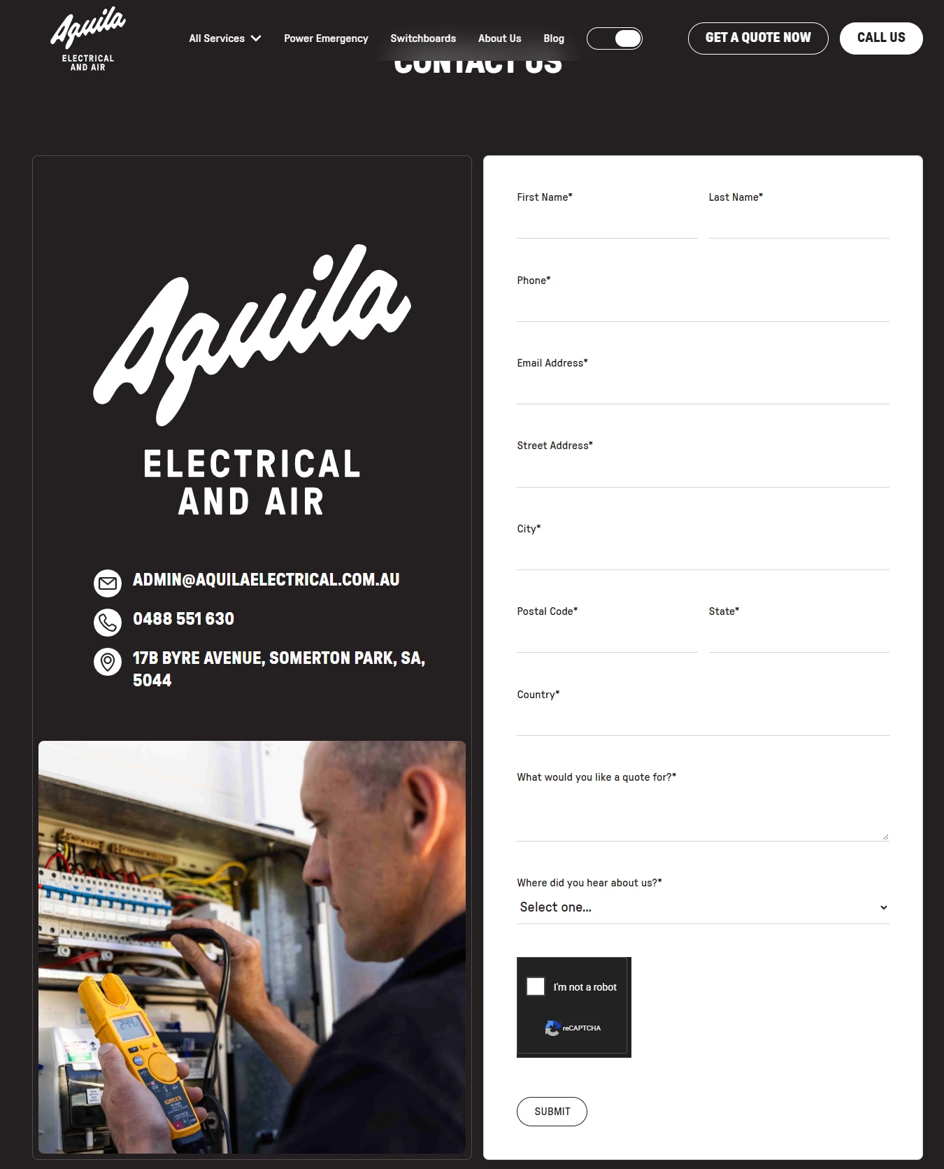
The quote form collects useful job information including:
Name
Phone
Email
Address
Suburb
Postcode
State
Type of work required
Referral source
This gives Aquila enough information to understand the enquiry before following up.
The form is detailed enough to qualify the lead without becoming unnecessarily complicated.
Responsive Experience
Mobile usability was a major priority because many electrical-service searches happen when someone has an immediate problem.
I optimized:
Navigation
Phone actions
Quote buttons
Service cards
Project images
FAQs
Contact forms
Trust signals
Long service content
CTA placement
The mobile experience makes calling or requesting a quote easy without forcing visitors through the entire site first.
5. Website Architecture
The website architecture was built around individual service intent.
Homepage
The homepage acts as the main discovery and conversion page.
The experience moves through:

Brand Positioning → Services → Residential / Commercial / Industrial → Why Choose Aquila → FAQ → Quote CTA
Services
Provides an overview of the full electrical offering.
Appliance Installations & Repairs
Covers ovens, induction cooktops, rangehoods, hot-water systems, faults, and appliance repairs.
Commercial Electrical
Focuses on workplace installations, maintenance, data infrastructure, lighting, and business continuity.
Industrial Electrical
Supports factories, warehouses, motors, machinery, breakdowns, VSDs, and industrial data requirements.
Switchboard Upgrades
Explains circuit protection, safety switches, electrical upgrades, and preparation for future solar, battery, and EV requirements.
EV Chargers
Provides a dedicated experience for residential and commercial charging installations.
Pool Electrical
Covers pool lighting, pumps, heat pumps, chlorinators, power, automation, and earth bonding.
Power Points & Switches
Supports new outlets, USB power points, modern replacements, and household electrical upgrades.
Additional Services
Other service pathways include:
Lighting
Air Conditioning
Smoke Detectors
Safety Switches
NBN / Data / AV
These give customers direct routes to the service most relevant to their needs.
Blog / Electrical Advice
The website also supports educational content around electrical repairs, safety, and common household or commercial concerns.
This creates opportunities for local organic search while helping customers understand electrical issues before contacting the team.
Contact / Quote
The contact page combines:
Call option
Quote form
Address
Email
Customer testimonial
Final CTA
This gives visitors several ways to begin the conversation.
6. Webflow Development
Once the UX structure and visual direction were established, I translated the design into a responsive Webflow build.
The development focused on creating a reusable service architecture because Aquila has a large number of individual service pages.
Key development work included:
Responsive Webflow development
Reusable service templates
Structured service components
Recent-project components
CMS-ready project content
Blog CMS
Responsive navigation
Quote form integration
Contact forms
Click-to-call functionality
FAQ interactions
Testimonial components
Reusable CTA sections
Custom hover states
Scroll interactions
Responsive imagery
Clean class structure
Semantic heading hierarchy
Local SEO structure
Meta titles and descriptions
Accessibility-conscious form states
Image optimization
Performance optimization
Cross-browser testing
Cross-device testing
The modular Webflow structure makes it easier to add future services, projects, articles, and promotional pages while maintaining visual consistency.
7. Design & Development Process
Research → UX Structure → Wireframes → UI Design → Design System → Webflow Development → Service Architecture → Responsive Optimization → Testing → Launch
Research
I started by understanding the different customers Aquila serves and the concerns each audience brings to the website.
A homeowner may care most about:
Safety → Cost → Reliability
A business may care about:
Compliance → Downtime → Productivity
An industrial client may care about:
Urgency → Technical capability → Operational continuity
That difference shaped the website structure.
UX Structure
I mapped the main journey around:
Do you handle my job? → Can I trust you? → Have you done this before? → What happens next? → How do I get a quote?
This became the foundation of the website.
Wireframes
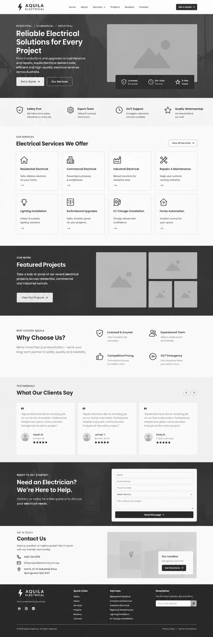
The wireframing stage established:
Hero
Trust indicators
Service grid
Customer-type sections
Recent projects
Benefits
FAQs
Quote CTAs
The priority was making service discovery easy before introducing detailed visual styling.
UI Design
The wireframes were developed into a modern trade-service interface.
I avoided making the website feel overly industrial.
Instead, clean typography, strong project photography, structured cards, and generous spacing create a more polished customer experience.
Design System
Reusable styles were created for:
Typography
Colors
Buttons
Service cards
Project cards
Testimonials
FAQs
Forms
Navigation
CTA sections
Responsive spacing
This gives the site consistency across a large number of service pages.
Webflow Development
The approved interface was translated into modular Webflow components.
The development structure makes similar service pages easy to maintain while still allowing each service to have its own content and projects.
Service Architecture
Each service follows a consistent layout so visitors quickly learn how to navigate the website.
The structure includes:
Intro → Capabilities → Recent Projects → Contact
This predictability helps reduce friction as visitors compare multiple services.
Responsive Optimization
Every important component was reviewed across desktop, tablet, and mobile.
Special attention was given to:
Service grids
Recent-project imagery
Quote forms
Phone CTAs
FAQs
Industrial content
Long service explanations
This keeps the site easy to use even when customers are searching from their phones.
Testing
Before launch, I reviewed:
Navigation
Quote forms
Phone links
Service CTAs
Service pages
Project images
FAQs
Blog content
Responsive layouts
Browser compatibility
Launch
The final stage focused on usability, local SEO, performance, responsive consistency, accessibility, and making sure every major service page had a clear route toward enquiry.
8. Key Features
Custom Webflow electrical website
Residential electrical services
Commercial electrical services
Industrial electrical services
Appliance installations and repairs
Lighting services
Air conditioning
Power points and switches
Switchboard upgrades
EV charger installation
Pool electrical services
Smoke detector services
Safety switch services
NBN / Data / AV
Recent project showcases
Free quote pathway
Emergency contact messaging
Customer testimonials
Interactive FAQs
Blog and electrical advice
Click-to-call functionality
Reusable Webflow components
Service templates
Responsive navigation
Local SEO structure
Custom interactions
Accessibility considerations
Performance optimization
Cross-device responsive design
9. Final Result
The final Aquila Electrical website turns a broad electrical-service offering into a clear, professional, and easy-to-navigate customer experience.
Visitors can quickly identify the service they need, understand how Aquila can help, review recent work, see the company’s experience, and move directly toward requesting a free quote or making a phone call.
The website also gives Aquila room to communicate the scale of its capabilities.
A homeowner looking for a new power point sees a business that still feels approachable, while a commercial or industrial customer can see enough technical depth to trust the company with larger projects.
Real project imagery, customer reviews, clear guarantees, transparent quote messaging, and dedicated service pages all work together to reduce uncertainty.
The Webflow build provides a scalable structure for future services, project content, electrical advice, and local search pages without sacrificing design consistency.
The result is a modern, trust-focused Webflow website that positions Aquila Electrical as a reliable Adelaide electrical partner, from everyday household jobs to complex commercial and industrial work, while giving every visitor a clear path from problem to quote.
Like this project
Posted Oct 23, 2026
A trust-focused Webflow website for Aquila Electrical that organizes residential, commercial, and industrial services into clear paths toward a quote or call.