Most healthcare apps try to feel “advanced.” This one tries ...

David Motilayo

Most healthcare apps try to feel “advanced.”
This one tries to feel calm.
When someone opens this screen, they’re not exploring.
They’re checking.
They’re confirming.
They’re making sure nothing went wrong.
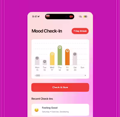
So the design leads with reassurance:
• Your appointment is set
• Here’s the time
• Here’s what’s next
No urgency.
No noise.
No pressure to “do more.”
In healthcare UX, calm isn’t a nice-to-have.
It is the feature.
Like this project
Posted Jan 2, 2026
Most healthcare apps try to feel “advanced.” This one tries to feel calm. When someone opens this screen, they’re not exploring. They’re checking. They’...
Likes
0
Views
0