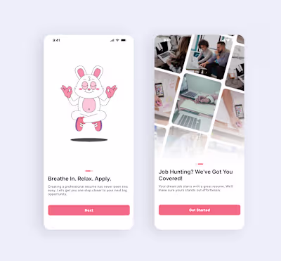
When I first saw the original homepage, it wasn’t bad. It wo...

David Motilayo

When I first saw the original homepage, it wasn’t bad.
It worked.
But for a wellness app, working isn’t enough.
The before design treated every feature the same.
Breathing, mood check-ins, journaling, support,everything competed for attention.
For someone opening the app feeling anxious or overwhelmed, that meant one thing: too many decisions, too fast.
The redesign started with a simple question:
What should a user feel the moment they open this app?
Good UX doesn’t draw attention to itself.
It simply helps users move forward, effortlessly.
Like this project
Posted Dec 30, 2025
When I first saw the original homepage, it wasn’t bad. It worked. But for a wellness app, working isn’t enough. The before design treated every feature th...
Likes
0
Views
0
Tags