David Motilayo
I design responsive websites and applications
Profile in progress
David is building their profile!
Sometimes, ideas don’t come from design sessions.
They come from scrolling.
I was on Facebook this morning when I saw a video of a penguin that had left its colony and was moving alone.
I scrolled past it… then saw another. And another.
At some point, it stopped feeling random and started feeling like a pattern.
That’s when a question hit me:
What if there was a way to respond to moments like this, instead of just consuming them?
That curiosity is what led me to design this system.
Not to make something flashy, but to explore how structure and intention can turn observation into action.
Design, for me, starts with noticing.
0
1
When we talk about onboarding, we often act like there’s one “right” way to do it.
But every product tells a different story.
One user needs reassurance; a calm breath before taking the first step.
Another needs clarity; a sense of progress, structure, and direction.
Another just needs a trigger; a simple moment that says, start here.
That’s why onboarding isn’t about copying patterns.
It’s about understanding the emotional state of the user before they even tap the first button.
Same screens.
Different intentions.
Different emotional entry points.
Good UX doesn’t force users into one feeling.
It meets them where they already are, and gently moves them forward.
2
16
One thing I’ve learned as a UI/UX designer is that we all start from the same place.
We’re taught that colors carry meaning;
red is dangerous, green is safe, pink is calm.
And that foundation matters.
But at some point, following those rules too literally starts to limit how you think.
I once heard, “A red button here would make me feel like I did something wrong.”
And I understood it, because that’s exactly how many of us are trained to read color early on.
But design doesn’t live in isolation.
A color that feels intimidating in one system can feel natural in another.
That’s the shift that comes with growth.
You stop asking, “What does this mean universally?”
And start asking, “What does this mean here?”
That’s when UX becomes intentional.
11
19
39
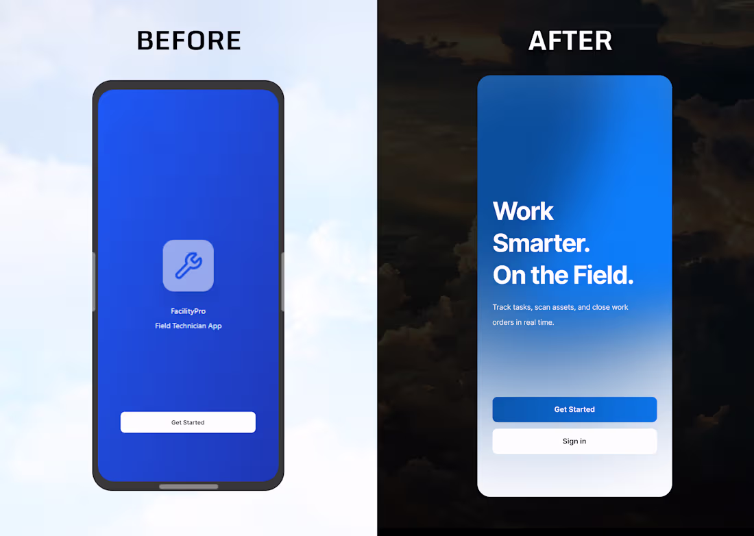
Most design conversations miss the real problem.
It’s not that “good-looking designs have bad UX.”
It’s that many screens don’t respect the moment the user is in.
This screen wasn’t redesigned to look smarter.
It was redesigned to behave better.
Nothing here is flashy.
But everything here is intentional.
This is the kind of UX you don’t notice immediately, because it’s not trying to prove anything.
It just makes the product feel easier to trust.
And easier to return to.
1
5
22
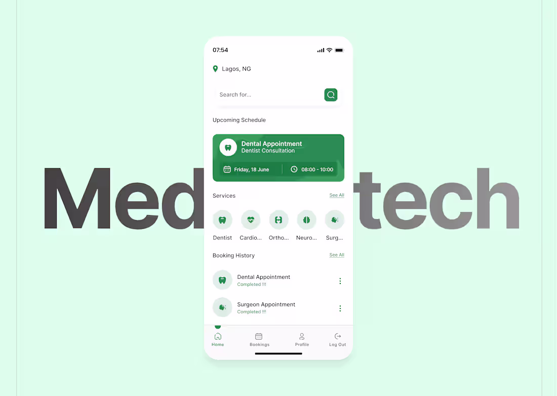
Most healthcare apps try to feel “advanced.”
This one tries to feel calm.
When someone opens this screen, they’re not exploring.
They’re checking.
They’re confirming.
They’re making sure nothing went wrong.
So the design leads with reassurance:
• Your appointment is set
• Here’s the time
• Here’s what’s next
No urgency.
No noise.
No pressure to “do more.”
In healthcare UX, calm isn’t a nice-to-have.
It is the feature.
2
1
28
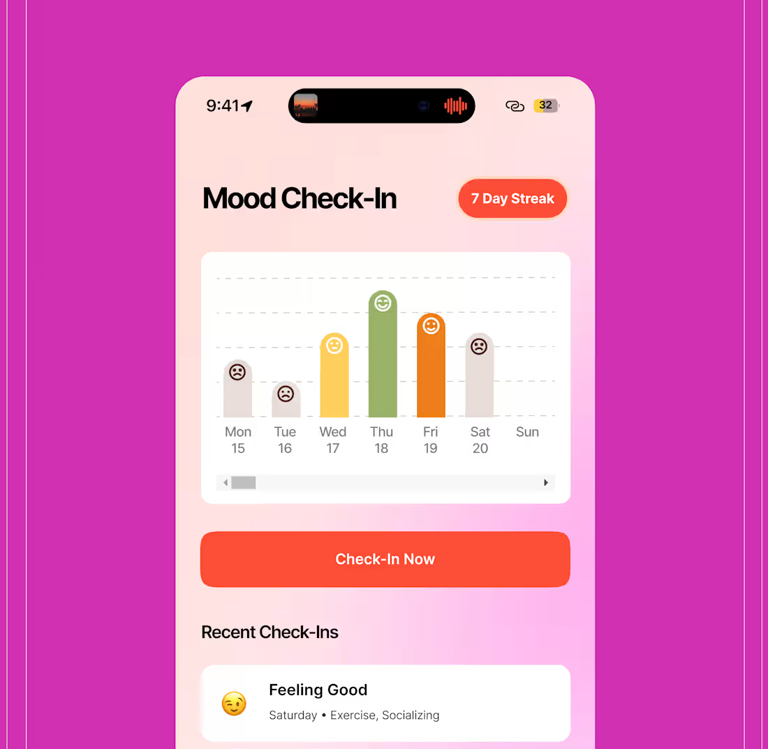
Most wellness apps ask how you feel, then do nothing with the answer.
That was my concern with the original Mood Check-In: it worked, but felt mechanical.
Tap a mood. Log it. Exit.
In the redesign, the goal was to slow users down just enough to reflect, not just report.
Instead of isolated entries, the experience highlights patterns, streaks, and emotional progress over time.
The shift was intentional:
From logging emotions → to understanding them
From static lists → to visual feedback
From checking in → to building awareness
For users, reflection feels natural, not forced.
For the product, it builds consistency, trust, and long-term engagement.
These few screens capture the core idea:
Good UX doesn’t just collect data, it helps people make sense of it.
1
21
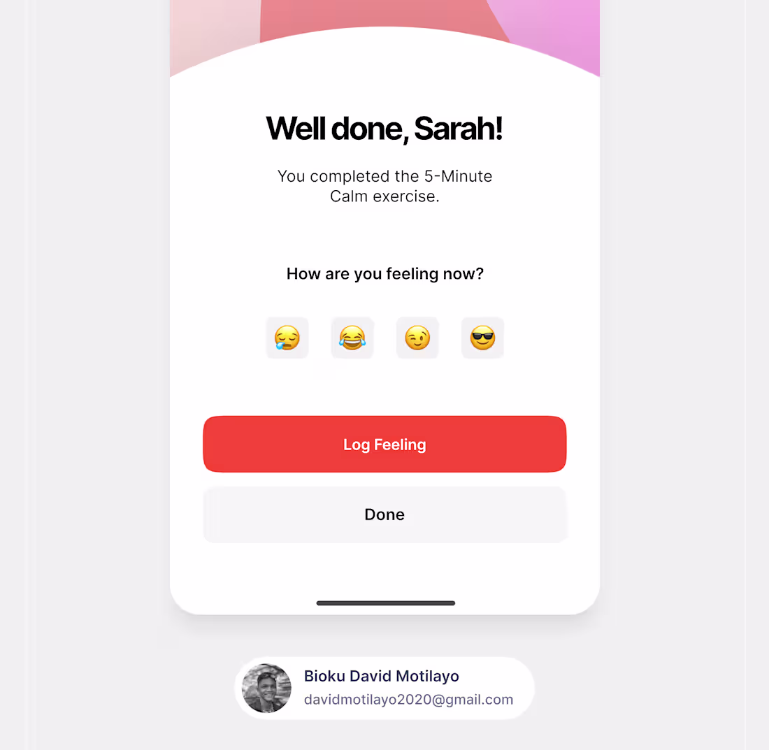
I didn’t redesign this screen to impress anyone.
I redesigned it because the old one rushed the user.
You finish a calming exercise and the interface immediately pushes you forward.
No pause.
No acknowledgment.
No moment to land.
So I shifted the question from
“What should the user do next?”
to
“What is the user feeling right now?”
That change reshaped everything.
Softer visuals.
A more affirming message.
Actions that feel optional, not forced.
This is the kind of UX people rarely notice.
Because when it works, it doesn’t demand attention.
It feels like understanding.
It builds trust.
And it creates experiences people come back to.
Good UX knows when not to rush.
0
20
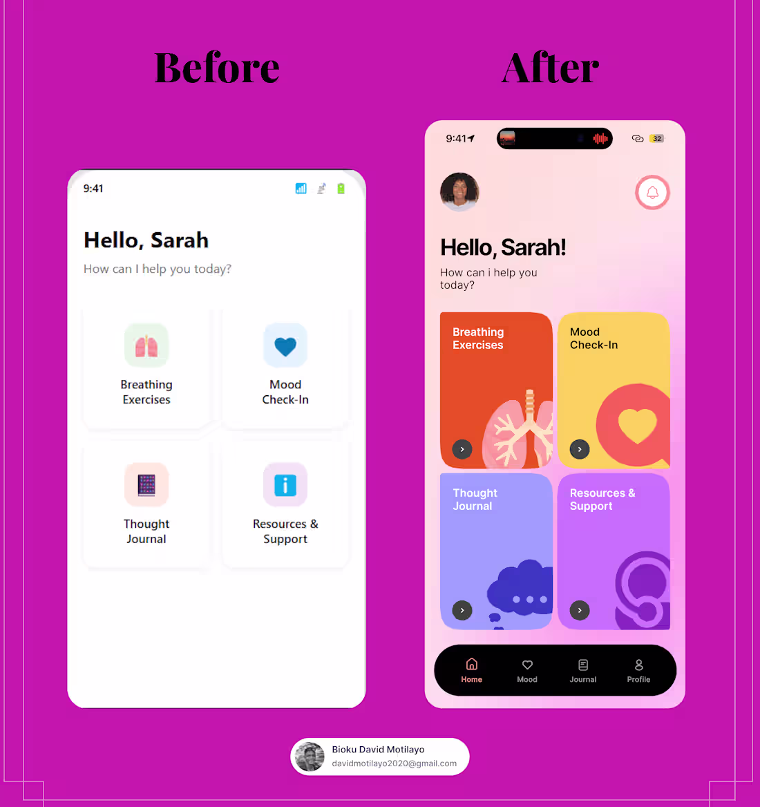
When I first saw the original homepage, it wasn’t bad.
It worked.
But for a wellness app, working isn’t enough.
The before design treated every feature the same.
Breathing, mood check-ins, journaling, support,everything competed for attention.
For someone opening the app feeling anxious or overwhelmed, that meant one thing: too many decisions, too fast.
The redesign started with a simple question:
What should a user feel the moment they open this app?
Good UX doesn’t draw attention to itself.
It simply helps users move forward, effortlessly.
18
26
97
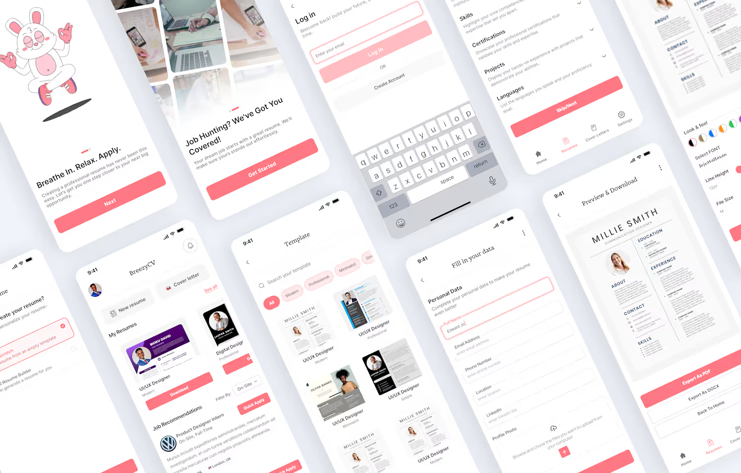
BreezyCV – AI-Powered Resume Builder
0
0
Washon – Modern Laundry Service Website Redesign
0
0
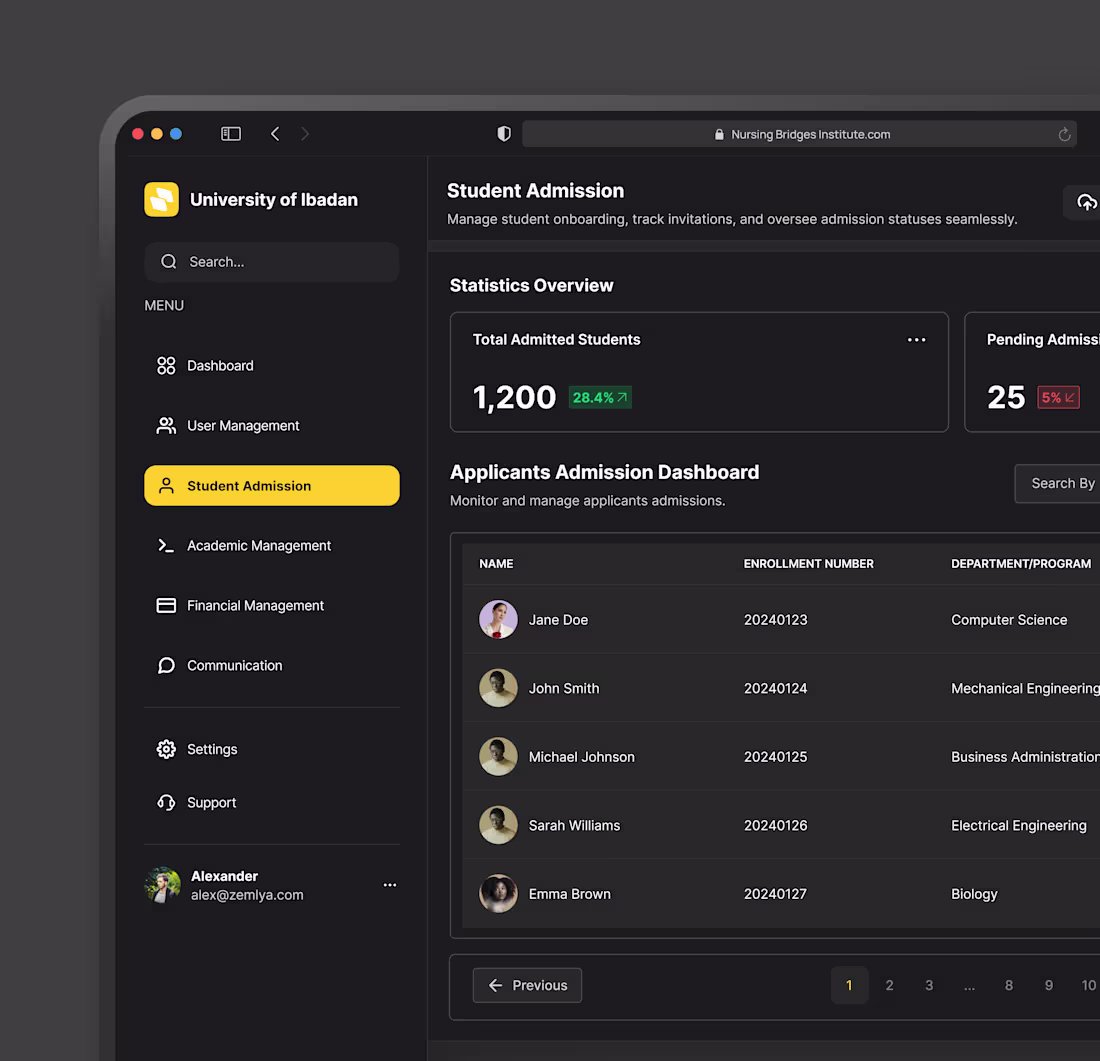
Institution Dashboard UI Design
0
0