Performance-Focused Landing Page for Data Report
Diana Fabianczuk
PROJECT OVERVIEW
Project: Report landing page for Instantly
Goal: Transform complex report content into a clear, conversion-focused landing page. (not heavy visuals)
Instantly needed a landing page to present a data-heavy report in a way that is:
– easy to scan
– aligned with their new brand
– focused on performance rather than decoration
The challenge was not visual complexity, but structuring and prioritizing information.
💡 This project was more about thinking than styling.
Approach:
2 variations: Low-fi mockups first (one plain text-focused, one with styled content boxes for contrast)
1 variation of High-fi mockup
Role: UX/UI Designer
Note: Charts and data visualizations were created by another designer.
CHALLENGE
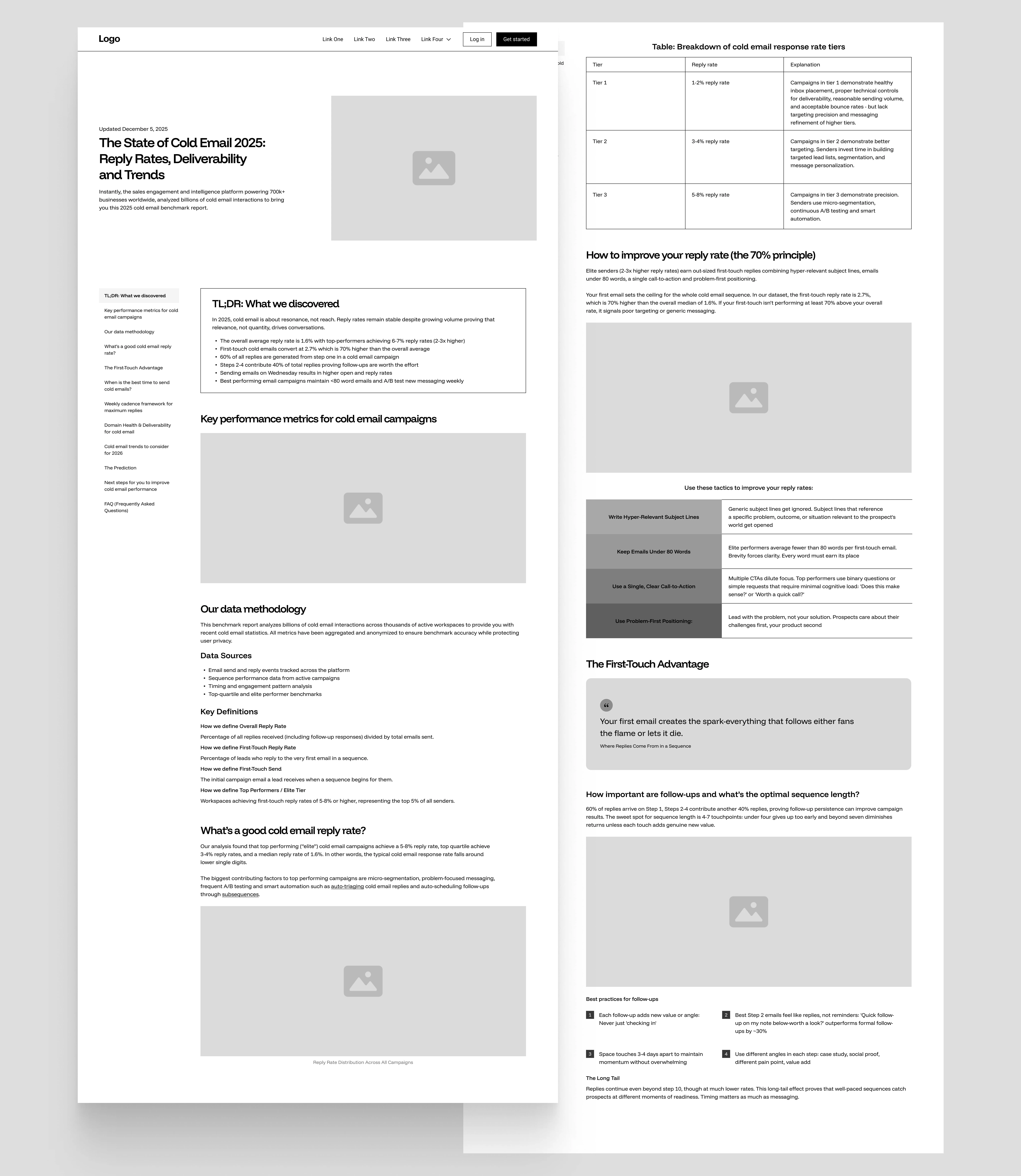
The client provided content in a raw format: long text blocks (see below)
Main challenges:
– large volume of text;
– no visual hierarchy;
– risk of cognitive overload;
– strong constraint: performance-first, not heavy visuals;
– must follow new brand guidelines.
Without restructuring, the page would:
– feel like a document, not a product;
– reduce readability;
– lower conversion potential.
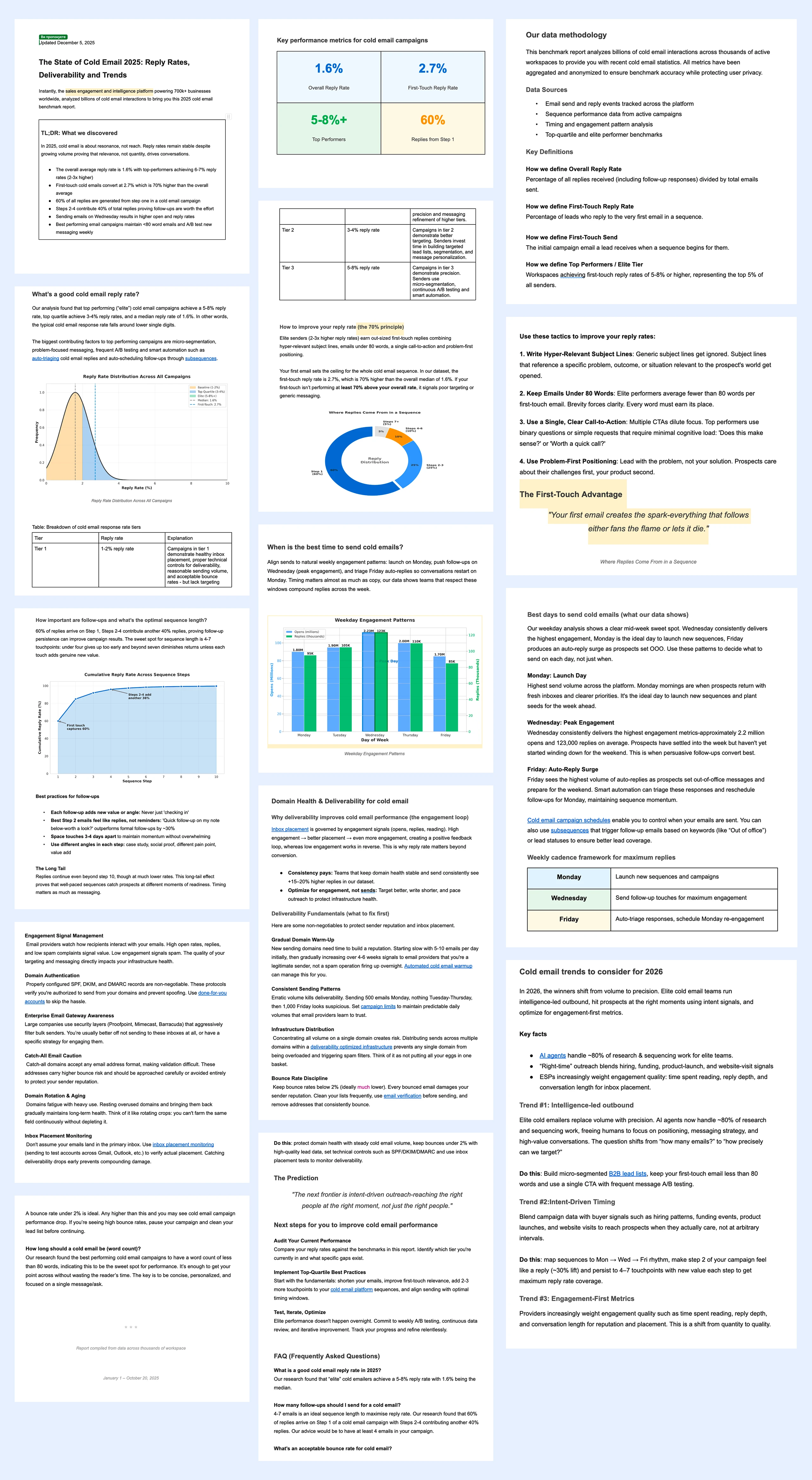
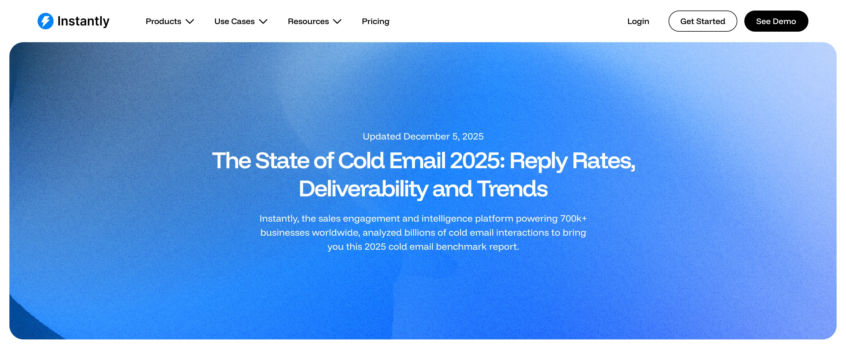
Initial content provided by the client
STRATEGY
Before designing visually, I focused on:
– content logic
– reading flow
– hierarchy
– user intent
Instead of jumping into UI, I started with structure.
My approach:
Reduce complexity through layout
Guide the eye with hierarchy
Design for scanning, not reading
Use contrast only where it improves clarity
LOW-FI MOCKUPS
To validate structure before visuals, I created two low-fidelity layout directions.
Variant 1 — Text-first layout
A minimal structure focused purely on:
– typography
– spacing
– reading rhythm
This version tested:
– how content flows without visual support
– whether hierarchy works on its own
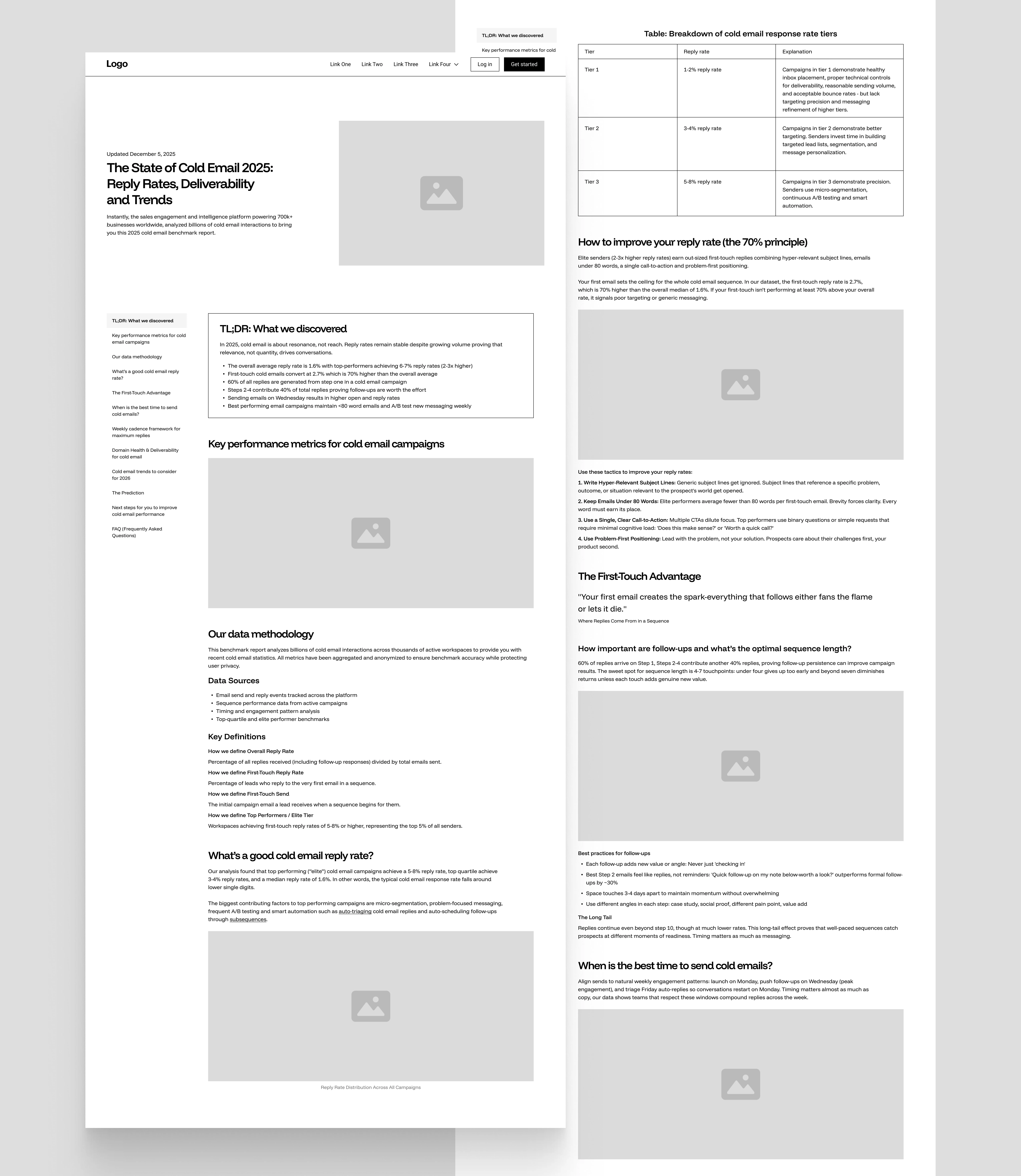
First step: building a structure before visuals.
Variant 2 — Structured layout with content boxes
This version introduced:
– section containers
– visual grouping
– contrast blocks
Goal:
To test if separating content into visual zones improves:
– scannability
– comprehension
– perceived complexity
These low-fi mockups allowed the client to evaluate logic, not aesthetics.
Alternative layout to test hierarchy and grouping
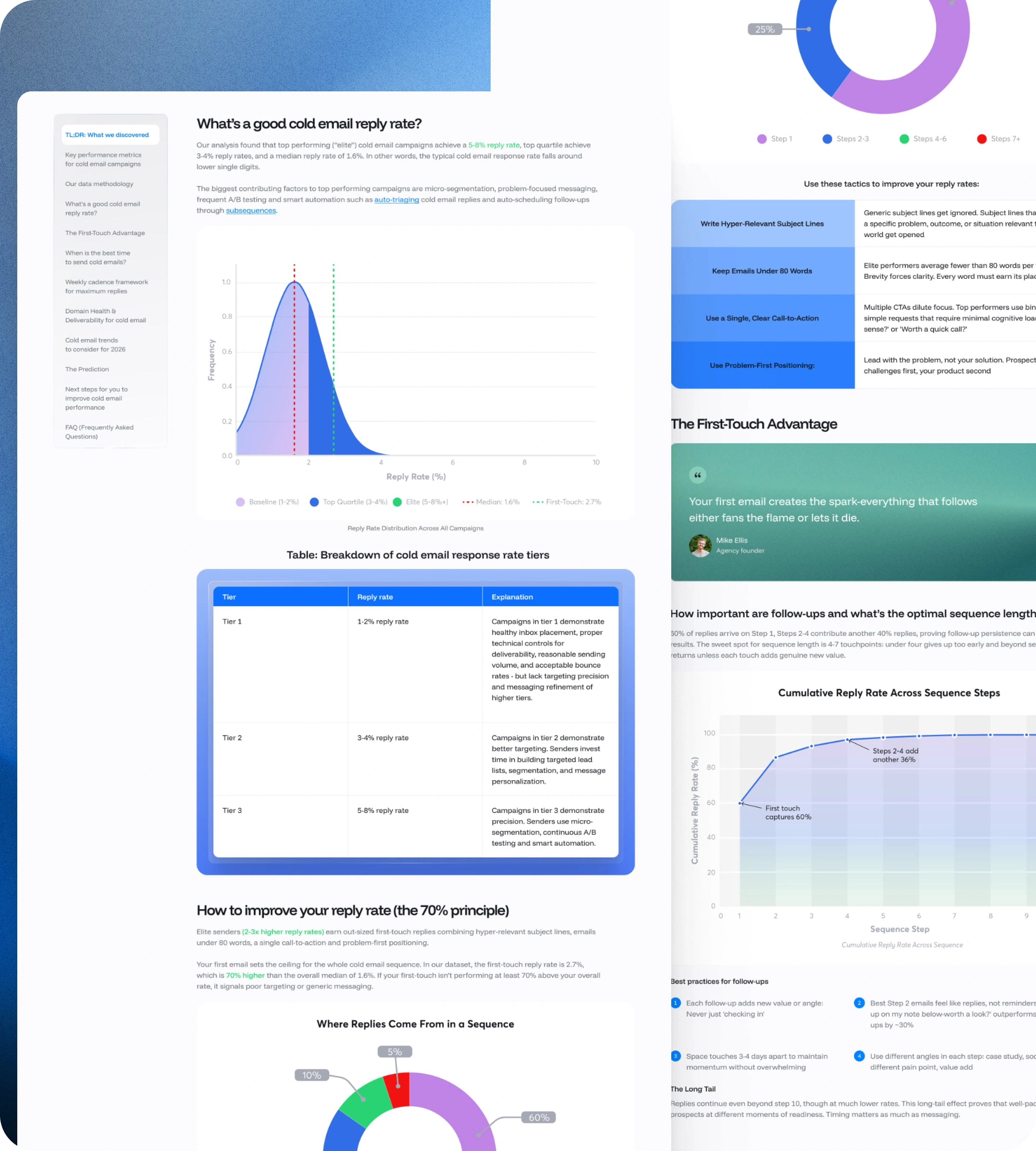
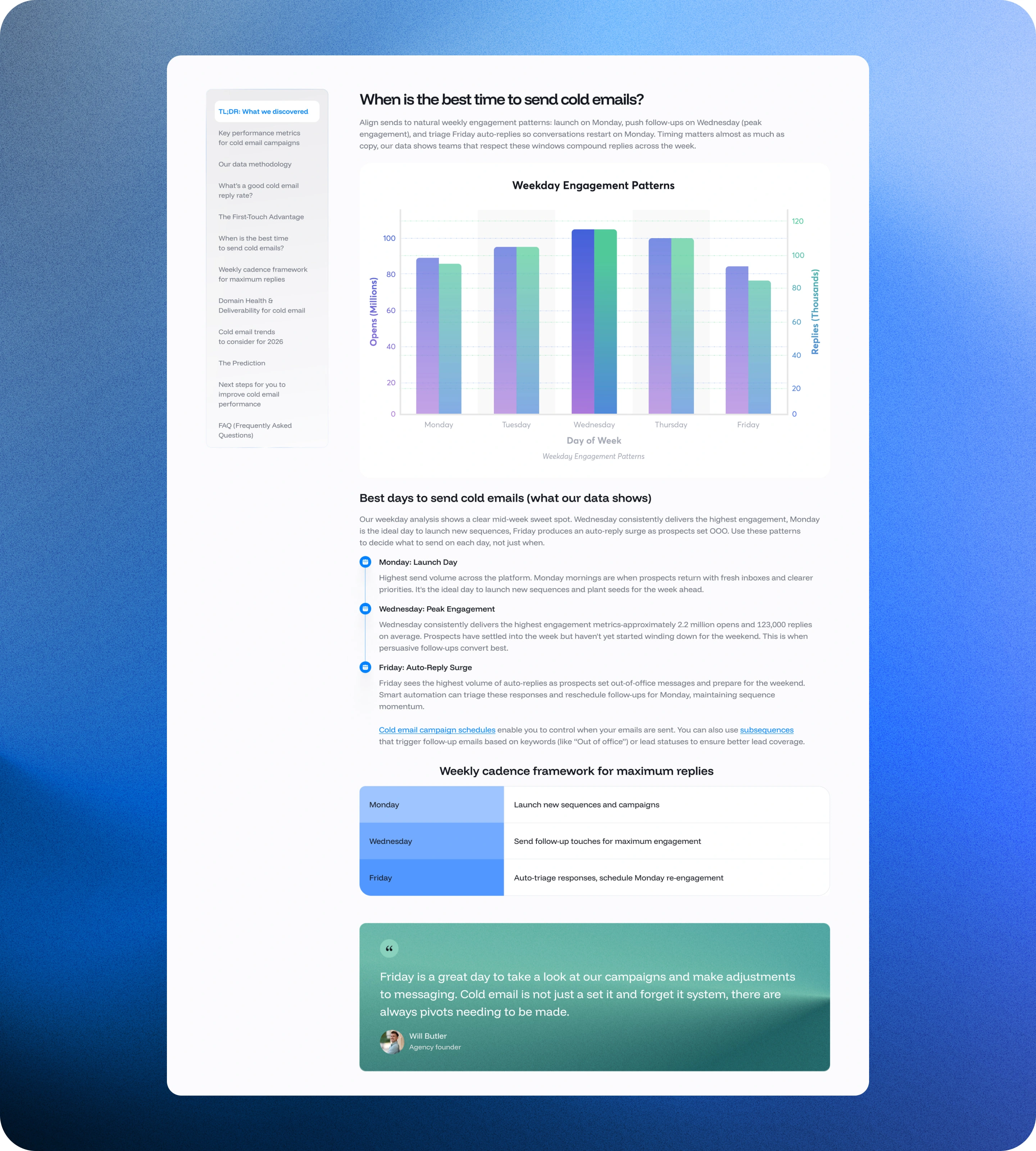
HIGH-FI DESIGN
After validating the structure, I translated the chosen layout into a high-fidelity design using Instantly’s new brand system.
Data charts were supplied by the client’s team and were not part of my design scope.
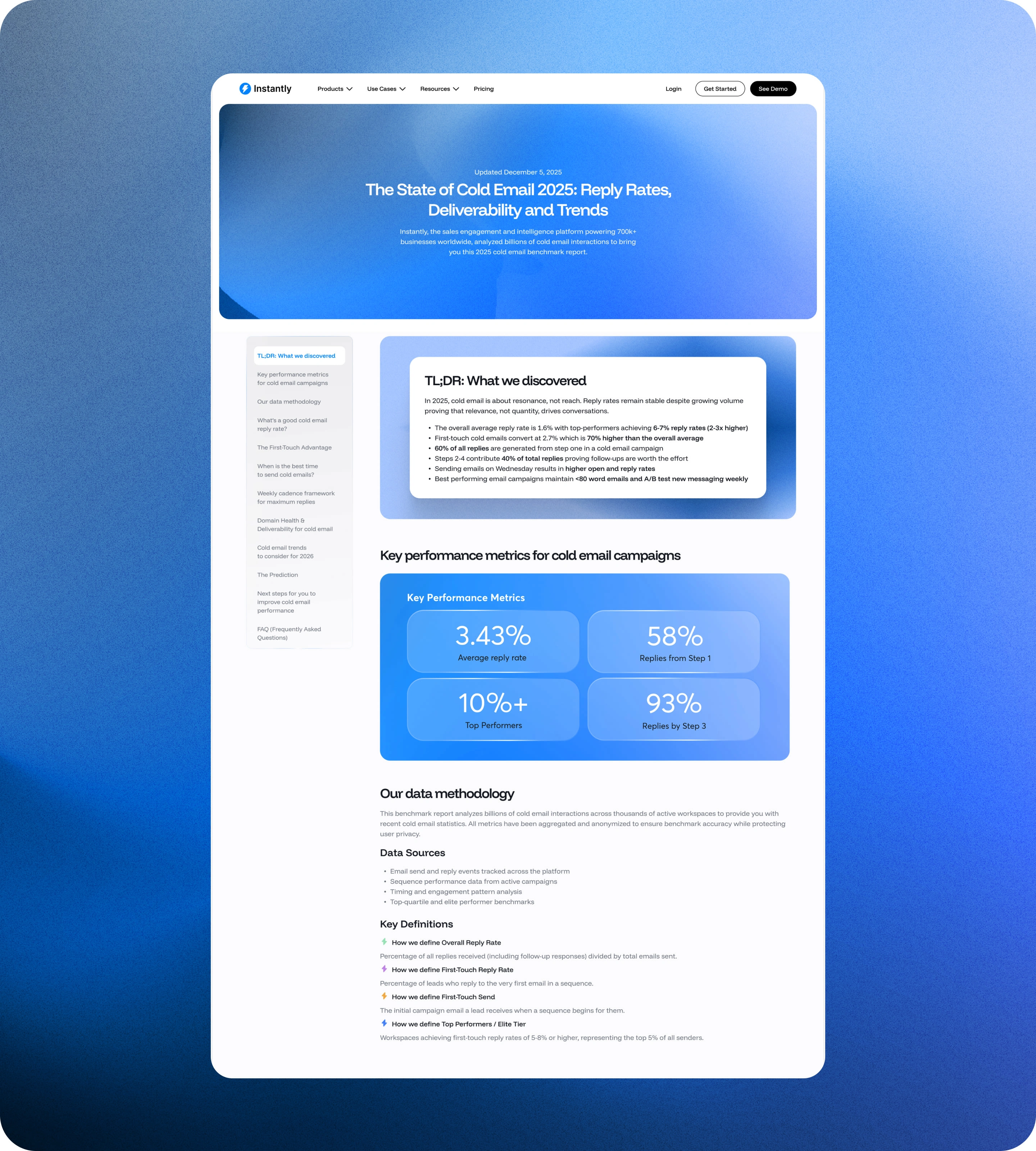
Final design based on validated structure and brand system
Design principles:
– lightweight visuals;
– strong typographic hierarchy;
– restrained color usage;
– layout over decoration;
– clarity over style.
The design supports:
– fast scanning;
– easy navigation through sections;
– focus on content, not UI noise.
WHAT I CONTRIBUTED
My role went beyond UI execution.
I worked on:
– content structuring;
– layout logic;
– hierarchy system;
– translation of brand rules into usable UI;
– performance-oriented design decisions.
This project demonstrates my strength in:
✅ turning raw content into structured experience;
✅ designing for clarity and usability;
✅ working with constraints;
✅ balancing brand and performance;
✅ explaining design decisions logically.
RESULT
The final design:
– feels like a product page, not a document
– makes long content approachable
– supports conversion goals
– remains lightweight and brand-consistent
This case shows how design can: not just decorate information, but organize it into an experience.
Like this project
Posted Feb 9, 2026
Design of a report LP for Instantly, created to support fast scanning, content hierarchy, and high performance while following the brand’s new visual system.
Likes
0
Views
9
Timeline
Dec 15, 2025 - Jan 9, 2026