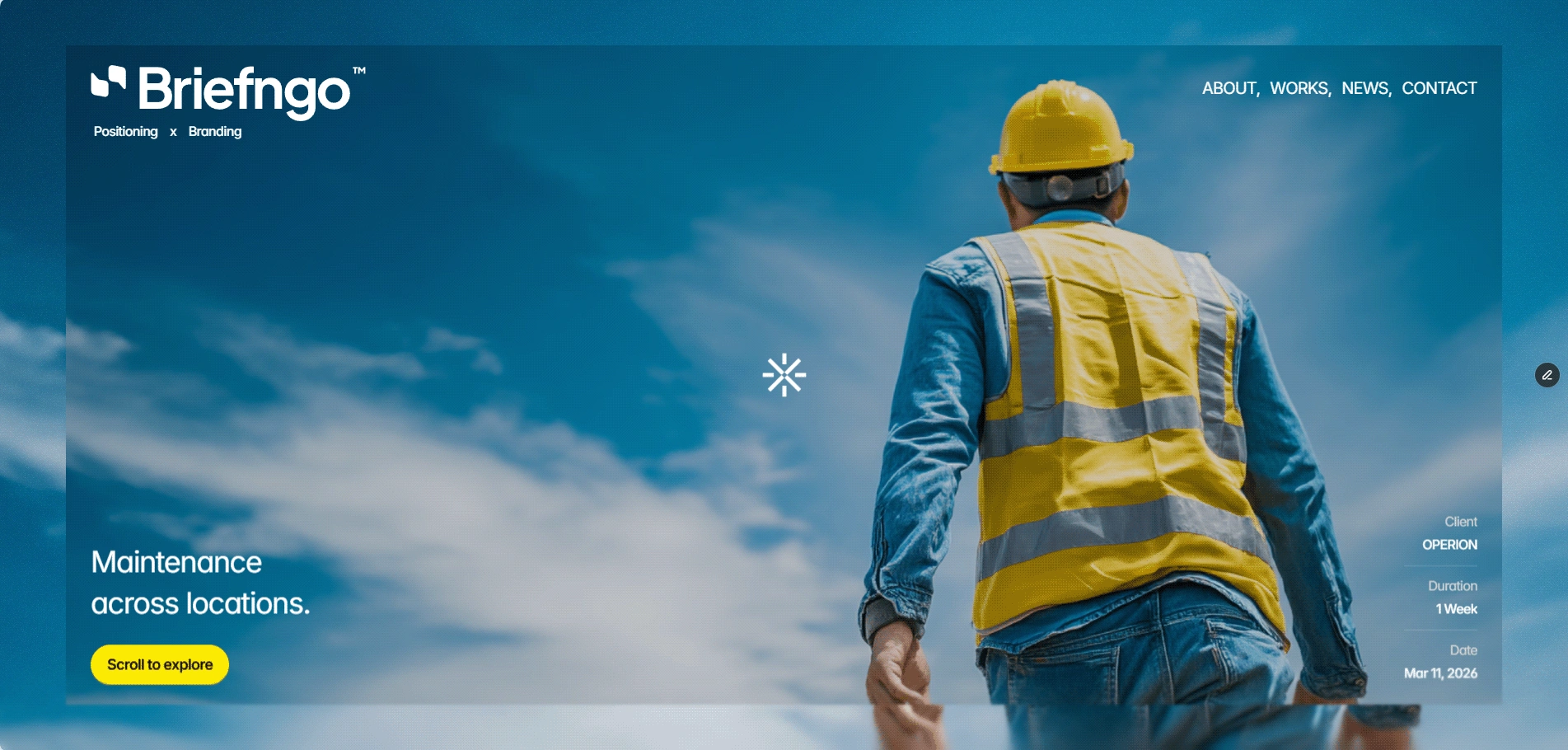
Operion | Brand Identity Development
Alejandro Giménez
( 00-01 ) ABOUT THE PROJECT
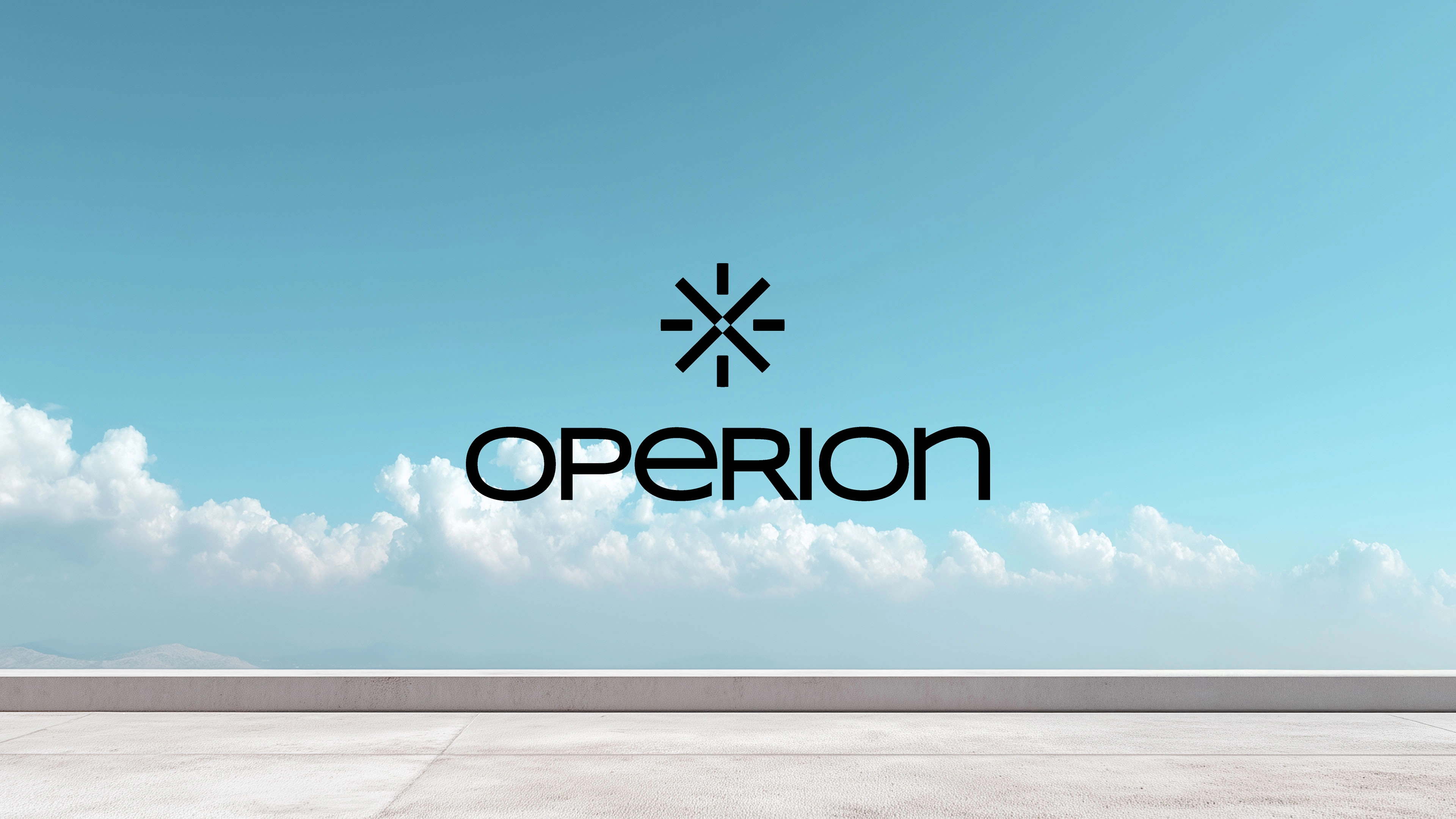
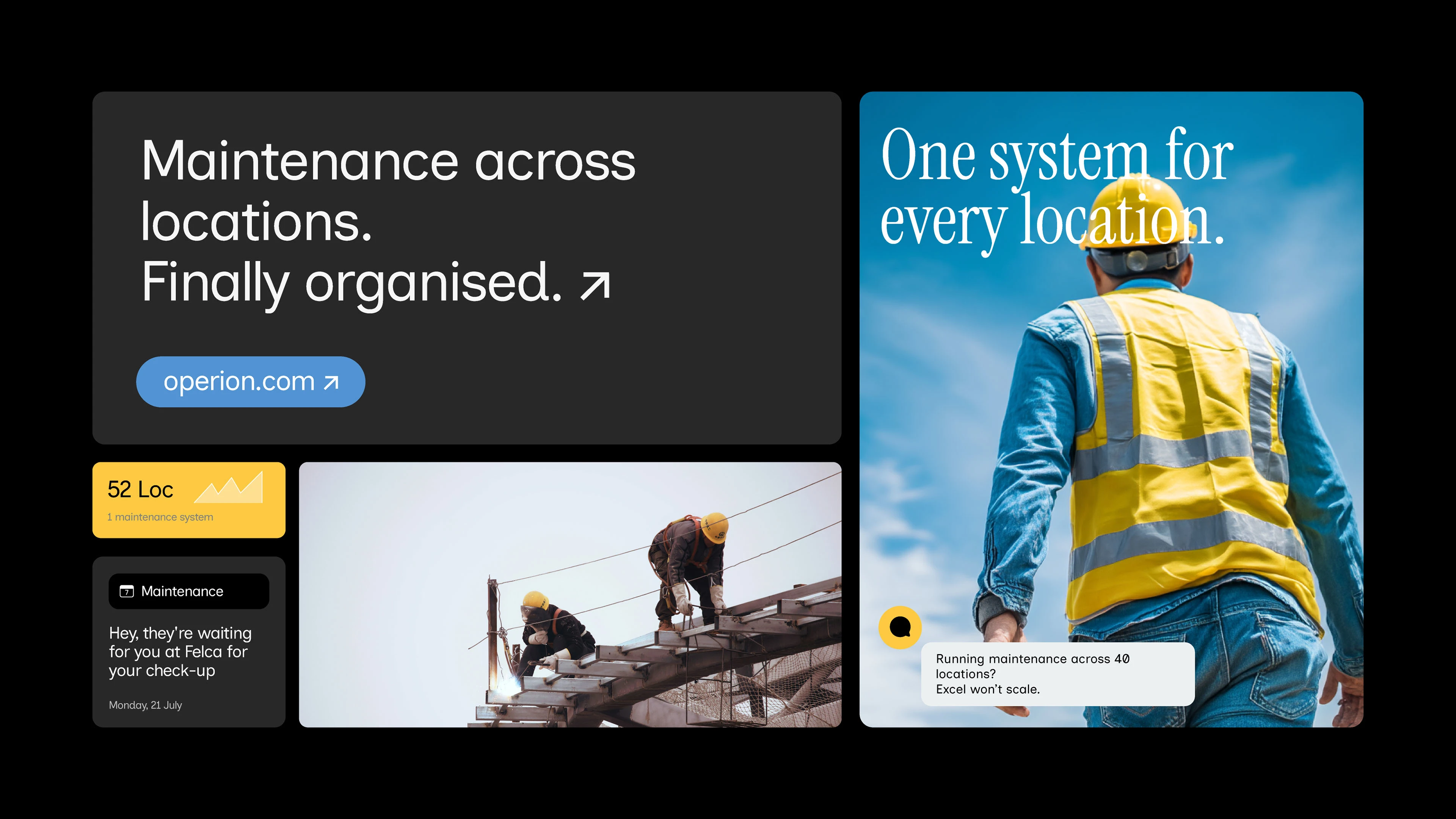
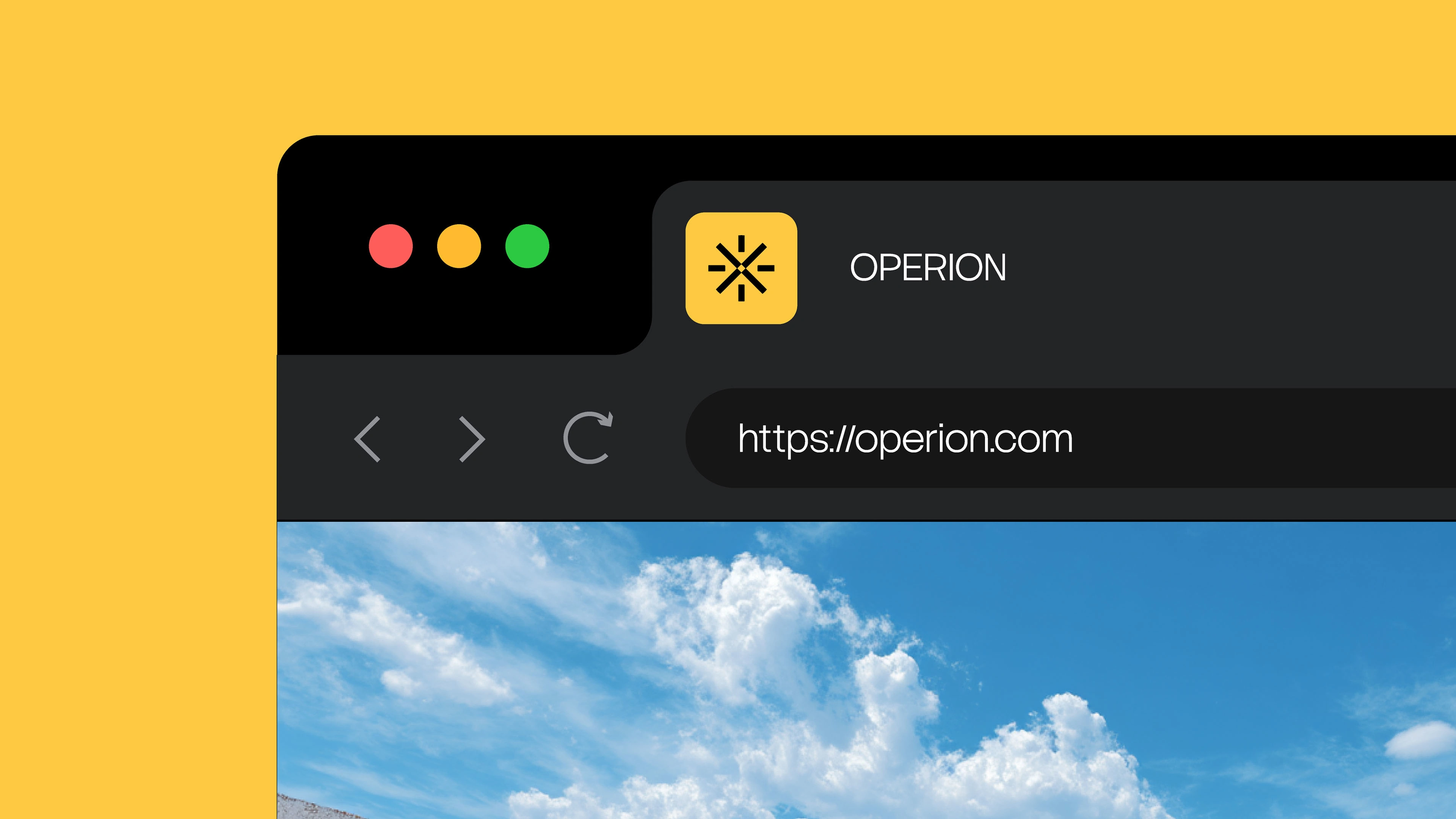
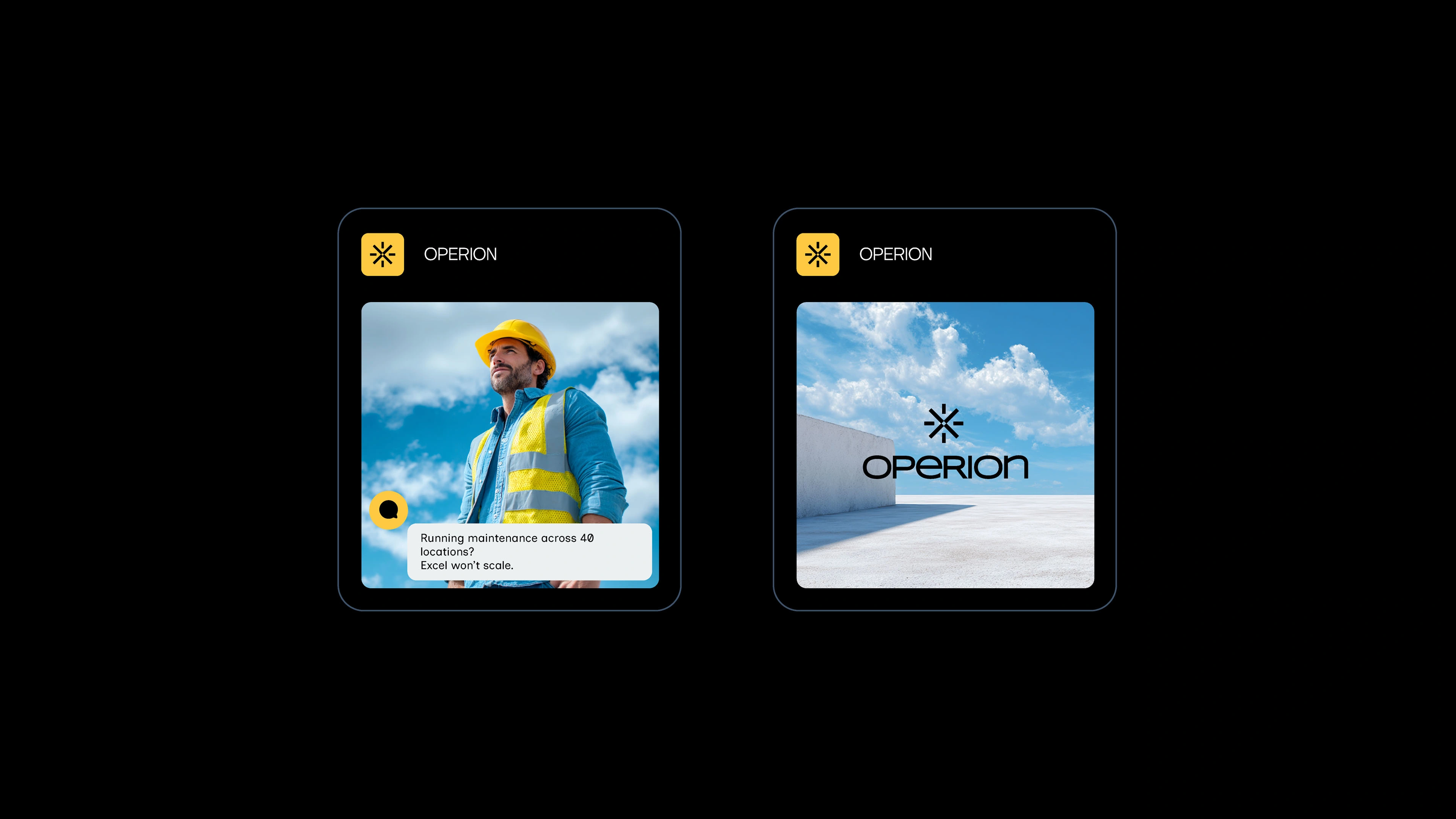
Operational software, clearly positioned
Operion is a field service platform designed for companies managing maintenance across multiple locations.
The goal of the project was to build a brand that reflects the operational nature of the product: structured, reliable and practical.
Rather than following typical SaaS aesthetics, the identity focuses on clarity, system thinking and real-world context, helping the product feel grounded in the environments where it is actually used.
( 00-02 ) CHALLENGES
Making complex operations easy to understand
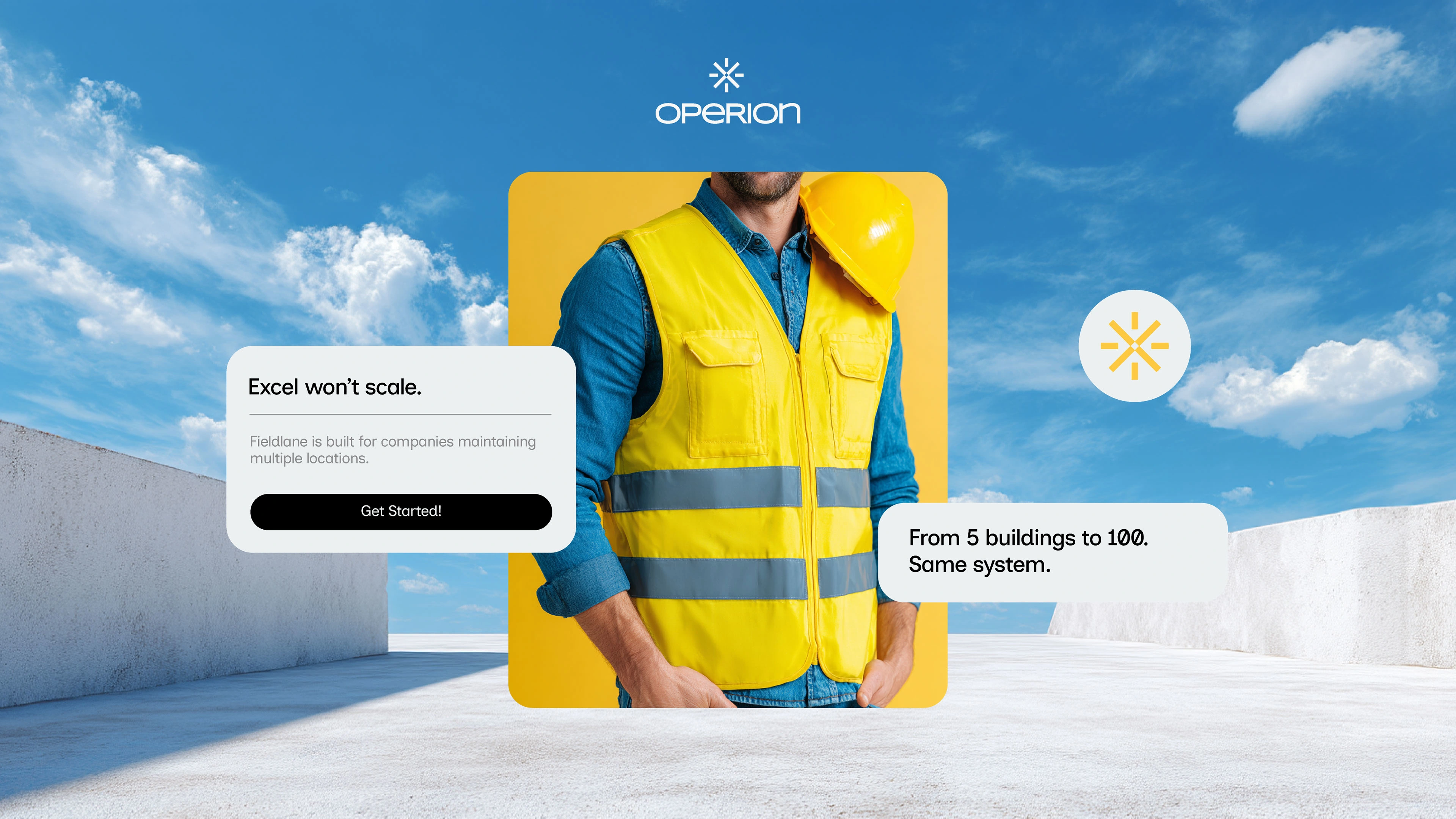
Many field service platforms communicate too broadly, making it difficult for potential customers to quickly understand what the product is built for.
For Operion, the challenge was to design a brand that immediately signals its focus: helping companies coordinate maintenance across multiple sites.
The visual system needed to balance technical clarity with strong operational cues, creating a brand that feels trustworthy, structured and purpose-built.
( 00-03 ) SUMMARY
A brand built for operational clarity
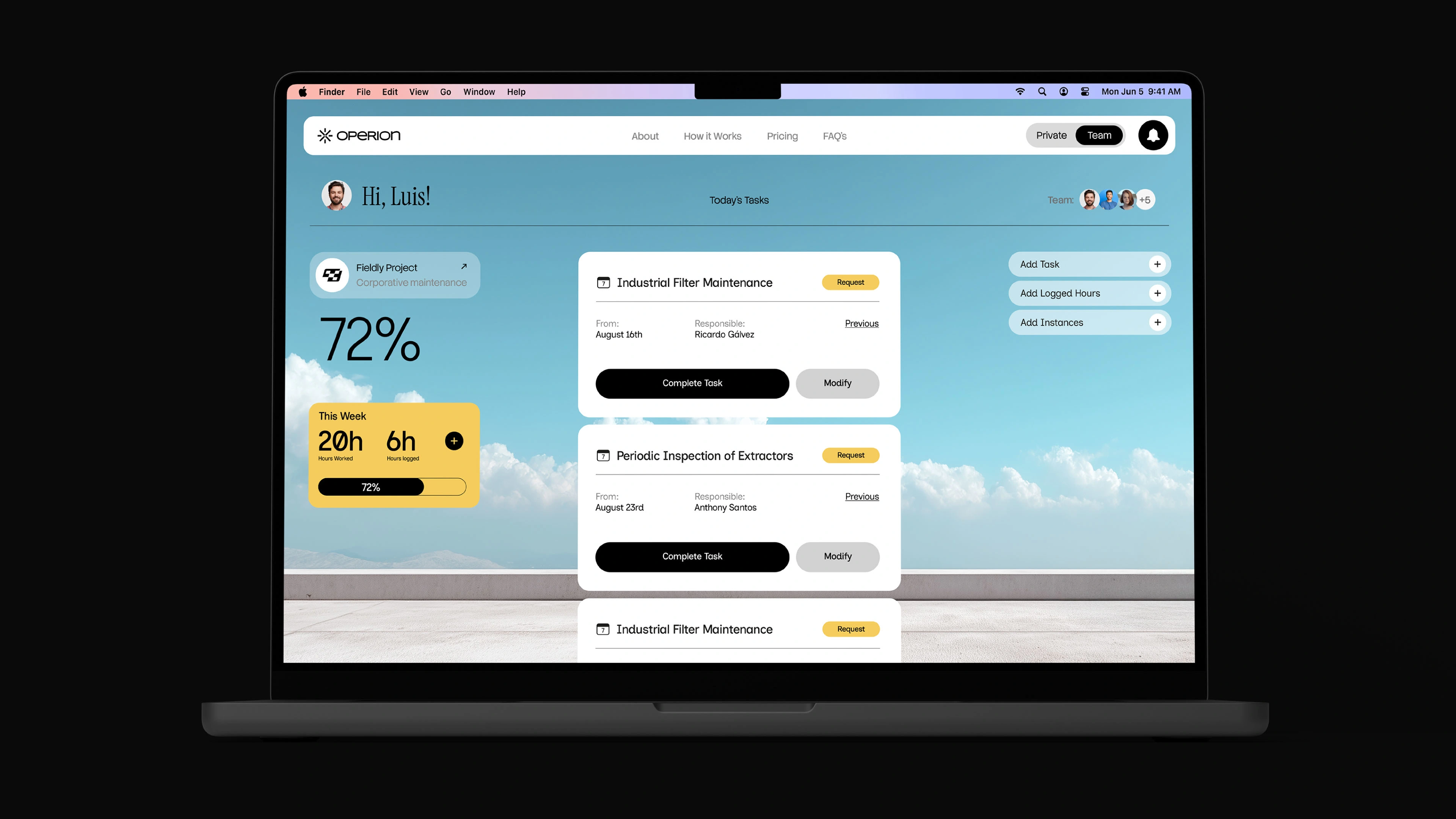
The final identity translates the product’s positioning into a clear and consistent visual system.
Structured layouts, functional typography and contextual imagery reinforce the operational nature of the platform while maintaining a modern digital presence.
The result is a brand that feels practical, dependable and aligned with the real needs of maintenance teams managing complex environments.
Like this project
Posted Mar 12, 2026
It's a platform designed to manage complex maintenance operations. We simplified the positioning by focusing on operational clarity and system organization.
Likes
2
Views
8
Timeline
Mar 5, 2026 - Mar 12, 2026
Clients
Operion