Parsley Health Digital Experience Redesign
Mosopefoluwa Afolayan
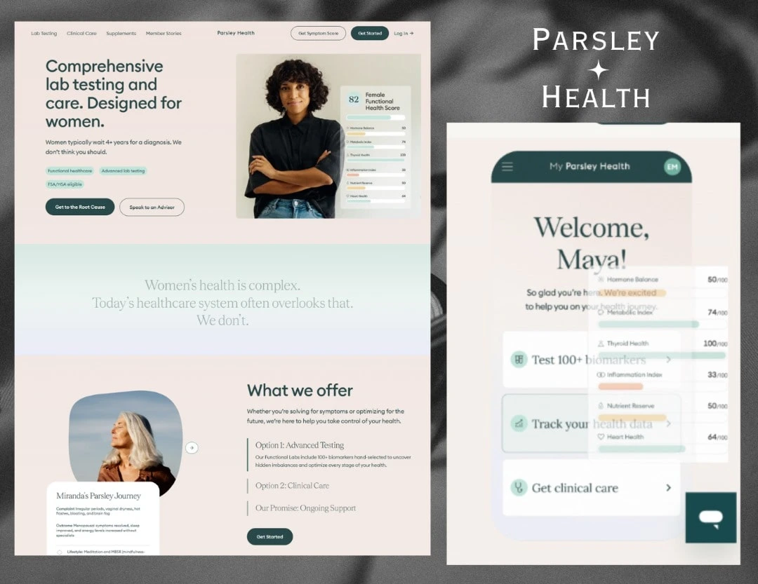
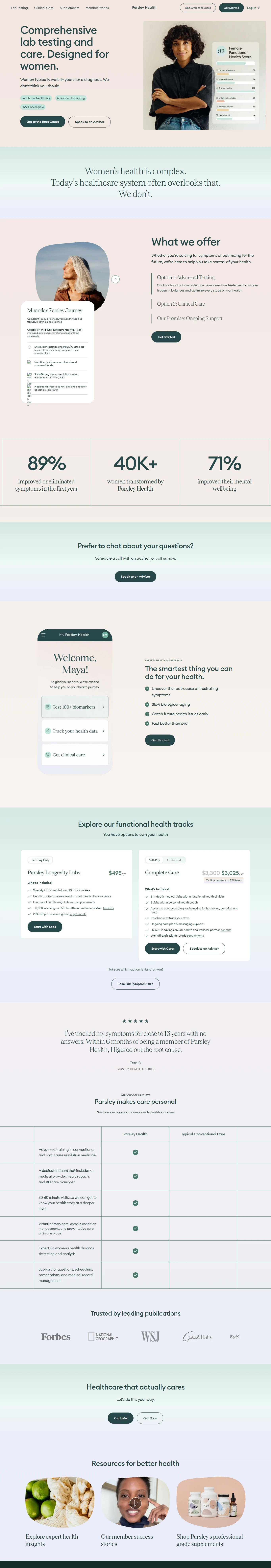
Project Overview: Parsley Health. Click here to visit website.
Our mission was to reimagine Parsley Health’s digital presence into an experience as transformative as its approach to medicine. The challenge lay in building a platform that could balance the science of advanced diagnostics with the soul of compassionate care. We needed to create a user experience that demystified functional medicine, guided people seamlessly toward membership, and captured the human stories of healing and prevention. Success would not be measured by page views alone, but by how effectively the design empowered people to take control of their health and well-being.
The Approach
This project was delivered timed to coincide with the launch of Parsley Health’s new digital initiatives. Our strategy was rooted in speed without compromise, ensuring that design decisions aligned tightly with the brand’s mission. We began by mapping user journeys of patients seeking answers beyond conventional medicine. The goal was to build a stigma-free, approachable environment where health felt personal, not clinical. We rapidly prototyped core flows, from membership sign-up to virtual care pathways, gathering iterative feedback directly from Parsley’s team of clinicians and strategists. The build was executed entirely in Framer, allowing design and engineering to live in harmony. This enabled us to craft a fluid, interactive experience where storytelling and functionality were seamlessly interwoven.
The Design
The design is a direct expression of Parsley Health’s values, whole-person care, innovation, and compassion. Every element was crafted to reduce friction, inspire trust, and make healthcare feel human.
Typography with Flow: We chose typefaces that balanced clinical clarity with warmth approachable yet authoritative, evoking the blend of science and humanity that defines Parsley.
Authentic Storytelling Through Imagery: Photography focused on real people in natural moments, steering clear of sterile medical stock images. The imagery reflects authenticity, resilience, and the everyday beauty of health in motion.
The Guiding Green: Parsley’s calming palette, anchored by fresh, natural greens, became more than decoration, it functioned as a visual compass, guiding users through membership flows and reinforcing the brand’s promise of renewal.
The Impact: A Health Experience Reimagined
The redesigned platform provided Parsley Health with a powerful new digital identity, a place where potential members could not only learn but also feel seen, supported, and empowered. By simplifying complex care models, streamlining membership journeys, and weaving storytelling into every interaction, the new site became more than a destination: it became a digital sanctuary for wellness.
Like this project
Posted Sep 9, 2025
Reimagined Parsley Health's digital presence to enhance user experience and empower health control. They gave the best 5 star feedback on this.